|
| Group |
Round |
C/R |
Comment |
Date |
Image |
| 99 |
Sep 22 |
Reply |
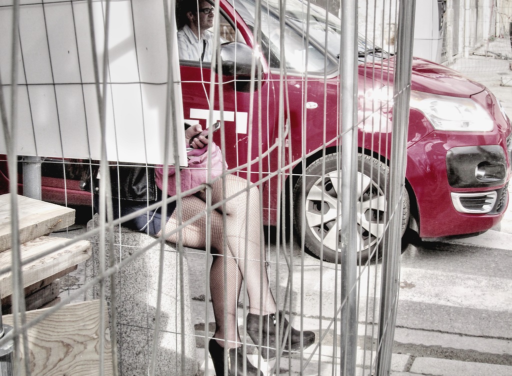
Hi Randy -- I just sent Gerard a message about the hand. He, too, suggested leaving it out completely which I think is a good idea. I thought the hand helped to indicate the "action" (basketweaving) but I really am primarily interested in the shoe. Great feedback - thanks! |
Sep 14th |
| 99 |
Sep 22 |
Reply |
Thanks, Gerard. I included the hand because I thought it added a little to the narative, but now that you mention it I can see the advantage of leaving the hand out completely. It does make a tighter composition - which I like. Great feedback! |
Sep 14th |
| 99 |
Sep 22 |
Reply |
Thanks, Barbara. I love lots of details so thanks for mentioning that. |
Sep 7th |
| 99 |
Sep 22 |
Reply |
Thanks, Michael. I appreciate you mentioning the various textures which is what I like about the image. I had not considered the possibility that it was unclear that the hand and foot are the same person - they are! |
Sep 7th |
| 99 |
Sep 22 |
Reply |
Peter - I was really interested in the shoe but I can see why more information about the person would add more to the story. The original is cropped tight - that's just how it worked out - but I felt like there was enough to work with. |
Sep 7th |
| 99 |
Sep 22 |
Reply |
Thanks, Linda. I like your version. I tend to go towards the dark end of the spectrum. |
Sep 7th |
| 99 |
Sep 22 |
Comment |
Hi Randy -- This is a really neat image but the amount of the composition obscured by dark shadows is a problem for me. I want to see more! It's hard to use multi-exposure HDR when you have a person moving in the frame so I guess that may not be the answer, but I would be looking for a way to get more shadow detail. |
Sep 7th |
| 99 |
Sep 22 |
Comment |
Michael - The bird's head and beak (I'm pretty sure it's a cormorant) echoed in the branch to the right looks really interesting. I would crop it more closely and eliminate the upright branch on the left side. I agree that richer blacks make the scene even better. Cool image! |
Sep 7th |
| 99 |
Sep 22 |
Comment |
Linda - what a beautiful image! I have taken pictures in Yellowstone and found it somewhat difficult to capture the atmosphere. I think you really nailed the feeling of mystery and strangeness that these amazing formations suggest. I wouldn't change anything! |
Sep 7th |
| 99 |
Sep 22 |
Comment |
Hi Peter -- I don't create composits myself and I know virtually nothing about the technique so reading your diion was very interesting. That said, I feel like the figures are not grounded which makes the image sort of unsettling, like the figures and the mural don't really relate to each other. I am glad you do these interesting things so we can learn about them! |
Sep 7th |
| 99 |
Sep 22 |
Comment |
Hi Gerard -- This is the sort of architectual photography that I really enjoy. The combination of the pattern of the bricks and the pattern of the glass blocks really creates a lot of interest. The fan almost has personality. I agree that perhaps the wires are somewhat distracting but they also add more lines and it seems like this image is all about lines. |
Sep 7th |
| 99 |
Sep 22 |
Comment |
Nice image, Barbara. The contasting dark/light of the different layers of petals really suits a monochrome approach. I like the simple background that still hints at texture. I pretty much always prefer a warm tone, so the color looks very good to me. A beautiful minimalist image. |
Sep 7th |
6 comments - 6 replies for Group 99
|
6 comments - 6 replies Total
|