|
| Group |
Round |
C/R |
Comment |
Date |
Image |
| 39 |
Mar 24 |
Reply |
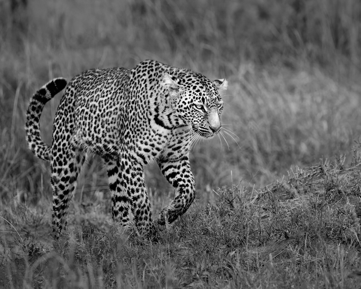
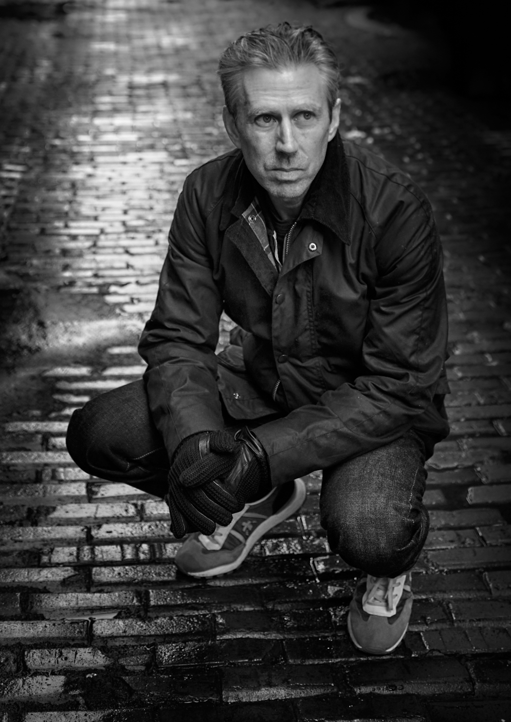
Ken, thanks, yes I think I can push the eyes a bit further. |
Mar 21st |
| 39 |
Mar 24 |
Reply |
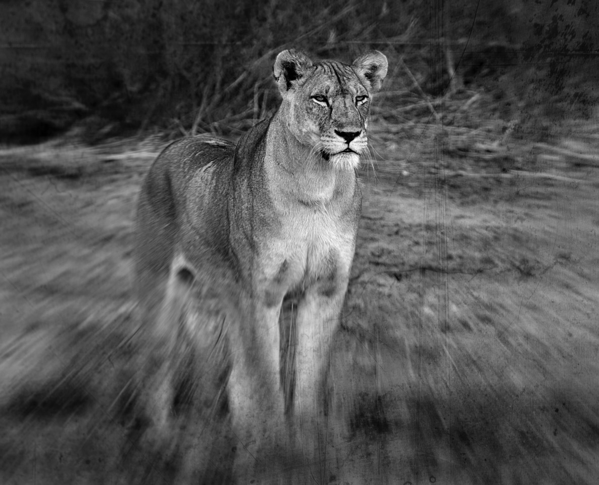
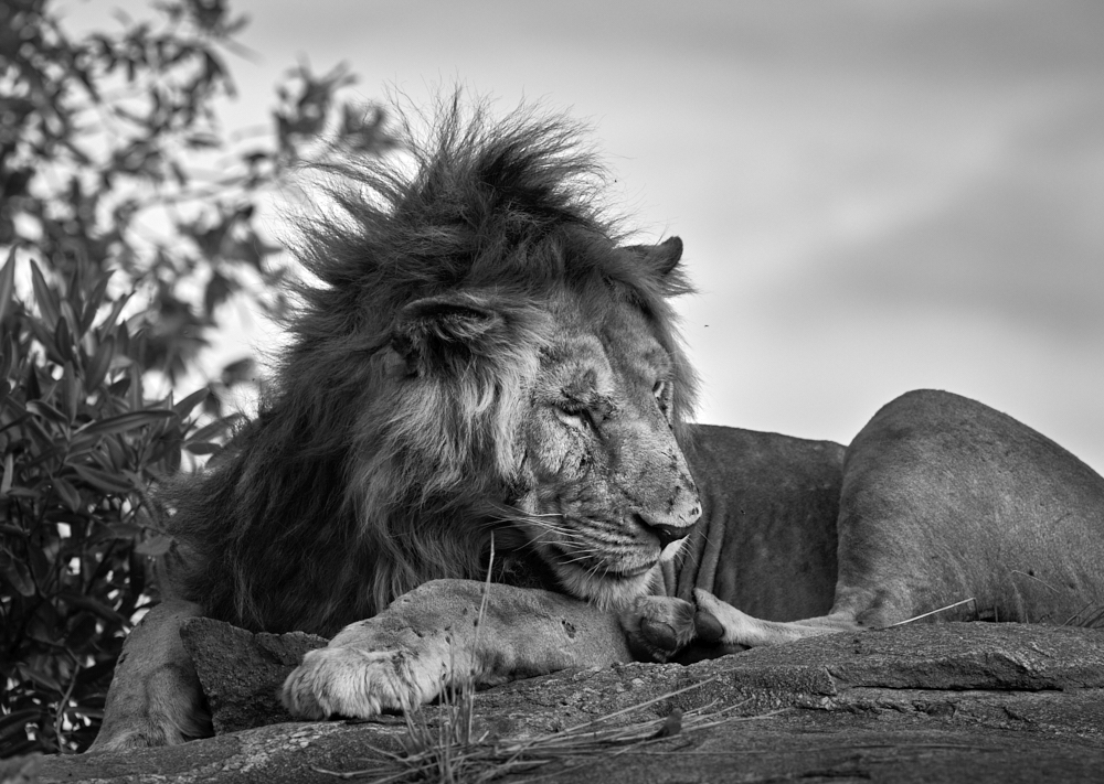
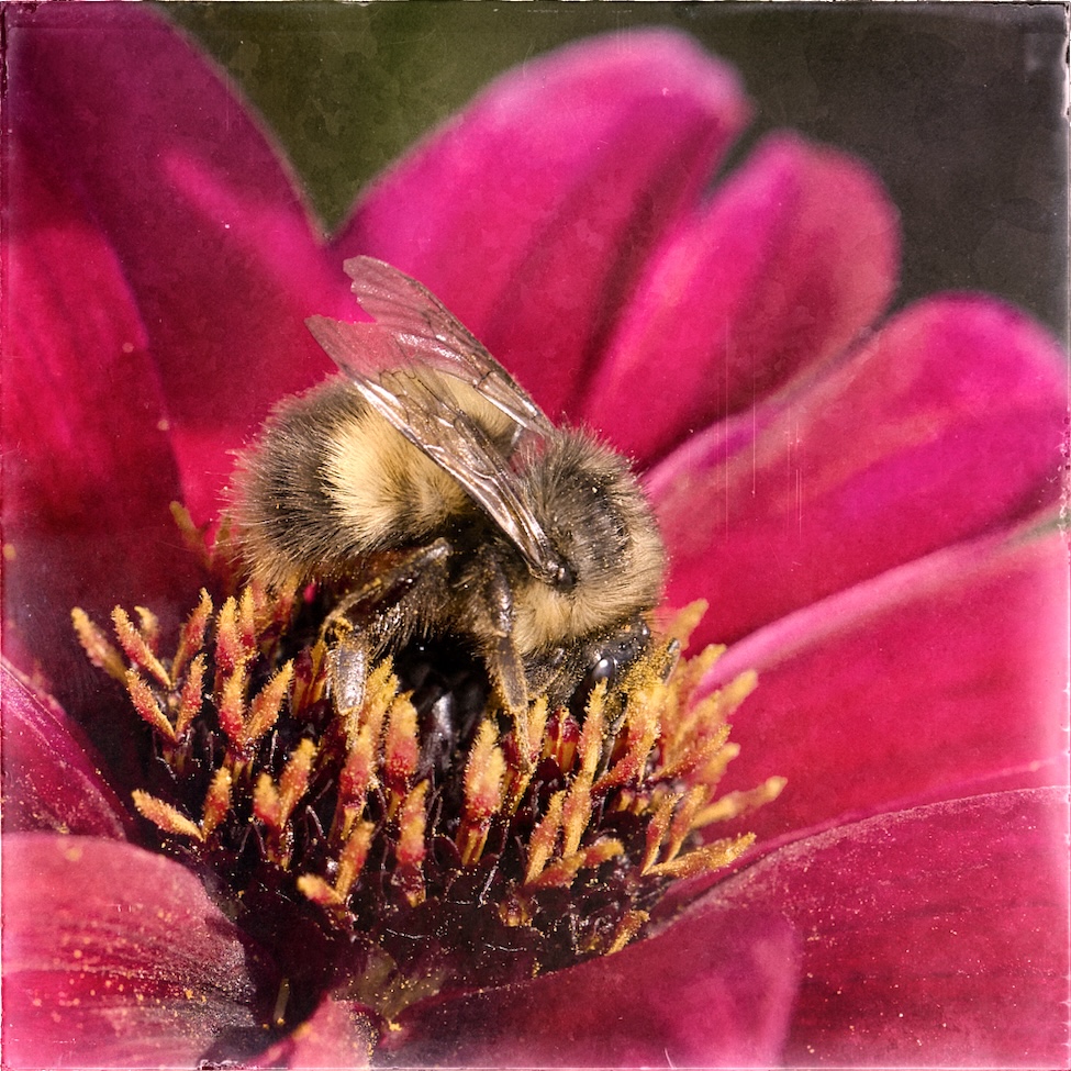
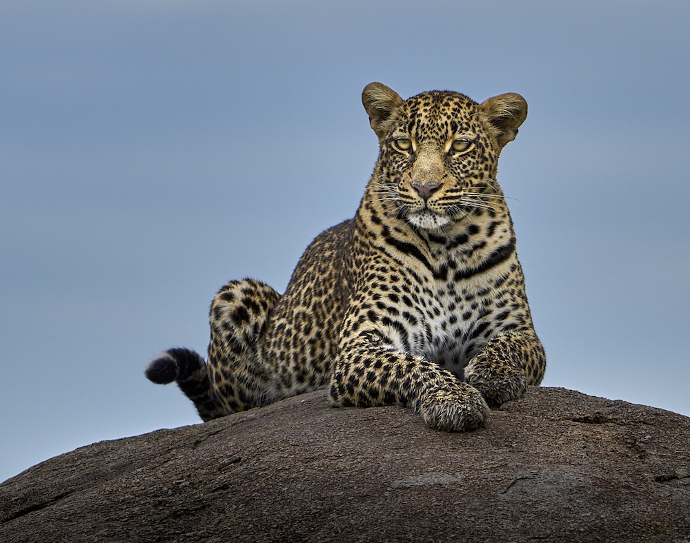
Thank you Paul, we were so lucky to find this cat. Early in the morning and no one else around but us. |
Mar 18th |
| 39 |
Mar 24 |
Comment |
Ken lovely image, and the lighting is good. Nice touch of Rembrandt light on the face. I wonder is a tiny brightening of the face (and I mean tiny) helps define him bit better more. The low key is lovely. |
Mar 14th |
| 39 |
Mar 24 |
Reply |
Vincent thank you - here is the colour version that I did the conversion from. |
Mar 14th |
 |
| 39 |
Mar 24 |
Reply |
Thanks Fran, I submitted it as a print. So we will see. |
Mar 14th |
| 39 |
Mar 24 |
Comment |
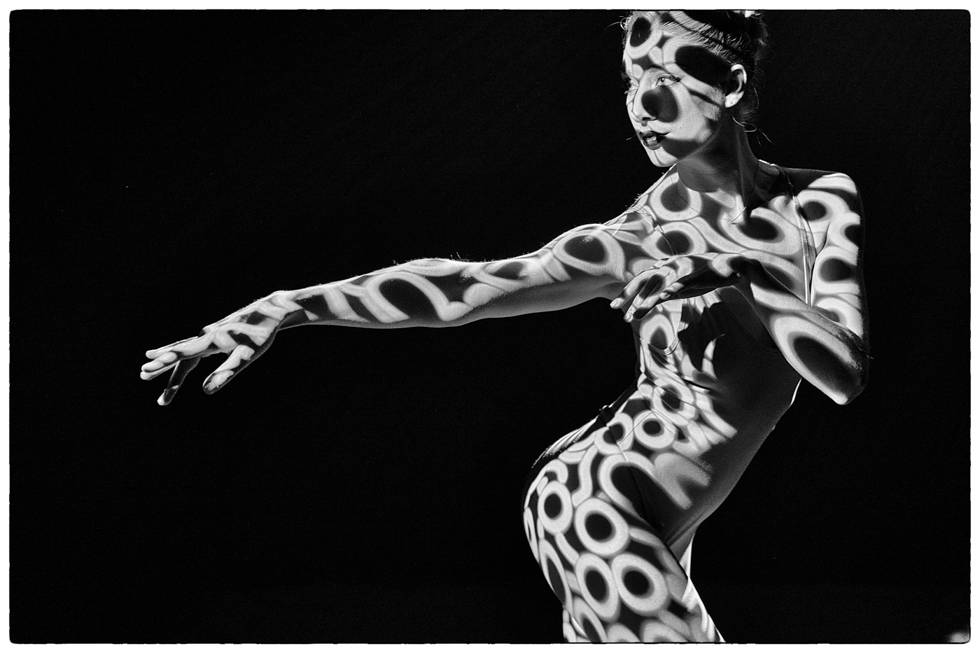
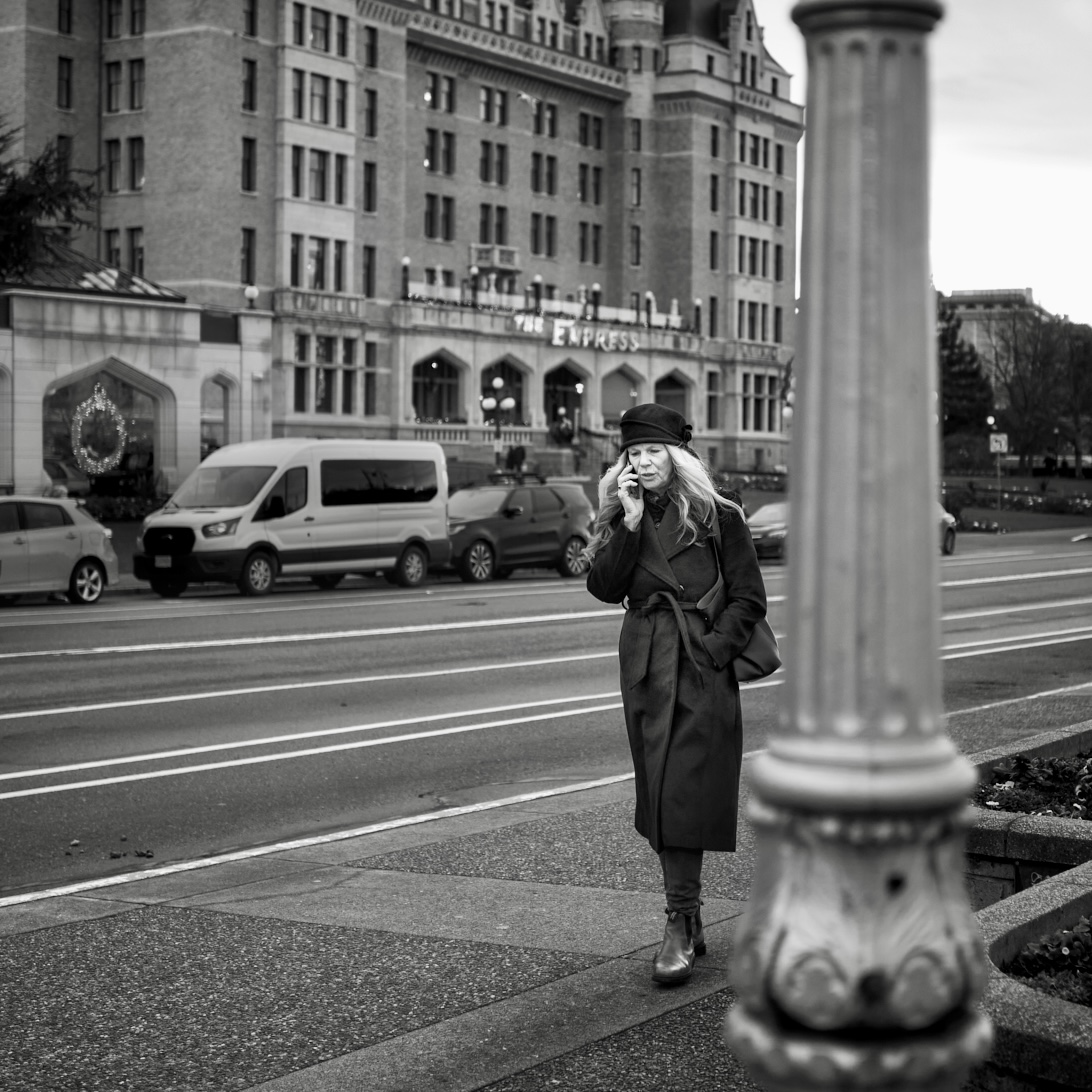
Vincent I like the geometry of the shapes and angles too. The composition could be cropped up from the bottom a bit and from the right side. Consider toning down the areas the mall or corridor that are really bright and increase contrast around the figures to really draw the eye there. Would slightly lighter tonal ranges in the carpet leading toward the figures help draw the eye in?
There are lights in the dark black ceiling area on the left - a white rectangle (vent) that could be cloned out - it is a distraction at the edge of the frame. Or crop in a bit. I would also darken the interior room in that area as it too detracts from your intended focal point? Or make that shape black too. Would that work repeating shapes etc?
Alternatively would a crop from the left to the edge of the dark ceiling be better and give more emphasis to the geometry you saw and like? |
Mar 7th |
| 39 |
Mar 24 |
Comment |
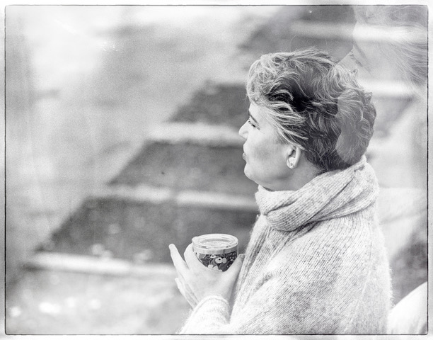
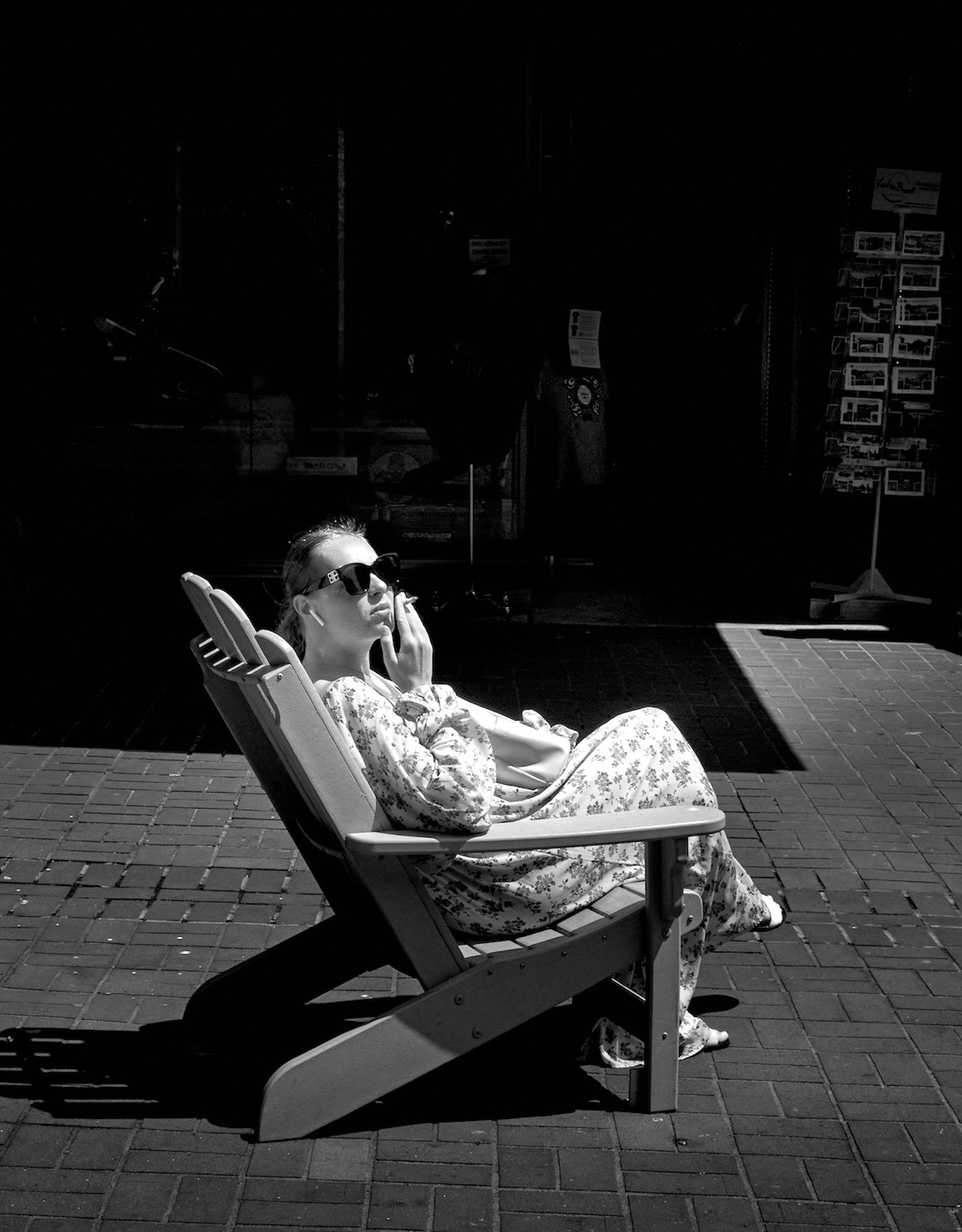
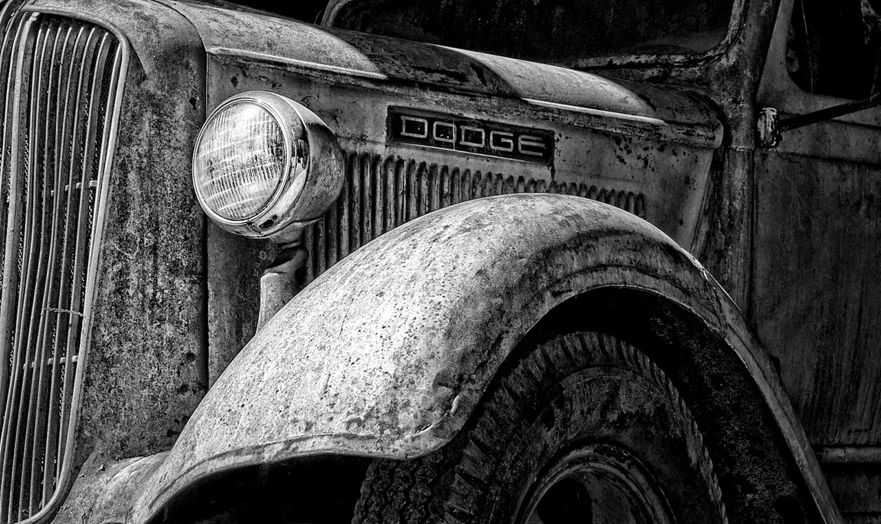
Paul a great street ,off the cuff capture here. Well spotted and the interior lights and reflections on the window all help tell the story. The black and white conversion definitely makes the story stronger and your tonal ranges are good. My nit pick is maybe tone down the white stone a bit and bring out the texture of it?
Overall love this. |
Mar 7th |
| 39 |
Mar 24 |
Comment |
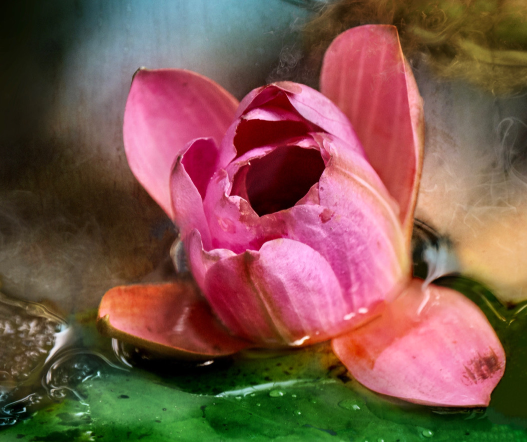
Fran a powerful and impactful image. The shallow depth of field you have used is very effective along with the cooler tones applied. Well done you.
I agree the fingers and nails are still a little soft. The fence is super sharp and maybe running it through Topaz sharpen on just the fingers and nails help a bit? Or does that change the impact of your story and vision?
I think you have done an outstanding job. |
Mar 7th |
| 39 |
Mar 24 |
Comment |
David good for you trying the AI. The conversion is quite nicely done. A crop in from the right to remove the distractions on the edge of the frame would be nice. I would love to see the path in front of the gate have a reverse shading - i.e. darkened at the frame edge and getting lighter toward the house - pulling you into the image.
Perhaps you could add a different and better lamp on the outside than the one that AI generated by doing a composite.
The interior of the courtyard could definitely benefit from a bigger variation in tonal ranges so that the viewer can travel through the space. It's fairly flat in there right now. The original gate rocks but opening it up is cool. Though the strange bar across the entry and the triangle shape act as a visual block I feel.
How about adding a cat in there too or a dog or a person?
Fun stuff. |
Mar 7th |
| 39 |
Mar 24 |
Reply |
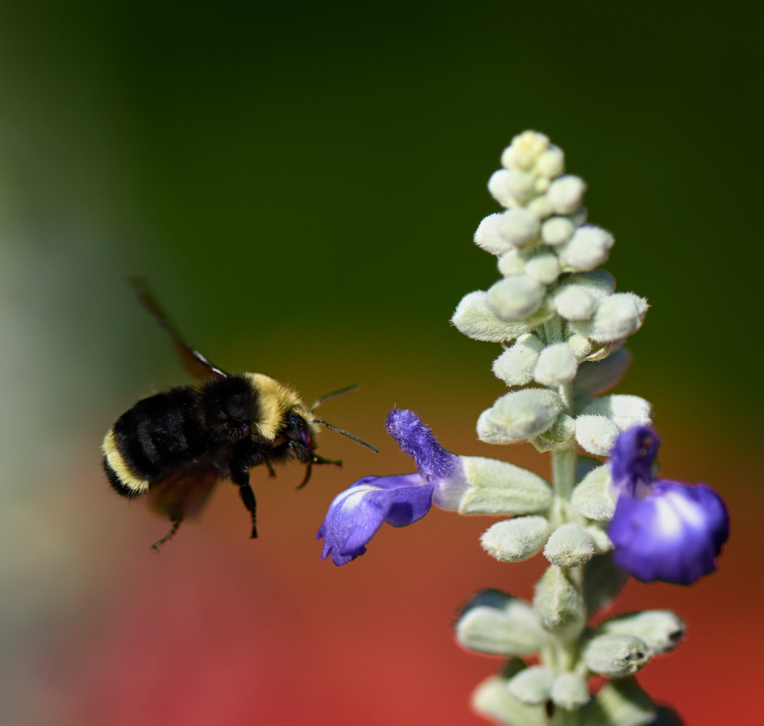
Jerry, we were on a safari in October last year. No glass other than on my lens LOL. We were in an open vehicle so had nothing in front of us. We had tracked this cat and she casually jumped up on the lovely rock for us and posed. Early morning light. |
Mar 7th |
| 39 |
Mar 24 |
Reply |
Thanks David, I was in a rush to get this out to you and neglected to embellish my story! I just entered it into our club competition today so hopefully it does well. |
Mar 7th |
5 comments - 6 replies for Group 39
|
| 80 |
Mar 24 |
Comment |
Jacob great job on the background blur and darkening to tame the busy bits. Good crop too. The flower itself has lost is shine though. The white petals are the shining star in the original. Is there a way to bring the white back up perhaps. That would draw the eye and give you a strong focal point. |
Mar 14th |
| 80 |
Mar 24 |
Reply |
Nadia I apologize I addressed you as Fran. I am sorry. Fran is part of my Black and white group. |
Mar 14th |
| 80 |
Mar 24 |
Comment |
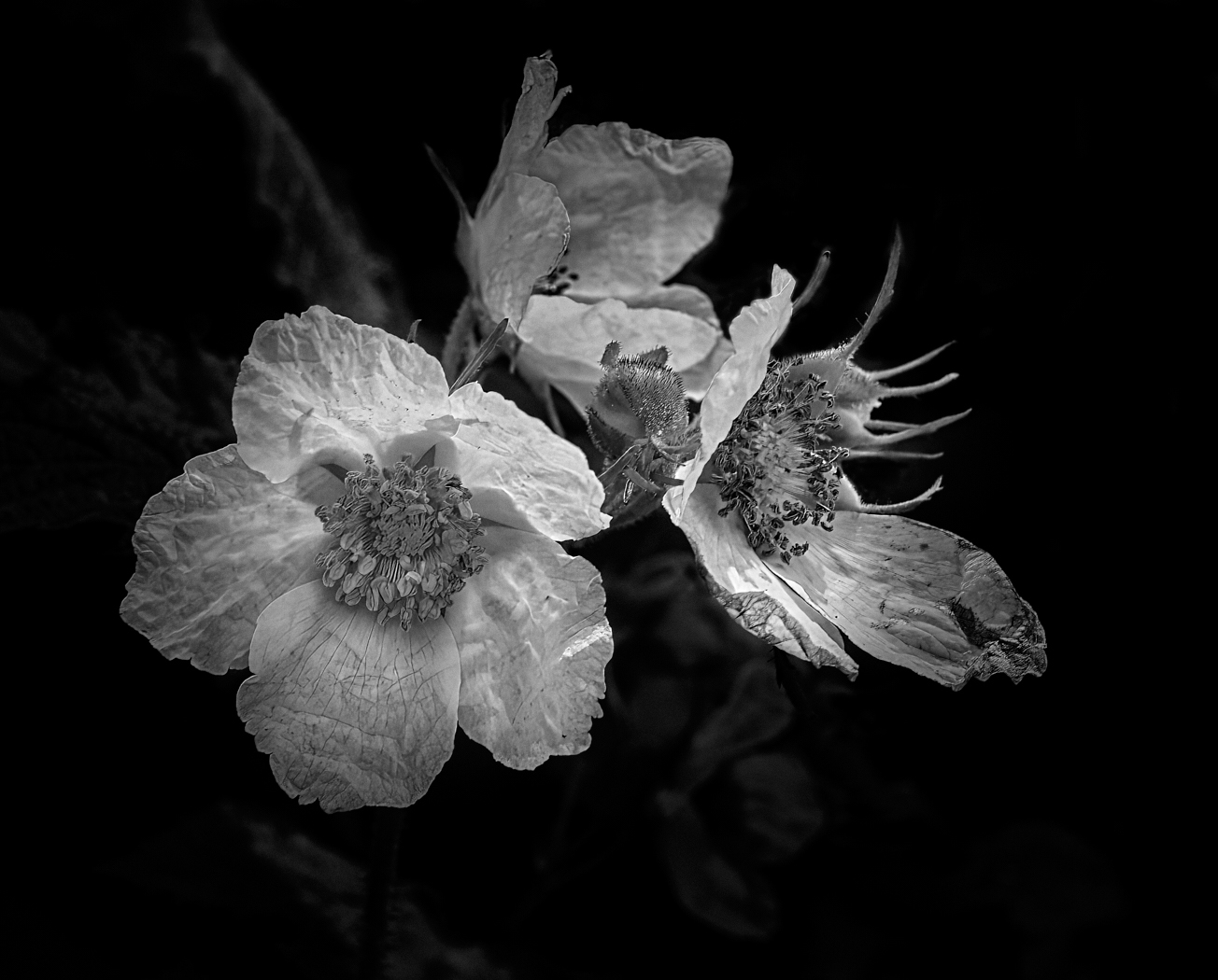
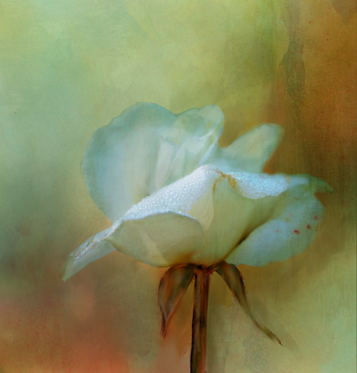
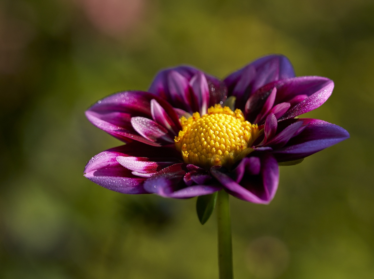
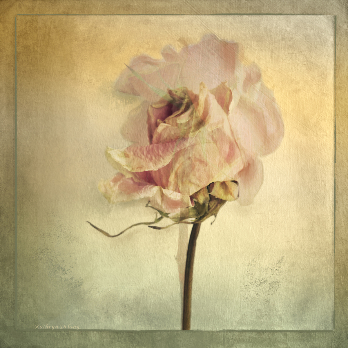
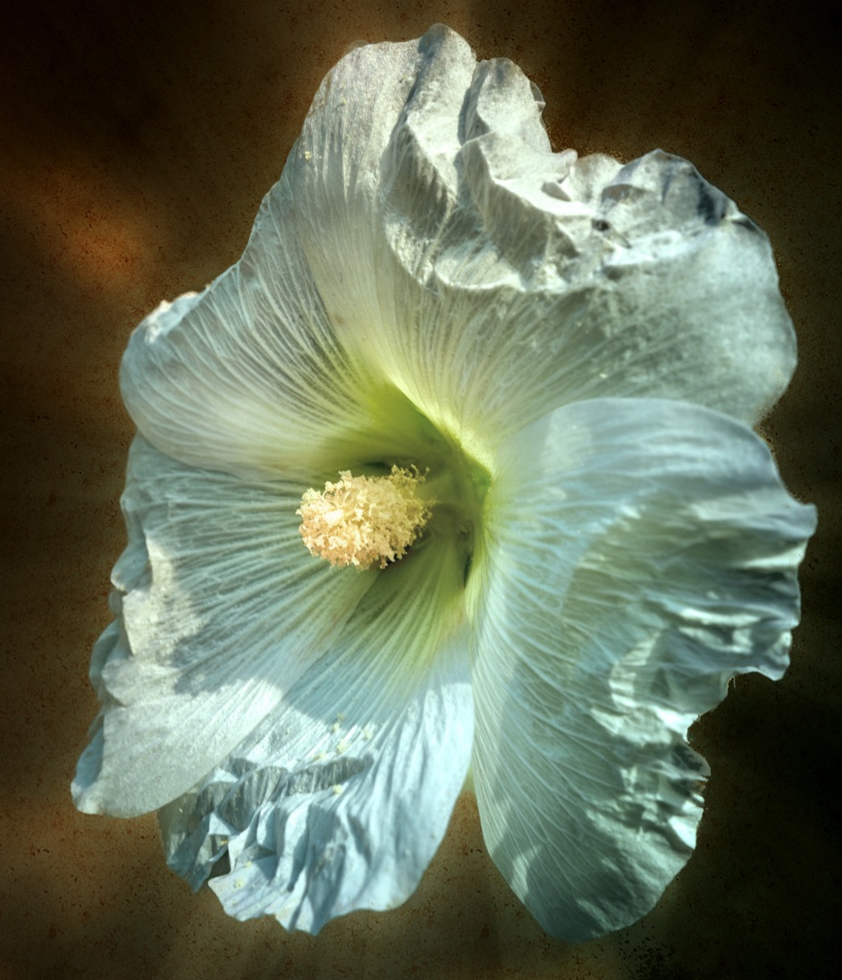
Rich nice work. I love Hellebores. The background could be darkened a touch and set off the petals (including the flower stem - or is it a stem looks like it has writing on it) Inclusion of a leaf or organic stem maybe a nice touch in the next one. I like the warm tones in your original. The current version the flower is so white it feels disconnected from that lovely warm textured background - which is an awesome background. White reflects colours around it so having some of the background hues on the flower would perhaps strengthen the overall effect? |
Mar 7th |
| 80 |
Mar 24 |
Comment |
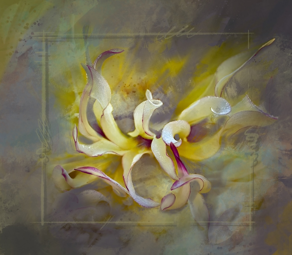
Doug Nice! Love the effect you have achieved and how lovely and dreamy the edges and corners are. Gorgeous rich colours. Would not change a thing on this one. |
Mar 7th |
| 80 |
Mar 24 |
Comment |
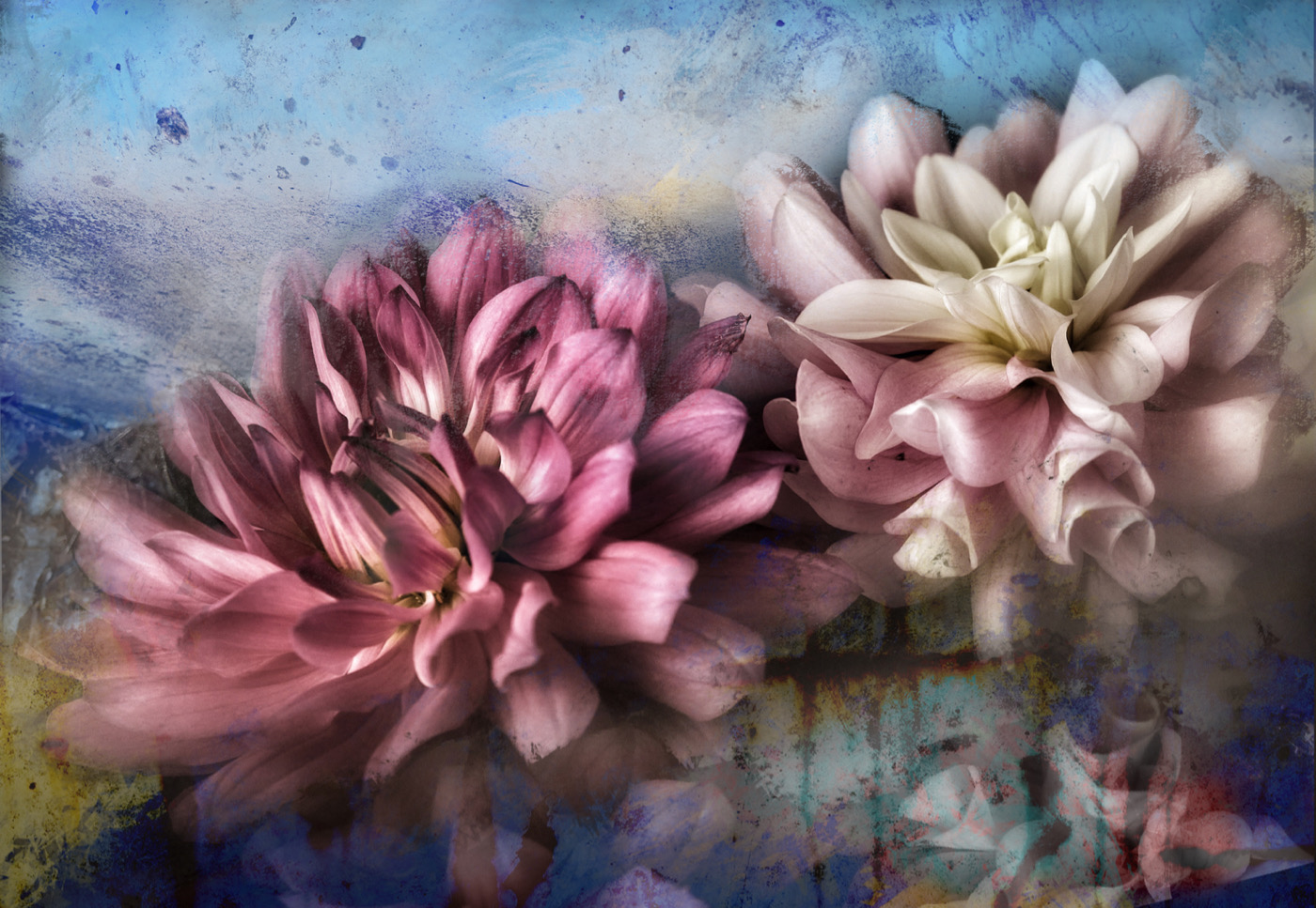
Fran nice job as always. The added butterfly helps and letting the flowers pop through the wing is fun. Love how the red reflects at the bottom of the vase too. Would love to see a bit more dodge and burn on some of the flowers to bring back some of the shading - a subtle touch nothing too heavy as the detail not eh bottom flower is lovely. and more of a shadow under the butterfly? |
Mar 7th |
| 80 |
Mar 24 |
Comment |
Bob fun fun fun. It looks like lego on steroids. The colours works well together for a pleasing effect. Would a vignette that darkens the edges a bit to tone down the bright are on the right particularly, help us focus on the right place?
PS. I sent you my images for this month of March 4, but don't see them posted. Perhaps they landed in your spam folder. I resent them just now. |
Mar 7th |
6 comments - 1 reply for Group 80
|
11 comments - 7 replies Total
|