|
| Group |
Round |
C/R |
Comment |
Date |
Image |
| 39 |
Feb 24 |
Reply |
Dave thanks for the crop suggestions I think I will give it a go. |
Feb 13th |
| 39 |
Feb 24 |
Reply |
Thanks so much Paul. I love the cats in black in white. |
Feb 13th |
| 39 |
Feb 24 |
Reply |
Ken thanks for the feedback. I agree - the background could be darkened for more separation. I will try to blur it a bit more as well. Just to see the effect. |
Feb 13th |
| 39 |
Feb 24 |
Reply |
Fran, I get it and you are welcome. We get so engrossed in the work we forget to see. Good idea to look at them in silverFX |
Feb 10th |
| 39 |
Feb 24 |
Reply |
Another good tool is an app called NotanIzer which will posterize your image and show you your tonal map of lights and darks. When I did this with this image it was clear you need some tones added back - think blacks, whites and mid tones - when you look at the map here, there are no mid tones - and would definitely call for a crop up from the bottom. By cropping the way I did the line of trees on the bottom left help frame the mountains and give a sense of space.
I hope this is somewhat helpful |
Feb 10th |
 |
| 39 |
Feb 24 |
Reply |
Fran when I say the image looks flat I mean that there is no tonal range in the landscape - they fall in the middle of the gray scale chart and so become uninteresting and flat. And maybe a little disconcerting in this instance as it appears you are trying to hide the trees. It looks like you did a linear gradient and just darkened it all and maybe took out some contrast to deemphasize the trees. You did a great job on the sky though. When you look there you have good tonal range from black to white. In that way you accomplished the sky story.
So another question is why keep the lower third of the image? Why not crop it to an interesting 16:9 type of composition? Then it truly is the sky story.
The rest of the image needs to support the story though and help the eye move around the composition. You can do a lot of dodge and burning to subtly include the landscape and help tell your story. The point of interest is the bright sky against the mountain but then because there are no more good tonal differences the viewer wants to quickly abandon this image. I did a quick edit in LR by simply cropping and an auto exposure and a tiny bit of dodge and burn. |
Feb 10th |
 |
| 39 |
Feb 24 |
Reply |
I am not sure what happened to my language and typing skills here. So I will try again - I did the mangled response on my phone.
Fran, thank you for your feed back. I agree the image needs more space on the left and due to my skills photographing I did not leave enough space there in camera. I could add space with photoshop generative fill, though that may not be acceptable if I enter it into competition. I do like the idea of a portrait. I will try that. |
Feb 10th |
| 39 |
Feb 24 |
Reply |
As that Thanks for the feedback Fran. Yes I ear add space with Pshop Ai is all the space available the fame. Not sure it would be acceptable for competition then. I will also try the portrait, |
Feb 9th |
| 39 |
Feb 24 |
Comment |
Ken this is lovely. Well done. What a beautiful minimal photo. I like it in colour as well as the tree and fence line have a lot more tonal values while maintaining the foggy mysterious feel. Maybe play a tiny bit with the tones in the tree and darken them a smidge? |
Feb 7th |
| 39 |
Feb 24 |
Comment |
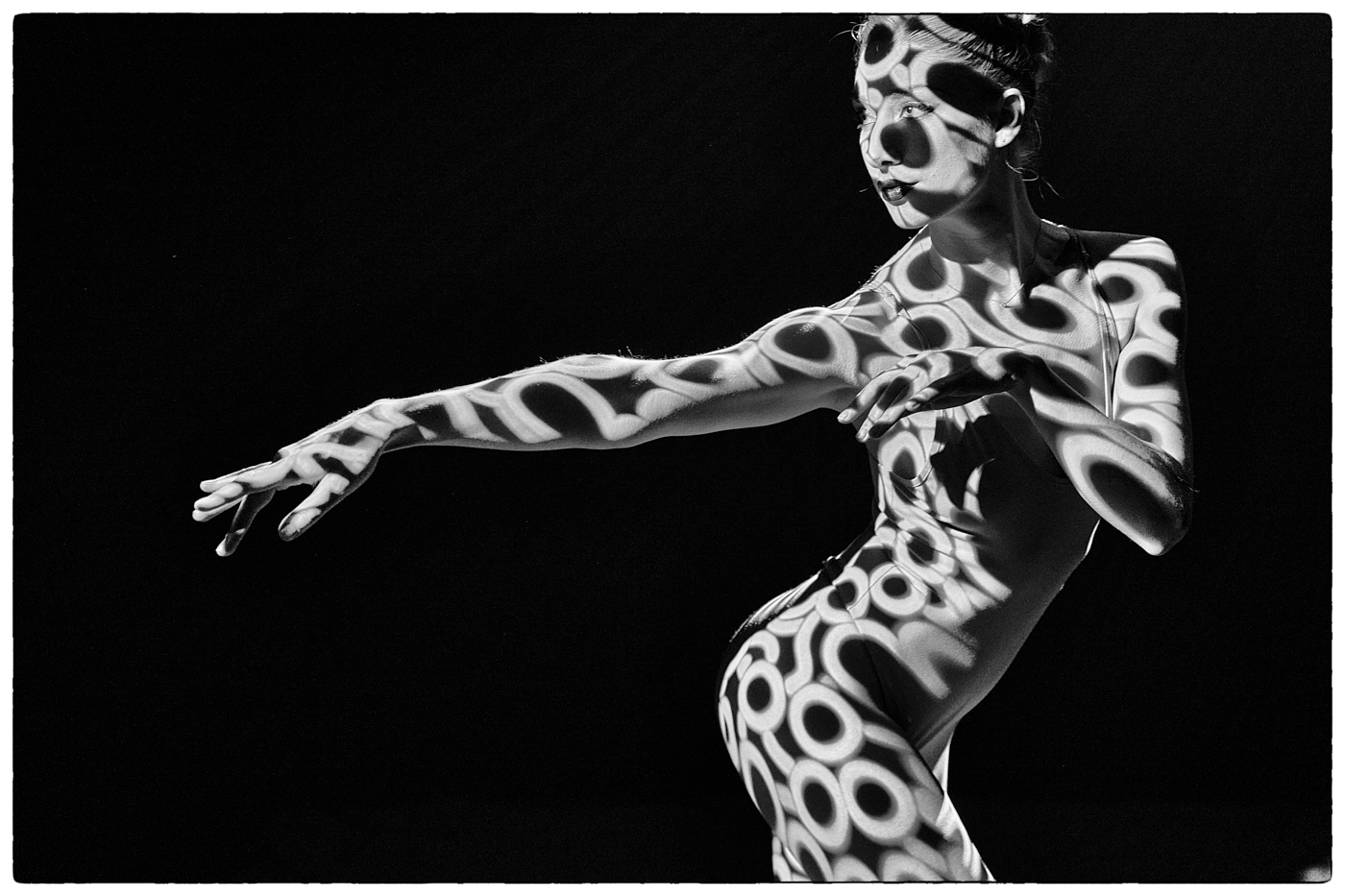
Vincent fun image to play with. I love this kind of photography. I agree with Fran's comments about the head structure in the background and the tree.
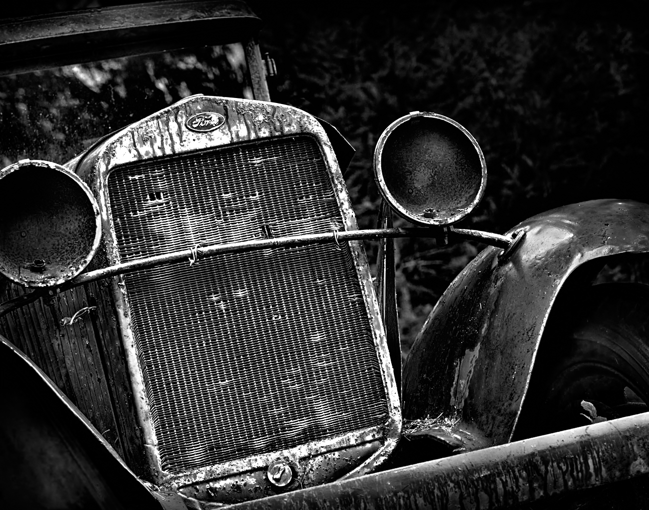
The tonal value are a bit dull and your area of highest contrast is the grass and sky so the real story gets lost. Try darkening the grasses and bring out the mass of the machine parts with dodge and burn. I have a great app call Notanizer and it basically posterizes your image and provide a map of light and dark and shows you where the area of focus is . In your image you simply have your tonal values reversed. The eye always goes to the lightest and darkest contrast first. This may be helpful in flipping the focus around here. |
Feb 7th |
 |
| 39 |
Feb 24 |
Comment |
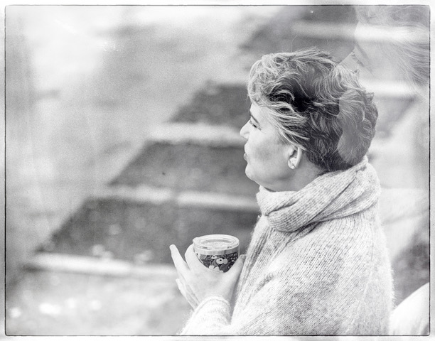
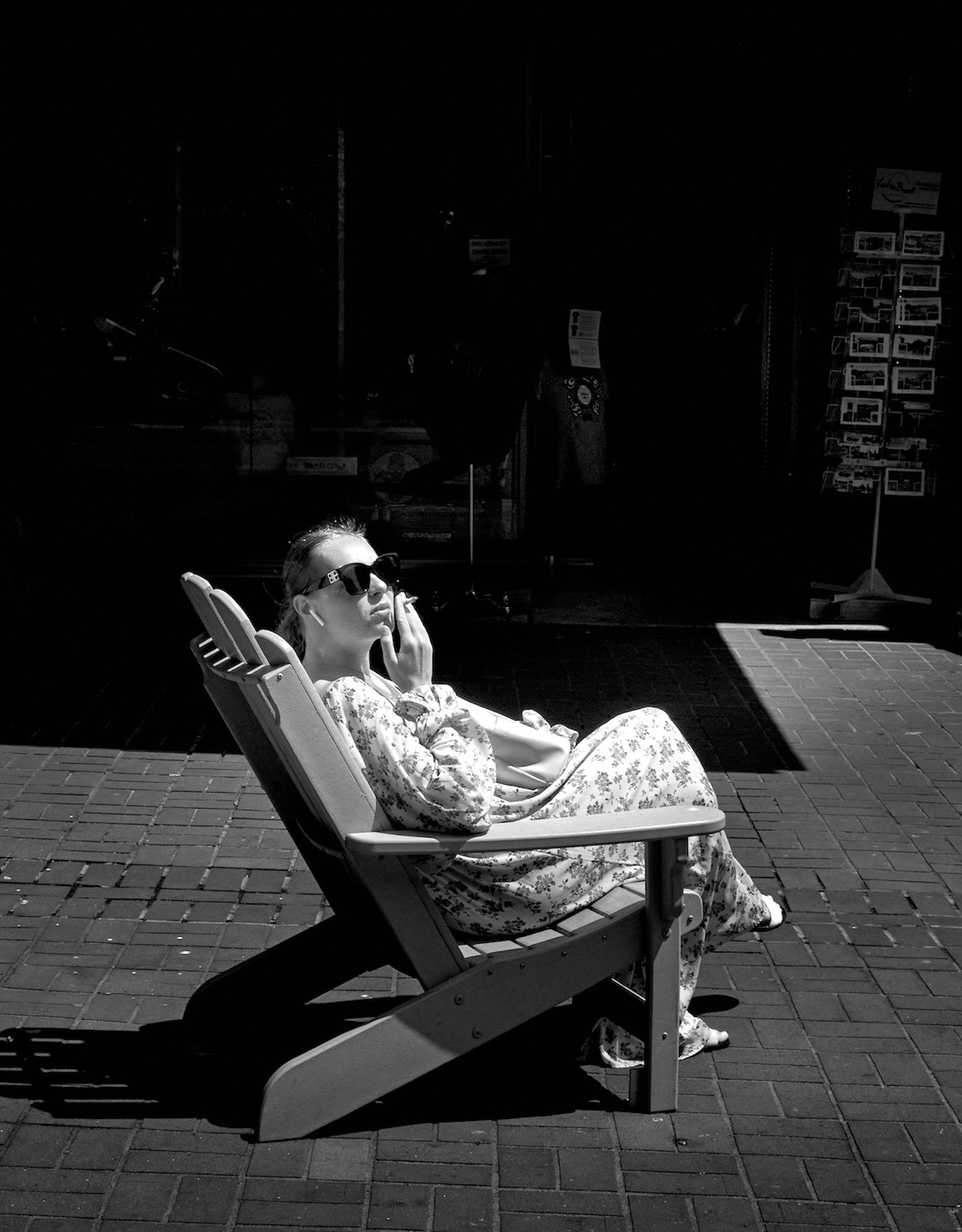
Good capture of a street scene Paul. I think the conversion works as it takes away the distractions in the colour version - like the blue bag and colours in the background. Now we can focus on the central characters. You could direct the eye more to the man - his beard is a nice high contrast area and achieves that, however I think you can subtly brighten his face and his hands and phone. The reflected light on his face and cigarette is there in colour version but you have lost it a bit in the conversion. Because of the tonal values of his clothes he almost disappears in comparison to the old lady ready to hit him with her bag. Remember we can always push our edits in a black and white further than in colour. I feel you can also darken the pavement below them to make them pop more. Hope this is helpful |
Feb 7th |
| 39 |
Feb 24 |
Comment |
Jerry good find from the archives. I think you need to decide where to direct the eye. To the front rocks with all that texture or the lighthouse. I think the story is the lighthouse. It is grainy and could use some denoising and sharpening for sure. OR you can embrace the grain as an artistic choice. But the buildings do need sharpening if they are the focal point. The front rocks at the bottom do not appear to be in focus. So for a stronger composition crop at least half of them away and darken them so they don't make the eye hang out at the bottom of the image. And lighten the 2 outcrops just behind those front rocks also a major contrast area. I think you can tweak the black points for some true blacks and add some good highlights on the buildings. |
Feb 7th |
| 39 |
Feb 24 |
Comment |
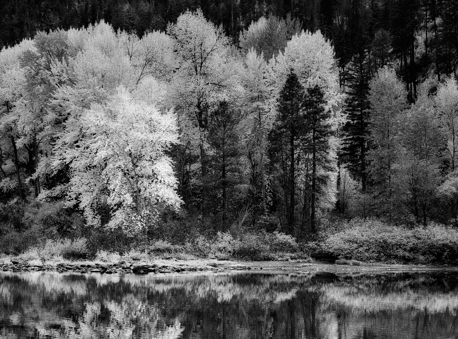
A lovey fall landscape Fran. I think for this round the colour version wins as the light on the trees highlight them. The conversion is flat and the story becomes about the clouds as that is where you have the most tonal range. Push it a bit more in the middle ground and play with the light. I think you could go a lot further in your edits in both versions actually. Decide on where you want us to focus our attention. It looks like you adjusted just the clouds. Is the story the Clouds or the trees. |
Feb 7th |
| 39 |
Feb 24 |
Comment |
Nice conversion David. I agree with everyone's comments on cleaning up different areas. The tones are good. the grasses do make a nice frame and the eye goes directly to the White building. I wonder if you gave the sky a bit more drama (as in the colour version) if it would make the buildings pop a bit more. |
Feb 7th |
| 39 |
Feb 24 |
Comment |
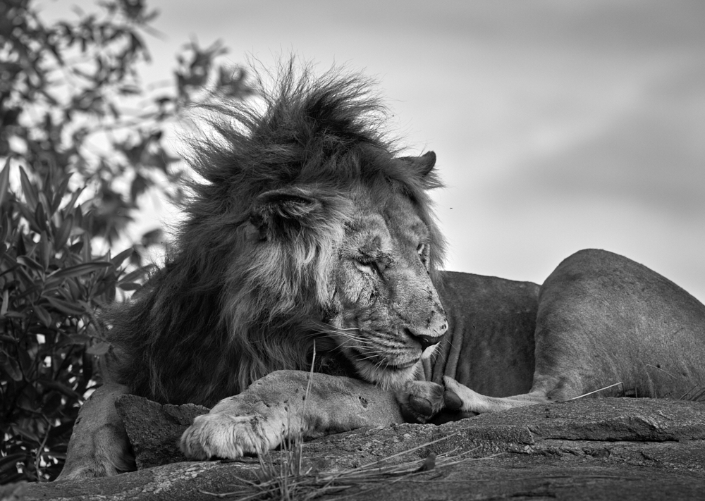
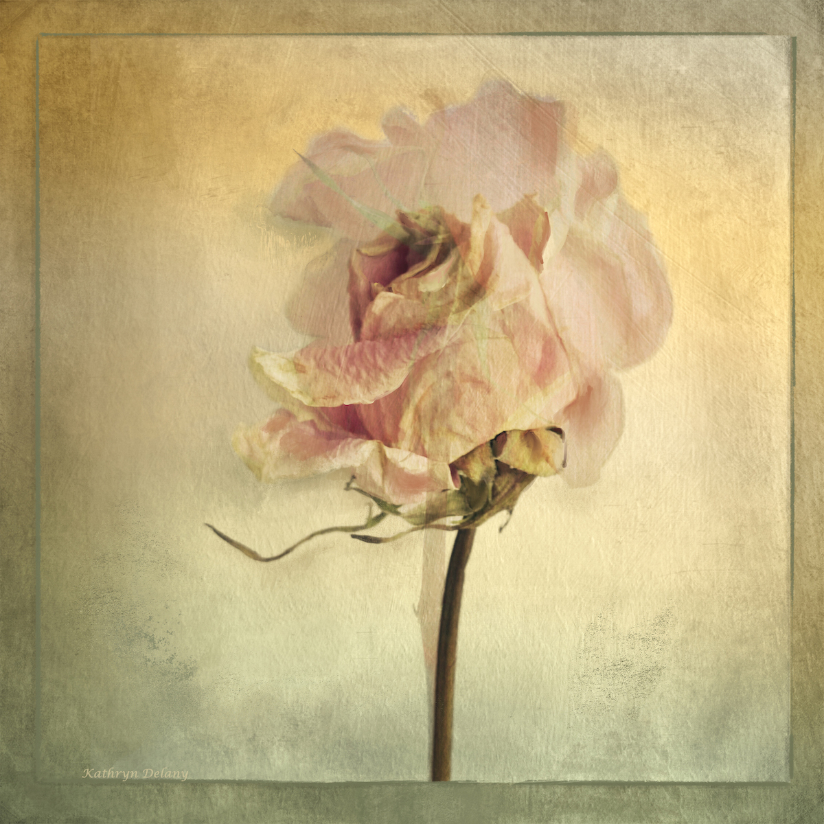
Vincent thanks, it is 4:5 format yes. For printing an 11x 14 (ish) size. We were above him as were in the landcover. And he was on a mission to get down the korongo or gully where there was water and cover from the safari people! So not bothered by us at all
|
Feb 7th |
7 comments - 8 replies for Group 39
|
| 80 |
Feb 24 |
Reply |
Yes exactly. Still learning. Still experimenting |
Feb 19th |
| 80 |
Feb 24 |
Reply |
What a good suggestion Nadia. yes it works. |
Feb 19th |
| 80 |
Feb 24 |
Reply |
Nadia thank you for your feedback. I am happy that you like it so well. |
Feb 19th |
| 80 |
Feb 24 |
Reply |
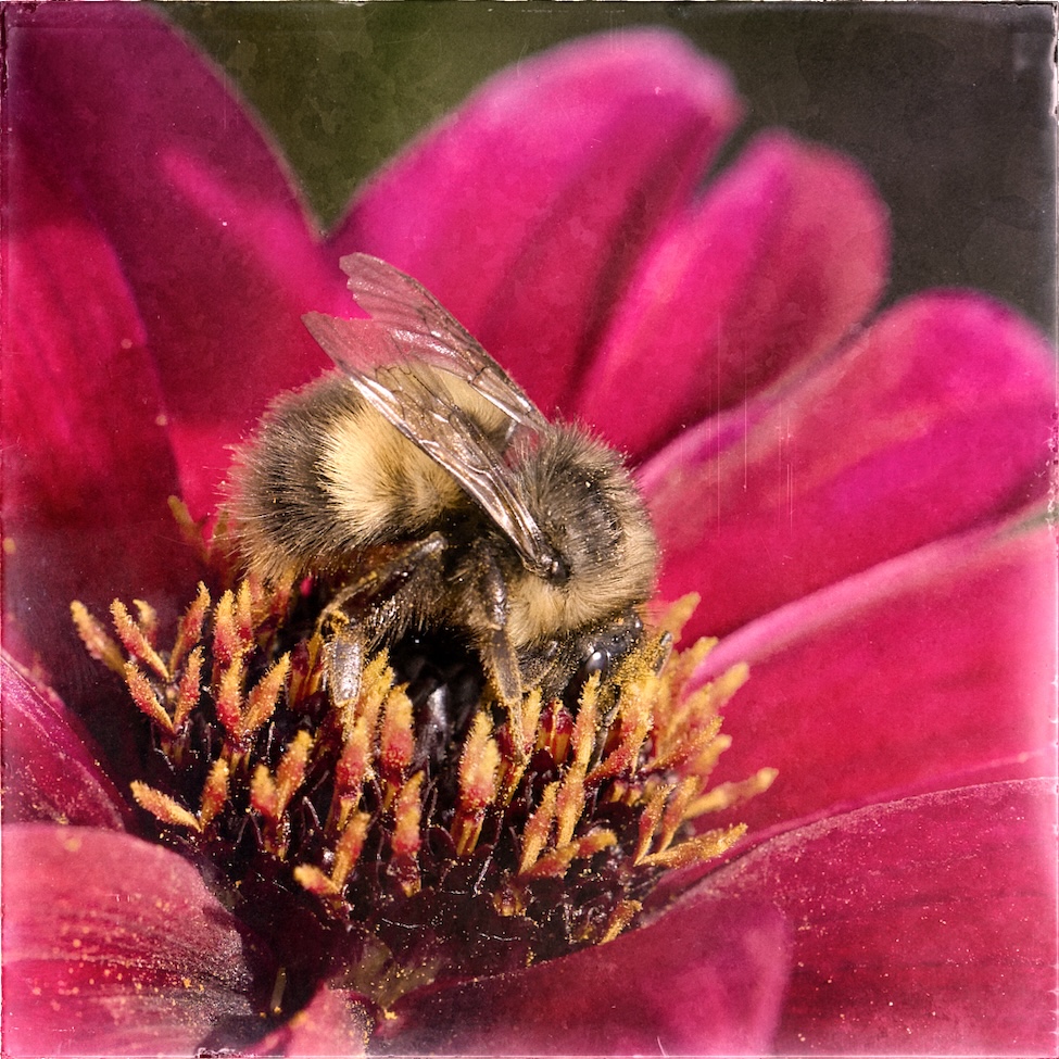
Doug thanks for the review. Yes the focus is toward the back I was trying to get the dew drops as the focal point. F2/8 is really really shallow - I was definitely going for a soft look overall. The dewdrops in the manipulated version do appear soft here. I need to check my files. |
Feb 19th |
| 80 |
Feb 24 |
Reply |
Kamal thank you so very much. |
Feb 19th |
| 80 |
Feb 24 |
Reply |
Hi Jacob thanks for the review - I am not sure which rims you are referring to? All of them - around the edges? Thanks |
Feb 16th |
| 80 |
Feb 24 |
Comment |
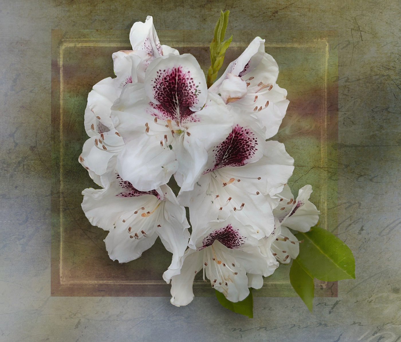
Rich this becomes and interesting abstract though I think you lost a lot of tones in the black and white conversion. Would slightly different tones within the purple would add interest? Certainly you could darken the edges in all 4 corners, to draw focus to the centre. You can still dodge and burn and try it out. The texture in the center of interest and again you could brighten it a bit? |
Feb 7th |
| 80 |
Feb 24 |
Comment |
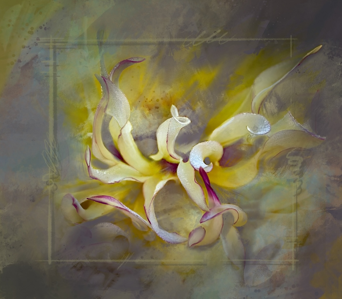
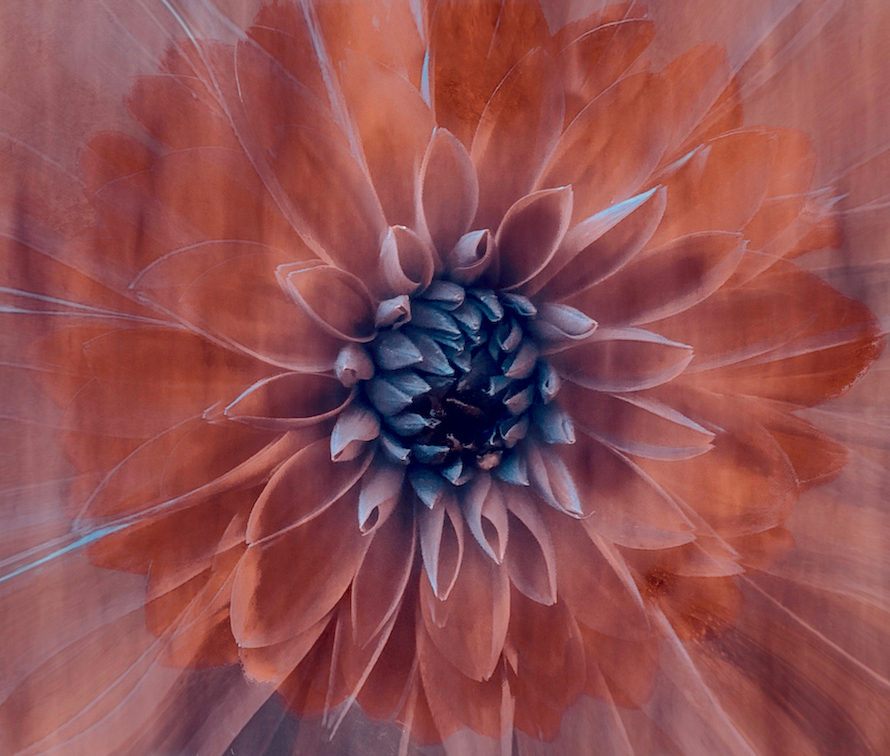
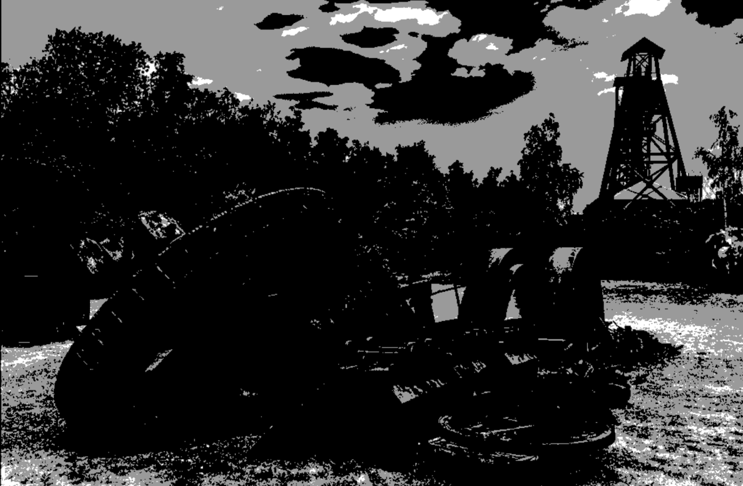
Doug a fun experiment. The close crop makes this abstract as the central part reminds me of a shaving brush! It may be a bit of a close crop - if more of the petals were included would it tell a different or better story. That's up to you. If you wanted to play with tonal values you can add some sends of form with dodge and burn and create central point of value contrast? |
Feb 7th |
| 80 |
Feb 24 |
Comment |
Nadia a lovely solution to a busy background. The colours really pop and those textures in background do not compete with the flower. Lovely light painting too. Well done you. |
Feb 7th |
| 80 |
Feb 24 |
Comment |
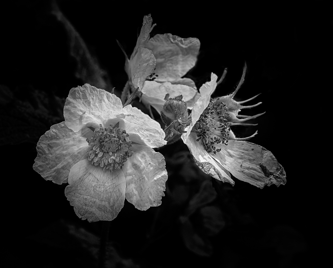
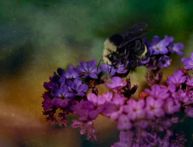
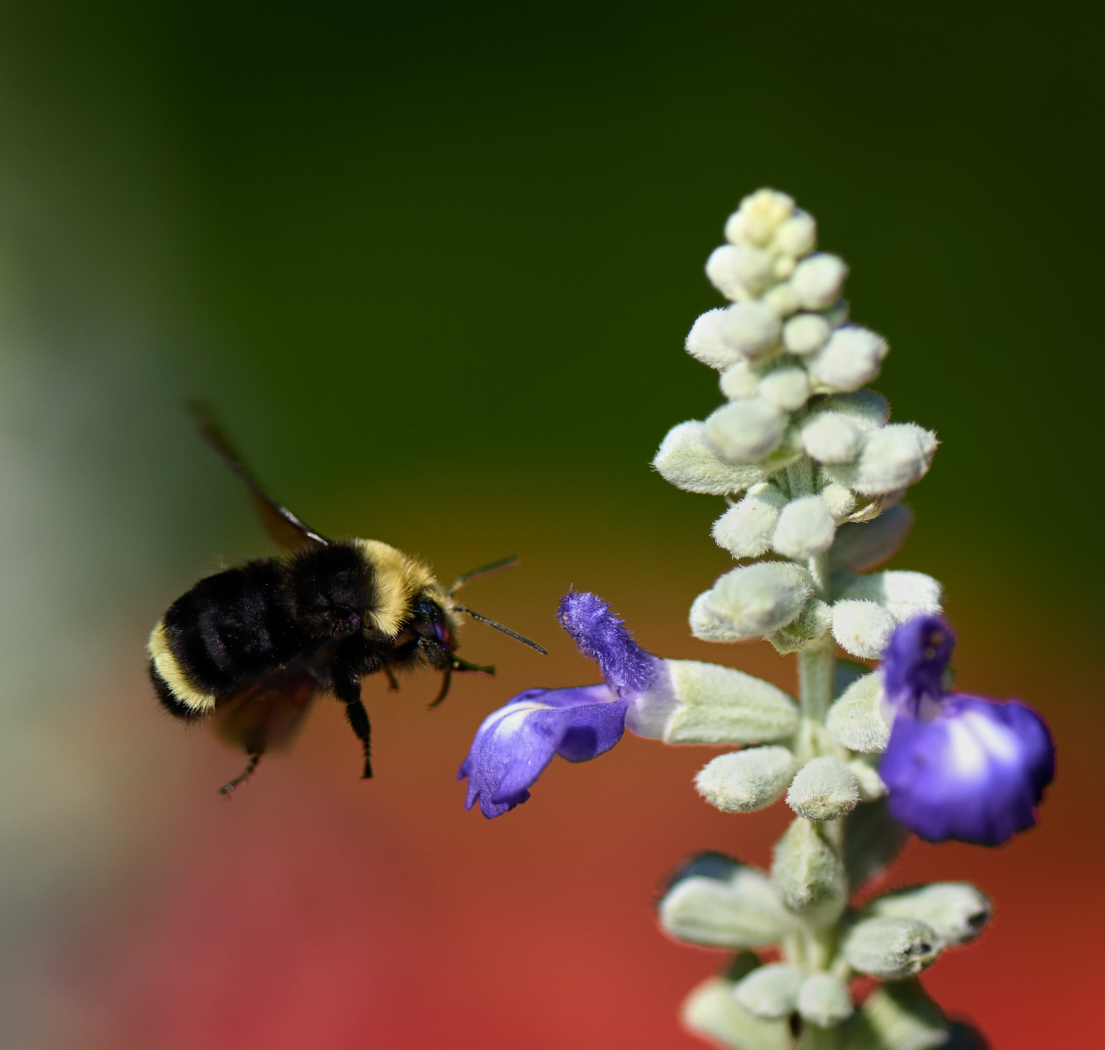
Jacob nice find. I feel that the colours have become rather oversaturated and the tonal values appear the same throughout. My eye does not know where you want me to look. I really like the colours in the original and if you were to do it again, you can still use the trichromatic scheme however make the flower and the yellow the centre destination for the viewer, rather than all the green elements as well. You can also try lessening how dark the 2 verticals on the left side of the flower are, one is a stem and one is a leaf? Lift the shadows on them. Or another way to remove their impact is to also darken the top section of the water as the bright highlights are a pull toward the eye vs the flower. You could also lighten just the flower so it stands out from the background. |
Feb 7th |
| 80 |
Feb 24 |
Reply |
I know what you mean about having to start again. Meh! l understand about your preferences on symmetry too. By the way I love the colours. |
Feb 7th |
| 80 |
Feb 24 |
Comment |
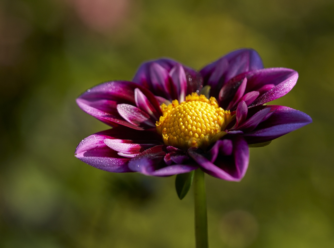
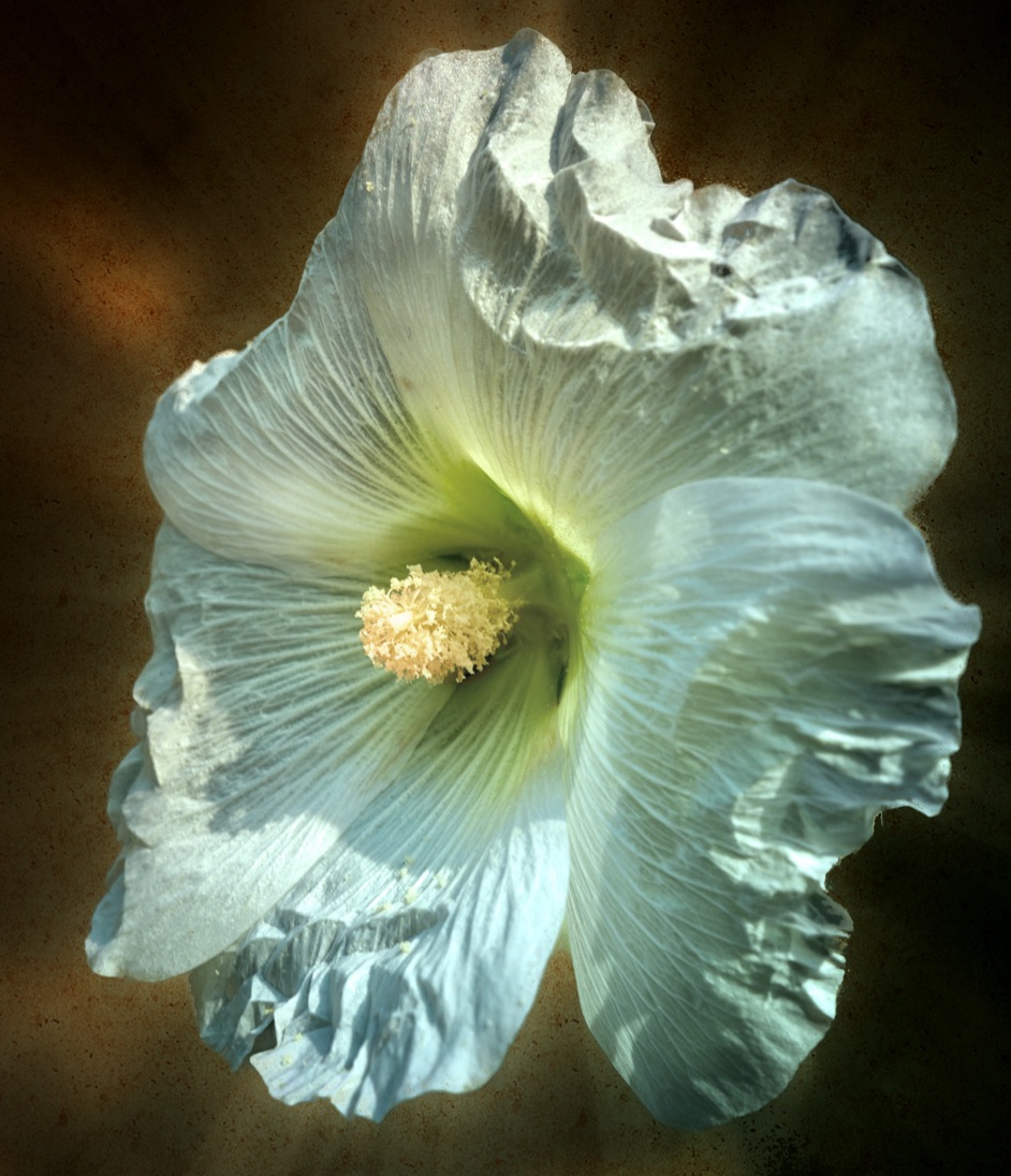
Kamal lovely edits this month. The flower shines and stands out. This could benefit from a crop from the top to crop out the 4th flower at the top left. Rule of 3 will then come into play. As it stands it tends to be quite bright in that top left corner and doesn't add to the composition. |
Feb 3rd |
| 80 |
Feb 24 |
Comment |
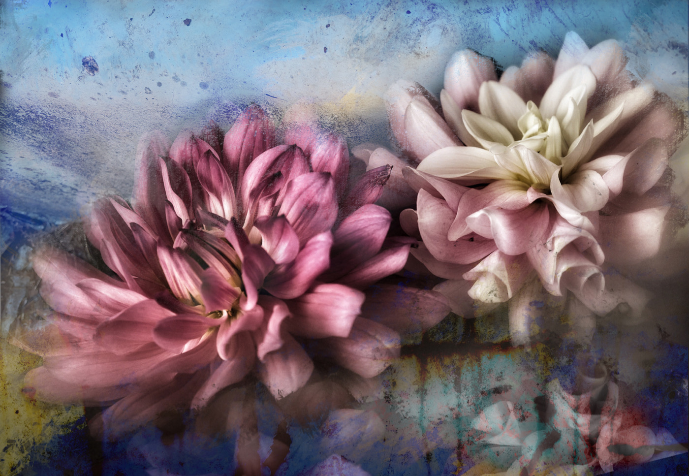
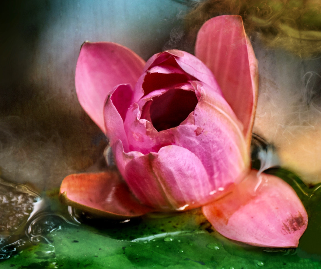
Bob what lovely colours you caught here as well. The swirls around the flower centre are lovely and then blending into the greens. I wonder if some of the swirls could go all the way to the edge of the canvas, like at bottom left and top right? Give more symmetry? |
Feb 3rd |
6 comments - 7 replies for Group 80
|
13 comments - 15 replies Total
|