|
| Group |
Round |
C/R |
Comment |
Date |
Image |
| 39 |
Jan 24 |
Reply |
Thanks Dave, I was wondering if I need more contrast, which may address the issue of the ghost being so vague! You camera sound interesting I am sure you had plenty of fun with it when you had easier access to the tools of a darkroom and plenty of film. |
Jan 10th |
| 39 |
Jan 24 |
Reply |
Fran thanks for taking the time to show me some edits I did not think of - I like the suggestions. I will try taking the double exposure off her hair. And of course no double exposure. |
Jan 10th |
| 39 |
Jan 24 |
Comment |
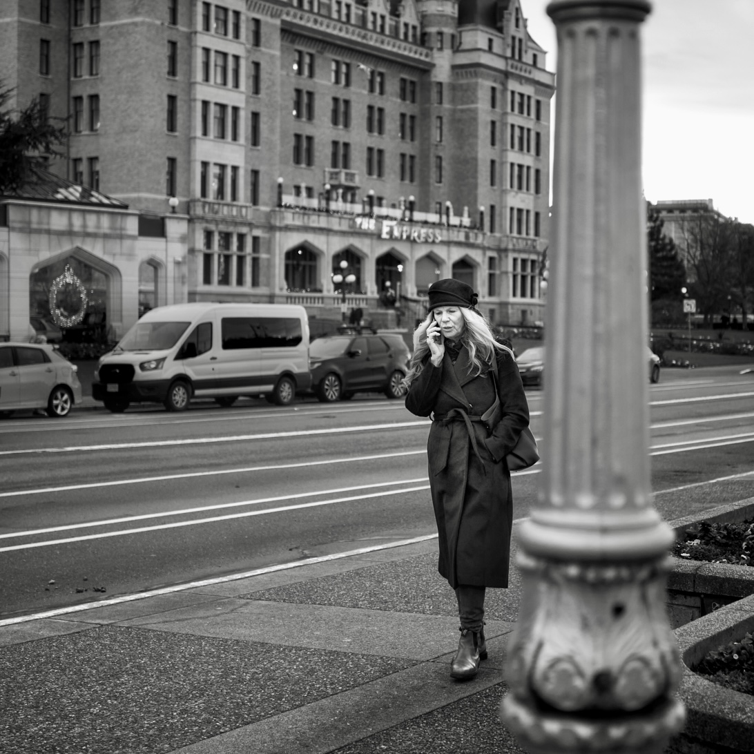
Vincent well seen and well converted. As Ken mentions the repeating patterns of the tiles, flooring , open doors even the lights is a strong element as is the diagonal of the composition. Good representation of all the tones. Love it. |
Jan 9th |
| 39 |
Jan 24 |
Comment |
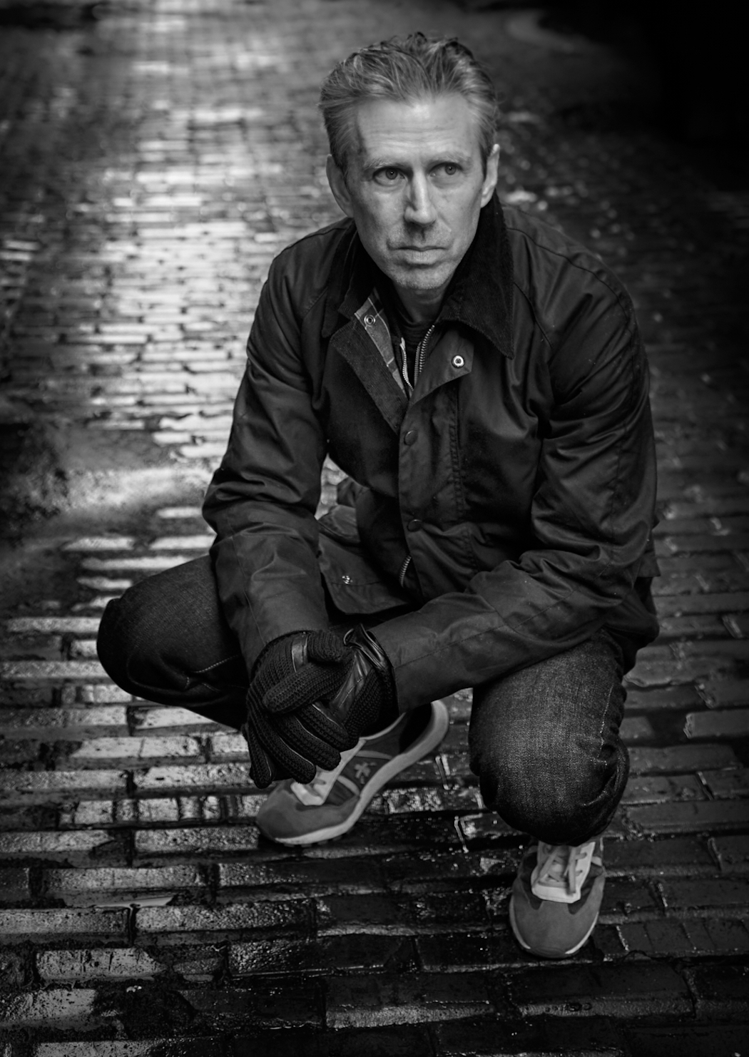
Good street capture Paul and a good conversion to tell a stronger story. The diagonal of the people supports the story. An idea I learned about recently - yellow will always translate as white in a black and white conversion. Change its colour before you convert it and then you can lessen the impact of those two stark yellow objects on the pole. Perhaps further subtle dulling the gray column behind the line of people. One final minor thing - there are some halos around the central figures on the back of his jacket and the pants of trouser but not awful. The subjects fae and beard really draw the eye and his posture is great. The eye travels around and comes back to where you intend it to. Nice job. |
Jan 9th |
| 39 |
Jan 24 |
Comment |
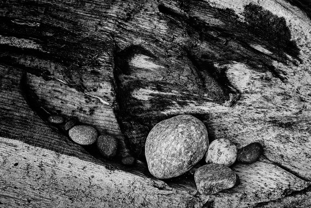
Jerry great textures here. There is lovely rhythm and movement too. The juxtaposition of the grainy lines of the wood and the fluffy snow works well. Great job. Love having a camera in your pocket. |
Jan 9th |
| 39 |
Jan 24 |
Comment |
Lovely capture Fran! You definitely are telling the story of the power and energy of that wave. The image works well in black and white and the strong contrast of the rocks to the white of the wave exploding is well done. Great tonal range and lovely use of diagonals in the composition. |
Jan 9th |
| 39 |
Jan 24 |
Comment |
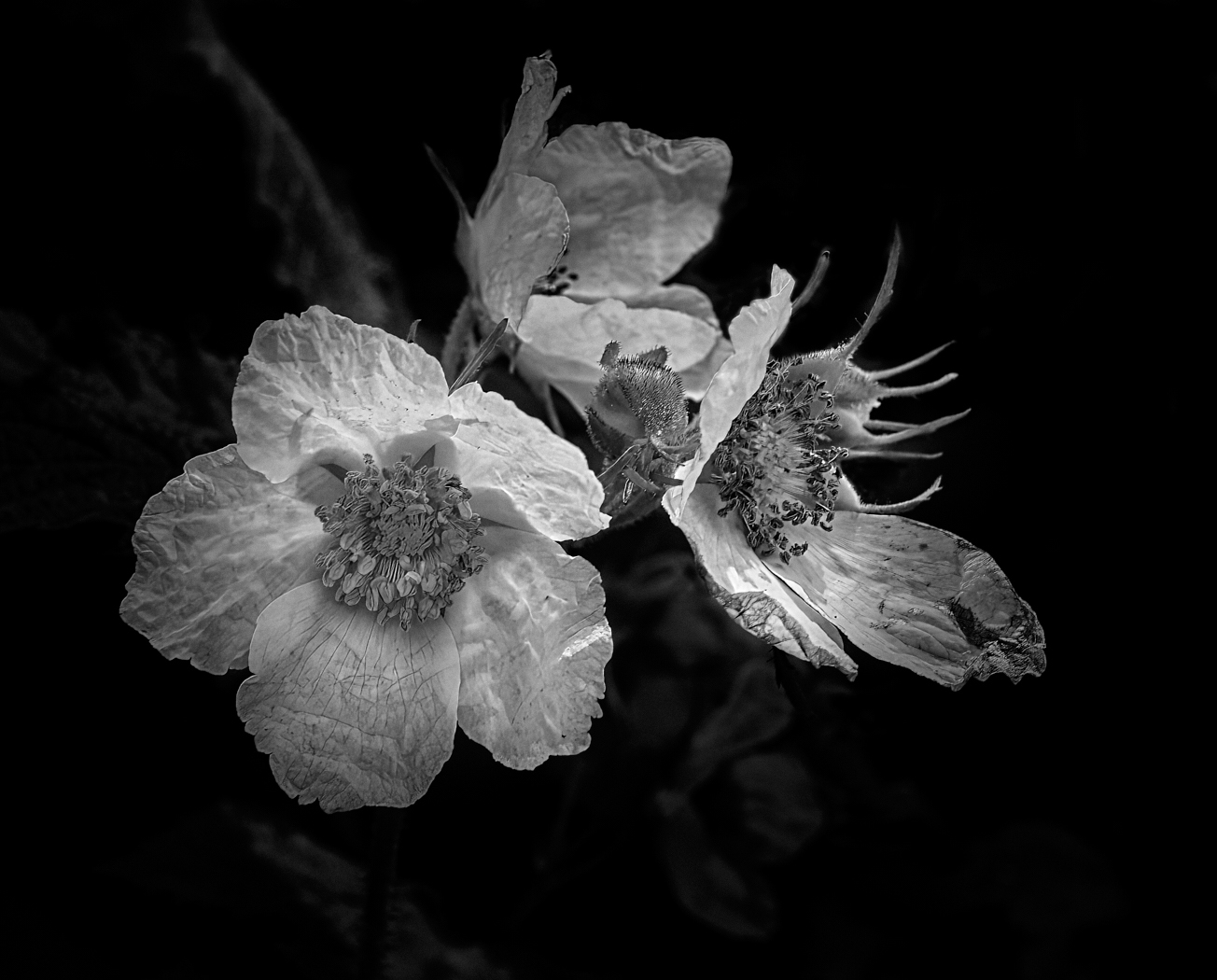
The conversion into a sepia toned monochrome is a classic and the handling of the clouds is good. Like everyone else the obvious halos around the rocks are a distraction. If you were to redo this with the AI sky masking I think that would be removed very easily. As this is monochrome you could still try to push some more light onto the focal rock formation on the scree in front of it and light it up and make a stronger pull for the eye to go there. At the moment the greatest contrast are the rocks behind that standing stack. |
Jan 9th |
| 39 |
Jan 24 |
Reply |
Thank Vincent. I photographed this from above which gave an interesting perspective and she was with a group of people so she was I think engaging with them. Though she seemed to be off in a different space for a while when I caught this. I think the distractions are a result of a light leak layer thanks for pointing them out . Ken also found them distracting so it seems I need to do something about them :-) |
Jan 9th |
| 39 |
Jan 24 |
Reply |
Ken I think those distractions are a result of the 'light leak' layer I added - that is if you are referring to the vertical lighter streaks on the left? Thanks for the observations |
Jan 9th |
5 comments - 4 replies for Group 39
|
5 comments - 4 replies Total
|