|
| Group |
Round |
C/R |
Comment |
Date |
Image |
| 39 |
Dec 23 |
Comment |
Here is a crop per your suggestions |
Dec 19th |
 |
| 39 |
Dec 23 |
Reply |
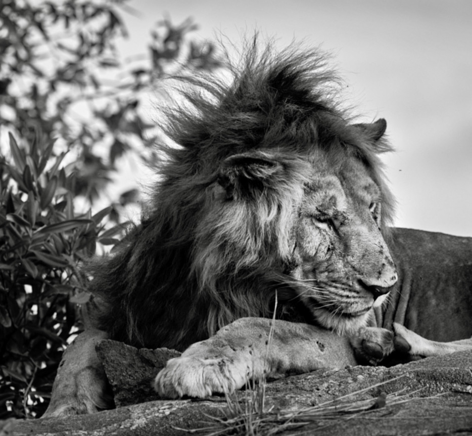
David thanks for the comments and insights. I have other images from this sequence maybe next month I should post one with his eyes open and his tail in view. |
Dec 19th |
| 39 |
Dec 23 |
Reply |
Thanks Vincent. Happy Holidays back to you |
Dec 19th |
| 39 |
Dec 23 |
Reply |
Fran, thanks for the feedback. What can I say? I had a busy travel year this year. Playing a bit of catch up after 5 years of no travel. I will try cropping in from the right. |
Dec 19th |
| 39 |
Dec 23 |
Reply |
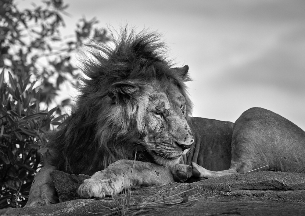
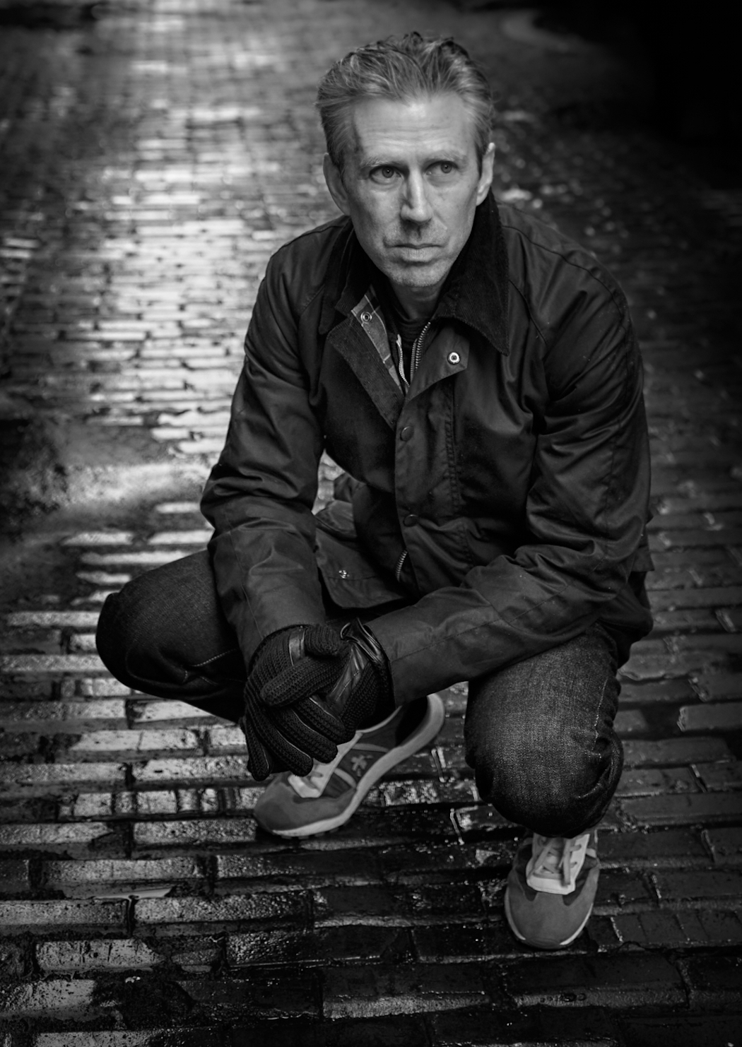
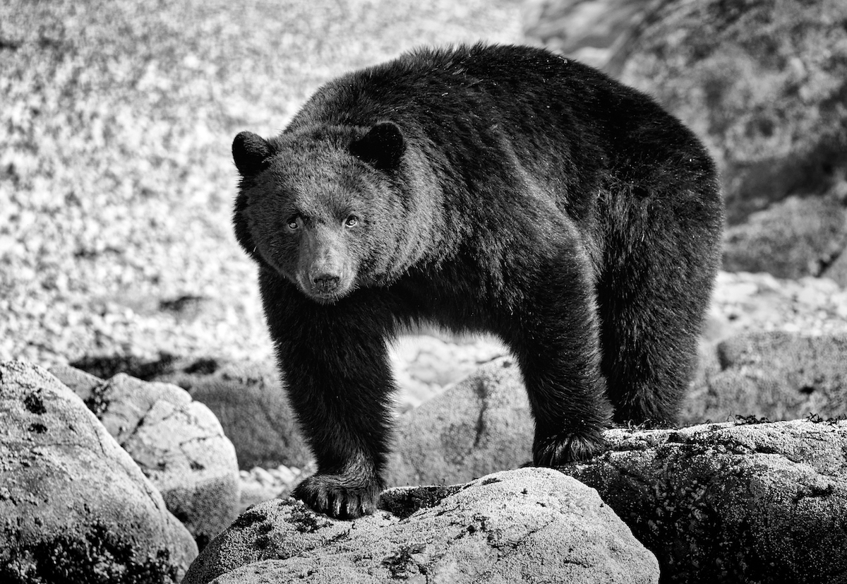
HI Paul thanks for the feedback. This lion filled the frame for sure - I should have remembered to zoom out a bit - though his tail was not on display in this pose. Just extra bushes and leaves...We were very close - just about sitting in the truck at the bottom of this rock. I have a burst and a few with the tongue sticking out which is a fun view too.The mane was definitely the star of the show. |
Dec 11th |
| 39 |
Dec 23 |
Comment |
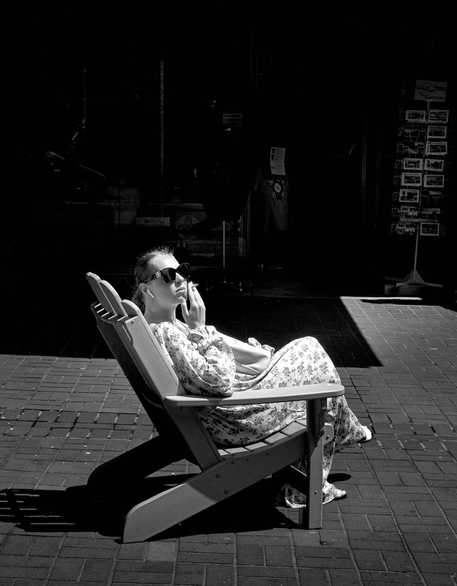
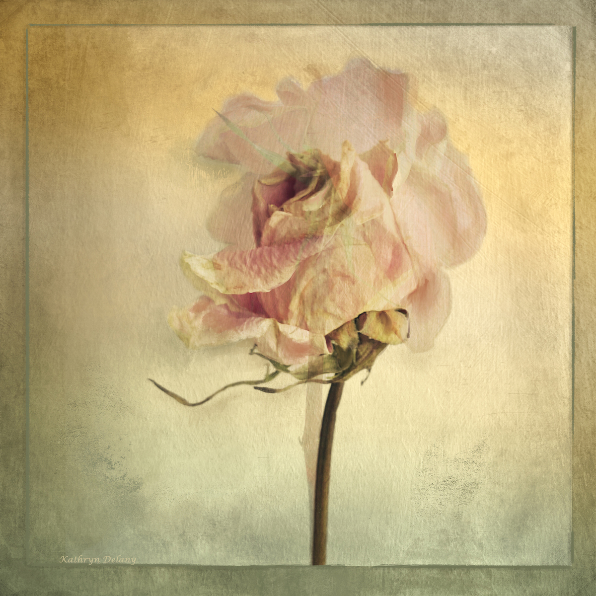
David, the conversion works well, and her outfit seemed to call for it too. That said the design on her blouse draws the eye down away from her face so maybe tone those done a tad. I think a light source that is straight on to the subject is pretty hard to deal with in terms of adding depth to the subject and you have done a lovely job. Have good holiday season. |
Dec 8th |
| 39 |
Dec 23 |
Comment |
Fran what a lovely portrait and well done on capturing the sense of her solid nature. Good depth of field. I really like the conversion, you have brought out the light on her and put all the focus on her face. Well done. |
Dec 8th |
| 39 |
Dec 23 |
Comment |
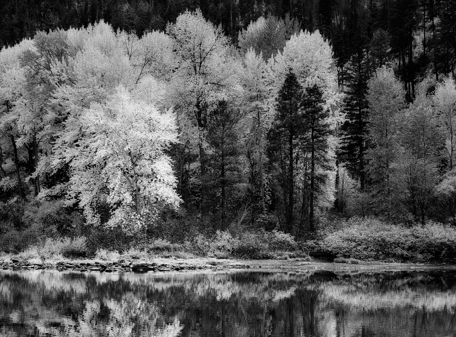
Ken the black and white conversion makes the boats become more a part of the story. They are almost lost in the colour version. The tree and shore line on the left could use some lifting of tones. Currently they are pretty dull compared to the colour image. Brightening that would really help with leading the eye into the image. Cheers. |
Dec 8th |
| 39 |
Dec 23 |
Comment |
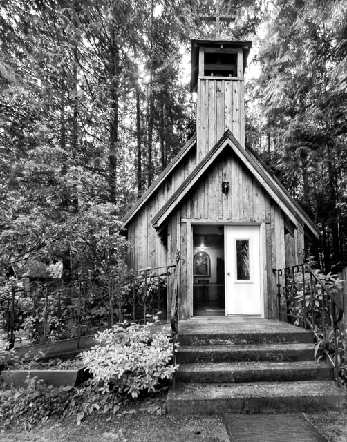
Vincent great job on the conversion, it really works and makes the buildings stand out against that moody sky. Maybe crop up from the bottom even more to remove the distraction of the bottom left corner? Nice job. Have a good holiday. |
Dec 8th |
| 39 |
Dec 23 |
Comment |
Paul nice effort at the conversion. The darkness of your edits bring a certain feeling of tension and abandonment to the image which I rather like.
For a different interpretation try bringing in a touch more tonal range? Somewhere between yours and Don's maybe. All depends on your intent and the outcome you are seeking. |
Dec 8th |
| 39 |
Dec 23 |
Comment |
Jerry Happy Holidays and here's to a seasonal image. The colour version works better for me, as the glow of the window lights let you see the little figures better. They get a bit lost in the 'white' conversion. Anyway fun idea. |
Dec 8th |
| 39 |
Dec 23 |
Reply |
Jerry thank you. We were in the northern Serengeti in Tanzania.This young lion had a number of puncture wounds, from what we are guessing were from a hunt. All he wanted was to rest and lick his wounds so to speak. And the flies would not leave him alone.
Happy Holidays to you as well. |
Dec 8th |
7 comments - 5 replies for Group 39
|
| 80 |
Dec 23 |
Reply |
Doug sorry for the confusion. I was talking Capture One process not LR process. in Capture one the default radial gradient is what an inverted radial is to LR. |
Dec 24th |
| 80 |
Dec 23 |
Reply |
Bob interesting to hear that you have been called out for the 'floating' flower issue. Good to know. It makes sense in a way - flowers need to be grounded so to speak :-) - good experiment. |
Dec 12th |
| 80 |
Dec 23 |
Comment |
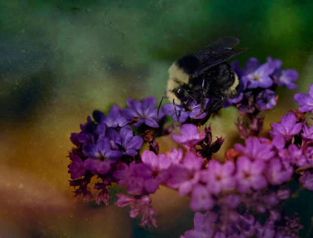
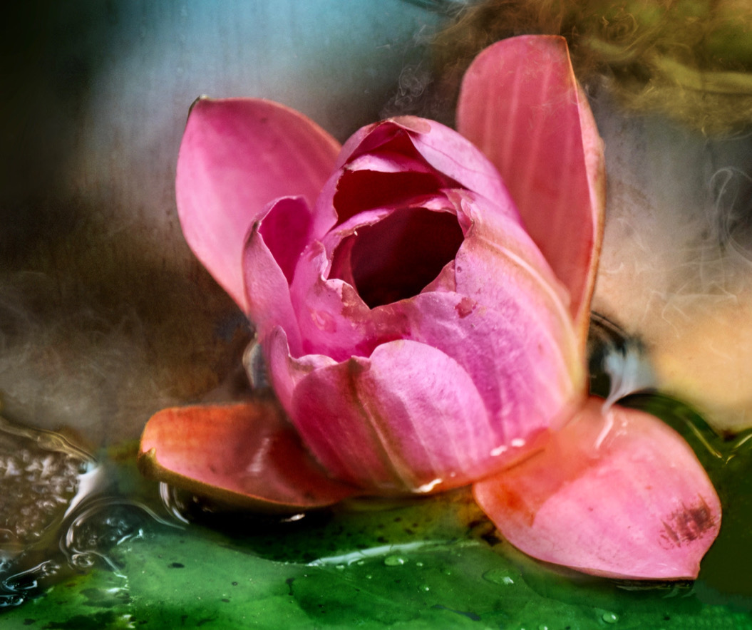
Doug nice job! To answer the question, yes a subtle texture would add to the image and complete the effect. I would try an inverted radial gradient over the centre of the flower and increase contrast and brightness to make it glow even more. |
Dec 11th |
| 80 |
Dec 23 |
Reply |
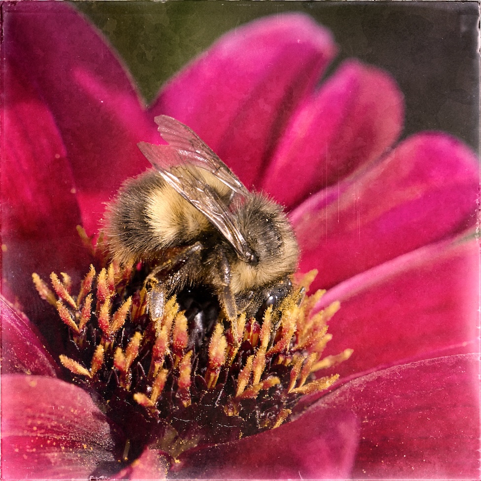
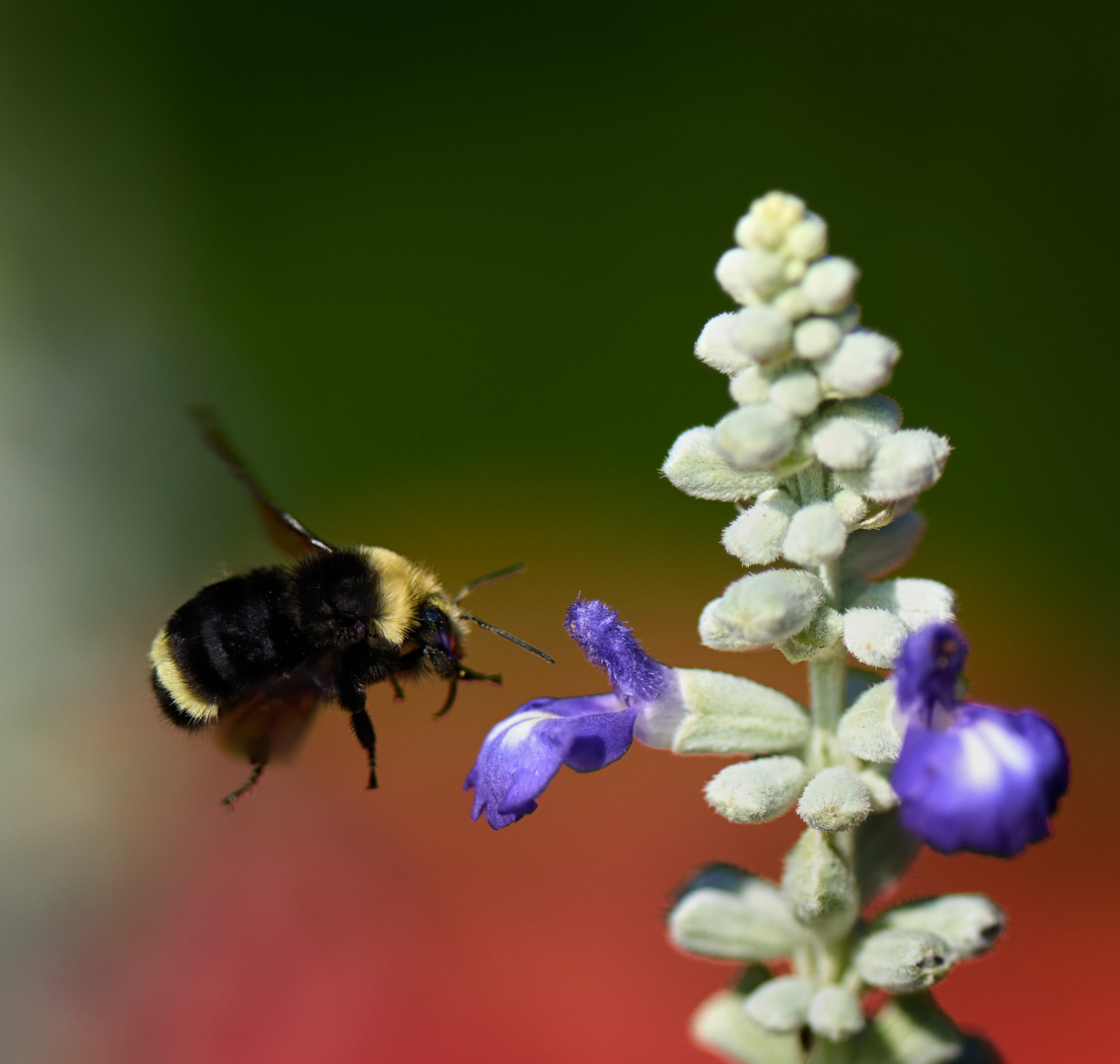
Bob thanks for the edits. I think the blurring - glow or washing of the flower itself is interesting as an effect though if I keep the bee sharp its seems odd. In your version the detail in the bee seems to have been lost too. I also think the crop at the bottom shows too much of the stems which become distracting, which could be lessened if that shape were just black? Fun to see a different perspective. Which means I could technically bring in more of the petals tot he right of the bee in my version |
Dec 11th |
| 80 |
Dec 23 |
Comment |
Kamal, beautiful focus on the flower and it pops out agains the blurry background. Bob is correct about the infects leaf. If you are editing on your phone see if there is an object removal app available and do the removal on your phone :-). I would suggest cropping in a bit from the left by about 50%. Nicely done. |
Dec 9th |
| 80 |
Dec 23 |
Reply |
Bob I would say go for it. Here is the original for you to play with. I have done only conventional edits keeping it as is so to speak. Have fun
|
Dec 9th |
 |
| 80 |
Dec 23 |
Comment |
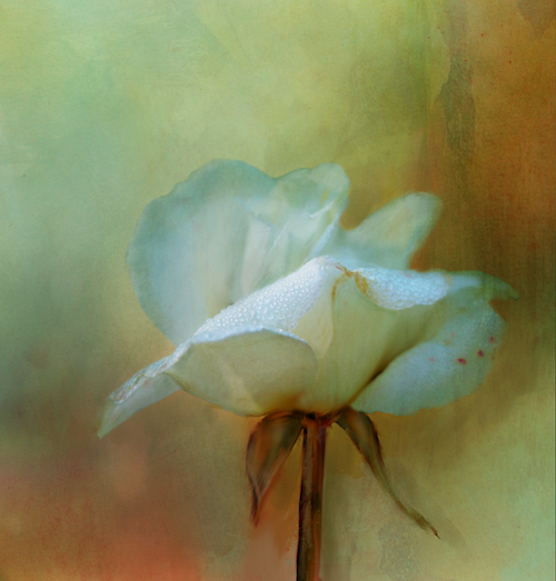
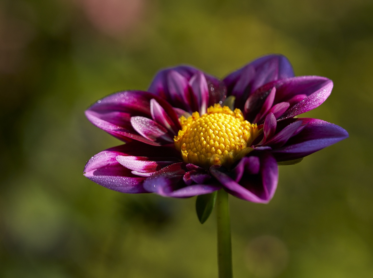
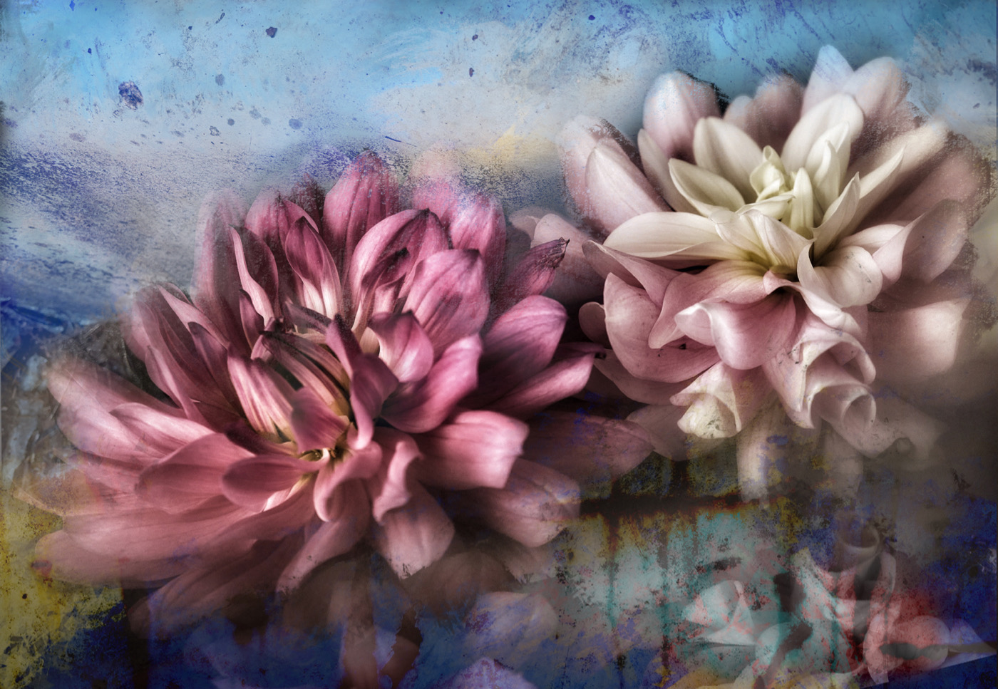
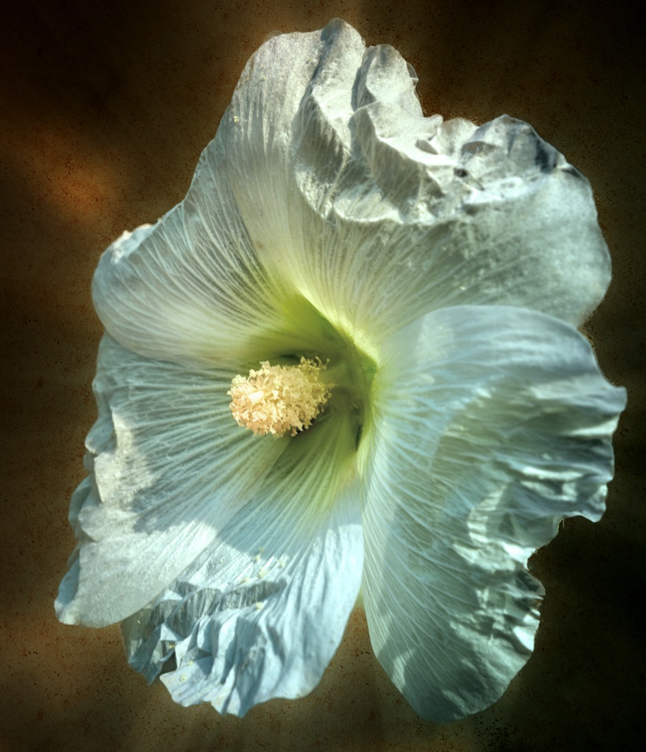
Bob wow look at that light glowing through the flower. The intense sharpness and saturated colours make it pop. Would darkening around the flower make it even stronger. It looks like a vignette was applied or a radial gradient used to brighten the center of the image. That results in the distractions of the leaves and second flower throwing in some attention vying competition. Mask some of those and burn them back and see what happens. A fun vibrant Christmas image. Happy Holidays. |
Dec 8th |
| 80 |
Dec 23 |
Comment |
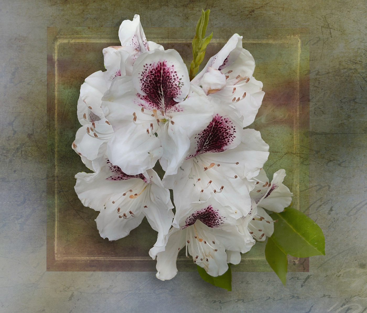
Jacob, nice edits and what a lovely flower. The diagonal works well. I would suggest that the background could be darkened further to make that flower stand out even more. Crop down from the top even more I think. Great handling of the flower itself too. Well done and Happy Holidays |
Dec 8th |
| 80 |
Dec 23 |
Comment |
Nadia � �. Well done you. Everything works. I can't pick out anything that could be improved. Happy Holidays. |
Dec 8th |
| 80 |
Dec 23 |
Reply |
Jacob, thanks for the feed back. I will see what happens if I lighten the stamens and or darken the bee. He is pretty light in comparison. Good spot. |
Dec 8th |
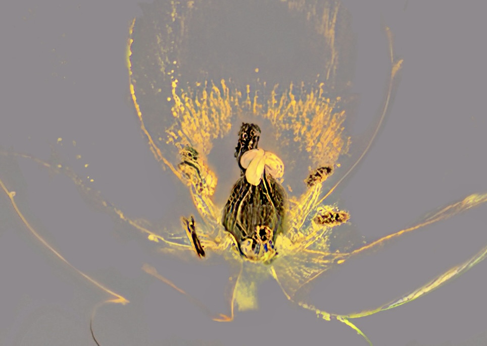
| 80 |
Dec 23 |
Comment |
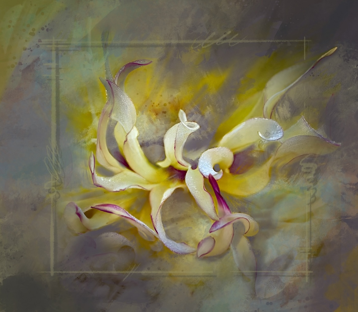
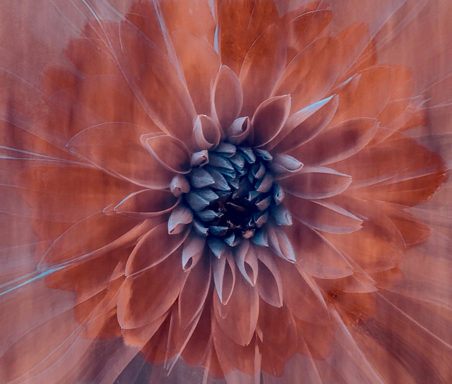
Rich a fun abstraction project. Thanks for the explanation of the process. For me I would love to see this minimalised even more. The top left bright yellow is stronger than the real focal point of the center of the flower. Same for the bright areas to the bottom right. If you simply had all those lovely swirling lines left leading the center.
I took the liberty of playing with it - as it intrigues me - to show you kind of what I mean. I took out all the distracting blasts of colour and then added even more sharpening and clarity contrast to the center. Happy Holidays |
Dec 8th |
 |
6 comments - 5 replies for Group 80
|
13 comments - 10 replies Total
|