|
| Group |
Round |
C/R |
Comment |
Date |
Image |
| 39 |
Nov 23 |
Comment |
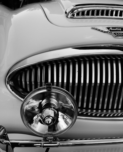
Well done Ken. You accomplished your goal magnificently with a impactful and simple image. Being a past Jaguar owner - the absence of the hood decorations of older models. Now it's a boring old badge. Love this image. |
Nov 18th |
| 39 |
Nov 23 |
Reply |
Fran this works I agree, and increasing the highlights does as well. One can always push things a bit further in black and white I think. Thanks for your feedback |
Nov 15th |
| 39 |
Nov 23 |
Reply |
Thanks Paul I would probably crop it and enter is a an open monochrome image if I do use it for competition. Taking it out definitely adds to the impact and stronger composition. |
Nov 14th |
| 39 |
Nov 23 |
Comment |
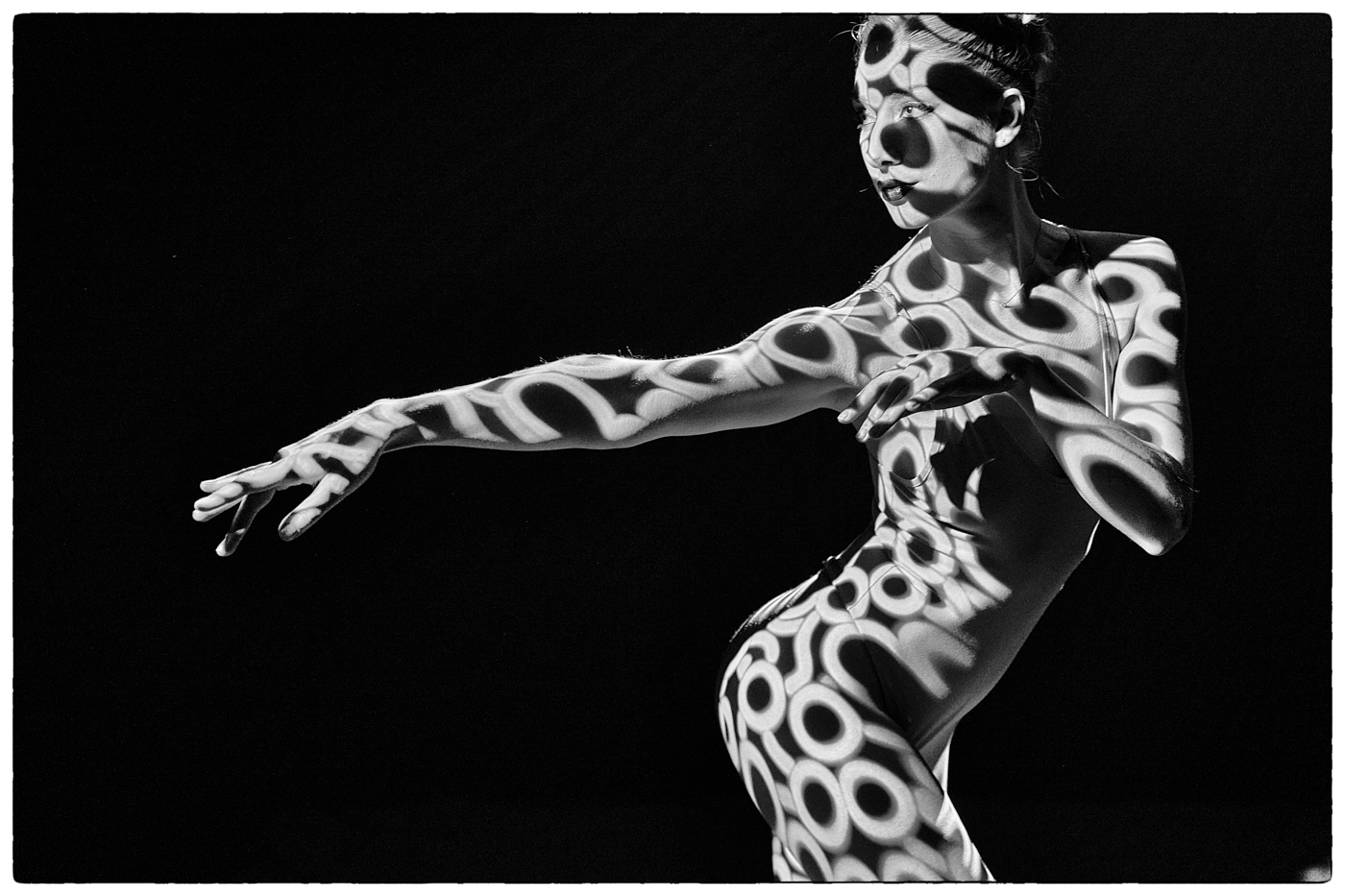
Vincent love the pose and the concept. The black and white conversion works. I agree with the previous comments about the light on her face. There is room to give the face more depth. |
Nov 12th |
| 39 |
Nov 23 |
Comment |
Paul nice conversion. The left side of the image with the out of focus dark brick wall cropped out would produce a stronger image. The white frame gives a retro polaroid feel to this and a sense timelessness. Realizing you have made a choice for a kind of matt finish to the whole, the tones still seem a bit dull which could be remedied by simply brightening the white shirt and the shoes slightly. Currently there is nowhere really logical that tells the eye what the important part of the image is. The wall behind the railing could also be darkened somewhat to help off set the figure. |
Nov 12th |
| 39 |
Nov 23 |
Comment |
Jerry its always fun to try something different like this. Since this a black and white and you can do anything it might be fun to try dropping in a different foreground under the lizard - as mentioned the 'step' on the left seems odd. In the heat of the moment with a phone - a burst would have been a better choice and perhaps being just a bit further away to get the tongue in focus. |
Nov 12th |
| 39 |
Nov 23 |
Comment |
Fran the sepia conversion is a good choice. Removing the salt like too has been so well done. Overall great tonal range. Maybe a slight brightening on the face of the mamma sheep and the baby. If you look at the colour version there is far more tonal range that draws the eye to the faces of the sheep. In the mono version you seem to have lost that range. |
Nov 12th |
| 39 |
Nov 23 |
Comment |
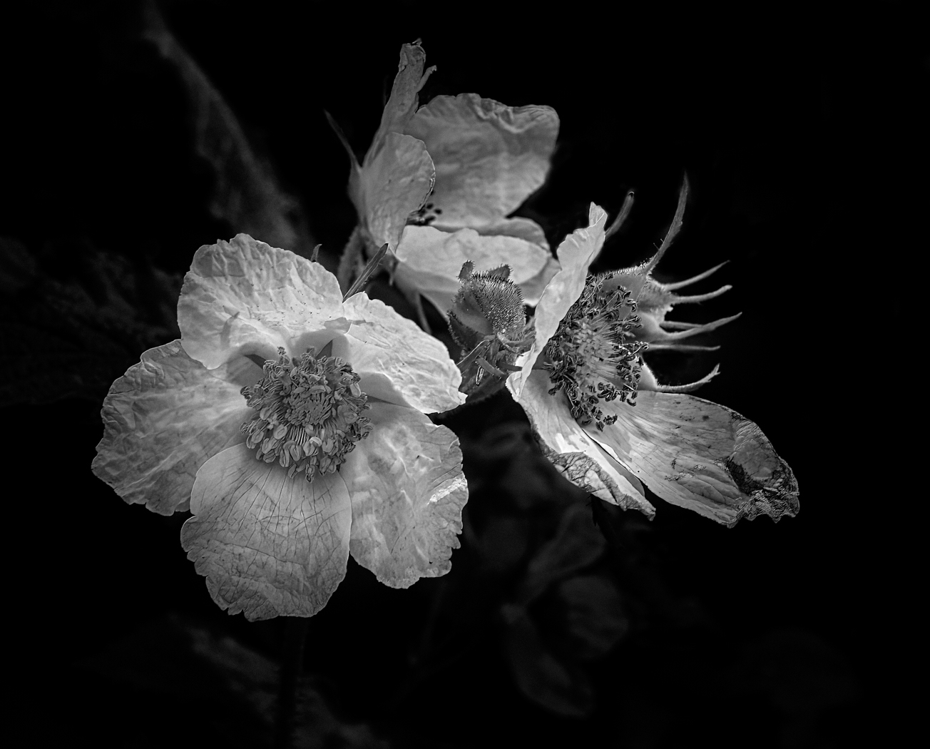
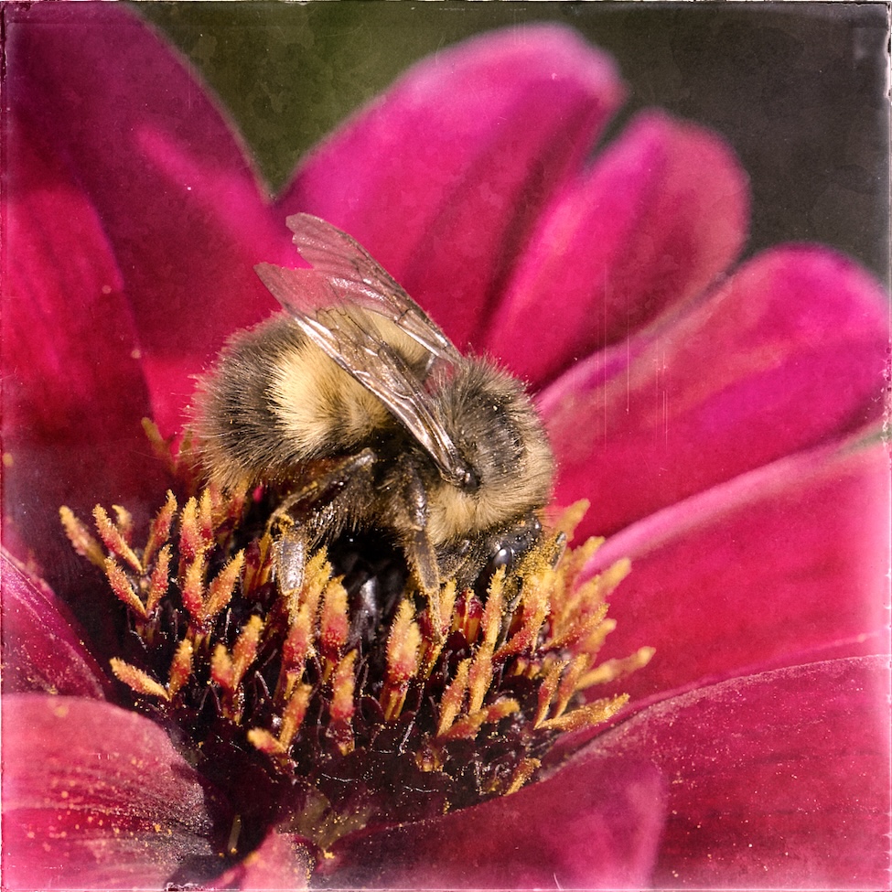
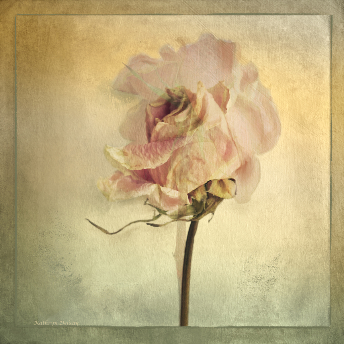
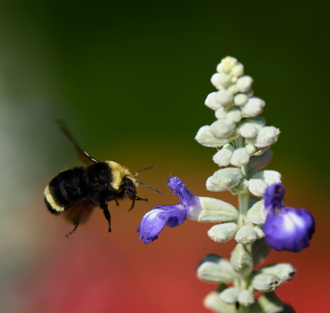
Dave good effort on the conversion. There is still room for darkening a bit more behind the flower on the left where the hot spot is. If that whole are is subdued more the flower might pop out even more. Can the bug be brightened or is it incidental to the flower? If so can it be removed? The straight stem at the right edge is a distraction - try a small crop in to remove it. Also crop up from the bottom, most of the objects there don't really strengthen the composition. Try the same edits for the colour version as the colours are lovely. |
Nov 12th |
| 39 |
Nov 23 |
Reply |
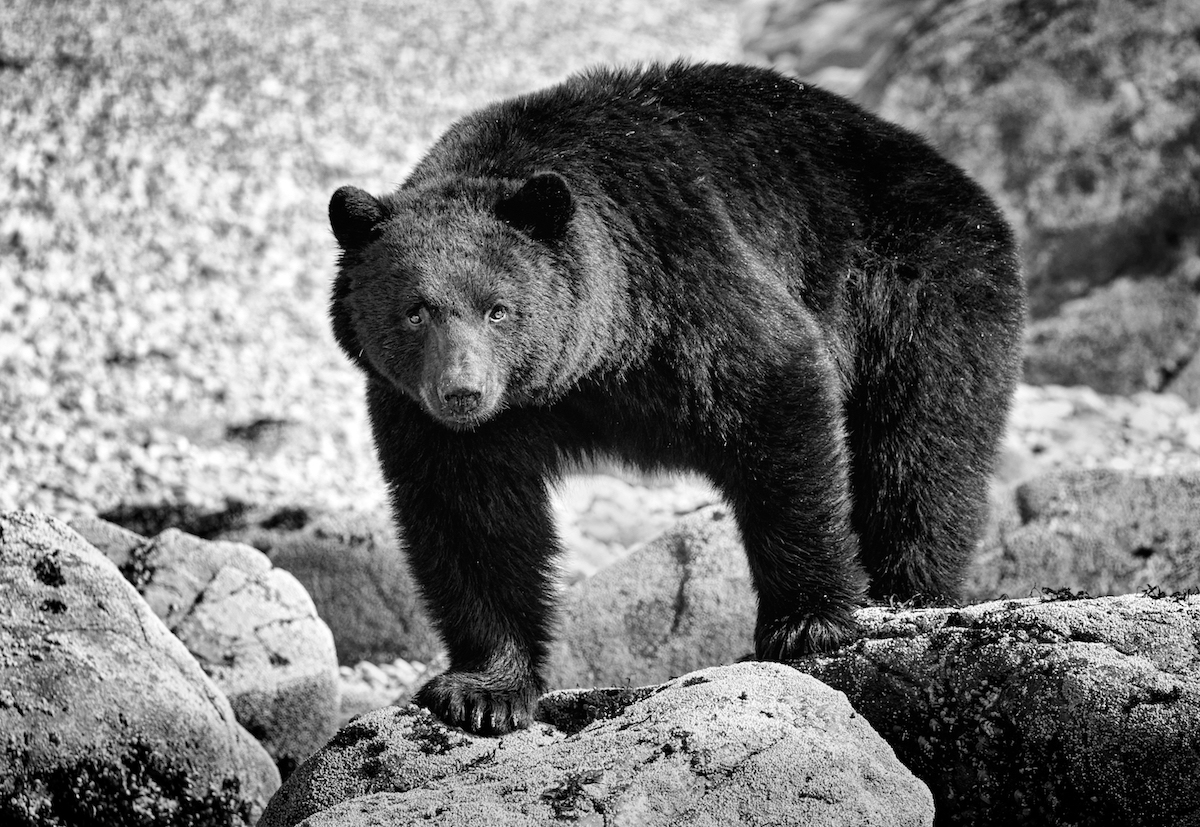
Ken nice idea I will give it a try. There is some detail there, though it is shot with rim light in mind and exposed for the light vs the bear. |
Nov 12th |
| 39 |
Nov 23 |
Reply |
Thanks Vincent. the gull is part of the original capture and not an add on. Thanks for backing up Jerry's thoughts here. |
Nov 10th |
| 39 |
Nov 23 |
Reply |
The bird is part of the original image, my question was whether it is value added to keep it in the composition. Reading your response Jerry, and Vincent's - it's unnecessary to the story. Again I forgot the white border line!
I agree that cropping it out makes for a more dynamic and stronger impactful image. Thank you. |
Nov 10th |
6 comments - 5 replies for Group 39
|
| 80 |
Nov 23 |
Reply |
Kamal, thank you very much for your comments. |
Nov 30th |
| 80 |
Nov 23 |
Reply |
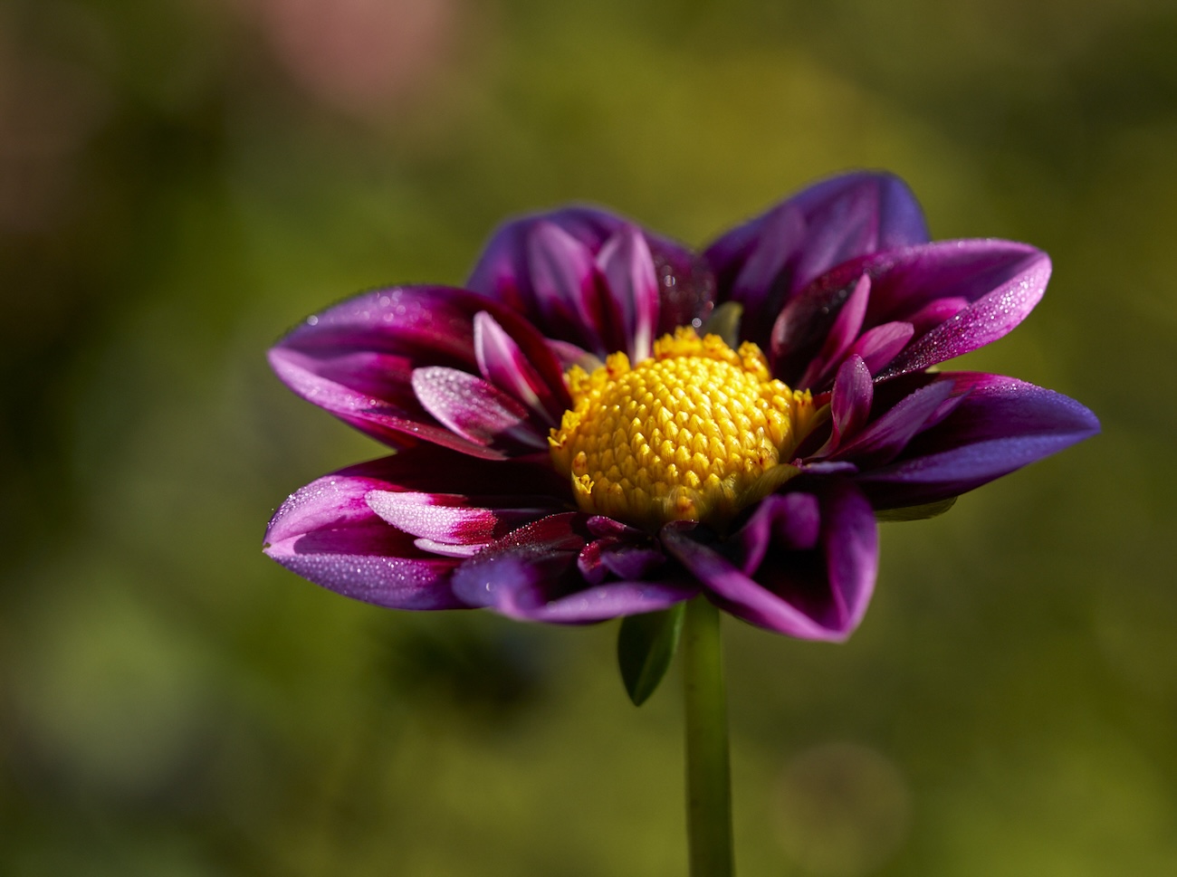
Nadia, just as well I live close to a wonderful garden and by next summer I should hopefully remember to have more DOF when I do these things. I do like it when the DOF blurs into the background, though the foreground needs more - I totally agree. I actually rather like the dappled light and so did not attempt to move it into the light. In public gardens you sometimes dont get the chance to do that. I guess I could blur that background bokeh now using the new LR blur AI. Thanks for taking the time for feedback.
|
Nov 30th |
| 80 |
Nov 23 |
Reply |
Rich - f/4 - for that creamy bokeh - Maybe I need to add mist or smoke in the foreground to help the whole thing along. |
Nov 18th |
| 80 |
Nov 23 |
Reply |
Jacob thank you for your feed back. I'll give your suggestions a try. Otherwise��. This baby may just end up with a crop! |
Nov 18th |
| 80 |
Nov 23 |
Comment |
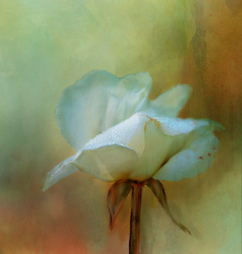
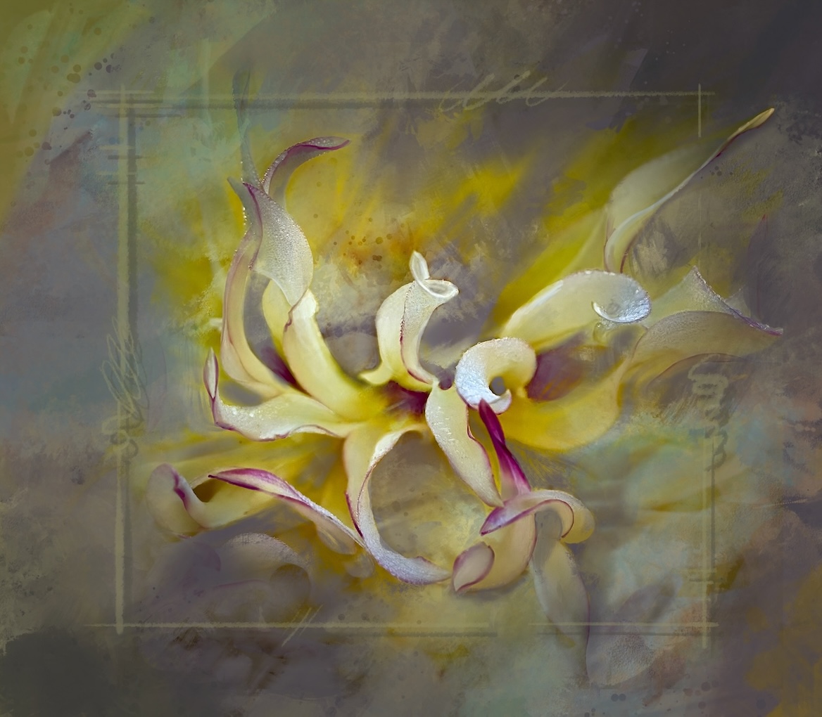
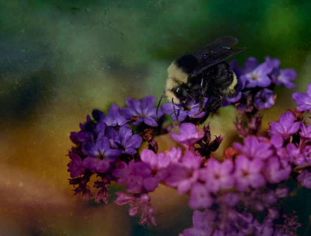
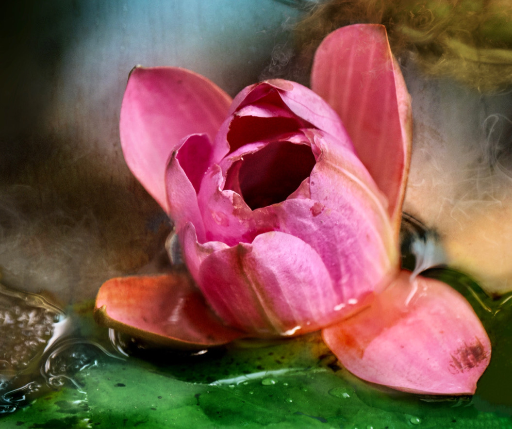
Rich all of Bob's comments are relevant to my input. The delicacy of the flower is evident and removing or blurring the distractions of the busy background would help tremendously. |
Nov 12th |
| 80 |
Nov 23 |
Comment |
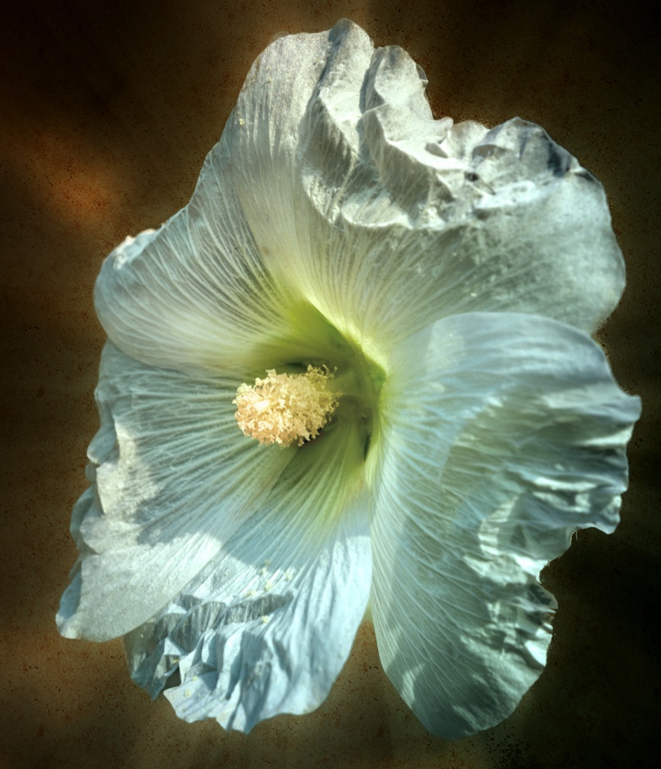
Kamal good job with experimenting and finding a way to make this work. Maybe pulling the black point down a bit to increase the tonal range would help add a bit more depth? The textures of the effect are a nice touch. Add a small white border too to ground the image (I am guilty of forgetting that last touch!) |
Nov 12th |
| 80 |
Nov 23 |
Comment |
Doug well done in the use of the creative background. Did you add it in post - it looks like you shot by using the background as a physical element. Lovely tones |
Nov 12th |
| 80 |
Nov 23 |
Comment |
Jacob - well done on the creative spin for your image. The muted tones are well done. The clone tool has been mentioned. Perhaps consider an elliptical mask and brighten the center ever so slightly as the green is a good contrast and would help pull the eye in better. |
Nov 12th |
| 80 |
Nov 23 |
Comment |
Bob I think you did a great job on pulling the colours out and the black background is a good option. I like Rich's crop as the way you have it, it just sort of floats out there with nothing grounding it. |
Nov 12th |
| 80 |
Nov 23 |
Reply |
Bob thanks for the feedback, I admit I had thought of a tighter crop to get rid of the top left! But liked the space around it. I will definitely fix it though as I think it's a valid point. I also made the creative choice for the shallow depth of field though on looking at it now maybe having the front petals in focus would be helpful. |
Nov 12th |
5 comments - 5 replies for Group 80
|
11 comments - 10 replies Total
|