|
| Group |
Round |
C/R |
Comment |
Date |
Image |
| 39 |
Oct 23 |
Comment |
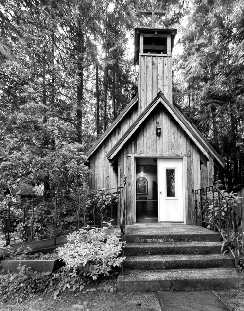
Vincent you do a good job on getting close to symmetry though in the way you have composed the crop. The Central focus appears to be absolute centre however it fails to hold the eye. Perhaps darkening the four supporting pillars like the one on the bottom left might help the eye travel there easier. Also - check those blacks and white levels. The highest point of contrast appears to be the area of detail at the top edge in the middle not the centre of the dome. So some dodging and burning in the important areas would be helpful. The centre is also a bit soft, try running it through a sharpening app and see what happens. |
Oct 5th |
| 39 |
Oct 23 |
Comment |
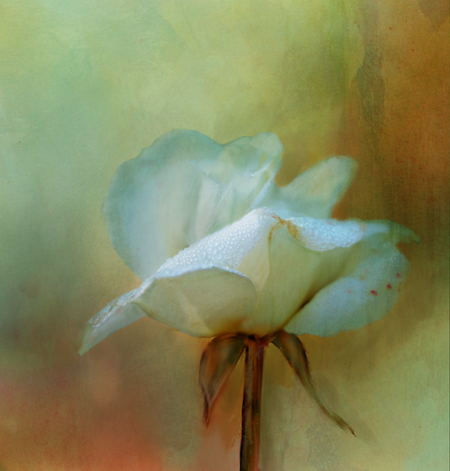
Paul - this black and white conversion is nice and gives and old world type of vibe. The tones however are very similar, which is probably intentional for the look. The focal point of the boy is lost a bit in the tones. Would brightening his shirt and the white area on it, as well as the on the shoes, help pull the eye toward him better? |
Oct 5th |
| 39 |
Oct 23 |
Comment |
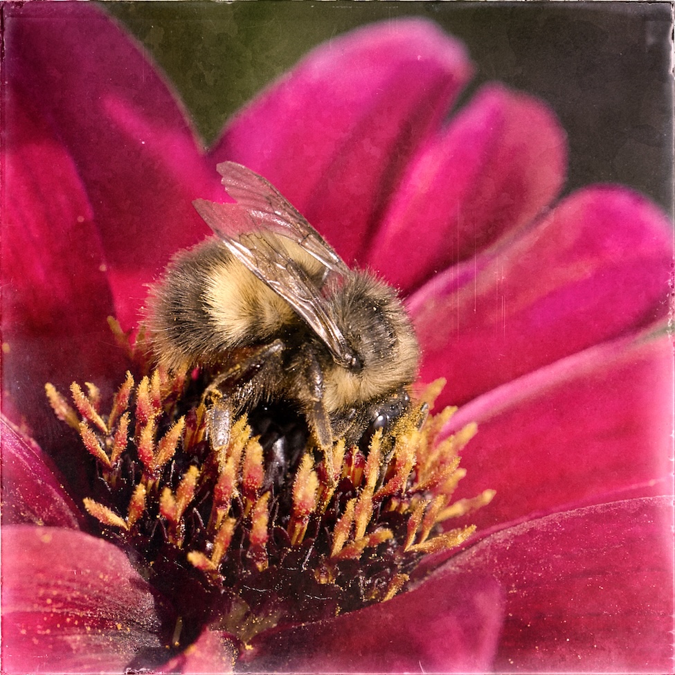
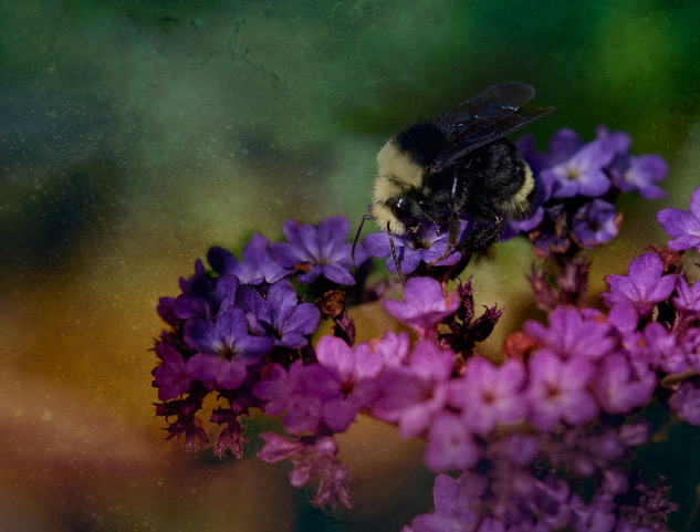
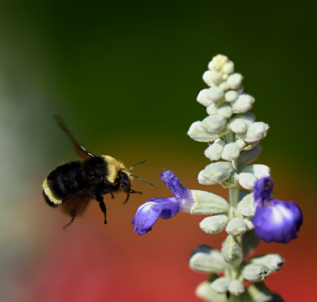
David Nice attempt to convert this to black and white. Generally yellow flowers convert nicely. There appears to be room for a crop from the bottom up as most of the content there is not helping the composition. Go back and check your black and white levels as the whites seem grey. The bee which is seemingly to focus of our attention seems soft. Consider running this through topaz sharpen or similar too. and focus on the bee only. Consider a radial gradient over the centre of the bee and the flower to lighten it and bring more focus to the bee. The background tonal value are rather lovely. Adding the frame is a nice touch |
Oct 5th |
3 comments - 0 replies for Group 39
|
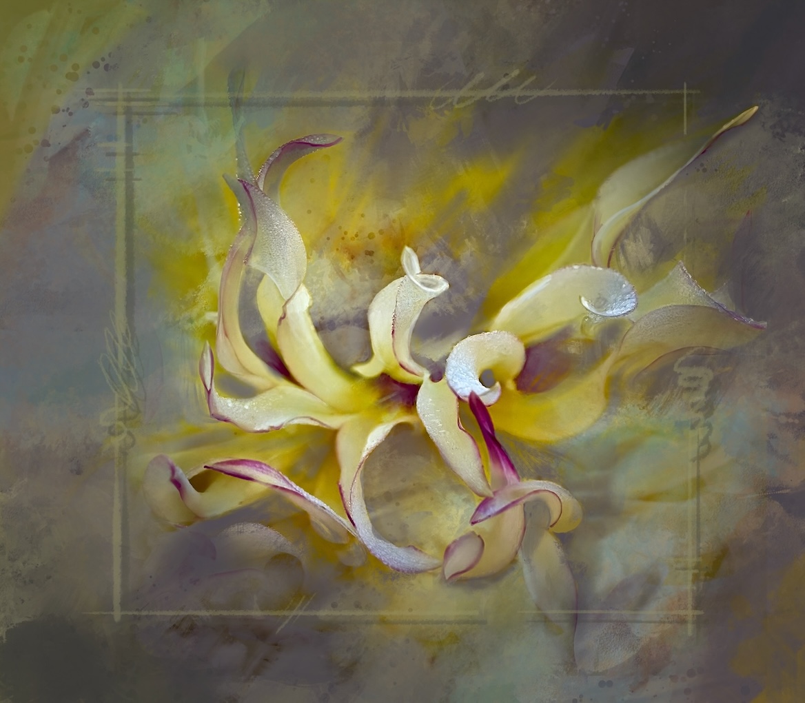
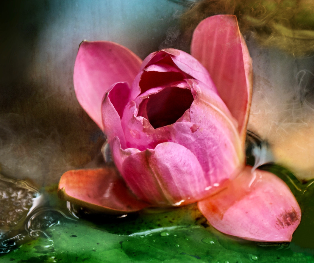
| 80 |
Oct 23 |
Comment |
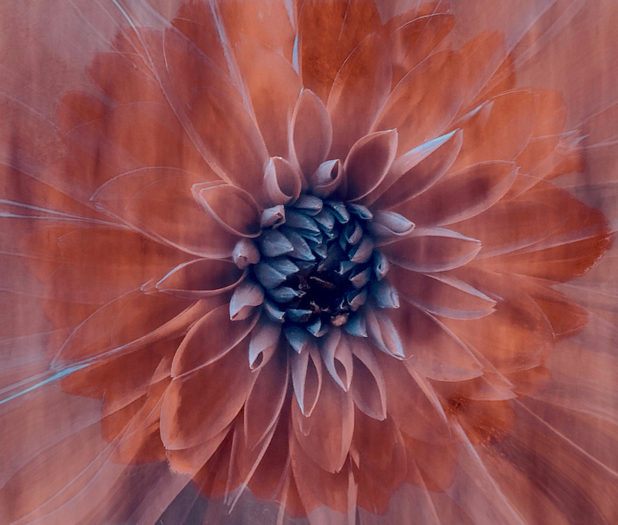
Doug, adding the vignette over the flower to further soften the outer petal edges is a nice touch. the colour tone of the vignette seems a touch warmer than the flower itself which gives just enough added interest. The center is nice and sharp and the yellow there draws the eye in. |
Oct 7th |
| 80 |
Oct 23 |
Reply |
Doug, thanks for the feed back. I was torn between the 2 for sure. I hear your point of view about the softness aiding the surreal effect and possibly agree with you. I also agree about the frame - removing it works better. I dont mind you playing with it at all. That's why we are here, to get different views and ideas. Thanks for taking the time. I appreciate the input |
Oct 7th |
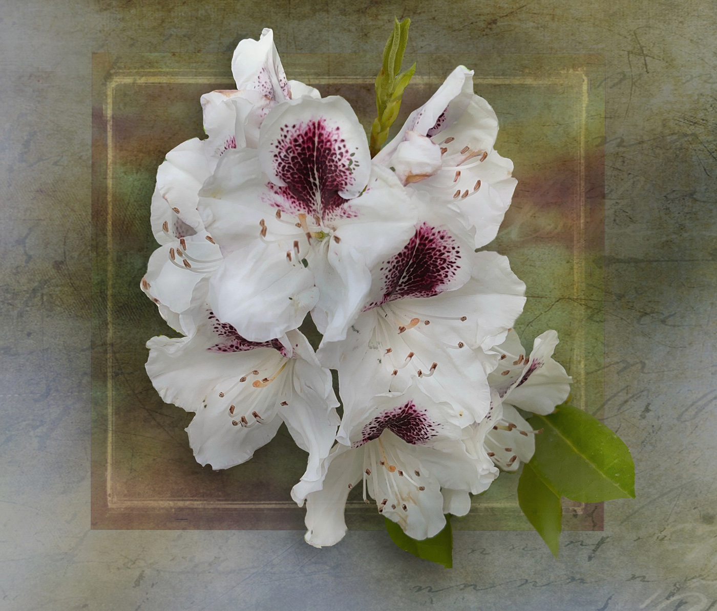
| 80 |
Oct 23 |
Reply |
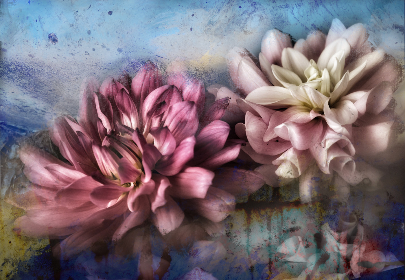
Thank you Bob. It's a bit busy but it tells the story for sure of an exploding of pollen, end of days approaching and more. |
Oct 6th |
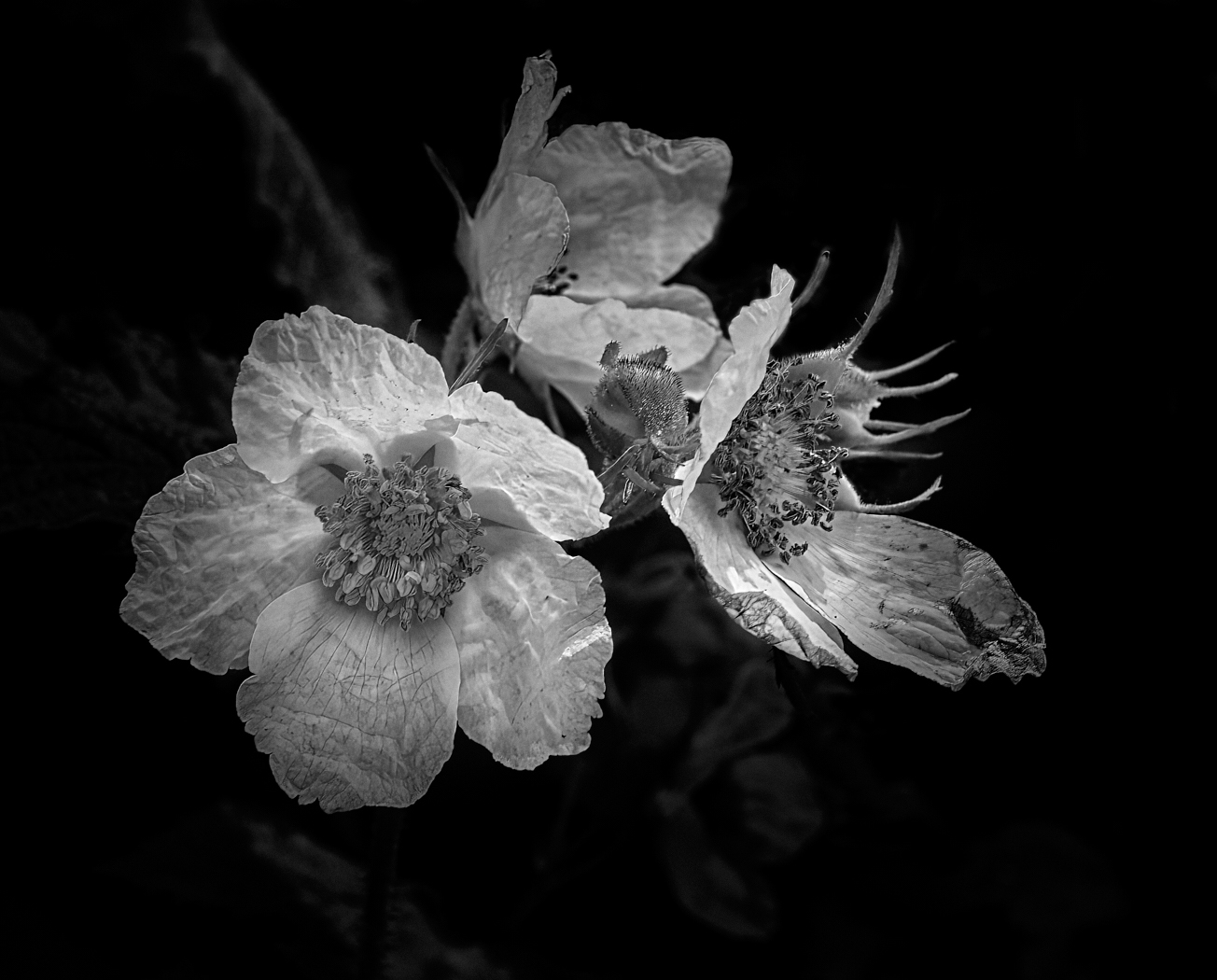
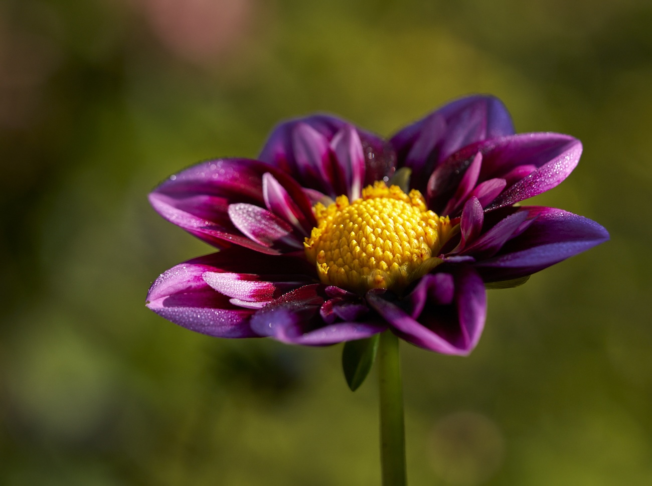
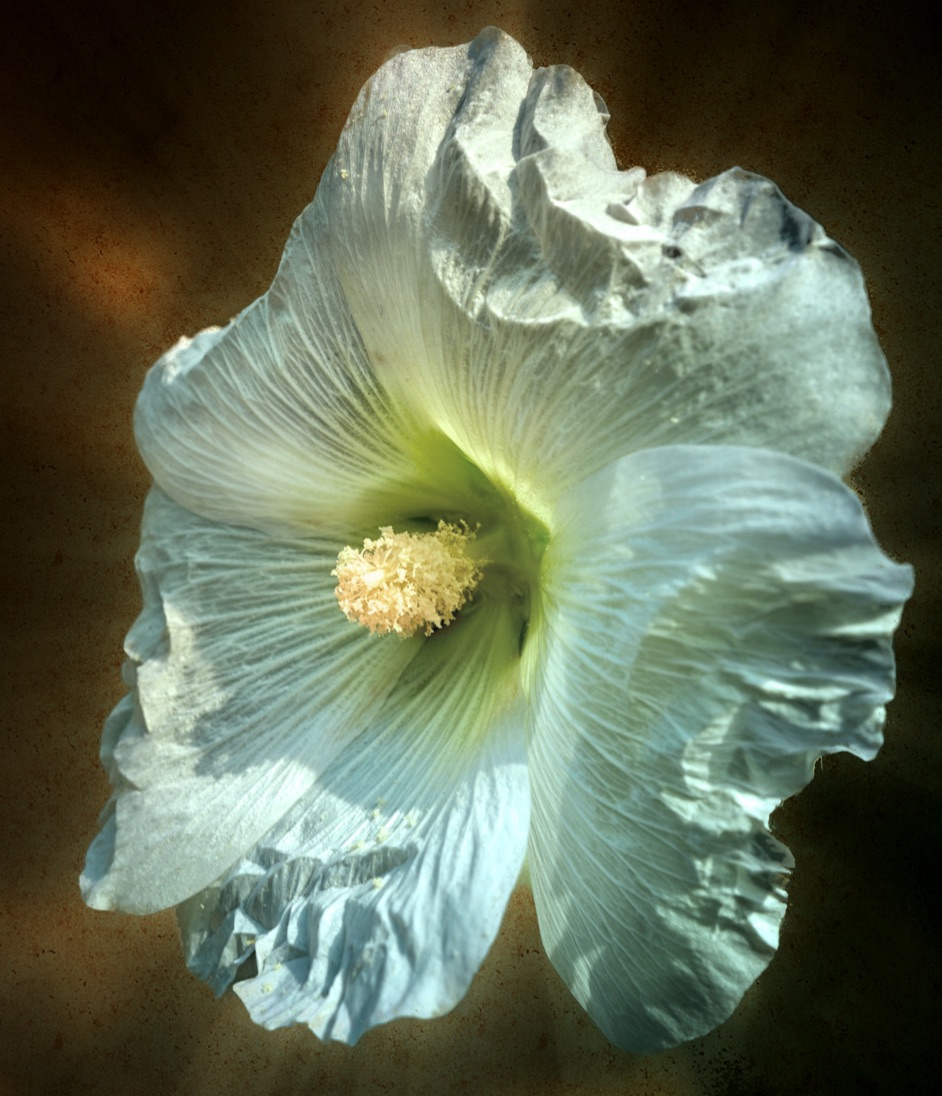
| 80 |
Oct 23 |
Comment |
Nadia good job in isolating the flower - the black certainly showcases the image well. The green out of focus bud seems to detract from the focal point of the flower centre perhaps try burning it back some more? |
Oct 5th |
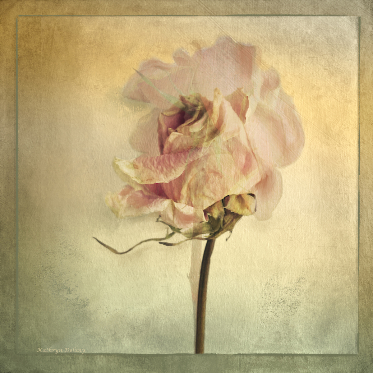
| 80 |
Oct 23 |
Comment |
Bob the effect and softness surrounding the flower is lovely while keeping the flower sharp where needed. The colour tones are good so well done in achieving your goal. |
Oct 5th |
3 comments - 2 replies for Group 80
|
6 comments - 2 replies Total
|