|
| Group |
Round |
C/R |
Comment |
Date |
Image |
| 39 |
Sep 23 |
Comment |
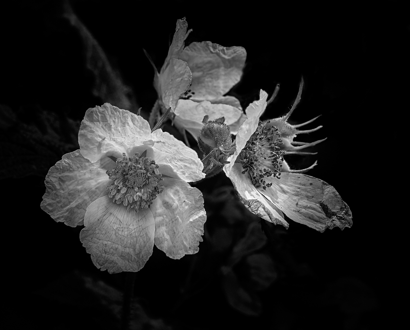
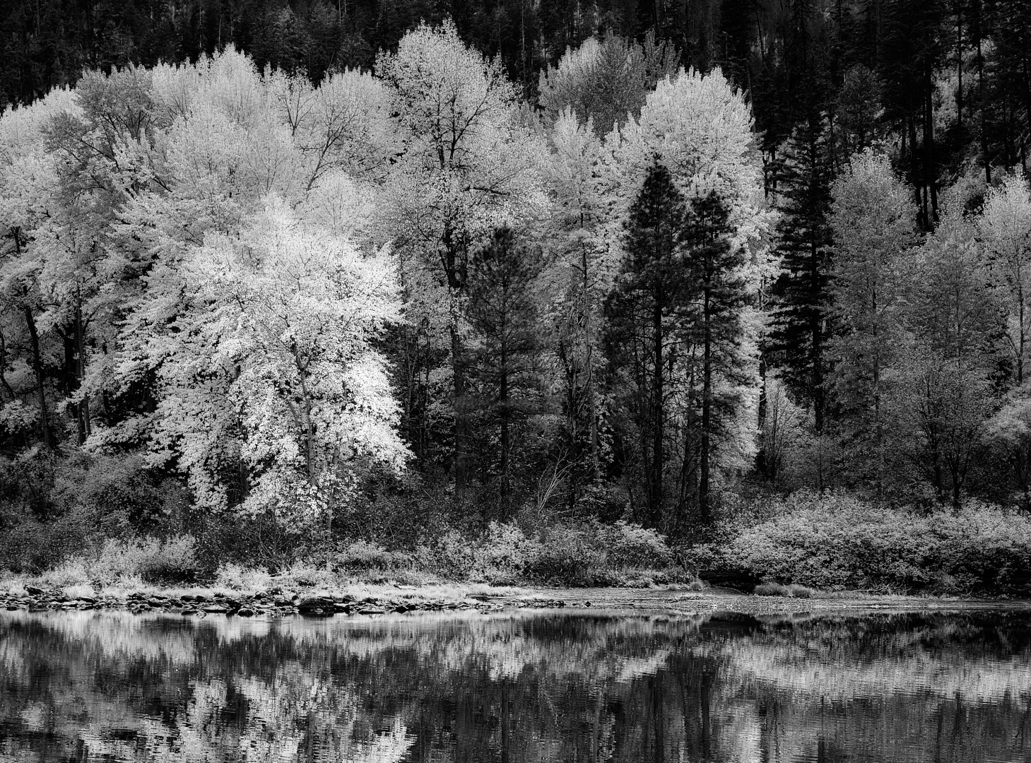
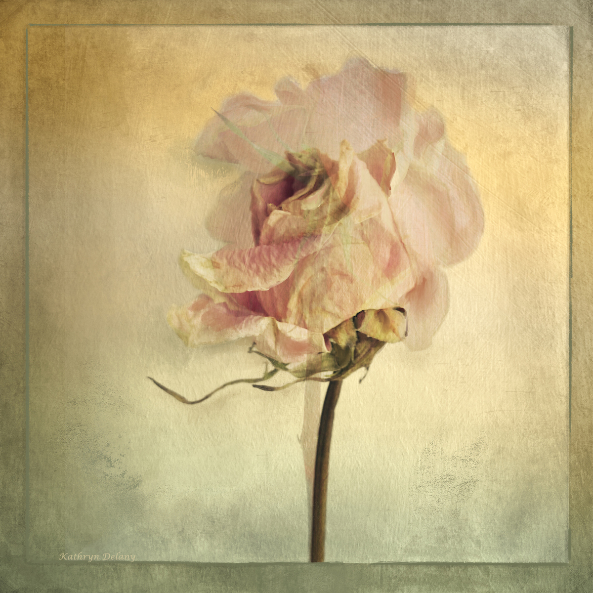
Ken sorry for the delay, I did not realize there was one image I had not seen! I do like the tonal values and the seemingly back light. I have nothing useful to add here. Well done |
Sep 26th |
| 39 |
Sep 23 |
Reply |
Jerry thanks a ton, I appreciate your taking the time |
Sep 26th |
| 39 |
Sep 23 |
Reply |
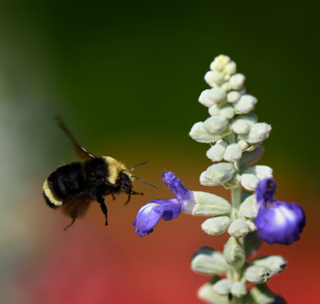
Ken thanks I think I do like V1 too
|
Sep 26th |
| 39 |
Sep 23 |
Reply |
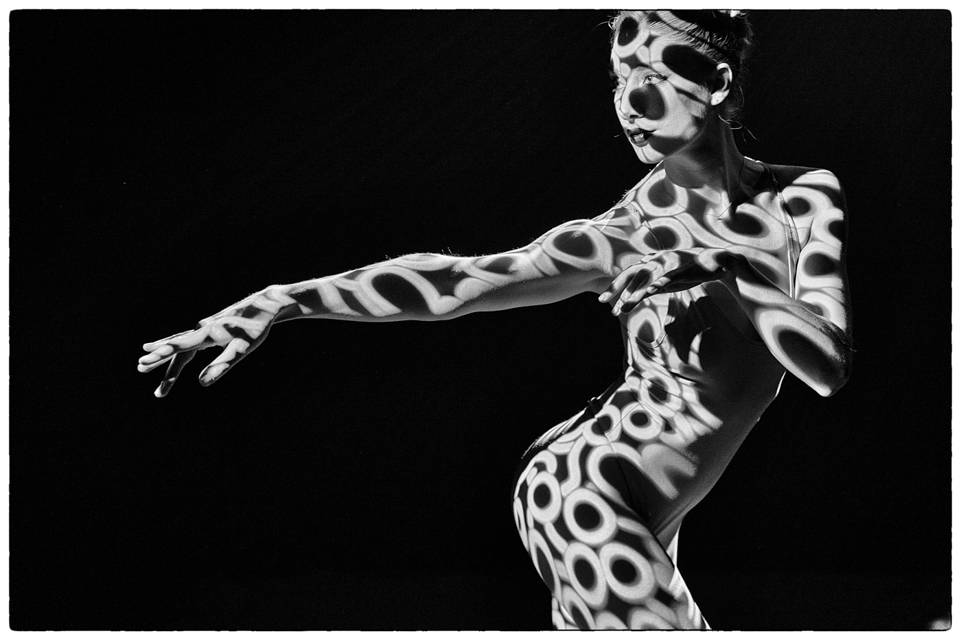
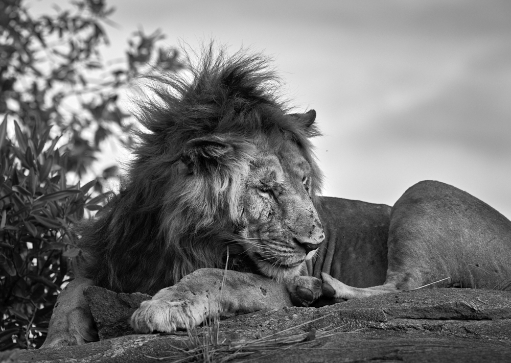
Vincent, very good observation, but keeping the crop wide it does create a totally different feel and atmosphere to the close in crop. I did spend a fair amount of time on location, If I could go back I would one day and try it again. |
Sep 15th |
| 39 |
Sep 23 |
Reply |
Fran, thanks you are right about bringing up the shadows and I agree that needs to happen. I love these discussions and getting everyone's point of view so to speak. |
Sep 15th |
| 39 |
Sep 23 |
Reply |
Thanks Paul I appreciate your point of view. The crop does focus the attention.
|
Sep 15th |
| 39 |
Sep 23 |
Reply |
Looking it the tiny thumbnail of the new version I can see your point of view! Thank you |
Sep 7th |
| 39 |
Sep 23 |
Comment |
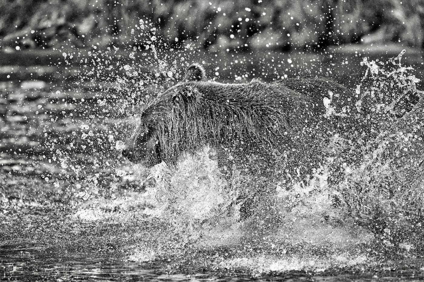
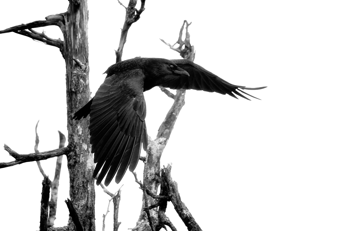
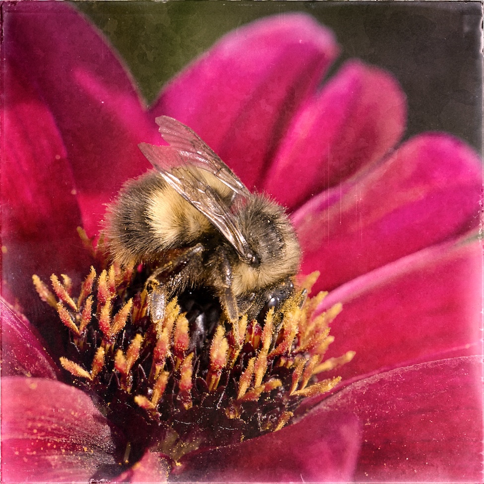
Fran a very good capture and you have handled that blue sky as well as possible in making it a neutral gray that separates the bird and pops it forward. Good tones throughout and clean whites on the head which the draws the viewer in and holds the attention. Well done. |
Sep 6th |
| 39 |
Sep 23 |
Comment |
David well done in capturing a new puppy. A really lovely portrait of your wife and the puppy. The lighting is lovely coming over the back and to the side lighting both the person and the dog. It is clear that you wife loves this little ragamuffin. You caught a great expression on the puppies face too. No improvements needed. Fabulous job |
Sep 6th |
| 39 |
Sep 23 |
Comment |
Vincent this is a really good example of abstract architectural photography. well composed and thought out. The tonal range is superb and the image itself makes the viewer stop and look again and study it. Excellent job. |
Sep 6th |
| 39 |
Sep 23 |
Comment |
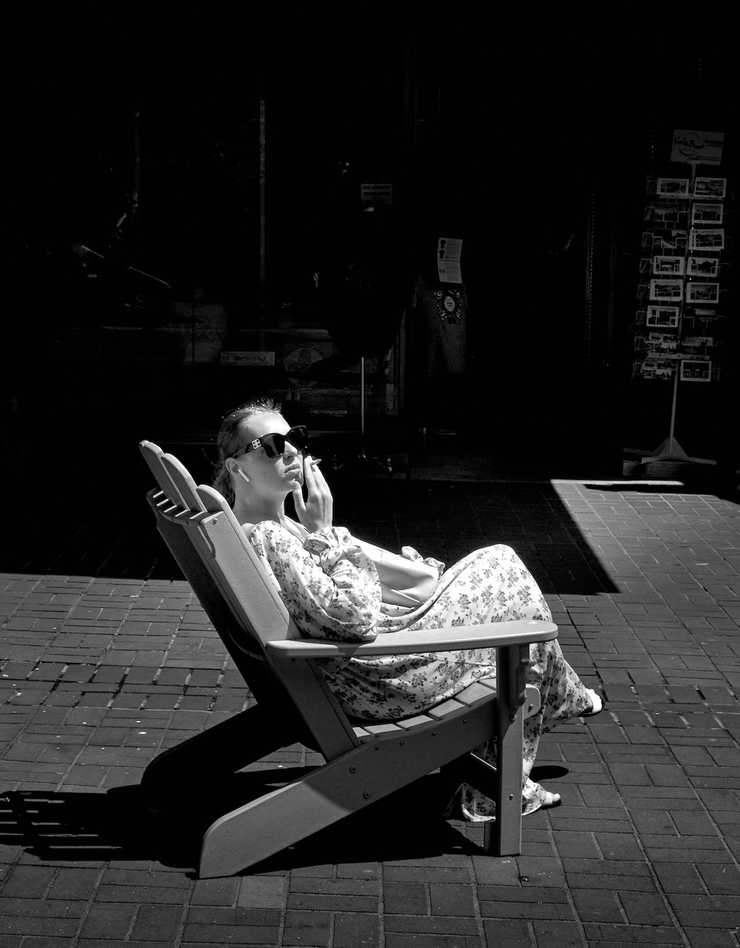
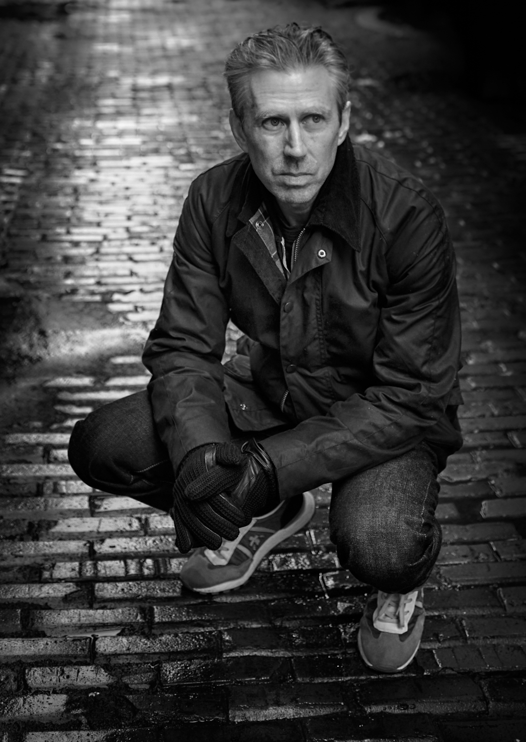
Jerry a good story here - I must sympathize with the young boy in trying to get away from the camera woman! The whites on the gloves and the 'lens' draw the eye in and the shape of the grass around her provide good leading lines. At first I questioned the white car however it does off set the figure well. A good bit of street photography story telling. |
Sep 6th |
| 39 |
Sep 23 |
Comment |
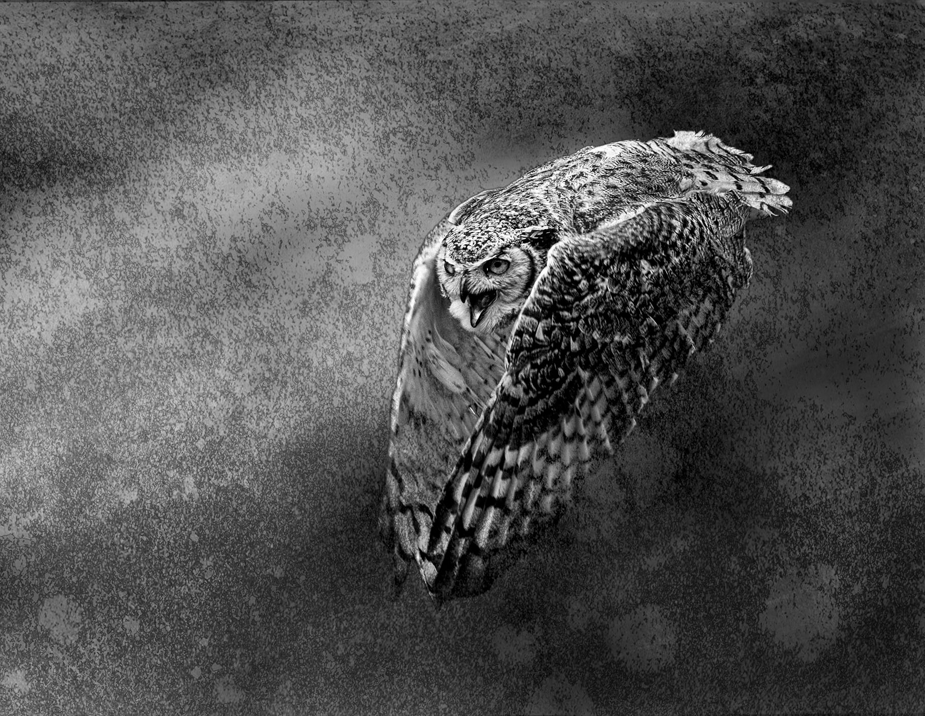
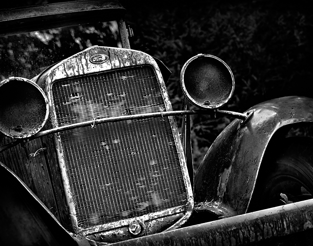
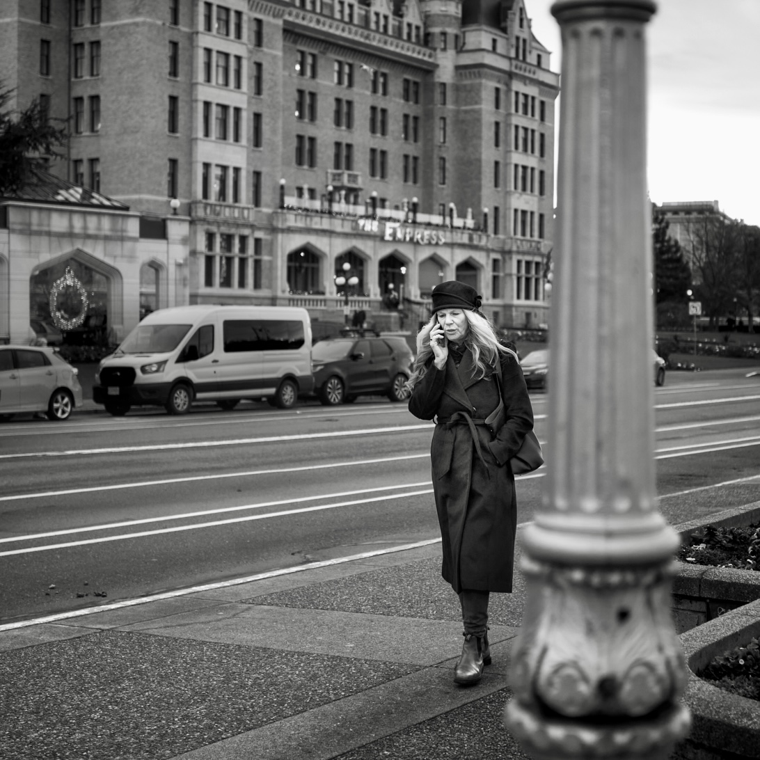
Paul this is fantastic. The overall tones and matte finish give a very classical feel to the image. Great story and lighting to draw the eye. The crop helps the composition and cuts out unnecessary background clutter. PS. I understand 100% about lugging around heavy equipment and am ever in the pursuit of lighter gear |
Sep 6th |
| 39 |
Sep 23 |
Reply |
David thanks I have this version which has the shadows opened up a but like you suggested - I cropped it and shut down the shadows because it is busy what do you think?
|
Sep 6th |
 |
6 comments - 7 replies for Group 39
|
| 80 |
Sep 23 |
Reply |
Doug, what a lovely and enthusiastic response, thank you. To answer your questions. Cutting out the background, I use masks - carefully. Sometimes it takes a long time to be sure you have a good mask. It also depends on the app you use. If you use Photoshop (desktop) its AI subject mask is pretty good.
I do almost all my creative work on my iPad. So I use Procreate and I this one I did in iColorama. The masking tool is pretty good in this app too.
I made the background - 3 images. I use my own textures which I have photographed or painted and blend them into the background using different blend modes- again either in Procreate and/or Procreate. This one started with a painted background, then a photo texture and finally a photo of bokeh I took. All are on separate layers with different blend modes and opacities.
Some sources for learning - Kathleen Clemons, Hazel Meredith is awesome. David Duchens and Alan Shapiro. I am putting together a program to teach this stuff as well. It's still in the beginning stages. Also Jackie Kramer offers a year long course which features all these creators who share techniques and methods for creating artistic mixed media photos. |
Sep 18th |
| 80 |
Sep 23 |
Reply |
Kamal, thank you very much |
Sep 18th |
| 80 |
Sep 23 |
Reply |
Thanks Nadia I appreciate your input |
Sep 15th |
| 80 |
Sep 23 |
Reply |
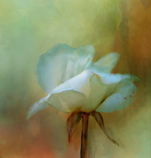
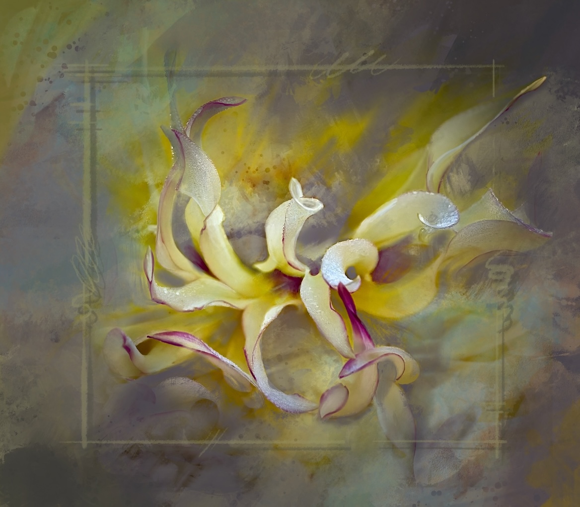
Nadia, I understand about wanting to make it look like a painting, though my point is about painting technique as well. In art lost and found edges (sharp and soft) are a very important for the same reasons in photography. The eyes like to to have a place(s) to identify as the focal area. What if you used the original image and a layer mask you can mask some sharpness back into the central part of the flower? Or paint some crisper areas back in. Would it help? |
Sep 15th |
| 80 |
Sep 23 |
Reply |
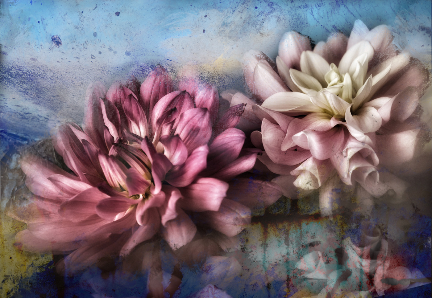
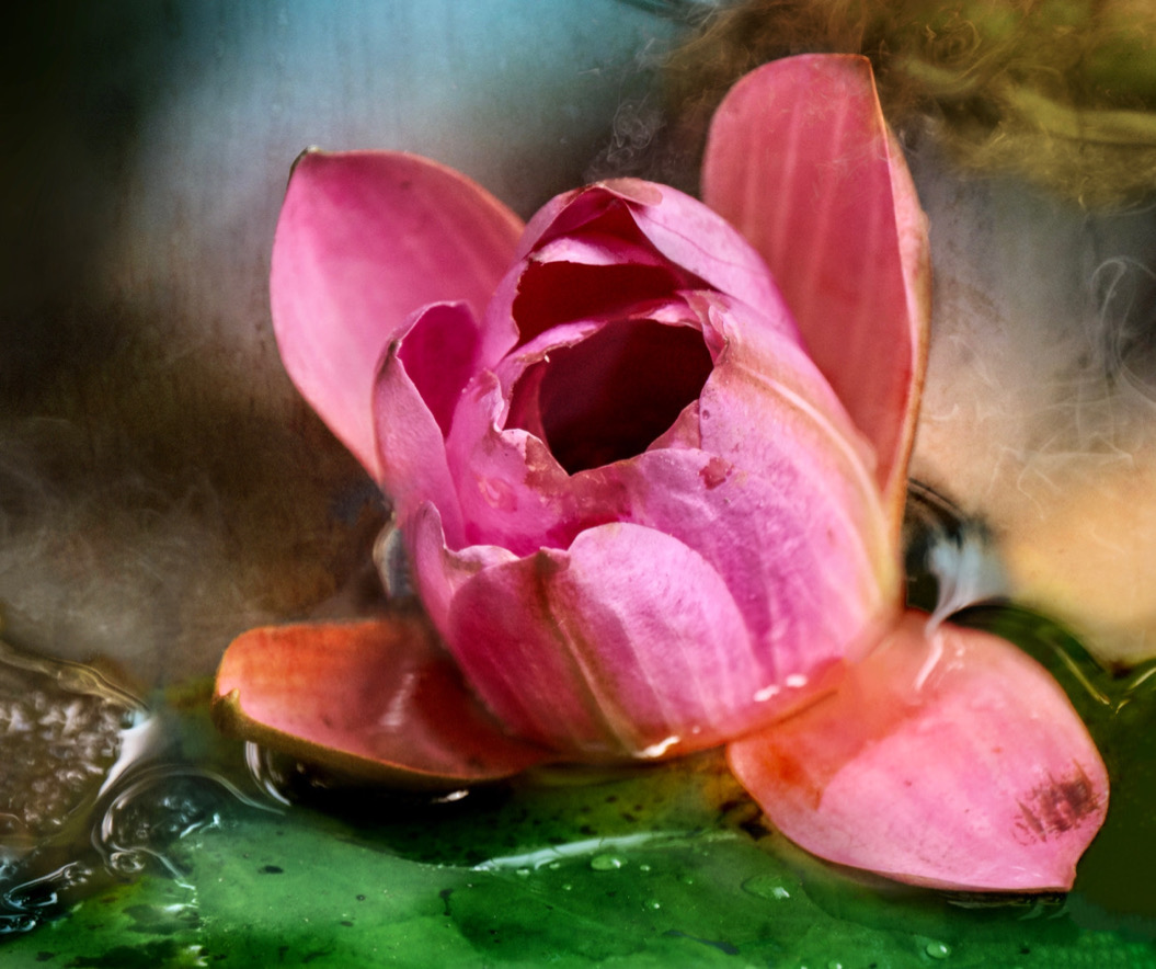
Thanks Jacob. I think it's still a WIP and will change as I progress. Looking at it now after some time away from it, I feel the flower is too bright and singular. So I will probably tone it down and maybe at more 'shadowy' flowers in the background too, and perhaps crop in tighter. |
Sep 13th |
| 80 |
Sep 23 |
Comment |
The soft pinks of the flowers against the greens is lovely. Crop down from the top to remove the big ing leaf. Crop up a bit from the bottom to remove the little bits of leaves sticking to that bottom edge. A radial gradient over the front flower to keep it in the light and slightly darken the rest of the image would provide a focal point. |
Sep 12th |
| 80 |
Sep 23 |
Comment |
Jacob good eye in catching this lovely huge sunflower. I wonder if you continued further. The treatment of the wood and texture is great. The busy top background competes with all the good stuff. Maybe try selecting the bushes behind the flower - keep its leaves as part of the design. Then add softer bokeh type of texture over the busy background which you can colour to complement what you already have going. Just a thought - You definitely are seeing more opportunities and taking better shots as you progress here. Well done. |
Sep 12th |
| 80 |
Sep 23 |
Comment |
Nadia very nice and painterly rendition and as Bob mentions have splashes of the flower colour in the background always pulls a piece together. It sure beats the bricks. It would be nice to have some of the centre sharp and brighter to pull the eye into a focal point. |
Sep 12th |
| 80 |
Sep 23 |
Comment |
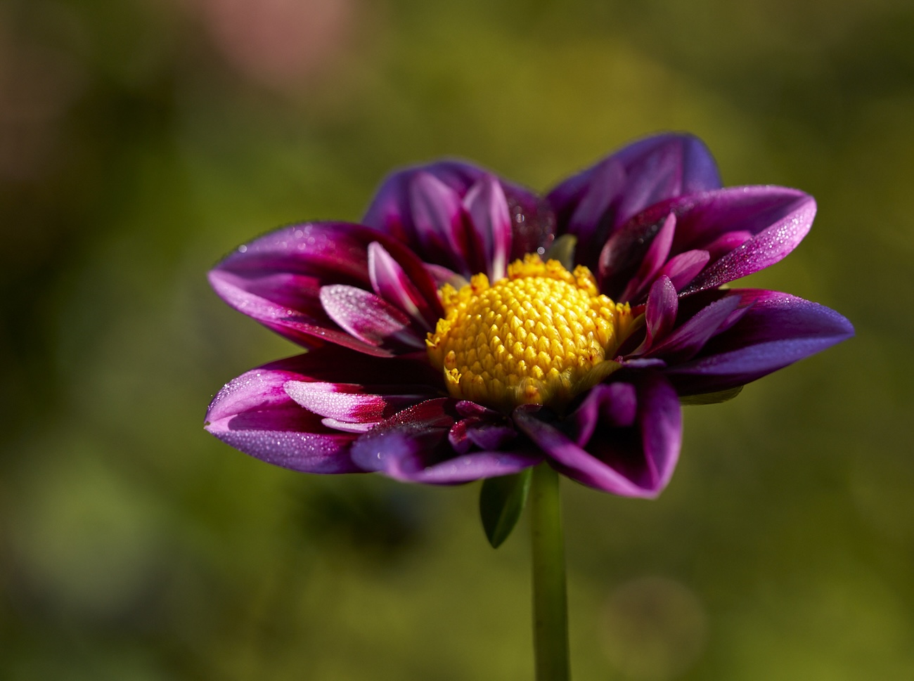
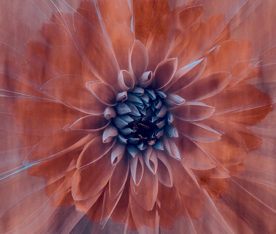
Rich excellent results. It is definitely all about the light in this game. I have nothing to say about the flower itself, bringing up the light and saturation on the flowers themselves is excellent. There are however some corner issues top right and bottom right, which can be easily taken care of. The warm tones of the background are complimentary to a dead black background. I like it. |
Sep 9th |
| 80 |
Sep 23 |
Reply |
Thank you so much Bob. I appreciate your feedback. It's always fun to take it up a notch - or try to. . |
Sep 7th |
| 80 |
Sep 23 |
Comment |
Rich excellent results. It is definitely all about the light in this game. I have nothing to say about the flower itself, bringing up the light and saturation on the flowers themselves is excellent. There are however some corner issues top right and bottom right, which can be easily taken care of. The warm tones of the background are complimentary to a dead black background. I like it. |
Sep 6th |
| 80 |
Sep 23 |
Comment |
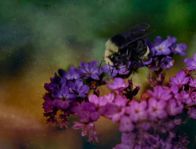
Bob a creative solution as always. The resulting image looks like sugar crystals on the flower which seems to have morphed into an interesting insect. The green offset the colourful flower well. Fun - keep it up. |
Sep 6th |
6 comments - 6 replies for Group 80
|
12 comments - 13 replies Total
|