|
| Group |
Round |
C/R |
Comment |
Date |
Image |
| 39 |
Aug 23 |
Comment |
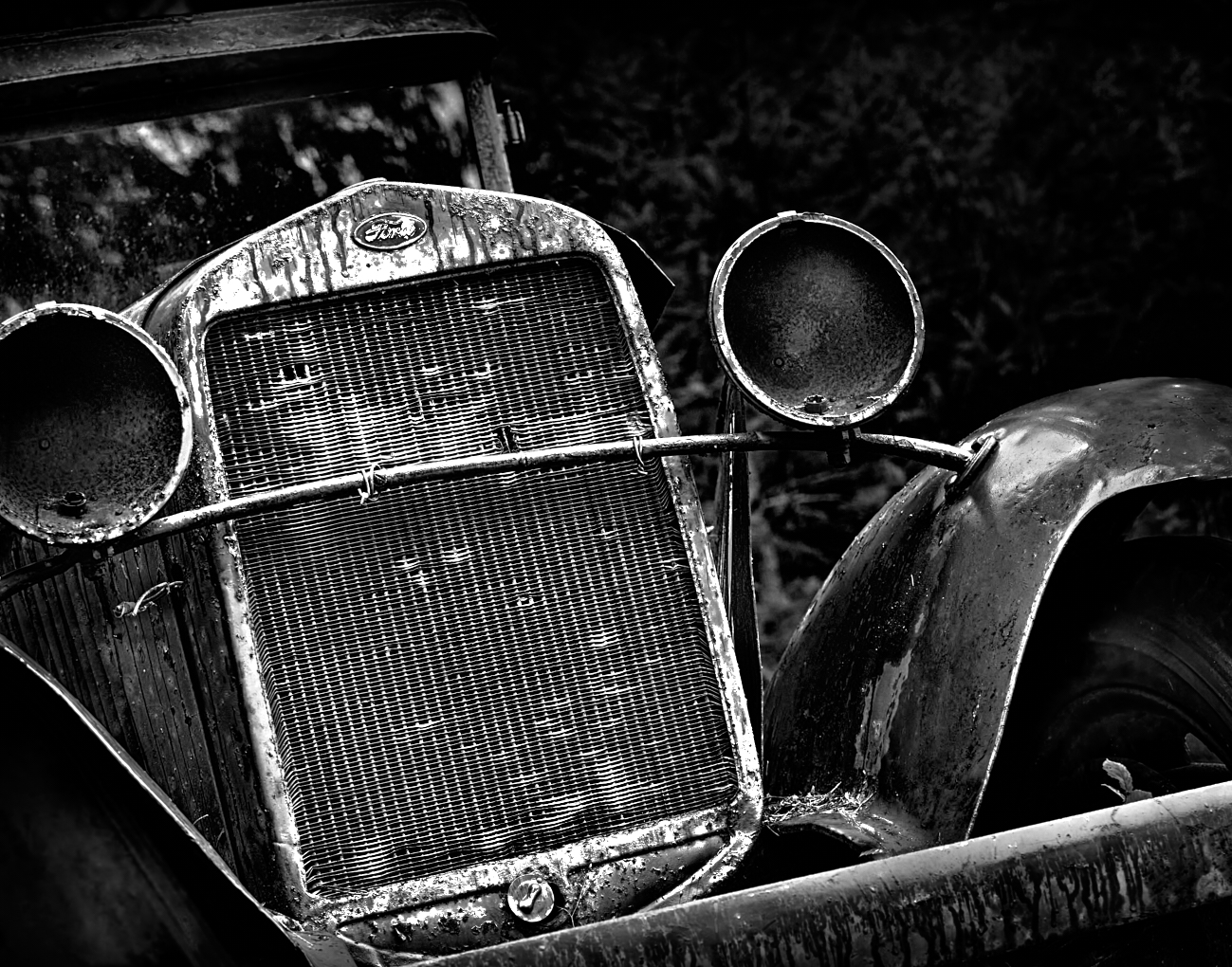
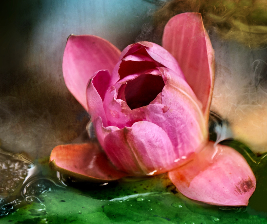
Ken, by now every one know I love old vehicles and this one is lovely. The colour version is stunning with the blues and burnt oranges giving it impact. The composition is good, though the tones in the black and white are a bit flat . I did a quick global levels adjustment and tweak of contrast which bumps the tonal values up and gives a bit more interest maybe. See what you think. |
Aug 21st |
 |
| 39 |
Aug 23 |
Comment |
Vincent, as I am late to the conversation most of my thoughts have been expressed already. The door makes a good frame, the pose does feel a bit to staged. Textures are all well done. Tonal range could be pushed a but further to create a definitive focal point of either her face with the guitar as a supporting actor. Perhaps tone down the light wooden door above the brick arch at the top. As it is brighter and lighter it pulls the eye up. A nice effort at story telling |
Aug 21st |
| 39 |
Aug 23 |
Comment |
Paul - a lovely moody mist sea scape. the right edge has blips that could just be cropped out - the lone swimmer and the specular highlights in the water toward the bottom, are distractions that pull the eye there unnecessarily. Try a tiny bit of dodge and burn on the waves in selected areas, to create a bit more tonal interest and maybe the far figures should just become silhouettes? See if it breaks the image or not. The bottom left of the image seems a bit dark - maybe brighten it somewhat to create a better flow and less of the abrupt line where sand meets water? |
Aug 21st |
| 39 |
Aug 23 |
Comment |
Jerry what a fun idea. I agree with Fran and David's comments about the composition. Getting lower you could decrease the effect of the busy background behind the head and create some soft bokeh looks to separate the figure from it. The colour. The head of the toy seems very soft so having the background compete with it is a distraction. If you do it again, get low and get all the reflection :-) |
Aug 21st |
| 39 |
Aug 23 |
Comment |
Fran nice composition and isolating portions of a busy waterfall is a good compositional choice. The nice lights and darks of the colour version have been lost and as a result the depth or 3D of the image is lost. It looks a bit too much HD and sharpening has been applied. This has been noted by the others too. Currently I prefer the colour, however editing black and white is a good practice and keeping the tones and light and shadows in place is always a challenge. |
Aug 21st |
| 39 |
Aug 23 |
Comment |
David, this is a really lovely and creative interpretation of the landscape. Keeping the telephone poles balances the composition, did you try taking the brightness on them down a touch. |
Aug 21st |
| 39 |
Aug 23 |
Comment |
Hi everyone, sorry for being non responsive, I have been away for the past few weeks with no internet or cell connections. Bliss! Thank you for all the feedback it is very helpful. I see that the shadow should not be chopped off when I went back into it I know why I did chop it as there is a manhole cover abutting the shadow which I do not like. I have done some changes. The background of the store was so busy so now I have just made that into one big negative space which I like. What do you think. |
Aug 21st |
 |
7 comments - 0 replies for Group 39
|
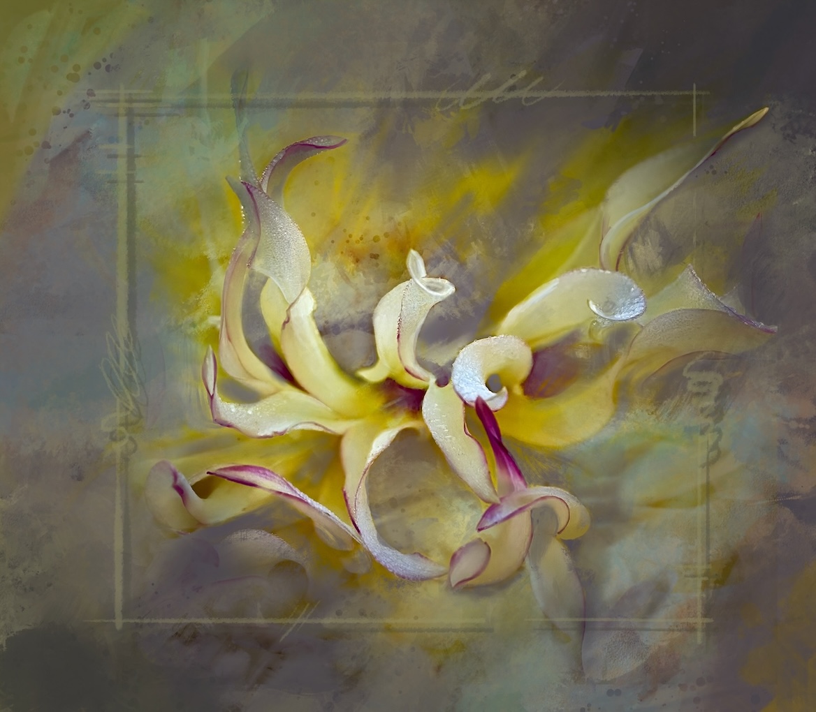
| 80 |
Aug 23 |
Comment |
Rich this is lovely. Putting the flower on the diagonal is a good compositional choice. Everything is beautifully sharp and the colours sing. Great submission |
Aug 21st |
| 80 |
Aug 23 |
Comment |
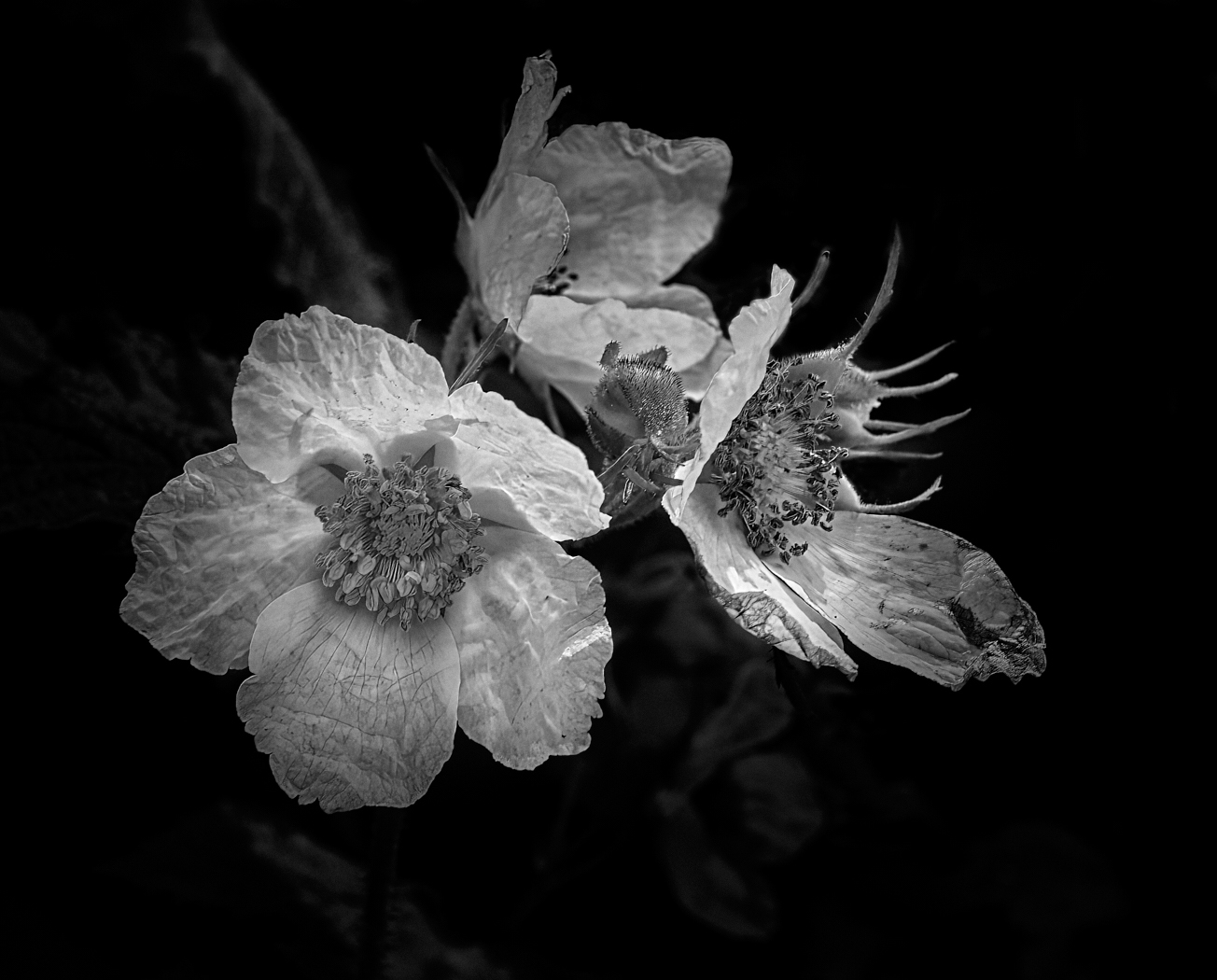
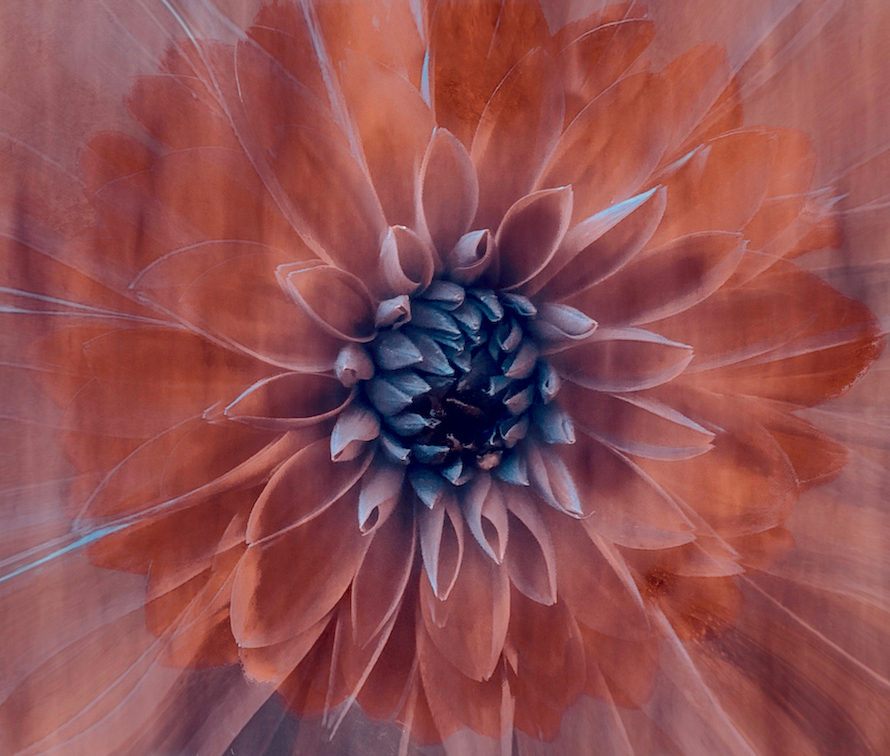
Kamal, good effort at trying a black and white composition. As a single lonely bud on a the black background it seems to lack impact somehow. Maybe a duplication or a mirror effect would help the composition. The tones seem a little flat, check the whites they seem a bit gray compared to the colour version. The very black centre needs addressing try brightening. I agree with Bob and Rich with their comments. |
Aug 21st |
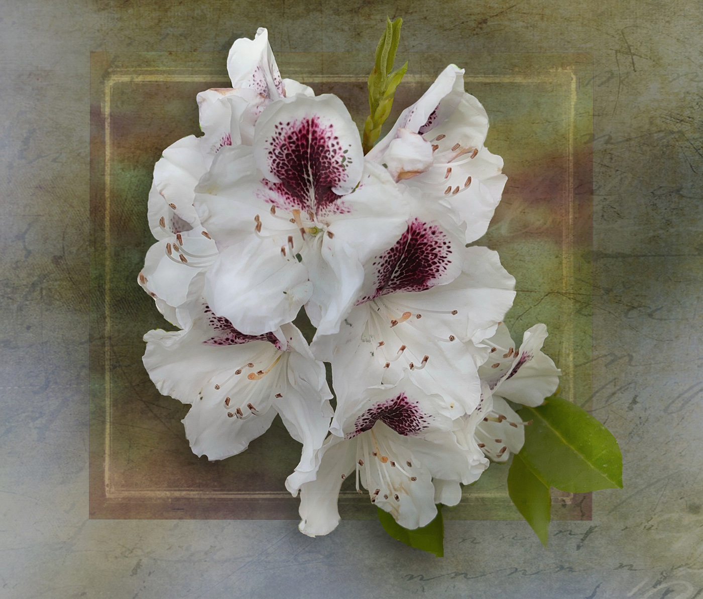
| 80 |
Aug 23 |
Comment |
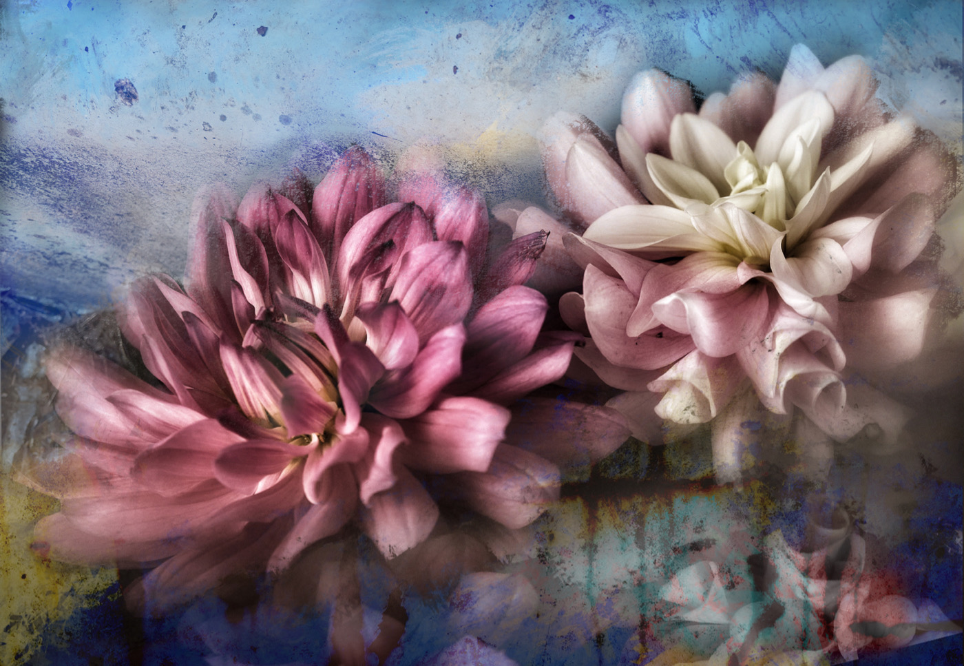
Doug this is a fun pattern and good choice of flower to do this with. The colours and tones are warm and buttery while staying soft resulting in an overall pleasing affect. Well done |
Aug 21st |
| 80 |
Aug 23 |
Comment |
Nadia, nice tones in this one - I believe everyone has covered my thoughts here as well. I like your 2nd edit better. |
Aug 21st |
| 80 |
Aug 23 |
Comment |
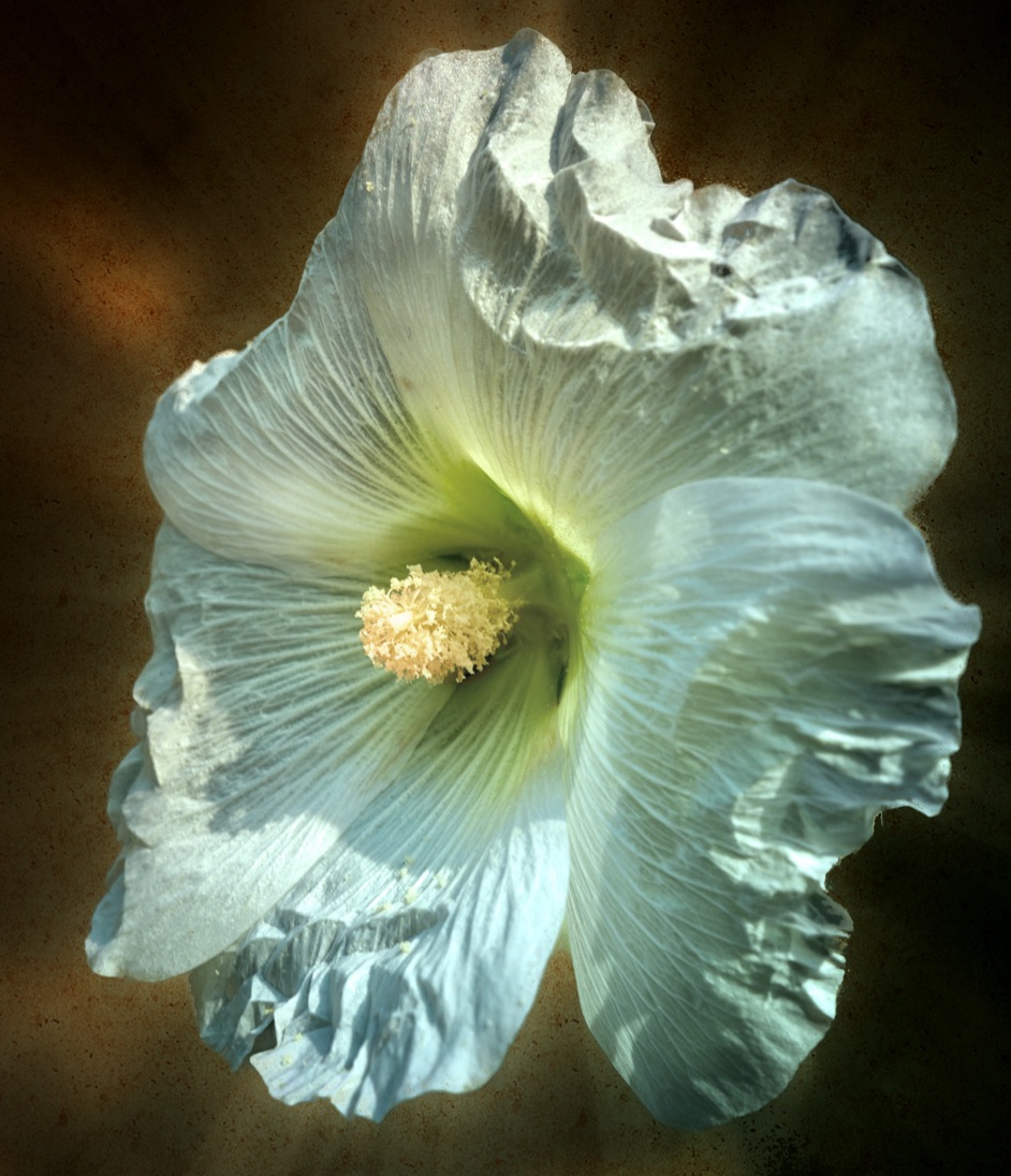
Jacob, a lovely sunflower - it is the season so a timely shot. Blurring the background to minimize the distractions would help improve this, or simply replacing the background with something else, a cool sky for example may strengthen the impact. Definitely you need to brighten the centre, try a radial gradient. Rich has pretty much covered my thoughts here too. |
Aug 21st |
| 80 |
Aug 23 |
Comment |
Bob an interesting compilation. I agree with most of what everyone is saying. having the leaves continue around to from the whole could be an interesting look too Cropping the blurry leaves would help as they are kind of central to the composition and distract your eye immediately. Sorry for not commenting before. I have been away. |
Aug 21st |
6 comments - 0 replies for Group 80
|
13 comments - 0 replies Total
|