|
| Group |
Round |
C/R |
Comment |
Date |
Image |
| 39 |
Jul 23 |
Comment |
Jerry nice conversion. This is a good composition. My only suggestion might be to burn back the leaves at the top left of the frame. In fact the whole background could be a bit more subdued and make the gorgeous flowers pop. |
Jul 28th |
| 39 |
Jul 23 |
Comment |
Ken the conversion works, it has a very surreal feeling to it due to the lighting. The atmosphere feels like a stage set. Perhaps toning down the sand and back rocks very slightly would soften their effect and bring more focus to the tree. Unless your intent is for the focus to be the rocks since they appear to be the points of highest contrast. Adding space above the tree helps the composition too. |
Jul 27th |
| 39 |
Jul 23 |
Reply |
Vincent I agree about the eye and making it brighter - I will try it and thank you for your feedback |
Jul 21st |
| 39 |
Jul 23 |
Reply |
Thanks Ken. I did do a blur on the background (see image under Fran's input). I will try brightening the eye, though I think it has quite a bit of grain on it�� |
Jul 21st |
| 39 |
Jul 23 |
Comment |
Jerry nice conversion. This is a good composition. My only suggestion might be to burn back the leaves at the top left of the frame. In fact the whole background could be a bit more subdued and make the gorgeous flowers pop. |
Jul 20th |
| 39 |
Jul 23 |
Comment |
Jerry nice conversion. This is a good composition. My only suggestion might be to burn back the leaves at the top left of the frame. In fact the whole background could be a bit more subdued and make the gorgeous flowers pop. |
Jul 19th |
| 39 |
Jul 23 |
Reply |
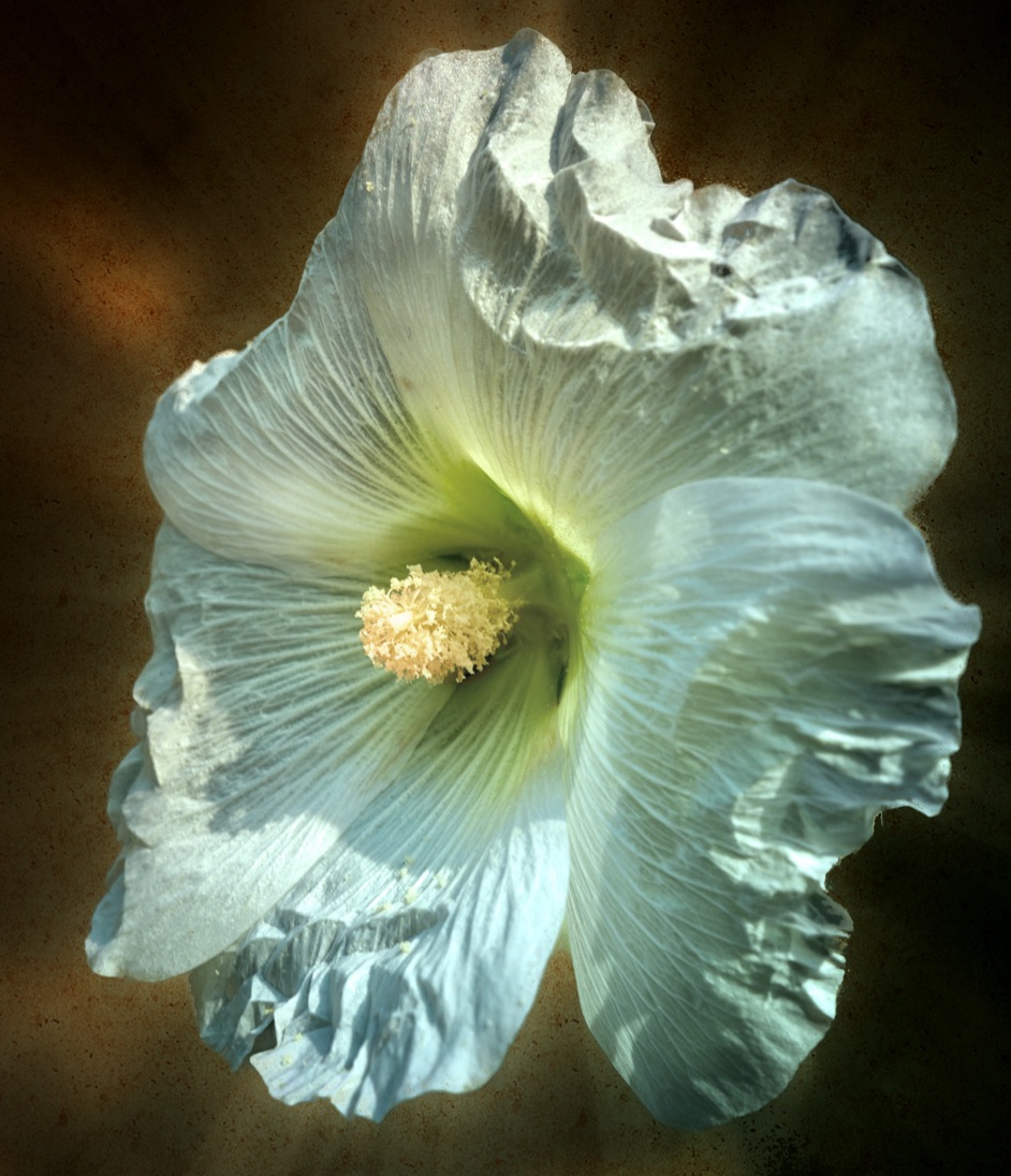
Hi Paul
Thank you so much. The first version of this in colour is pretty much almost sepia. I like all the looks. thanks for the edit.
|
Jul 19th |
| 39 |
Jul 23 |
Reply |
I will! I think I will enter it into a competition too! By the way I lived in Portland for 25 years before moving every northward. |
Jul 8th |
| 39 |
Jul 23 |
Comment |
Vincent nice job on seeing the opportunity and getting that starburst of the sun rays. The long shadows are wonderful. I agree with Fran and David that the cropping helps. This is black and white you can do anything you like. Like cloning out that branch bang in the middle of the composition. In Fran's crop you can further clone out the bit of house that is left. This make for a far stronger composition. It clearly converts a clear and frosty winter moment. |
Jul 8th |
| 39 |
Jul 23 |
Comment |
Paul nice capture and perspective. I like the low horizon and the bird on the top!
Watch your masking. As David points out there is a halo on the left of the boat. There are also some rather harsh mask lines at the horizon - particularly on the right which stops abruptly. You can push this a bit further by really brightening the words and lettering - contrast and clarity maybe. To a lesser degree along the top edge on that side of the hull as well. Lifting the shadows somewhat on the left may pop the boat a bit further and separate the background. The question now becomes. What is the story? The clouds or the boat. For now the clouds tend to compete a bit with the story line. |
Jul 8th |
| 39 |
Jul 23 |
Comment |
Fran this works so well in B&W. Your choices to remove the tree and extend the sky are well considered. I agree about cropping some of the snow out. Lovely tones and details and that reflection! Well done. |
Jul 8th |
| 39 |
Jul 23 |
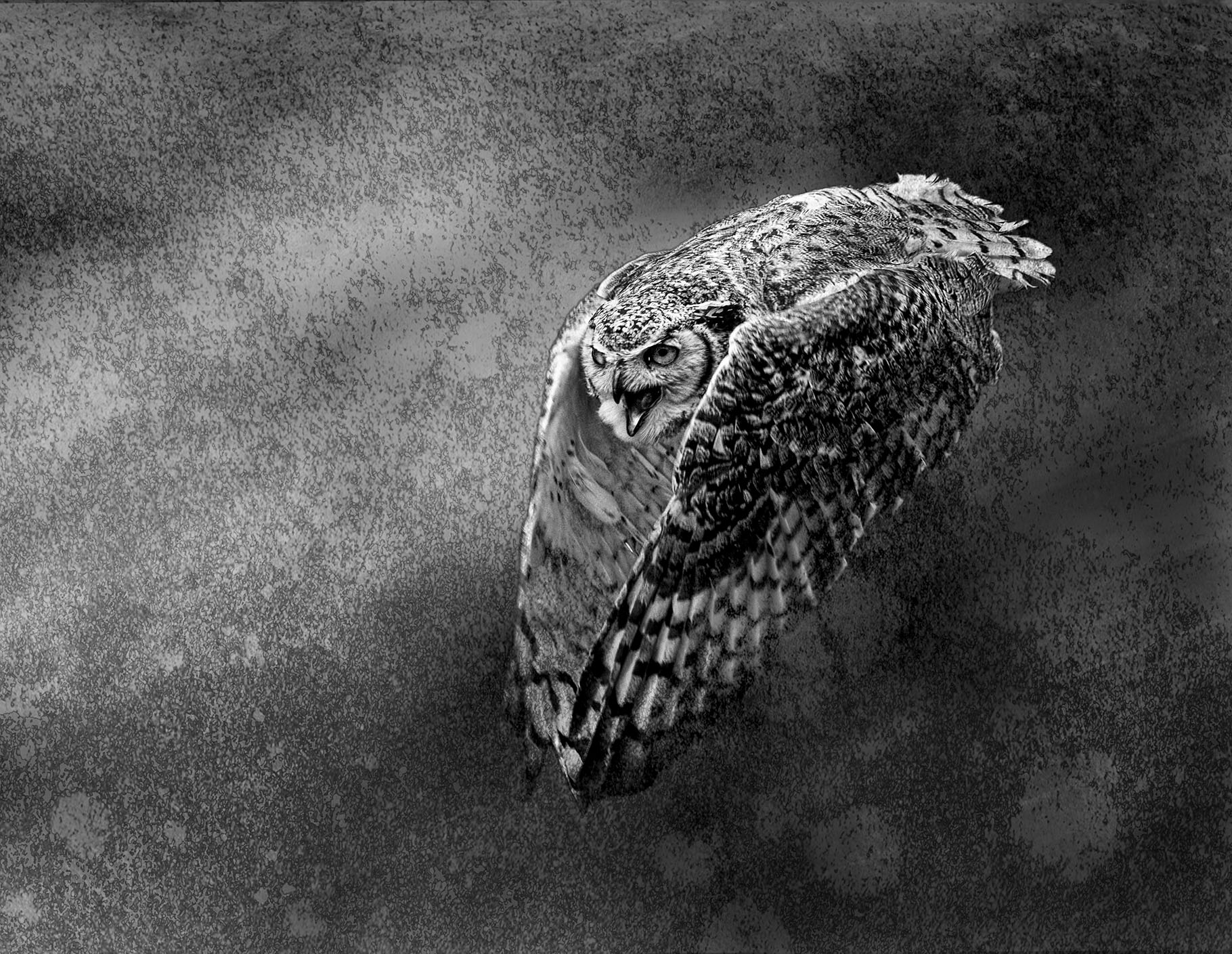
Comment |
Dave, Nicely done. The tones in the B&W are good and everything leads to the brightest white and contrast of the open beak. There is a great argument of using a prime for wildlife just because of the deliciously soft bokeh. Love it as is no suggestions |
Jul 8th |
| 39 |
Jul 23 |
Reply |
Fran I agree with you 100% thanks for the suggestions. |
Jul 8th |
| 39 |
Jul 23 |
Reply |
David thanks for the feedback - I did a crop - see my answer to Fran. what do you think? |
Jul 8th |
| 39 |
Jul 23 |
Reply |
Fran thanks for the input. Here is an amended version - I cropped from top, bottom and left and added that blur to the background. It definitely helps to separate the owl from the background. |
Jul 8th |
 |
8 comments - 7 replies for Group 39
|
| 80 |
Jul 23 |
Reply |
Doug the app(s) allow me to cut out the background and different elements and then rearrange them to suit my composition
|
Jul 27th |
| 80 |
Jul 23 |
Comment |
Nice job Doug in transforming this into a monochromatic and harmonious image. Sharp where it needs to be and the softening of the edges gives a lovely soft impression. |
Jul 27th |
| 80 |
Jul 23 |
Reply |
Kamal thanks for taking the time, even if you think you are a bit late. |
Jul 27th |
| 80 |
Jul 23 |
Reply |
Hi Nadia. Thank you so much
|
Jul 27th |
| 80 |
Jul 23 |
Comment |
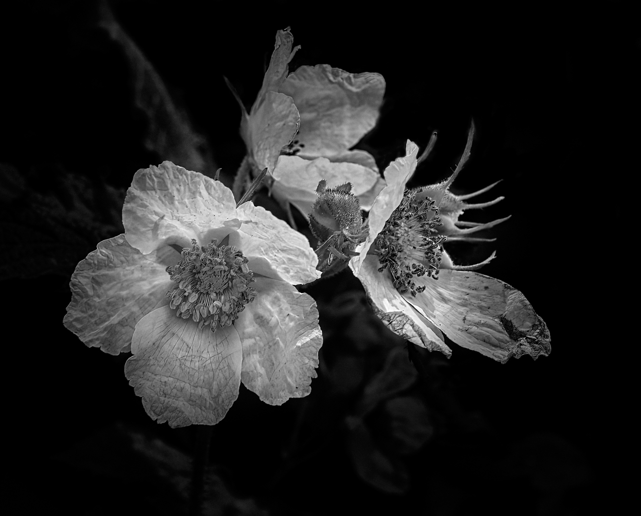
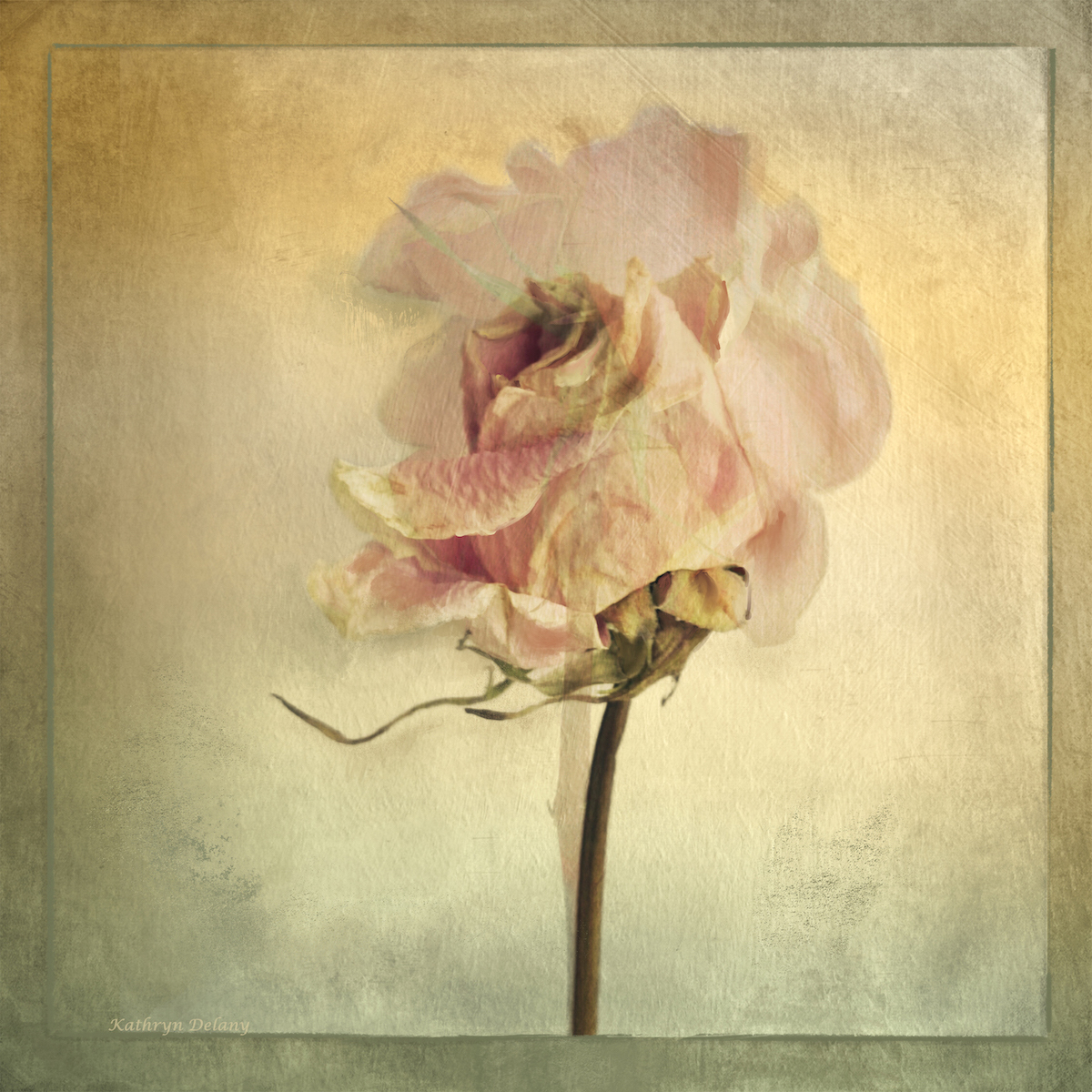
Jacob well done on taking this image and giving it a strong name mpactvwith the black background. Adding saturation is a good touch. A touch of the healing brush on the bottom petal could take it a step further as would brush brightening the flowers center |
Jul 19th |
| 80 |
Jul 23 |
Comment |
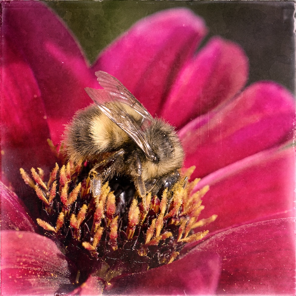
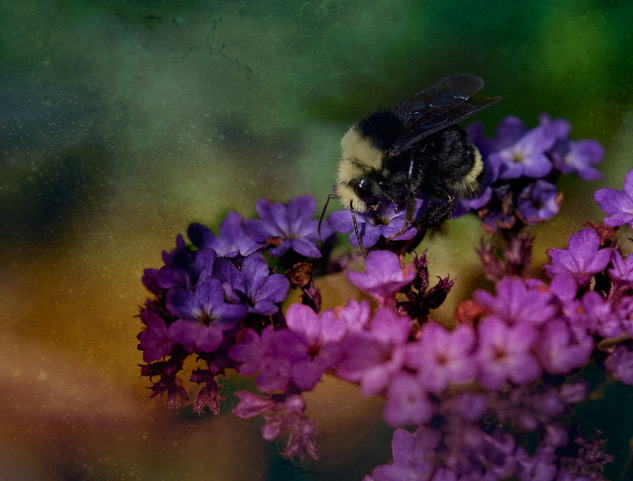
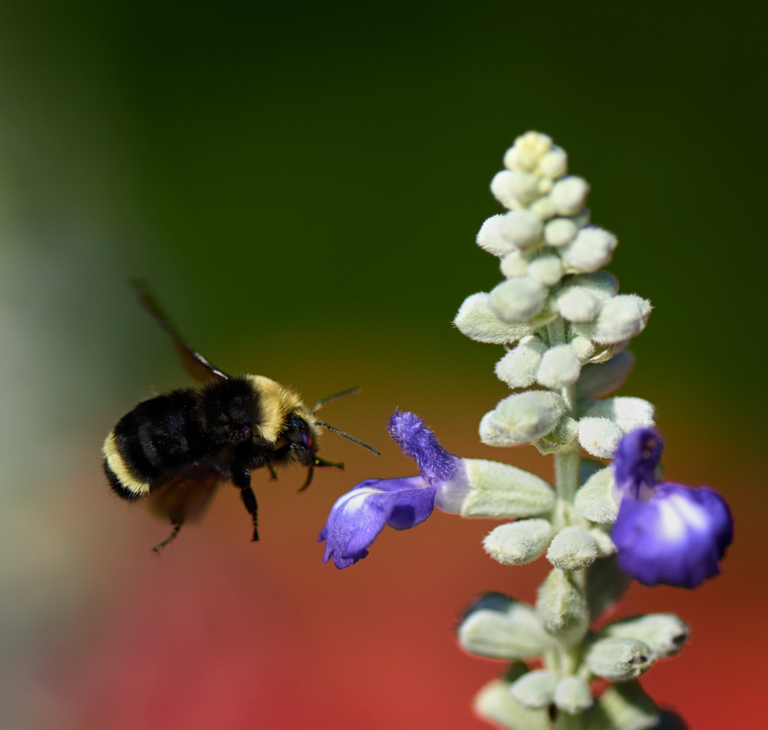
Kamal lovely shot and the red against the green is striking. I agree the bee is a bit soft and since it is part of the story it needs to be sharp. Try Topaz sharpen on just the bee. The 2 seed heads add to the list mage impact too. |
Jul 19th |
| 80 |
Jul 23 |
Comment |
Kamal lovely shot and the red against the green is striking. I agree the bee is a bit soft and since it is part of the story it needs to be sharp. Try Topaz sharpen on just the bee. The 2 seed heads add to the list mage impact too. |
Jul 19th |
| 80 |
Jul 23 |
Reply |
Rich thanks for your kind feedback. I appreciate all the input |
Jul 19th |
| 80 |
Jul 23 |
Reply |
Thanks so much Jacob |
Jul 19th |
| 80 |
Jul 23 |
Reply |
Thank you |
Jul 19th |
| 80 |
Jul 23 |
Comment |
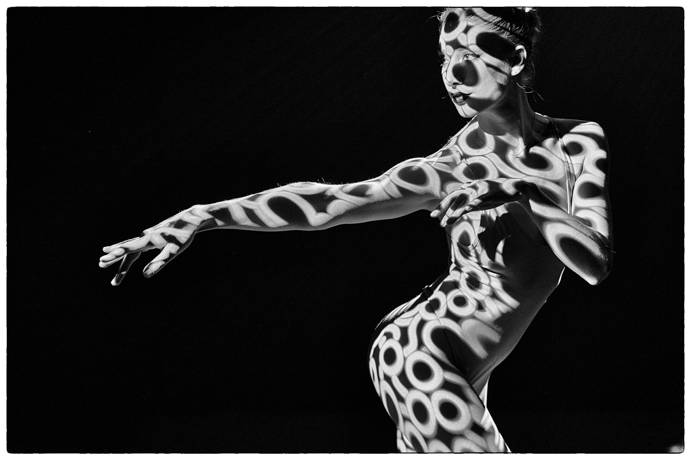
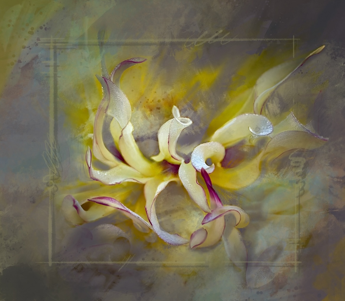
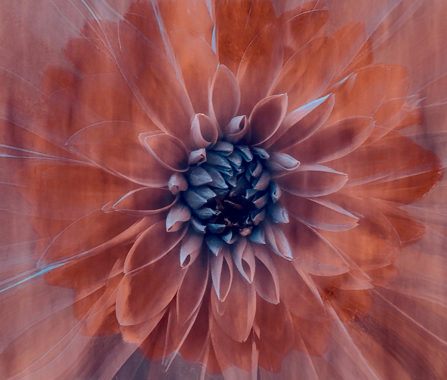
Bob this image is all about fun and experimenting and the lyrical result is just fine. It has a feel of long exposure and car lights in the night. Very organic.
|
Jul 8th |
5 comments - 6 replies for Group 80
|
13 comments - 13 replies Total
|