|
| Group |
Round |
C/R |
Comment |
Date |
Image |
| 39 |
Jun 23 |
Reply |
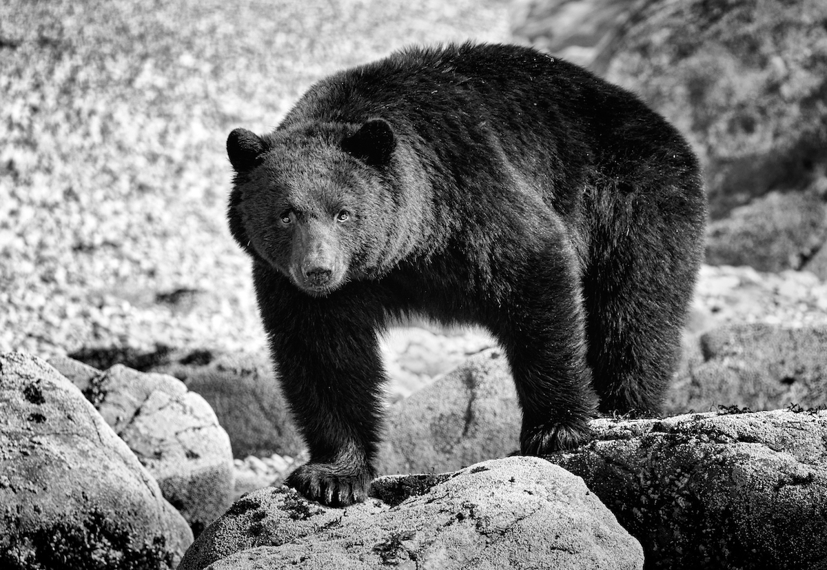
Hello Michael thanks for dropping by and leaving a comment. I appreciate your input. The Q2 is an amazing camera and the details that are possible make it a go to camera all the time. It's great for travel and street, and the built in macro functionality is stunning. The nice thing about the Q3 is the swivel screen.
I do my black and white conversion most often using NIK CEP Pro as I find it allows for more flexibility than Silver EFEX. Try it sometime you will be surprised. I will remember to add a white stroke moving forward. it's something that has been low on my radar til now.
|
Jun 26th |
| 39 |
Jun 23 |
Reply |
Hello Michael thanks for dropping by and leaving a comment. I appreciate your input. The Q2 is an amazing camera and the details that are possible make it a go to camera all the time. It's great for travel and street, and the built in macro functionality is stunning. The nice thing about the Q3 is the swivel screen.
I do my black and white conversion most often using NIK CEP Pro as I find it allows for more flexibility than Silver EFEX. Try it sometime you will be surprised. I will remember to add a white stroke moving forward. it's something that has been low on my radar til now.
|
Jun 23rd |
| 39 |
Jun 23 |
Reply |
Thanks Fran, I also follow Kathleen. Good tip I will try it. |
Jun 16th |
| 39 |
Jun 23 |
Reply |
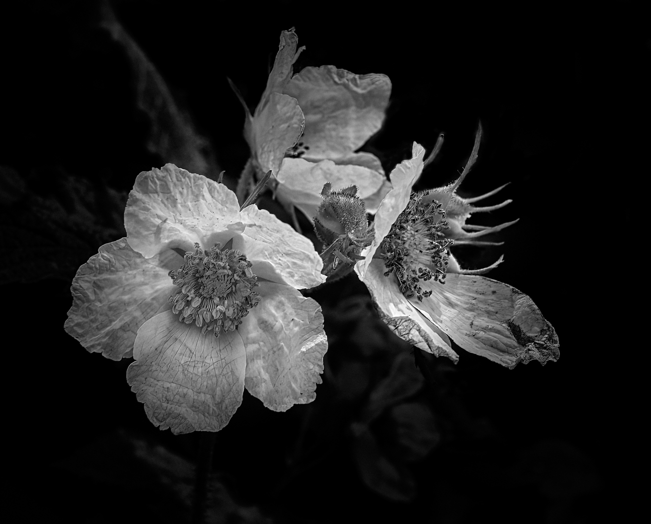
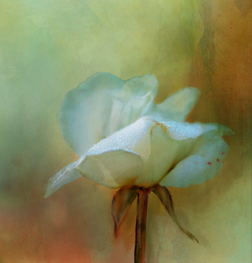
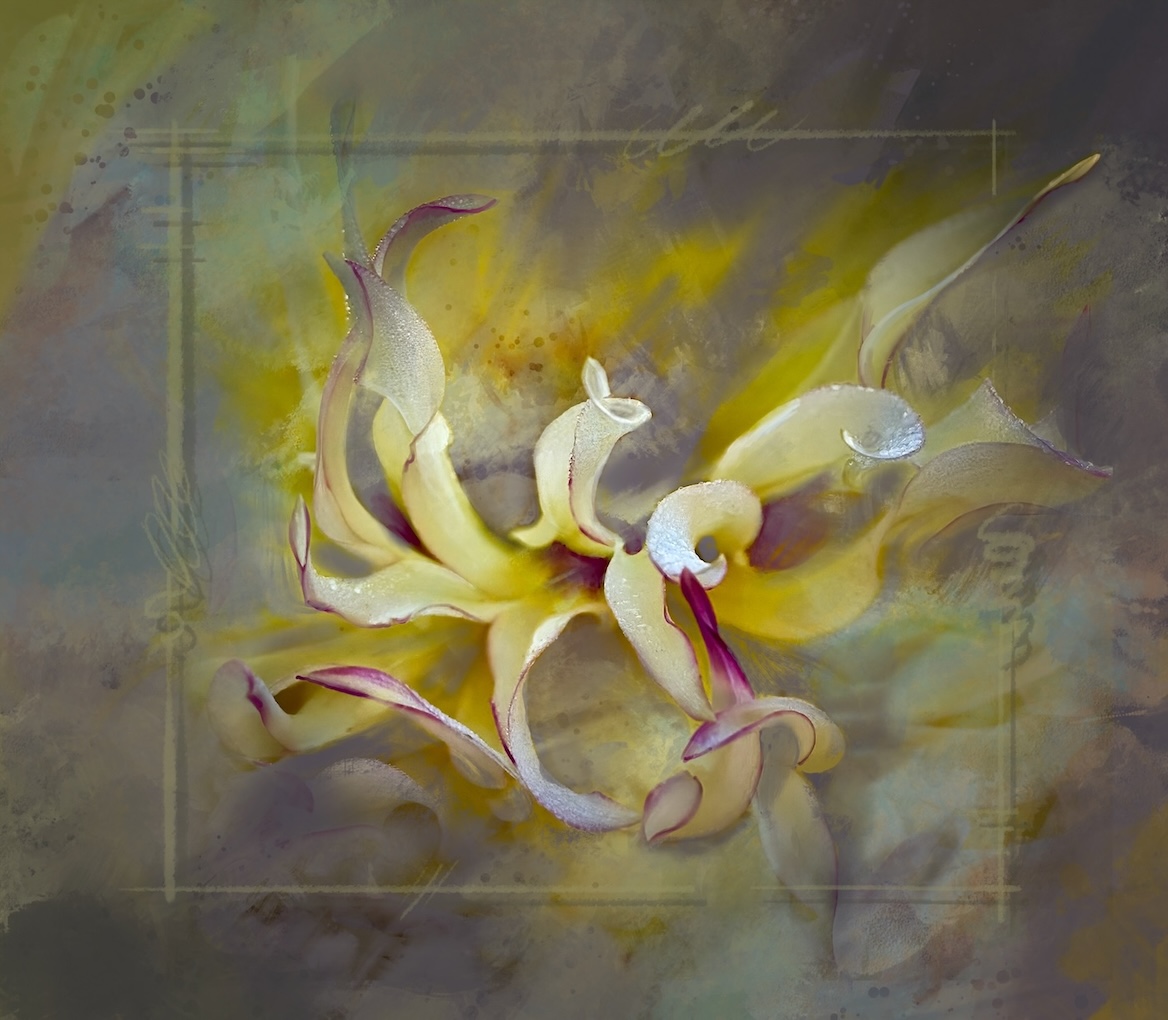
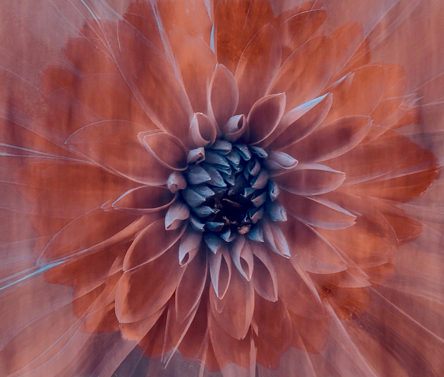
Fran thanks for the comments- I debated about that upper leaf and I think you are right. I will take it out. I can remove the mask I put over the upper flower to darken it! When you talk about the dark spot, is that the dead part toward to end of the petal? I think it is because looking at this its a black hole! |
Jun 16th |
| 39 |
Jun 23 |
Reply |
Thanks Vincent! I am glad I am not the only forgetful one ðŸ˜�¬ |
Jun 16th |
| 39 |
Jun 23 |
Comment |
Ken, personally I think this works better in colour, as the warmth of the light gold on the spoon adds interest. I agree with Paul's input and would like to see the base cleaned up and really really clean and reflective that would help. Overall the tones are very flat though that is probably due to the nature of the metal which looks to be pewter, would rubbing the metal help give definition. Please give it another shot and repost. |
Jun 14th |
| 39 |
Jun 23 |
Comment |
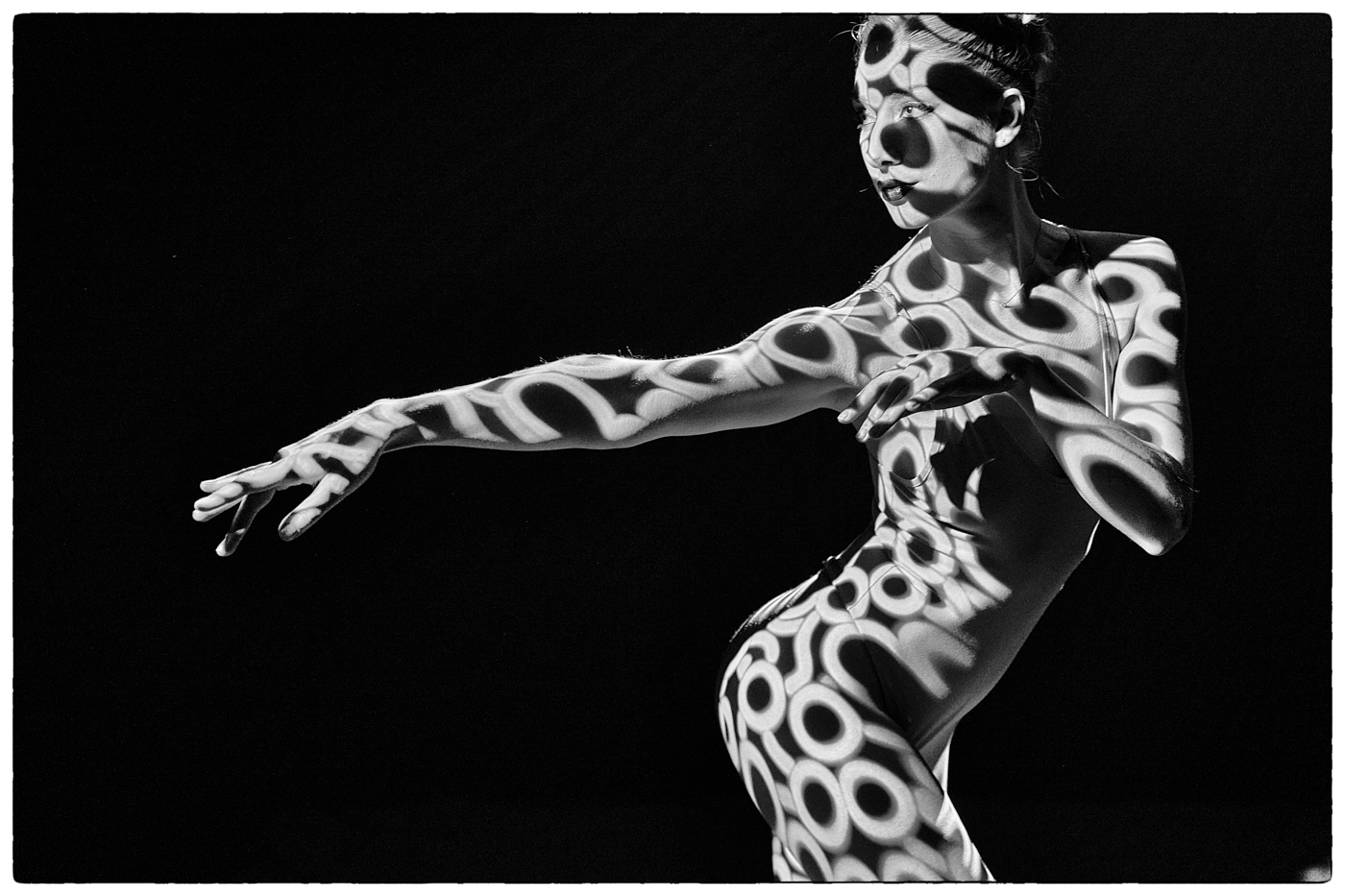
Vincent I like your dance images and this conversion is nicely done. The expression on the central figure's face makes her look very pained and makes the viewer try to make up a story so that is a good thing. The tonal values are well done. Nice diagonals created with the legs and arms. |
Jun 14th |
| 39 |
Jun 23 |
Comment |
Paul great story telling with this composite. The monk while having an almost spooky expression is a bit too disconnected from the background. While the back ground has a flat tonal values the lights and darks on the monk don't match the feel of the back ground. A lot more dodge and burn could take place on the monk. The clouds are well defined and tell a great story, so it comes down to the handling of the church and church yard and the values there. The three elements need to be pulled together - keep at it as it is a worthy composition |
Jun 14th |
| 39 |
Jun 23 |
Comment |
Nice work on the composite its very well done. There is a bit too much detail in the clouds for a long exposure of the falls. Surely there would be a tiny bit of streaking of the clouds given how many there are? I have not done much long exposure, then mostly on my iPhone so I may be wrong with that thought. Black and white points are good and so are the tonal values. Overall a nice image though |
Jun 14th |
| 39 |
Jun 23 |
Comment |
Fran, great job with the composite. It is great you had clouds from the same location from a different shoot with similar light. Well done. I like the fact you kept the original clouds in as well. If you lifted the tones slightly on the lighthouse or made the light and the cupola a bit brighter is may make a nice separation. Good composition. |
Jun 14th |
| 39 |
Jun 23 |
Comment |
David, nice catch! I agree with the foregoing comments and the colour version definitely defines the head better. I am think if you burned the water back from the top down to about mid way - tone it down if it would pop the bird more. Right now it's almost the brightest aspect of the image. |
Jun 14th |
| 39 |
Jun 23 |
Reply |
Paul thanks for the feedback. Looking at what you have done I think a tighter crop would help. |
Jun 14th |
| 39 |
Jun 23 |
Reply |
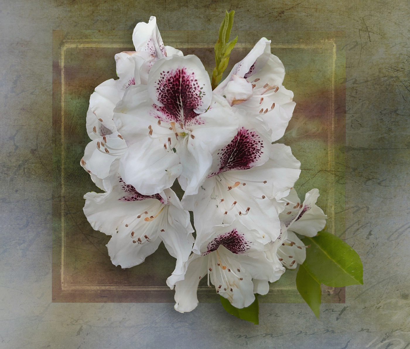
Thanks for the feed back Jerry. I will try your idea on the top flower - I in fact darkened it somewhat in my edit. I will also try to remember to add a small border. Talking of balance I wonder if I add the bottom flower back in. |
Jun 14th |
6 comments - 7 replies for Group 39
|
| 80 |
Jun 23 |
Reply |
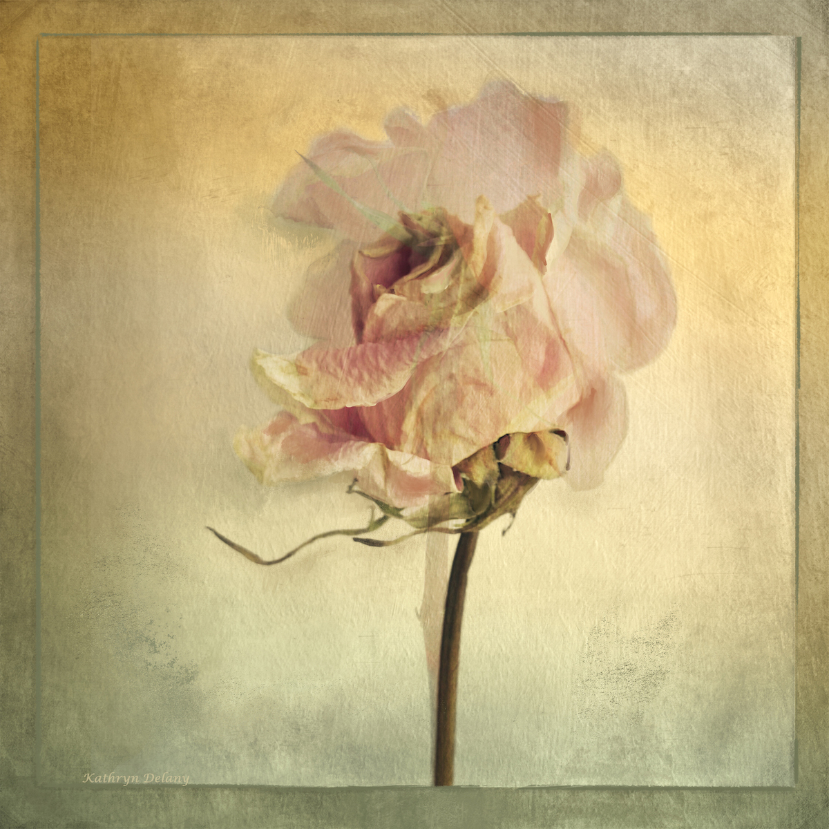
Barbara - thank you for swinging by and leaving such a lovely comment. I appreciate it. I love dried flowers and flowers that are past their prime. |
Jun 18th |
| 80 |
Jun 23 |
Reply |
Bob very true on the compositional value of your current crop. You are right. |
Jun 15th |
| 80 |
Jun 23 |
Reply |
Kamal, I like your edits overall, and I do not think the closer crop works as I suggested. The one you posted last in response to Bob and Jacob is more balanced. Toning down the lily pads is an enormous step. Good job. |
Jun 15th |
| 80 |
Jun 23 |
Reply |
Rich - we get really invested in our work, so having other eyes on it is a very helpful exercise! |
Jun 14th |
| 80 |
Jun 23 |
Comment |
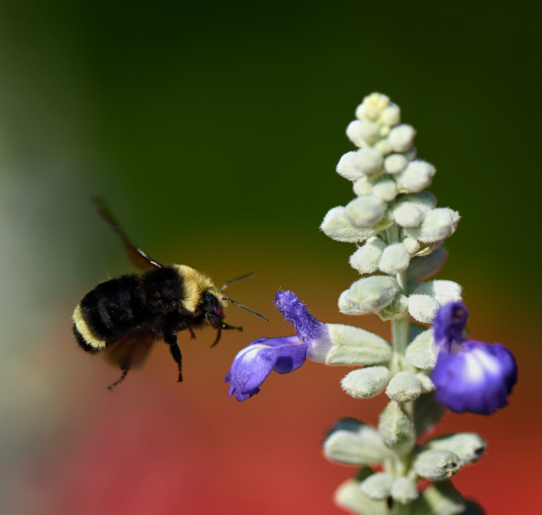
Rich a lovely composition of the flower hanging down on the diagonal. The soft rich blue in the background is great. Overall the feel of the flowers and leaves is oversaturated to my eye. The tonal values have become very flat. By increasing the saturation and the overall brightness of the plant there is obvious purple fringing around the edges, which may be part of your artistic interpretation. The colour of the light used to expose the plant seems really cool and harsh - it's hard to tell from the original as the image is so small. Perhaps a more diffused light would help soften some of the brights that got over blown when you did your edits. I hope this helps. Though at the end of the day your interpretation is what counts. |
Jun 14th |
| 80 |
Jun 23 |
Comment |
The composition is nice with the repeating round pattern of the leaves. Consider darkening the repeating bright white spots at the centre of the leaf pads though, as they make the eye jump to them. Also crop in from the right to get rid of the busy white pieces in the middle there. A tighter crop overall may help. The red of the lily seems to have lost its definition as Jacob mentions some dodge and burn would help that - with some contrast to help define the flower. |
Jun 14th |
| 80 |
Jun 23 |
Comment |
Doug good effort with the reflections and ripples it works well. I would like to see all of the flower at the top though. Great colours |
Jun 14th |
| 80 |
Jun 23 |
Comment |
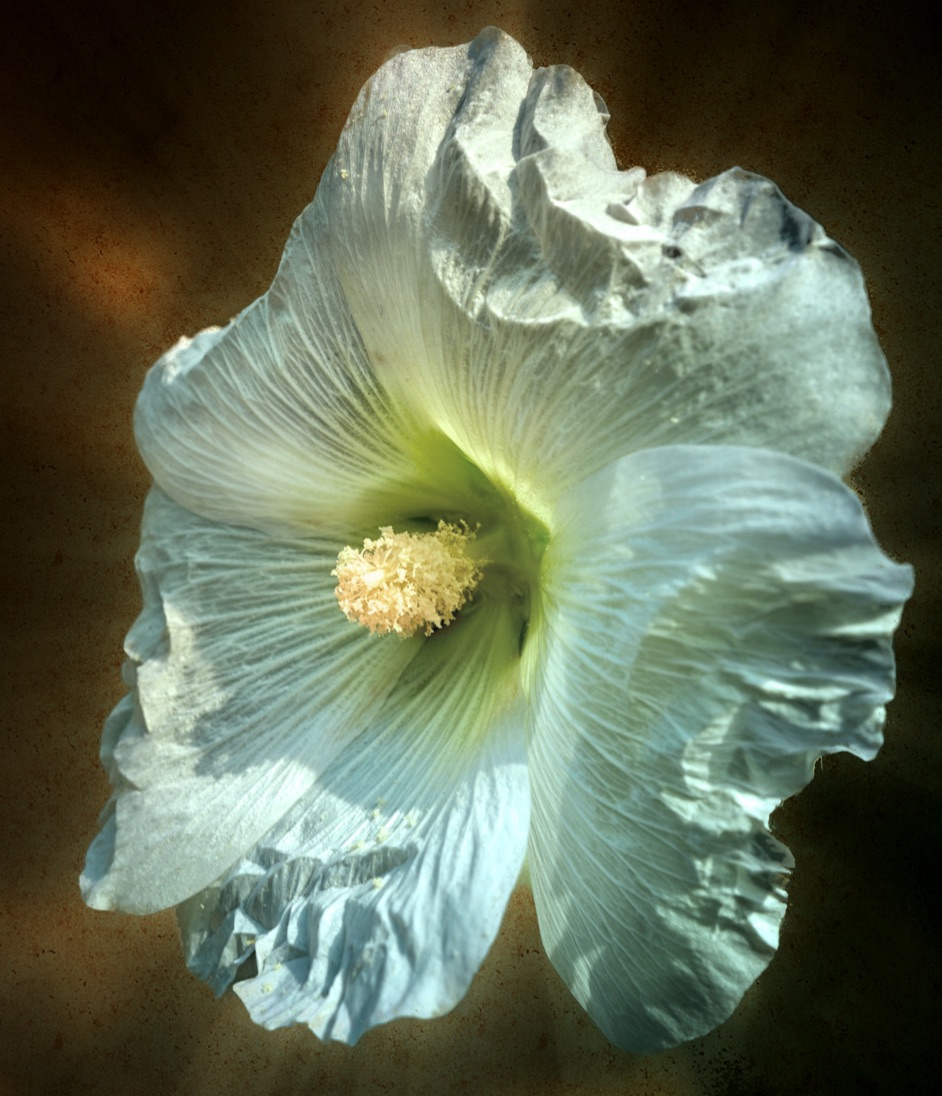
Nadia nice effects and great textures. It has a feeling of a classic painting. I would like to see the bottom flower moved up just a smidge so that it is more connected to the main flower. addressing the comments that no one sees the clouds is probably because as you mention you blurred them to add a very subtle extra layer of texture. They are there and to my eye look more like faint bokeh light. For the top flower it feels a bit 'cut' out, aka too many hard edges, try softening some of the back petals and edges to soften some edges, or run some of textures over some of the petals - these are all just ideas and suggestions as I look at it. Its a very pleasing image overall. |
Jun 14th |
| 80 |
Jun 23 |
Comment |
Bob as always I like how you use the presets to help create more impressionistic results. cropping down from the top and in from the right may help pull the focal point to the single yellow flower on the right. And perhaps a slight darkening vignette? This has a sparkle and lightness to it - nice work. |
Jun 14th |
| 80 |
Jun 23 |
Comment |
Jacob very nice capture. I love the oranges and yellows and you have done a good job on softening the background and creating softer bokeh. You may consider a slight darkening vignette around the edges to further enhance the composition. Good job. |
Jun 14th |
| 80 |
Jun 23 |
Reply |
Jacob Hi, and thank you for your feedback. Keeping it soft is the magic sauce. |
Jun 14th |
| 80 |
Jun 23 |
Reply |
Thanks very much Bob. I am always amazed at what is possible using mobile editing apps.
|
Jun 14th |
6 comments - 6 replies for Group 80
|
12 comments - 13 replies Total
|