|
| Group |
Round |
C/R |
Comment |
Date |
Image |
| 39 |
May 23 |
Reply |
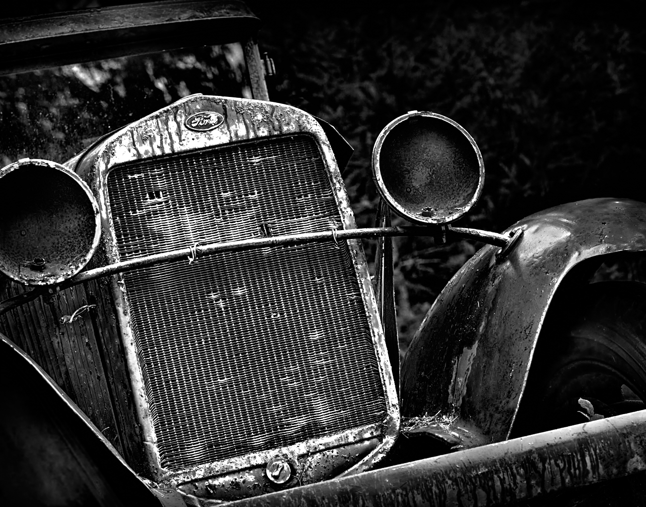
Fran - hi, yes I do seem to like this subject ðŸ¤â€ś. I hear what everyone is saying about including more of the car. So I will go back and retake it and see if I can do a similar treatment. Thanks for commenting |
May 17th |
| 39 |
May 23 |
Reply |
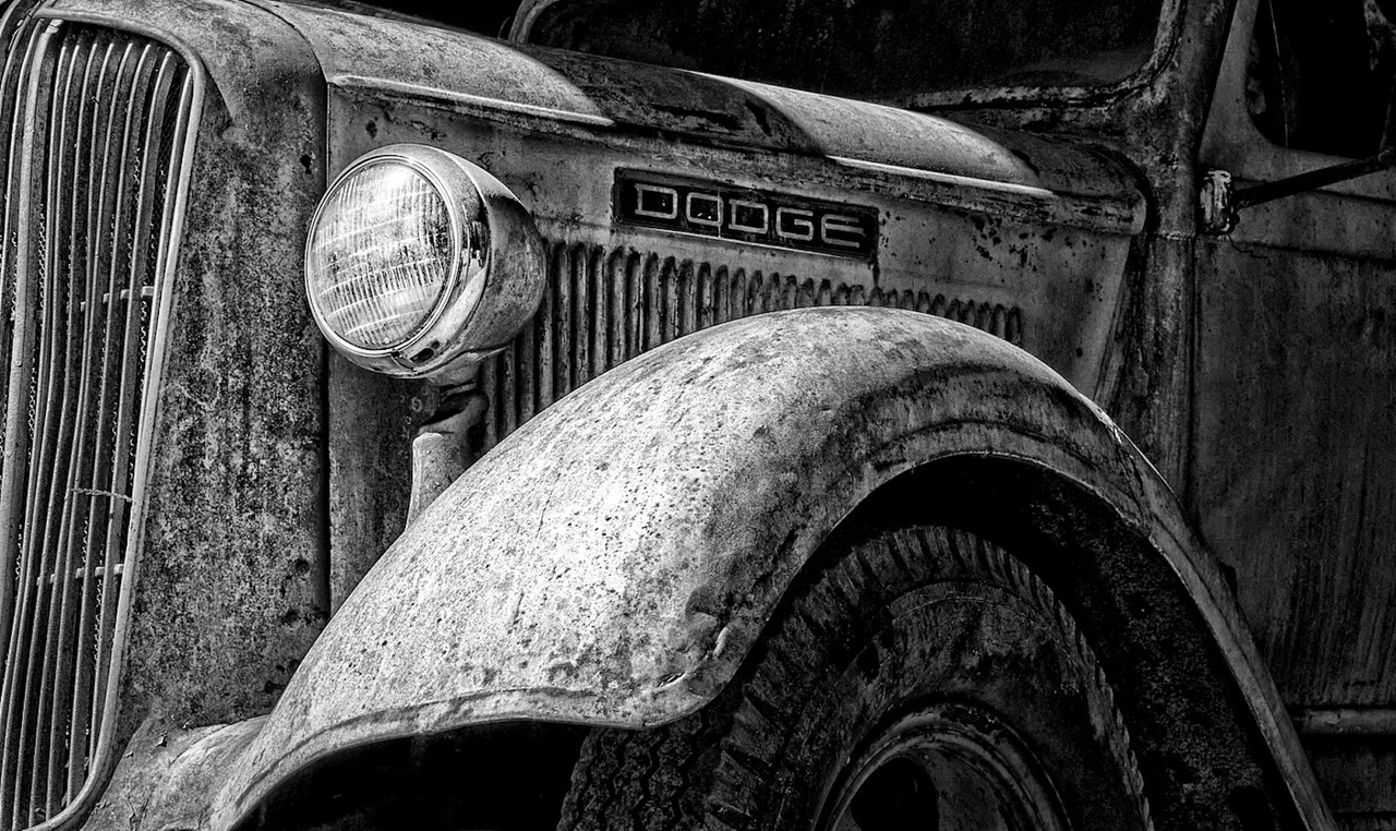
Yes it would help out here to have a white border Jerry, I always forget. I did a lot to the image conversion. In Capture One I cloned out A big old white tree trunk that was behind the car on the right as you look at it. I got rid of various distracting bright spots etc. I added a darkening gradient at the top of the frame, added clarity to the ford logo, and some basic global adjustments. I did the BnW conversion in NIK CEP5. I used the point control for detail extraction on the headlamps, grill, the tire etc. Added Tonal contrast high pass and used darken/lighten centre module. I also added a some grain (127%) and did 9% if Clear View (clarity). Then back to Capture One where I did a lot more dodge and burn and added selective clarity etc until I got this. This got a 1st place award at our club competition with a 20 out of 20 score. So I guess I have an affinity for these old vehicles. The more texture and decay the better.
|
May 17th |
| 39 |
May 23 |
Reply |
Vincent, too true, sometimes I forget to check things. Thank you for your comments. I do like the angle being off kilter I feel it fits with story of abandoned items and decay. The car is up on wood blocks and sagging. I guess I made the 'art' choice of the crop permanent as I took it in portrait mode and failed to level it in camera! Since the location is close I can go back and recompose. I have a version head on which I find boring. I always forget to add a small white border for this platform. |
May 17th |
| 39 |
May 23 |
Comment |
Dave lovely shot and you caught the light and atmosphere beautifully. The conversion is well done though the tonal values could be tweaked with some more dodge and burn to pop the snow on the island would help pull the eye in to the focal point of the story. Black and white definitely gives more drama and impact to the scene. The dark black rock(?) at the bottom left could be removed or cropped out. Nice work. |
May 17th |
| 39 |
May 23 |
Comment |
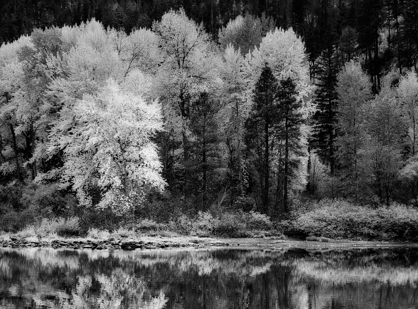
Fran, lovely capture. The light and colours in the original is great - that time of day of course. The conversion works, though if there is detail in the rock stack it would be nice to pull up the shadows for a bit of detail. The lines in the sand and the shadows serve as wonderful leading lines. Overall the rock formations feel too dark. the original crop works better for the composition as it gives room for the stack to balance (just an opinion). The grasses on the left feel too bright and the effect there could be toned down a touch. There is a very large spot in both images on the right line of thirds toward the horizon. It can be easily cloned out. It is a beautiful capture and personally I prefer the colour version. |
May 17th |
| 39 |
May 23 |
Comment |
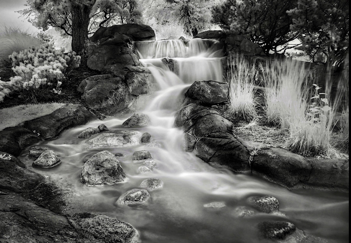
Jerry good find, it definitely feels like something out of set design and fairy tale. Smoothing out the water like you did adds to that impression. The image feels a bit dark overall particularly the rocks. There is disconnect to the eye due to the haze over the top left background that would suggest mist or fog, however, it is not repeated on any other elements in the distance if that were true. the grasses in the middle foreground could be removed or burned back since the eye keeps returning there. Same for the bit of grass in the middle left row of the rocks. Bringing up the shadows of the rocks maybe would pull things together tonally. Try a crop from the bottom up and in from the left - I did a fast example to show what is possible. This whole image feels as though there is no straight horizon though - the flower beds are both on a curve - left and right. Particularly on the right the angle is pretty dramatic. The top of the falls is not straight, so overall a little unsettling to the viewers eye. It feels like a fisheye lens was used. Hope this is helpful |
May 17th |
 |
| 39 |
May 23 |
Comment |
Vincent, I love square formats as a compositional tool. So this is a good start. That said I think this image is also about symmetry so a vertical composition cutting out the blocky trees on the left and right edges would focus the attention on the subject of statue, reflections and sky. Try bringing up the reflections in the pond more. It becomes a question of your story where do you want the viewer to focus. Right now the biggest area of contrast are the two blocky topiaries either side of the statue. The clouds could be more dramatic, though there is already a large amount of noise added from your processing of pulling the texture out of the somewhat blown clouds, so it may not be possible. The statue does seem a bit soft so maybe darken it more so it it more silhouetted? Great eye in seeing this composition. |
May 17th |
| 39 |
May 23 |
Comment |
Ken nice capture and the conversion is a good choice. I do like how you handled the foreground cliff by darkening it, although that puts the focus on the cliff tops vs the clouds. A crop up from the bottom would help shift the composition to being more about the sky/clouds and Vincent's suggestion to shift the crop in from the right so that the clouds provide a diagonal line would perhaps strengthen the image over all. What happens if you shift the sky to a darker tone, would that provide more drama? |
May 17th |
5 comments - 3 replies for Group 39
|
| 80 |
May 23 |
Comment |
Nadia thanks. I will be deleting it as well, because the original is definitely a sub par image. Sometimes though I find when I play like this with an image that is not the sharpest or best, it allows me to be more free with trying out different stuff, and see what is possible with the tools I have. Cheers |
May 20th |
| 80 |
May 23 |
Reply |
Rich thank you so very much😀. Procreate uses non-destructive layers, you can mask, and use blend modes and a lot of tools you would be familiar with from Photoshop. Just much easier to paint in Procreate, particularly if you have the Apple Pencil. Have fun experimenting. |
May 18th |
| 80 |
May 23 |
Comment |
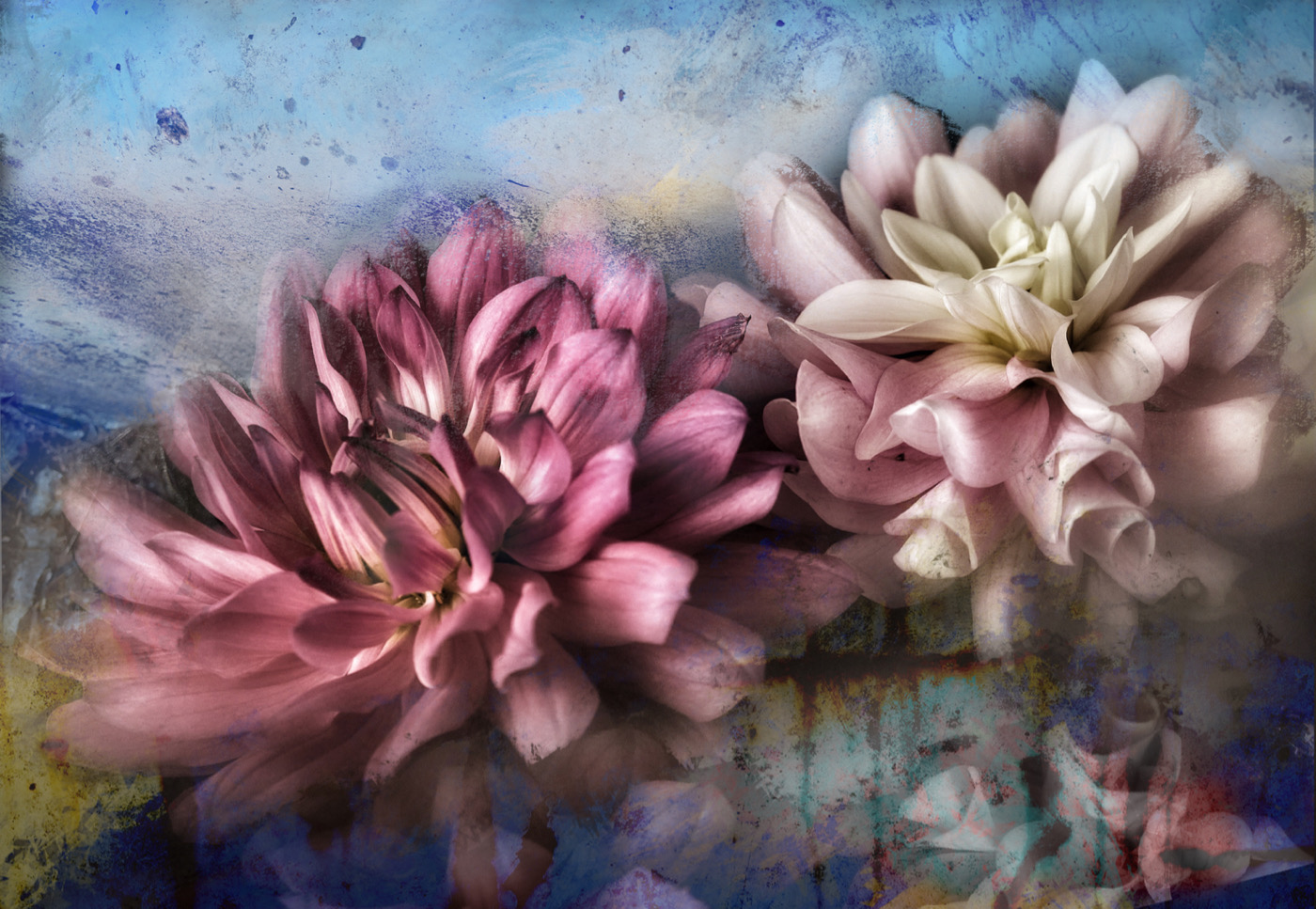
Nadia, as usual lovely result with your edits. The colours of the lily are luscious and using background colours to harmonize with the flower is an excellent choice. Flipping the lilly and isolating the lily and one leaf simplifies the composition and makes it strong. Beautiful work. |
May 16th |
| 80 |
May 23 |
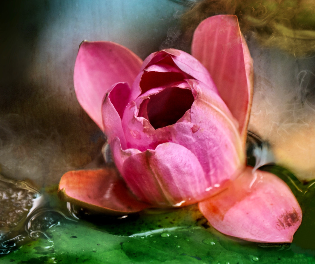
Comment |
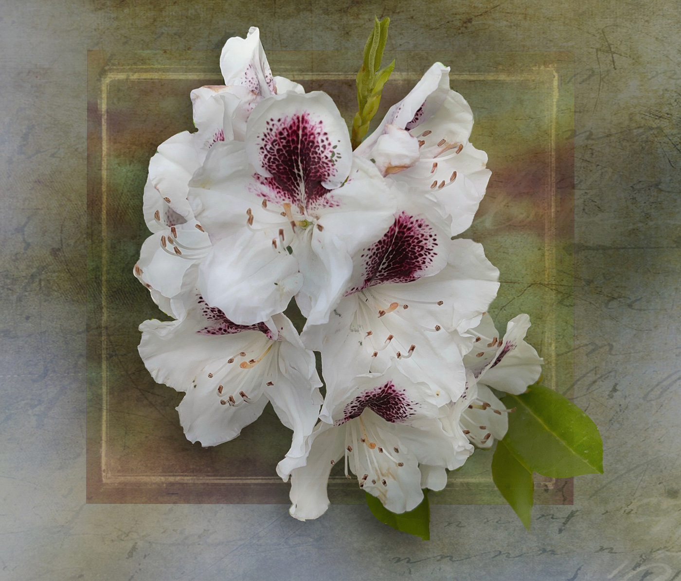
Doug this is lovely. I am familiar with Kathleen's work and am doing an online workshop where she was one of the presenters, so am familiar with her and love her work as well.
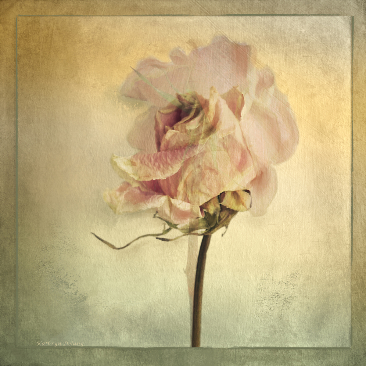
The shape of the petals and the suggested movement and motion is wonderful. You have handled the light, tones and colours beautifully. The diagonal of the stem helps balance the composition as well. Just a well done image. Nothing more to add. |
May 16th |
| 80 |
May 23 |
Comment |
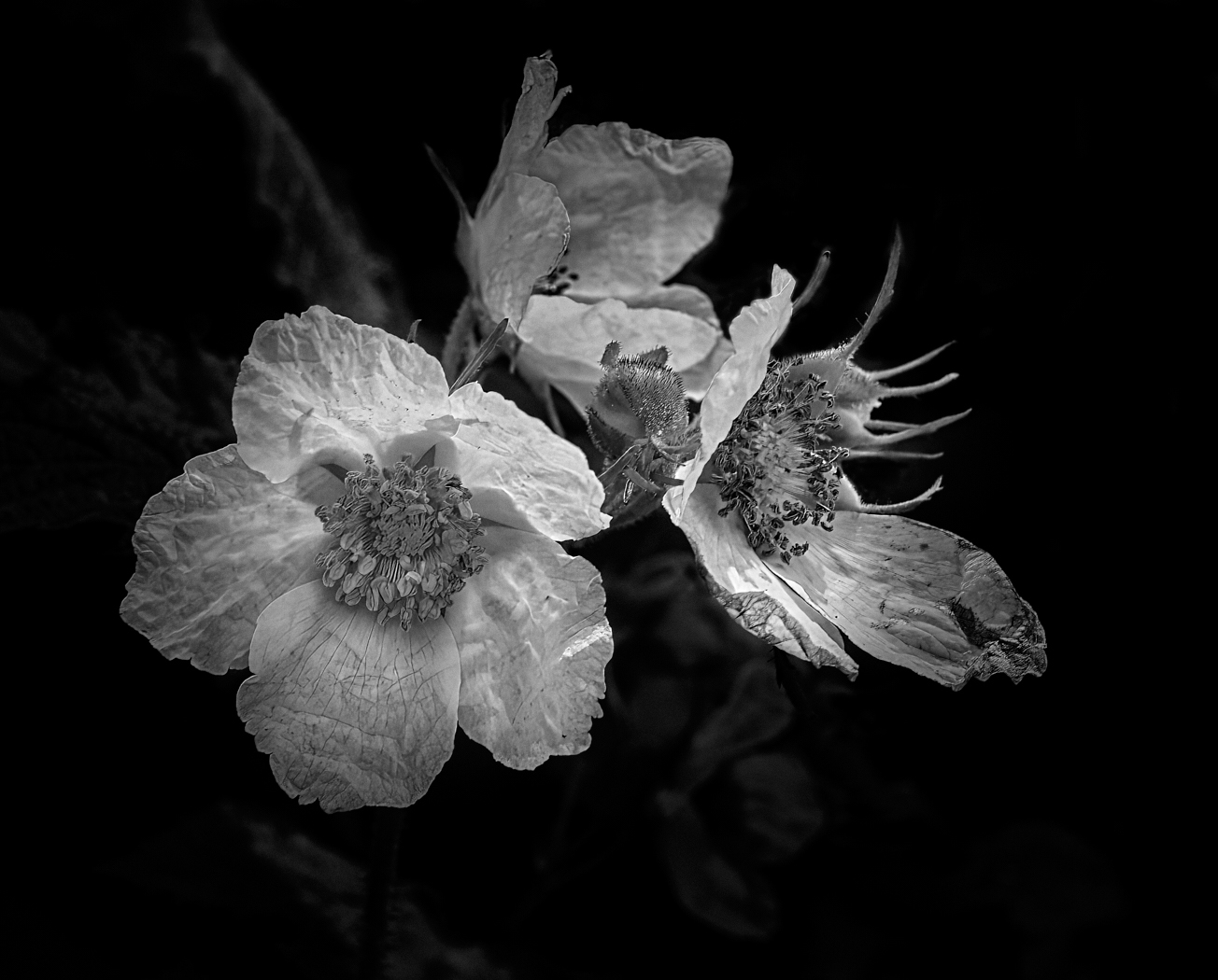
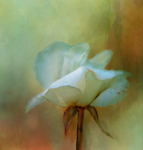
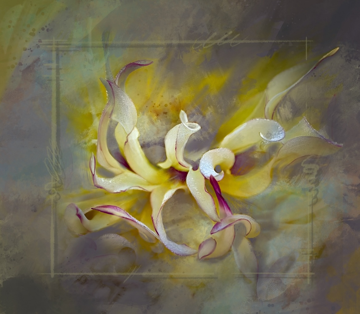
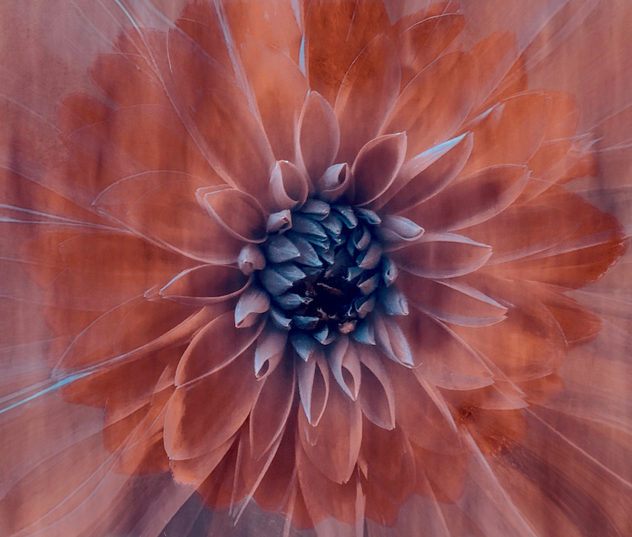
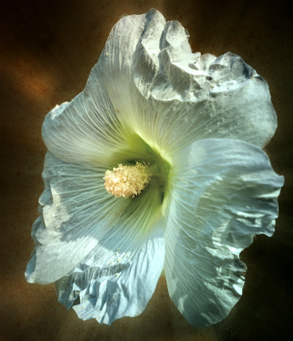
Kamal, lovely conversion. The shape of the petals and feel of airiness and that it is dancing in the wind is lovely. Perhaps small darkening adjustment to the tone of the stamens against the white petals would make them really pop. The texture really shows up on the petals and is lovely. The bottom right leaf and bud are lovely however as mentioned perhaps a bit distracting Try darkening them so they barely show up or simply remove them. The issue is the shape and the location, so perhaps removing the distraction would be better. Check your white point, as the whites seems a bit dull, perhaps selective brightening where the light naturally falls on the petals. Keeping the colour version against the black background would also be a pleasing image. |
May 16th |
| 80 |
May 23 |
Comment |
Rich this is a fun idea. Popping the colour luminosity works so well, these flowers glow. Using a black background is a good choice to offset that light and colour. I think the composition is a bit off. his seems to be about not only colour but a little bit of symmetry. As such the crop leaves the viewer wondering why you chopped the middle flower off ant the top - which works well in the original to break the solid line of the tops of the petals. Additionally the eye wants to see all of the leaves on both the left and right sides of the composition. If you were to do it again, include all of the elements with room around everything to would allow for more creative cropping. Nice work. |
May 16th |
| 80 |
May 23 |
Comment |
Jacob good job on subduing the background and cropping in for a tighter focus on the flower. If you darken the background just a bit including the stem of the flower it may pop that flower even more. Juicing up the colour of the petals works. I wonder if you brought back the natural glow at the center of the flower (as per the original ) if that would give it a kick. Great job. |
May 16th |
| 80 |
May 23 |
Comment |
Bob a good effort at playing with post editing. I agree with other comments here that it seems mono-tonal and a bit of a vignette might help or some manipulation of mid tones. The pastel colours make for a pleasing overall impact though. Thanks for making me think of other solutions. |
May 16th |
| 80 |
May 23 |
Reply |
Bob - thank you for your support for something outside the box. |
May 16th |
| 80 |
May 23 |
Reply |
Jacob thank you for your comments. I agree the colour combination has a sunny out look😊sometimes its just fun to a bit wild. |
May 16th |
7 comments - 3 replies for Group 80
|
12 comments - 6 replies Total
|