|
| Group |
Round |
C/R |
Comment |
Date |
Image |
| 39 |
Apr 23 |
Comment |
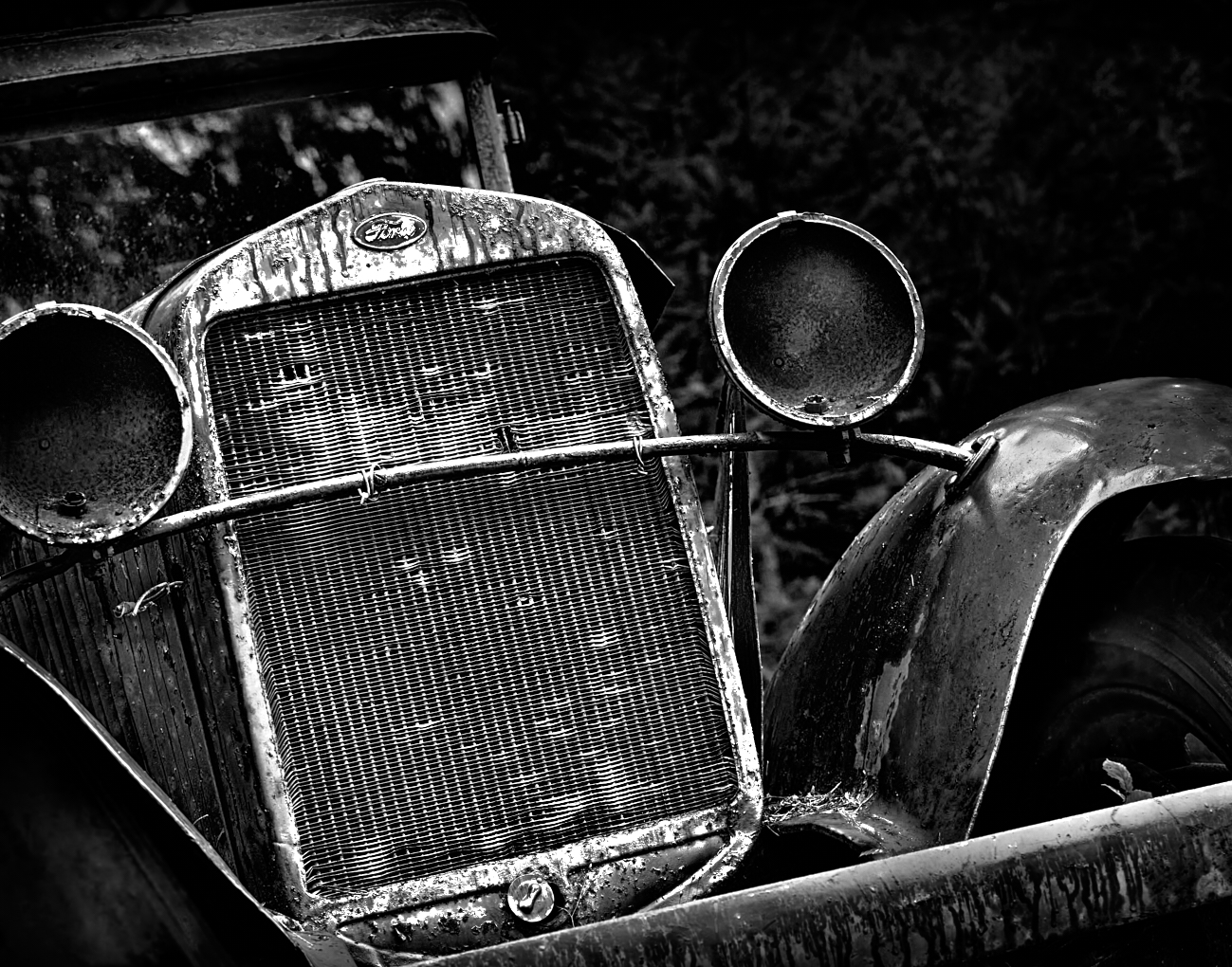
Ken thanks, yes this is about the lines and shapes. I sadly in my space headedness did not get a bigger better shot of this car! I will remember for next time. |
Apr 12th |
| 39 |
Apr 23 |
Comment |
Thanks for the feed back Vincent, I must admit I was not sure about that bottom left corner - should it stay or should it go? |
Apr 11th |
| 39 |
Apr 23 |
Comment |
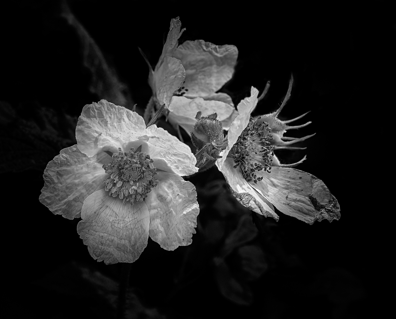
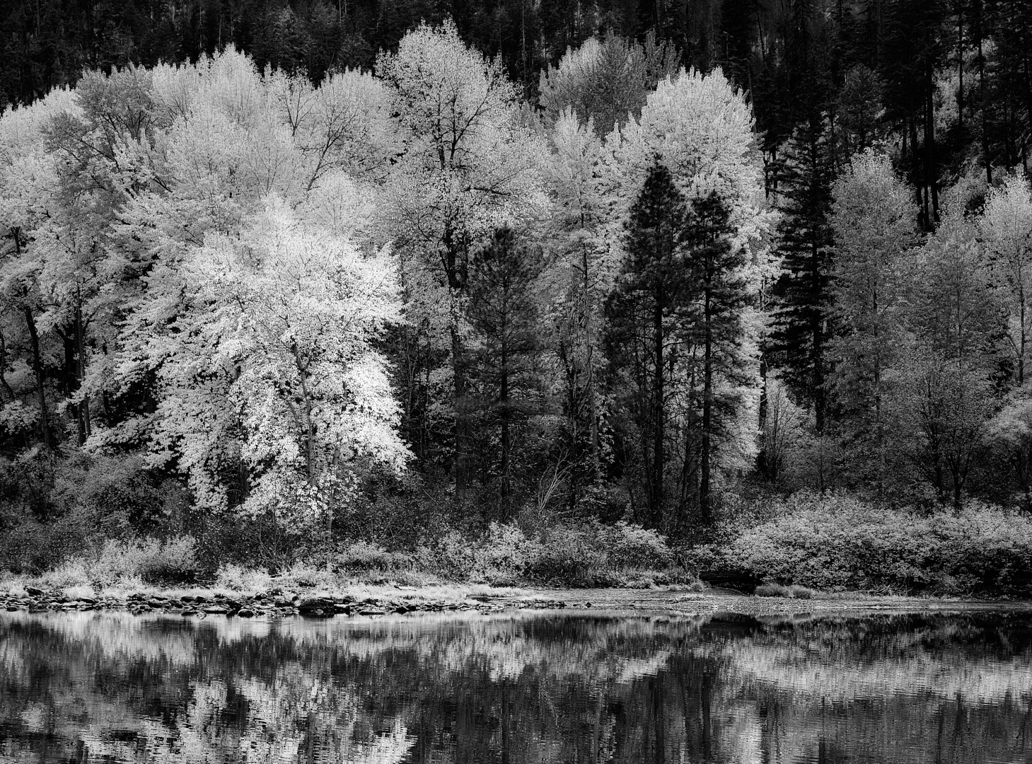
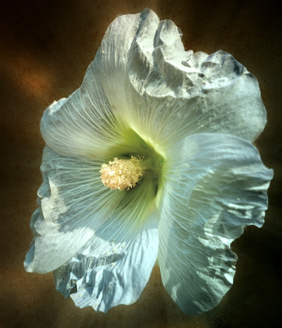
Ken, the black and white conversion turns this into a strong minimalist composition. It feels balanced and I think you may have added some clarity to the flowers which enhances the veins and structure of the flower, which is added interest. The tones are good, as is sharpness. I like this a lot. |
Apr 5th |
| 39 |
Apr 23 |
Comment |
Vincent this is a lovely portrait of the old buildings. The Original 2 with clouds provides more interest whereas the main one here there is a definite halo around the buildings that detract. The tones seem a little flat and perhaps tweaking your black point a touch will help pop things on the building (this goes for both versions of the images). As they stand I am not 100% certain of the light source, I think it's from the right and behind the subject. Would emphasizing some shadowed walls helps give more depth? Determine where you want the main focus to be and then work out from there in your dodging and burning. This has potential to be a strong competitor. |
Apr 5th |
| 39 |
Apr 23 |
Comment |
Paul this is a good composition and reminiscent of story telling from a day gone by. Well done on seeing it and capturing it. The conversion is handled well, and tonality is solid. The whites on the horse draw the eye nicely to the main story and the the supporting element of the odd guy out, speaks volumes! The shadowat bottom right might work better if the edges could be softened? They seem almost too dark and the eye keeps pulling toward them. So just a teeny bit? Lovely Story, well done. |
Apr 5th |
| 39 |
Apr 23 |
Comment |
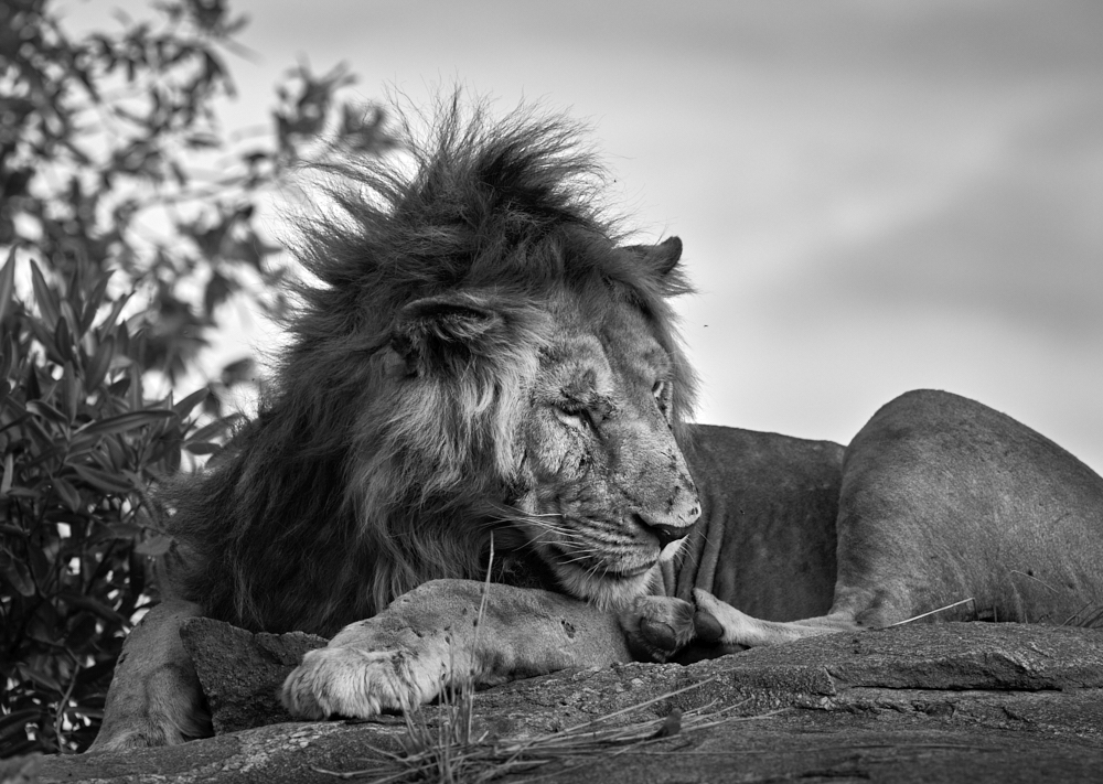
Jerry, what lovely portrait of a majestic cat. I also have the iPhone 14 Pro Max and it's an impressive tool. Good sharpness and depth of field. The tones are good dark through light. The composition is well balanced too. Maybe, this is a small nitpick, if you darkened the light rock wall at the very right edge of the frame it would be less of a distraction and keep the eye focused on the subject? |
Apr 5th |
| 39 |
Apr 23 |
Comment |
Fran, a good portrait and well composed though I do agree that having that frame stop just short behind her is distracting. What if you shot a close up of similar texture and composited it in behind her. A good mid tone, to darker tone behind her would make her more prominent. Love the three quarter pose and the catchlight in her eyes are the sparkles on the cake! Perhaps a slight brightening of the shadows on her face too. The soft background is well handled. Great job. |
Apr 5th |
| 39 |
Apr 23 |
Comment |
David, well done on getting your tones nicely balanced. The directional leading lines of the clouds is well handled as well. I do feel that you could crop up slightly from the bottom, as some of that foreground becomes distracting to the eye and seems unnecessary to the story. It's tiny amount and would give a dimension closer to 16:9. The focal point is nicely lit up too. |
Apr 5th |
| 39 |
Apr 23 |
Reply |
Hi Jerry, you are right, the iPhone is an awesome tool. I did shoot this in RAW - so I got to edit it in Capture One. I nearly blacked out that top left corner but determined it was an interesting addition, glad you do as well. Thanks for your encouragement. I will check out the Blackie app, sound intriguing. |
Apr 5th |
| 39 |
Apr 23 |
Comment |
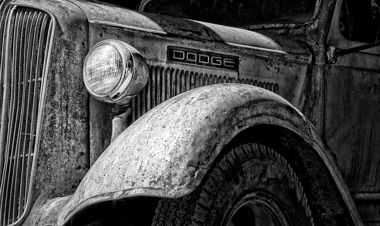
Thanks David. I did a close up of the grill and dont have another photo at a wider angle, my fault for not doing multiples. Yes it would have been a better shot perhaps, I think I was not as experienced in framing a composition back then as now. |
Apr 4th |
| 39 |
Apr 23 |
Comment |
Thanks David. I did a close up of the grill and dont have another photo at a wider angle, my fault for not doing multiples. Yes it would have been a better shot perhaps, I think I was not as experienced in framing a composition back then as now. |
Apr 4th |
10 comments - 1 reply for Group 39
|
| 80 |
Apr 23 |
Reply |
Thank you very much Jacob I appreciate your feed back. |
Apr 15th |
| 80 |
Apr 23 |
Comment |
Nadia, thanks for your thoughtful input. I will try your suggestions. I am normally an advocate of trying to flip an image, and I did not even think of that with this one! |
Apr 15th |
| 80 |
Apr 23 |
Comment |
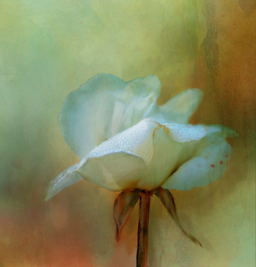
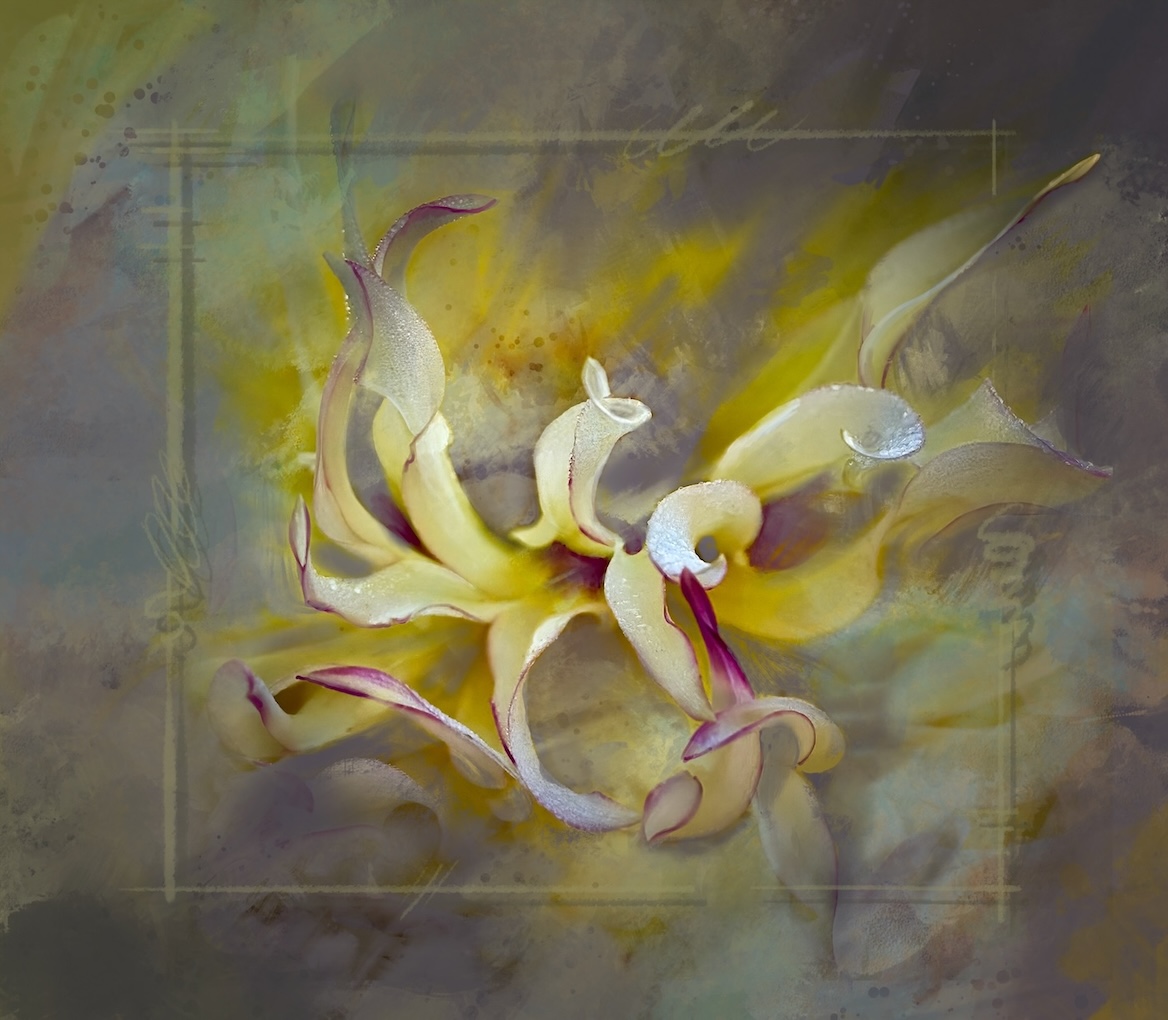
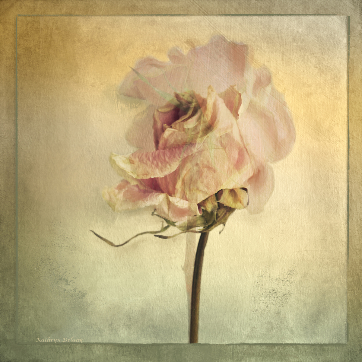
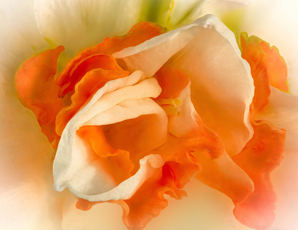
Doug, this is the kind of effect I like in flower photography. The soft glow around the edges is lovely. Your masking has left some strange dark areas and spots all around the image that are distracting. Look on the left side there are some rather large splotchy parts and the masking seems to have overlapped along the petal edges leaving a line of discolouration. This is also true on the green parts at the top it seems inconsistent. Also check the parts of the petal along the top and on the top right.
Did you try cropping in even closer for something really abstract? The colours are wonderful overall, however perhaps the green at the top could be subdued a bit further as it is the only area that colour? Or introduce it below the flower. I have done a quick edit to give an idea of how adding a subtle hint of the green below the main area pulls it together, also of how removing the distractions will help. |
Apr 12th |
 |
| 80 |
Apr 23 |
Comment |
This image has potential, though the brightness and busy background compete with the focal point of the 3 flower that are in focus. A radial gradient could tone down the background and help pop the 3 flowers. NIK software CEP5 has a glamour glow that could work really well with this and then you would mask the flowers you wish to keep sharp. I am not sure if Topas has this effect. Photoshop has a glow effect I think. I hope this is helpful |
Apr 12th |
| 80 |
Apr 23 |
Comment |
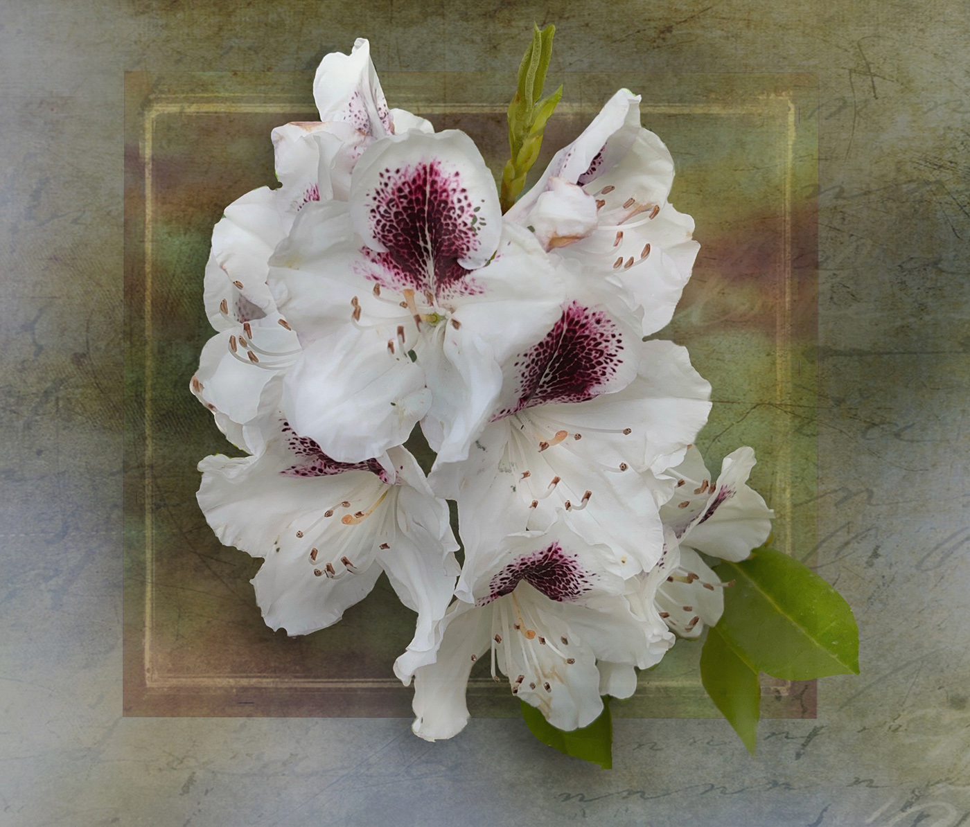
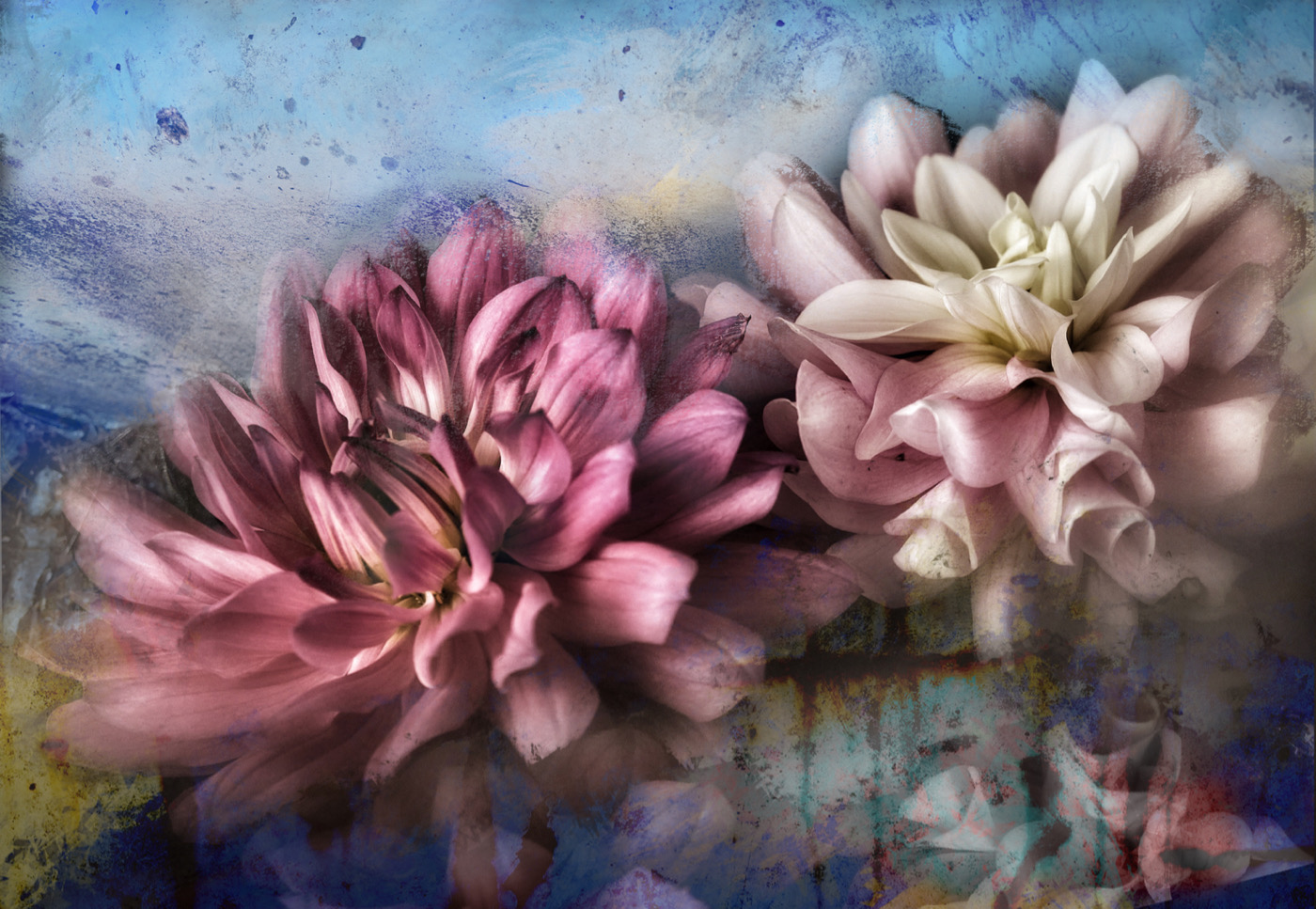
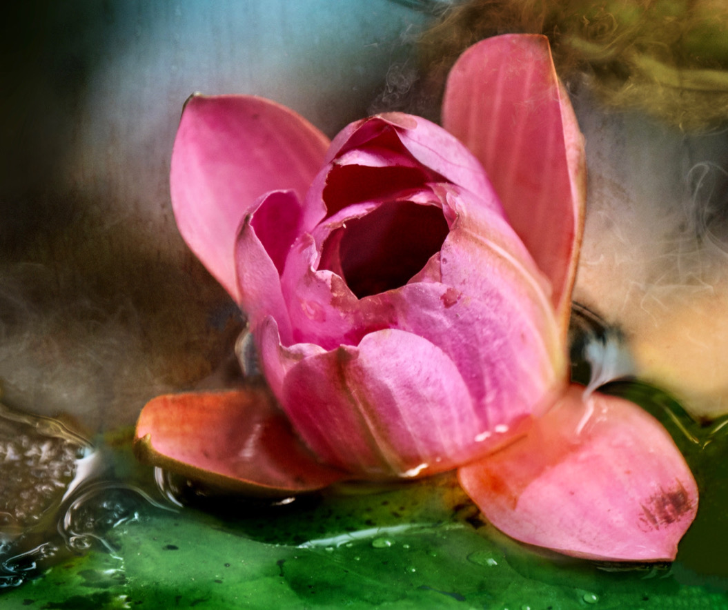
Rich, this looks like a great series you are working on. The black background offsets the composition really well. Would darkening the top right corner and the bottom right corner, be a way to stop the eye for drifting up there away from the lovely curves of the main story. Or simply crop the petal corners off. The petals are very white and so pull the eye. The soft colour of the stems of the stamens and pistils is lovely, it would be cool if you could tone the petals similarly if you were to keep them. If you were to do it again, perhaps more petals in soft focus below rather than at the top. The yellow of the pollen and the blue grey of the tips is lovely. and the lighting is great. Good job. |
Apr 12th |
| 80 |
Apr 23 |
Comment |
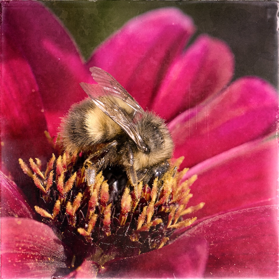
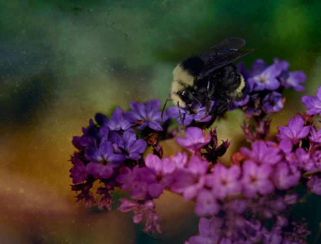
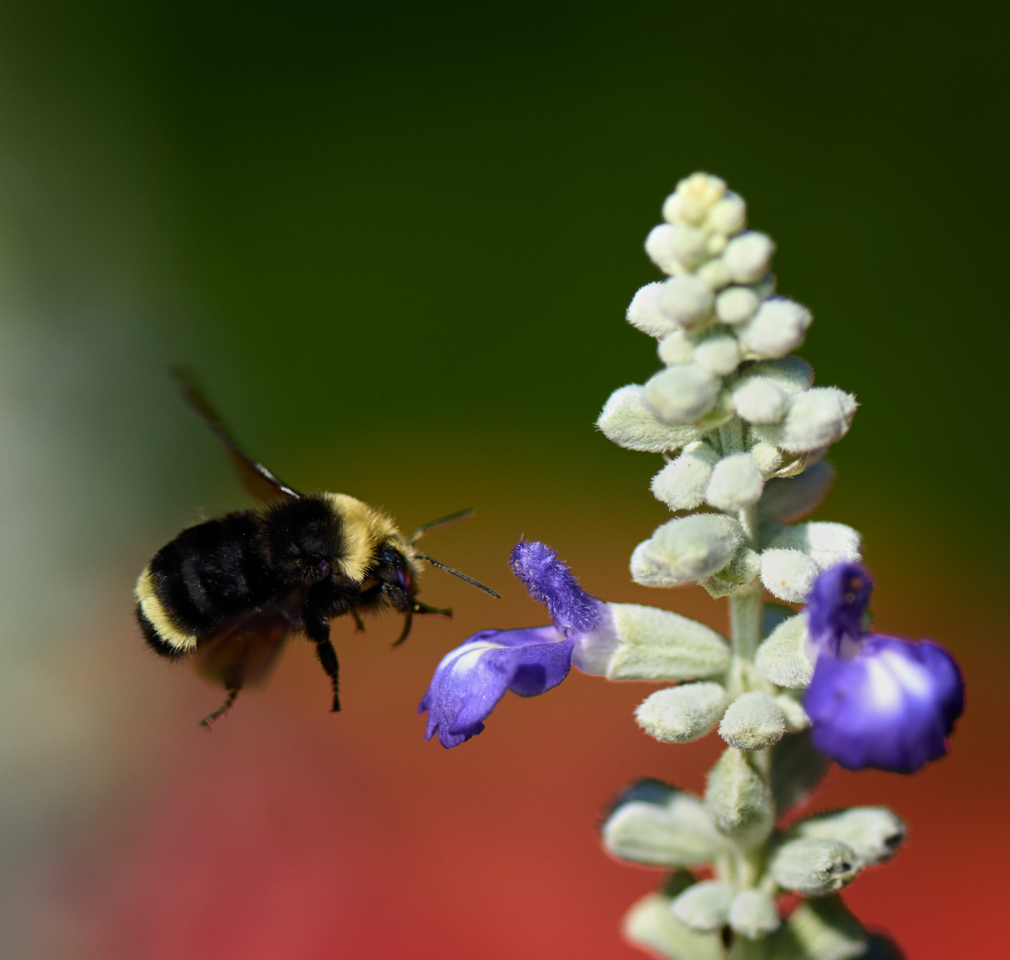
Bob thanks for the feed back. I guess the fun of this is I can try it again this summer and spring. I deliberately set the f/stop as I wanted the softness, though I agree that something around f/5.6 to f/8 would probably be better, but I love the soft background at 3.5. I will try it at an increased one in the future. I will also instruct the bee to hang around a bit longer, or learn to react quicker ðŸ˜�½ - I agree though, seeing more of the eyes and from the front would be a far better image result, so I will move my feet a bit faster moving forward. |
Apr 12th |
| 80 |
Apr 23 |
Comment |
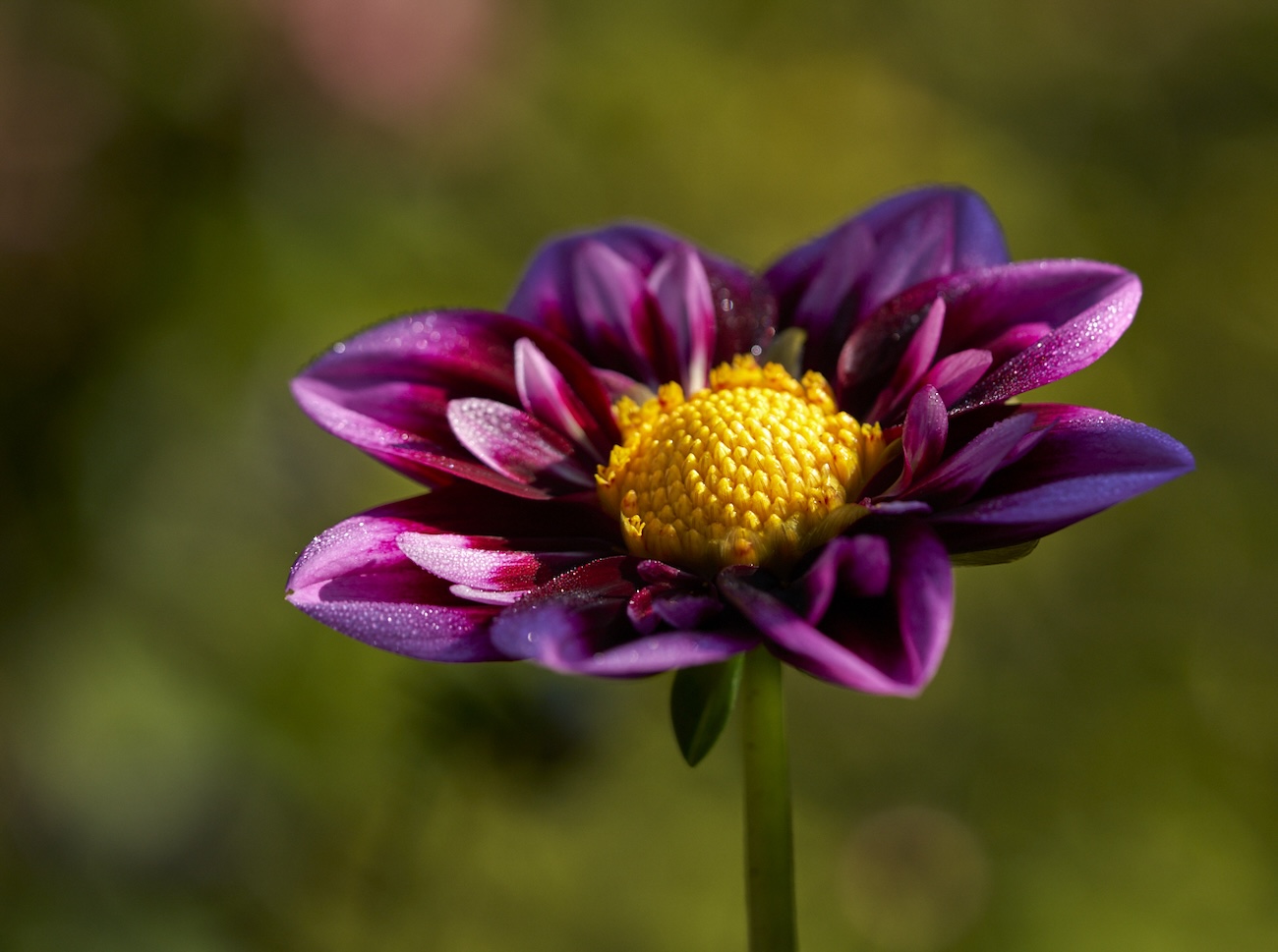
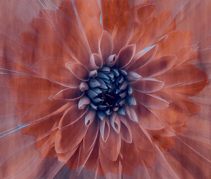
Lovely colours and handling of the background, though I agree with Bob that the two small buds could be removed or darkened more. There appears to be a softening or small double exposure on the petals which I like. the petals appear to be dancing which gives this energy. |
Apr 12th |
| 80 |
Apr 23 |
Comment |
Jacob good job on the conversion, and taking out the background distractions. A suggestion on these shots is to take multiple ones from different angles and if you want a shot full sharp throughout practice on how far away you are from the object. If you intentionally want soft edges perhaps using portrait mode would work. Try portrait mode in black and white too and see what happens. Over all this conversion seems a bit flat - i.e. mono toned. Try a radial gradient over the middle and brighten the center a bit and make those details pop. |
Apr 12th |
| 80 |
Apr 23 |
Comment |
Nice end result Bob. I like that the effect gets rid of all the blurry interfering bits. You have framed the focal point nicely with light, contrast and a diamond shaped inner frame of lines. |
Apr 12th |
8 comments - 1 reply for Group 80
|
18 comments - 2 replies Total
|