|
| Group |
Round |
C/R |
Comment |
Date |
Image |
| 39 |
Mar 23 |
Reply |
Hi Paul, thanks for the feedback. Now I have a monster on my mind!😀 I appreciate your input |
Mar 20th |
| 39 |
Mar 23 |
Reply |
Hi Jerry, thanks for the feedback. I will try your idea of cropping in even more though that really will reduce file size. I will also try a wider crop. Or simply not crop at all. So many choices is fun. |
Mar 16th |
| 39 |
Mar 23 |
Comment |
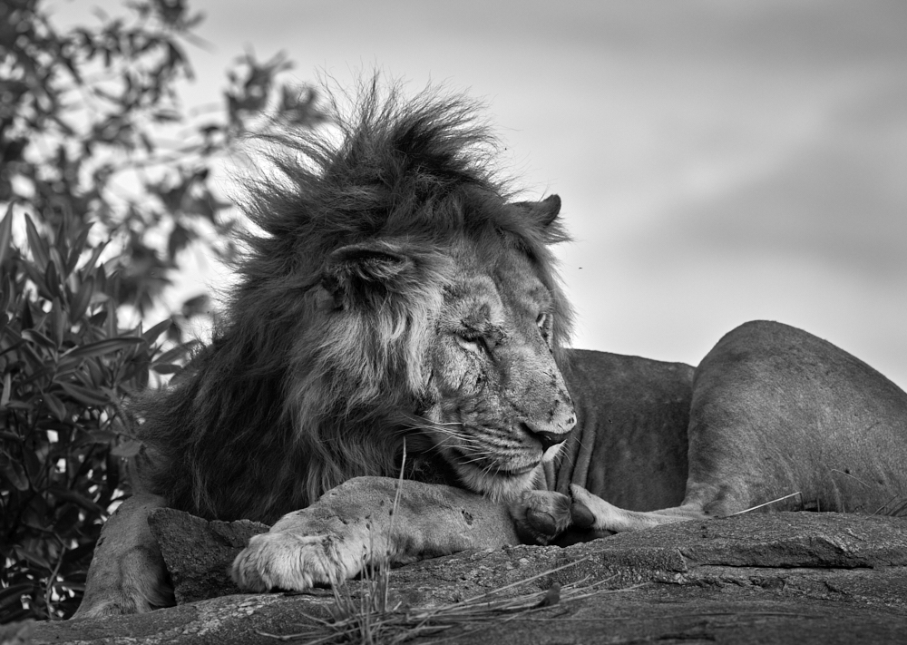
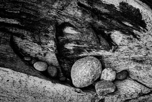
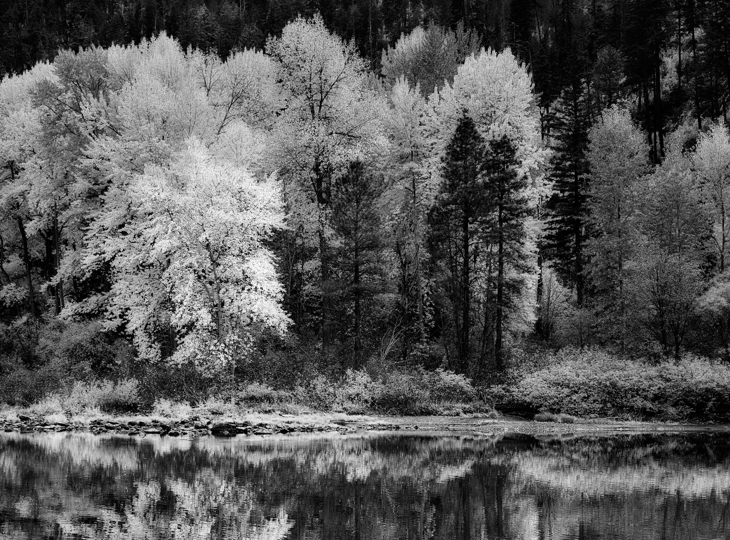
Great framing in the field Paul and a worthy conversion. The overall impression is a bit flat in terms of the tones. Using luminosity masks is a great tool. You can use them on the the mid tones as well and lift them. Adding more variation in the rocks and ground around the water would add energy to the composition. An additional subtle vignette to keep the foreground rocks on the left and the corner edges darker would add a feeling of the shoot through technique you have going here.
Great job on getting the shot. |
Mar 12th |
| 39 |
Mar 23 |
Comment |
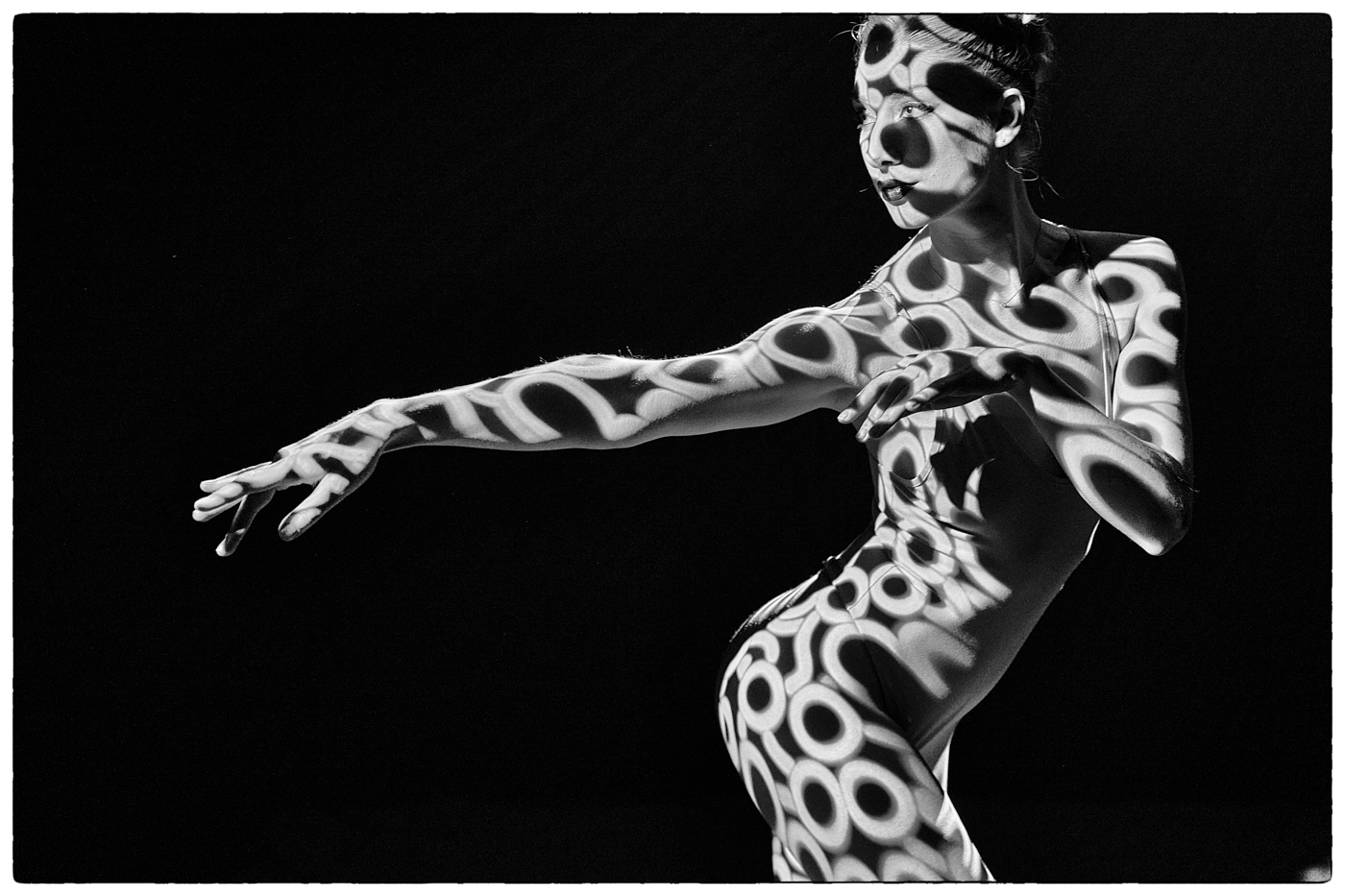
Vincent - this is wonderful. Your tones are good, the black and white points seem to on point (lol). Nothing is blown out. That tutu is stunning. I wonder if strengthening some of the tones on her back will add power to her figure. It's a subtle adjustment but could be awesome. You could also follow the light and subtlety darken her lower arm under her head to push it back there is a shadow there already. The circle of the tutu in the square frame works so well. I agree this is competition worthy. Well done. |
Mar 12th |
| 39 |
Mar 23 |
Reply |
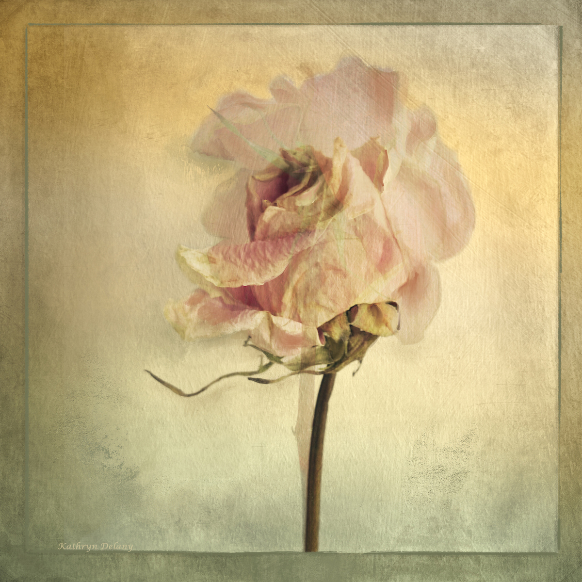
Thank you Fran. It is a good exercise to play with these kind of textures. The original makes a nice use of contrasting warm and cool colours. With those stripped away as you mention is is about texture. |
Mar 12th |
| 39 |
Mar 23 |
Reply |
Ken thanks for your input. I initially had the rocks and stones the big ones, a bit brighter but then they felt overblown. But perhaps there is a happy in between point just a tiny bit of brighteness to emphasize at least one rock. |
Mar 12th |
| 39 |
Mar 23 |
Reply |
David thanks for the feedback. I will try the selective colour edit too - I like the idea. I will also try a stronger vignette - it sure is a different thing processing in black and white as all the bias of colour is removed and you just work on tones. In fact artists of old (and now as well) mostly started all their paintings in black and white or tonal paintings and then added colour on top! So if I get it right in black and white I should be able to nail the colour right? |
Mar 12th |
| 39 |
Mar 23 |
Comment |
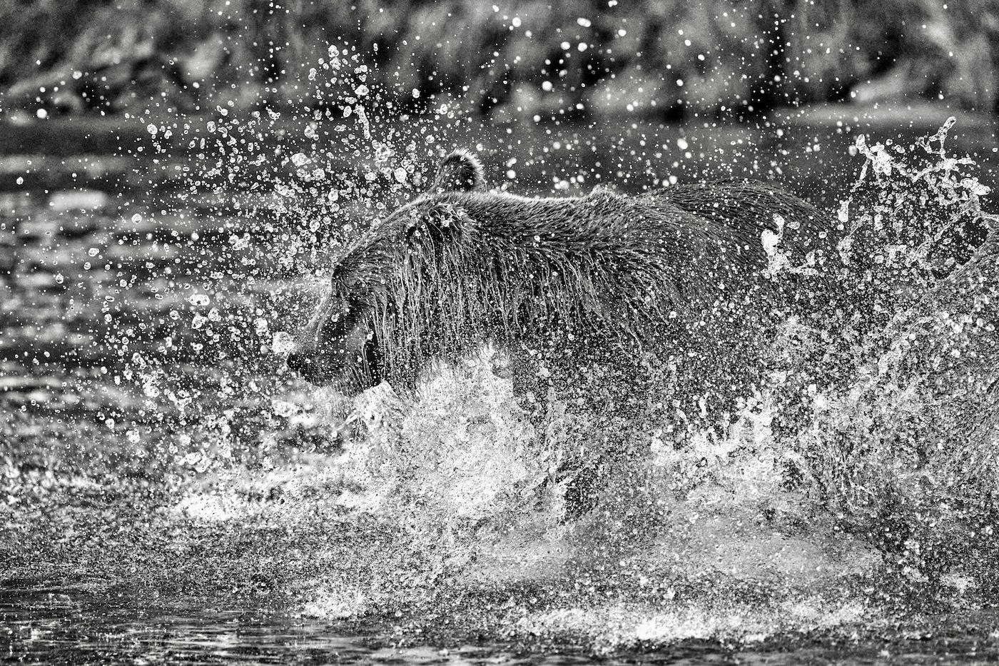
Jerry good job using your iPhone to capture the action. The black and white is a fun conversion. I have the same phone and the images you can get now are amazing. I agree with the other comments that the crop at the top is too close but probably that is all you have. I agree about darkening /blurring the background and even a harder crop from the left to bring focus right on to the 3 central figures. I tough subject to capture particularly as you were right up there close to the action. Good opportunity seen and taken. |
Mar 12th |
| 39 |
Mar 23 |
Comment |
Fran great job at capturing the soft Oregon snow. I lived in and around Portland for over 20 years so am familiar with the area. The high key image feels as though it lacks some good mid tones and the whites feel a bit blown. I agree that the one you posted before the high key conversion is the better image. It feels more like a quiet forest shrouded in snow where the sounds are muted and the calm of those big trees envelop you. Glad to see that one. |
Mar 12th |
| 39 |
Mar 23 |
Comment |
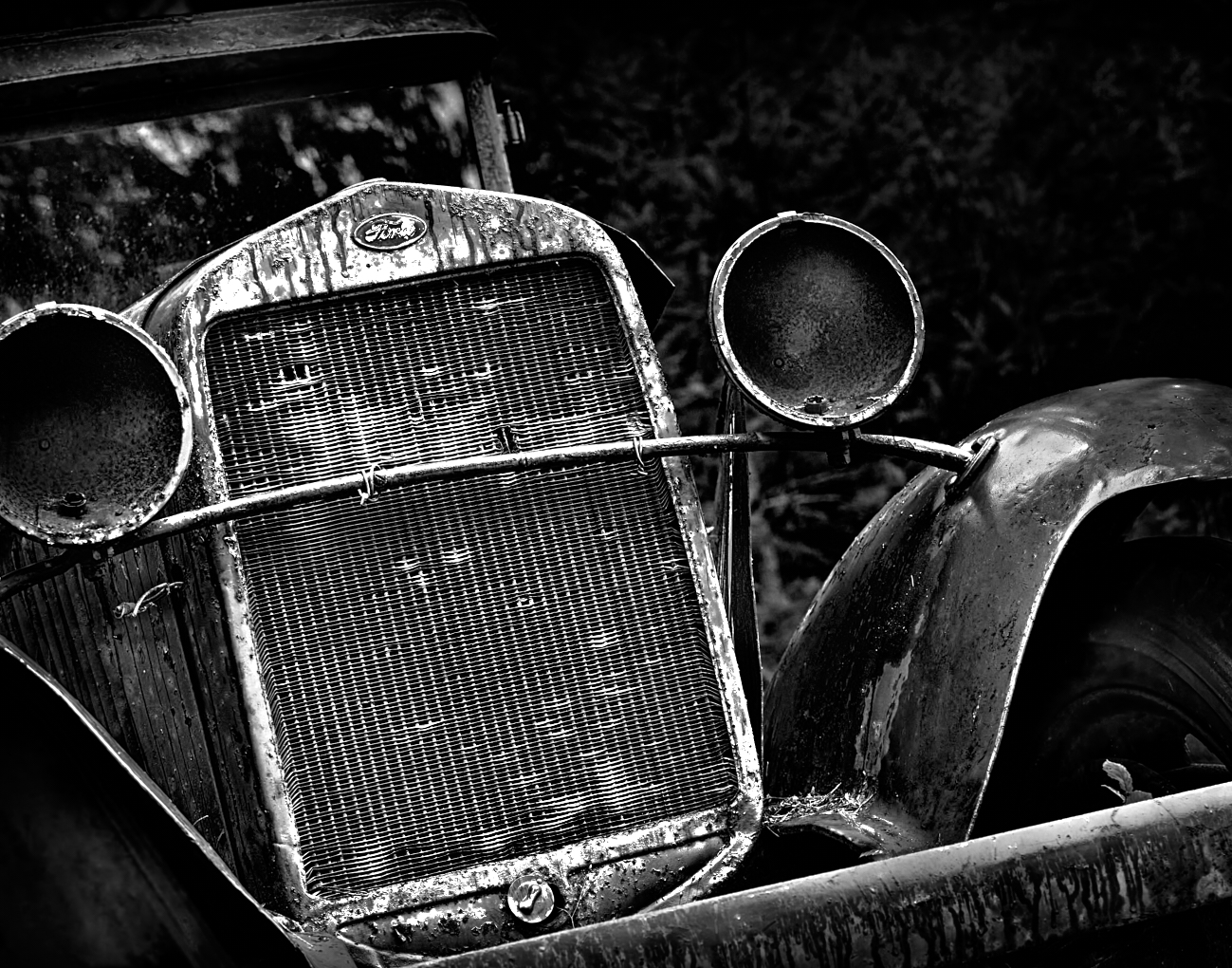
David, a very solid conversion to black and white. the tones are all well represented. Like Fran the original crop is stronger and cropping up from the bottom is a good choice. Try the composition without the communication tower / power tower on the left. I also question the need for the very white building on the right as it is very white and the eye bounces back to it all the time resulting in an unbalanced feel. For me the story is about the 3 tall towers against the far mountains and light airy sky. That may be a more powerful composition. |
Mar 12th |
5 comments - 5 replies for Group 39
|
| 80 |
Mar 23 |
Reply |
Rich thank you very much. My initial thought from the original was it needed more space below, and I posed the question here. Some say it is good as is with added space and some dont like that extra space. I am thinking that somewhere between the two may be necessary. I hear you that your eyes drift to the empty space. |
Mar 20th |
| 80 |
Mar 23 |
Reply |
Nice edit Nadia |
Mar 17th |
| 80 |
Mar 23 |
Reply |
Doug thanks for showing me how to take this further. i quite like your edits. I love how this forum allows us to explore different solutions. |
Mar 17th |
| 80 |
Mar 23 |
Reply |
Jacob thank for the input. I will try the suggestions to darken sections to pop the flower. I think it helps. |
Mar 17th |
| 80 |
Mar 23 |
Reply |
Thank you Nadia. |
Mar 17th |
| 80 |
Mar 23 |
Comment |
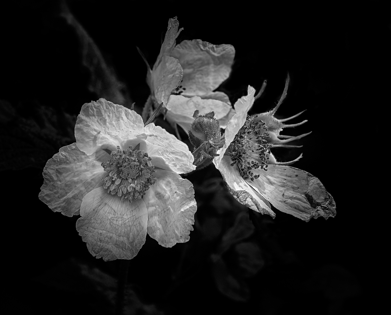
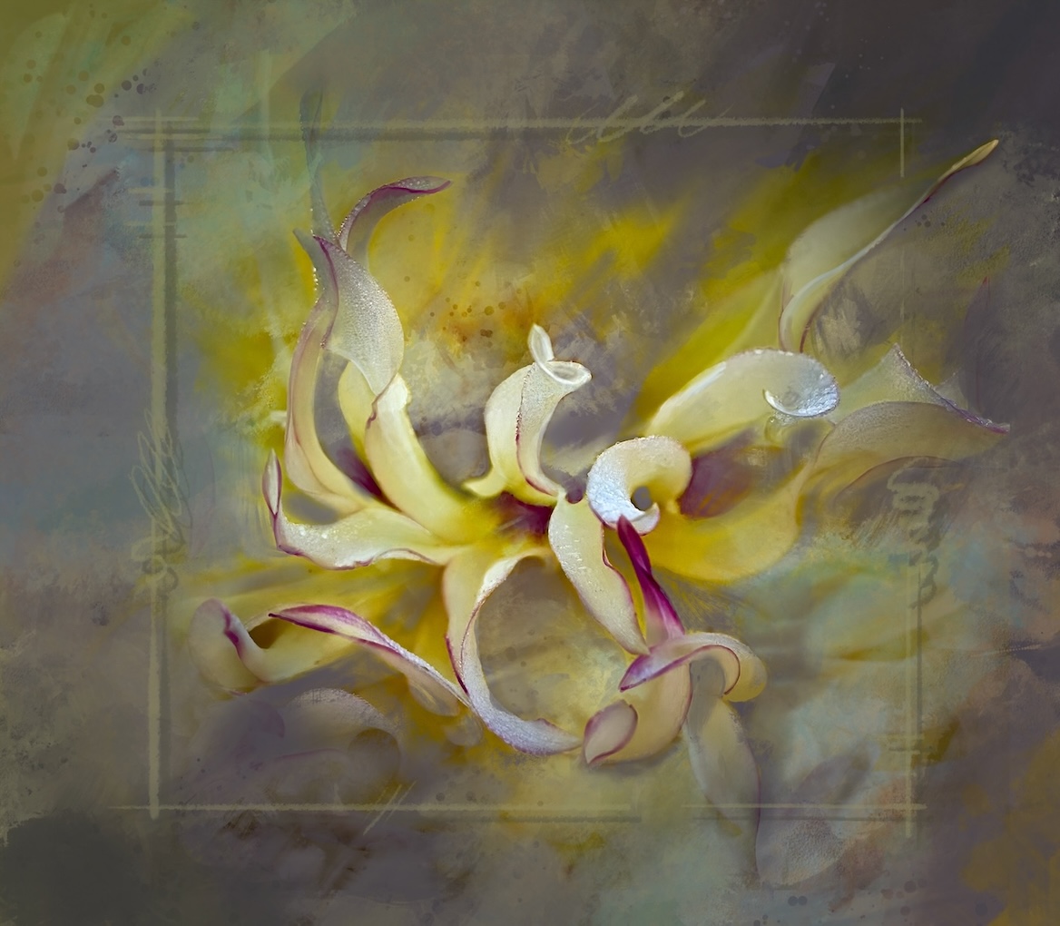
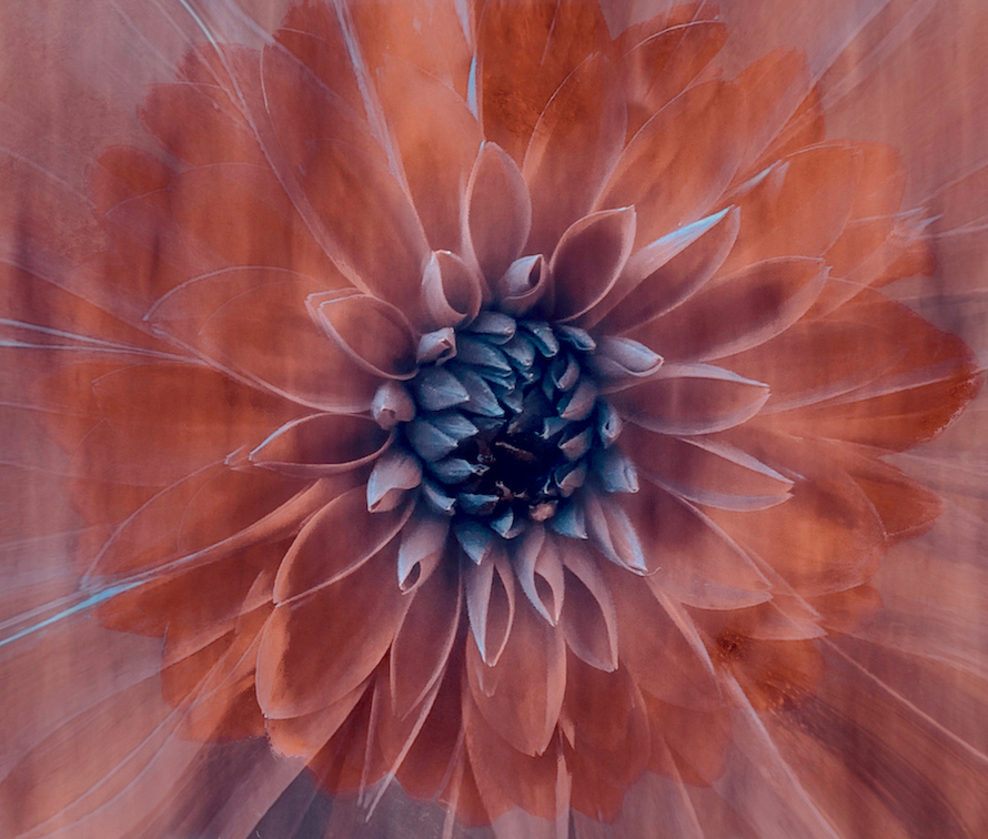
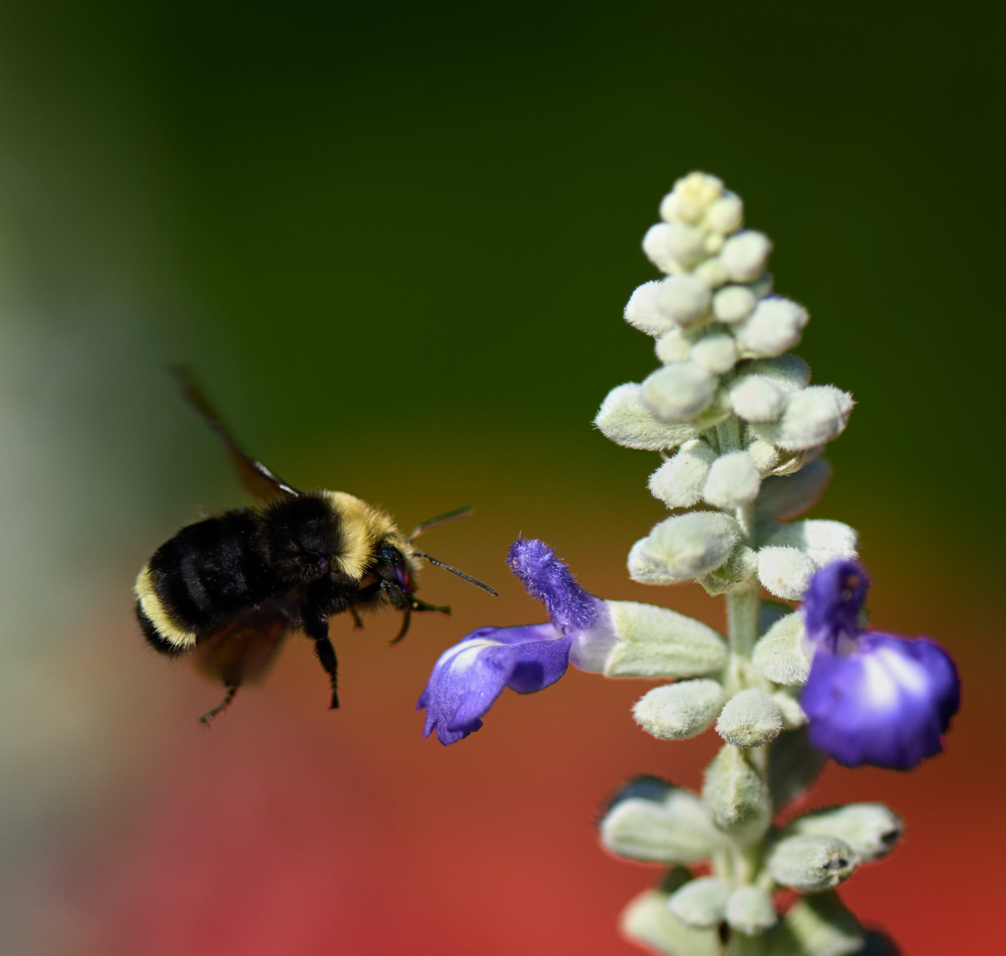
Jacob the tones and colours in the flowers themselves are lovely. I wonder if you try to do something like Nadia has done this month. Isolate the central flower and put it on a black background to make it the star. I rather like the angle and the flower once isolated could be worked with interesting light - dodge and burn. I would love to see you try a few things and post back here. |
Mar 12th |
| 80 |
Mar 23 |
Comment |
Doug an intriguing submission. Lots of lovely leading lines and use of silhouettes keeps the attention of the viewer. I agree with Bob that perhaps a slight crop in from the left to remove the section toward the bottom left of the image as the eye wants to linger there versus on what is important. This also looks like a multiple exposure which is awesome, unless it is part of what a prism lens does in which case even more cool. |
Mar 12th |
| 80 |
Mar 23 |
Comment |
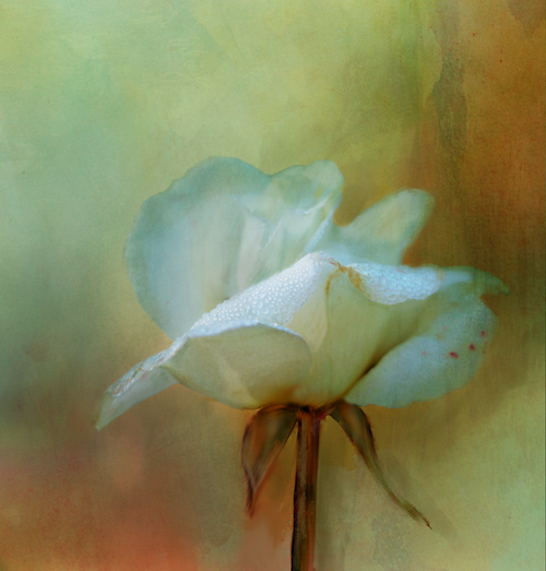
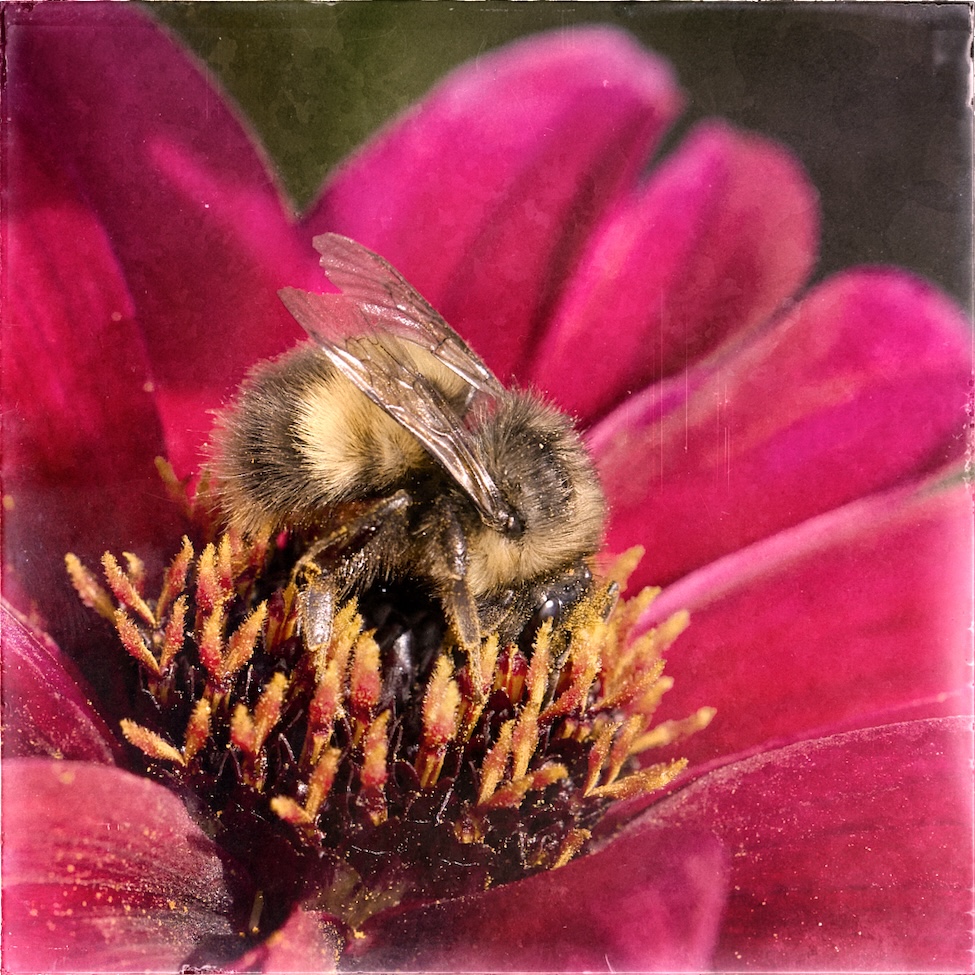
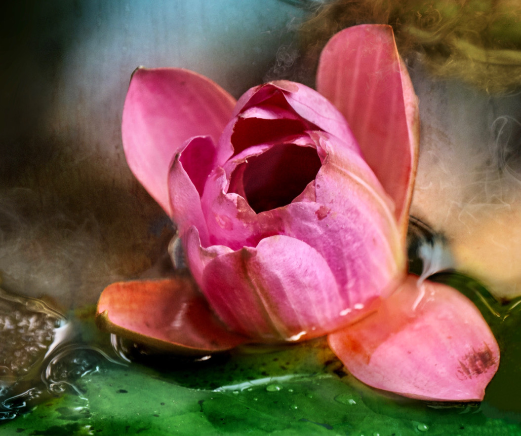
Hi Kamal, nice contribution this month. Lovely rich tones and the paint technique is interesting. It is always hard to isolate the subject from a busy background. The texture on the flower is nice, however the background does compete with it. Perhaps masking the background and creating a soft blur would help push the flower forward, also reducing it brightness a touch? The flower itself could use some dodge and burn to help it shine. |
Mar 12th |
| 80 |
Mar 23 |
Comment |
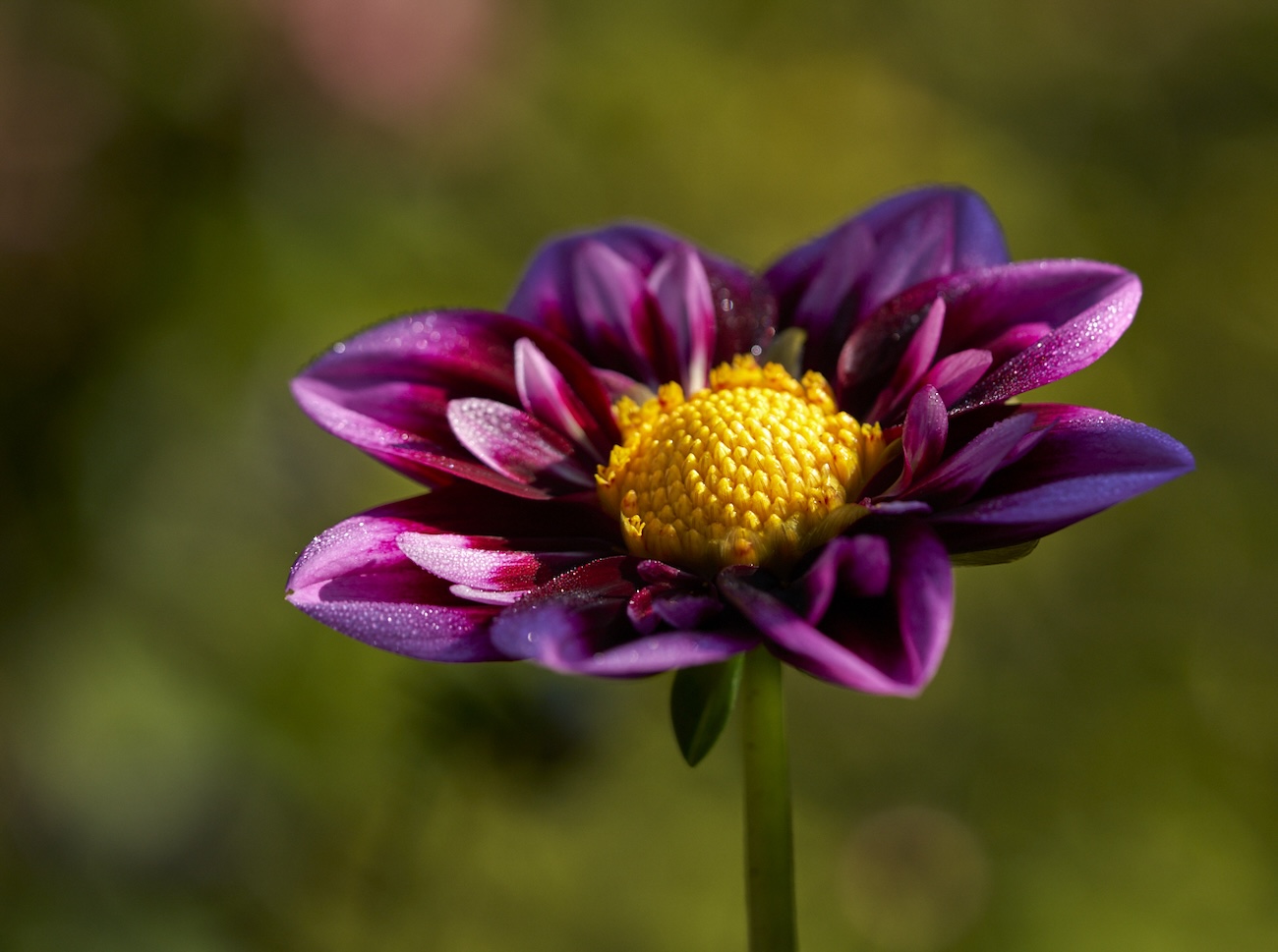
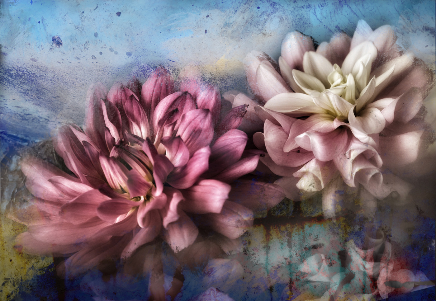
Rich I like the diagonal of the composition here and the focus stacking makes for a lovely sharp image front to back. Overall the image feels over exposed and some of the whites are close to blown out. There are some blue casts to the light on the leaves. The brightness of the green leaves seem to compete with the flowers. Perhaps try backing off that brightness so it's closer to the original image. which leaves an impression of the leaves vs them being a main feature. The crop is very tight and if you have more room at the top I feel the flowers would have more room to breathe so to speak. Alternatively a portrait orientation could really make this one sing. I did a quick edit to show what I mean. I adjusted the blacks and whites and backed off on the exposure. Anyway, just an alternative way of approaching this. |
Mar 12th |
 |
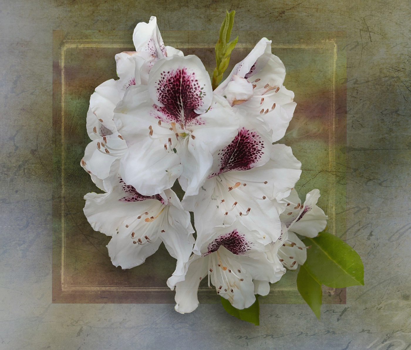
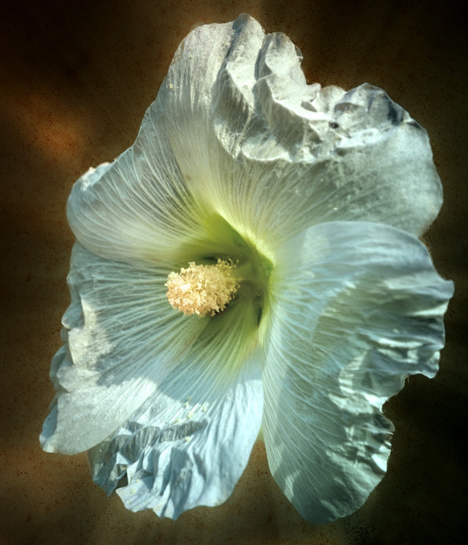
| 80 |
Mar 23 |
Comment |
Nadia, once again you have provided us with a lovely image. I like what you have done to make this a stand along piece. Isolating the flower on the black makes it into more of an art piece too. Good job on the details and saturation adjustment. |
Mar 10th |
| 80 |
Mar 23 |
Comment |
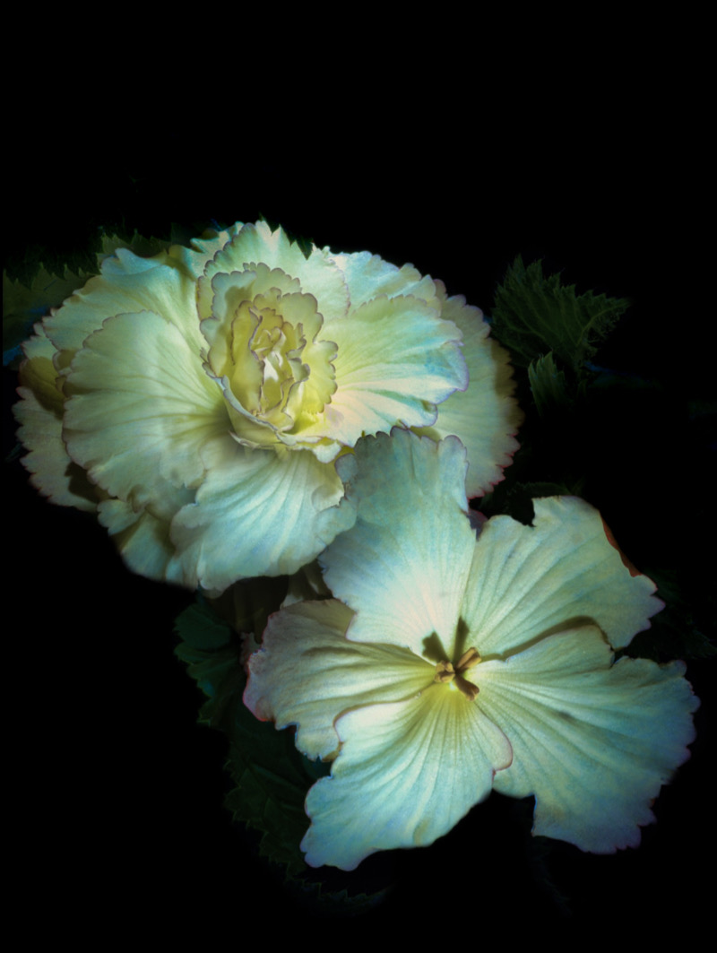
Bob, well done. This is so colourful and energetic. I love that you put this onto a black background to make the design stand out. It has a carnival feel to it. |
Mar 10th |
| 80 |
Mar 23 |
Reply |
Thank you Bob that is very complimentary. |
Mar 10th |
6 comments - 6 replies for Group 80
|
11 comments - 11 replies Total
|