|
| Group |
Round |
C/R |
Comment |
Date |
Image |
| 39 |
Feb 23 |
Reply |
Thanks Paul, I wonder how I 'lost' that glow of the pavement in the translation. I will go back and take a look and make some changes. Thank you for the feedback. Perhaps the blacks dominate so much because the clothing is essentially blue which turns more to a darker gray/black, and you lose the contrast of the warm bricks against the cooler tones of the clothing. |
Feb 16th |
| 39 |
Feb 23 |
Reply |
Thank you Vincent. |
Feb 16th |
| 39 |
Feb 23 |
Reply |
Vincent, I agree with your comments about the square format here - now I look back at it as a tiny thumbnail, she needs more room on the right - like Paul did.
I concur that having these groups is so helpful in reviewing our work and getting ideas of how to improve. |
Feb 16th |
| 39 |
Feb 23 |
Comment |
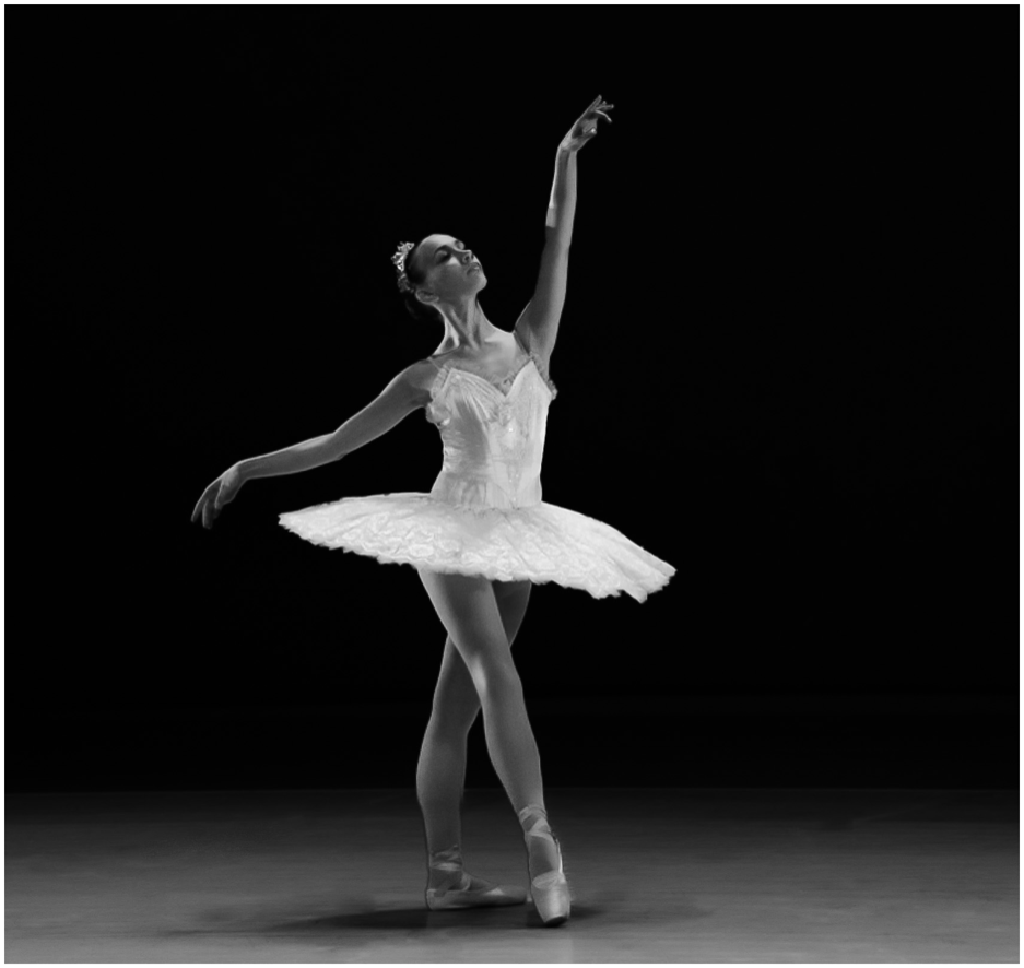
Vincent, great capture and a perfect moment in time. I feel this has an infrared feel to it and that the tonal range could be tweaked on the ballerina herself. All the whites look a little blown out.
I would also like to see her grounded on the floor since the light is from above and behind. I took you up on your invitation to give a different interpretation. I would suggest more negative space around the figure and a more subtle gradation to let the floor emerge. If you can clone out or tone down the very abrupt transition of light to dark on the raised arm it would help - I did not do it here, but it is a distraction. Then selectively darken and brighten the bodice giving more depth and interest. If you use LR you can mask out the figure from the vignette or any other radial or gradient mask, which is a fantastic tool. Any way here is my version for you to consider
|
Feb 12th |
 |
| 39 |
Feb 23 |
Reply |
Ken thank you. This was an experiment with depth of field and street photography and trying different angles for more engaging compositions. My thought behind this one was a scene from West Side Story! Also learning how to get the exposure right in camera so there is little processing needed afterwards. I may not have achieved that bit just yet :-) . If I could get down that low I would definitely try it again, once down there I cant get back up LOL |
Feb 12th |
| 39 |
Feb 23 |
Comment |
David very nice work. I would agree that you can crop up more from the bottom, about 1/3rd more. Great use of negative space and all the tones from black to white are present. Great job. |
Feb 12th |
| 39 |
Feb 23 |
Comment |
Fran, lovely conversion. I like both but definitely lean toward the black and white as it is a more dreamy and moody. The tonal range really works to keep it soft and dreamy. Nice job. |
Feb 12th |
| 39 |
Feb 23 |
Comment |
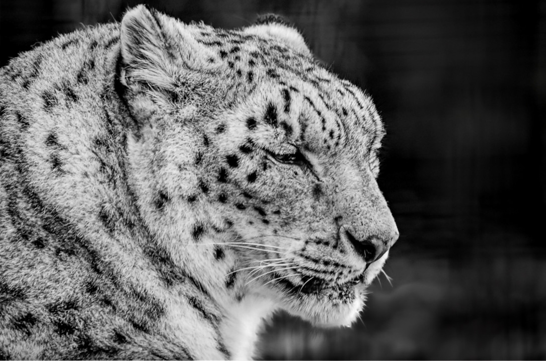
Paul I think you made the correct choice to convert this to black and white. I agree with Ken, that the background needs to be darkened and then the will pop, the background is very symmetrical (ie. it feels like a fence or man made structure so deemphasizing that would help. Maybe try resetting the blacks popping the whites a bit they seem a bit flat or gray. Be careful not to let the area under the chin blow out though. Here's a quick example |
Feb 12th |
 |
| 39 |
Feb 23 |
Comment |
Ken, The black and white conversion is really well done. All the tones are represented and give such depth to the storyline. The way you handled the background and have the principle subjects emerging subtly from it is wonderful. That side light on the taller girl is just wonderful. You have nailed it in my opinion. |
Feb 12th |
| 39 |
Feb 23 |
Reply |
Hi Fran. Thanks for the comments. I love your ideas and yes I have CEP - I will try it and post it back here. |
Feb 10th |
5 comments - 5 replies for Group 39
|
| 80 |
Feb 23 |
Reply |
Kamal Thank you as well for the comments and input. I love the conversation I must admit. |
Feb 23rd |
| 80 |
Feb 23 |
Reply |
Hi Nadia thank you so much for this feedback. It is fun to share the process and get everyone's point of view I must admit. And for the amount of discussion produced I deem this a success.! |
Feb 23rd |
| 80 |
Feb 23 |
Reply |
Rich thank you so much for the helpful and encouraging feedback. I appreciate it. It's going to be printed up for sure. |
Feb 23rd |
| 80 |
Feb 23 |
Comment |
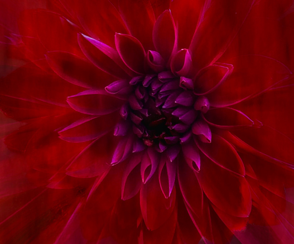
Doug I could and have. However the whole point is taking it to a more abstracted place via colour and effects. So here you go - a closer to nature version and cropped in a bit to remove some of the background - if you look at the original the center is closer to blue/purple which has become emphasized here as well, so on the 1st 2 versions I desaturated that center somewhat - because it pleased me. I am loving this conversation as I have obviously triggered some different responses to the image. For that reason I am calling it a successðŸ˜�½ |
Feb 18th |
 |
| 80 |
Feb 23 |
Comment |
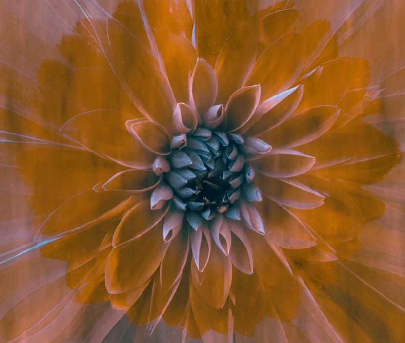
Bob thank for your input and you raise an interesting question. My goal is to go beyond and push the creative boundaries. I do have versions of this that are closer to the colour of the original flower but really wanted more out of the result. In fact I have a series of this image in different stages and colours that could make a good grouping. My aim here was for a more art interpretation that could hang in someone's home - so I was thinking of at is more as a designers solution - I think this would make a great throw pillow cover too🙒 For me colours are part of the mood or emotion that result - this one, that is more yellow, presents a totally different feeling. Also taking a photo of the face of the flower from above is generally a boring result, it needs more - and I definitely did not have a good coloured bokeh behind the flower - simply a bright white overexposed background I could do nothing with. Until you add textures and find a way to make it stand out. I hope that answers in some way the question you pose. |
Feb 18th |
 |
| 80 |
Feb 23 |
Comment |
Good capture on the phone. Definitely a tighter crop to bring focus to the flowers which are a great colour. I like Doug's 2nd edit. You could try glancing some directional light off some of the leaf pads but it may add distraction. |
Feb 17th |
| 80 |
Feb 23 |
Reply |
Hi Jacob thanks for the feedback! |
Feb 17th |
| 80 |
Feb 23 |
Comment |
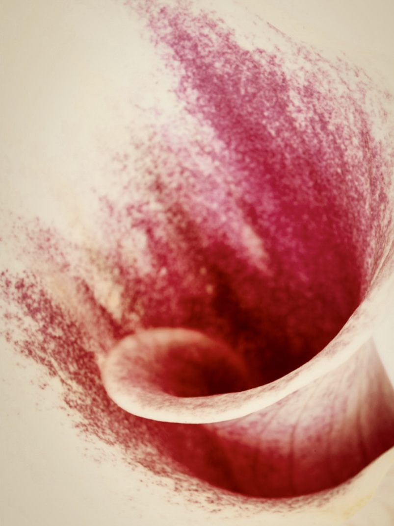
Doug Nice concept and agreed that putting the flower on more of diagonal lends more interest. Maybe try cropping the green stem out as it's the only spot of green and your eye tends to keep returning to it. Also try selective sharpening on some of those edges and adding some tonal contrasts. Try some artistic filter. I did play with it quickly to give a different interpretation and to try and take it even more abstract. |
Feb 12th |
 |
| 80 |
Feb 23 |
Comment |
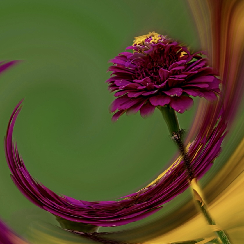
Bob, fun and creative. I feel there is too much space going on around the focal point that is superfluous. I tried a square crop to focus in on the essence of the art. You may have tried it already. Also might a spot of light to brighten the flower head help focus the eye even more. Thanks for the edit. |
Feb 12th |
 |
| 80 |
Feb 23 |
Comment |
Rich - well done on producing an image out of something you were not very happy with. A good crop to make and interesting composition and the adjustment to the colours works well. Try rotating and flipping it so the center of the flower is at the bottom left or top right, for me if its at bottom left my eye has a good diagonal from the bottom left corner to the top right. :-) Nice job. |
Feb 12th |
| 80 |
Feb 23 |
Comment |
Jacob, great capture of the rose and you definitely succeeded in boosting the rose itself. You could try lifting some of the shadows in the petals a bit more particularly the one very black area on the bottom right petal. You could try a radial gradient and invert it and lower the brightness of the background too that might pop the flower even more. Good job on seeing the flower. |
Feb 12th |
| 80 |
Feb 23 |
Comment |
Nadia, lovely use of a digital frame and soft background texture to isolate the flower. You already had a great bokeh in the original and the flower is beautiful and crisp where it needs to be - the use of the soft edges as a result of the shallow depth of field is skillfully done. Good composition too. Well done. |
Feb 12th |
8 comments - 4 replies for Group 80
|
13 comments - 9 replies Total
|