|
| Group |
Round |
C/R |
Comment |
Date |
Image |
| 39 |
Jan 23 |
Reply |
Paul thank you for the advice. I did not know the rule about a pole. (Works for a tree too maybe). It makes total sense. I will put this in my things learned hat . |
Jan 15th |
| 39 |
Jan 23 |
Reply |
Thanks Ken, I agree 100% |
Jan 12th |
| 39 |
Jan 23 |
Reply |
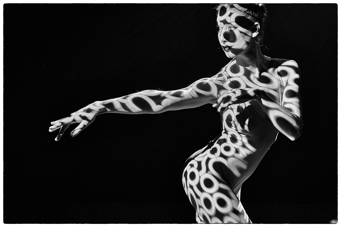
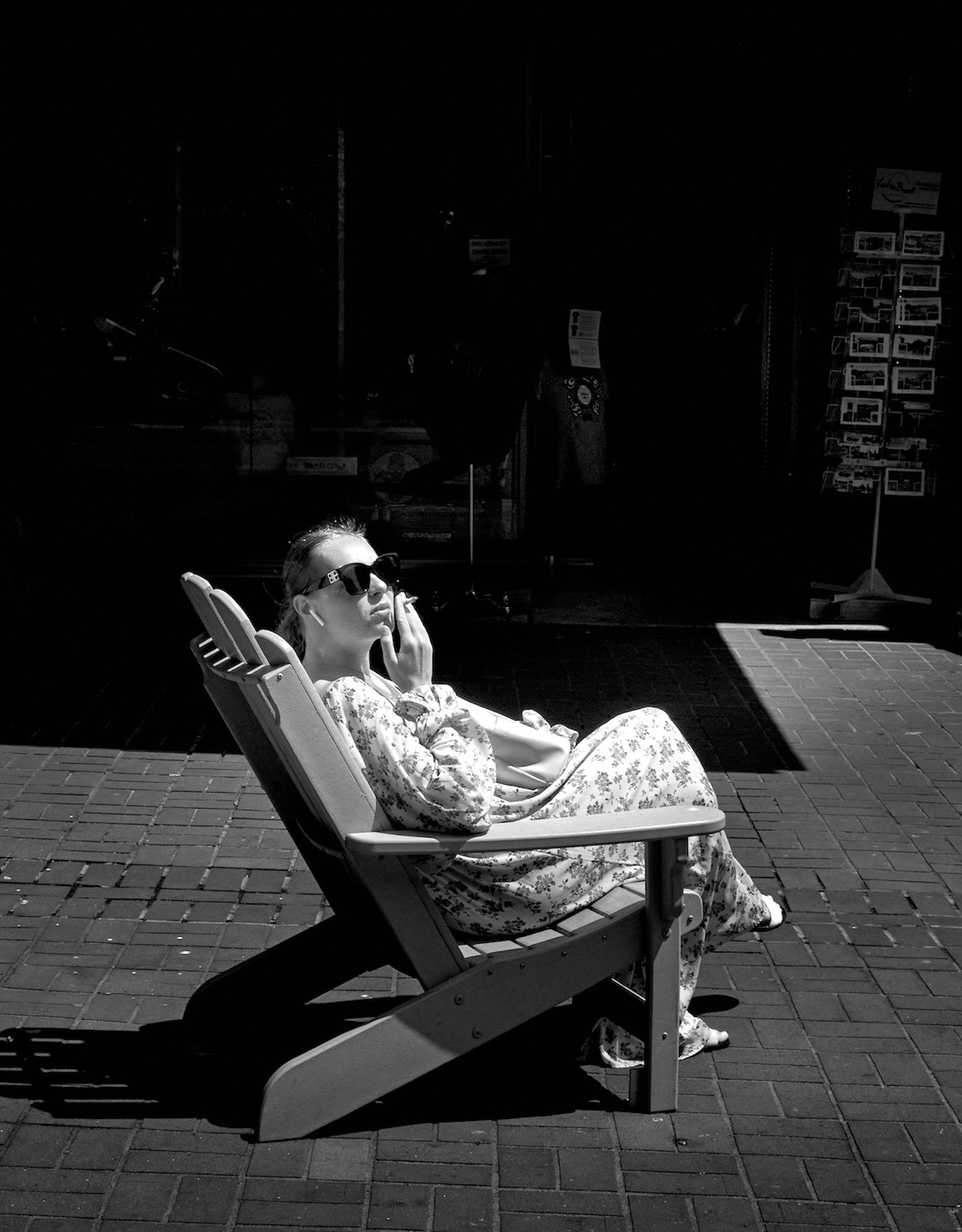
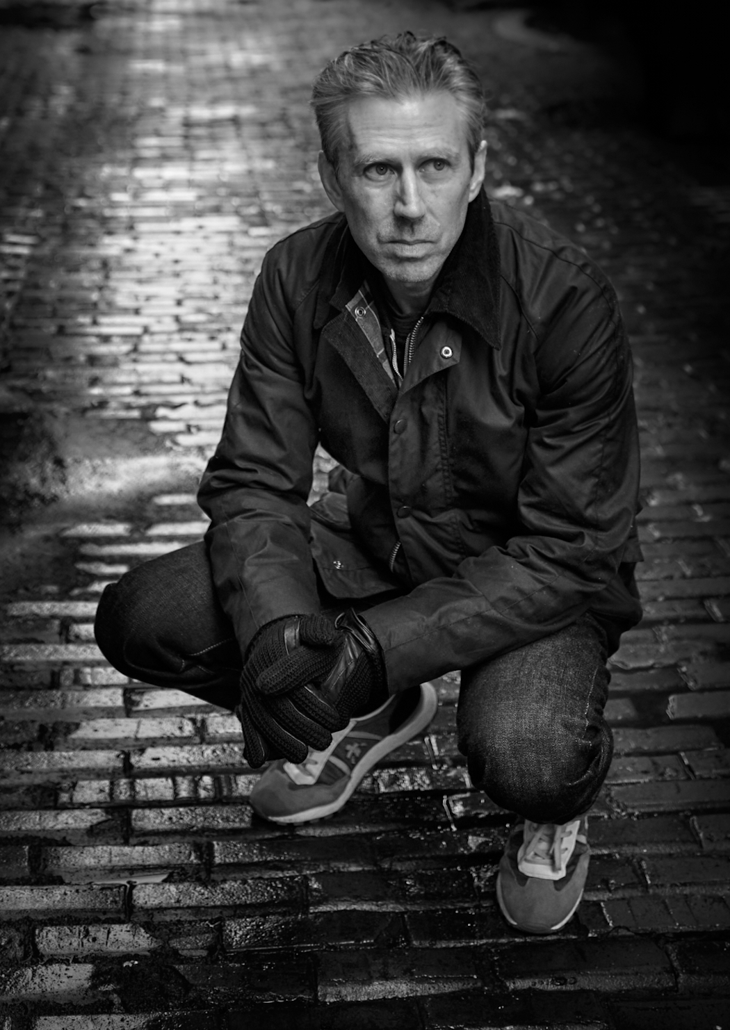
Thanks Fran, Yes! I like the closer crop and the brightened name. The Title was a kind of double of entendre. Which I guess failed. I don't like getting too close to people and I shoot normally with a small 28mm lens. |
Jan 12th |
| 39 |
Jan 23 |
Reply |
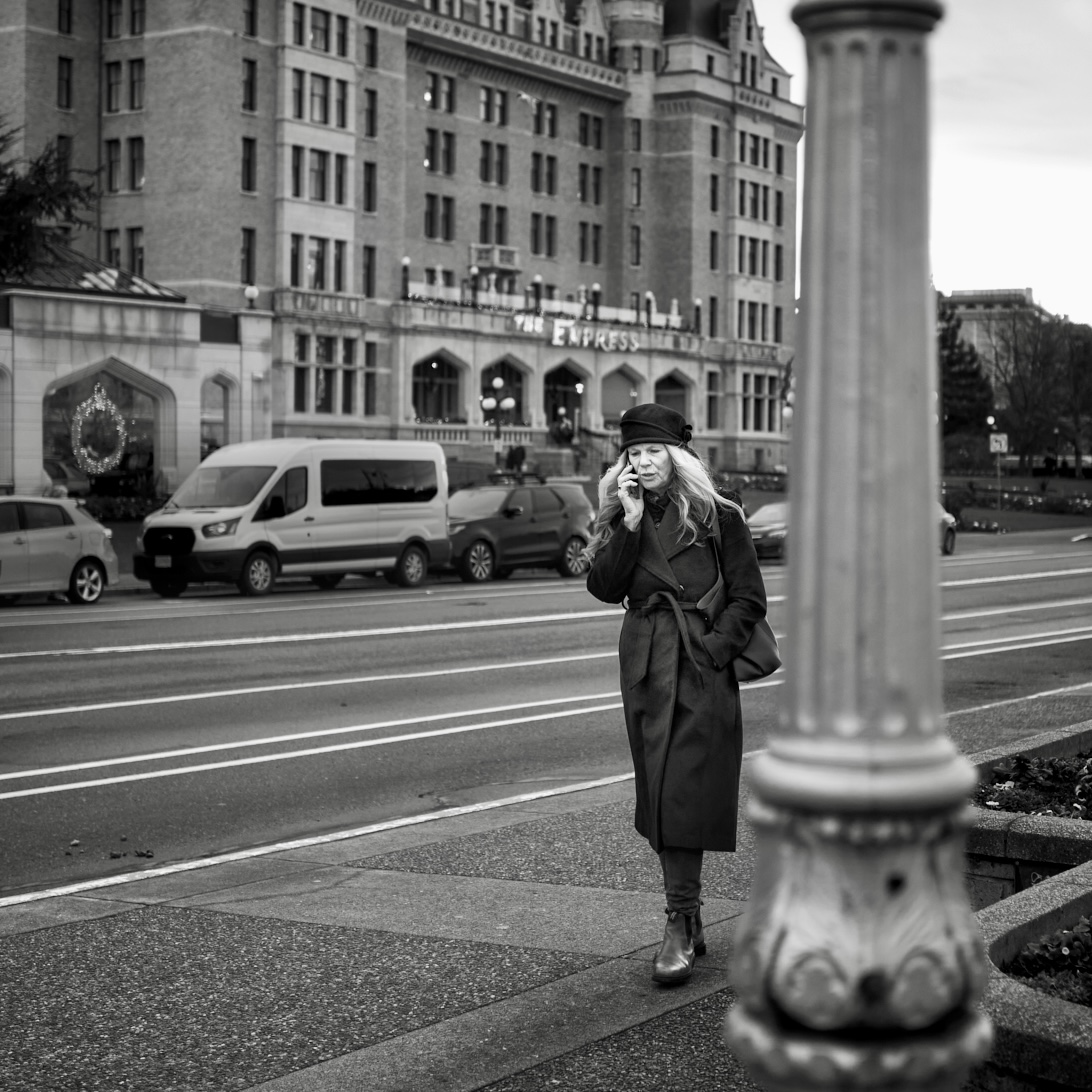
Thanks Vincent. The reason no image six feet later is that as she walked toward me a) I was too close at that point, and b) the effort was a blurred head, c) she was aware of me and not too happy. So making the best of a bad situation? And for fun. |
Jan 10th |
| 39 |
Jan 23 |
Reply |
True - remember our stopping point is the viewer's starting point - it is very helpful to have other look at our work and discuss it as you say. |
Jan 6th |
| 39 |
Jan 23 |
Reply |
Fran so true, ultimately an end product is your vision and interpretation. And definitely all your elements are part of the story |
Jan 6th |
| 39 |
Jan 23 |
Comment |
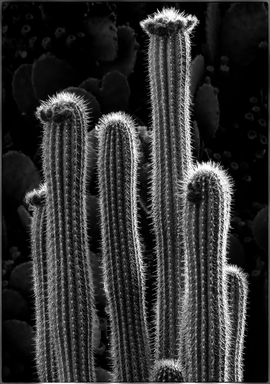
David - Love the light on this one. Love the colour version too, though you have done an outstanding job of the conversion. Having that side/backlight really helps the conversion. Everything about the cactus is sharp and you have set your black and white points nicely.
Consider burning back those bright background details of the other cacti. For my eye they are a bit distracting particularly around the edges of the image. I did a quick edit to show you what I mean. With care you can achieve a more subtle look, having them show up as faint impressions will allow the organ pipe cactus become the story as intended. |
Jan 6th |
 |
| 39 |
Jan 23 |
Comment |
Vincent a nice juxtaposition of the pattern of the bench against the organic form of the leaves. I feel the leaves are a bit overexposed and you could do as David suggest at bringing the highlights down a bit and getting more texture. Try emphasizing the darkened of the foreground a bit more - what is there already - and see if that works since I find the background a to be all one tone. |
Jan 6th |
| 39 |
Jan 23 |
Comment |
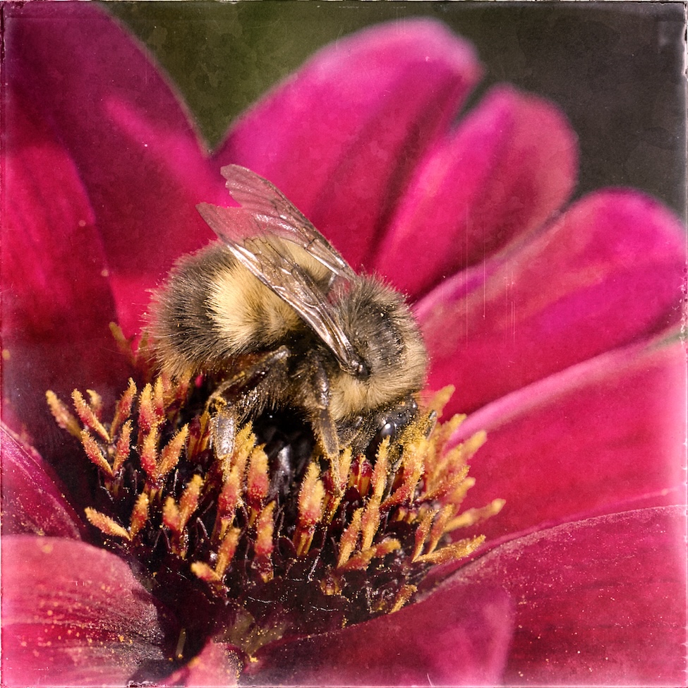
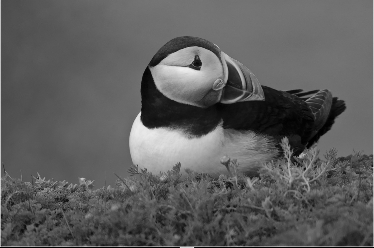
Paul what a wonderful experience. I have yet to find a live puffin even though I live on the west coast of Canada! Skimmer sounds like an ideal adventure. I do love the colour version as well.
The conversion works well and I love that uncluttered background. However there are some things I believe you could still do to make the bird pop. Currently the brightest point is the birds chest. You can bring back the brightness of the chest and some detail in the whites, then try brightening the face, sharpening the eye and the white rim around the eye. You could add more contrast to the beak. Also there is more detail in the body of the bird that could be brought up and add texture. I would also add a subtle linear gradient over the foreground to separate it from the background. I did a few of these edits to show you the potential of your great shot. |
Jan 6th |
 |
| 39 |
Jan 23 |
Comment |
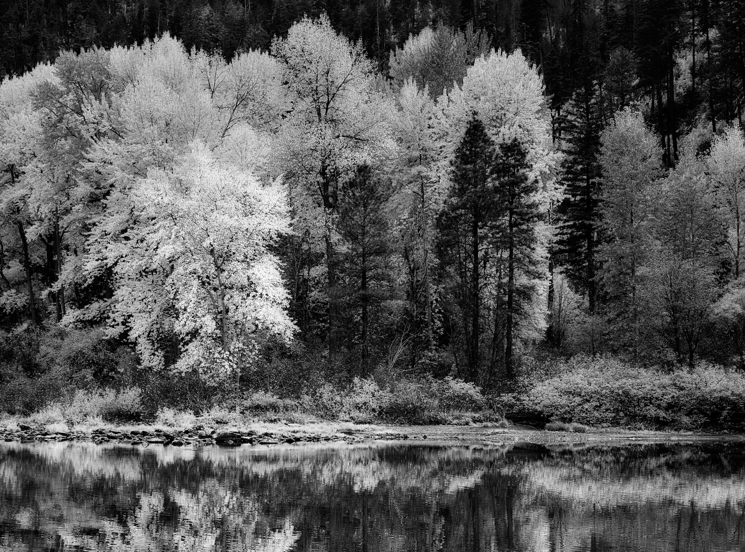
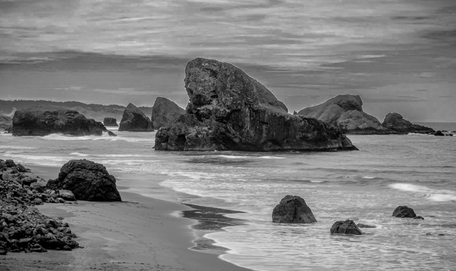
Fran this makes me nostalgic for Oregon. I like the rocks and agree with David's comments. Always check your horizon linesðŸ˜�½. I was wondering how this would look if you took out some of the sky and made the story more about the rocks. I took the original colour and somehow from my screenshot cuts off the birds but this give you an idea. Also you could make the sky/clouds more dramatic and lift the shadow of the rock on the left. I would have like more beach to the left as well.
|
Jan 6th |
 |
| 39 |
Jan 23 |
Reply |
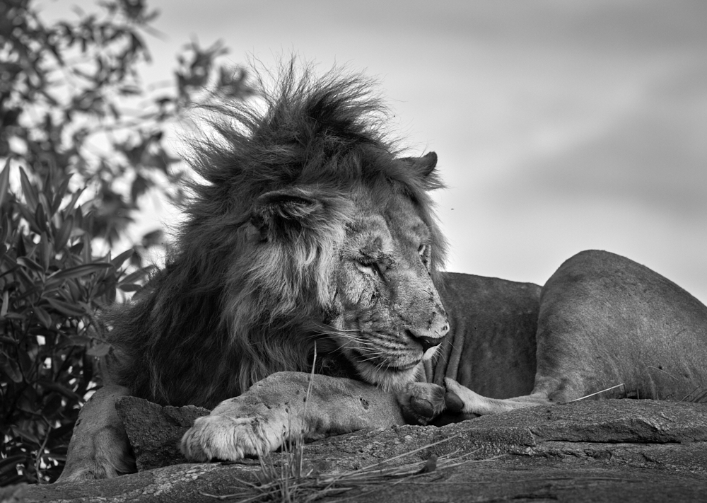
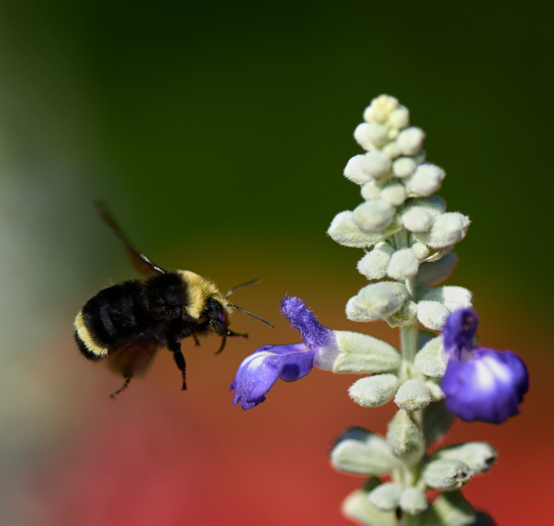
Chuck thanks for stopping by and taking the time to comment. I kind of like that blurred pole as well. |
Jan 6th |
| 39 |
Jan 23 |
Reply |
David thanks for your input. I agree if I could have caught her 2 steps later possibly a stronger image. The next in the series was blurred!! |
Jan 6th |
4 comments - 8 replies for Group 39
|
| 80 |
Jan 23 |
Comment |
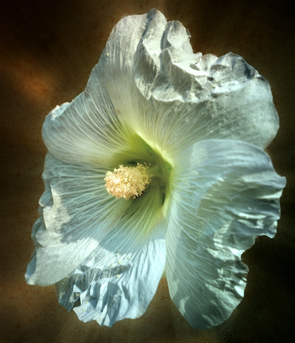
Jacob great job on eliminating all the stuff in the background, this works. I too like what you have done with the colour on the flower and the light. Keeping the leaf and keeping it subtle gives a good counter balance. Well done. PS I had thought I had made my comments long ago, so apologize for not having done so before. |
Jan 18th |
| 80 |
Jan 23 |
Reply |
Doug thanks I like the more subdued bg give a bit of overall moodiness. I admit to going back and forth between the light and the dark! |
Jan 13th |
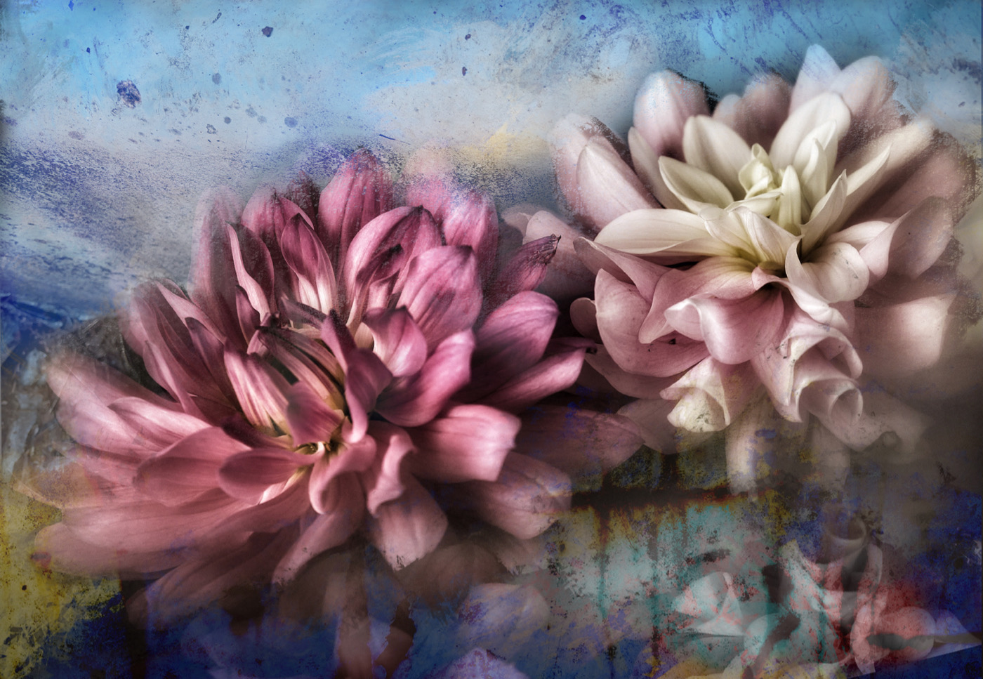
| 80 |
Jan 23 |
Reply |
Rich thanks. I did not clone the flowers at the bottom right. I simple duplicated the layer, flipped it vertically and positioned it in place. I so appreciate your kind comments this encourages me to put it into a show I am having next month! |
Jan 11th |
| 80 |
Jan 23 |
Reply |
LOL thanks Bob. |
Jan 6th |
| 80 |
Jan 23 |
Reply |
Bob thanks for your comments I appreciate your feedback. I would say that I did not plan it in advance! I did have the notion to photograph the flower with a black background a couple of years ago now, so that perhaps I could do something more with it down the road. However I did not plan the composite until last monthðŸ˜�½ |
Jan 6th |
| 80 |
Jan 23 |
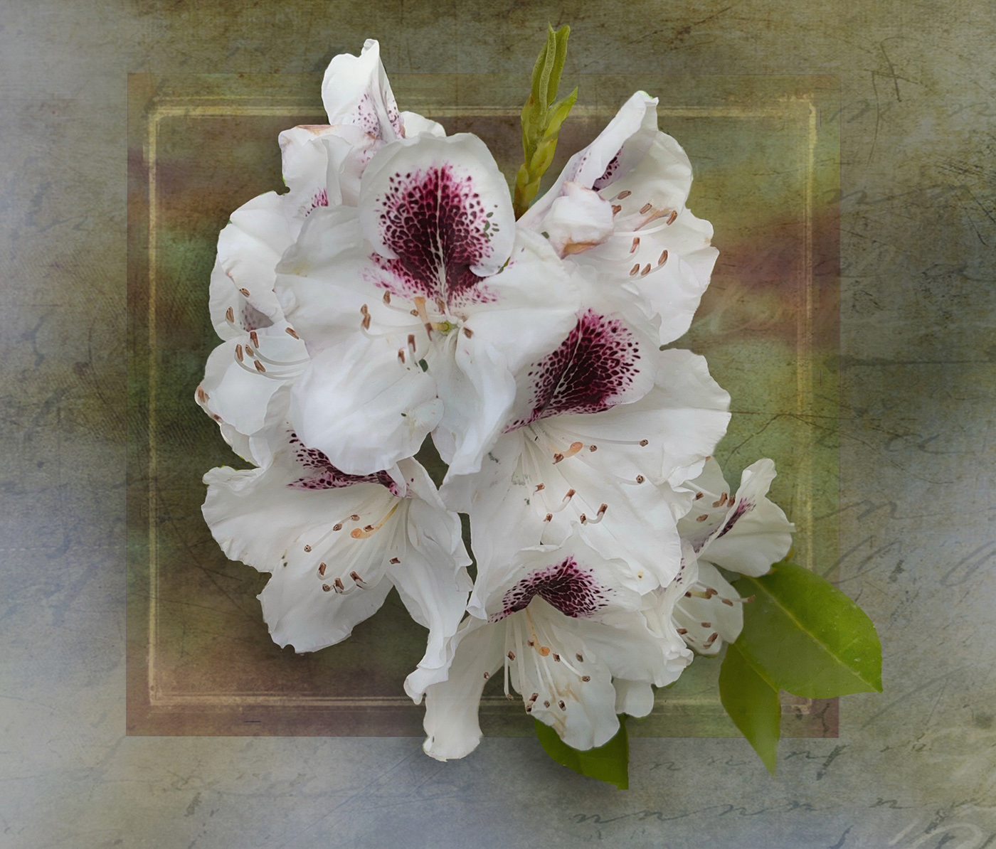
Comment |
Rich I love your edit and it transforms the image into a very interesting photo. The details are sharp and the centred composition works. Having the stacked image was definitely the way to go with this. This could also make a great series of images if you did other flowers in a similar way with the same composition. |
Jan 6th |
| 80 |
Jan 23 |
Comment |
Doug very nice composition and I like the square framing. Wow 47 images no wonder this is so beautifully sharp. This is well exposed and colours pop. I might suggest a slight blurring of the background to create a more creamy texture. Since the detail is in the leaf you don't need the distractions of the texture in the background. It would focus the attention of the leaf. I took the liberty of an edit - hope thats alright |
Jan 6th |
 |
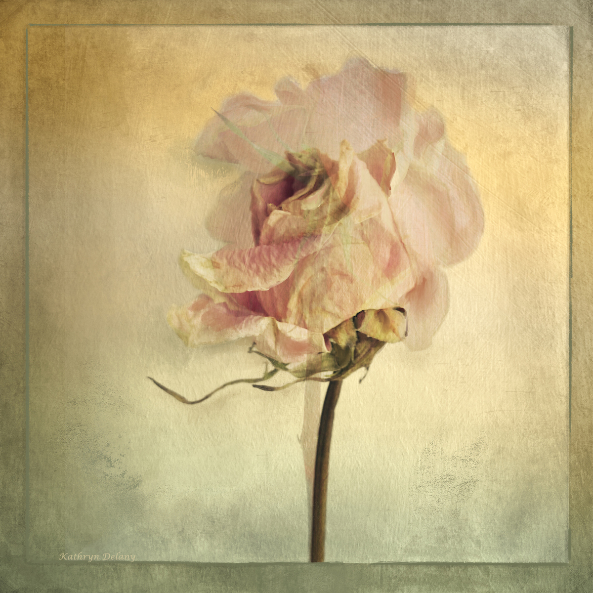
| 80 |
Jan 23 |
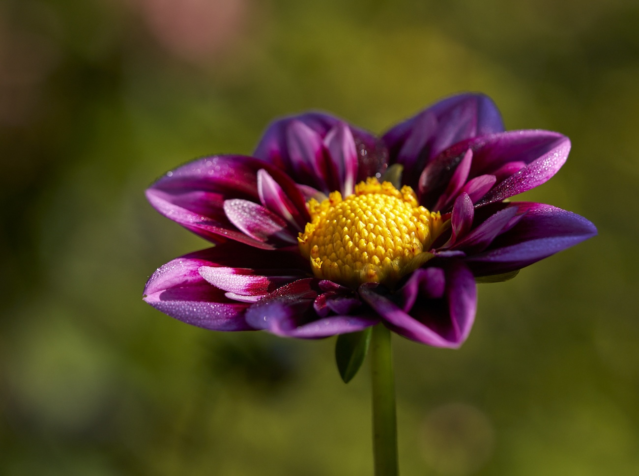
Comment |
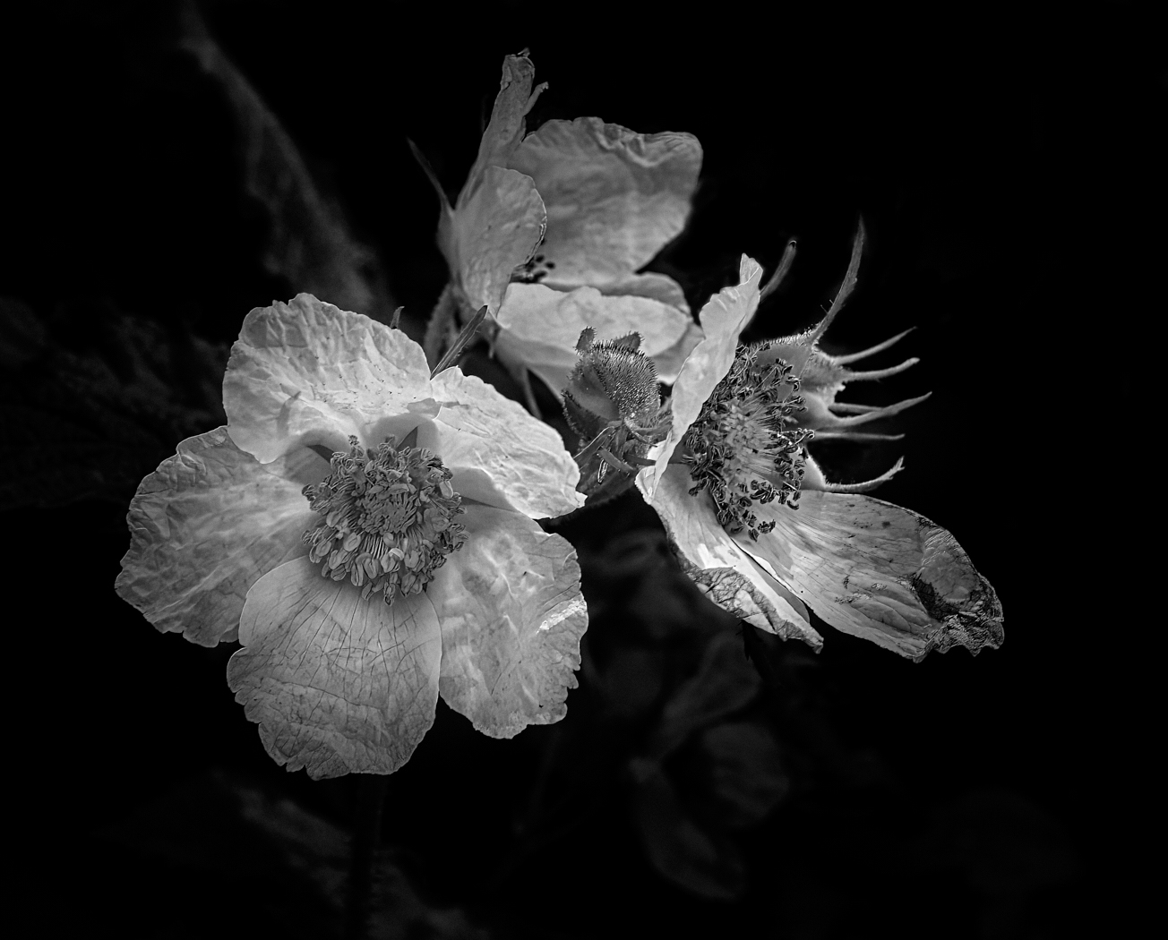
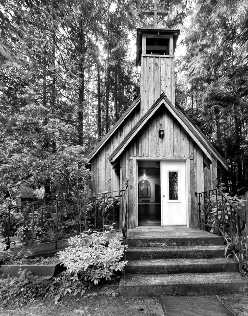
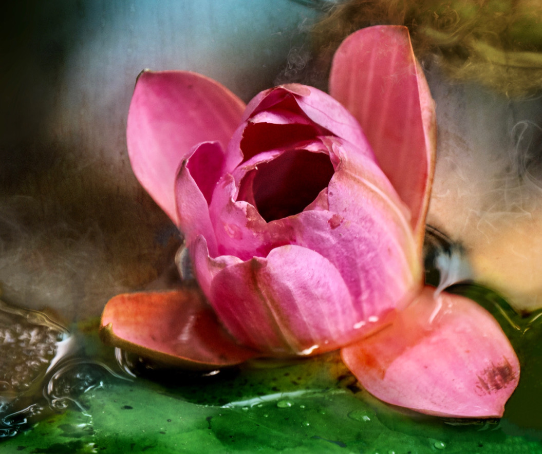
Nadia, this is a beautiful rose. I agree that the water droplets have been blown out, and need adjusting. I agree there is not much you need to do to this image. Instead of doing global edits try a spot gradient which will allow you to brighten and maintain the light in the center of the image and not blow out the droplets. I did the edit to show you how simple it could be. Hope thats okay |
Jan 6th |
 |
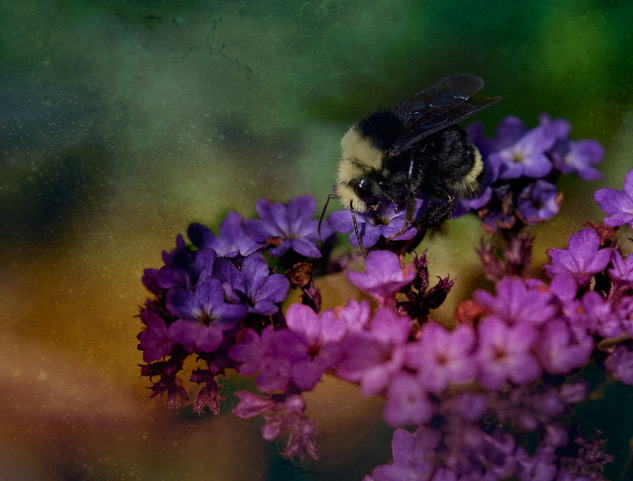
| 80 |
Jan 23 |
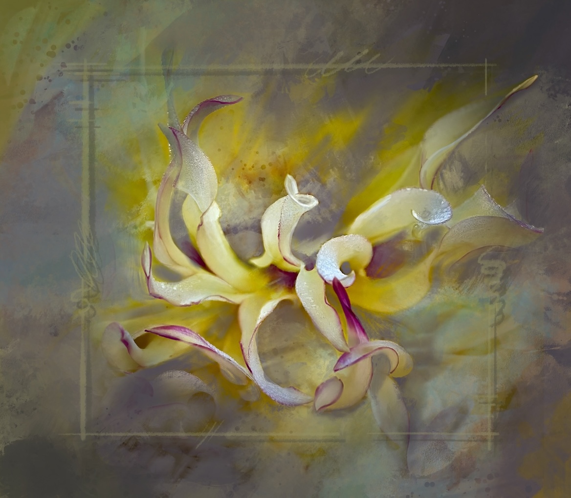
Comment |
Bob I like your interpretation of this subject. It is always a challenge to tame the chaos of an image like this. Isolating the key images works and I love the composition. The painterly handling of the background definitely makes this into a fine art photo - well done. |
Jan 6th |
5 comments - 4 replies for Group 80
|
9 comments - 12 replies Total
|