|
| Group |
Round |
C/R |
Comment |
Date |
Image |
| 39 |
Nov 22 |
Comment |
Thank you everyone for the effort and great suggestions. I will rework and repost. |
Nov 16th |
| 39 |
Nov 22 |
Reply |
David thanks for you time on this. I agree that the shadows can be brought up like you have demonstrated thanks for providing the direction. |
Nov 13th |
| 39 |
Nov 22 |
Reply |
Thanks Fran, I agree about the new crop it is way too close! |
Nov 13th |
| 39 |
Nov 22 |
Comment |
Vincent understood, in my mind this is still High Key. |
Nov 8th |
| 39 |
Nov 22 |
Reply |
Vincent, so much better in terms of composition and tonal range. She now stand out from the white background. I hope you like it too. Good re-processing. |
Nov 8th |
| 39 |
Nov 22 |
Reply |
I tried cropping in harder - I will try that again |
Nov 7th |
| 39 |
Nov 22 |
Reply |
Hi Jerry thank you very much. I did some more edits as some of those branches were just in the way. What do you think? |
Nov 7th |
 |
| 39 |
Nov 22 |
Comment |
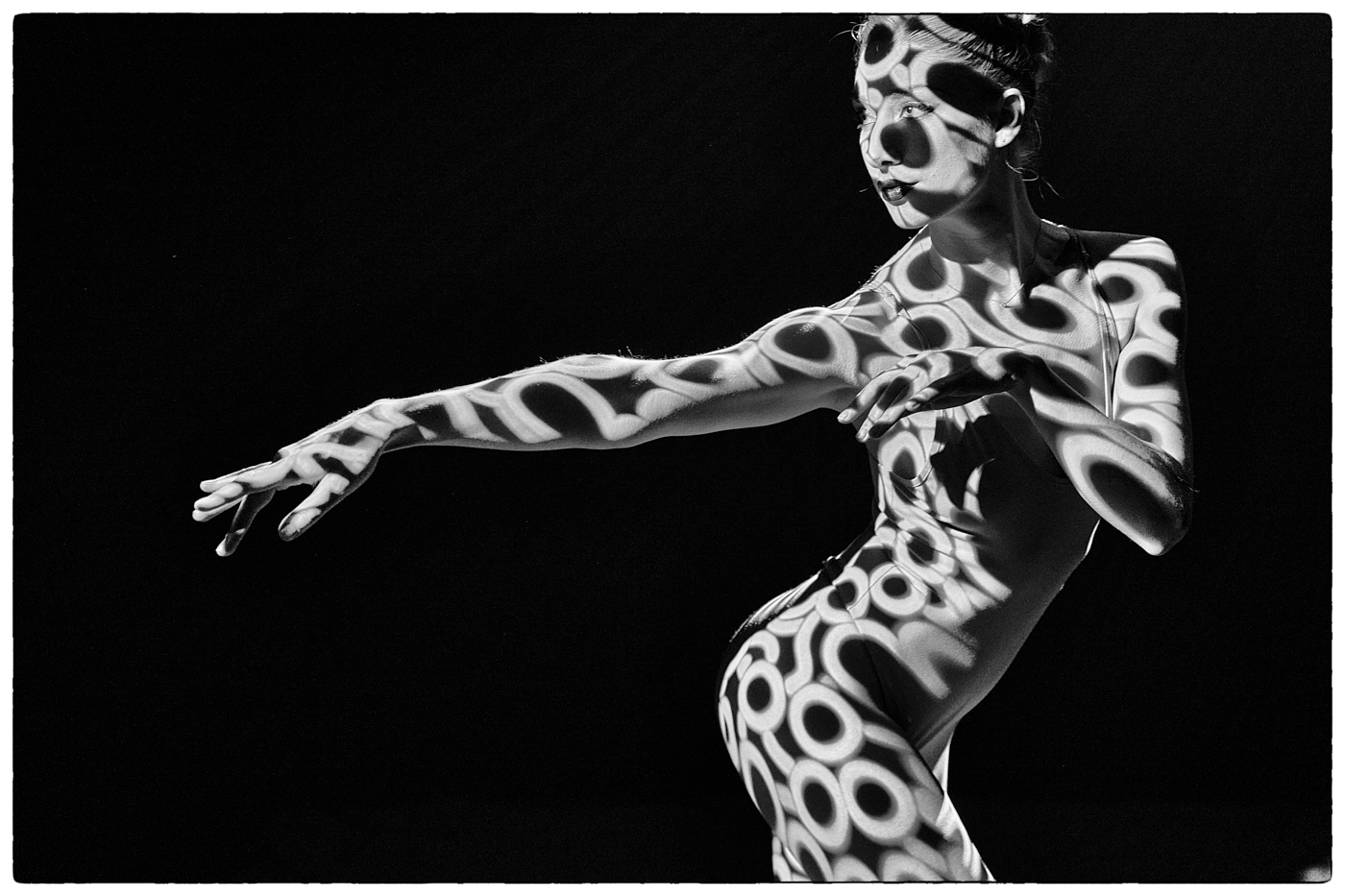
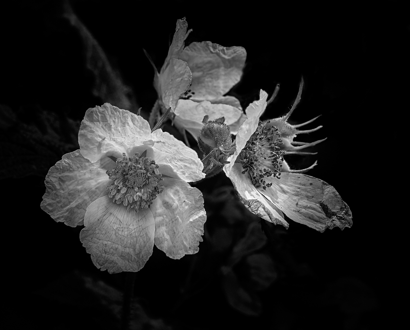
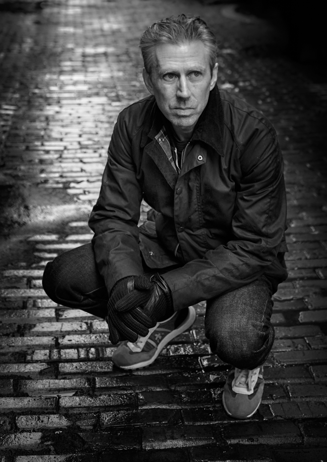
Vincent lucky you to get this chance to have a model. I like the conversion and agree with Jerry that you could eliminate some of the area above her head. Crop closer. Take a hard look at your colour version - have some of the mid tones have been lost? It appears to now be overexposed all that lovely light on her face, arms and body seem to have been lost and the end result seems a bit flat and washed out. I hope this is helpful. |
Nov 7th |
| 39 |
Nov 22 |
Comment |
Paul, strong story and strong statement of today's societal issues. Homelessness is a worldwide issue and getting worse. The conversion makes a very strong impact and having your brightest contrasts around the woman works well. It does leave the viewer making up a story and taking a closer look which is what a good image does. I would have liked to see a bit more space on the right behind the woman. I wonder if dulling the bright lights would help to move the eyes away from the to the actual subject. Just a thought - nice job |
Nov 7th |
| 39 |
Nov 22 |
Comment |
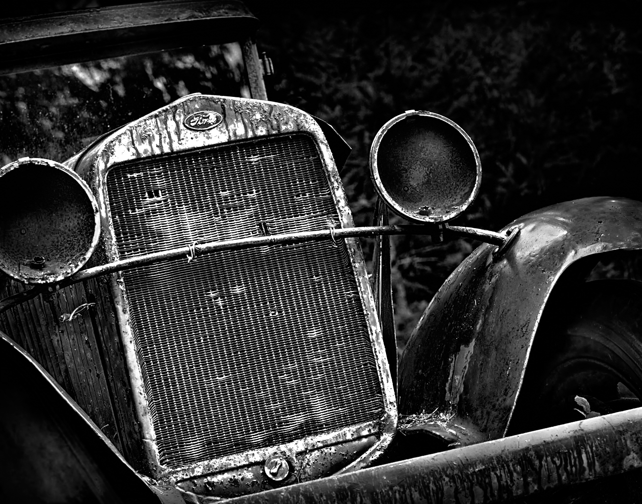
Jerry interesting choice to switch this to black and white. It's effective. That's one awesome lawn display. I am not sure what photo Computational Editing is - is that a specific app on the phone or the simply the BW conversion preset in the photo app? Consider a crop from the right to eliminate the bright shape that is confuse and draws the eye. And then use healing or cloning to remove any bright bits left because of the crop. Fun and well seen. |
Nov 7th |
| 39 |
Nov 22 |
Comment |
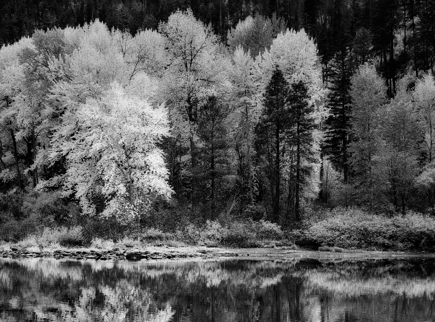
Fran I like the composition with the spit leading to the mountains. The mountains are lovely and go back forever. If as you state the image is about the spit and the stormy clouds and mountains I think you need to emphasize that. Try cropping out the foreground so the spit leads in from the bottom right. This wold bring focus to the story you are trying to tell. I also think the horizon line is a tiny bit off so check that. Check your right edge (I'm getting picky now) there is a tiny spit of land at the base of the mountains that could be removed or simply cropped out. It's tiny but it grabs attention. This misty mountains are just lovely , could the clouds be lightened just a bit? Maybe consider a 16:9 sort of crop - take a bit off the top and bottom. Nice work. |
Nov 7th |
| 39 |
Nov 22 |
Comment |
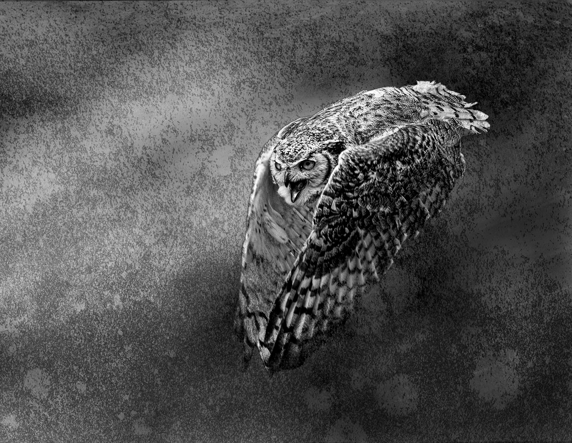
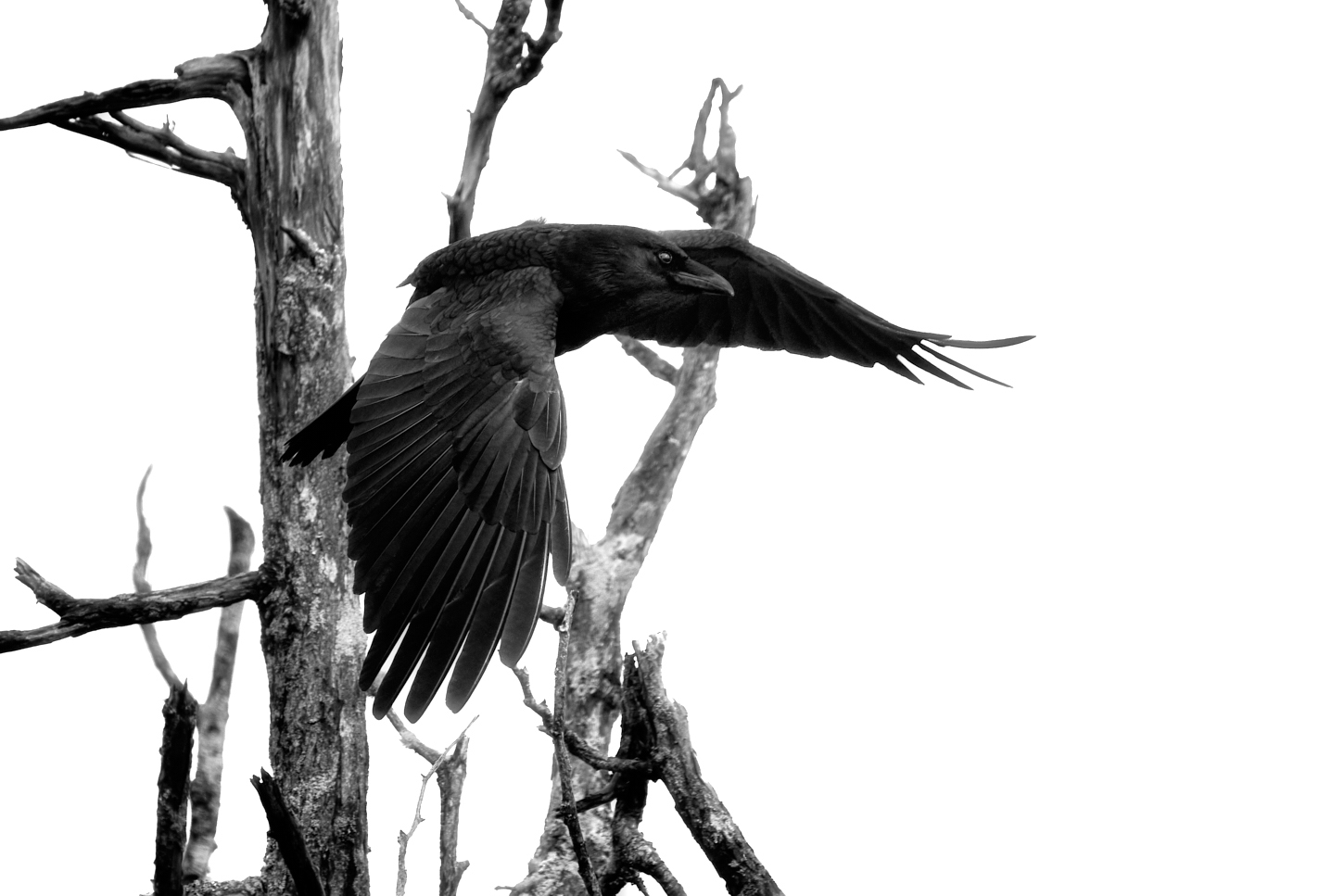
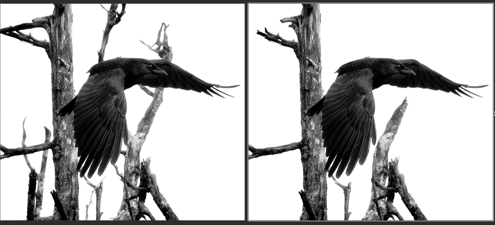
Dave nice conversion to black and white which really works. It gives the birds and their flight path the attention they deserve. Nice and sharp and all the wing positions are lovely. I agree with Jerry, keep it as it is. |
Nov 7th |
7 comments - 5 replies for Group 39
|
| 80 |
Nov 22 |
Reply |
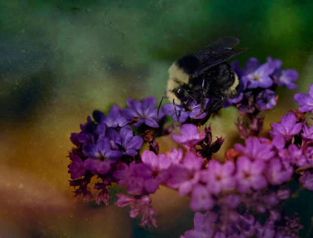
I really like this subtle treatment. It is subtle but it glows. Nice! |
Nov 27th |
| 80 |
Nov 22 |
Comment |
I am sorry to have not commented before. the treatment on the image feels like it was added because you could. the original image has lovely bokeh even if not all of the petals are in focus. All it needs is a bit of level adjustments to pull out some brights and mid tones and maybe keep the background subdued to make the poppy pop. You could definitely make the whites that are in focus pop a touch more. |
Nov 26th |
| 80 |
Nov 22 |
Reply |
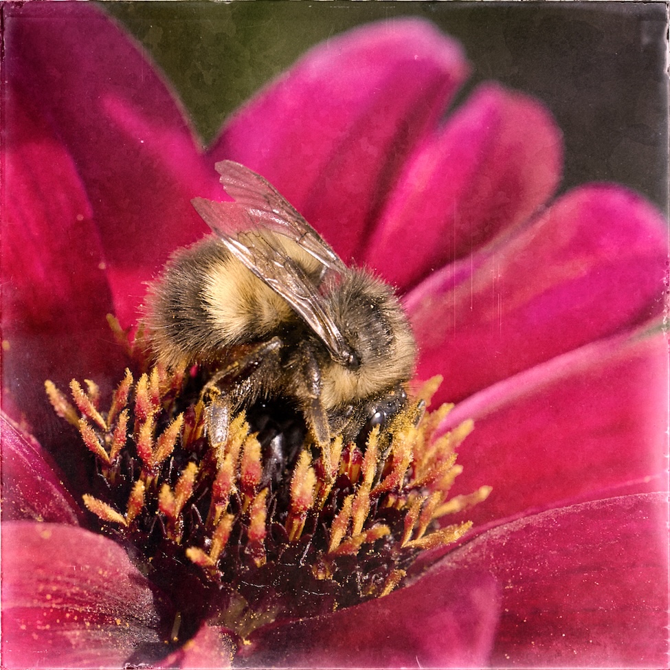
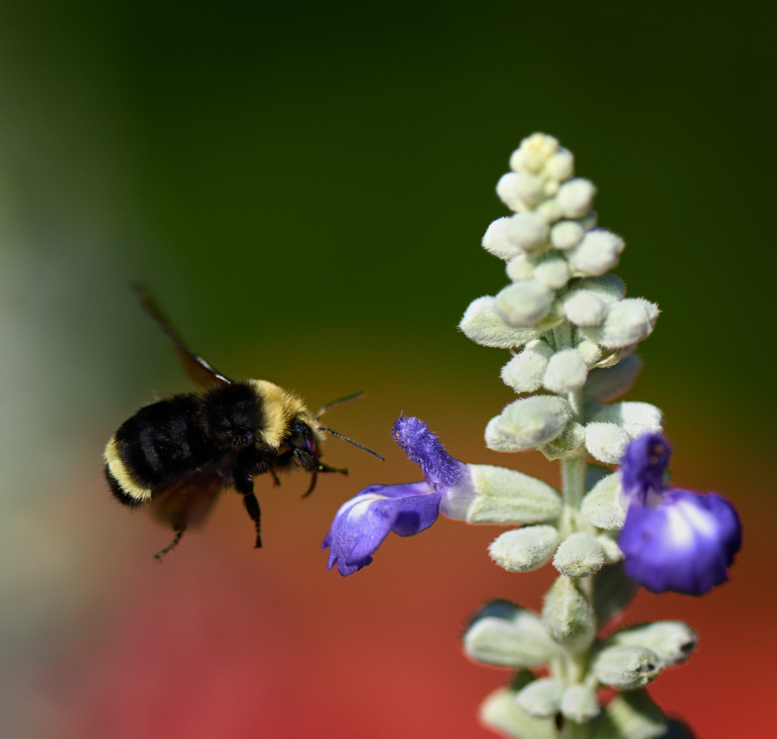
Nadia thanks for sharing your settings with me. I guess my ISO is a wee bit to low! Bees are a constant challenge. |
Nov 17th |
| 80 |
Nov 22 |
Reply |
Doug thank you, I agree on the poor old bee. Next time! You have to be quick and steady to get them. They are fast. Also I guess the peril of hand held vs using a tripod |
Nov 10th |
| 80 |
Nov 22 |
Comment |
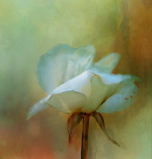
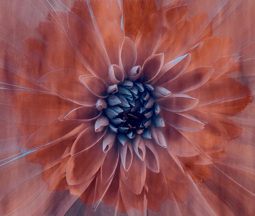
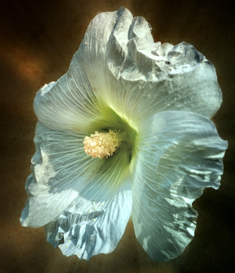
Here is a high key version perhaps not as effective |
Nov 7th |
 |
| 80 |
Nov 22 |
Comment |
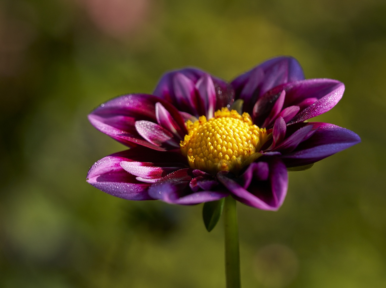
Jacob lovely flower and the Colors are well edited. I think with a bit of editing. You can make this better. How about a tighter crop and doing either high or low key. I took the liberty of a very fast two edits on my iPad (so apologies for my masking not being all it could be). Remove those background distractions. Or once you have masked it out drop in a nice soft bokeh texture or other texture. What do you think? I also would remove the top leaf/stem that goes off to the left - better rhythm. |
Nov 7th |
 |
| 80 |
Nov 22 |
Comment |
Rich thanks for the feedback - I like your idea of the crop I think it works better. |
Nov 7th |
| 80 |
Nov 22 |
Comment |
|
Nov 7th |
| 80 |
Nov 22 |
Comment |
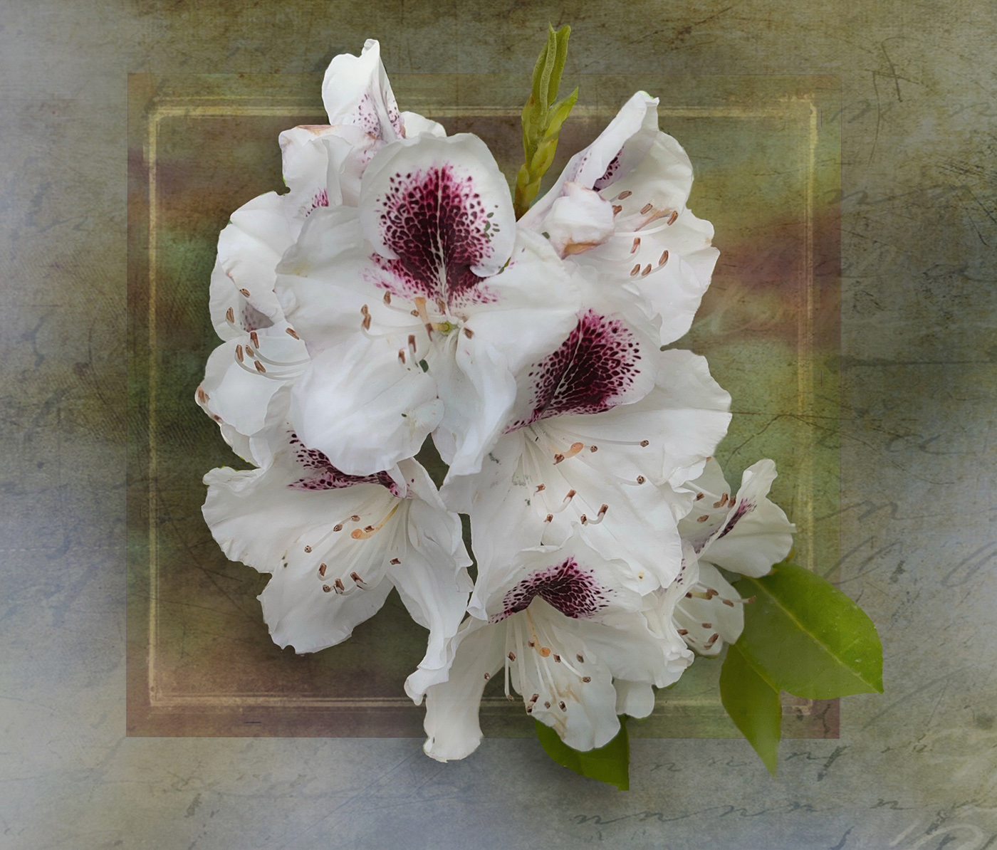
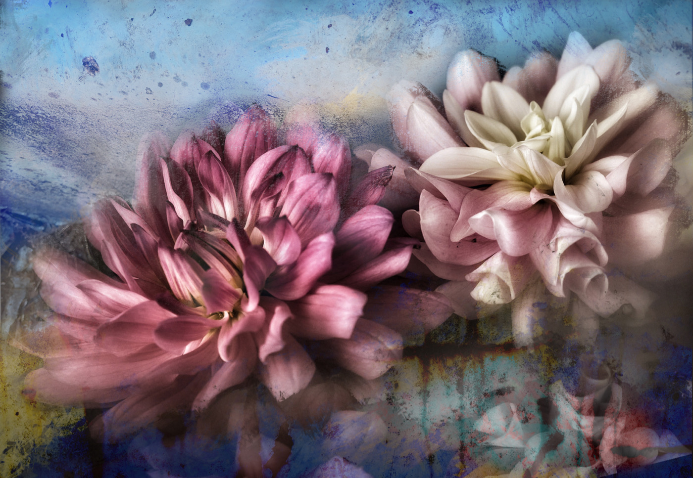
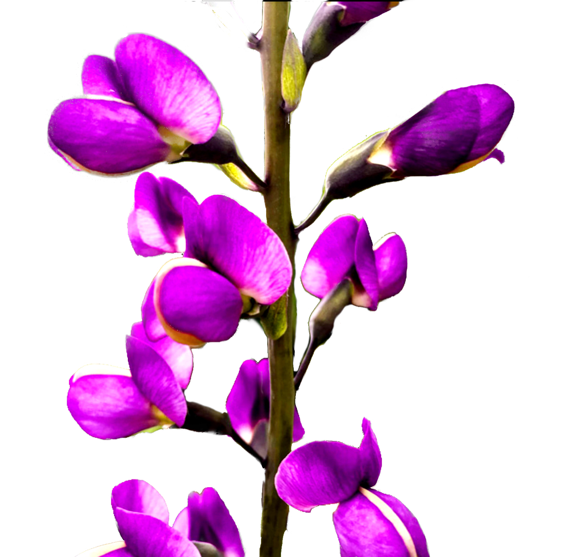
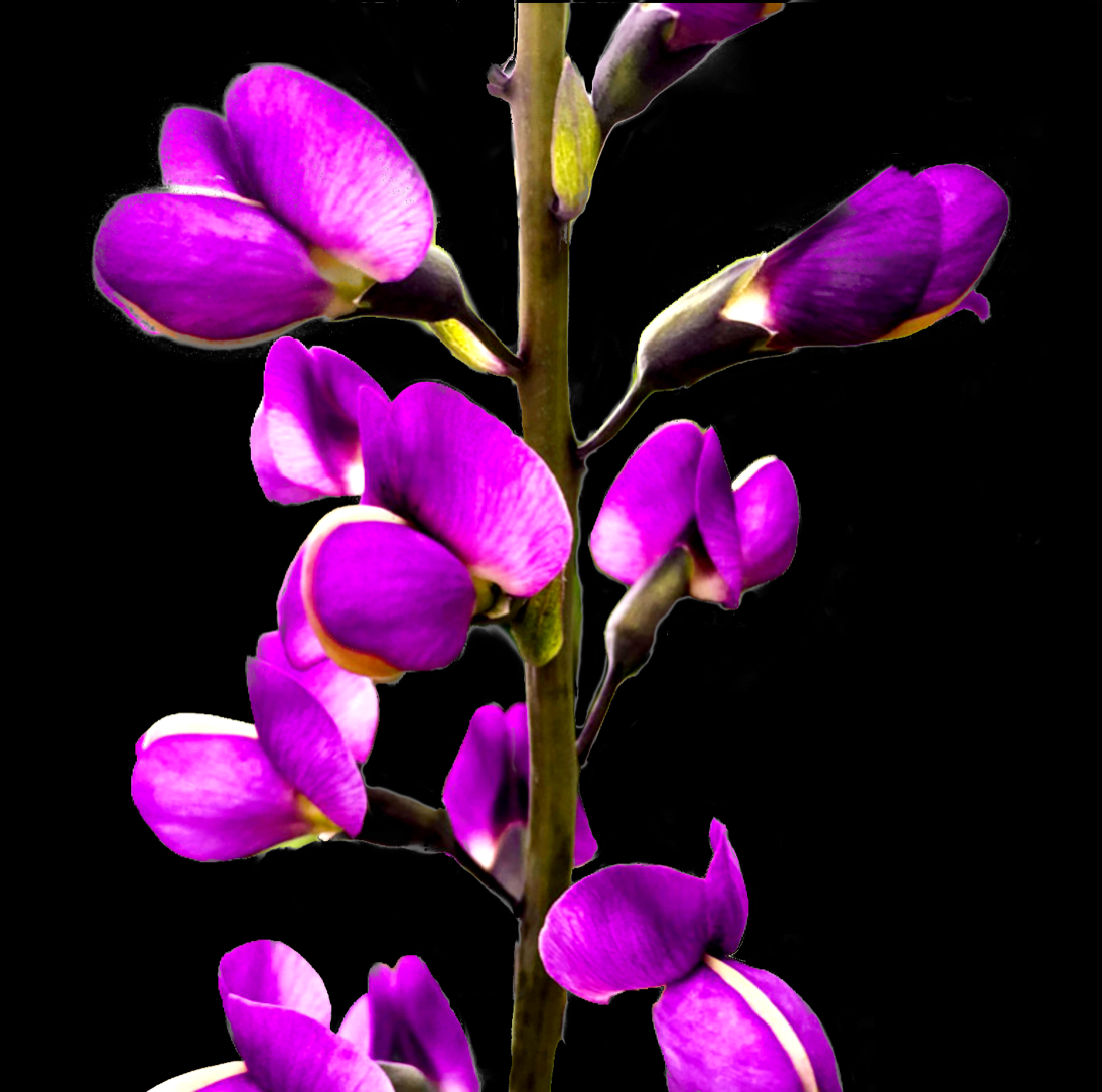
Welcome Rich. What a wonderful image. There is nothing to add. This is beautifully symmetric and the overlapping of the top bud to tie the two sides together is very well done. It's has a graphic feel to it . the colour manipulation on the right with the black background is so well done too. The fact that some of the petals on the dark side appear to have lost edges add to the interest. With that said would that same effect on the light side work where some of the petals fade out a bit more. Perhaps it would destroy the symmetry and completeness of the image. Well done! |
Nov 5th |
| 80 |
Nov 22 |
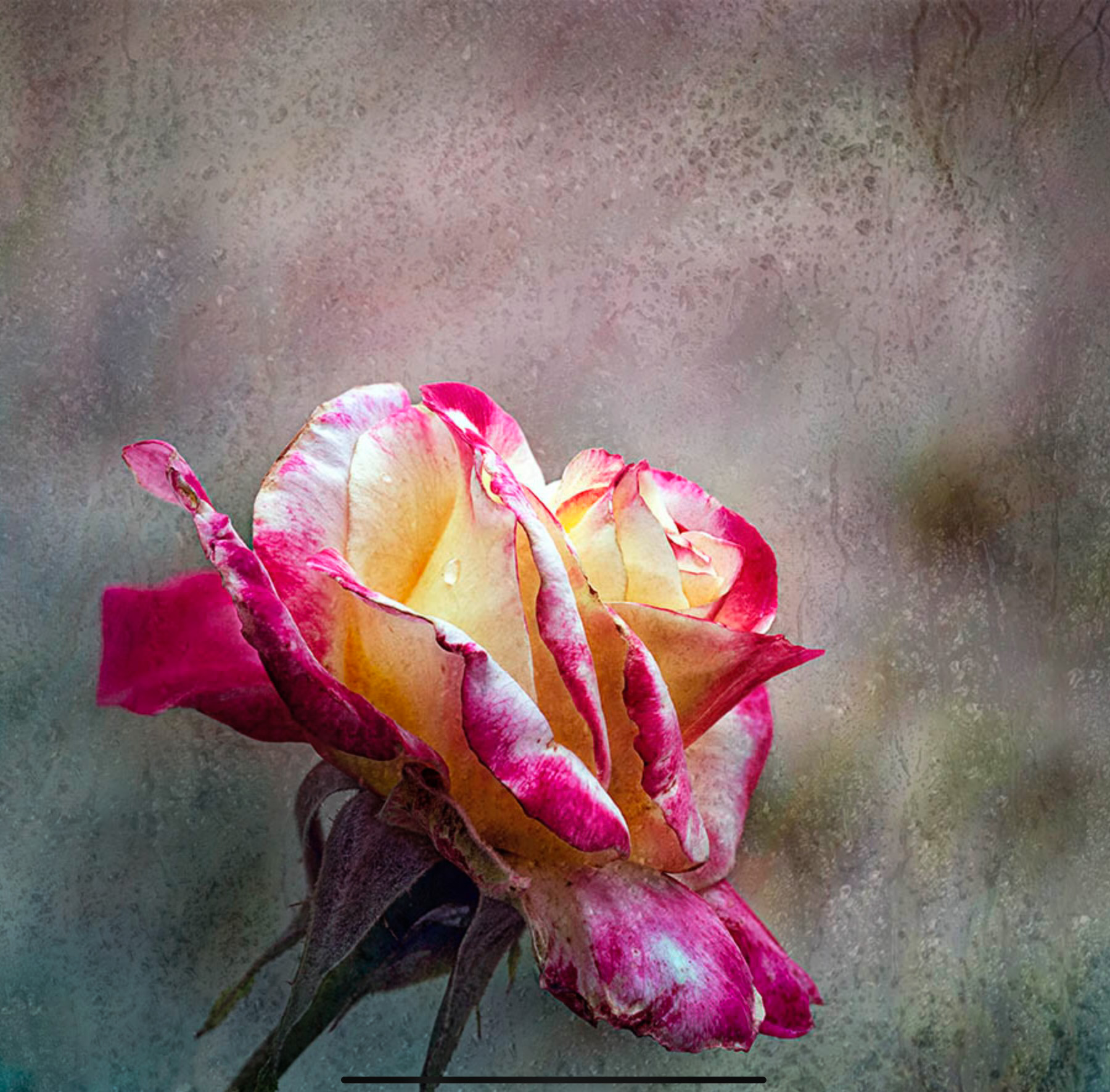
Comment |
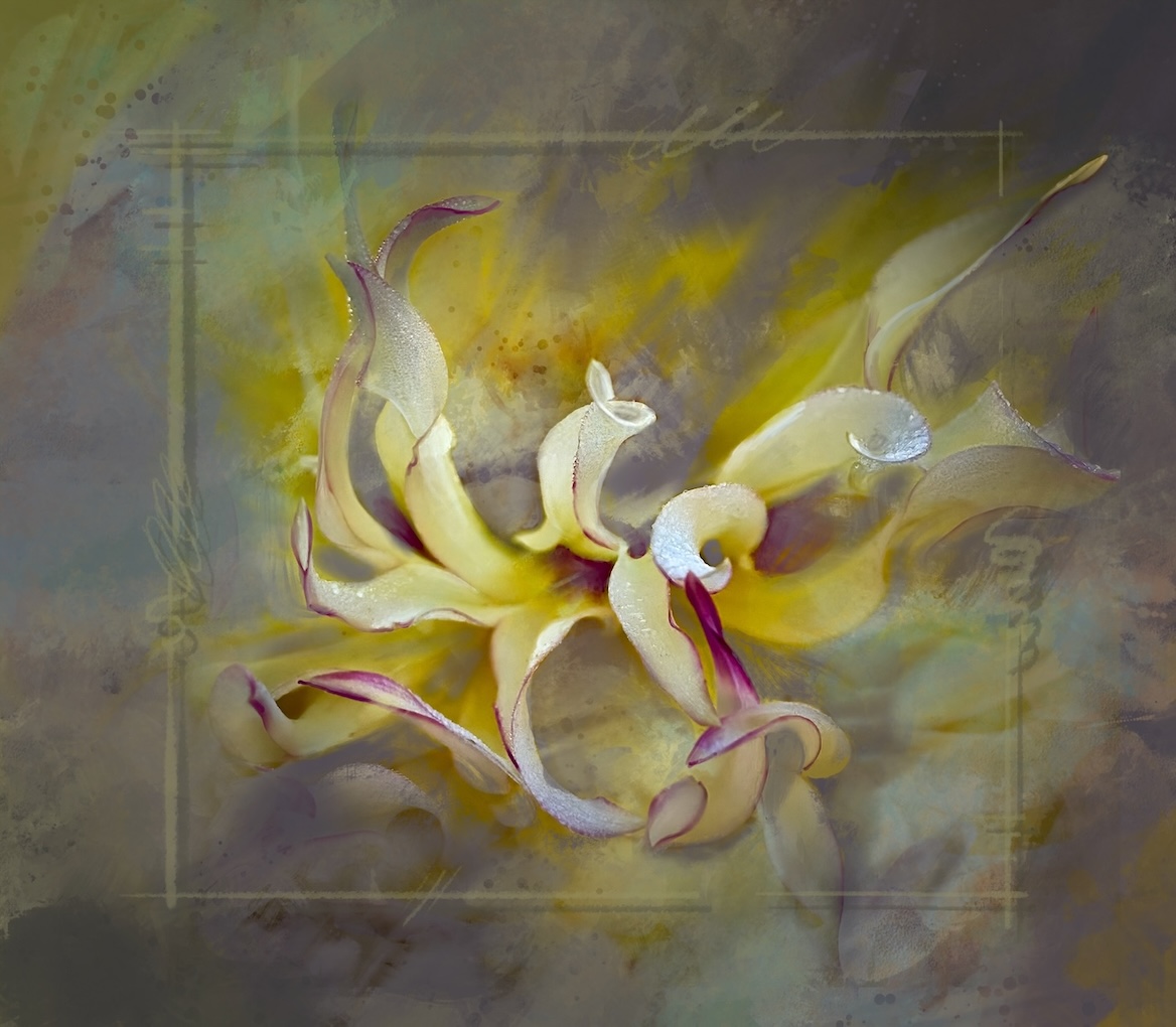
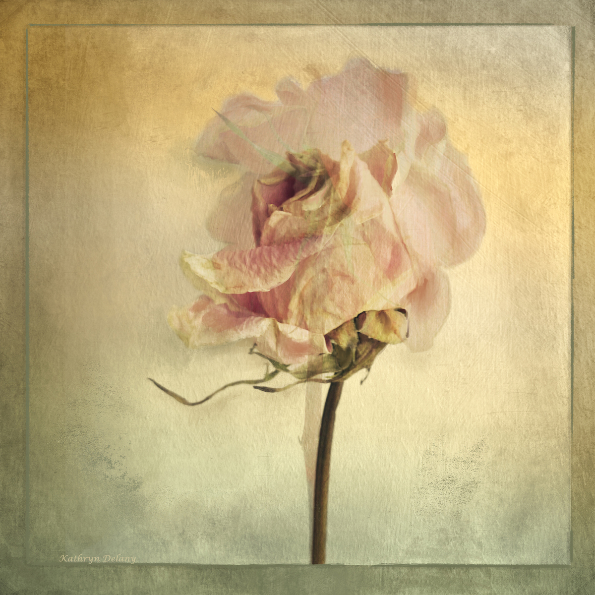
Bob and fun interpretation for a fading flower. I like the intense tones in the flower I would like to see you add in the soft toning in the background per the original - it might give an interesting grounding and depth to the image. You have some but more. |
Nov 5th |
| 80 |
Nov 22 |
Comment |
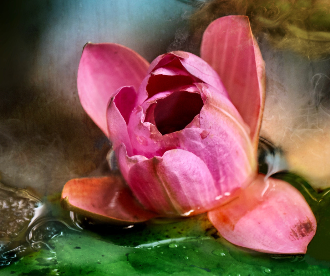
Doug lucky you - Catherine does lovely work. Overall I love the concept of this image. The pinks and green create a nice tension and the curving lines of the stem and stem head are very graceful.
My eye seeks some extra soft shading or burning on the stem head of the flower where the shadow naturally falls. You have some there already but a bit more. Some of the colour in the pinks closest to the stem head seem to have blown out. It makes the eye jump to the high key edges and back - and so makes me not sure where to look. Re-examine your light source and follow that for your edits. I think it is either back lit or from the top left or both? Given where you have darkened the stem head it is from the left though the light on flower does not follow that interpretation. Perhaps that a long way of saying some of the mid tones are missing. I hope this helps |
Nov 5th |
| 80 |
Nov 22 |
Comment |
Nadia it looks like you nailed the background technique - it really works. Maybe a little darkening of the bottom left part behind the rose might help depth of field.
|
Nov 5th |
 |
9 comments - 3 replies for Group 80
|
16 comments - 8 replies Total
|