|
| Group |
Round |
C/R |
Comment |
Date |
Image |
| 39 |
Oct 22 |
Reply |
Vincent so true and it is always an interesting journey to explore how editing gives us such vastly different results. |
Oct 18th |
| 39 |
Oct 22 |
Reply |
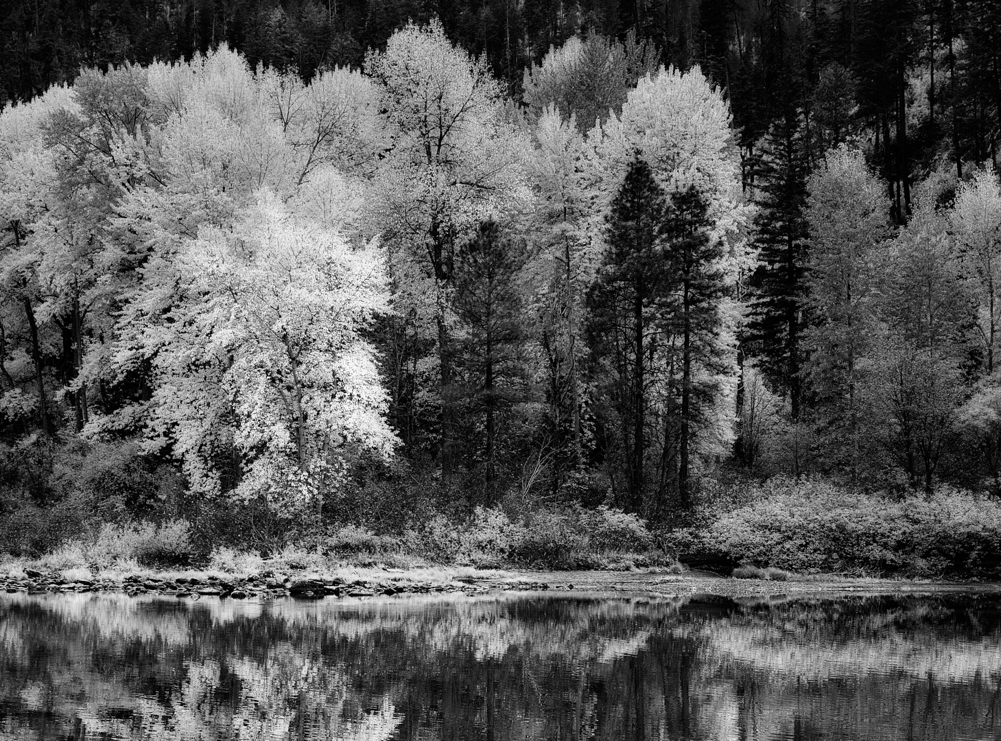
David, thanks. I think 3 votes for the colour makes the original a winner. Doing the b&w conversion was a good exercise for me in looking at tones and dodging and burning. I like the crop and more vertical orientation. Interesting that my edits made everyone think of infrared. Thanks everyone for your considered feedback |
Oct 18th |
| 39 |
Oct 22 |
Reply |
Paul thank you for your input. I agree about the highlights being pushed to the edge. I like the idea of more of the reflection. It creates a symmetry. And yes I agree with everyone the colour wins. |
Oct 18th |
| 39 |
Oct 22 |
Comment |
Fran, thank you for the feed back. I tend to agree that the colour version sings. |
Oct 16th |
| 39 |
Oct 22 |
Comment |
Fran - this makes a huge difference. I like it brighter as well - you can see so much more of the story. Nice re-edit |
Oct 9th |
| 39 |
Oct 22 |
Comment |
Paul good edit here. I think including the bit of fence is part of your story - though worth a try to see how it feels by cropping it out. It may crowd the composition though unless you went to a square. I like how you have brightened the grass and it provides a grounding to the rest of the image. The deer stands out nicely from the background which is nicely blurred. Well done |
Oct 9th |
| 39 |
Oct 22 |
Comment |
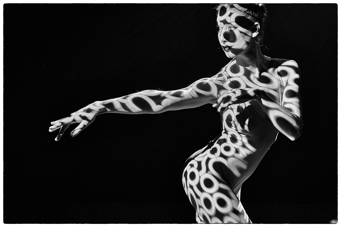
Vincent what a special moment and the black and white conversion really works. I was wondering why her arm and hand were in such an awkward position as on first glance it is not really evident that she is pregnant. The tones of the horse and her dress are very similar. I think it would be nice if you could bring that up subtly as part of the story? The whites really draw your attention to her and she looks very radiant, happy and confident. I too like the square format. I am not sure I would have gone quite as dark as you have. Overall the story comes across successfully. So a very nice edit. |
Oct 9th |
| 39 |
Oct 22 |
Comment |
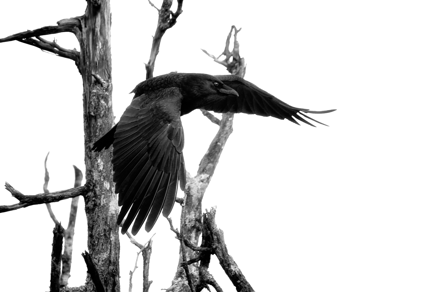
Larry, nice conversion from a low light shot. I like the crop. I think there are a number of distraction elements in the image like the sign, the electrical box and the 3rd bird with its head obscured. I think with a bit more work you could clone out the bird, the sign and the electrical box. I also think a very small vignette and perhaps playing with the shadows a bit could add a bit more drama to the image. I took the liberty of a few quick edits to give you an idea. |
Oct 9th |
 |
| 39 |
Oct 22 |
Comment |
Jerry, nice rendition in the black and white. I like how you have smoothed out the water and use those as bright / glowing areas of interest to lead the eye. I also like how you have balanced and brought up the rocks so the tones work well together. The vertical crop is interesting and helps add height to the falls. I think I do prefer a landscape crop on this one in a way. Nicely done. |
Oct 9th |
| 39 |
Oct 22 |
Comment |
Fran, I agree this calls for a black and white conversion. I do like how the clouds shine and wonder if you could gently pick out some other brighter areas? May brighten the whites on the boat and the wake just a bit to provide a bit more push and pull. And subtly lighten the layer of mist in front of the boat? I would also make the mountains completely dark - remove the bits of snow that are distracting on the left of the mountains. |
Oct 9th |
| 39 |
Oct 22 |
Comment |
David, your monochrome definitely is the correct choice here to convey your story. You handled the tonal values so well. I love the drama that is revealed in the sky and that possibly echoes how you were feeling. Also all the lights and darks that emphasize the fairways which provide movement and leading lines is excellent. I cannot see any way to improve it right now. Well done. |
Oct 9th |
8 comments - 3 replies for Group 39
|
| 80 |
Oct 22 |
Comment |
Jacob and Nadia thanks for the idea. I actually like it this way as well. ðŸ˜�½ |
Oct 24th |
 |
| 80 |
Oct 22 |
Comment |
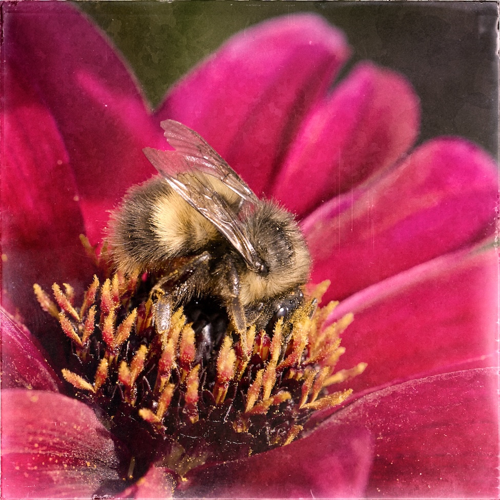
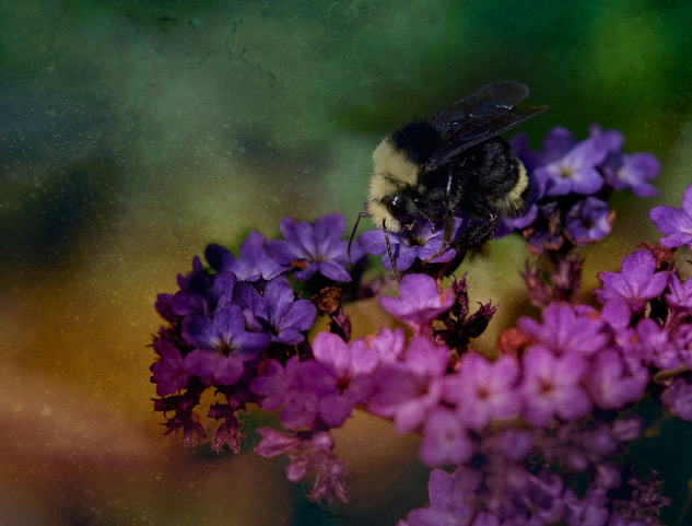
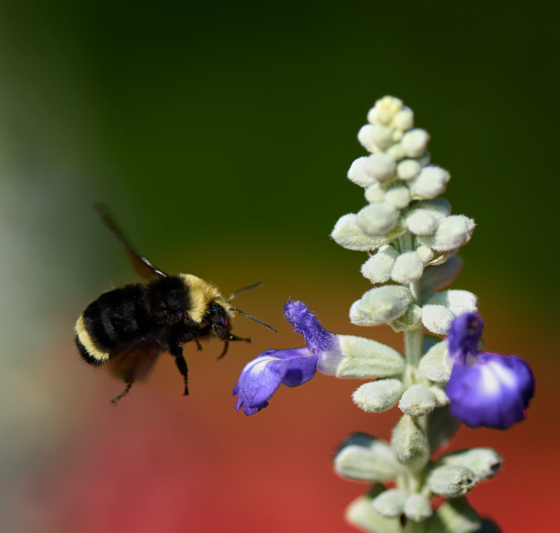
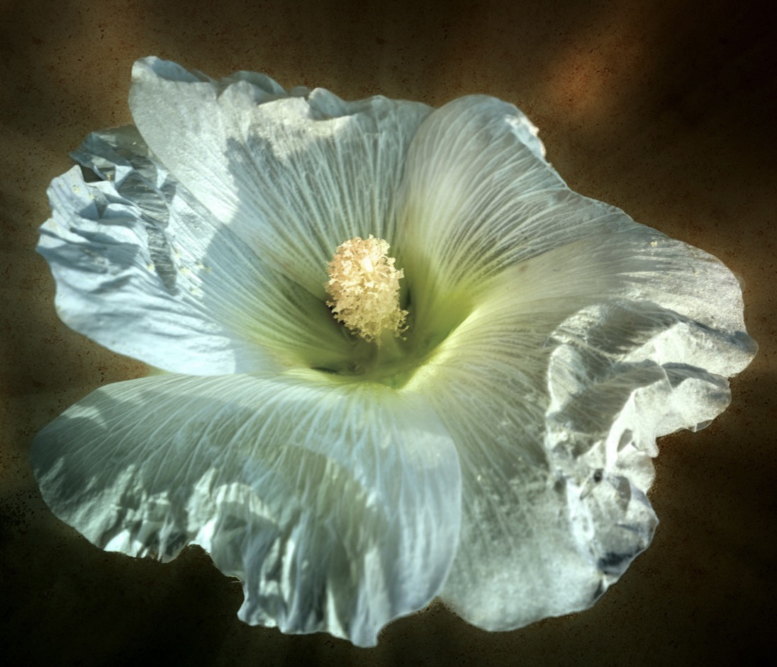
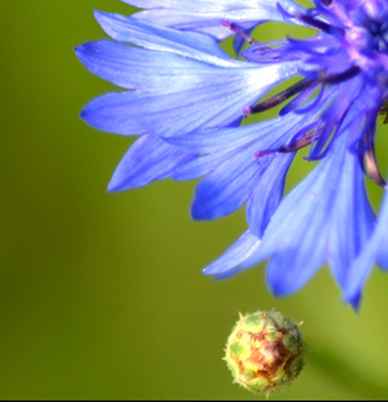
Syed, one thing I have found trying hand held macro is that you definitely need a higher F-stop than you think. I frequently catch myself at f.4 for f.5.6 and having the same result that you have here where the focus misses the key area due to possibly movement either by the flower or by yourself. So I normally crank up to at least f11 and if without a tripod I will use a much higher ISO to compensate for wind movement. For me the focus is on the small bud and the back of the flower on the left so having so much out of focus is a problem to my eye. I love the colour of the flower against the soft greens and yellows of the background. I would consider a hard crop for a really different look. |
Oct 11th |
 |
| 80 |
Oct 22 |
Reply |
Bob thanks very much for your positive comments. I appreciate it. |
Oct 11th |
| 80 |
Oct 22 |
Comment |
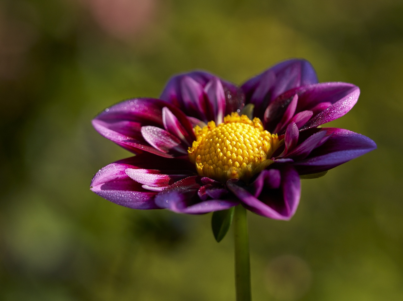
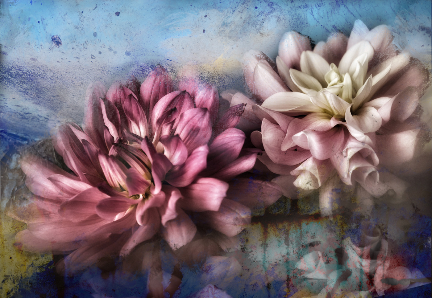
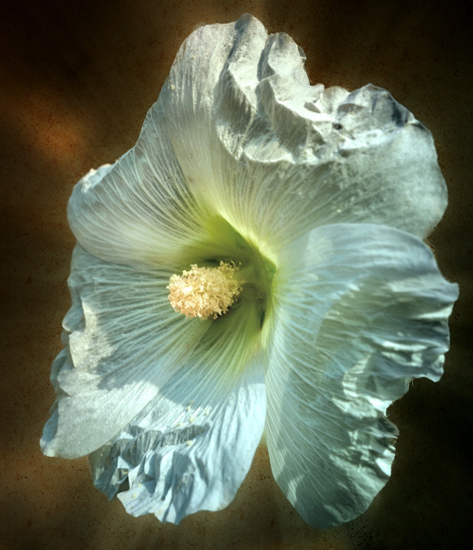
Doug great effort here. THe colours are fun and positive. I like how the flower fades away on the right. I do find the overall textural treatment is a bit busy so if you could selectively mask it so that it is not such a strong overall pattern. I would also like to see more darks and shading in the background area of the image to help bring the flower more in focus. Maybe if all you you did is to tone down the background it will bring some clam to the busy patterns. I hope this helps. |
Oct 9th |
| 80 |
Oct 22 |
Comment |
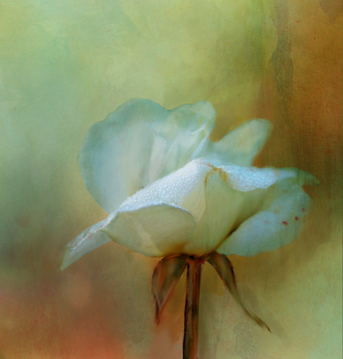
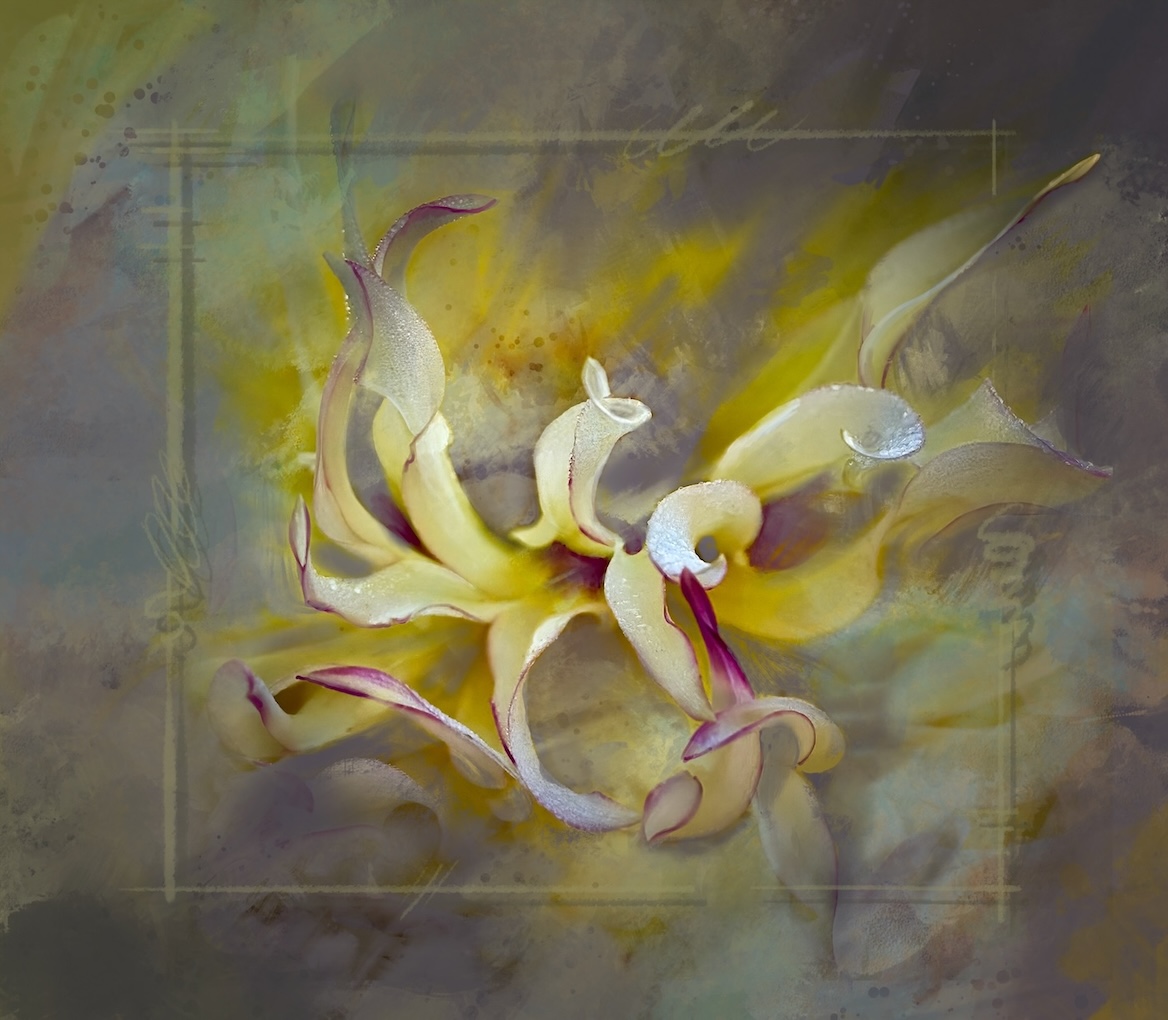
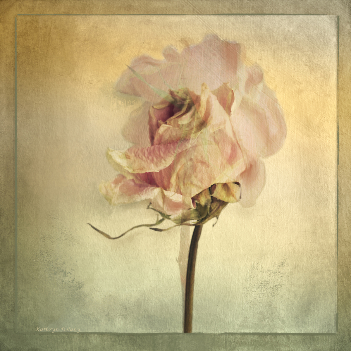
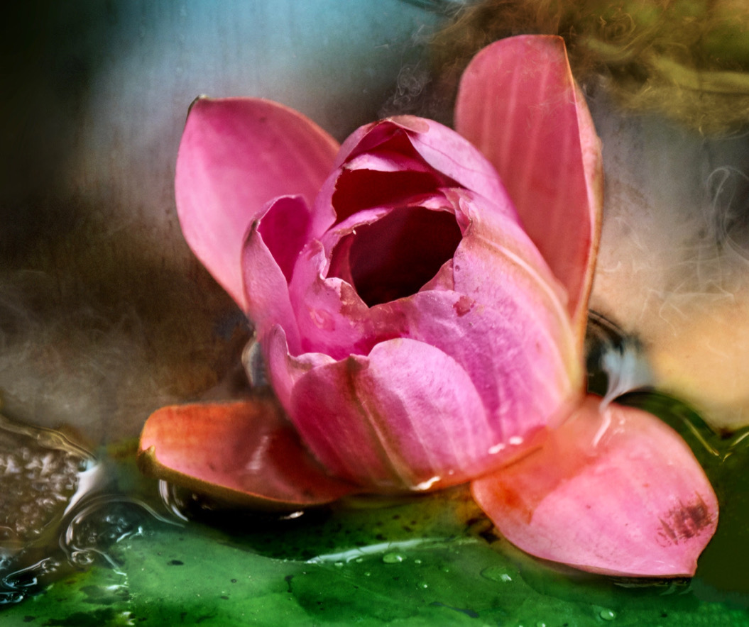
Nadia, I love how you have isolated the bloom and of course the square crop. Seems almost everyone has a square crop this month! The painterly treatment is nice though I find some of the brush strokes (top right) a bit repetitive so perhaps you can erase or blur them back a bit for more variation of texture. I would also like to see more dodging and burning in the background to push the flower forward, right now for me this is very flat and the tonal values feel all equal. You have a bit of a darker more interesting area at the bottom left. Look hard at your original and how the bokeh and tones help bring the flower into the foreground. The flower itself glows nicely. |
Oct 9th |
| 80 |
Oct 22 |
Comment |
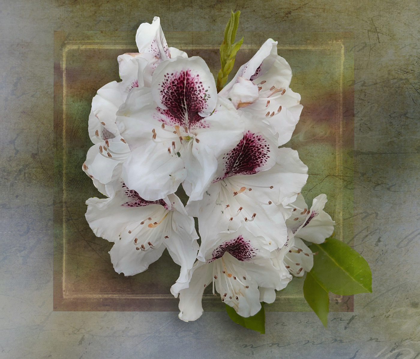
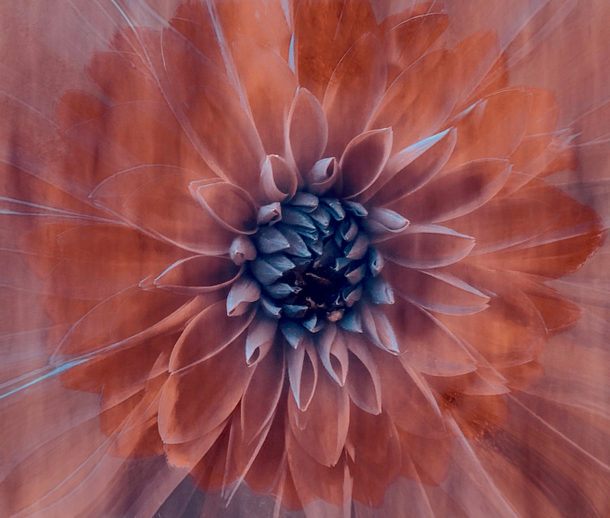
Jacob, nicely handled edits. I love the background and the use of the complimentary colour toning. I may suggest a tiny tiny brightening of some of the petals to add even more interest perhaps. You can brush it in selectively in Lightroom or if you are editing on your mobile device use an app called iColorama. That said I really like your edits here. Colours are sumptuous |
Oct 9th |
| 80 |
Oct 22 |
Comment |
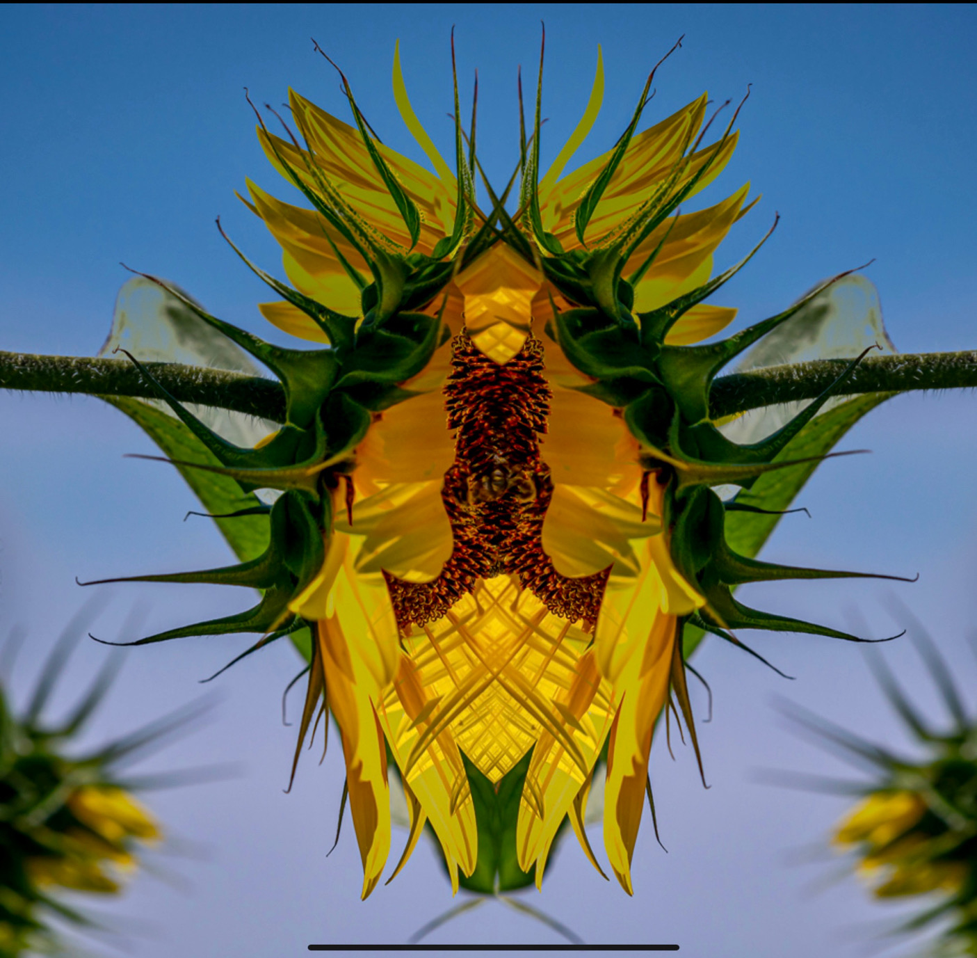
Bob fun edit for sure. It brings an abstraction element that is a bit edgy. I definitely like the brightness in the center flowers. Did you consider a square crop? I also feel a bit more vibrancy or lightening overall in the blue sky will maybe increase the feel of a hot summer day with beautiful sunflowers. I feel the heaviness's of the outside green leaves is a bit distracting and not necessarily needed. Nice Job. I did a couple of quick edits but in the end its what pleases you. |
Oct 9th |
 |
6 comments - 1 reply for Group 80
|
14 comments - 4 replies Total
|