|
| Group |
Round |
C/R |
Comment |
Date |
Image |
| 39 |
Sep 22 |
Reply |
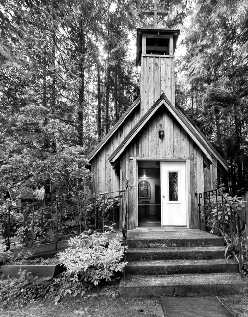
Paul Hi and thanks for dropping by and taking time to leave positive feedback. I would love to find both doors open. That said having a partial view invites you in and makes the story. |
Sep 16th |
| 39 |
Sep 22 |
Reply |
Larry thanks. I did try a bit to the rift however felt that angle really didn't help the composition. I agree with you about the white door and will take it down a bit. |
Sep 10th |
| 39 |
Sep 22 |
Reply |
Thank you Vincent for your feedback |
Sep 6th |
| 39 |
Sep 22 |
Comment |
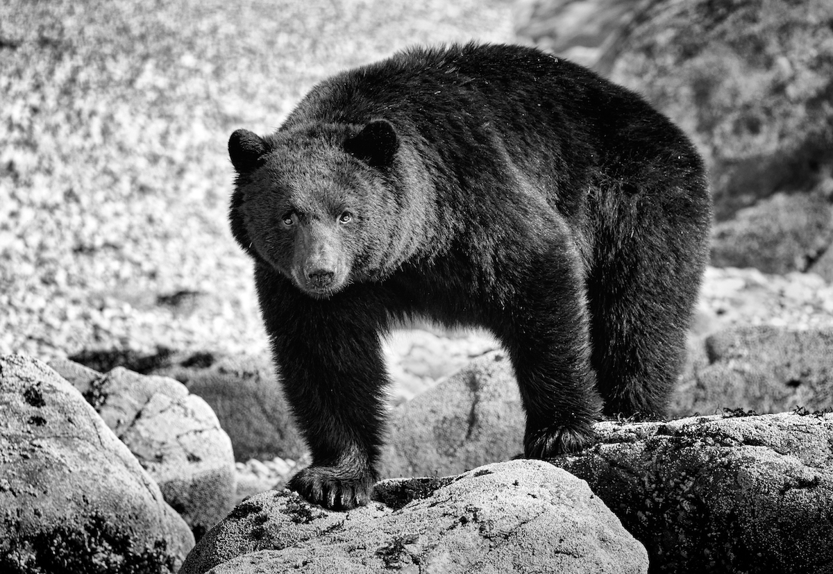
I think the black and white conversion works and you did a good job getting separation of tones. What an unexpected gift you had. I love that the whales are coming right at you. Having the whitest whites around the whales draws the eye where it should be.
|
Sep 5th |
| 39 |
Sep 22 |
Comment |
I think the black and white conversion works and you did a good job getting separation of tones. What an unexpected gift you had. I love that the whales are coming right at you. Having the whitest whites around the whales draws the eye where it should be.
|
Sep 5th |
| 39 |
Sep 22 |
Comment |
Vincent nice job with the black and white. It brings out the texture and has a great mood to it. I like it cropped too. Topaz Sharpen sure did the trick of getting a more impactful image. Good tones. |
Sep 5th |
| 39 |
Sep 22 |
Comment |
Great job with your edits. I like the balance of shapes between the drummer boy and lady in the BG. The white and black points are good and your rebuild of the wall awesome! I agree on burning the people behind the gate back to just vague shadows. As that contrast draws the eye. Try the same for the letters on the board behind the boy maybe. Also maybe a subtle darkening of the sky so the white helmets pop forward. Finally consider lightening the heavy shadows on the boys face, brighten the helmet to try and emphasize him and draw more attention there. I might crop the black square window off the right. All this is just my opinion of course. |
Sep 5th |
| 39 |
Sep 22 |
Comment |
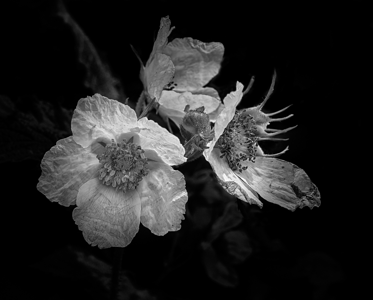
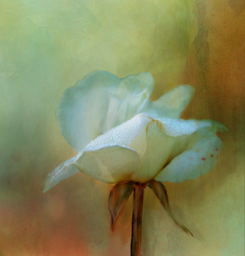
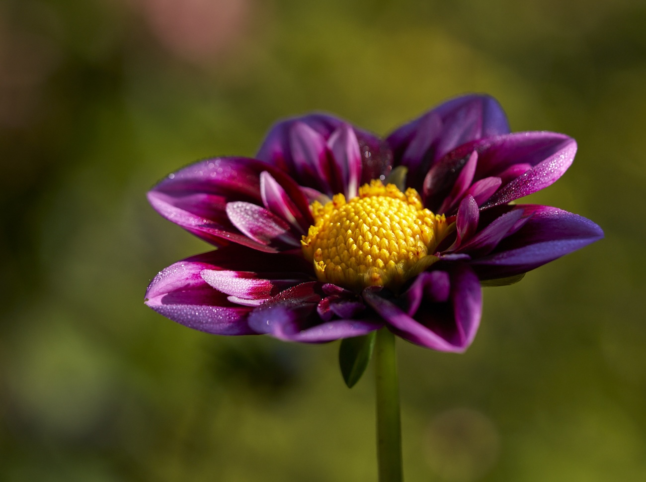
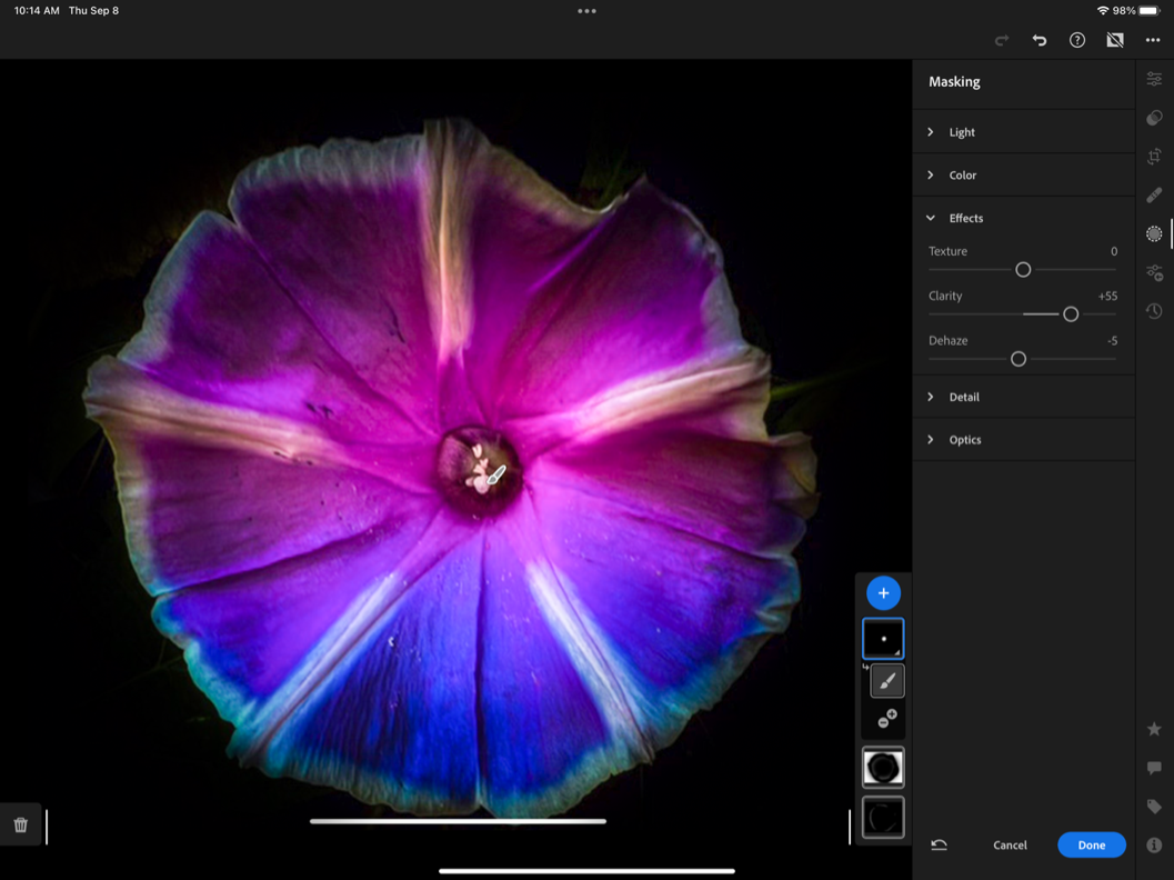
I like the conversion for sure. I think a square crop would result in a stronger composition as the bottom elements are not really adding anything. I might consider a bit more contrast in the whites and blacks by setting your black point and increasing the highlights a touch. I think that would give even more depth to the image. I would have liked to see the centre of the flower more in focus as to me its a bit soft and the focal point seems to be on the stem and bottom petals. Maybe running it through Topaz Sharon with just the flower selected would help that - see my screenshot.
|
Sep 5th |
 |
| 39 |
Sep 22 |
Comment |
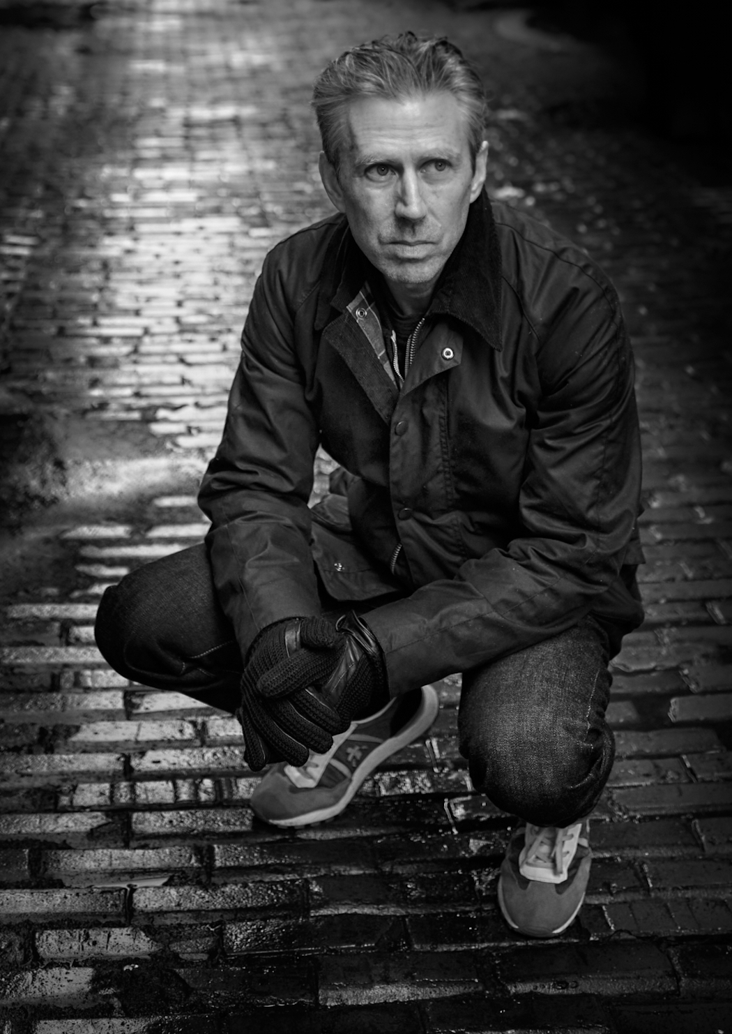
I do like the black and white conversion and she looks very sad and lonely so you captured the emotion. The image is sharp where it needs to be and the blacks and whites are good. The catch light in the eye also is good. A title would help tell you story as well, particularly if you do keep the black background. |
Sep 5th |
| 39 |
Sep 22 |
Comment |
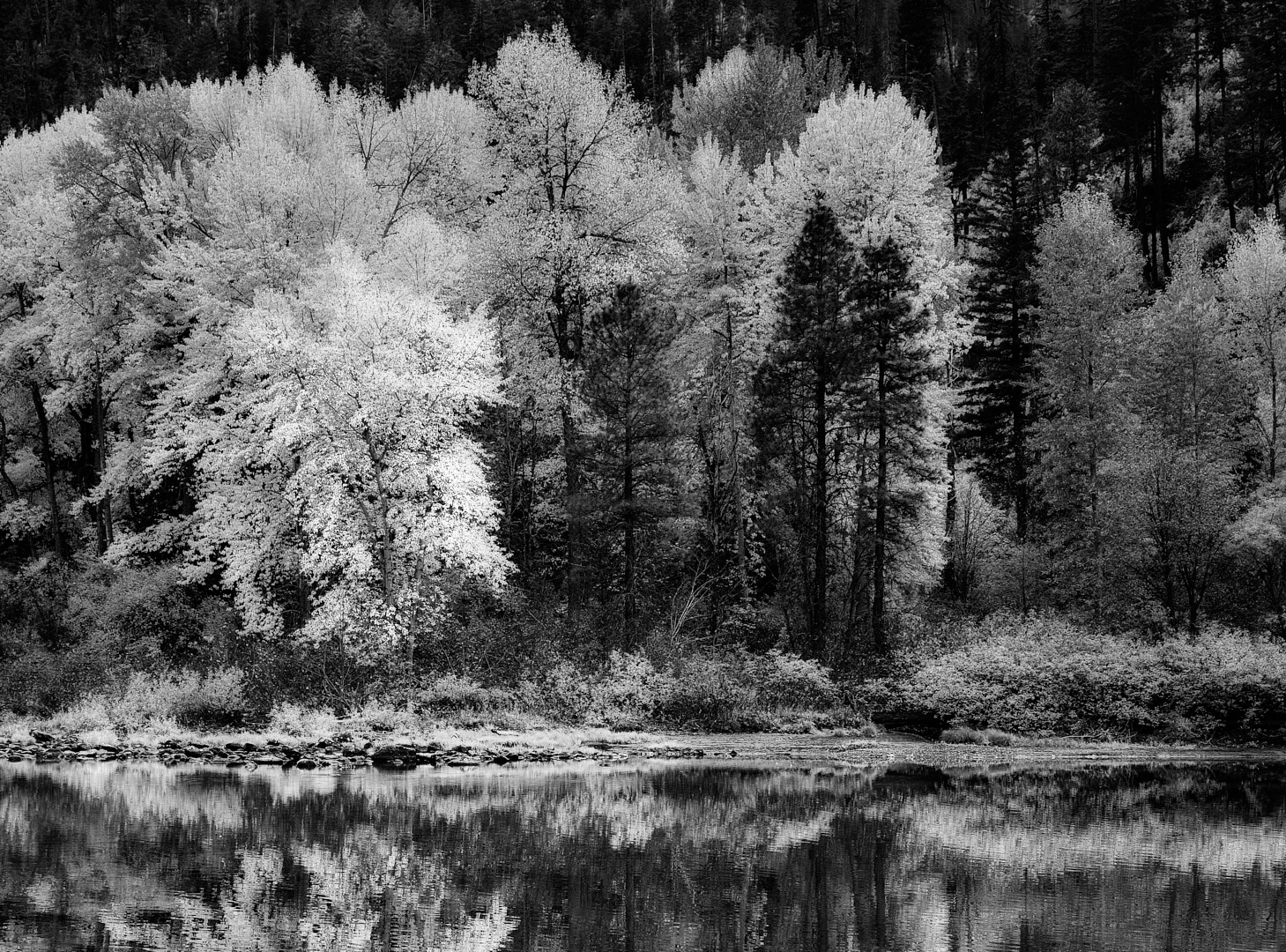
Black and white definitely ups the game for this image - I like your choice though the 2 bright white spots of paint seem to bother me since you have chosen to deemphasize the railway for the most part. So I would perhaps burn those back a touch - similar to your version 2. I like the light as well and the contrasts and lines. I also feel the power line could go. |
Sep 5th |
| 39 |
Sep 22 |
Reply |
David thanks for the input and helpful comments - shall I resend the files? |
Sep 5th |
7 comments - 4 replies for Group 39
|
| 80 |
Sep 22 |
Reply |
I like your suggestion of consciously selecting the whites to bring forward vs all over equally, I think it would add a lot of dynamic interest. |
Sep 28th |
| 80 |
Sep 22 |
Reply |
Bob I think the best part of this discussion for me is that it has generated a interest. Enough interest that other members are engaged and willing to experiment with the processes. My opinion is that, yes the softening helps tremendously. Now my question back to you... Is it worthy of competition? |
Sep 13th |
| 80 |
Sep 22 |
Reply |
Bob I think the best part of this discussion for me is that it has generated an interest. Enough interest that other members are engaged and willing to experiment with the processes. My opinion is that, yes the softening helps tremendously. Now my question back to you... Is it worthy of competition? |
Sep 13th |
| 80 |
Sep 22 |
Reply |
Hi Doug. Nice Edit I do like the blur and edits. Thanks for taking the time. |
Sep 13th |
| 80 |
Sep 22 |
Reply |
Jacob thank you for your feed back. I appreciate the comments. |
Sep 8th |
| 80 |
Sep 22 |
Comment |
|
Sep 8th |
 |
| 80 |
Sep 22 |
Comment |
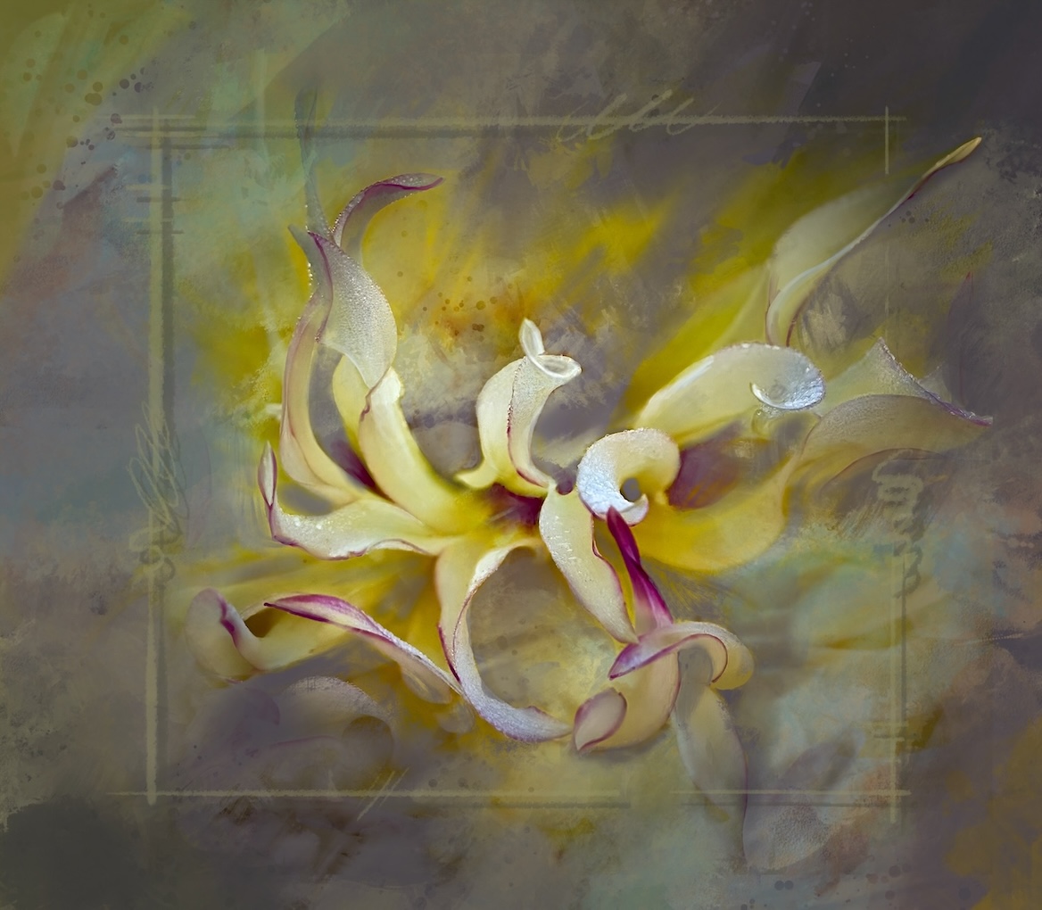
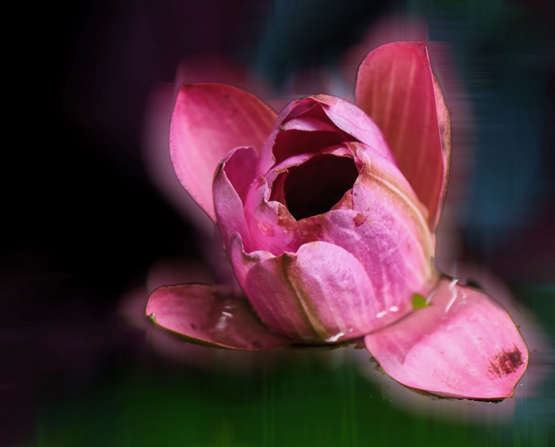
Hi Jacob - nice effort here. Personally I am a colourist so I really like how you saturated your colours in your 1st image. I also like the inner glow of light. The fading to black on the flower edges is part of the mood of the image for me. A nice arty interpretation. So some more ideas for you��.
I do a lot of editing on my iPad and I took your 1st effort in LR mobile and simply hit the auto adjust button which lifted the colour and glow. Then I brushed a mask over the edges and brightened the edges, just enough to give a bit more definition but hopefully not lose the feel you were after. I also did a specific mask over the flower center and added sharpening and clarity to the center.
If you have the iPhone 13 are you shooting in RAW. Some apps will allow you to adjust the speed and sometimes you need higher speed to get all the flower sharp. I have found those centres are tricky on the phone native app. I do use the Portrait mode too for flowers so you could try that next time as well. I hope this is helpful and I am looking forward to seeing your next effort |
Sep 8th |
 |
| 80 |
Sep 22 |
Reply |
Nadia thank you for your feedback, its very helpful. I do like my first edit as well. I do have NIK and I will take a look at that preset thanks for the tip. |
Sep 7th |
| 80 |
Sep 22 |
Comment |
This one is remarkably close to your edit :) |
Sep 5th |
 |
| 80 |
Sep 22 |
Comment |
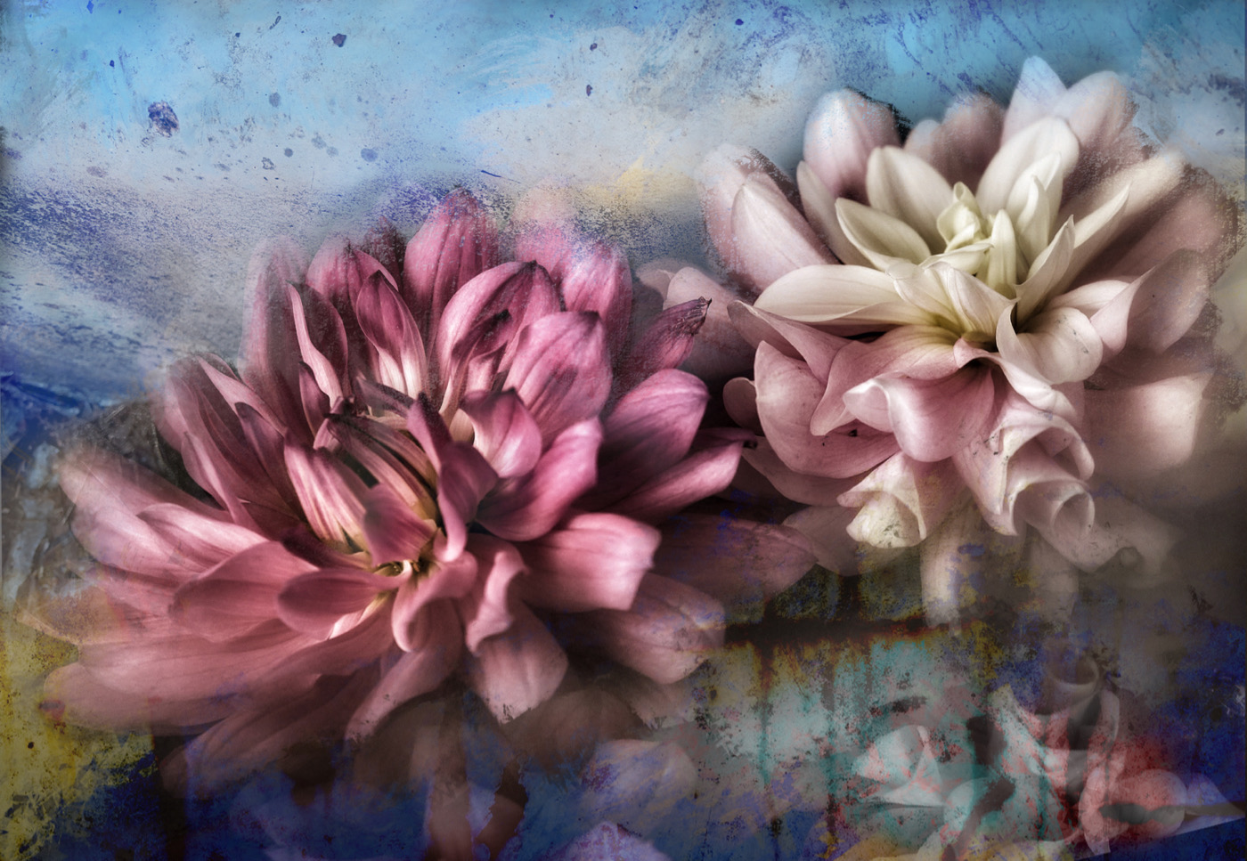
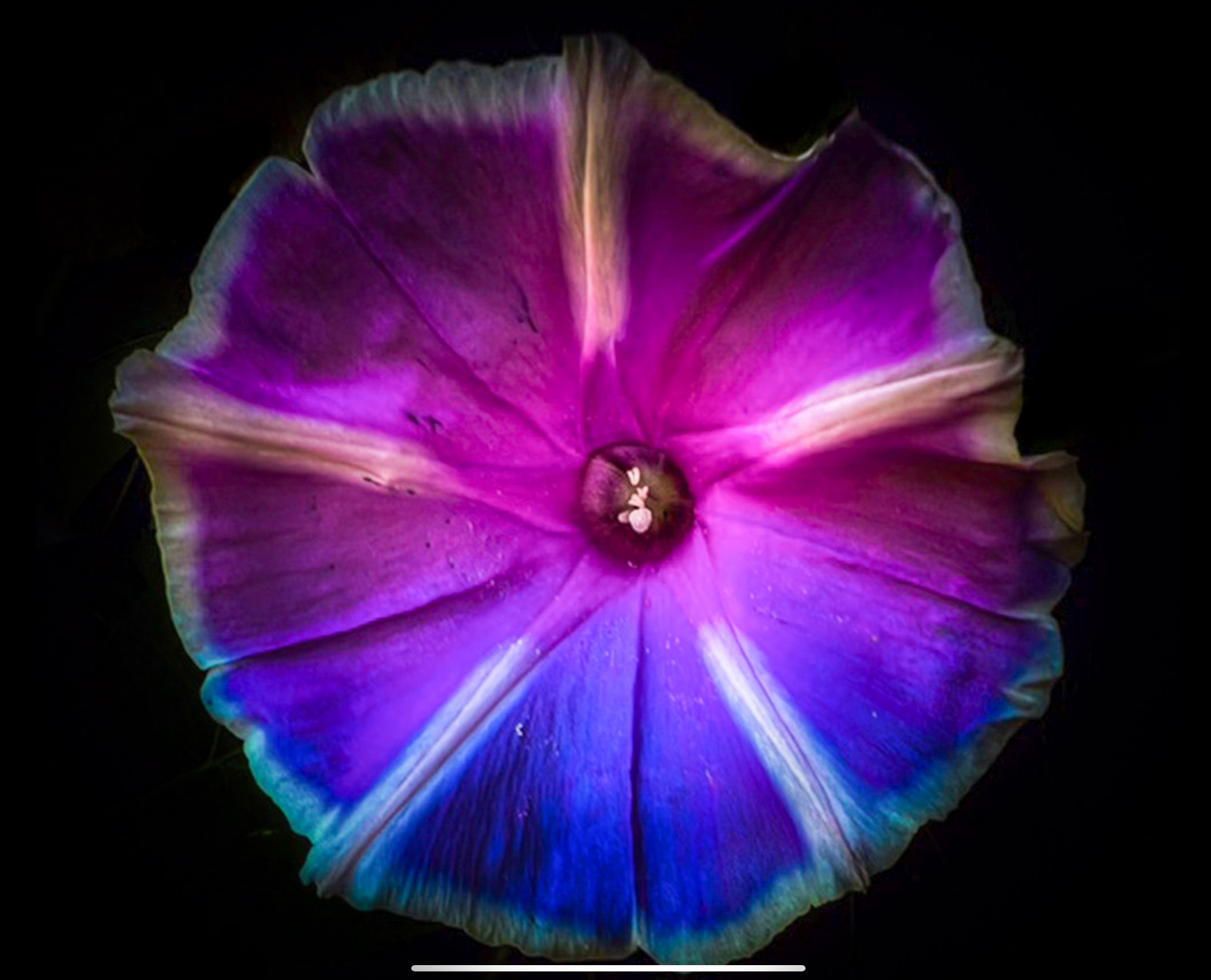
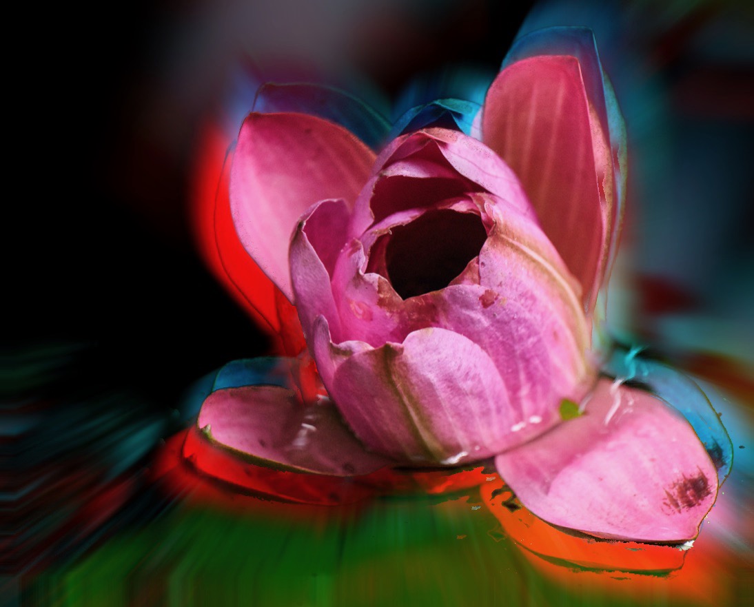
Bob thank for you reply and another way to look at the solution. As you say there are many solutions to one image. I use a combo of apps to get the look and Topaz Studio is a good one too - though most of my edits are created on an iPad for this kind of thing. Here are two other options I considered. Just for fun |
Sep 5th |
 |
| 80 |
Sep 22 |
Comment |
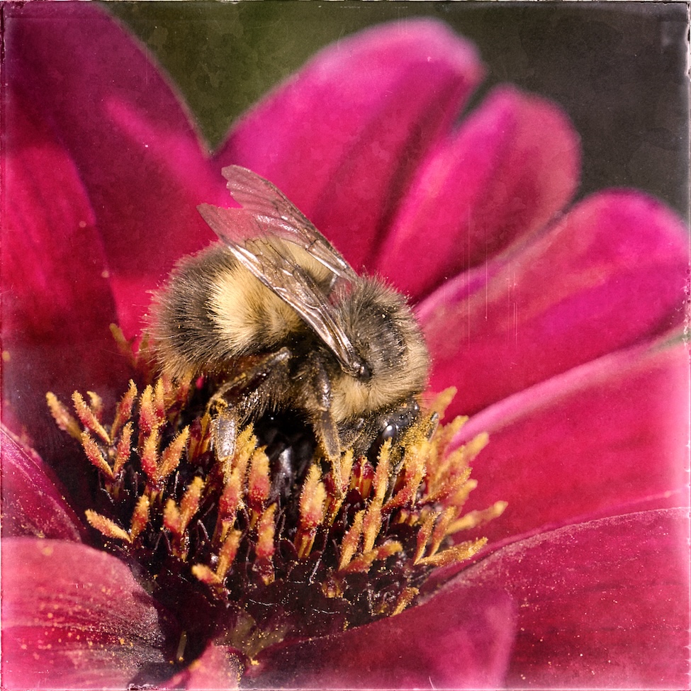
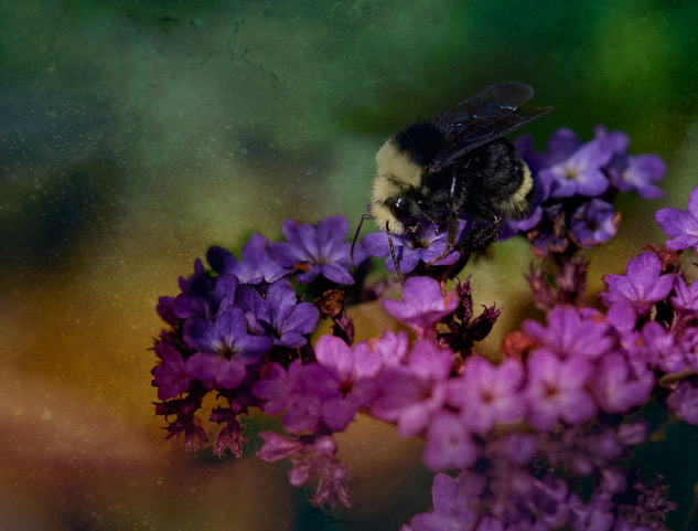
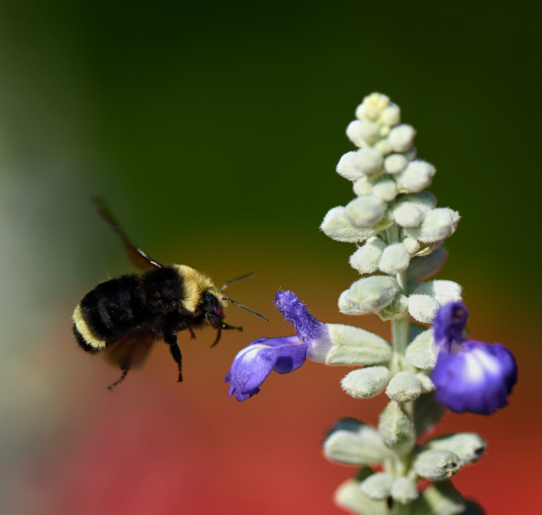
Syed, I love the soft bokeh in the back ground. I see your dilemma of the bee just being a bit soft. Have you tried running it through Topaz Sharpen on just the elements you want a bit more in focus. I might consider cropping to a square as well., or at least shaving a bit more off the right side. Then finally darkening the background a touch or a very very subtle vignette? Love the colours - keep these coming. |
Sep 5th |
| 80 |
Sep 22 |
Comment |
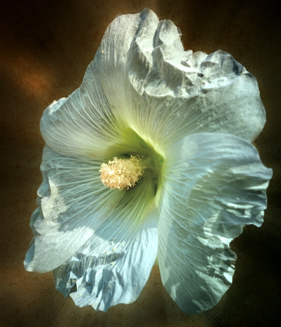
Doug I like your approach to something that you felt was not a great capture. The treatment gives the idea of the veins and life that lie inside the outer shell of the leaf we can see. Well done. |
Sep 5th |
| 80 |
Sep 22 |
Comment |
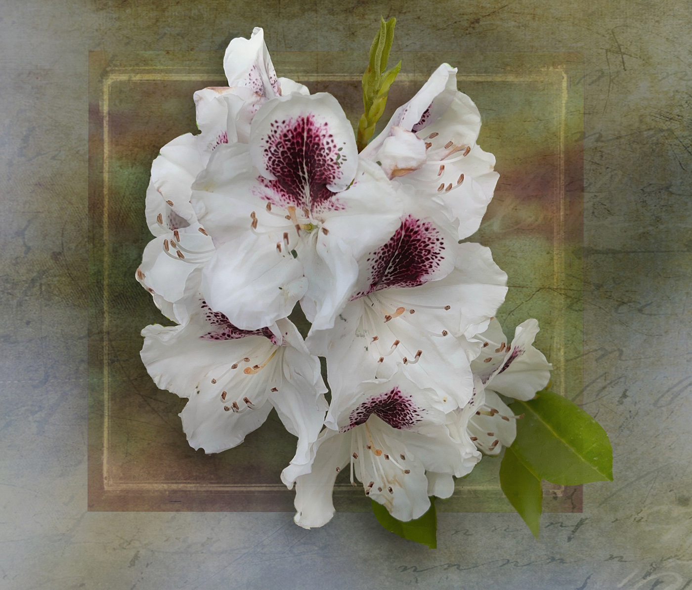
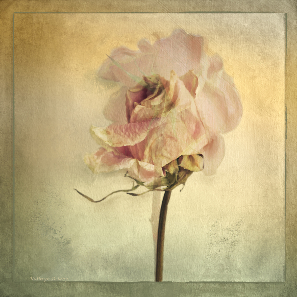
Nadia - I really like your remix of the back ground and the overlays are subtle and work really well. good use of light too, sharp where it needs to be. The composition works with the stem leading the eye in. |
Sep 5th |
| 80 |
Sep 22 |
Comment |
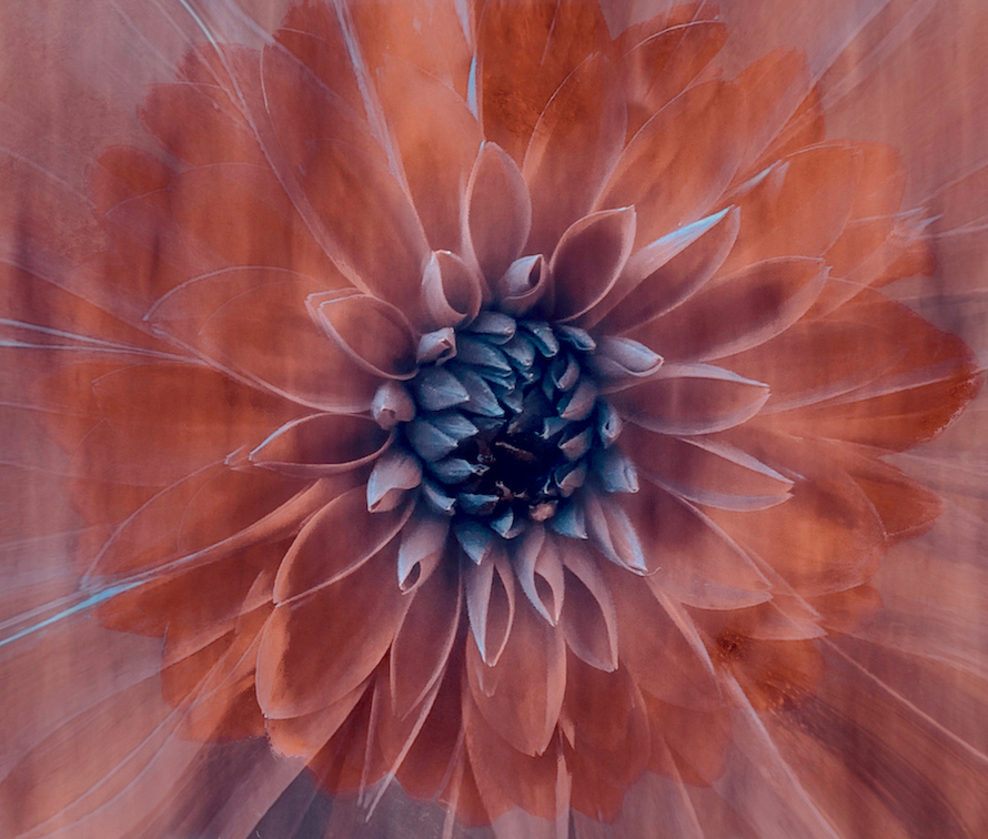
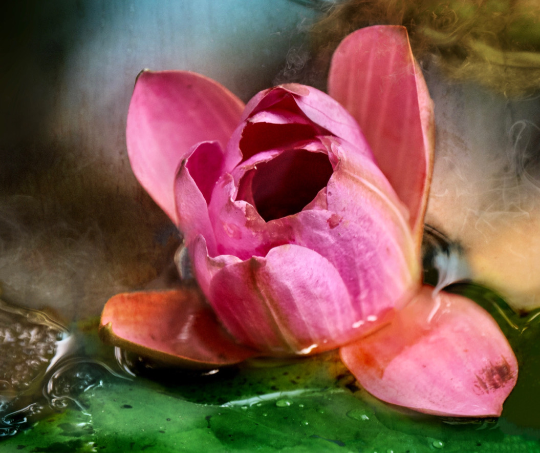
I really love this one, the colours, the lines and rhythm. If you have an app that you can add a mask and simply brighten the central flower a tiny bit that would help you I think. I think it is fun and well done |
Sep 5th |
8 comments - 6 replies for Group 80
|
15 comments - 10 replies Total
|