|
| Group |
Round |
C/R |
Comment |
Date |
Image |
| 39 |
Aug 22 |
Comment |
Thanks everyone for your input - I have tried to incorporate all the advice and redone the image. |
Aug 24th |
 |
| 39 |
Aug 22 |
Comment |
Thanks everyone for your input - I have tried to incorporate all the advice and redone the image. |
Aug 22nd |
|
| 39 |
Aug 22 |
Comment |
Thanks everyone for your input - I have tried to incorporate all the advice and redone the image. |
Aug 20th |
 |
| 39 |
Aug 22 |
Reply |
I agree with a lot of the suggestions I will make the changes and post the result |
Aug 13th |
| 39 |
Aug 22 |
Comment |
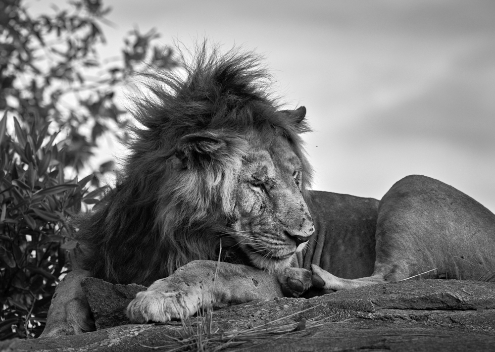
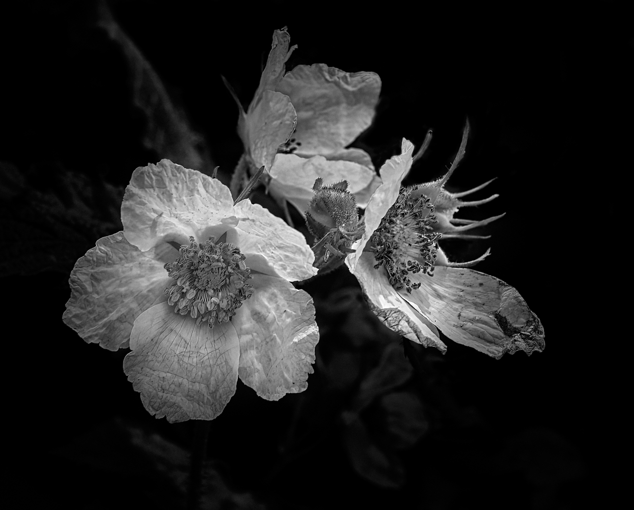
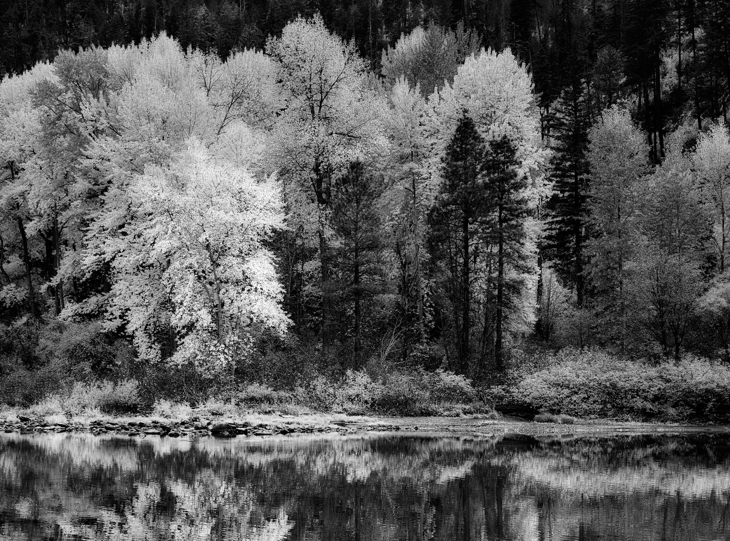
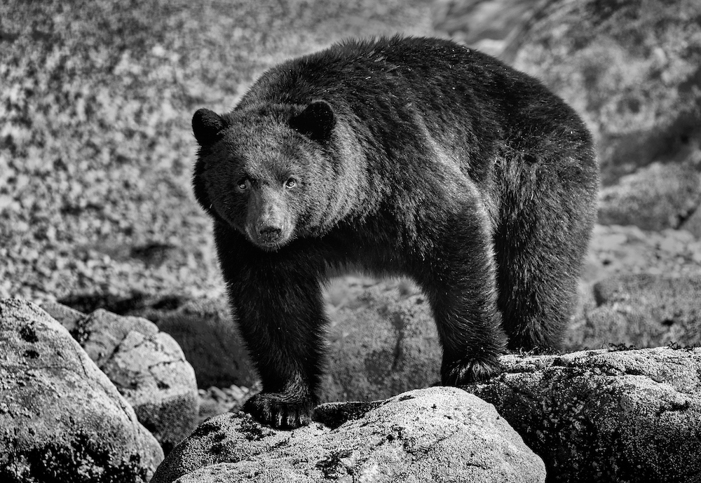
Fran this is well composed and the black and white works. I too think tiny could pull more subtle details out of the rocks and water per Paul's suggestions. Subtle dodge and burn. Great image |
Aug 13th |
| 39 |
Aug 22 |
Comment |
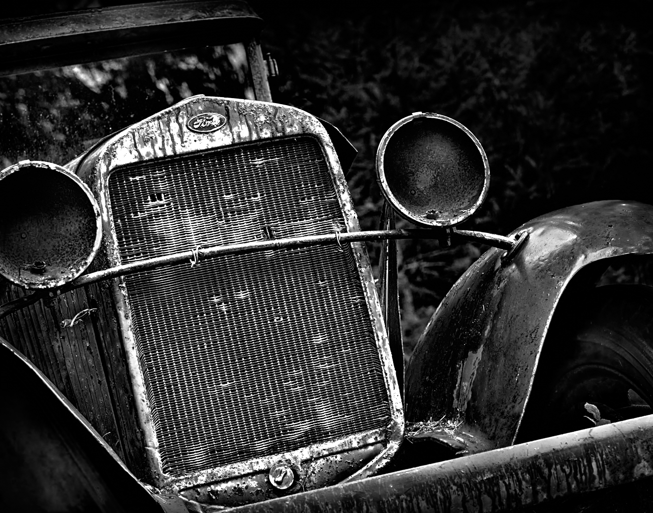
Paul, I think you have composed this well, for a pre-set still life. The composition works and by getting rid of an annoyance you allow the eye to be led to where you want it with the greatest contrast of light and dark around the basket with the bunch of grass pointing toward it. There are good leading lines from the supports on the shelf to the upright on the scooter. Lots of lovely repetition of the wooden boards. I find this well exposed and with good details. I think a slight more dark under the bright basket may ground it better. By which I mean make it to seem less like it floats on the floor. Well done. |
Aug 2nd |
| 39 |
Aug 22 |
Comment |
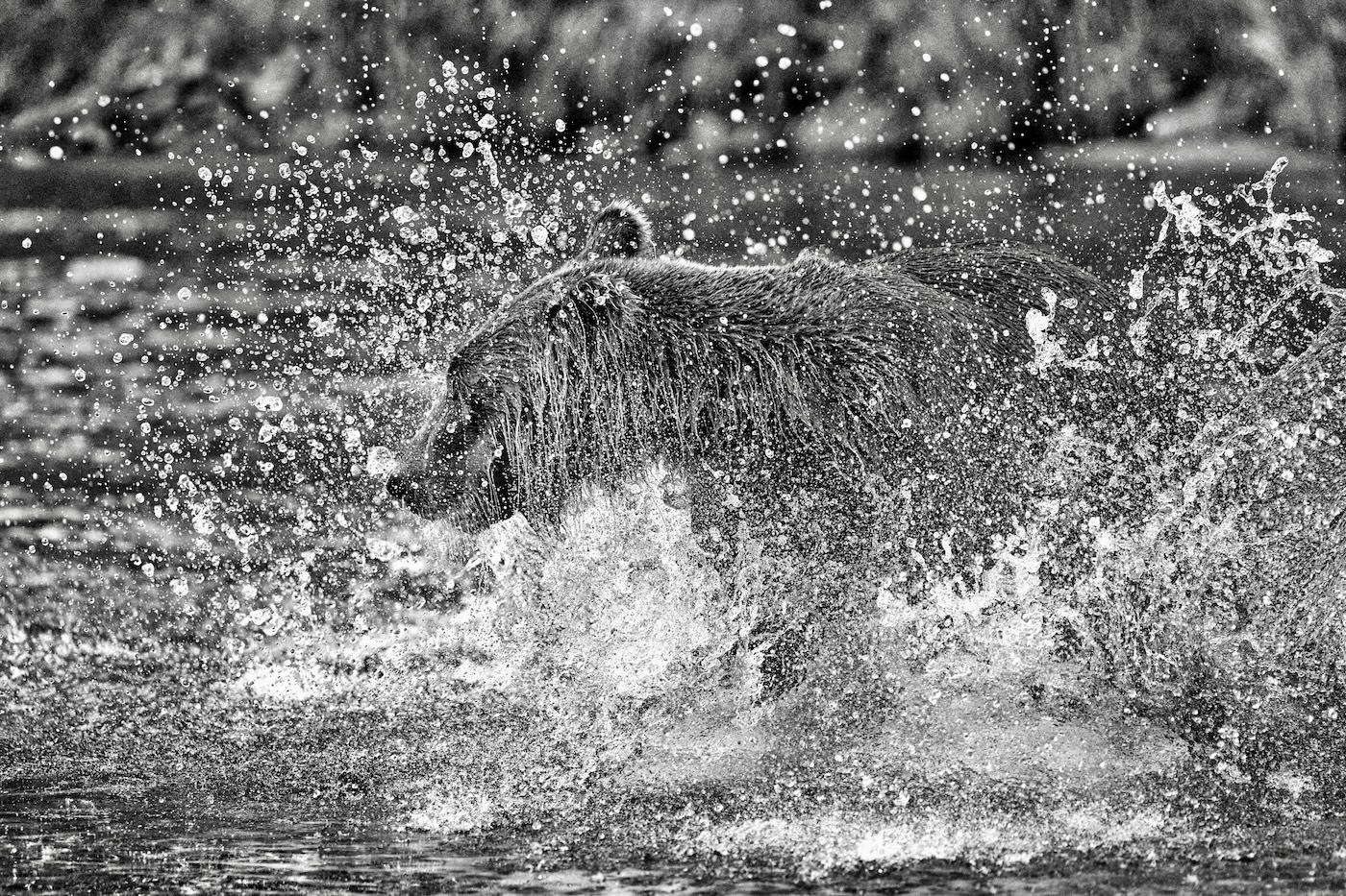
David, I understand you debating going to the event. Glad you did. I like the composition with the strong diagonal leading the eye upward to the main action. This is well exposed and translating into b&w works. The bursts look like dandelion flowers, lovely crisp details. Looks like a well done floral design! What a great feature to have on your camera as well |
Aug 2nd |
| 39 |
Aug 22 |
Comment |
Jerry great job with the iPhone camera for Adobe.
I might suggest adding a slight subtle vignette - I tried it in NIK software CEP5 and used the Darken/Lighten Center tool for a subtle vignette. It seems to separate out the sky from the trees a bit and bring the eye into the centre. I used shape 1 and pretty much the default settings with the centre point placed on the leaves for the foremost tree. Though that may take away from the point of an Infrared shot :-) |
Aug 2nd |
 |
| 39 |
Aug 22 |
Comment |
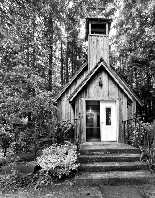
I like the way way have cropped the image to frame the church within the poles. At present I feel the emphasis falls on the little house to the right of the road. I would reverse that. Knock back the brightness of the little house and bring up the brightness and lights on the church itself. The leading lines of the road edge and poles and wires work well. As do the shadows across the fields. |
Aug 2nd |
| 39 |
Aug 22 |
Comment |
Thank you Vincent. I think the background was a primary driver for the conversion. |
Aug 2nd |
9 comments - 1 reply for Group 39
|
| 80 |
Aug 22 |
Reply |
Peter exactly right - the choice starts and ends with you the creator |
Aug 24th |
| 80 |
Aug 22 |
Comment |
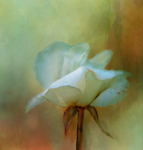
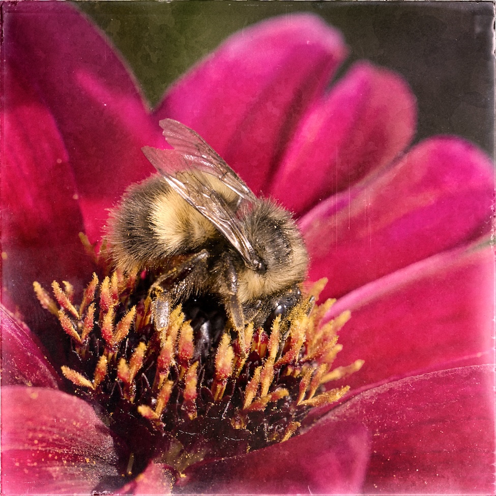
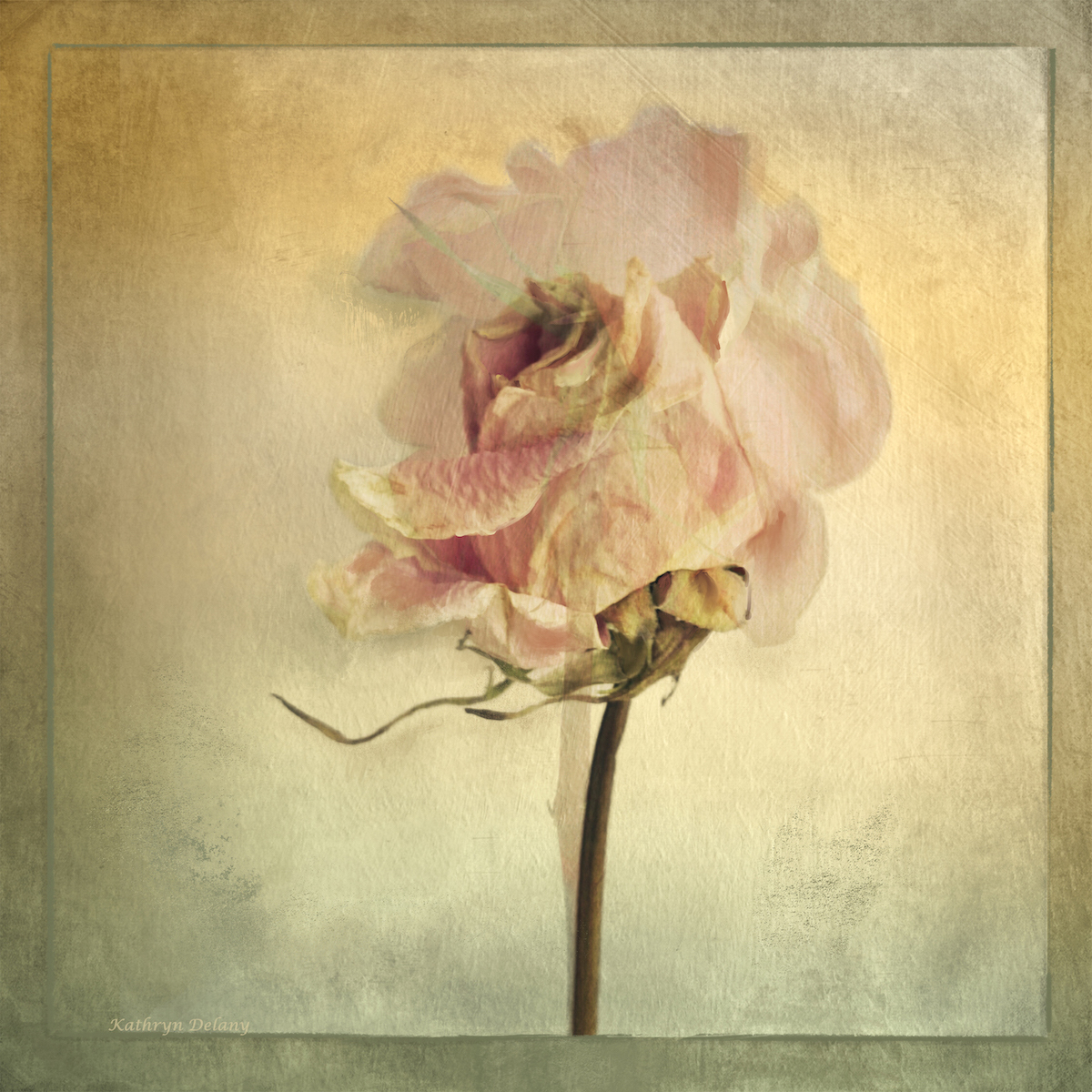
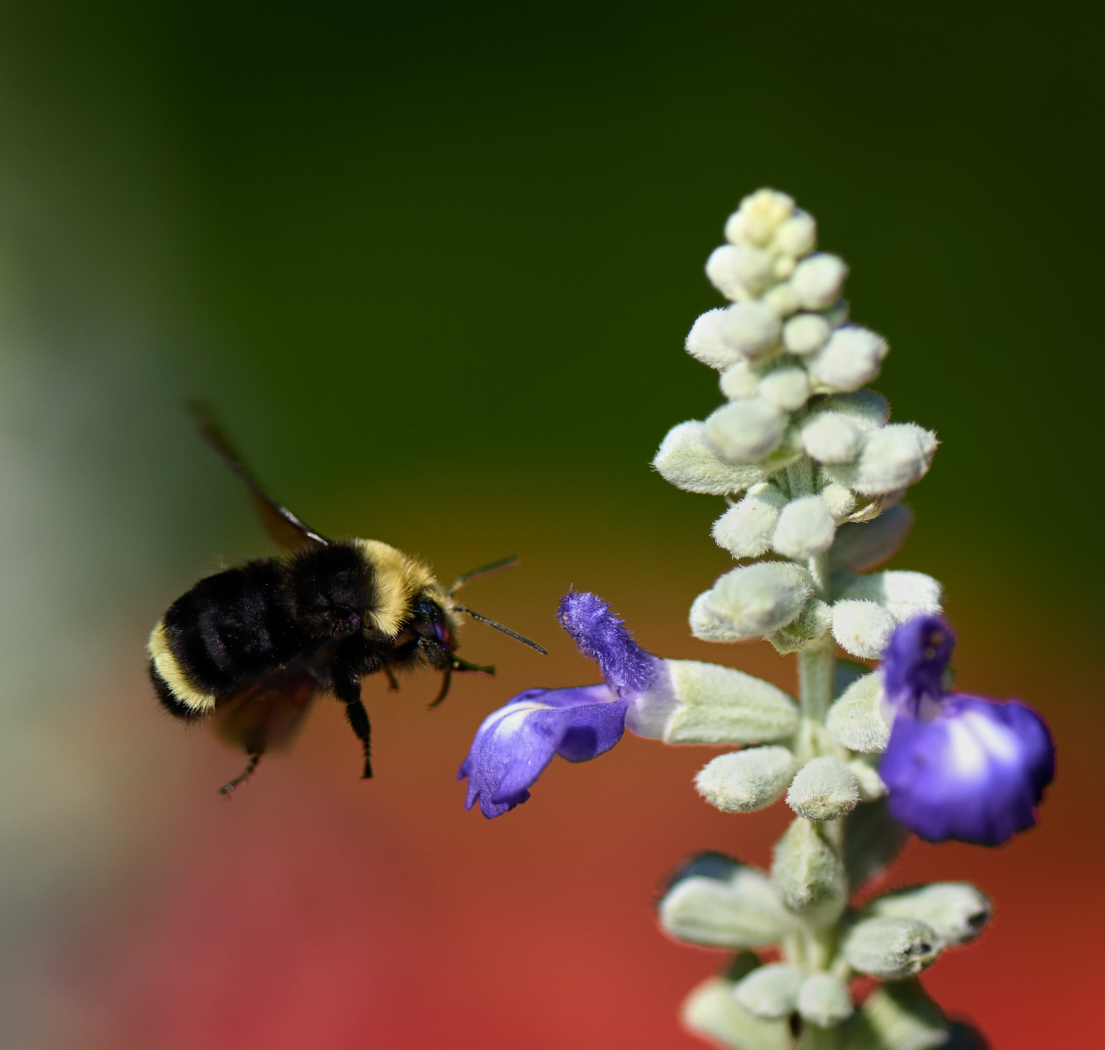
I like the use of the impressionistic look it gives the image a lot of movement and life. The composition is good with the diagonal gesture of the stem and then the tension of the blossom and leaves going in the opposite way. Bringing the highlight on the the flower works well. The colors are glorious and the texture and subtle shades the in the background set the flower and the drop of water off really well. If you had room at the top to keep the top buds from being nipped off it might be a bit better for the composition. Lovely play of light, textures and lines. Well done. |
Aug 19th |
| 80 |
Aug 22 |
Reply |
These will look lovely as a group |
Aug 14th |
| 80 |
Aug 22 |
Reply |
Thanks I will give it a try |
Aug 14th |
| 80 |
Aug 22 |
Comment |
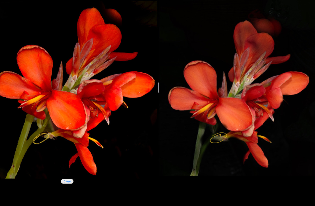
Peter nice job of using the black to isolate the flower. For me the busy backgrounds are always a challenge. I like your idea of adding an extra petal element however I feel it should be less detailed and more connected to the nearest petal with a graduated colour right now it has equal weight and saturation. Your original has some lovely depth in terms of light and colours so perhaps working with that would help bring in depth. Your current edit it appears all light is equal as is the booted saturation. Use masking to selectively dodge and burn to place emphasis on your focal point. Try pushing the top part back.
Finally you have lost the stem connecting the lower part of the flower to the main stem so it's kind of floating. (See my edit and the yellow circled area.
I took the liberty of using your original image and a few fast edits to try and demonstrate what I mean. I hope this is of some help |
Aug 13th |
 |
| 80 |
Aug 22 |
Comment |
Syed L nice crop for the composition. Iloke that the lines of the petals lead the eye to the centre on the diagonal. Also good exposure for capturing the orangey red of the flower. For me the depth of field is not too much of a problem it really comes down to your intent. The out of focus stamens just help bring ny eye back to the in focus parts. My eye keeps moving around the image. Hope this is helpful. |
Aug 13th |
| 80 |
Aug 22 |
Comment |
Doug I really like this idea and you doing a series is an indication of your love too. The green golden tones are lovely and speak to the fading of life. This one is composed well and is very lyrical to me it has a feel of a dancer. This is an image you can always get pleasure when looking at it. If your supporting 2 images have a similar rhythm you will do well I am sure. The stacking works so well for those gorgeous details. |
Aug 13th |
| 80 |
Aug 22 |
Comment |
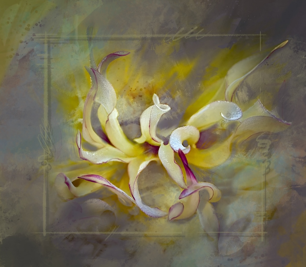
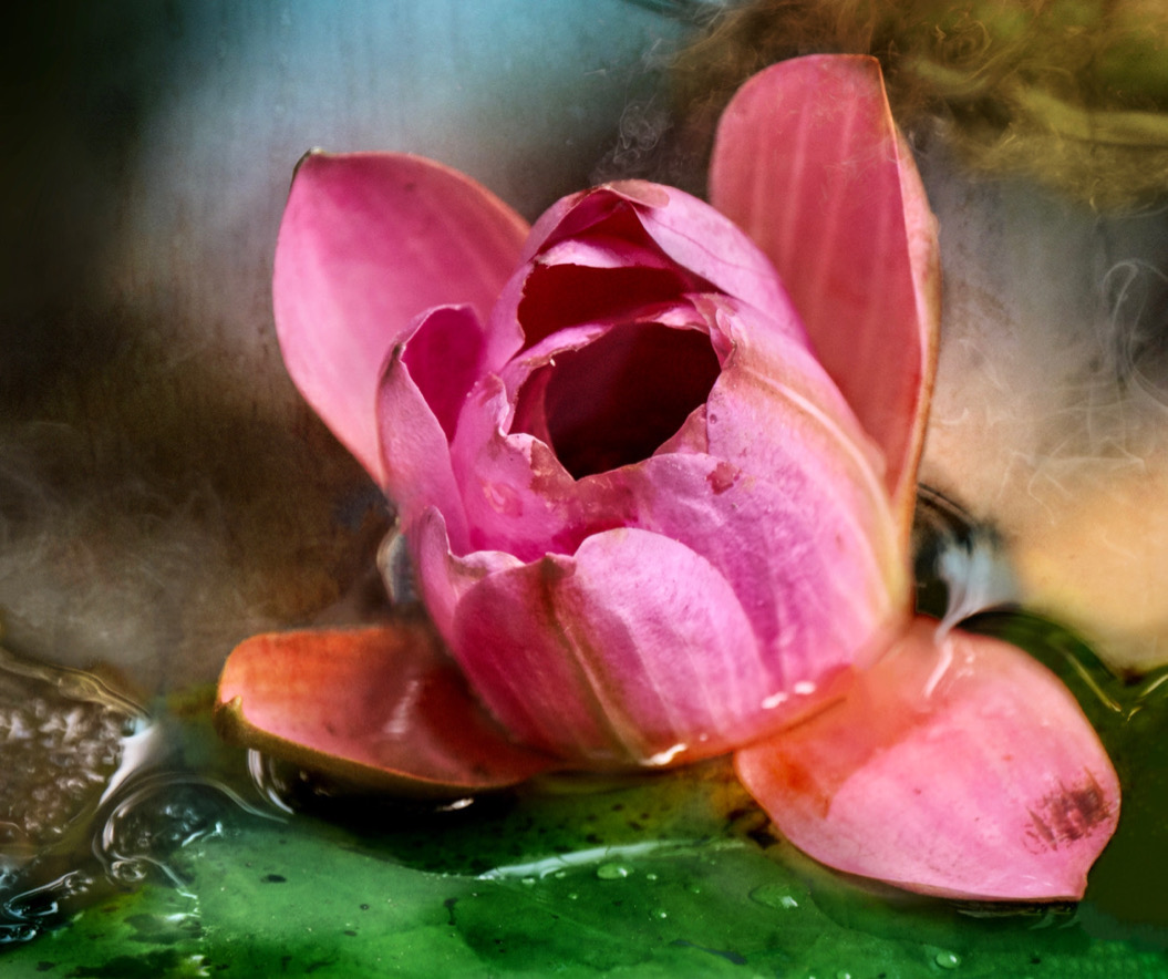
Nadia I love your creative interpretation. Like all of us I am here yo get more creative ideas and explore the genre in more depth. The way you blurred/softened the 2 blooms (since they were already soft) really pops your focal point well and you texture overlay is also nice and soft without becoming distracting. I actually do not mind the blue cast it adds depth and interest. Well done |
Aug 13th |
| 80 |
Aug 22 |
Comment |
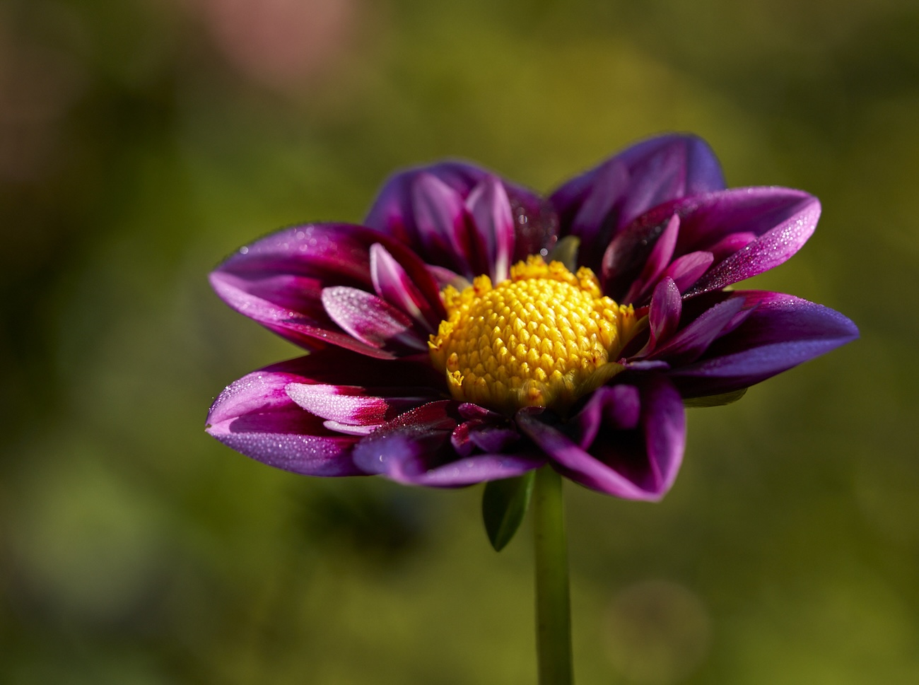
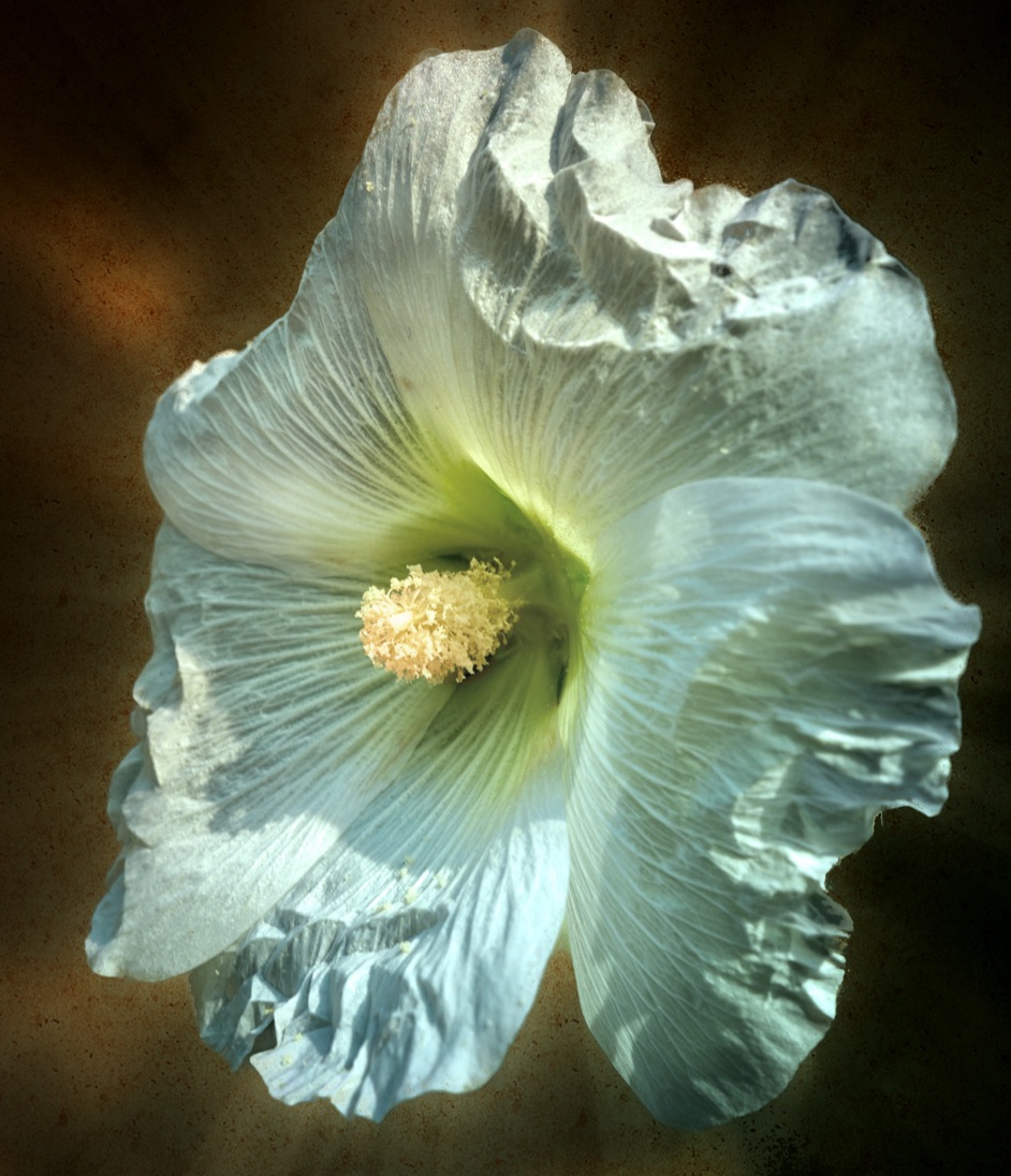
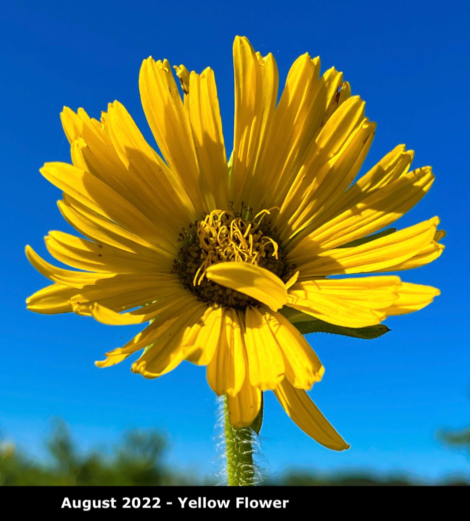
Jacob. I love the yellow against the blue sky for sure. Also the way the light falls on the centre of the flower is well done on drawing the eye there. I think if you are trying tp portray the height maybe a closer crop would help. I can see why you cropped the stem down to remove the background structure though. Perhaps if you had tried moving around the flower and used portrait orientation it would have allowed more inclusion of the stem. A lovely in-focus image that makes one feel positive. |
Aug 7th |
 |
| 80 |
Aug 22 |
Reply |
You are right!! Oops. Here is the correct original |
Aug 7th |
 |
| 80 |
Aug 22 |
Reply |
Bob thanks for the feed back - I did not conciously do that I admit so success unbeknownst to me! I will add the original next time meanwhile here it is |
Aug 4th |
| 80 |
Aug 22 |
Comment |
I like the use of the impressionistic look it gives the image a lot of movement and life. The composition is good with the diagonal gesture of the stem and then the tension of the blossom and leaves going in the opposite way. Bringing the highlight on the the flower works well. The colors are glorious and the texture and subtle shades the in the background set the flower and the drop of water off really well. If you had room at the top to keep the top buds from being nipped off it might be a bit better for the composition. Lovely play of light, textures and lines. Well done. |
Aug 4th |
| 80 |
Aug 22 |
Reply |
Hello Lance, Thanks for taking the time to leave feedback, I appreciate it a lot. |
Aug 4th |
| 80 |
Aug 22 |
Comment |
I like the use of the impressionistic look it gives the image a lot of movement and life. The composition is good with the diagonal gesture of the stem and then the tension of the blossom and leaves going in the opposite way. Bringing the highlight on the the flower works well. The colors are glorious and the texture and subtle shades the in the background set the flower and the drop of water off really well. If you had room at the top to keep the top buds from being nipped off it might be a bit better for the composition. Lovely play of light, textures and lines. Well done. |
Aug 2nd |
8 comments - 6 replies for Group 80
|
17 comments - 7 replies Total
|