|
| Group |
Round |
C/R |
Comment |
Date |
Image |
| 64 |
Jan 26 |
Comment |
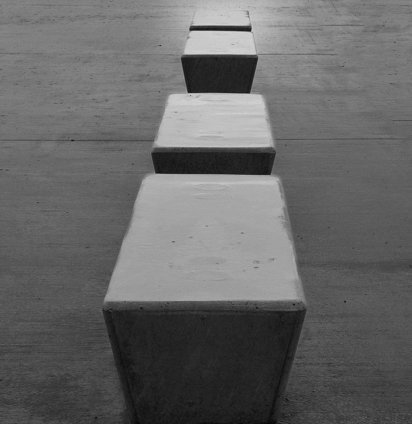
in this one I reversed the mask and just adjusted background leaving the seats as they were |
Jan 17th |
 |
| 64 |
Jan 26 |
Comment |
In this one I made a mask and decreased highlights on the seats effectively darkening them |
Jan 17th |
 |
| 64 |
Jan 26 |
Comment |
thanks Don I hear what you are saying and agree the seats need more separation from background by darkening them. You have also got me thinking it might be easier if I masked out all of the seats, both the dark and light bits and simply adjust the background. |
Jan 17th |
| 64 |
Jan 26 |
Comment |
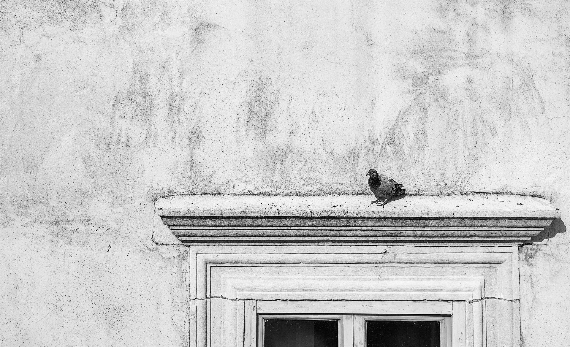
Very nice lighting on the back of the egret's neck and shoulder area which compliments the bokeh which I don't mind as it adds to the luminosity. I would however remove the one spot just above the tip of the beak as it competes too much for attention with the bird. I agree with Don on lightening of the bird's body to bring out some more shadow detail. |
Jan 17th |
| 64 |
Jan 26 |
Comment |
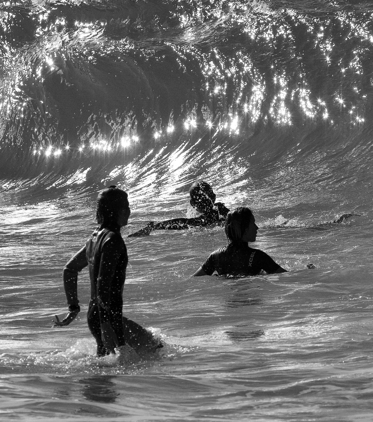
The water flow has been captured and exposed well and has nice rhythm from top left to bottom right. I would like to see more of the river at the top to provide greater scale and also more detail in the shadows. |
Jan 17th |
| 64 |
Jan 26 |
Comment |
I agree with Don on the tight crop; some more surrounding space would be desirable and I am thinking if you had'nt zoomed in so tight that would have resolved that issue plus given a tad more sharpness to the horses top teeth/ nose area where it seems to get a tad soft. On a positive note, I like the contrast of the straining horse versus the calmness of the rider and I also like the diagonal composition. |
Jan 17th |
| 64 |
Jan 26 |
Comment |
I am also not keen on the green toning but I commend you for trying it. The original is serene and peaceful whereas this mood gets lost with the greening. The clouds seem to compliment the blossoms on the main tree. I think I would have liked if you chose an angle that eliminated the tree protruding on the right as that would simplify the image and make a more endearing composition. |
Jan 16th |
| 64 |
Jan 26 |
Comment |
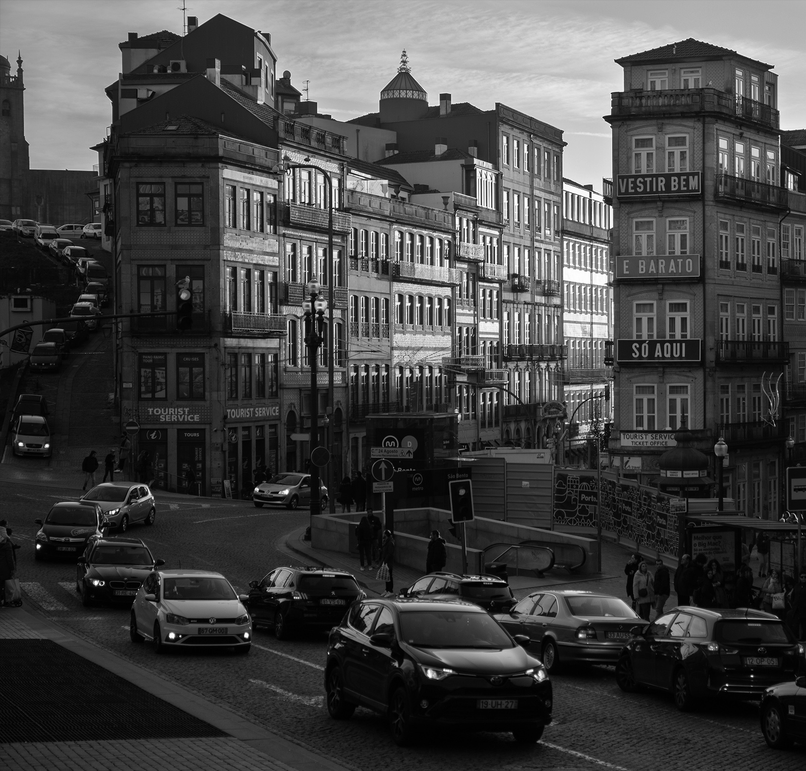
The sharpness creates a lot of impact and the tonal range and contrast are superb. I'd like to see the bright high lights in the middle area toned down especially where the left window, lamp and candelabra meet. Apart from that its quite impressive. |
Jan 16th |
8 comments - 0 replies for Group 64
|
8 comments - 0 replies Total
|