|
| Group |
Round |
C/R |
Comment |
Date |
Image |
| 64 |
Jun 25 |
Comment |
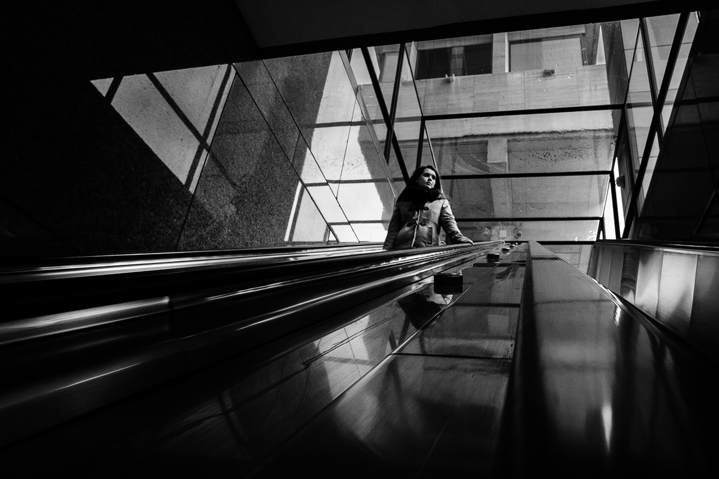
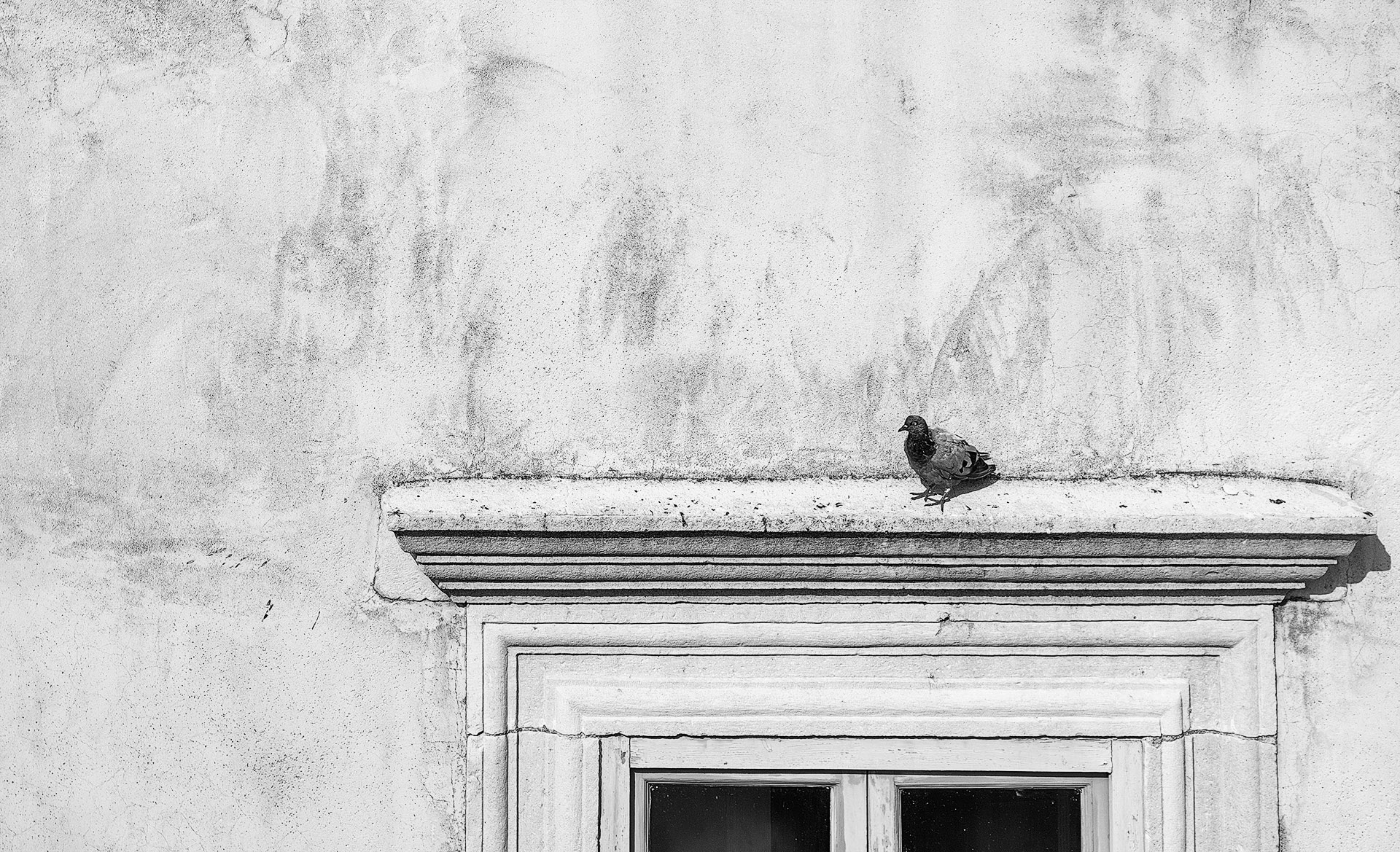
The first thing that strikes me is the range of tones from the deep blacks of the picture frames to the clean whites on the back wall and in the picture borders. Contrast is good and the room does not look gloomy whatsoever- quite the opposite. It looks bright and inviting. My only suggestion is to tone down the tread of the bottom step and the little bright area to the left of it. |
Jun 14th |
| 64 |
Jun 25 |
Comment |
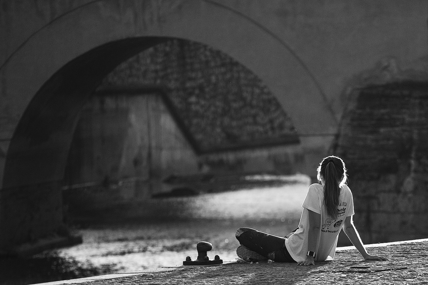
It is very high key and has a penciled sketch feel which emphasizes the lines and detail in the shadows but seems to lose a lot in the highlights. I like the domination of the arches and the deep shadows raking across the bottom. |
Jun 14th |
| 64 |
Jun 25 |
Comment |
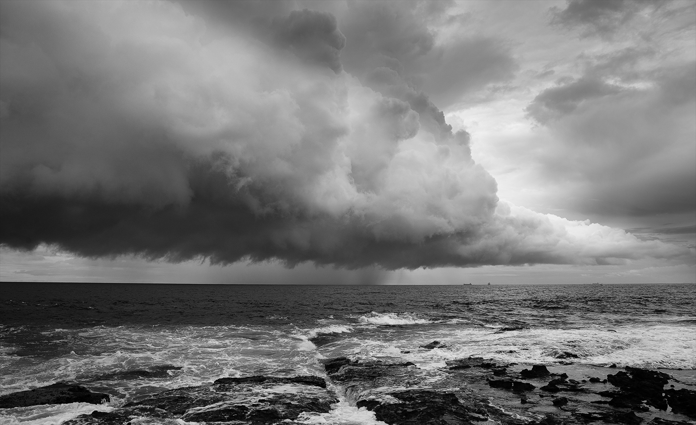
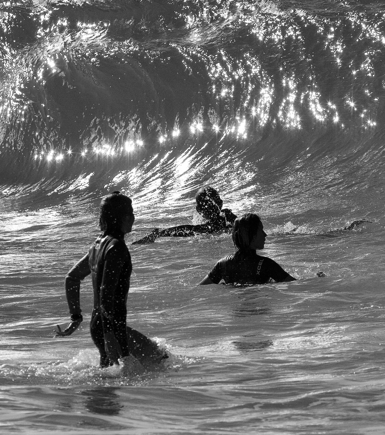
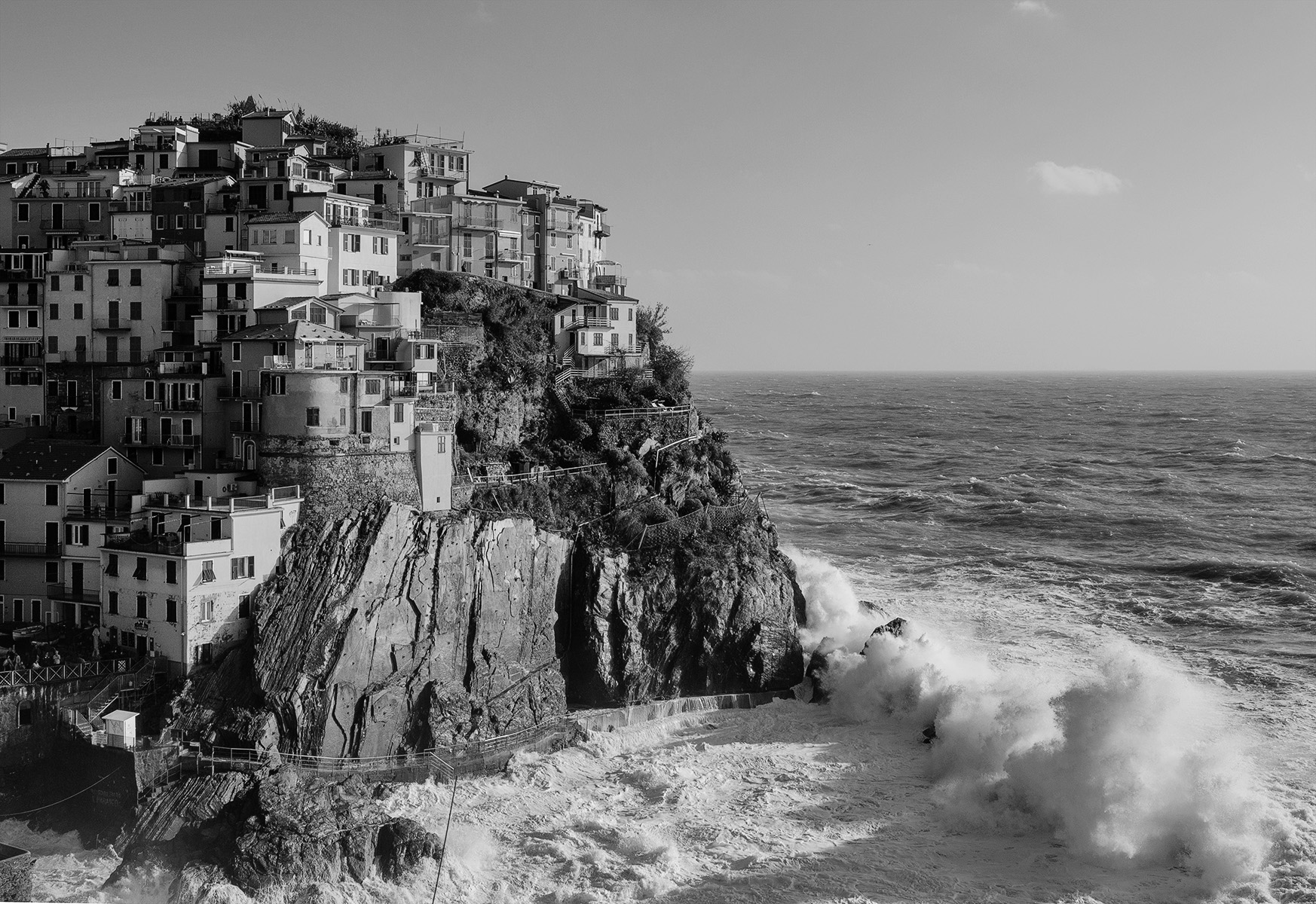
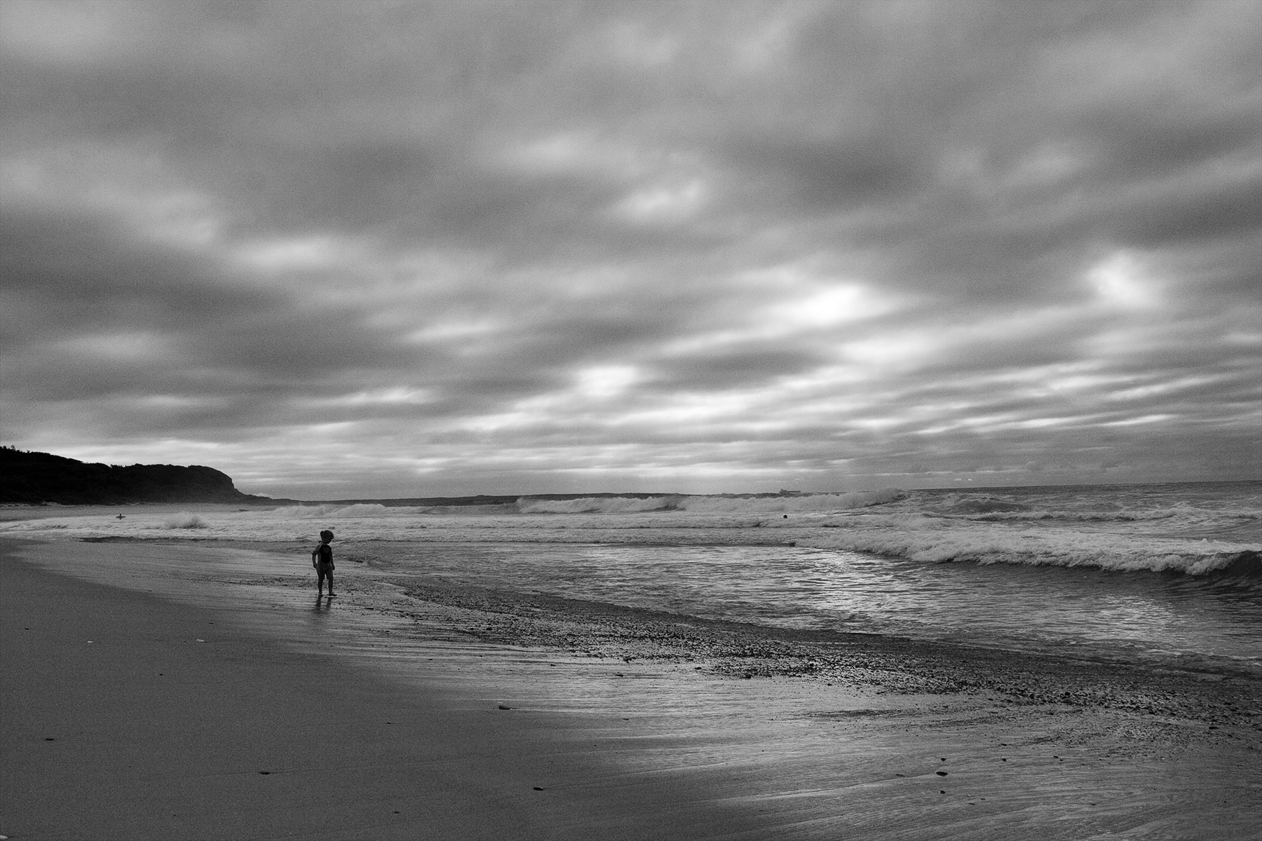
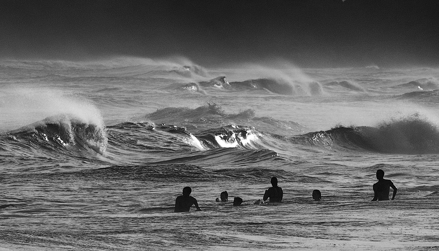
It has a real grungy look like a grainy film exposure and that suits the subject matter and creates the mood of treacherous and foreboding. Was the water cold? It looks cold. I like the contrast of that treacherous sea against the calmness of the pool and I would'nt mind seeing more of the pool. Good texture and detail in the rocks. The brightest water in the central part of the image just right of the pool could be toned down just a little to match the tonality of the water in the foreground which is really well done. |
Jun 14th |
| 64 |
Jun 25 |
Comment |
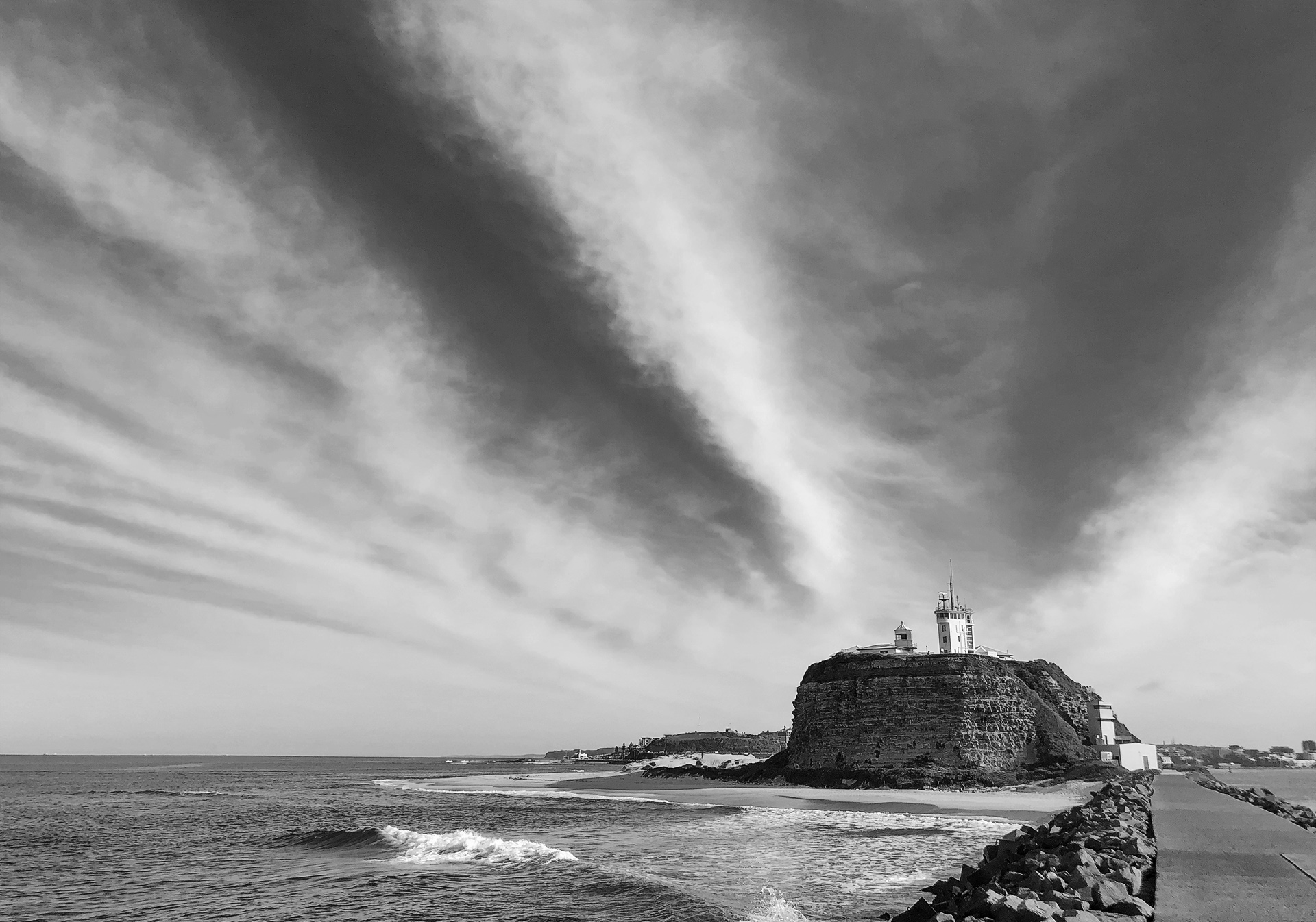
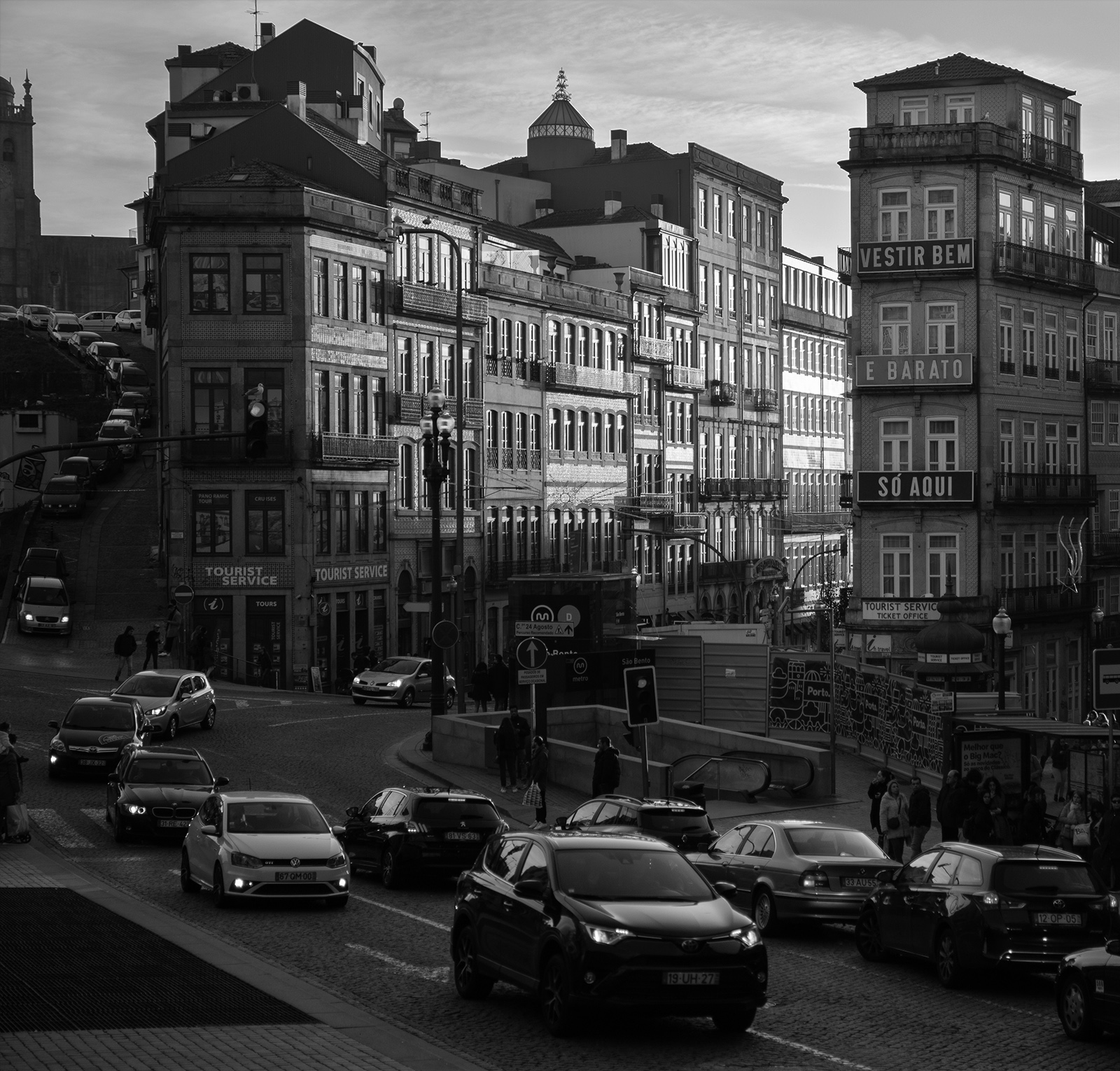
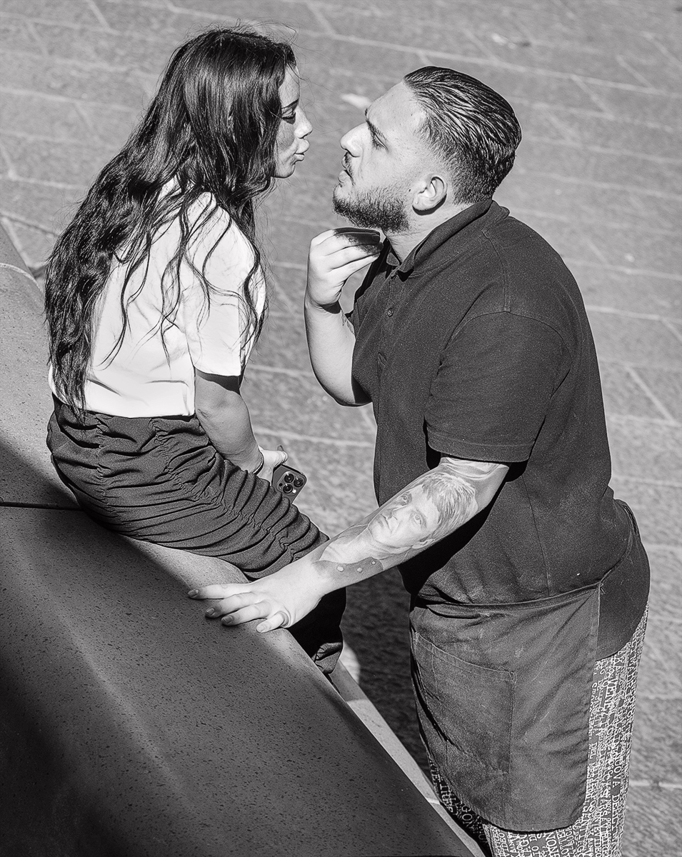
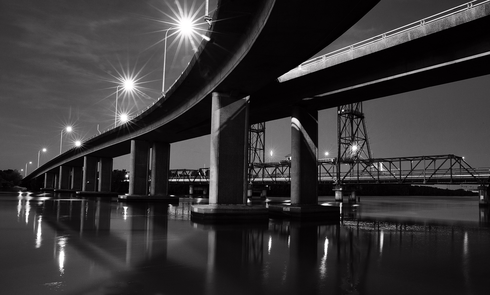
My first thoughts were it is a bit on the flat side and could do with a boost in contrast. Stuart's reworking brings out more shadow detail which I like and also more contrast and I like that in the stonework but not in the sky as the white patches are burnt out. It would be interesting to see a little more of the foreground road leading in (if that was possible). |
Jun 14th |
4 comments - 0 replies for Group 64
|
4 comments - 0 replies Total
|