|
| Group |
Round |
C/R |
Comment |
Date |
Image |
| 64 |
Apr 25 |
Comment |
Ah, the beauty of layers. You dont even have to remove it; just turn it off. |
Apr 24th |
| 64 |
Apr 25 |
Reply |
Much better Stuart. It is a lot easier on the eye. |
Apr 20th |
| 64 |
Apr 25 |
Comment |
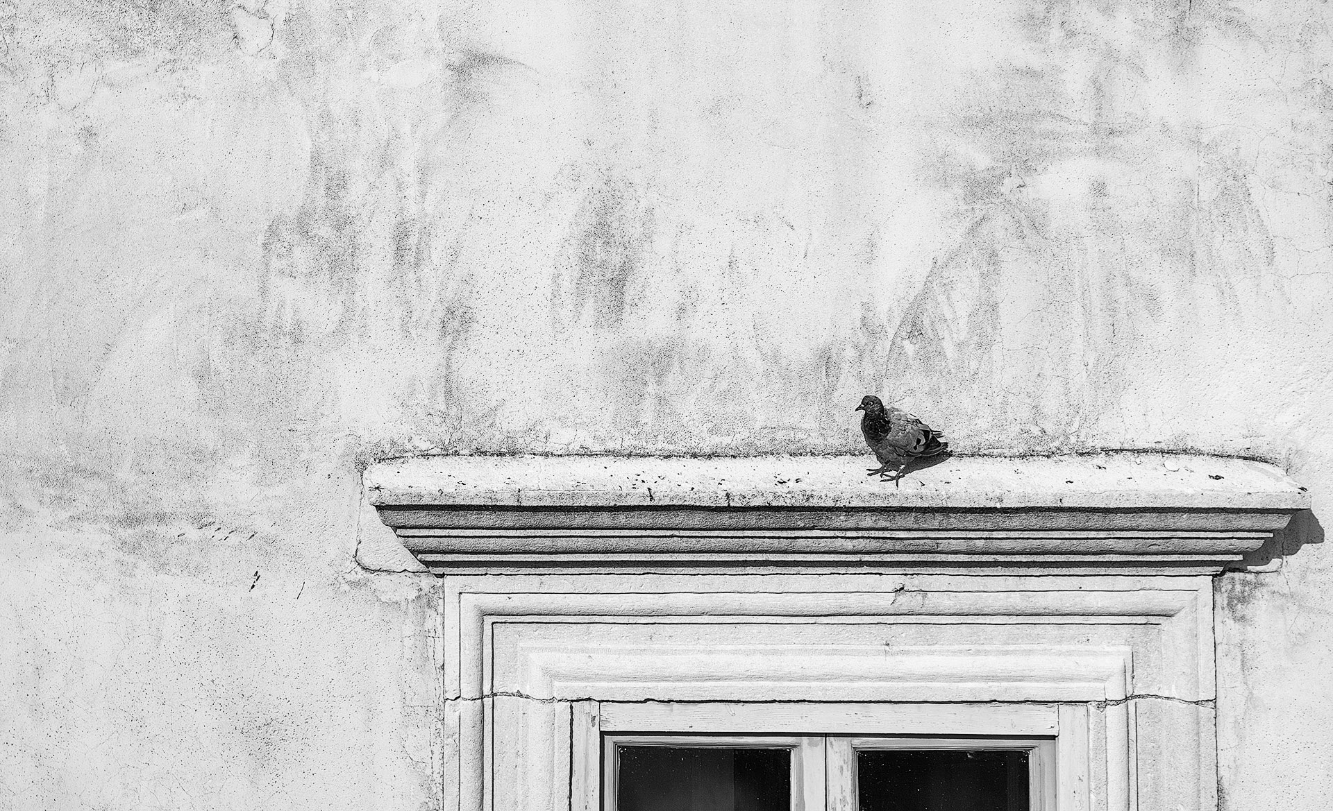
The image has a nice fine art quality to it and I like the symmetry and the range of subtle tones around the mid and top sections which gives a real metalic feel. I would'nt mind seeing the badge a bit brighter and some frame lines. |
Apr 17th |
| 64 |
Apr 25 |
Comment |
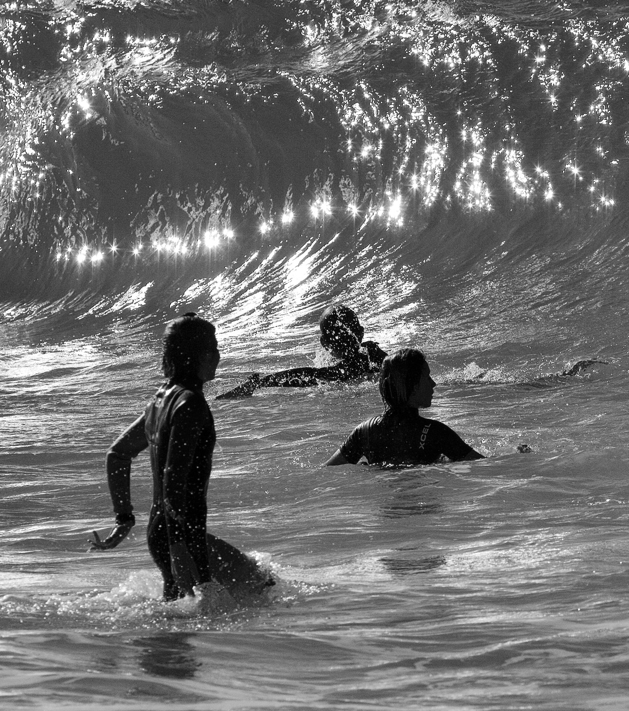
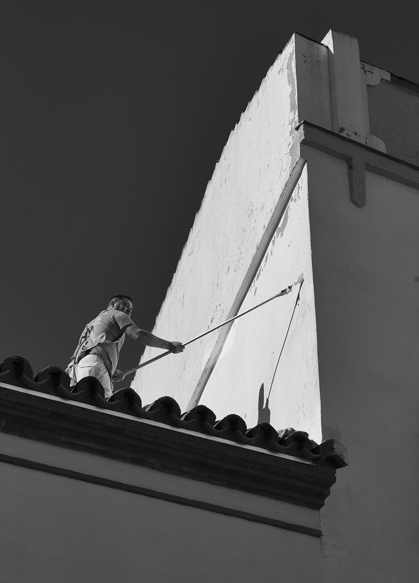
An easy to interpret story telling image where it appears the lighting conditions were less than ideal as it is quite contrasty. Some more detail in the shadow areas especially on the man's clothing would be desirable. There are pixelation marks in the smoke most noticeably above the man's head which is a big spoiler so not sure if it has been enlarged too much or over processed. |
Apr 17th |
| 64 |
Apr 25 |
Comment |
Really good exposure and contrast which brings out heaps of texture and details in the stonework. I think Grace's comment about the tree is valid and it would be better omitted (by shooting from closer in) but fortunately it still does provide enough gap so the cathedral is on full view and the criss cross of low walls in the foreground provide strong leading lines which tend to steer me through that gap. Tonal range is excellent and the sky is interesting. |
Apr 17th |
| 64 |
Apr 25 |
Comment |
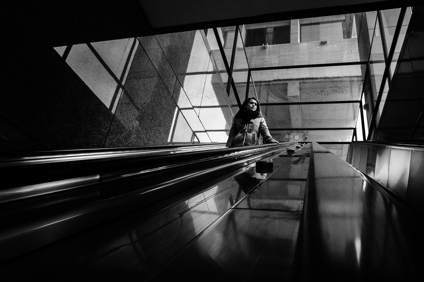
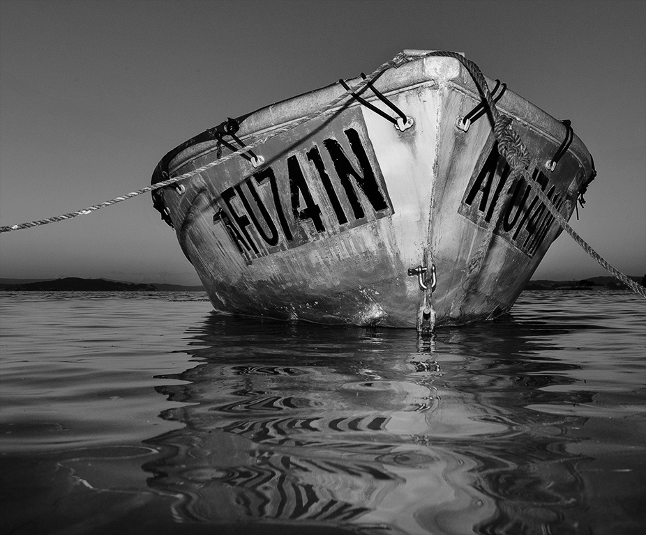
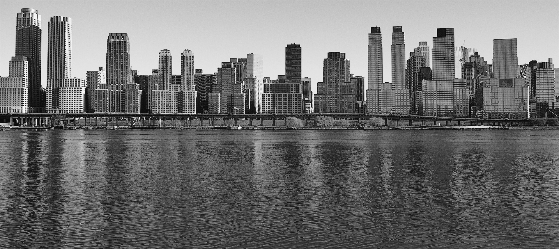
I like the composition full of shapes and lines with the two angles merging near the middle of the image and the person providing scale and a strong focal point. It holds my interest. Perspective is good in terms of straight verticals. The only thing I can suggest for improvement is a boost in contrast to give a wider tonal range as I would like to see deeper blacks and crisper whites. |
Apr 17th |
| 64 |
Apr 25 |
Comment |
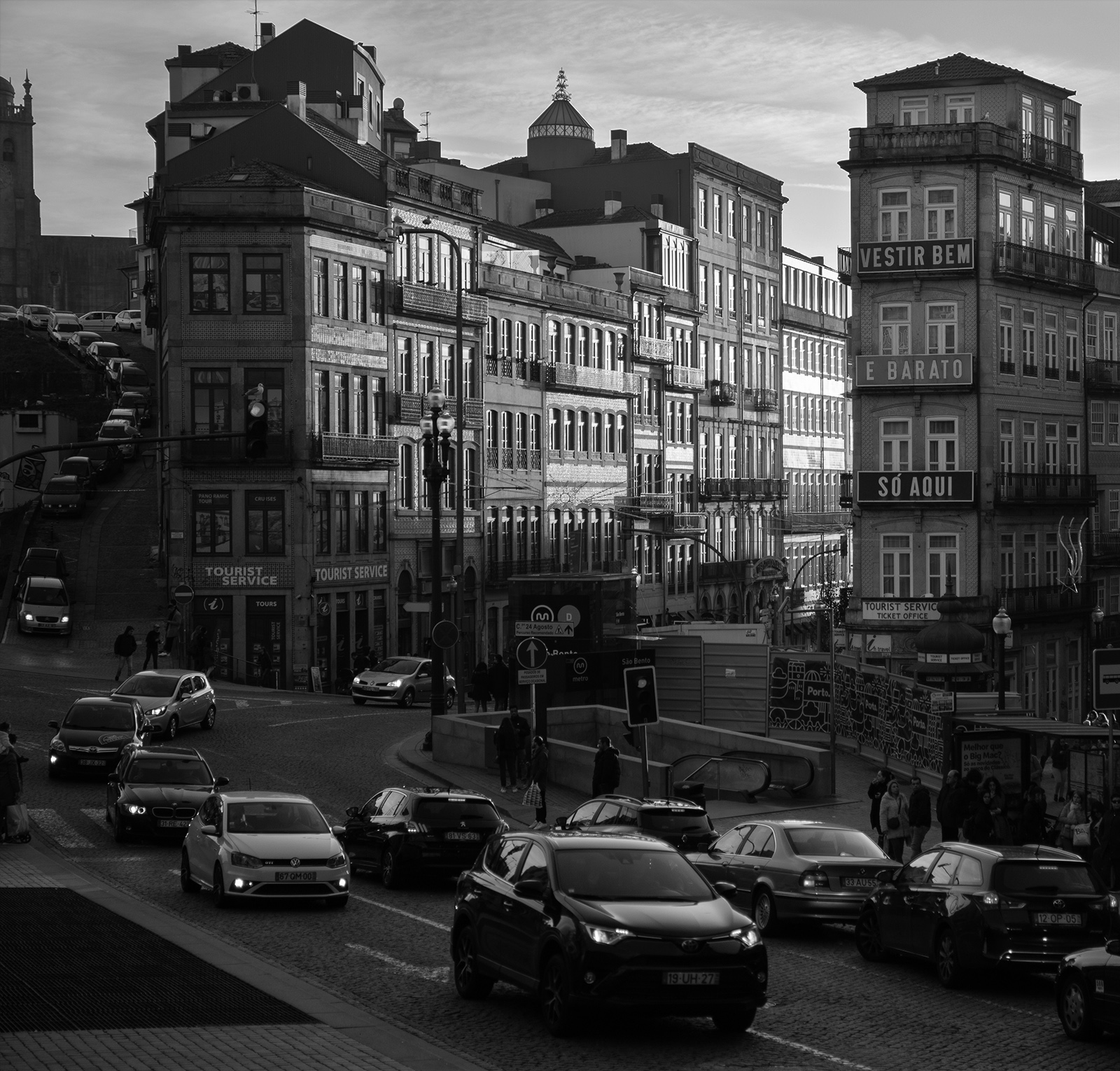
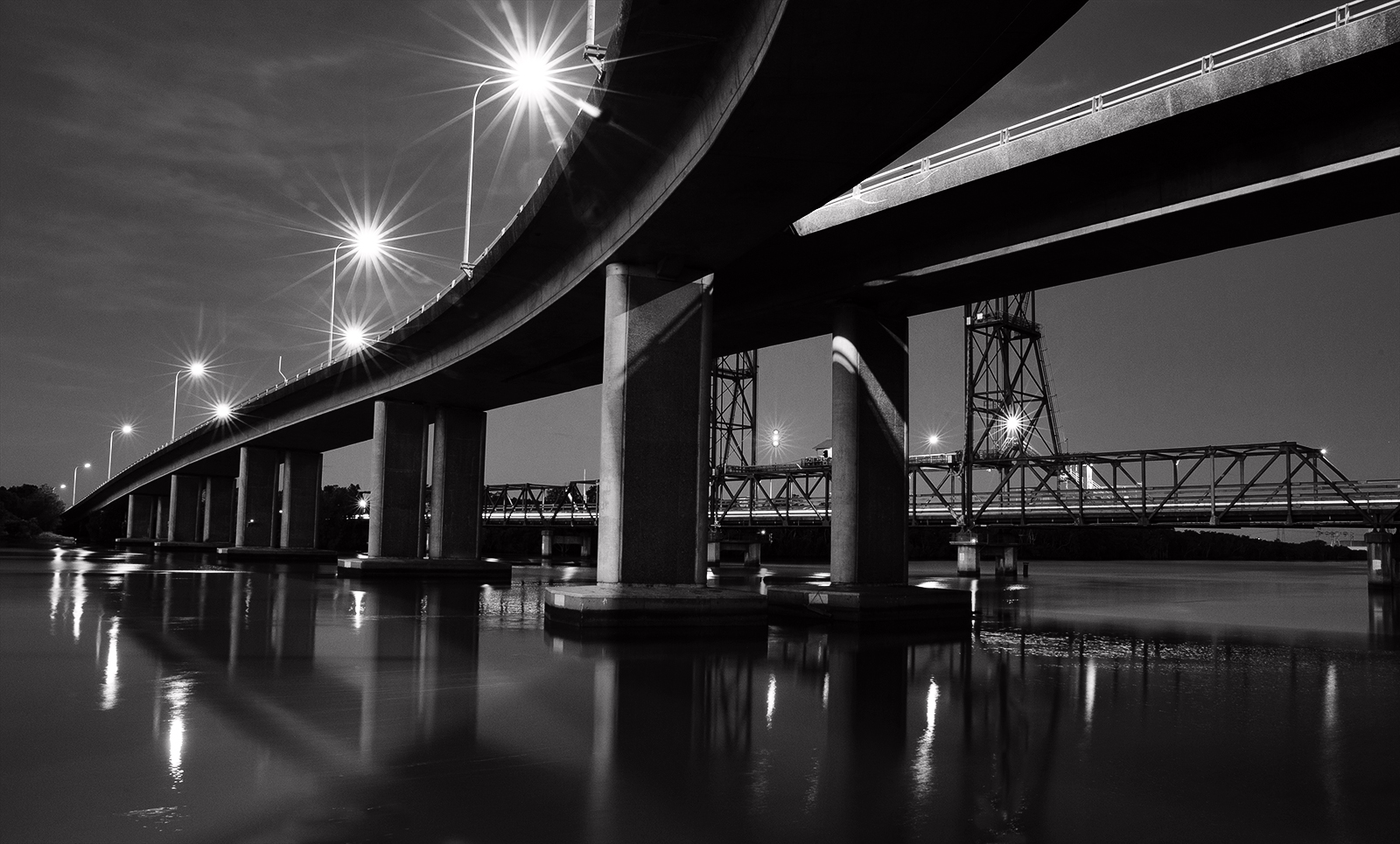
Fascinating cityscape. I imagine there were some challenges producing the image in the dim light and cold but there is plenty of information there for us viewers to work out the lay of the land. The highlights dominate and provide too much contrast for me although the Topaz Denoise has worked well here to tame them to an extent. They are quite overbearing in the original. Could you have gotten away with a lower ISO? |
Apr 15th |
| 64 |
Apr 25 |
Comment |
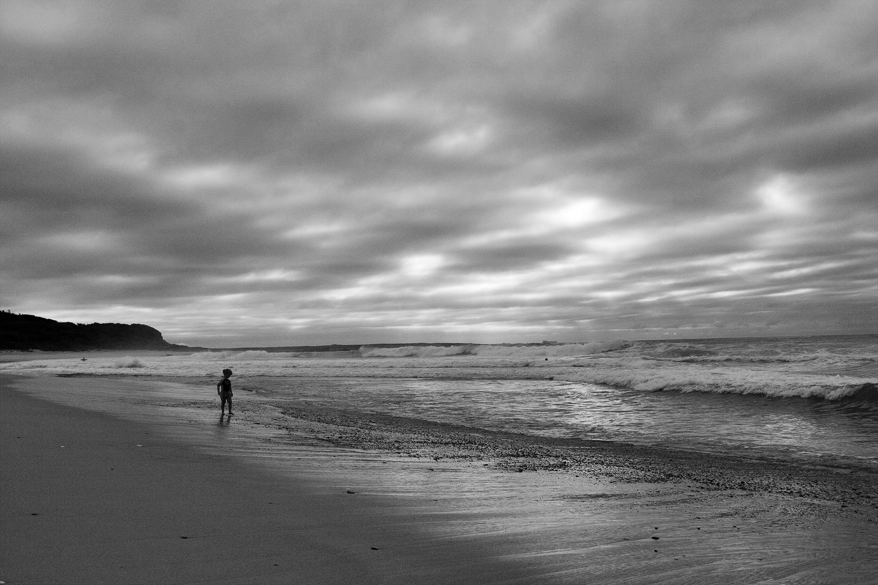
The grasses and raking light certainly have lots of appeal and you have managed to reveal quite a lot of detail in both the shadows & highlights all the way through. It is a really nice composition also with the house/ tree providing a strong focal point off the leading line of the path. Has a really peaceful mood. Well done. |
Apr 15th |
7 comments - 1 reply for Group 64
|
7 comments - 1 reply Total
|