|
| Group |
Round |
C/R |
Comment |
Date |
Image |
| 64 |
Feb 25 |
Comment |
I dont mind the softness as it suits the subject; it gives the flower a smooth silky feel. I have not tried a smoothing filter so have noted to give it a go. For similar effect I like to use the gaussian blur filter on a separate layer as I can easily control the amount of softness with the sliders.
Your treatment also shows plenty of texture and line detail. I am not keen on the totally black background as the flower seems to be floating in limbo. It does however emphasis the shape and form. |
Feb 16th |
| 64 |
Feb 25 |
Comment |
The smoke provides a lot of mood and the trees in silhouette work well in telling the story of devastation/ destruction. I also would like to see a little more detail in the dark area bottom left and also top left as my eyes get drawn to that area in a distracting way- some smoke cloned in up there could work well |
Feb 16th |
| 64 |
Feb 25 |
Comment |
Fantastic range of tones providing strong contrast with beautiful luminosity coming from the upper floor open area. The image screams 'opulence'. I too recommend cropping out of the vertical area on the right; it is not needed so would be no loss and for me it adds greater impact to the chalice. |
Feb 16th |
| 64 |
Feb 25 |
Comment |
I like 'Grumpy' and the way you have portrayed him so at ease with you as the photographer. I do agree totally not to crop out any of the shelf as the surroundings in the image add to the environmental portrait. The lighting and/or processing brings out nice texture in the bricks and also in the creases in the clothing and provides strong modelling on the face. Also I like that you have toned down the shelf and items in the corner so that 'Grumpy' takes centre stage. |
Feb 16th |
| 64 |
Feb 25 |
Comment |
I agree with all the above comments. For me the colour version brings out a stronger sense of the extent of the rusting so tells the story better. It just looks more dilapidated and gnarlier. |
Feb 16th |
| 64 |
Feb 25 |
Comment |
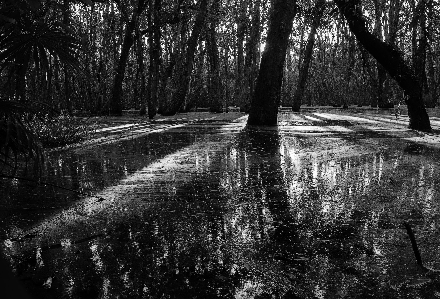
Great subject matter for monochrome and the image has great impact from the contrast of the repetitive blacks and whites. The dark black oval shape in the centre works well compositionally as it draws me straight to that point before meandering off towards the rear. I like Stuart's suggestion of getting rid of some background as it certainly does simplify the image and makes the shadow area at the front more prominent leading to greater overall impact. |
Feb 16th |
6 comments - 0 replies for Group 64
|
6 comments - 0 replies Total
|