|
| Group |
Round |
C/R |
Comment |
Date |
Image |
| 64 |
Oct 24 |
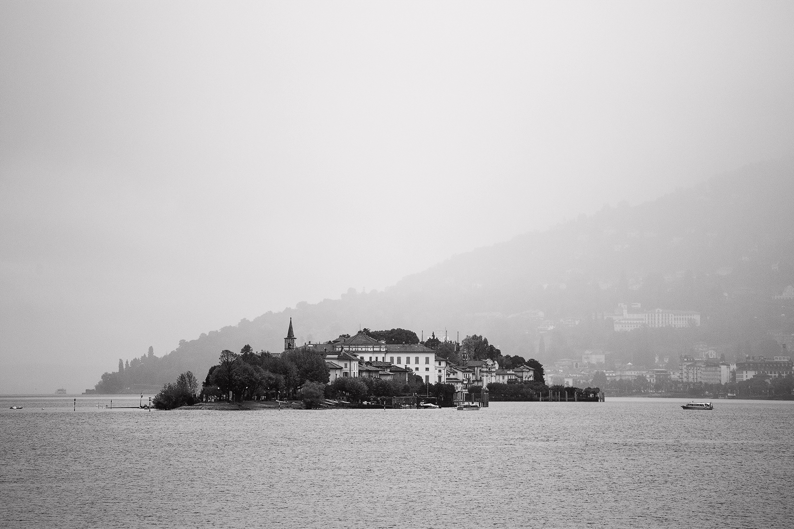
Comment |
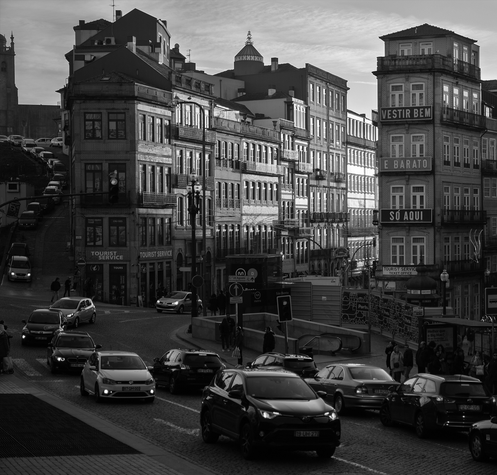
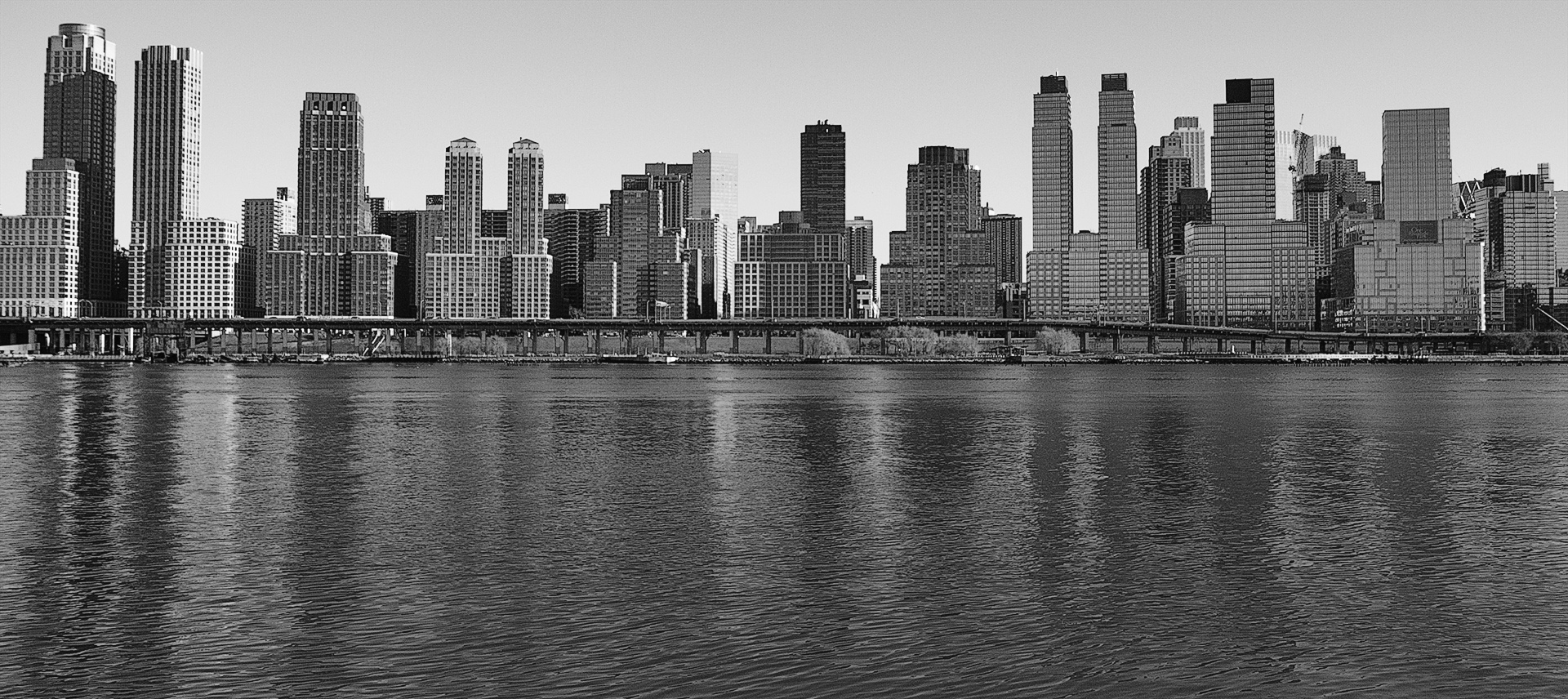
Interesting choice to go with a square format. Omission of the city buildings and the access bridge/ archway from the sides makes the resultant image more compact and less conflicting as the remaining buildings all share the same design and age factors which achieves your aim to make it simpler. There is some nice light on the water. The middle line of white buildings works well to contrast/ delineate from the museum on the hill and adds depth. |
Oct 7th |
| 64 |
Oct 24 |
Comment |
Certainly has a wide tonal range which brings out the texture nicely but apart from that it is not doing a lot for me. The idea is good as a starting point and some experimenting with different compositions would be worth trying. The inclusion of a bug/ spider etc would change things considerably. |
Oct 7th |
| 64 |
Oct 24 |
Comment |
A fine animal portrait and you could not have it pose any better. Quite a handsome beast. Whether by accident or design the head placement against a break in the foliage is first class. The whole setup looks professional. Great tonal range and exquisite detail in the fur. Perfect depth of field to isolate subject from surroundings. My only concern is the loss of detail on the sheep's backside- could it be burned down or cloned from an area adjacent? |
Oct 7th |
| 64 |
Oct 24 |
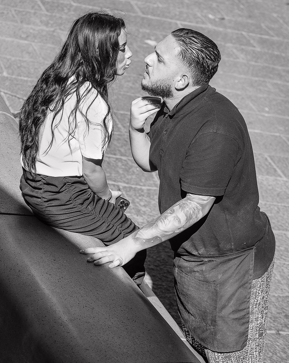
Comment |
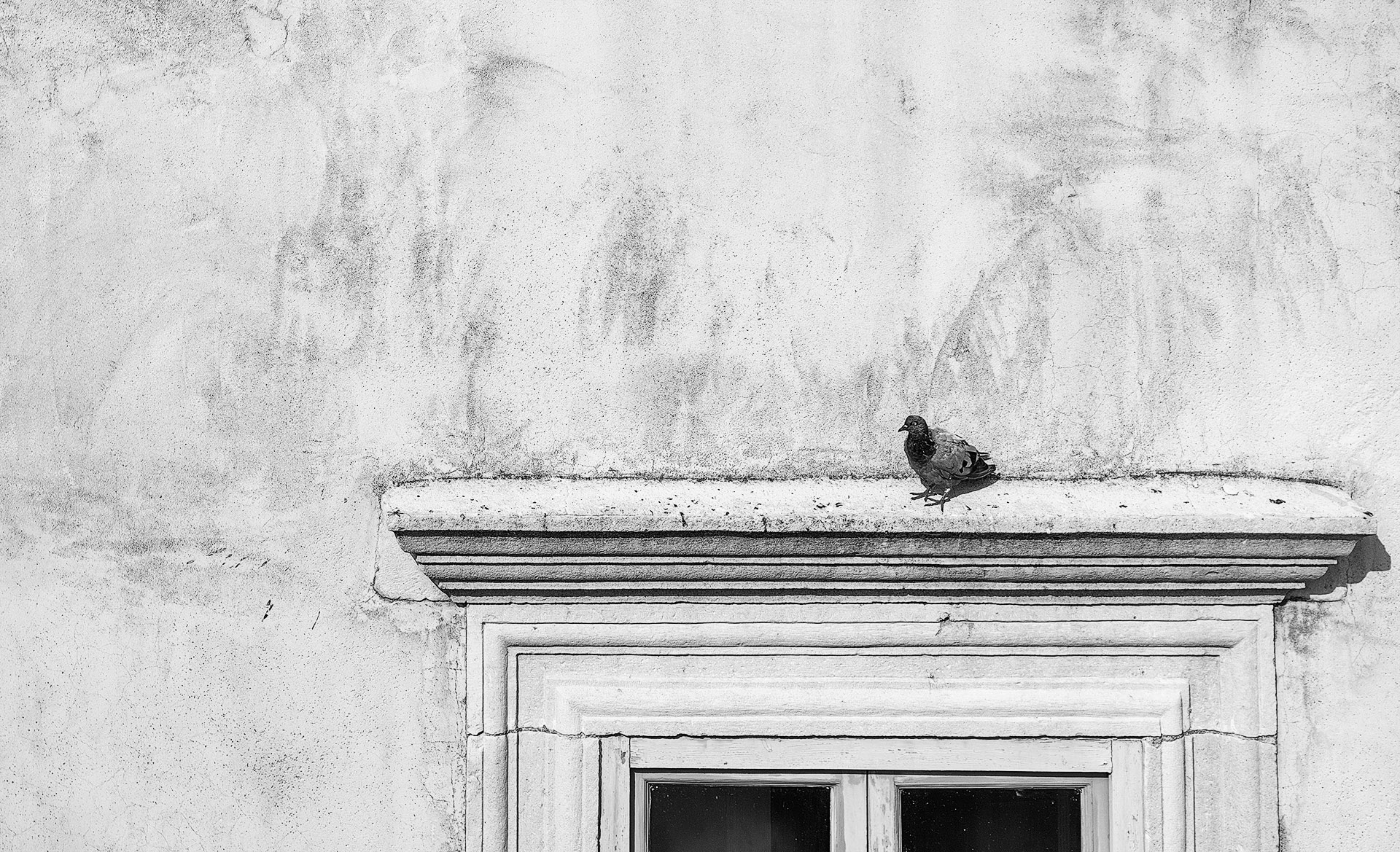
I would not have picked this for infra red but can see some tell tale signs now I am aware and you get my congratulations for trying something different. The treatment results in great contrast as the blacks are deep and the whites are really white. What works best for me is the contrast of the static pair against the mobile throng of people. Regarding the woman on the left, the detail, density, tones & clarity in the jeans, hair & hat are perfect but I think the shirt needs toning down a little so it is not so dominant. |
Oct 7th |
| 64 |
Oct 24 |
Comment |
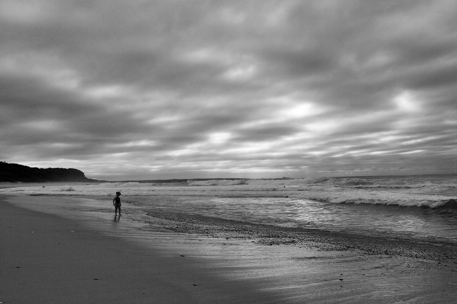
I too like the curves and wonder if a little darker with more contrast would give them greater impact. Interesting idea about the people removal. I am not bothered by their inclusion although leaving just the one couple at bottom would evoke a greater sense of isolation and grander scale. Would a crop of 10-15% off the bottom strengthen the image? |
Oct 7th |
| 64 |
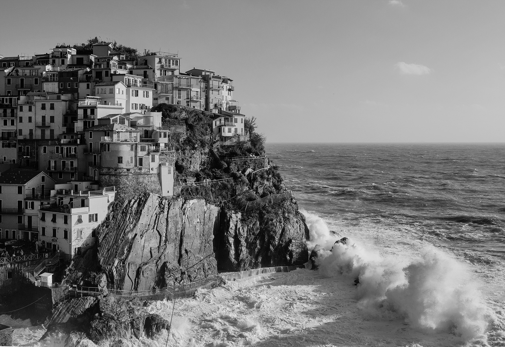
Oct 24 |
Comment |
Amazing difference with people removed as it transforms the location from a popular tourist attraction to an ancient ruin to give the viewer a sense of what it really used to be like. The wide path provides a strong leading line to take you through the thoroughfare. I would like more overall darkness; I think that would help add some contrast. Unfortunate protrusion of the modern building on the left. |
Oct 7th |
6 comments - 0 replies for Group 64
|
6 comments - 0 replies Total
|