|
| Group |
Round |
C/R |
Comment |
Date |
Image |
| 64 |
Jun 24 |
Comment |
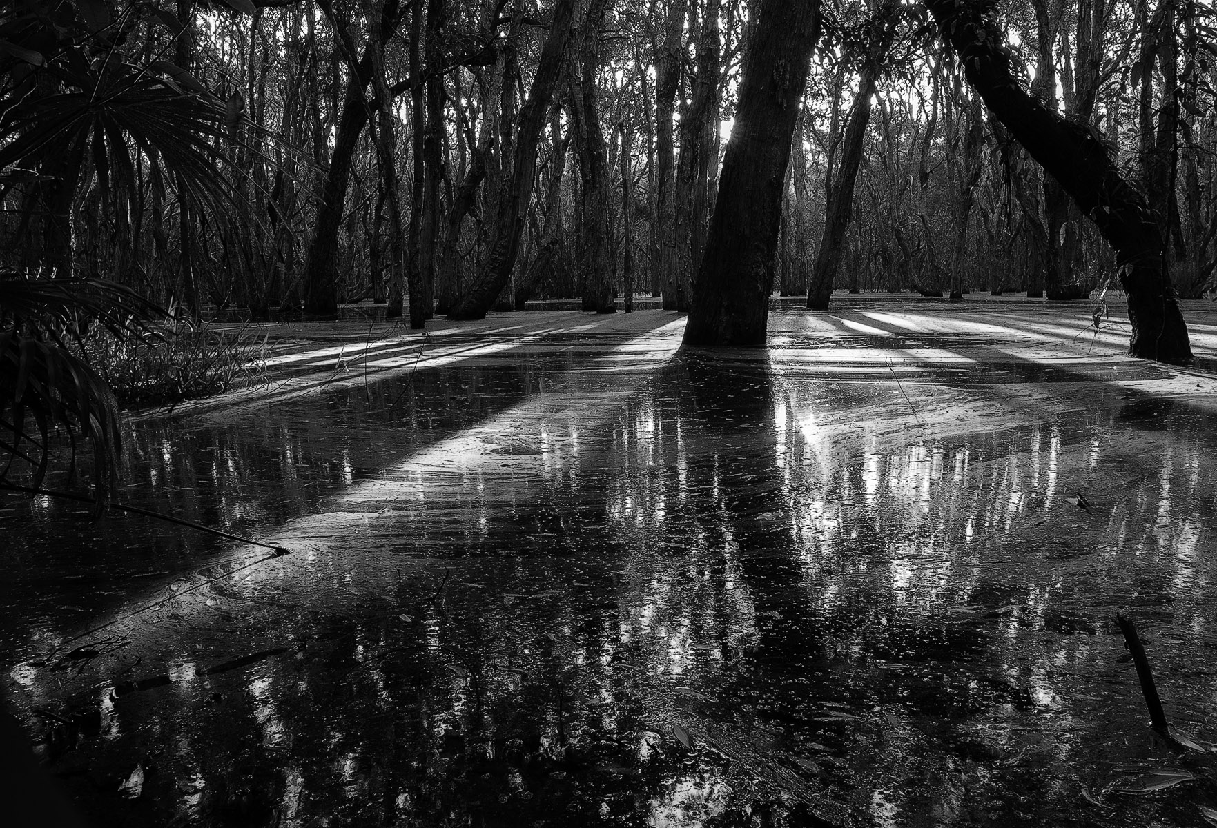
Sharp with the full range of tones where both highlights and shadows handled well. Agree totally with the reflection and the foresight not to put the shoreline directly across the centre. I would be interested to see the effect if the tree started closer to the right edge so that it flowed right across the image even if it meant including more of what is on the left. PS: I really like the colour palette in the original. |
Jun 15th |
| 64 |
Jun 24 |
Comment |
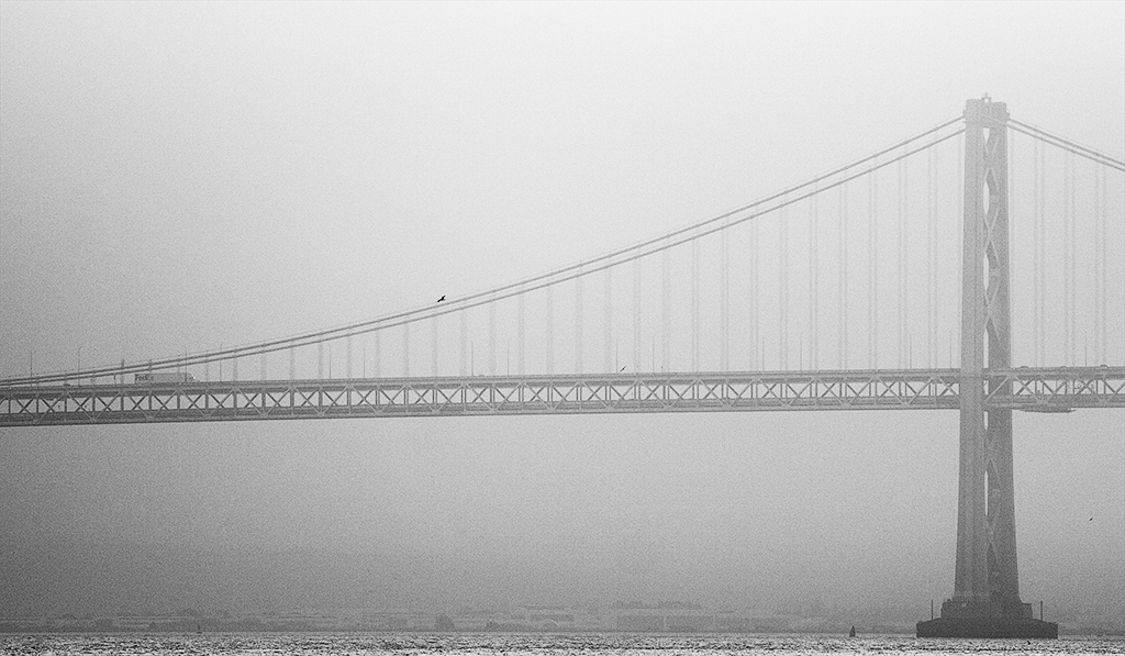
I quite like the sky for this image as is. The soft texture acts as a passive backdrop so as not to impede too much on the subject which is full of fine detail. The angle is fortunate in that the protruding section of the ship juts up just before the building on the right so there is no conflict there. Good detail in the blacks. I like the tidiness where you have not cut partially through any of the foreground boats. As an aside the image resonates strongly with me as I am currently half way through reading an 8 book series where some of the scenes take place on such vessels sailing between GB & Australia in the latter part of the 1800's. I have a feeling the Warrior was mentioned. (The McIntosh/Duffy series by Peter Watt starting with 'Cry Of The Curlew'). |
Jun 15th |
| 64 |
Jun 24 |
Comment |
The first thing that grabs me is the exquisite texture in the flower and I like the lighter inner radiating to the darker outer petals which I guess is a product of your dodging and burning. The baby's breath seems to be suffocating the flower a little so if there could be some separation there so the flower pops out in front of it; I think that would work better. As for sepia v mono I like the softness in the sepia and the baby's breath works better there as it is soft as well so you dont get that harsh contrast where they meet on the left side. |
Jun 15th |
| 64 |
Jun 24 |
Comment |
I too prefer the colour version. It is so warm, opulent and reverent which is not to say I dont like the mono. It has its plusses particularly the contrast. The mono puts more emphasis on the detail in the temples. They are sharp and there is a beautiful balance between the taller & narrower one contrasting with the shorter stockier one. The sky is simplified in the mono and has a lovely graduation toward the top of frame. I like that you have allowed enough space at the top for the spires to extend into. |
Jun 15th |
| 64 |
Jun 24 |
Comment |
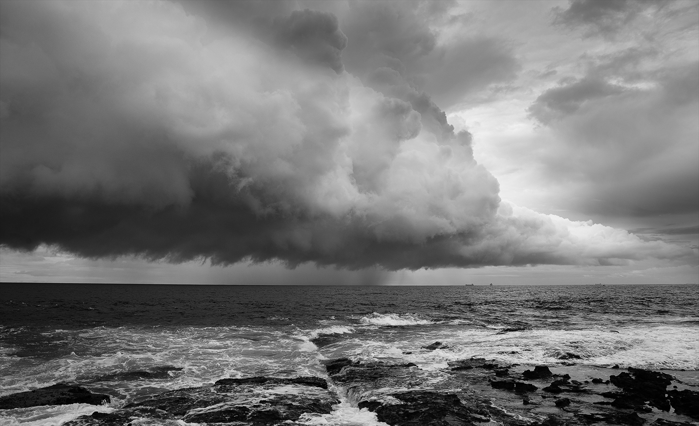
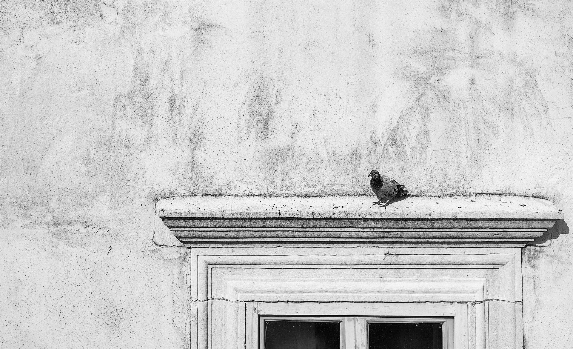
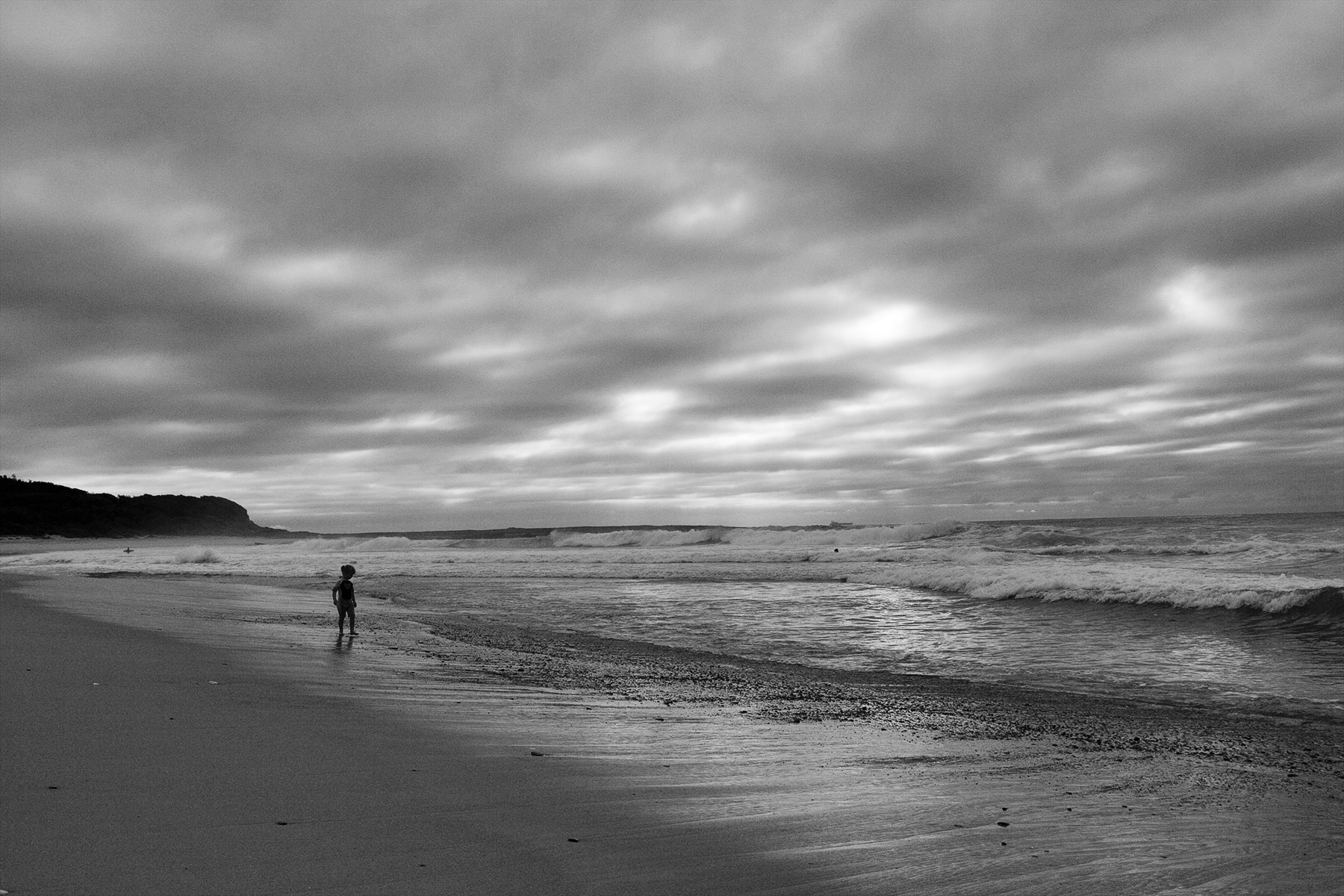
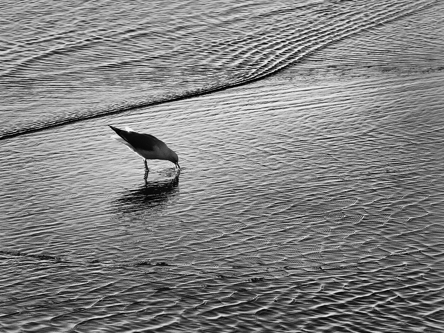
The tonal range and contrast and the detail it reveals is fantastic. There is a nice leading line made by the ridge running vertically through the centre. Coupled with the white curvy lines coming in from the right makes it easy for the viewer to follow down to the foreground. My only recommendation is to burn down the light area near the top left corner as I find it to be a tiny distraction. |
Jun 15th |
| 64 |
Jun 24 |
Comment |
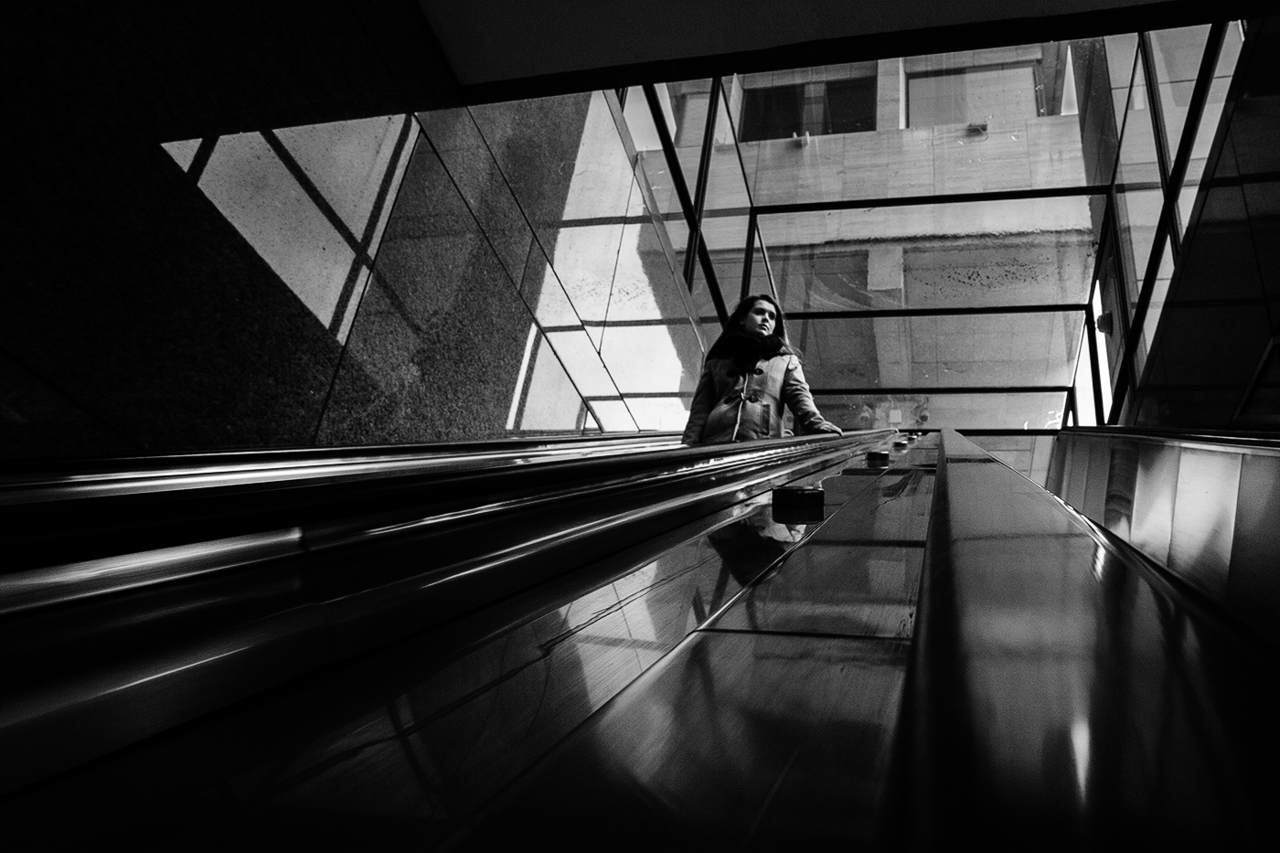
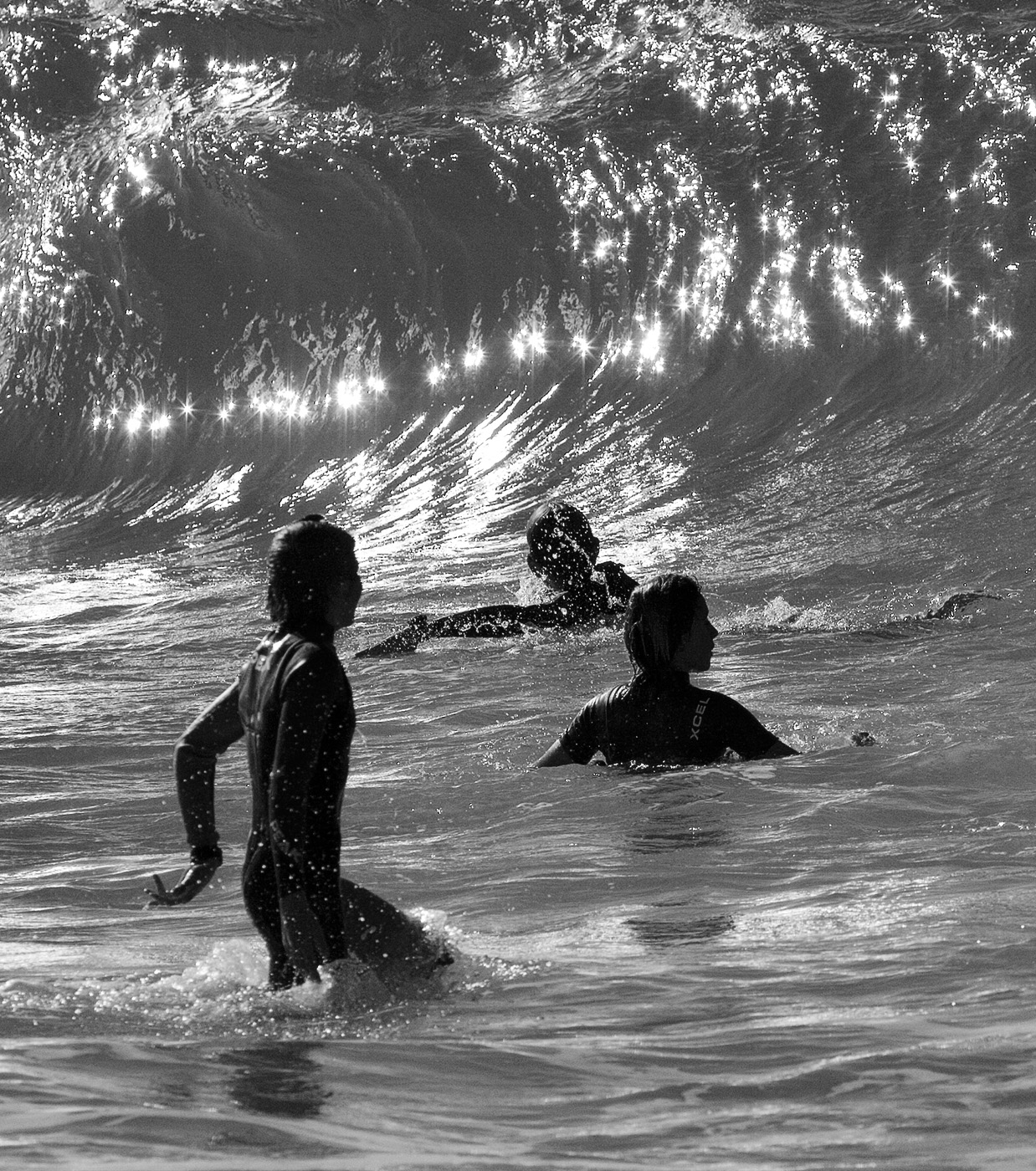
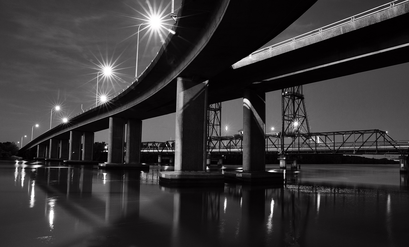
The tonal range is excellent. I draw a line top left to bottom right making two triangles where the left side is light & the other side shadow so this gives a really good balance of contrast and I think it is this that pulls the viewer through the tunnel. I would recommend darkening down the rectangular light patch on the window opening on the right side. |
Jun 15th |
6 comments - 0 replies for Group 64
|
6 comments - 0 replies Total
|