|
| Group |
Round |
C/R |
Comment |
Date |
Image |
| 64 |
Apr 24 |
Comment |
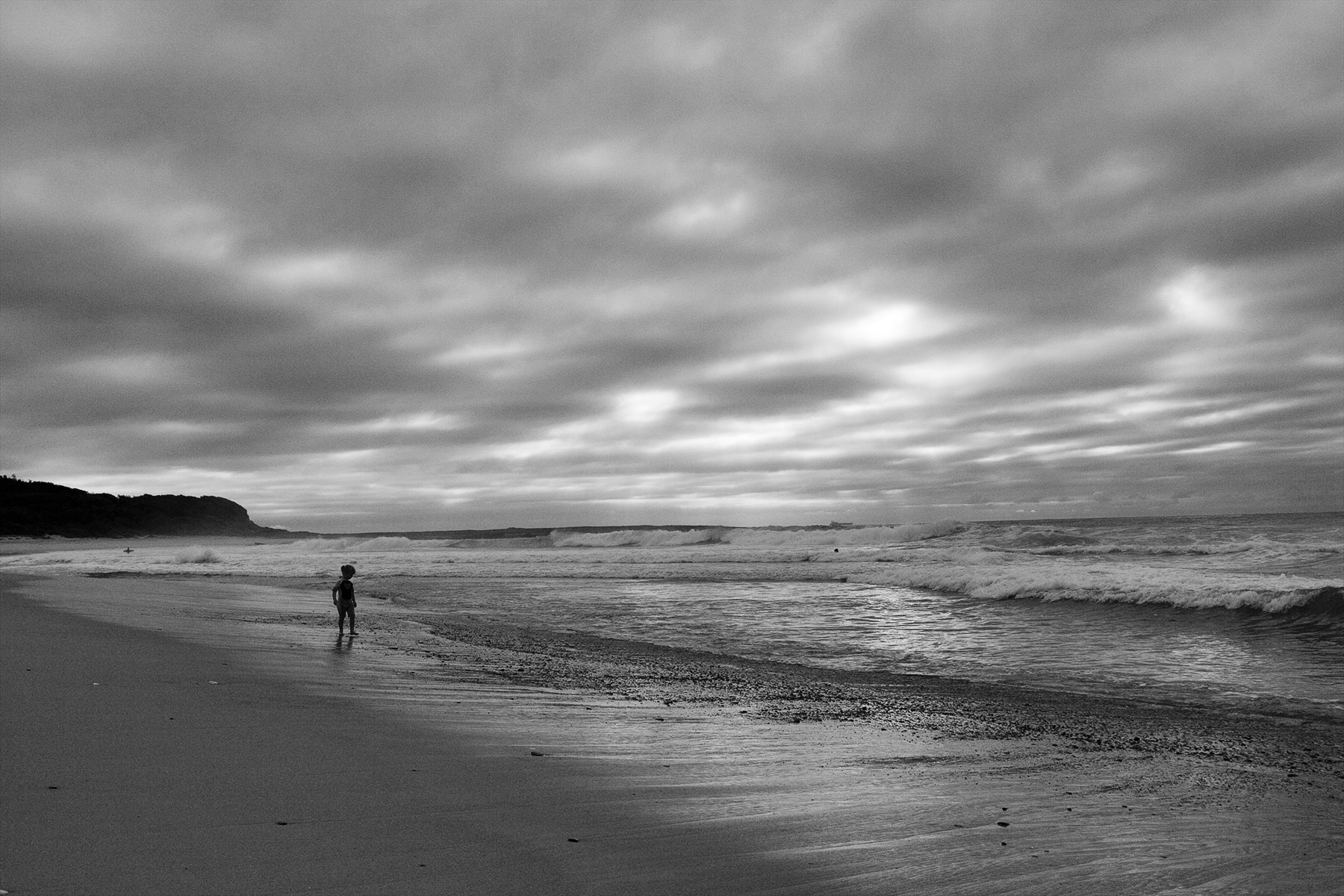
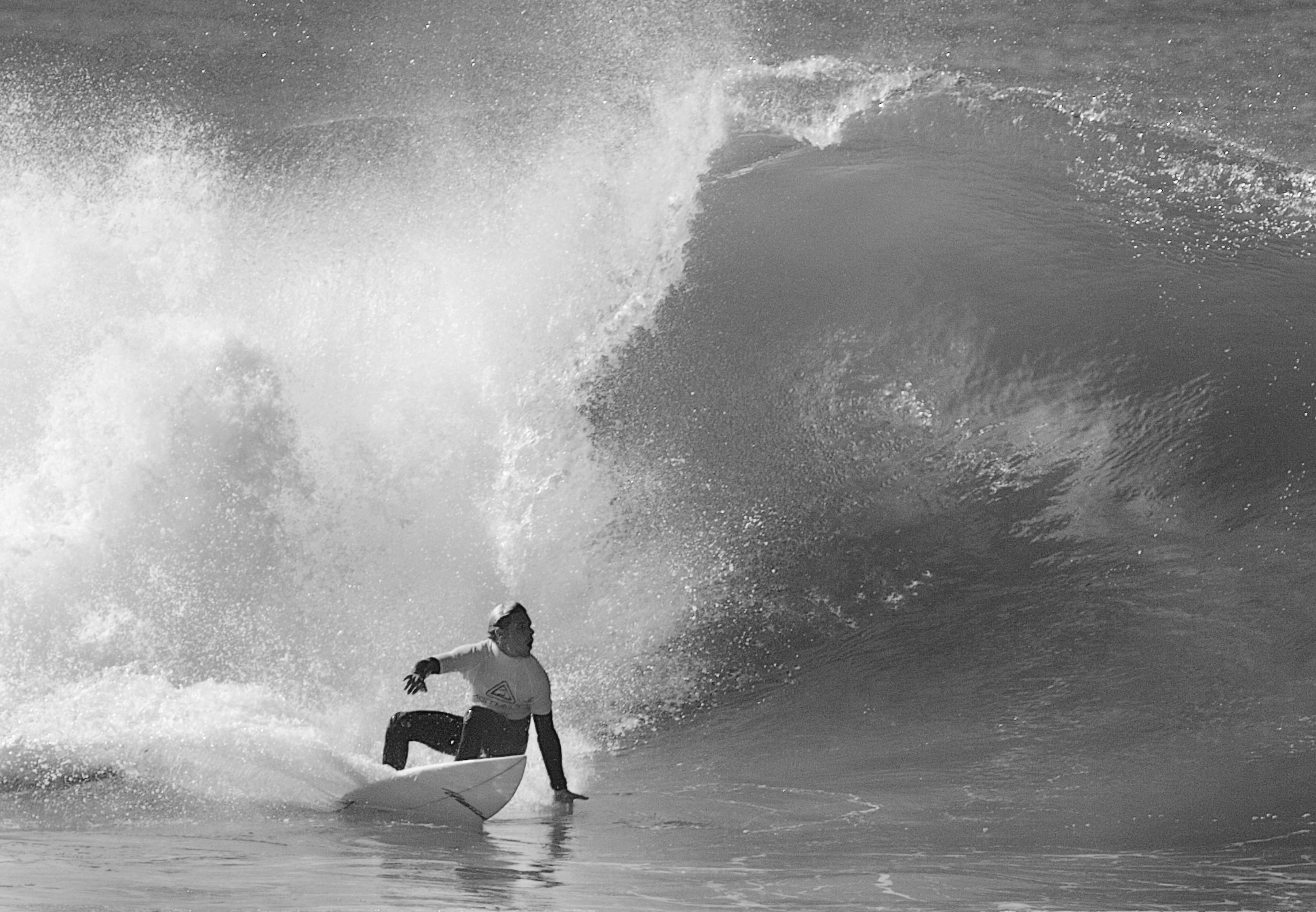
I like the inclusion of the back marker who is rendered blurrier than the main subject so plays a passive role but definitely adds to the story. The look on the main rider's face is priceless. I would crop approx. one third off the top as there are a lot of distractions there especially both top corners. To me this would give the main subject more impact. |
Apr 21st |
| 64 |
Apr 24 |
Comment |
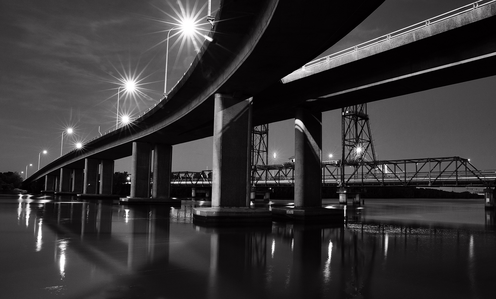
Great contrast and fantastic tonal range bringing out much texture and detail in the building materials. The dramatic sky and darker right side force me up the stairs so from a compositional perspective that works well. I like the density- it adds to the mood. |
Apr 21st |
| 64 |
Apr 24 |
Comment |
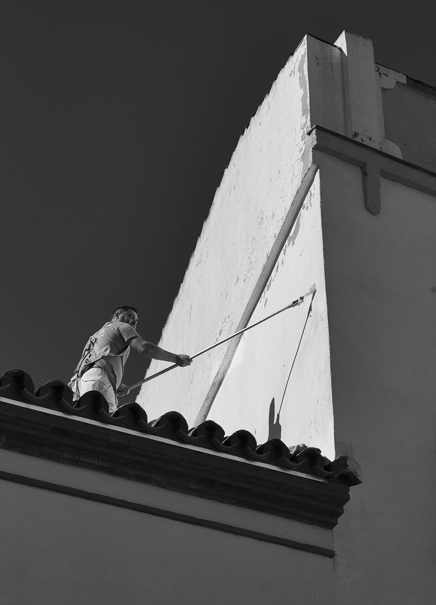
The light and shade on the floor does it for me and I dont mind the back view of the man as he is heading out the door and takes me through the image. I personally would crop out the three light fittings. The image is all about light and shadow so they would not be missed. I believe that would simplify the image, make the composition tidier and provide more impact. I like the density and tonal range as is. |
Apr 21st |
| 64 |
Apr 24 |
Comment |
I cant think of how you could get much better. Everything is great, the tonal range and texture in the fur especially so. |
Apr 21st |
| 64 |
Apr 24 |
Comment |
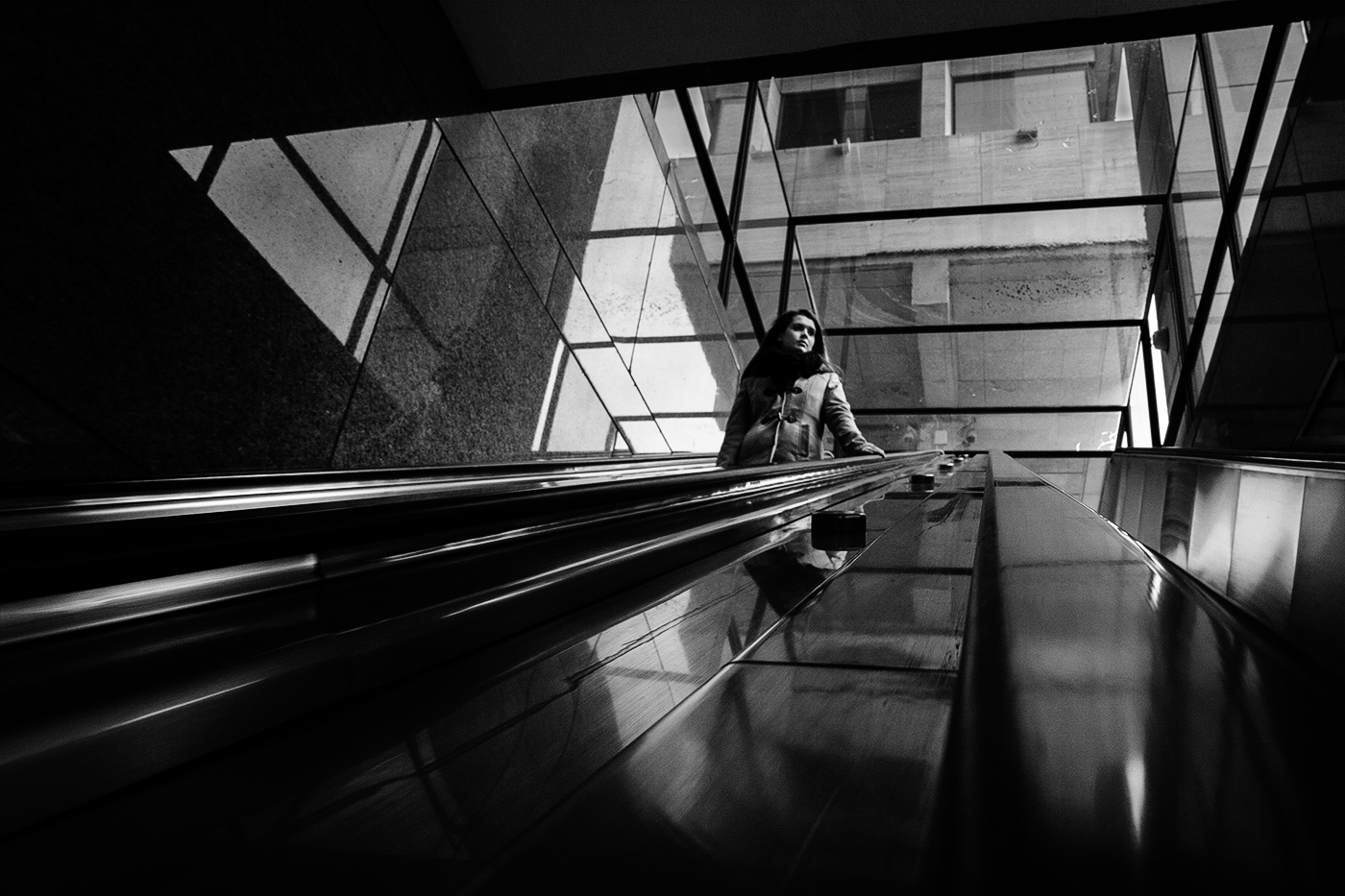
Lines, patterns, contrast- all combine for big impact. The structure itself adds to that. How would you feel about cropping 20% off the top to take out the bright ceiling area top middle. For me that makes it a stronger image as the bright section pulls my eyes to the top but when eliminated I travel through the centre along the floor exploring the patterns as I go. The suggested crop has the added bonus of eliminating a large expanse of the darkest area top right where the blacks lack detail. A good case of where less is more. |
Apr 21st |
| 64 |
Apr 24 |
Comment |
I like the brightness. Given the subject it needs to be bright and I think that is where a lot of the impact is. Mostly the highlights have been well contained although the edge of the circular part where the stamen is pointing could do with a little more detail burned in. The fine lines in the leaves give off little shadows which accentuate the texture. The background being blurred and non intrusive works well and the subject contrasts nicely with it. I recommend burning down the little light area top right corner as it is a minor distraction. As per Stuart I also would like to see more space (a similar amount at top & bottom to that on the sides). |
Apr 21st |
6 comments - 0 replies for Group 64
|
6 comments - 0 replies Total
|