|
| Group |
Round |
C/R |
Comment |
Date |
Image |
| 64 |
Feb 24 |
Comment |
Following Don's amendments I have two observations. Firstly there is a big increase in contrast and while I dont mind that, I think to a degree it kills the mood. Secondly the result leaves a noticeable oversharpening halo around the top of the gazebo and some of the clouds on the right which has me wondering if the 'AI' in the Topaz DeNoise AI was responsible for that. So I'm thinking the amendments have been pushed too far. I would be interested to see an edit somewhere between the original and the amended version. There has got to be a happy medium there somewhere. |
Feb 22nd |
| 64 |
Feb 24 |
Reply |
nice |
Feb 19th |
| 64 |
Feb 24 |
Comment |
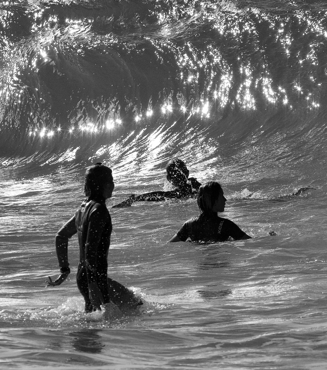
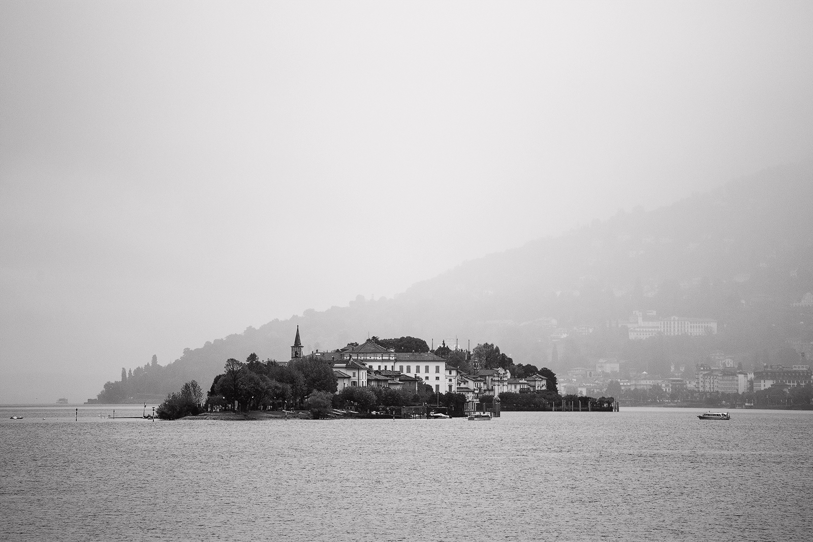
Does'nt work for me either. I like the relaxed wide open space feeling of the 'as presented' image. The dock creates a nice leading line to a strong focal point. I think the sky is an important part of this image giving the trees the space to reach into. To me the image is more about the great outdoors rather than just the fishers & dock. I cannot suggest improvement. I was thinking darken down the large horizontal band of cloud but you run the risk then of turning it a filthy grey so happy with it as is. |
Feb 19th |
| 64 |
Feb 24 |
Comment |
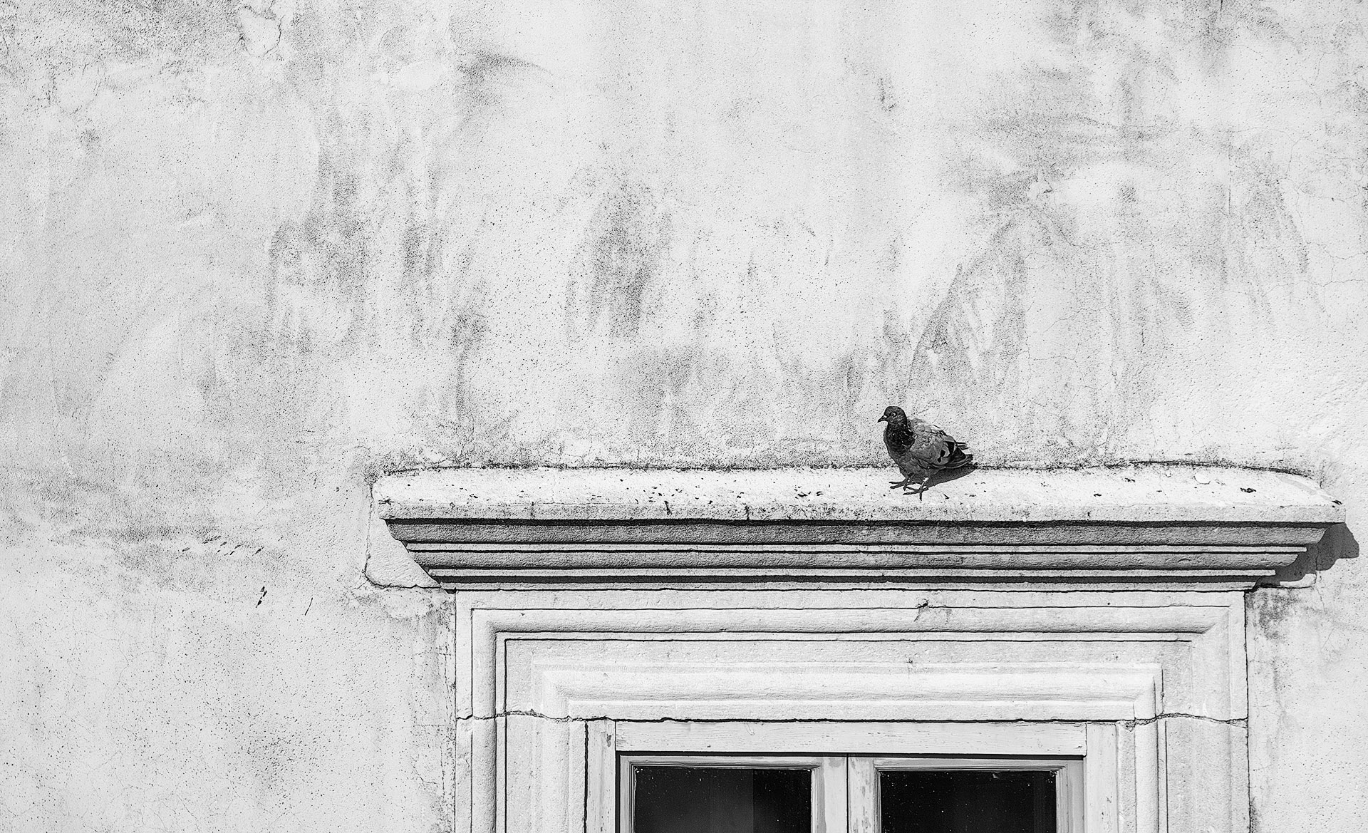
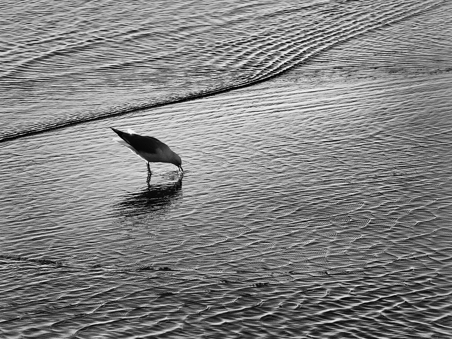
Great contrast and a great angle to show the bird's form. It has a lot of impact and viewer appeal. I like that you have not tried to fully blacken the background. Without the benefit of the colour version I am thinking the image was cherry ripe for a mono. My only suggestion for improvement is as Stuart says about bottom left corner. |
Feb 19th |
| 64 |
Feb 24 |
Comment |
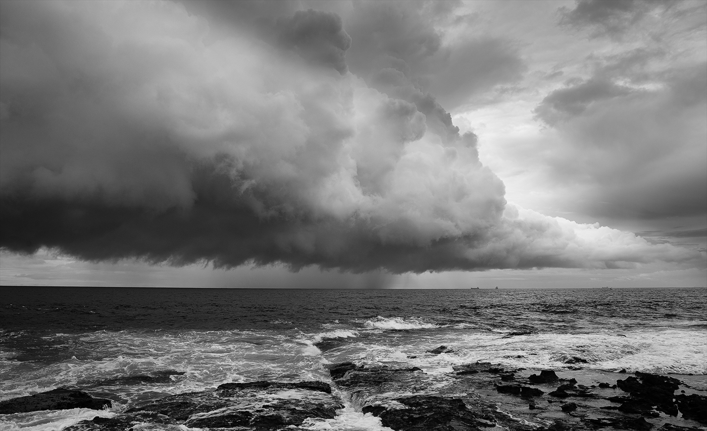
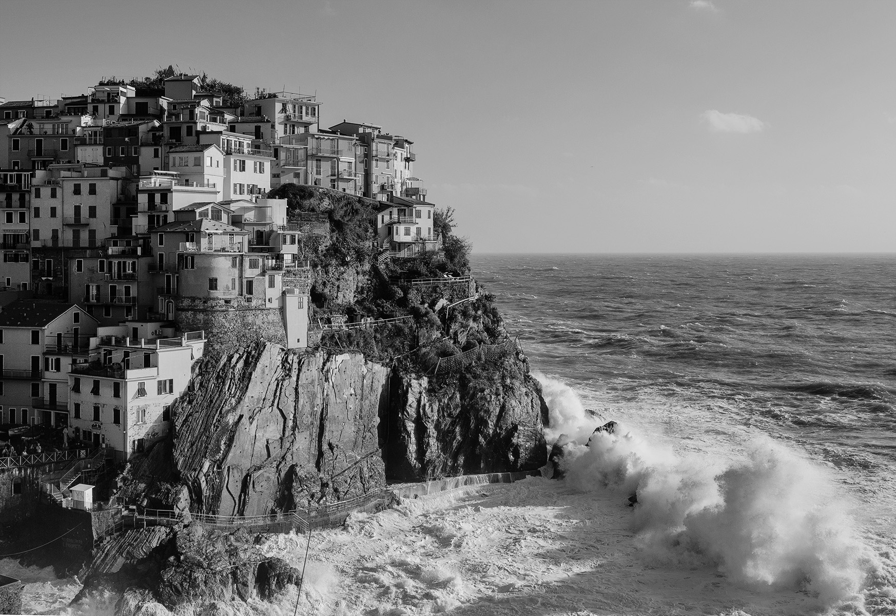
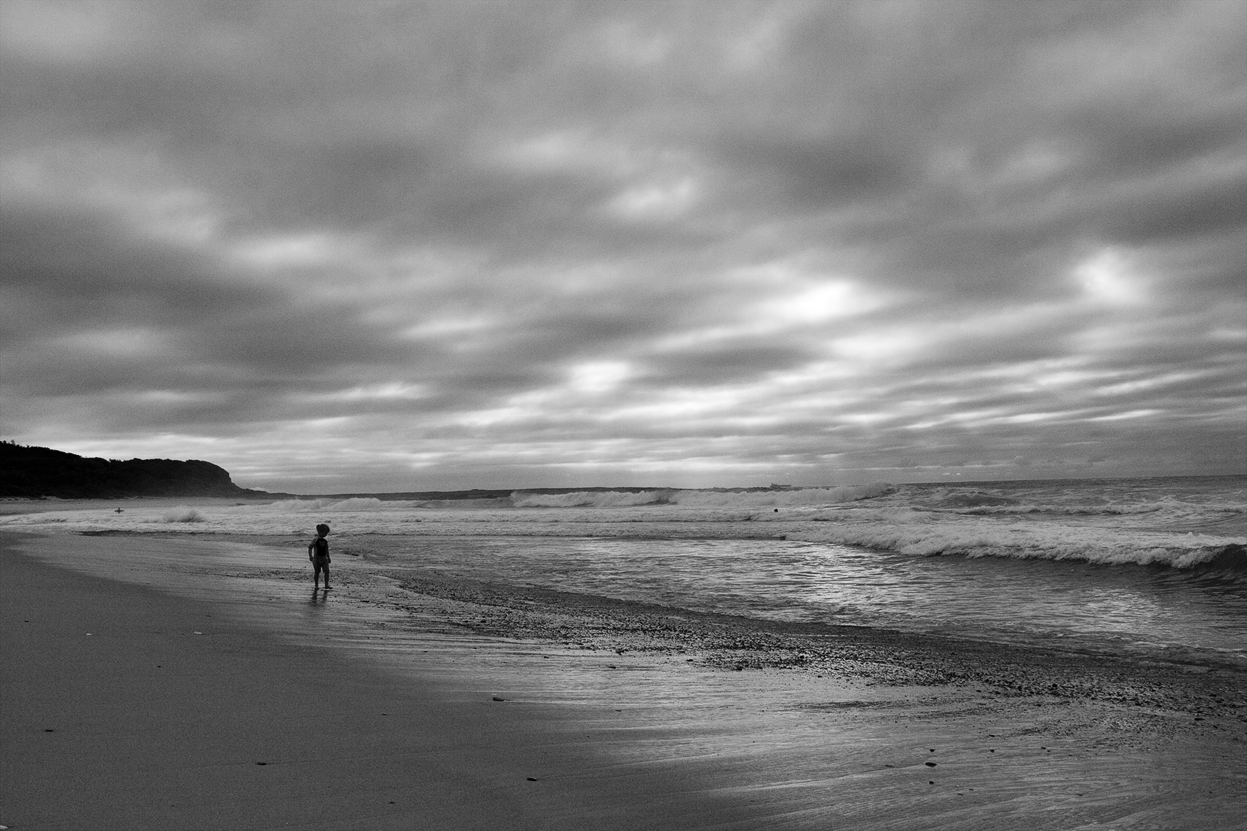
I am taken by the luminosity from behind the clouds lighting up that stormy sea. The mood is well captured. Great range of tones especially in the gazebo which has a lot of impact being such a bold shape against the background. I am a big fan of straight horizons in seascapes (otherwise your water is flowing down hill) so of course I would like to see it straight. |
Feb 18th |
| 64 |
Feb 24 |
Comment |
Great tones and contrast. Vertical format works well as it accentuates the size and steepness of the mountains. I too think a little more shadow reduction and brightness at the bottom could be a good thing. I like the smaller clump of trees both as a focal point and to provide scale. |
Feb 18th |
| 64 |
Feb 24 |
Comment |
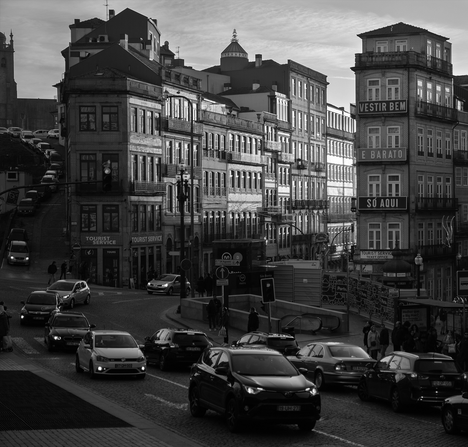
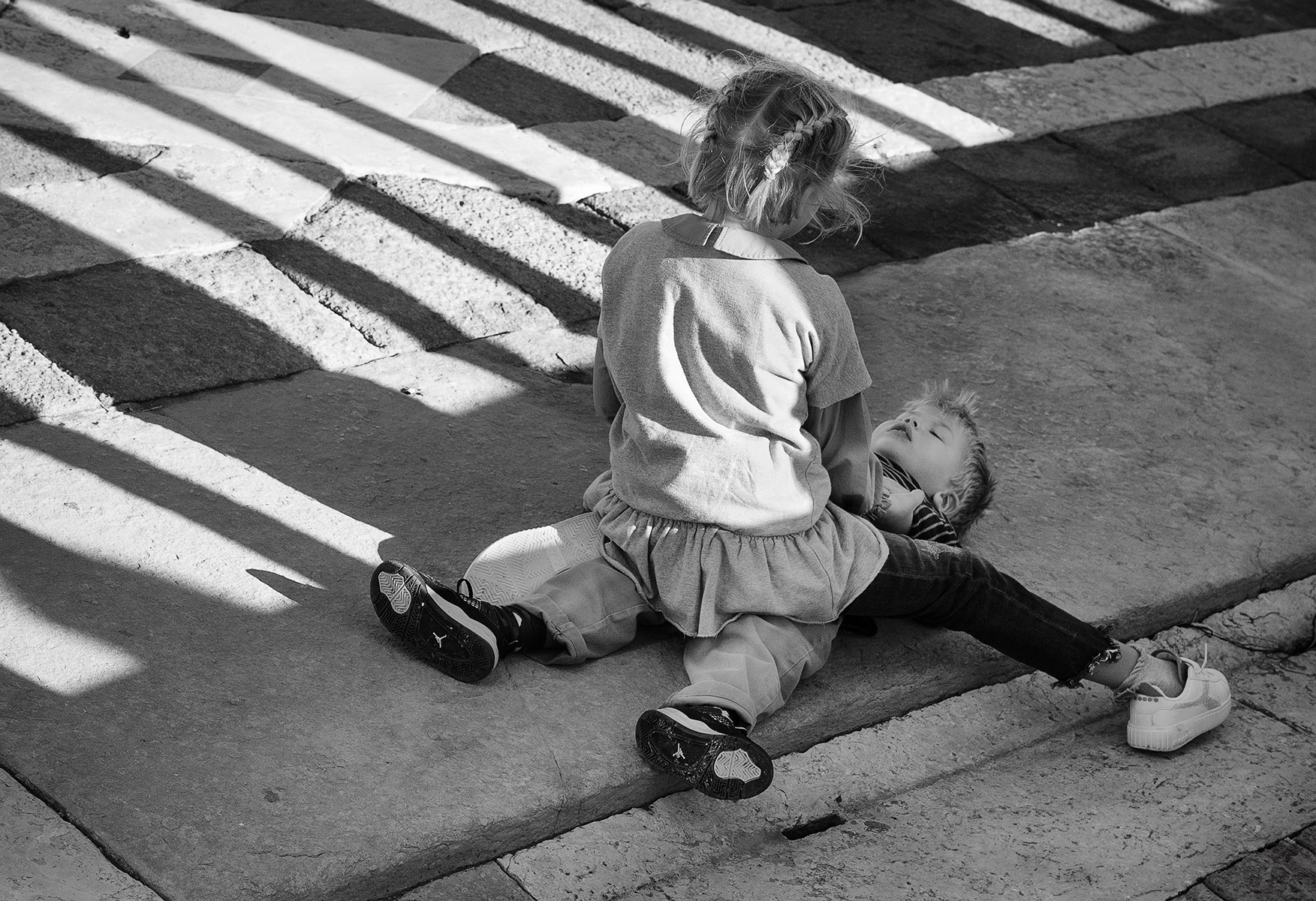
I would not have noticed a tarp or any covering of it unless you pointed it out. It was fortunate it was way off in the far background- good job. As for the image, every things great. My only suggestion would be to burn down the light foliage at the bottom. Framing using the foliage is excellent. |
Feb 18th |
| 64 |
Feb 24 |
Reply |
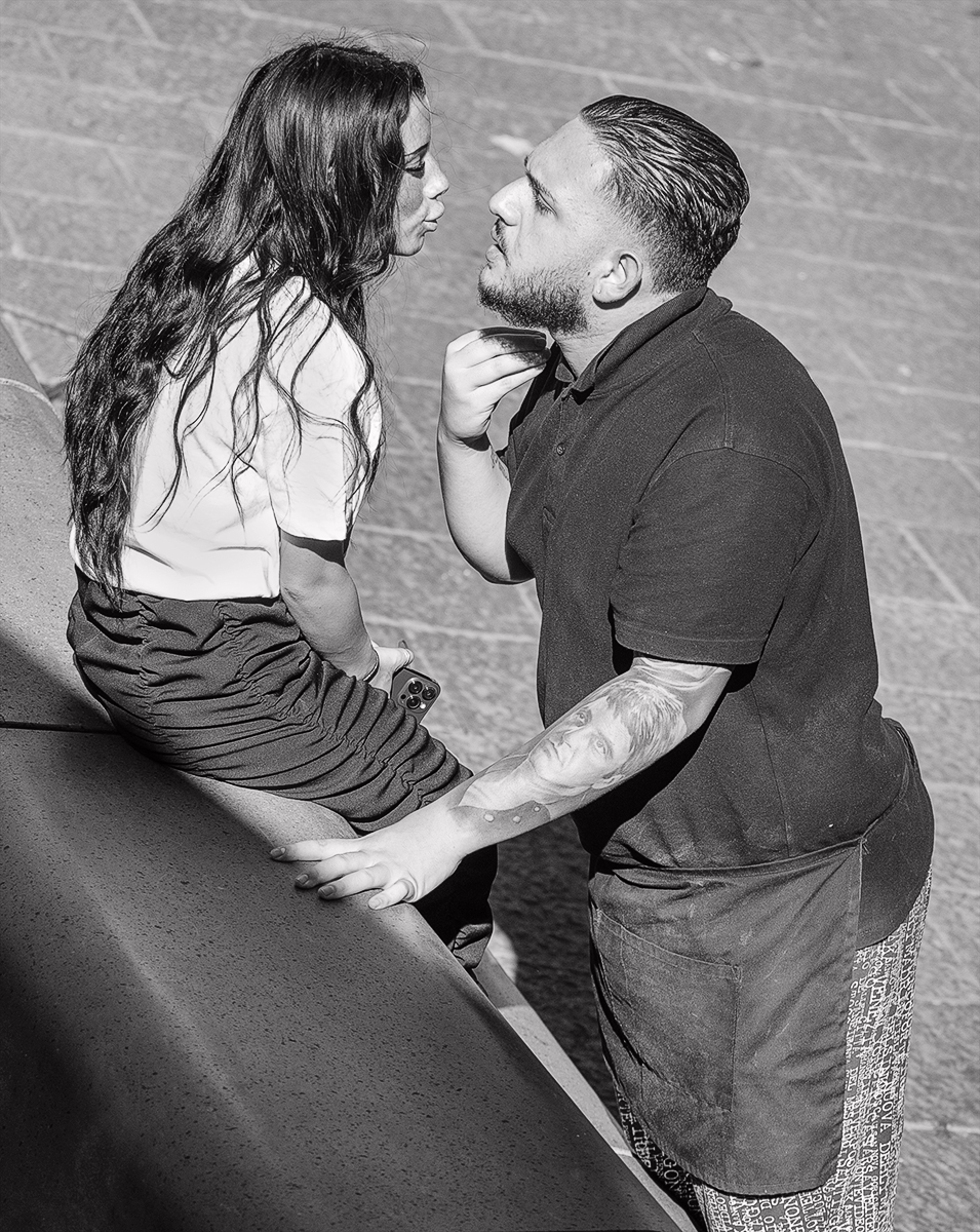
Hi Stuart, firstly yes it is not illegal to photograph children in a public space and I think as long as we use common sense and discretion all should be fine...photography is not a crime.
Secondly my conversion method is my preferred workflow. I have tried a few different ways and like it best. It takes me less than 5 seconds so I can see straight away if it is a good candidate for mono or not. If it is I start over and do all the dodging & burning, spot healing, cloning etc then adjust the high lights, shadows & brightness using different layers (I have a preset action for this). Then I do the conversion. I can then go back in and adjust highlights, shadows, brightness on the individual layers. |
Feb 13th |
6 comments - 2 replies for Group 64
|
6 comments - 2 replies Total
|