|
| Group |
Round |
C/R |
Comment |
Date |
Image |
| 64 |
Jan 24 |
Comment |
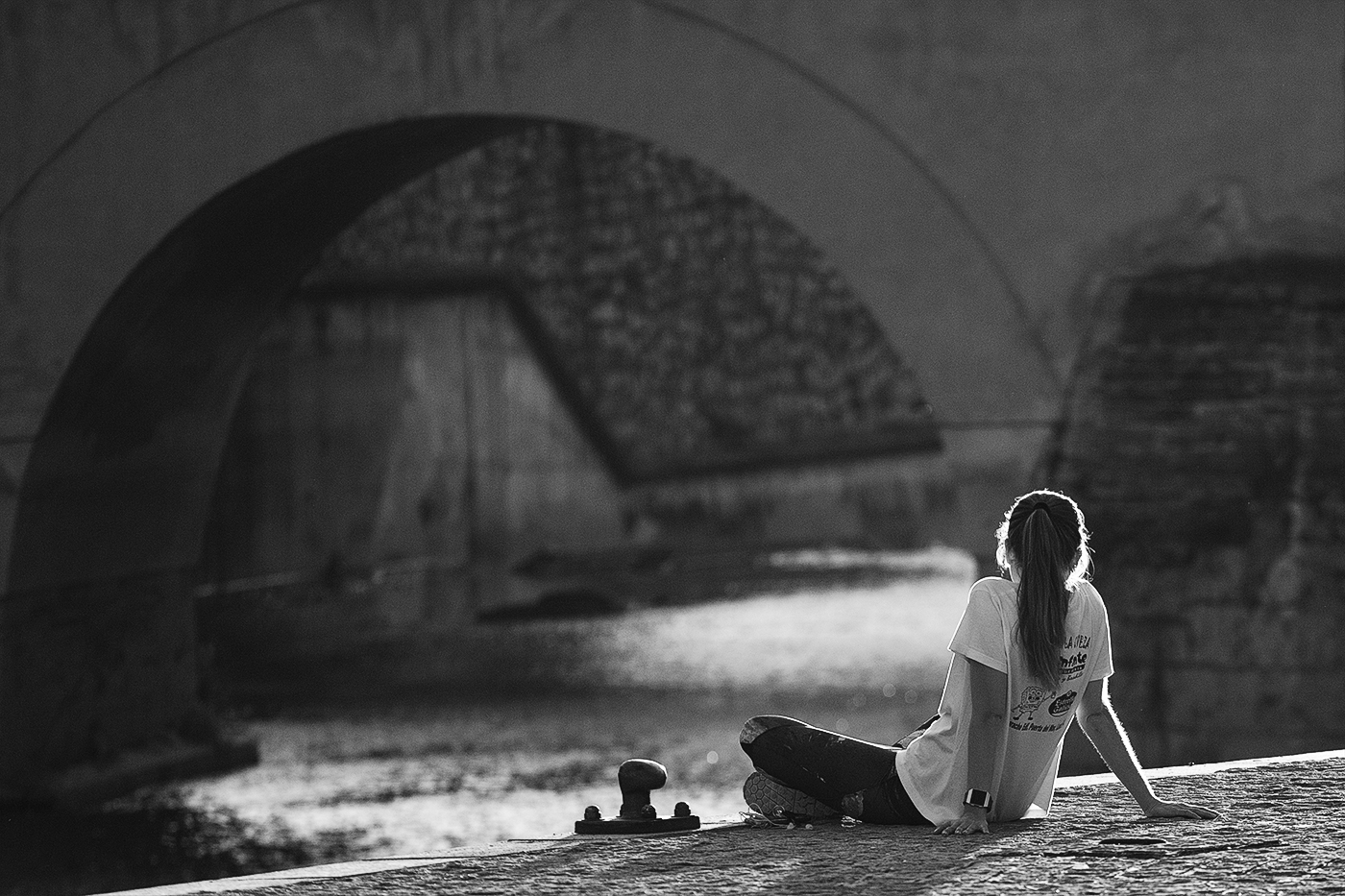
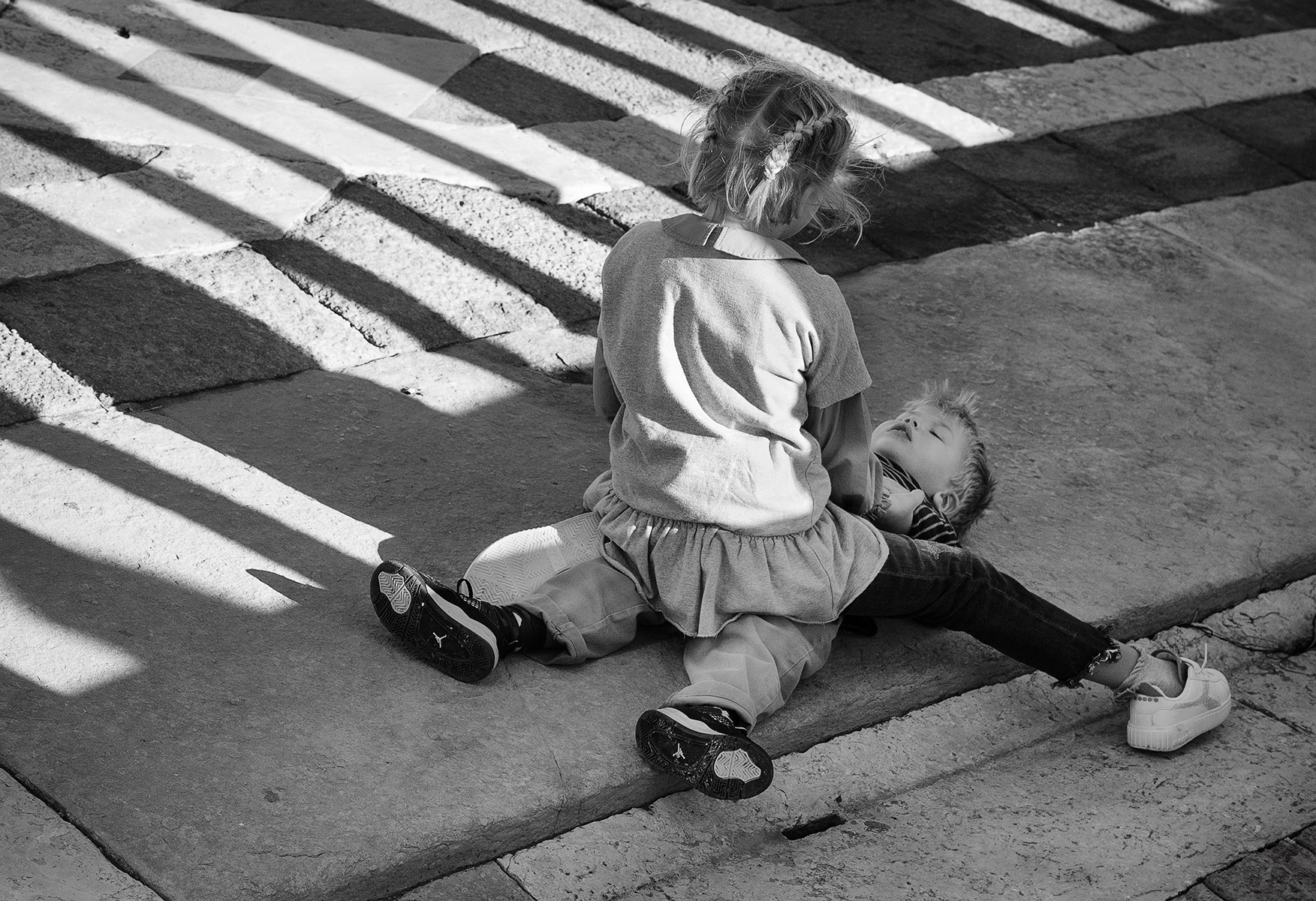
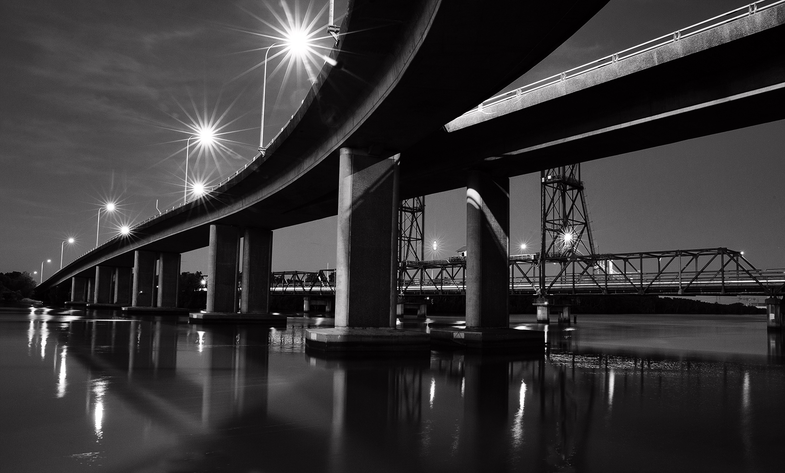
If any cropping were to be considered I'd take it off the top as the sky is featureless so there would be no real loss there.
The bottom has beautiful texture so I am in favour of not disturbing that area. Panorama format suits and I think the fact I cannot see the starting points of the two bridges creates a strong link and keeps the scene tight. I do agree the fall feel has been lost in the conversion whereas it is a major feature in the colour version. So tone down of the right tree is my recommendation too, only because the lighter tones are dragging my eyes to the right. |
Jan 19th |
| 64 |
Jan 24 |
Comment |
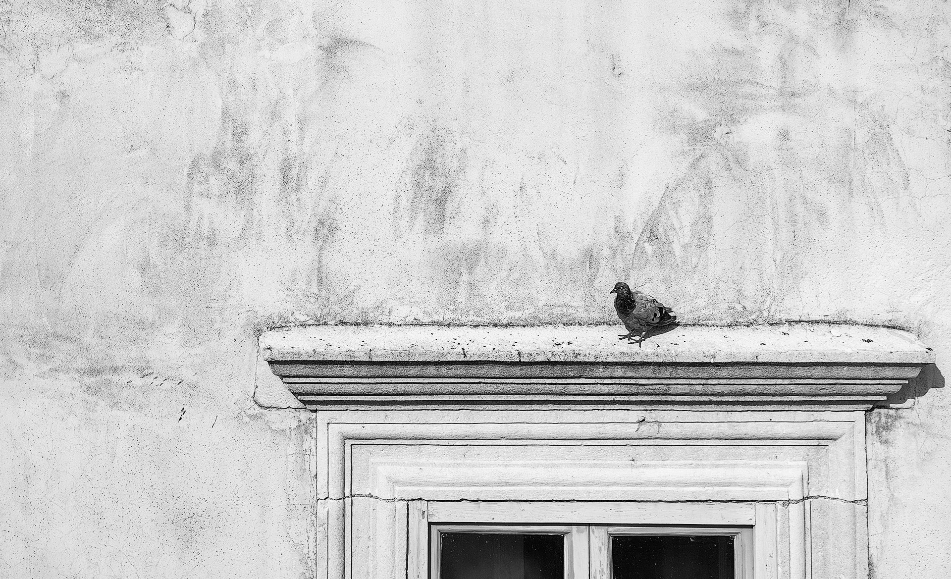
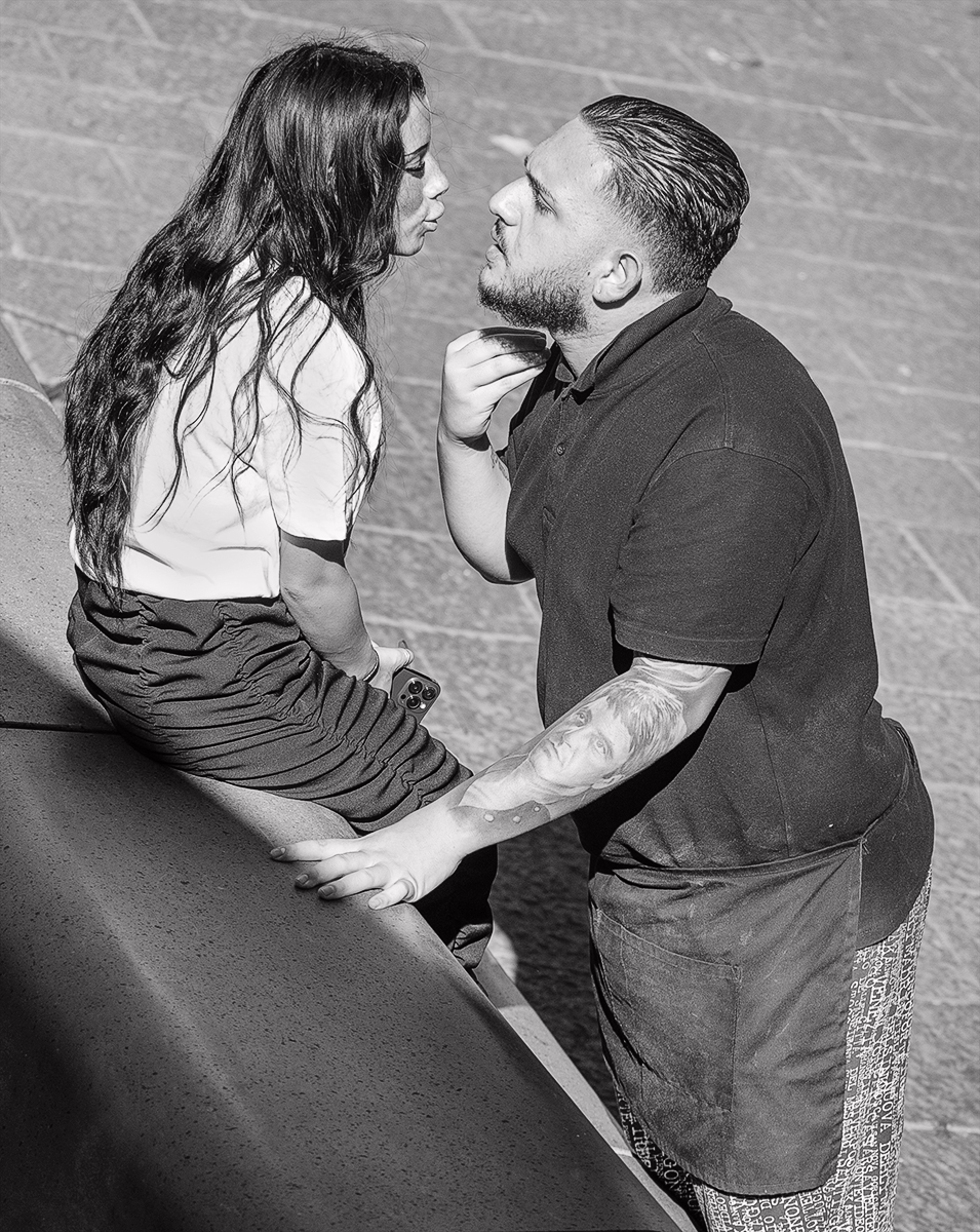
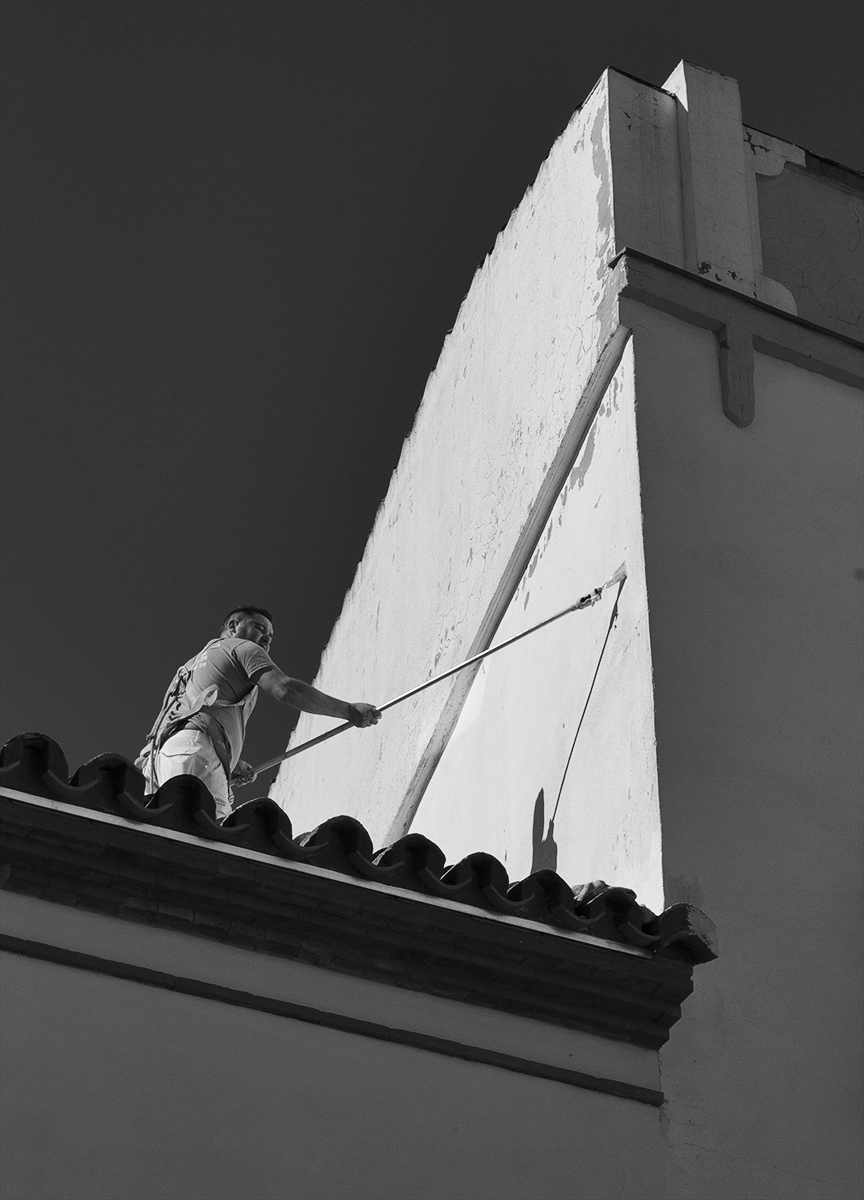
Dustspots aside its a high impact image and has a sinister feel with the dead tree and menacing sky. The static body language of the people give the impression they are a little cautious as to whether they should enter or not. It has a great range of tones and I too would like to see more contrast as I think that would lift the drama even further. |
Jan 19th |
| 64 |
Jan 24 |
Comment |
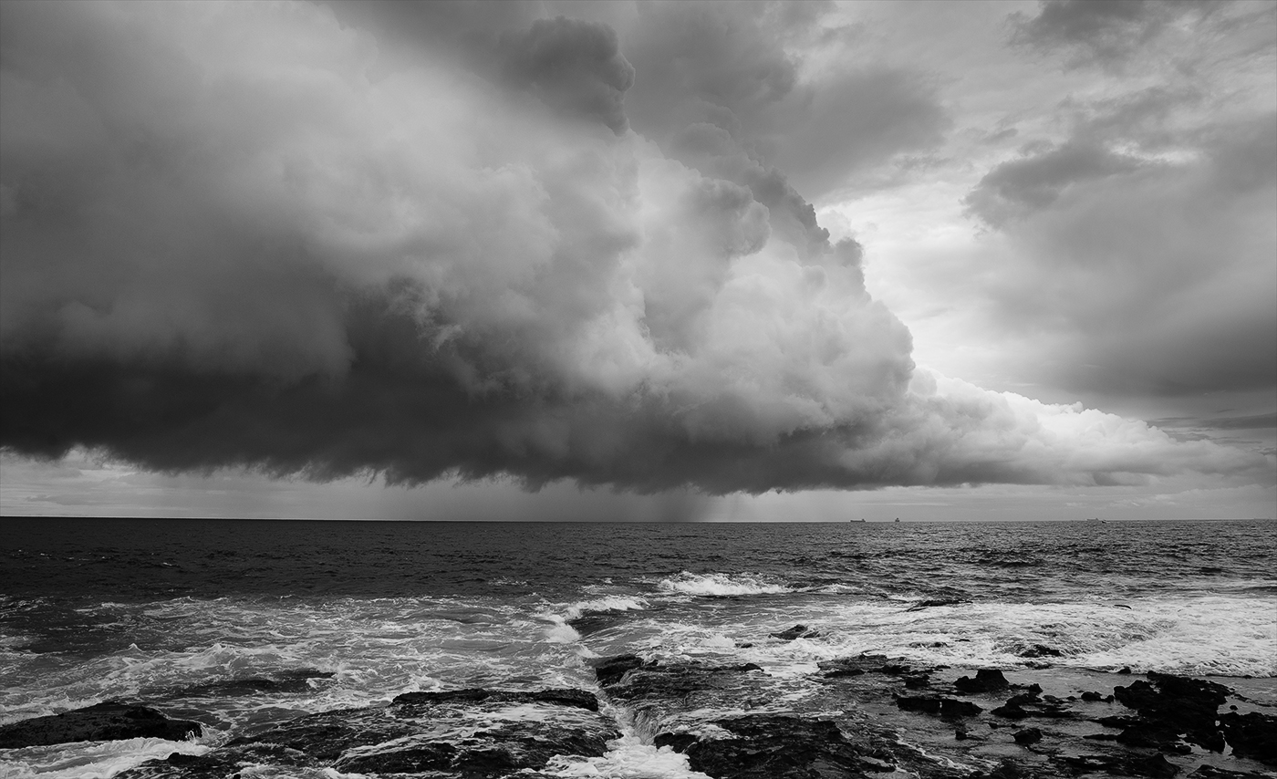
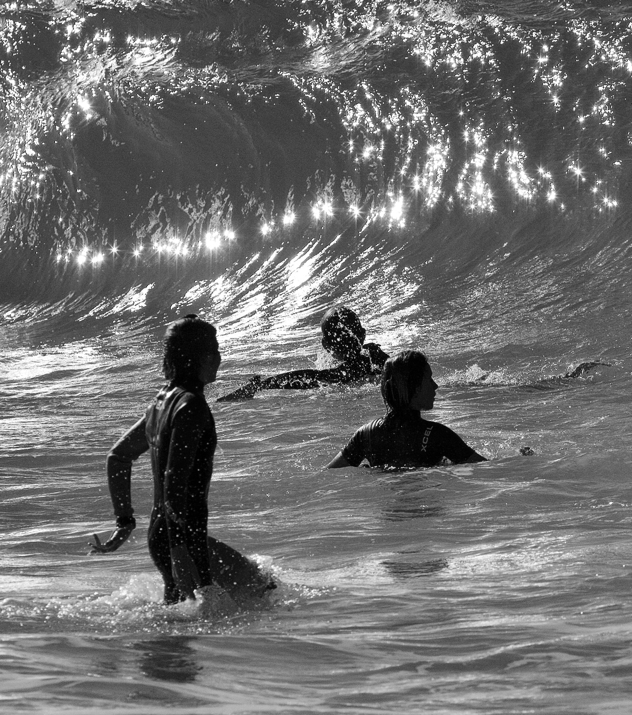
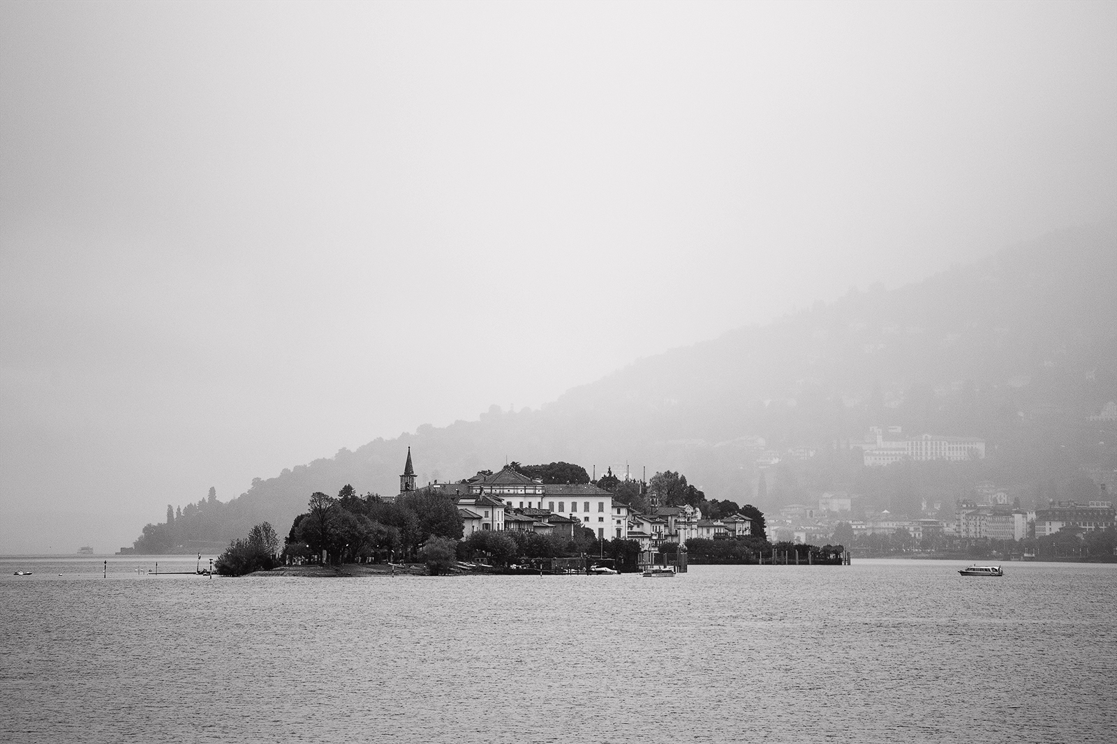
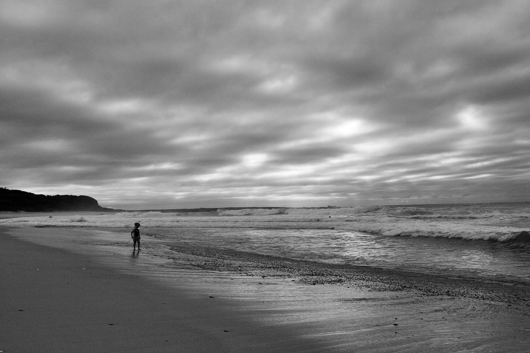
The slanted horizon has my eyes rolling off to the right and out of frame. I think that is detrimental to an otherwise interesting image full of life and texture with great depth. A small crop at bottom could be considered to get rid of the foliage as it gets lost in the conversion and would'nt be missed. I think the colour version trumps the mono. It has a simple palette of green, blue and brown which combine harmoniously and emphasizes the treachery of that stretch of coast. |
Jan 18th |
| 64 |
Jan 24 |
Comment |
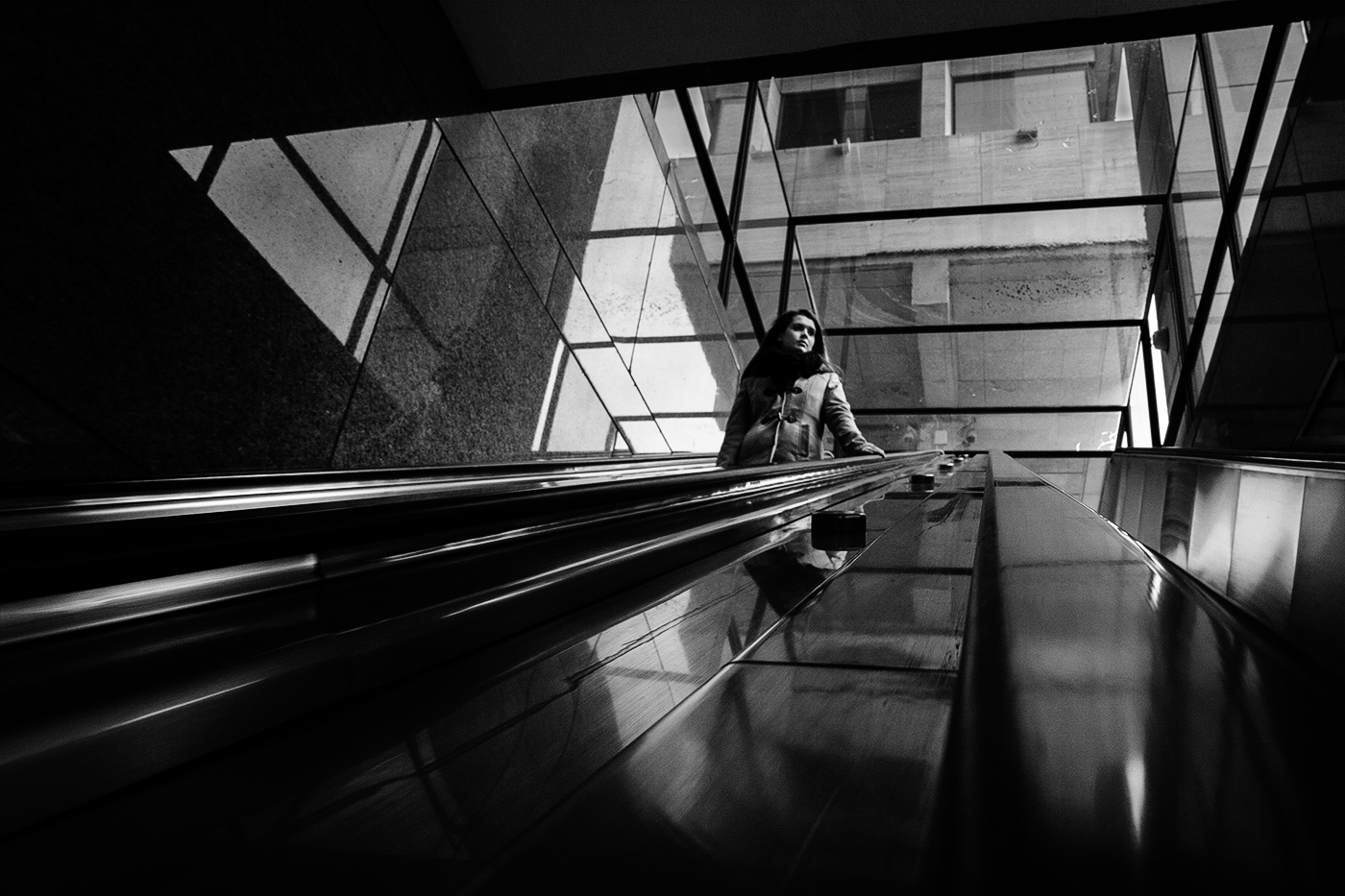
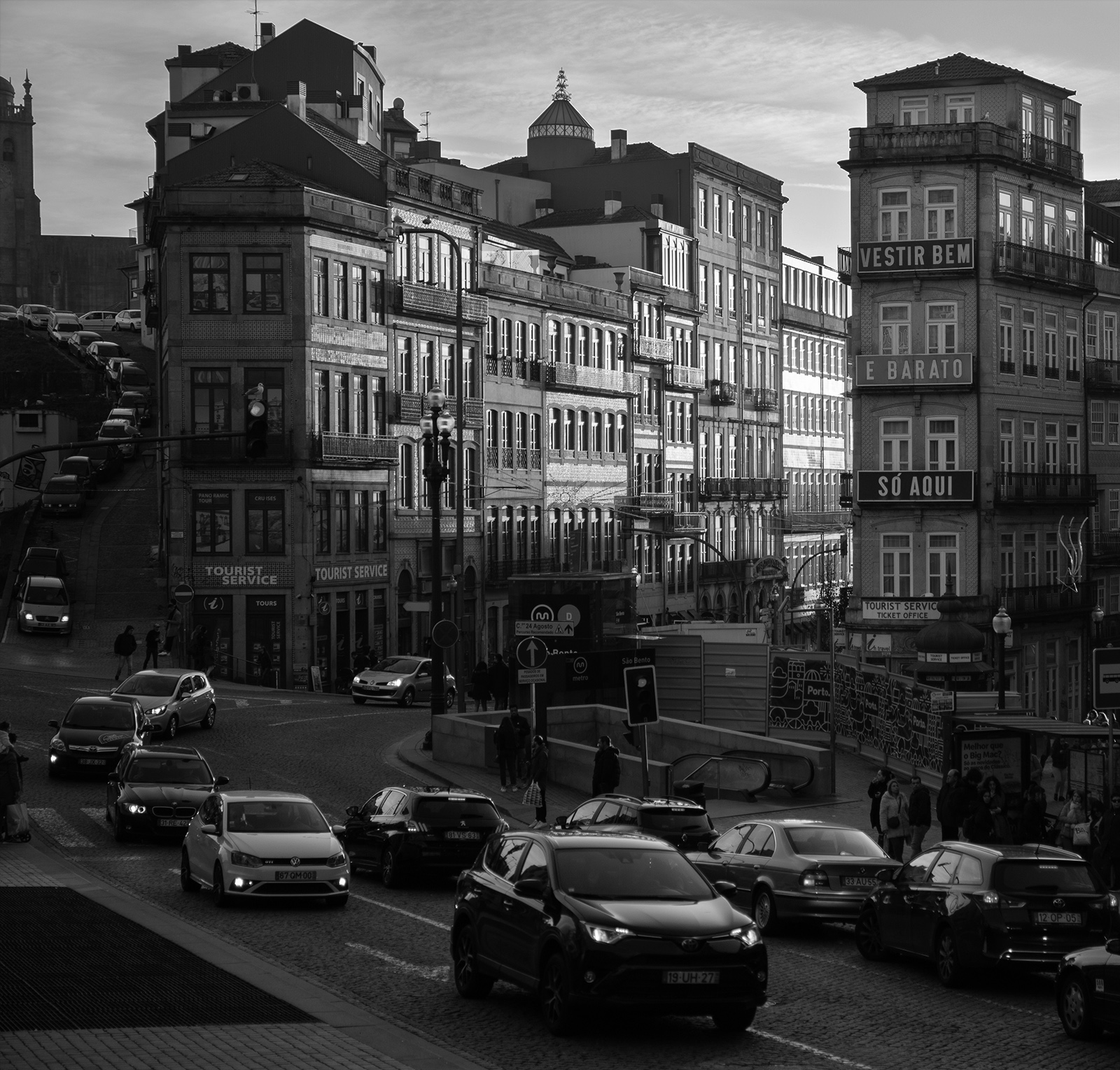
The first thing that hit me was how good the blacks are especially in the train. Sharp and well detailed. The arch and tracks make pleasant framing. There is a nice bit of space for the train to move in to. The bent tracks emphasize the wobble in the train adding life and a sense of movement. Me personally; I would crop off the bottom to get rid of the object bottom right corner- it is not necessary and would only serve to give the train more impact. A marvelous image. |
Jan 18th |
| 64 |
Jan 24 |
Comment |
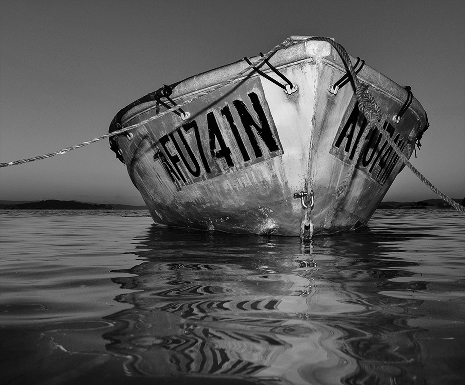
I am immediately drawn to the two circular black patches then down the rope through the bottom right corner and out of the frame completely. Those two straight strands of rope are a leading line but in a negative way as they take me away from the subject. Tones and texture are good but I would like to see a bit more contrast. As a consideration, what about a lower viewpoint with the camera almost at deck level?- I think that would be worth exploring. |
Jan 18th |
5 comments - 0 replies for Group 64
|
5 comments - 0 replies Total
|