|
| Group |
Round |
C/R |
Comment |
Date |
Image |
| 64 |
Dec 23 |
Comment |
All the elements work well to stitch a story together and I note the reasons you did it so the big "N" works well in the context of the assignment. The two pages being so bright really dominate and grab my attention straight away. I would like to see some more space around the edges as the statue in particular seems very tight up in the corner. |
Dec 17th |
| 64 |
Dec 23 |
Comment |
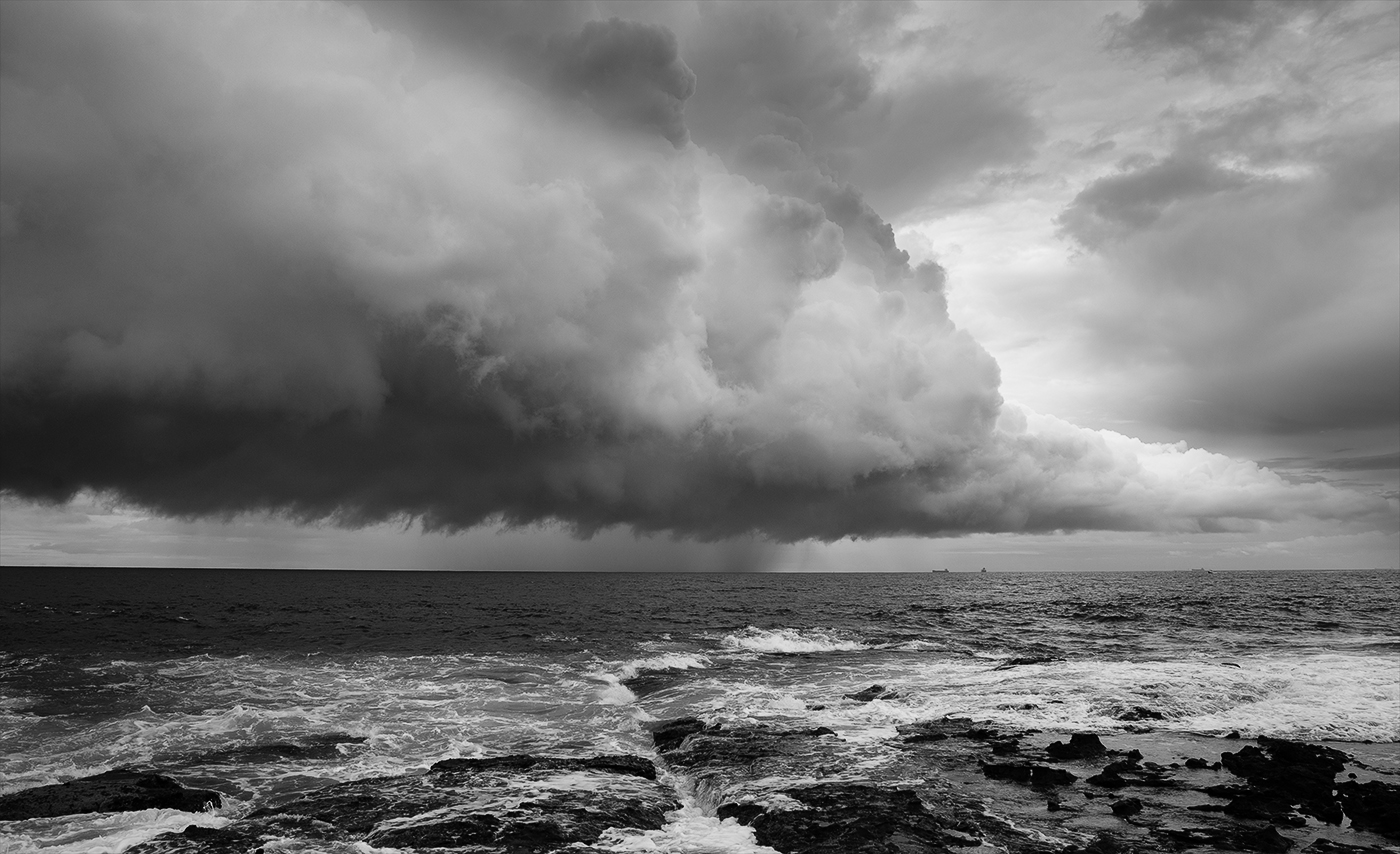
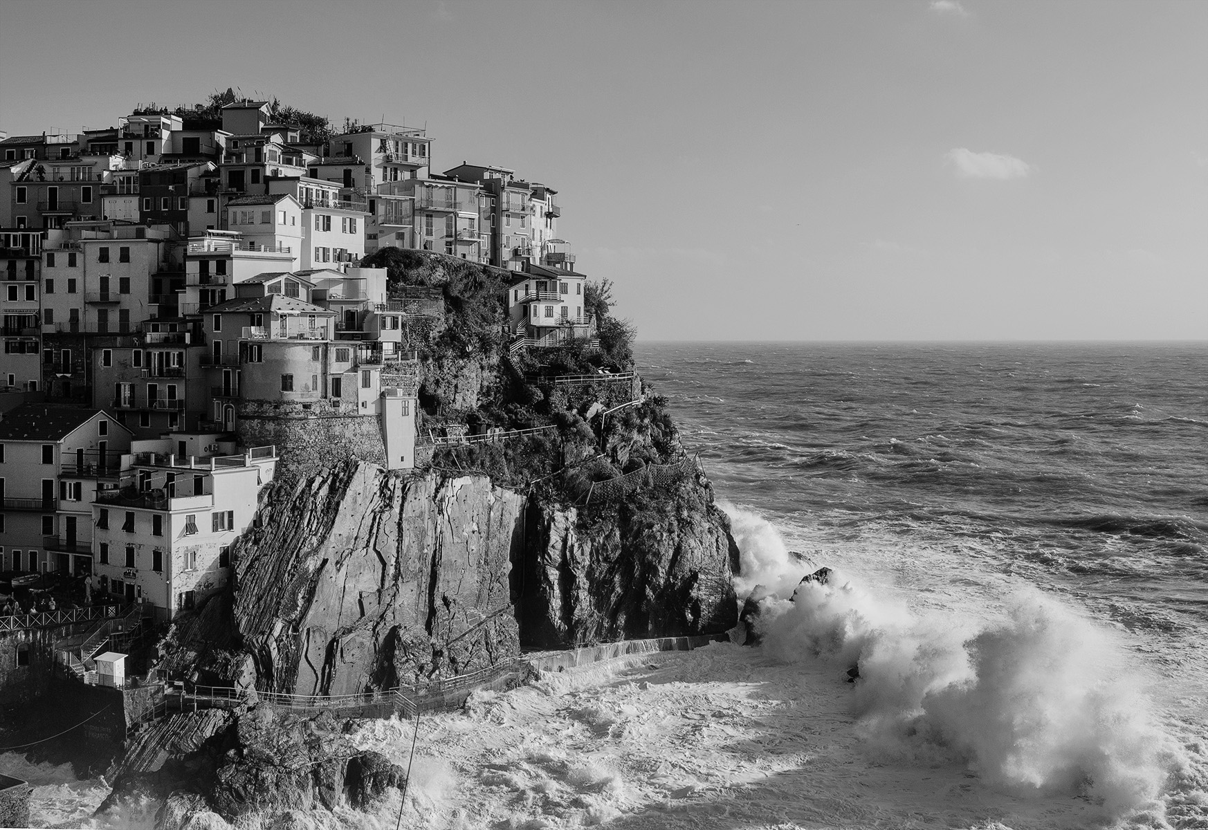
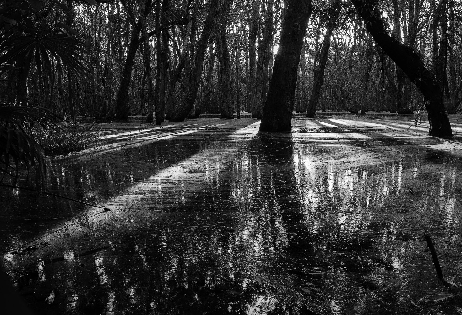
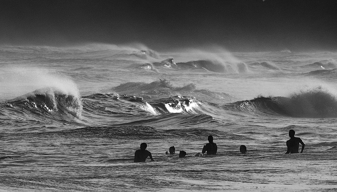
The thing I like most is the two defined columns falling on to the two defined rocks. It makes a strong composition. Highlights are well contained and there is reasonable detail in the rocks but I too would like to see a little more shadow detail. The splashes stand out well against the dark and fill in some otherwise empty expanses of black. Regarding a border, John has a point and it would probably result in a tidier compact image but at the same time it would take away the mystery of how high the falls are. |
Dec 17th |
| 64 |
Dec 23 |
Comment |
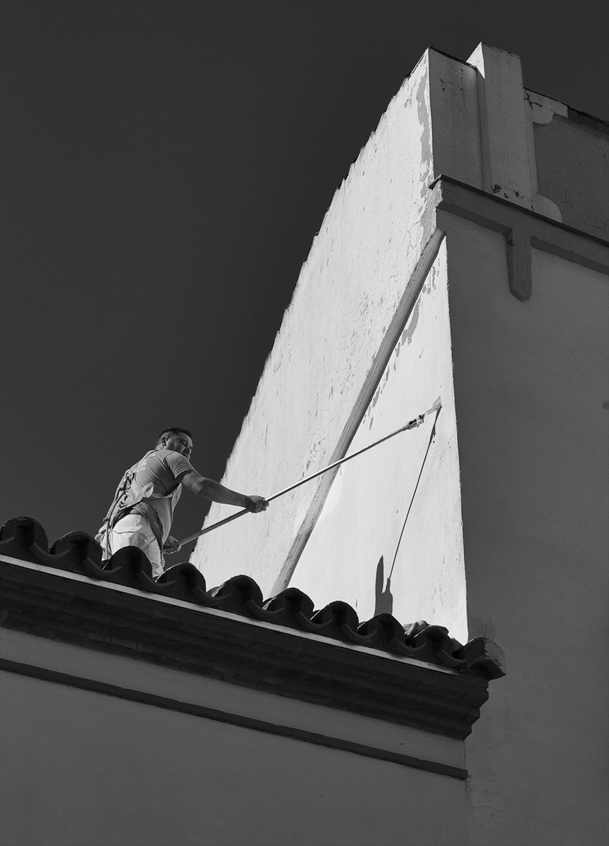
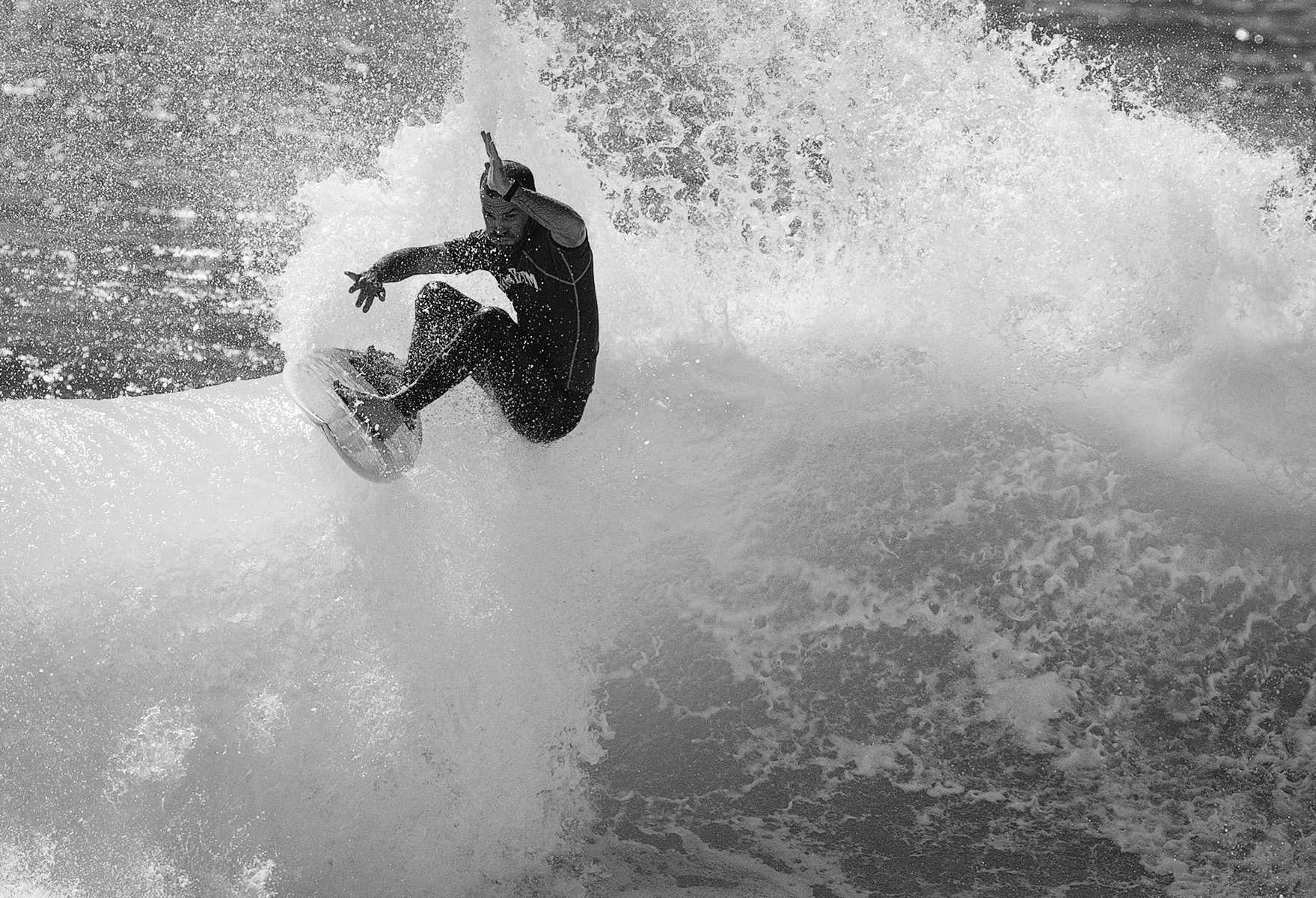
Totally agree with Don. The needle point on bottom protruding leaf is a noticeable distraction in the colour version but it gets disguised somewhat in the mono. I love the detail in the lines and texture which provide strong impact and so considering time of day you have done very well. |
Dec 17th |
| 64 |
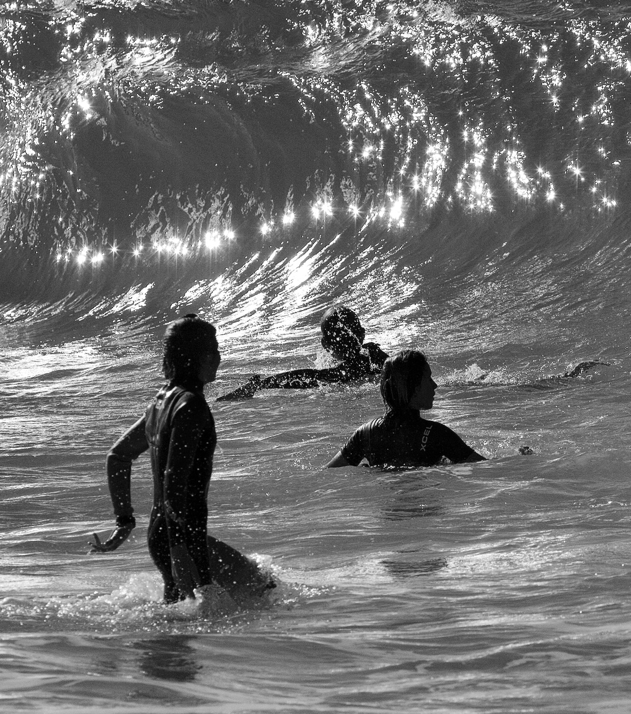
Dec 23 |
Comment |
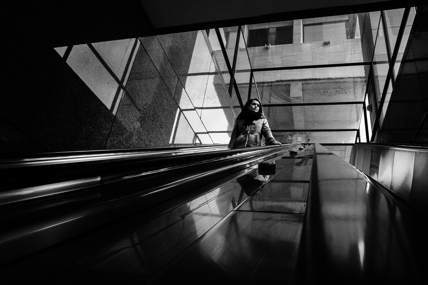
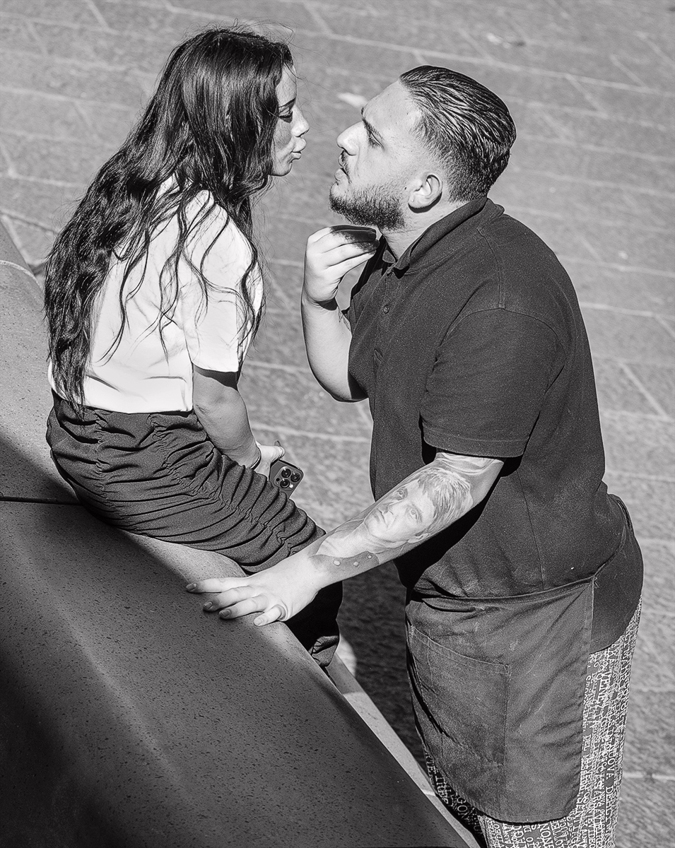
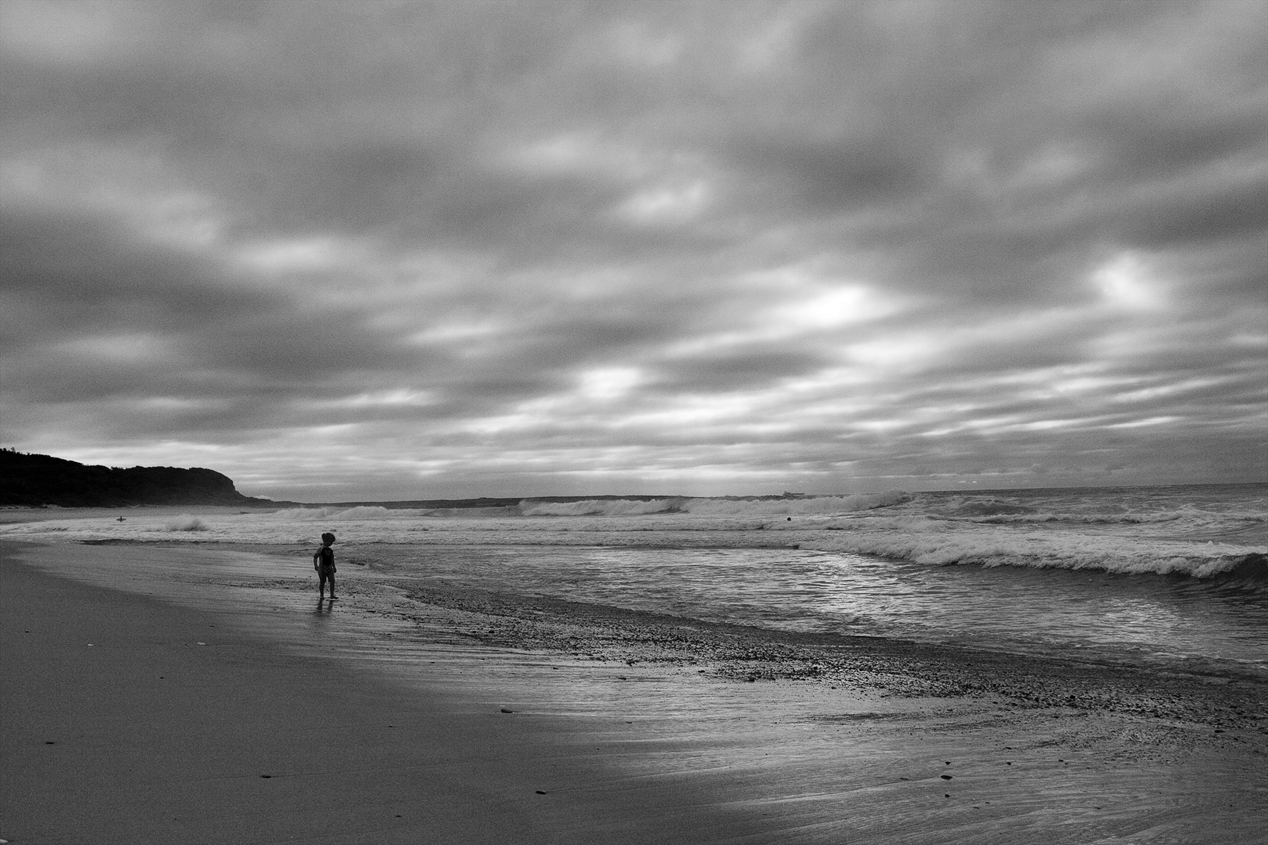
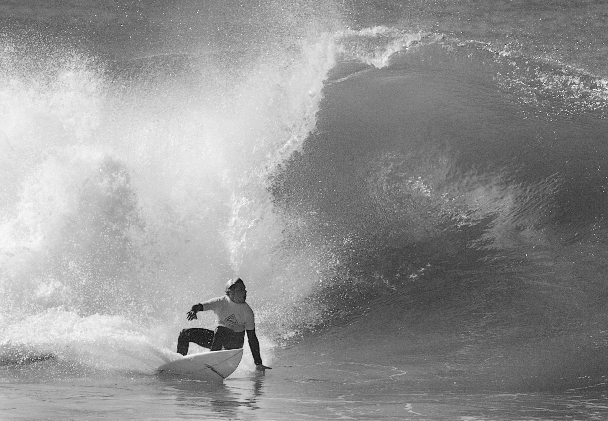
Out of focus or not; it is where the man is looking so I am all for the inclusion as it does add to the story. In any case it is probably motion blur causing the unsharpness. The bright background while distracting does allow the man's face to stand out well and you have extracted some good detail there. |
Dec 17th |
| 64 |
Dec 23 |
Comment |
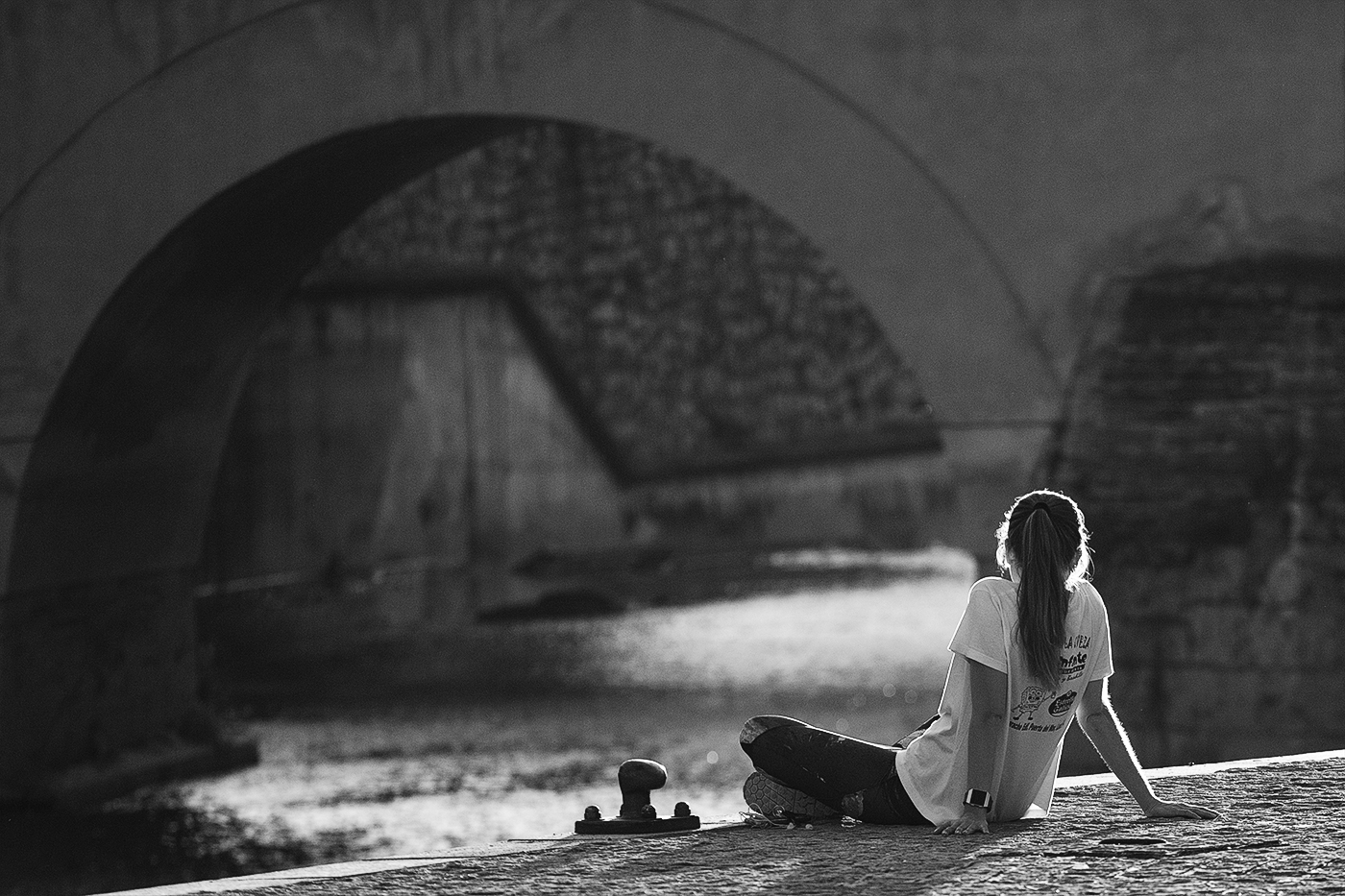
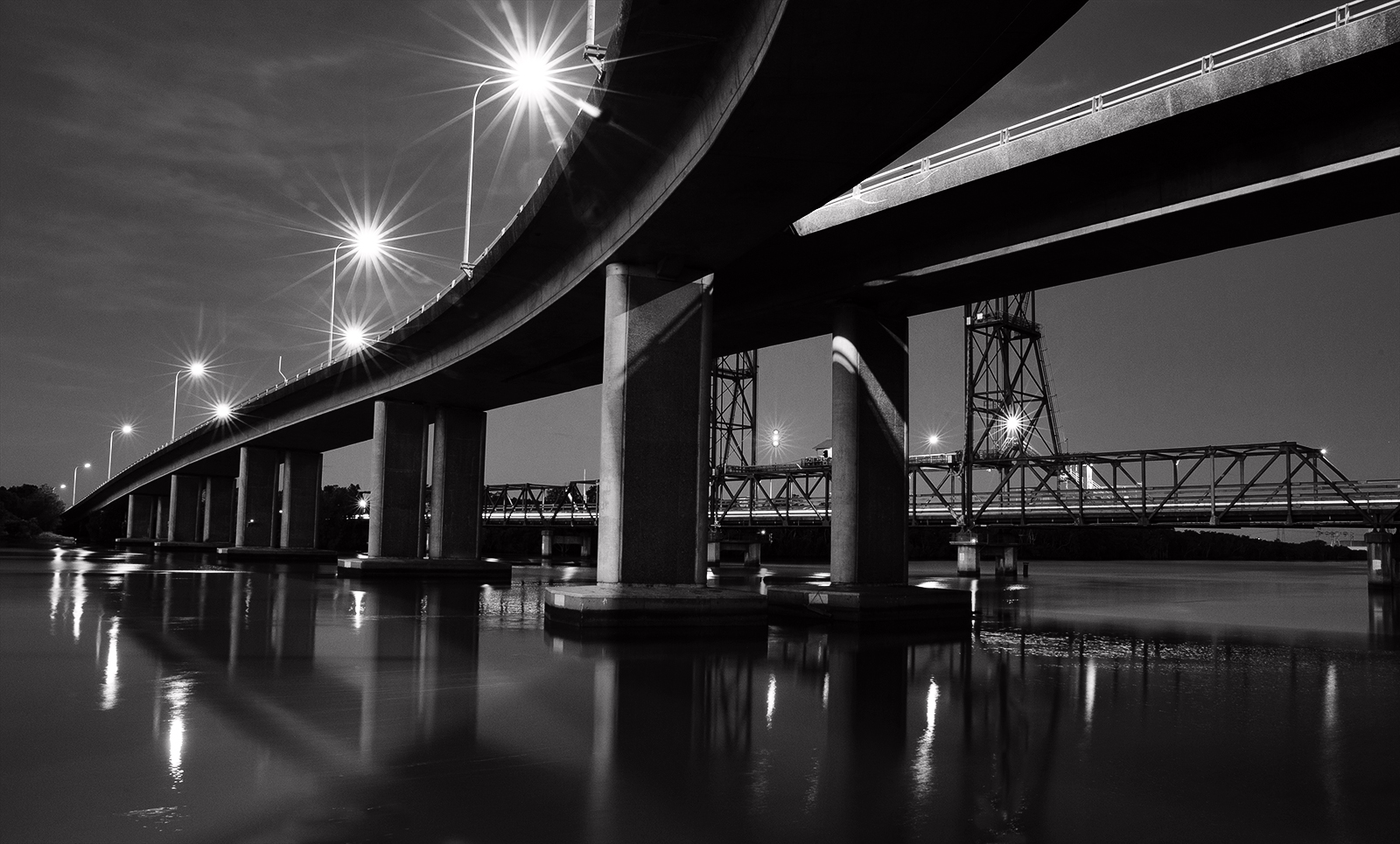
Obviously you have had some fun making this but I'm not sure you needed all the tricks as the image seems strong enough compositionally wise on it's own as the grass and foliage in three corners and reflections in the other work as a nice frame and the curve of the bridge provides some rhythym and the inclusion of Sue provides a subtle focal point. So I think the blurring/ sponging etc has diminished the final result (ie: gone too far when you did'nt have to). There is a reasonable range of tones. More contrast would not go astray but I note it was a dull day. |
Dec 17th |
| 64 |
Dec 23 |
Comment |
What a difference a simple crop does to eliminate the people in modern clothes to take the viewer back in history. Even the one remaining on the far right is disguised well enough so it can be believed he is part of the gang. The conversion to mono also takes the viewer back in time. I think the inclusion of the woman adds to the story. She is doing all the work while the men stand around chatting which is the hierarchy of that time period. Good range of tones. Quite well done considering the slow shutter speed so I too am surprised at the low ISO (was that accidental?) |
Dec 15th |
6 comments - 0 replies for Group 64
|
6 comments - 0 replies Total
|