|
| Group |
Round |
C/R |
Comment |
Date |
Image |
| 64 |
Aug 23 |
Comment |
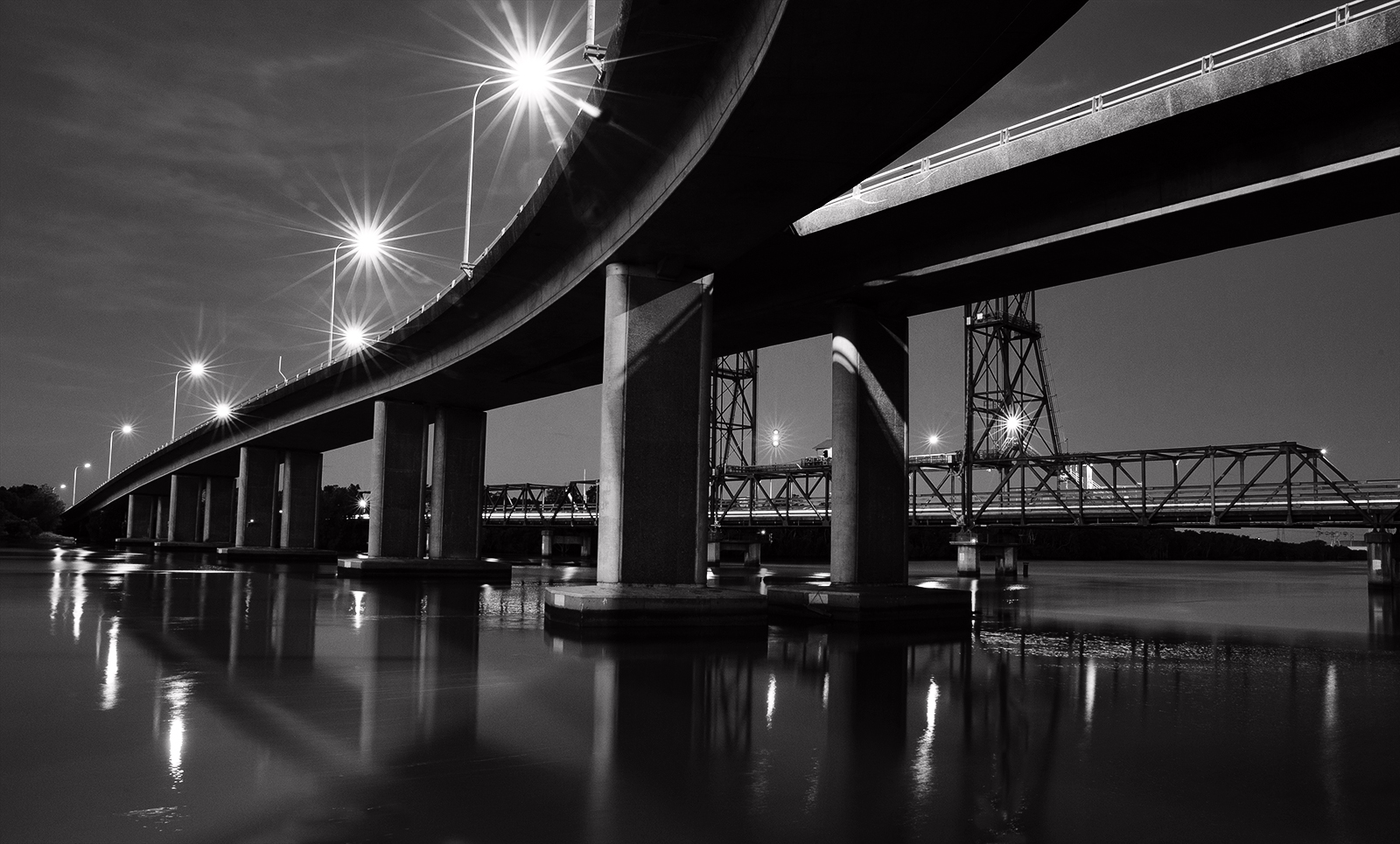
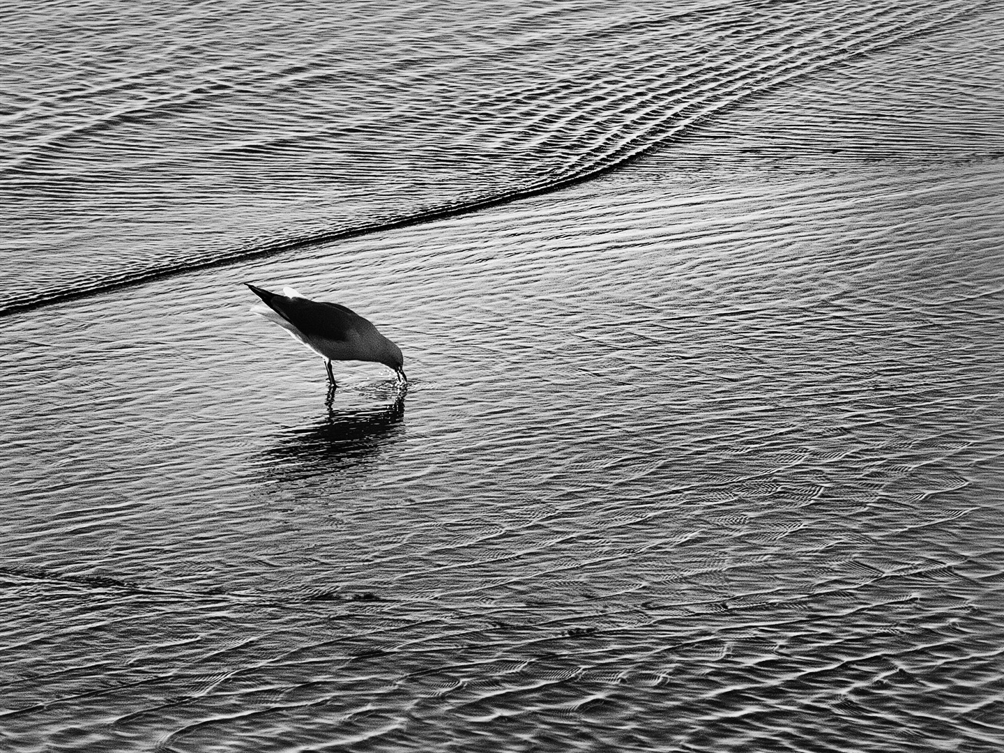
Nice work Jerry especially in the pre planning and it has paid off. I would not have though to use varying exposure settings but when I think about it, it makes sense. It is a great scientific record. I like the graduation to red in the original but for me the mono has better effect. How would it go in a horizontal format following a rainbow shaped curve? I think that could be interesting. |
Aug 13th |
| 64 |
Aug 23 |
Comment |
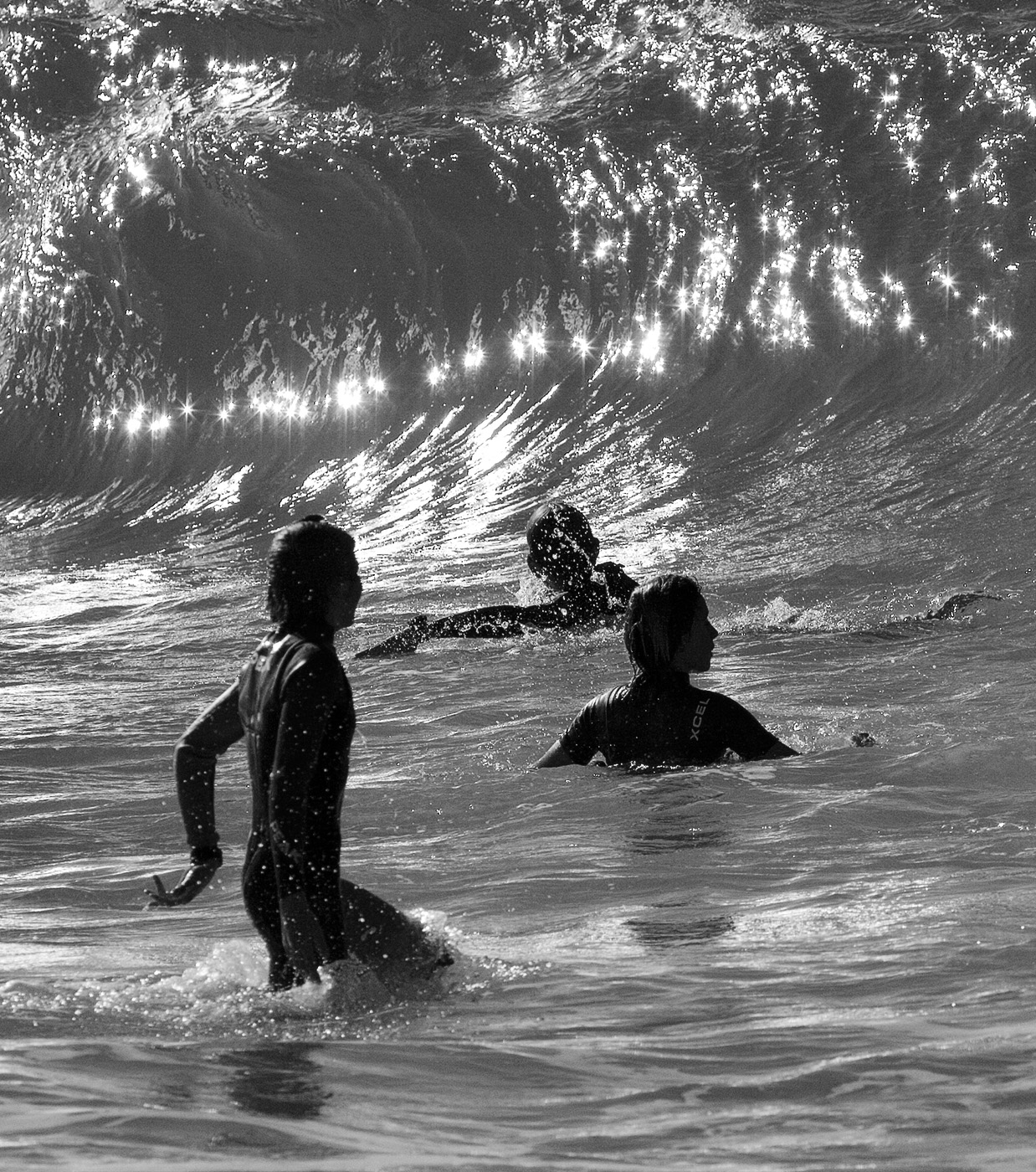
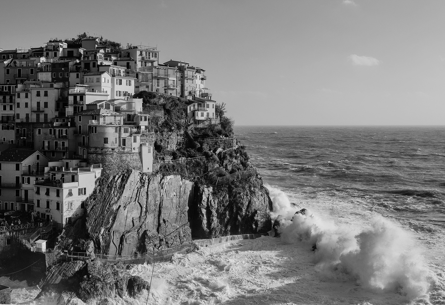
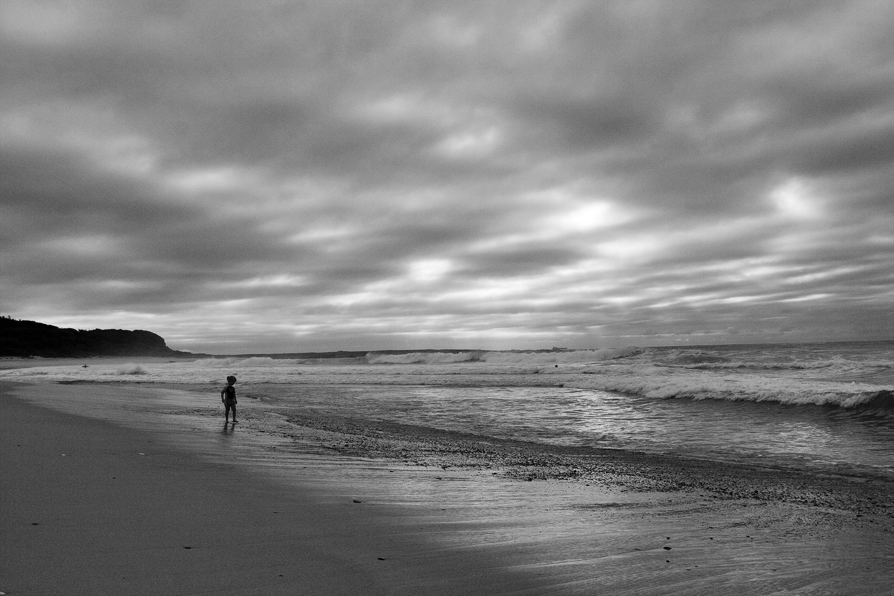
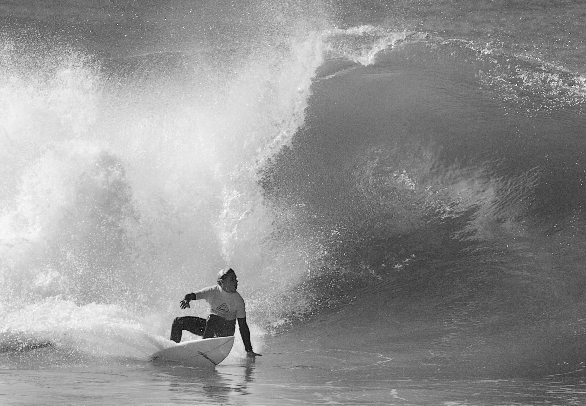
Considering the original, the detail in the frothy section is amazing and you have done a great job extracting it without affecting the falling water which has a strong tonal range and plenty of detail frozen by the high shutter speed. What really interests me is the use of 10,000 ISO which is something I have feared to use but now just might. |
Aug 13th |
| 64 |
Aug 23 |
Comment |
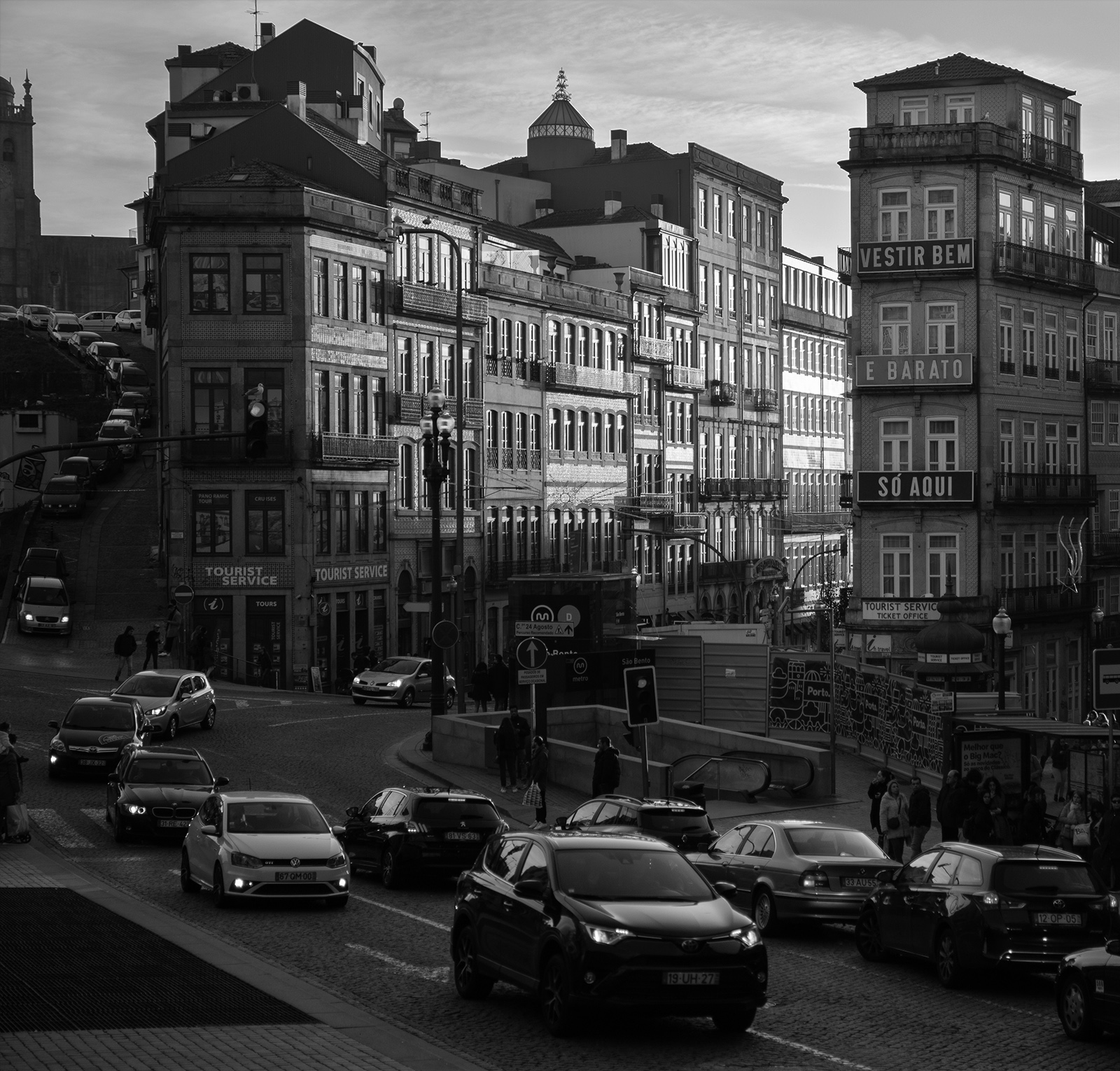
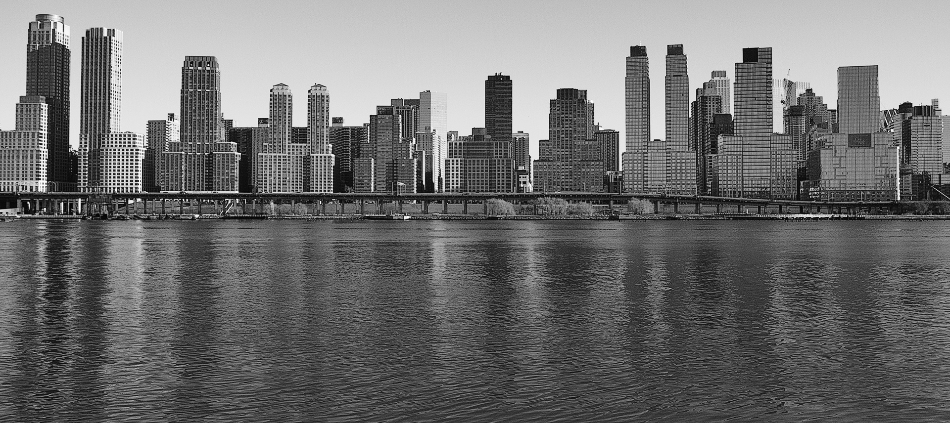
A strong composition courtesy of the leading line of road which takes the viewer down it and straight to the spire. The building leaning in top left provides a foil to stop the viewer wandering out of the frame and assists with diverting attention to the spire. Tonal range is good. I would be interested to see say another 10 per cent of the right side as I feel this would strenghthen the composition placing the spired building on an intersecting third but acknowledge there may be something you wanted to exclude on that side. |
Aug 13th |
| 64 |
Aug 23 |
Comment |
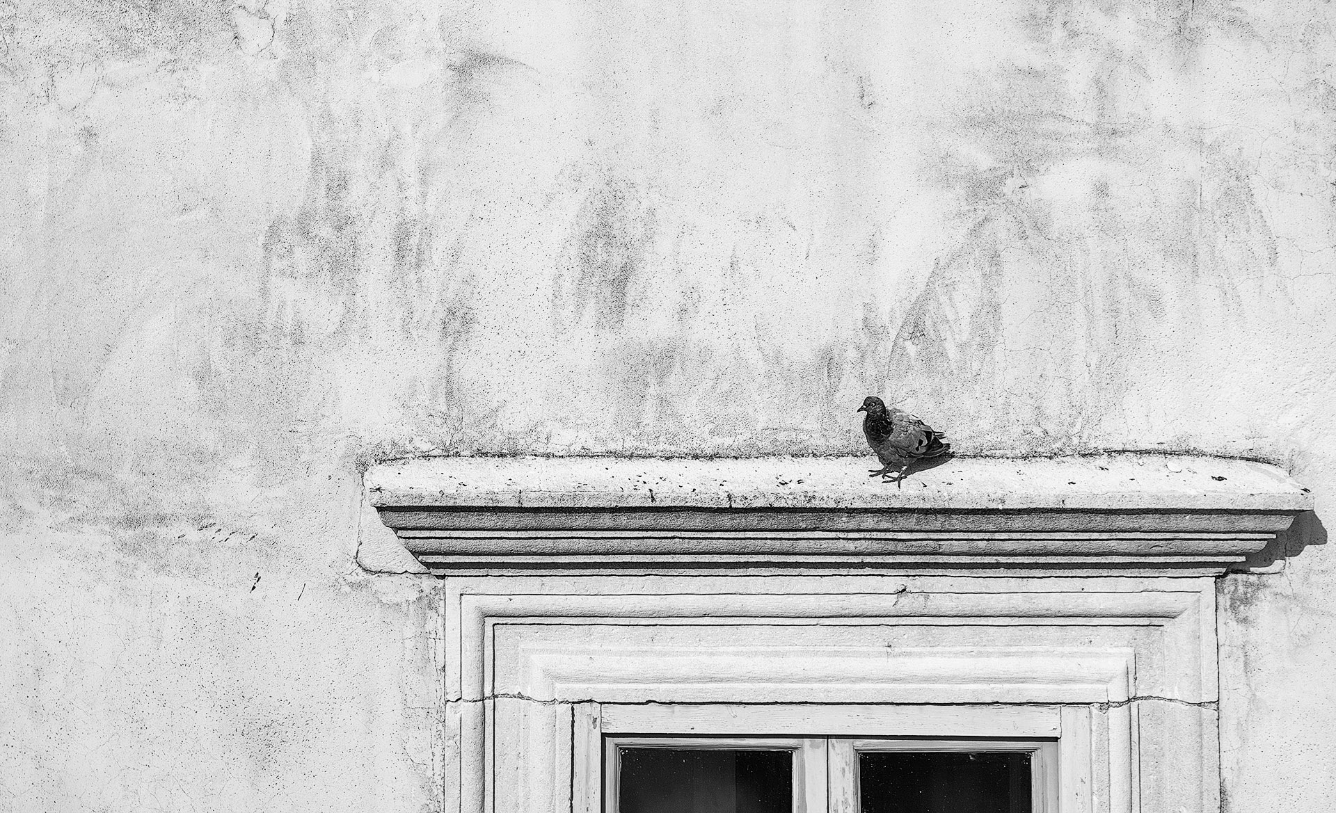
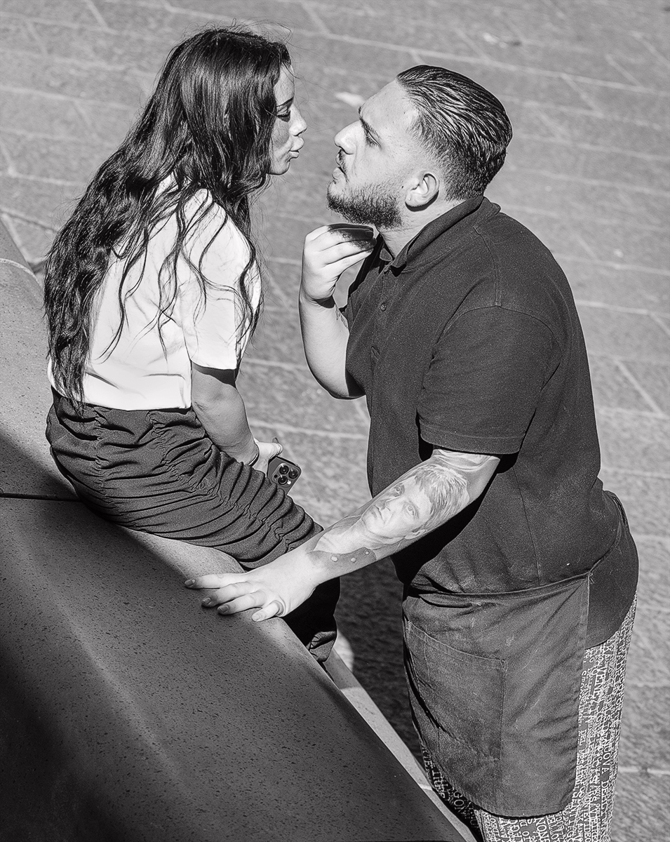
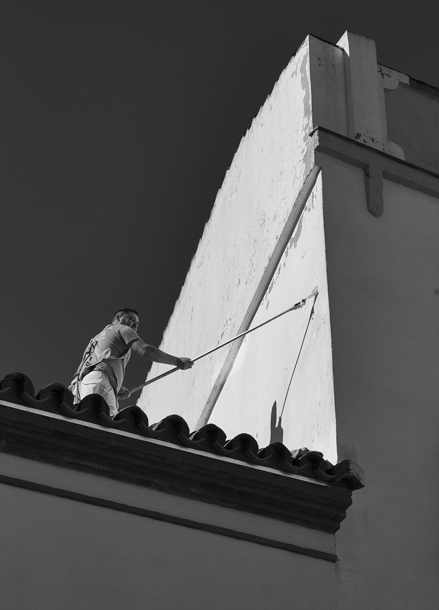
It does appear to have some sort of filter treatment tending toward infra red but I note you have done little post processing so obviously it is the dappled light & shade that provides the effect. I wonder how it would go if a little brighter overall. I like the curve of the bench coupled with the man's body language as this gives it a relaxed and peaceful mood and a pleasing composition. |
Aug 13th |
| 64 |
Aug 23 |
Comment |
The first thing I noticed which looked odd was the left side of middle spire as there is a line running down so I referred to the colour version which shows detail there but it has been lost in the mono version. You have also lost some detail in the brickwork which makes me think you have gone too far with the highlights so darkeneing down overall would likely alleviate some of that. The perspective has been well corrected in the mono. The windows, arches, columns etc are lovely details, are a delight to explore and provide great interest. |
Aug 13th |
5 comments - 0 replies for Group 64
|
5 comments - 0 replies Total
|