|
| Group |
Round |
C/R |
Comment |
Date |
Image |
| 64 |
Mar 23 |
Comment |
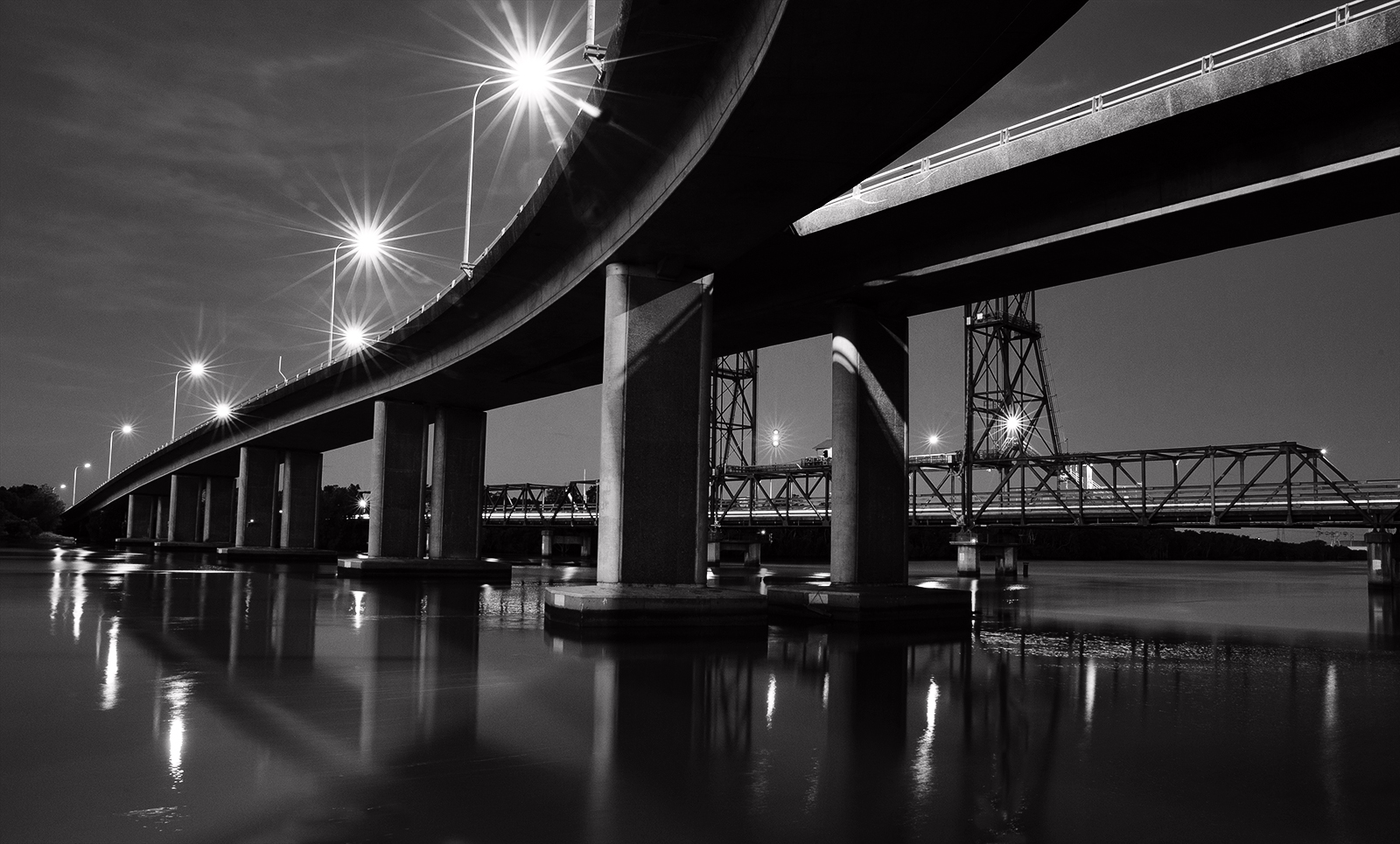
I like the double span and the detail in the motley texture. Could you have included the tip of your kayak? That would point to the structure and provide a new level of interest. More contrast? I would ideally like to see more space at the top but note the sky is featureless so understand its exclusion. |
Mar 11th |
| 64 |
Mar 23 |
Comment |
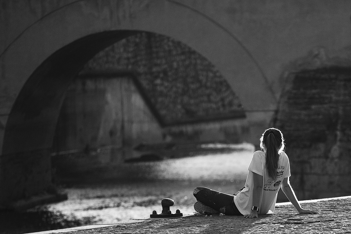
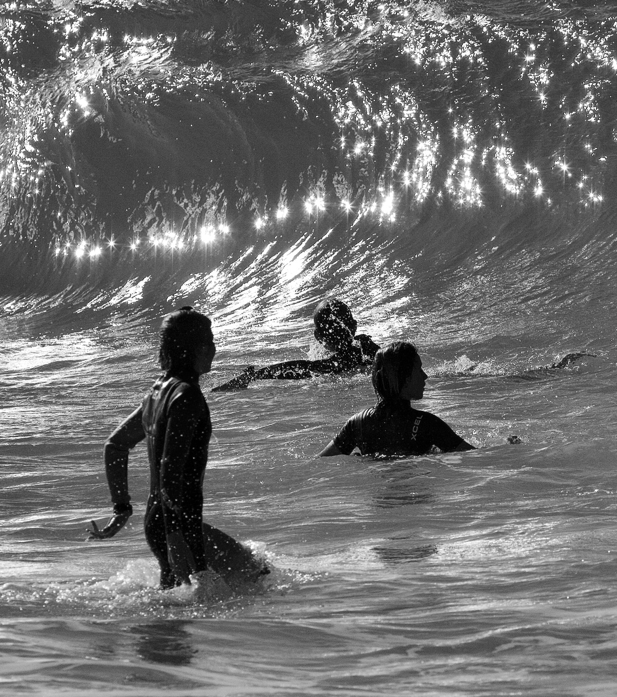
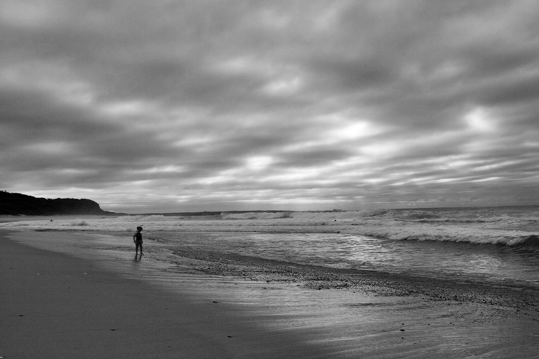
I like the composition and framing especially the scraggly branches above the rock and the leading line of the path. The colour version is flat so the high key mono was probably a good choice although a little too contrasty for my liking. The more I look the more it grows on me. |
Mar 11th |
| 64 |
Mar 23 |
Comment |
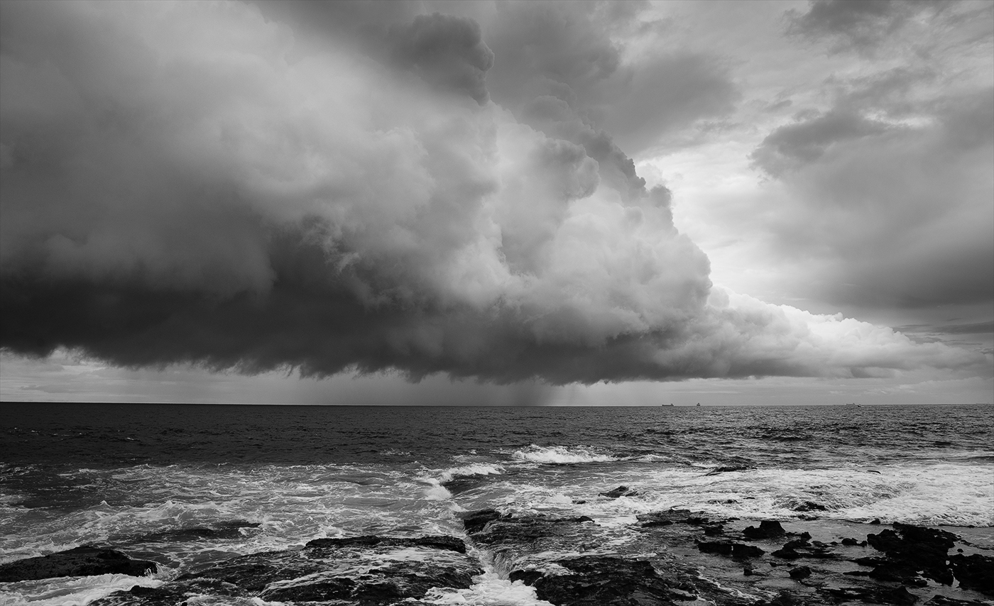
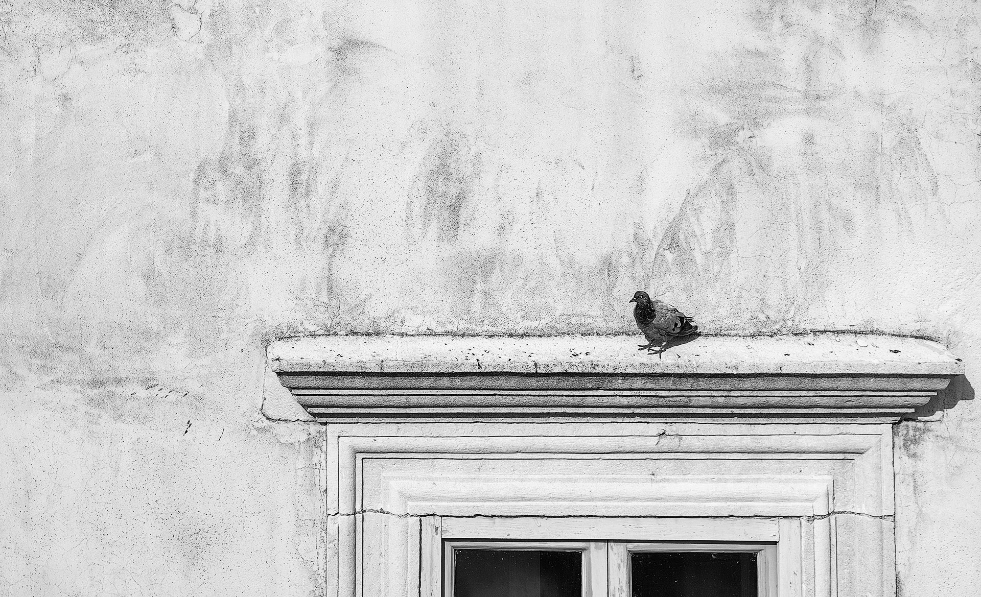
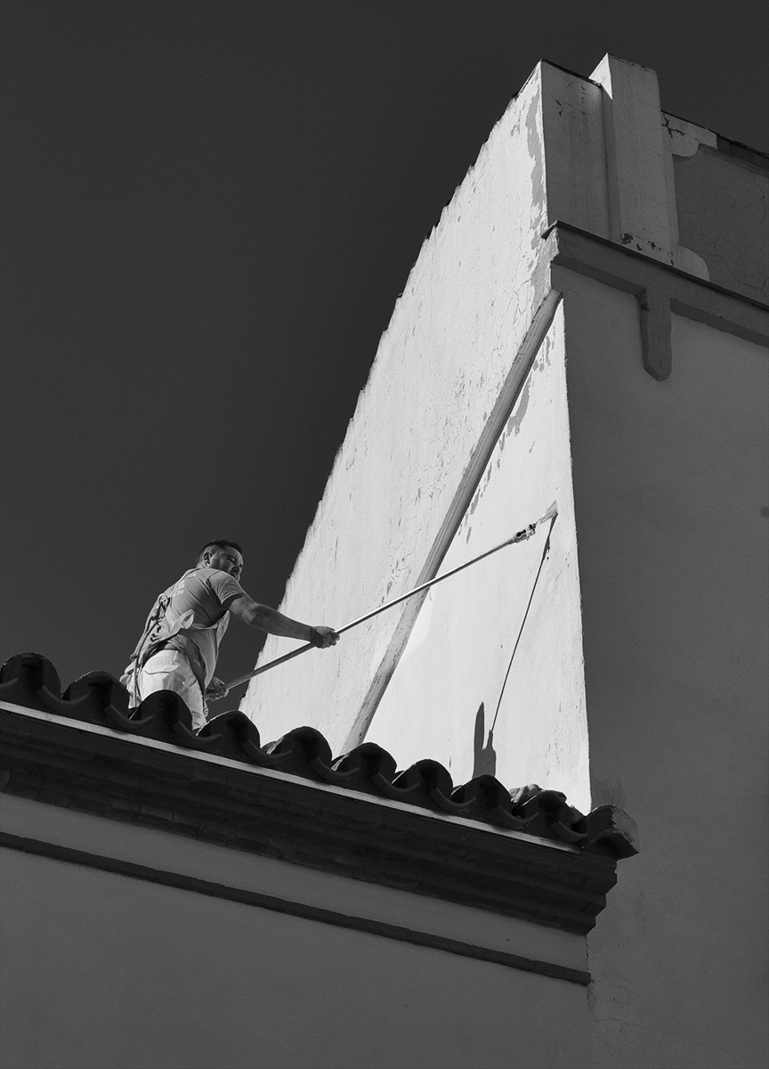
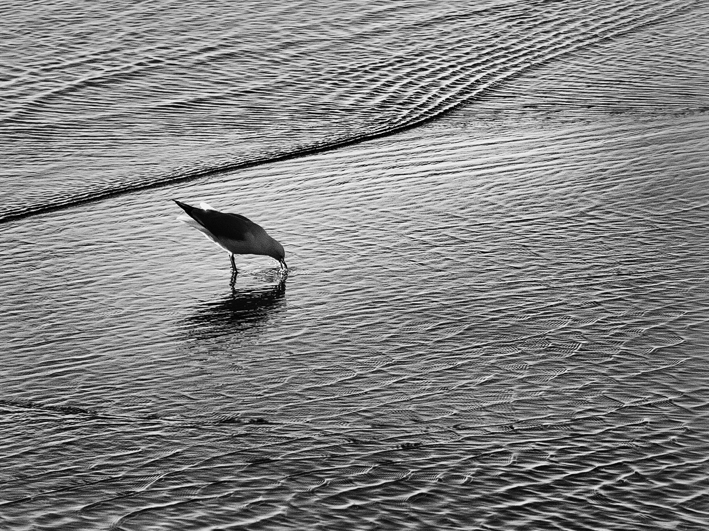
Great impact with excellent tonal range and the dark background accentuates the shape and the graphic aspect and keeps the image simple. I am not so sure about dodging the top as the middle areas reveal what is going on and if too light at the top the viewer may keep going up and out of frame. I think the darkness up there pulls the viewer back to where the best graphical features are. |
Mar 11th |
| 64 |
Mar 23 |
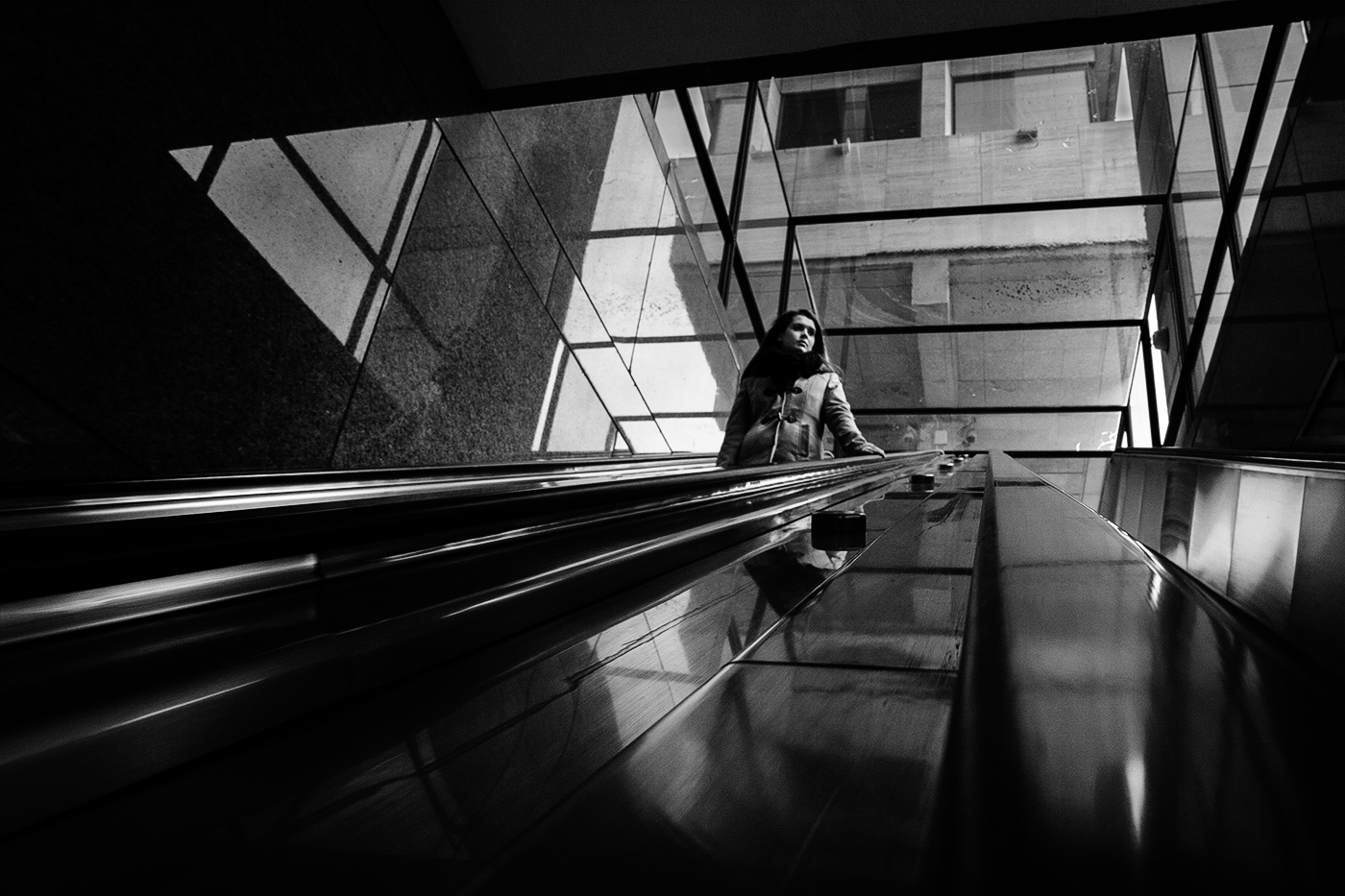
Comment |
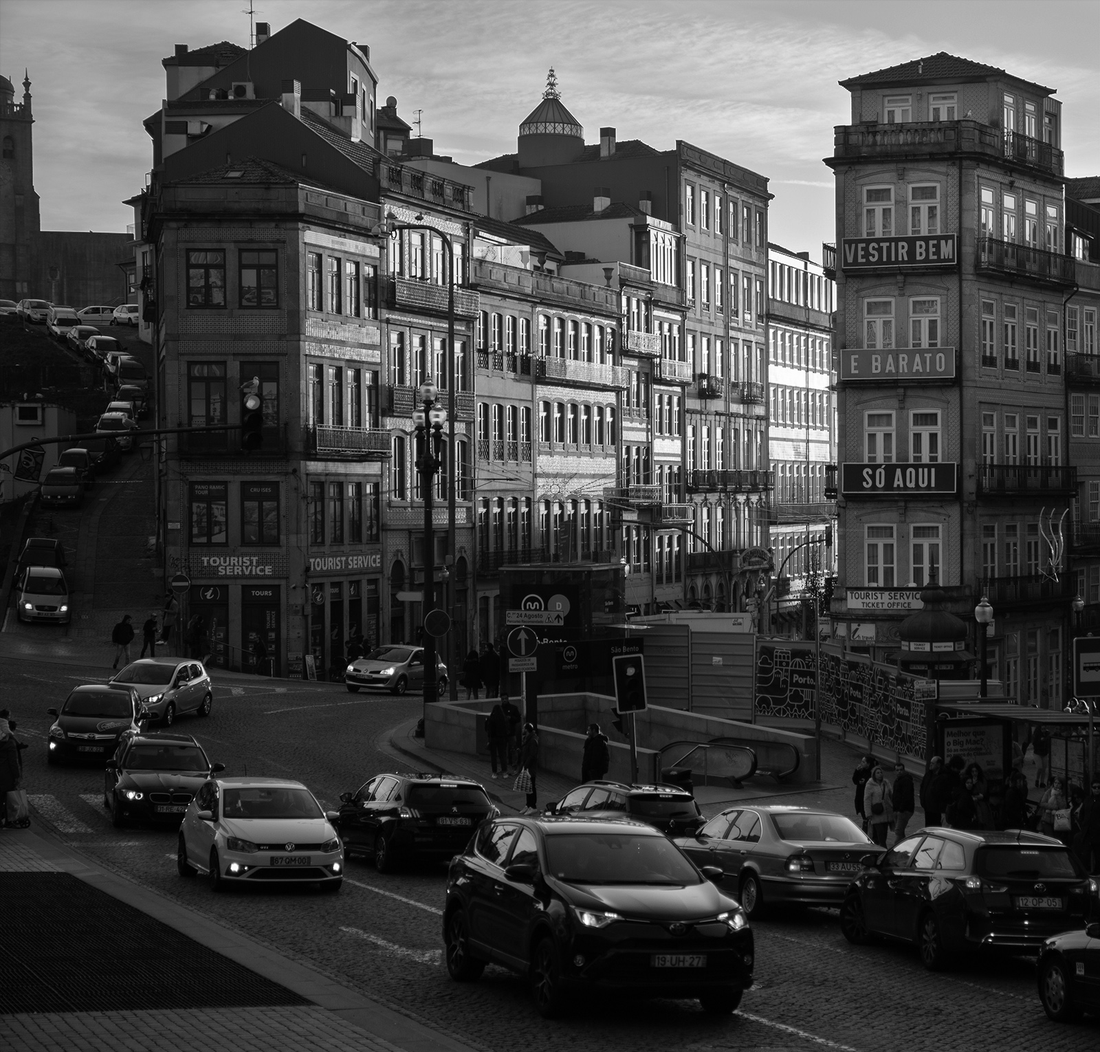
Nice detail everywhere and I like the dominant pair striding in to the frame as it takes me with them towards the centre and they balance nicely with the passive pair beneath the umbrella. Some more contrast would not go astray. There is some pixelation in the gray area of sky and noticeable halos around the top of the building so not sure if it has been enlarged too much or inherent with the phone capture. Could you replace the sky? |
Mar 11th |
| 64 |
Mar 23 |
Comment |
Interesting abstract with strong repetitive patterns. I would like to see the top ten percent cropped to get rid of some of the black area as I think that would throw more impact on the four eyes in the top third and accentuate the two long (leading) lines to the eyes at the bottom making for a stronger composition. I think going a step further you could also crop out the frame on both sides as I don't think you really need them. This would add to the abstract and provide more mystery. |
Mar 11th |
| 64 |
Mar 23 |
Comment |
The side lighting works well to bring out the textures and provides definition especially around the edge of the petals which accentuates the shape as opposed to it appearing flat and one dimensional. I like the detail in the centre. What about a tiny bit more detail in the bottom three petals as there are a few spots there that may benefit with a little dodging. Square format works well. |
Mar 11th |
6 comments - 0 replies for Group 64
|
6 comments - 0 replies Total
|