|
| Group |
Round |
C/R |
Comment |
Date |
Image |
| 64 |
Jan 23 |
Comment |
I like the softness and the abstact and the interest created by the raindrops illuminated by the two bright windows. Without the raindrops it is a totally different picture. I too wondered about whether to include or exclude top panes and I dont think there is a right or wrong answer. You get away with it as we can see the fifteen pane configuration of the full windows through the one and a half panes. What about excluding the two panes on right and include the two panes left and middle in their entirety in a square composition? Or, just two panes bottom middle & bottom right showing one window and the fireplace. There are many possibilities. Thanks to this Jerry, you have got me thinking for the next time I am faced with this scenario. |
Jan 19th |
| 64 |
Jan 23 |
Comment |
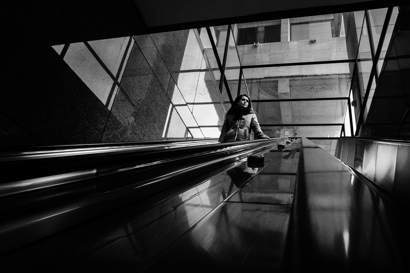
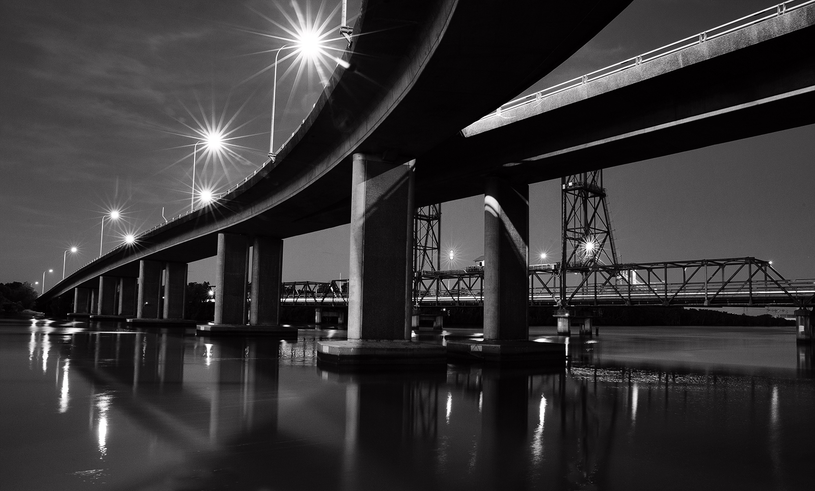
Wow such contrast and great texture in the block work. I don't mind the 'looking up' perspective which is held together by the triangulation of the towers and the V shape where the straight angles criss cross towards the bottom. It holds the viewer's interest. I note it is a night shot so can understand the bright highlights. Maybe some minor burning down of the bright areas right in the middle and just left of it above the windows would'nt go astray. |
Jan 19th |
| 64 |
Jan 23 |
Comment |
I like the mono conversion as it emphasises luminosity and makes it glorious. Rim lighting on the leaves is exquisite. It is almost 3D. Some of the frost gets lost from the original but I like it better that way. I think it is just such a simple and delightful image with absolutely perfect depth of field. |
Jan 19th |
| 64 |
Jan 23 |
Comment |
Great contrast and looks almost infra red. As a travel shot and display of the great works it is well portrayed in a tidy and strong composition and the clouds play their part in filling the empty spaces and create some life. I like the zig zag lead in from bottom left as it takes me straight to the top of the pyramid. Lots of texture and tones. Good mono. |
Jan 19th |
| 64 |
Jan 23 |
Reply |
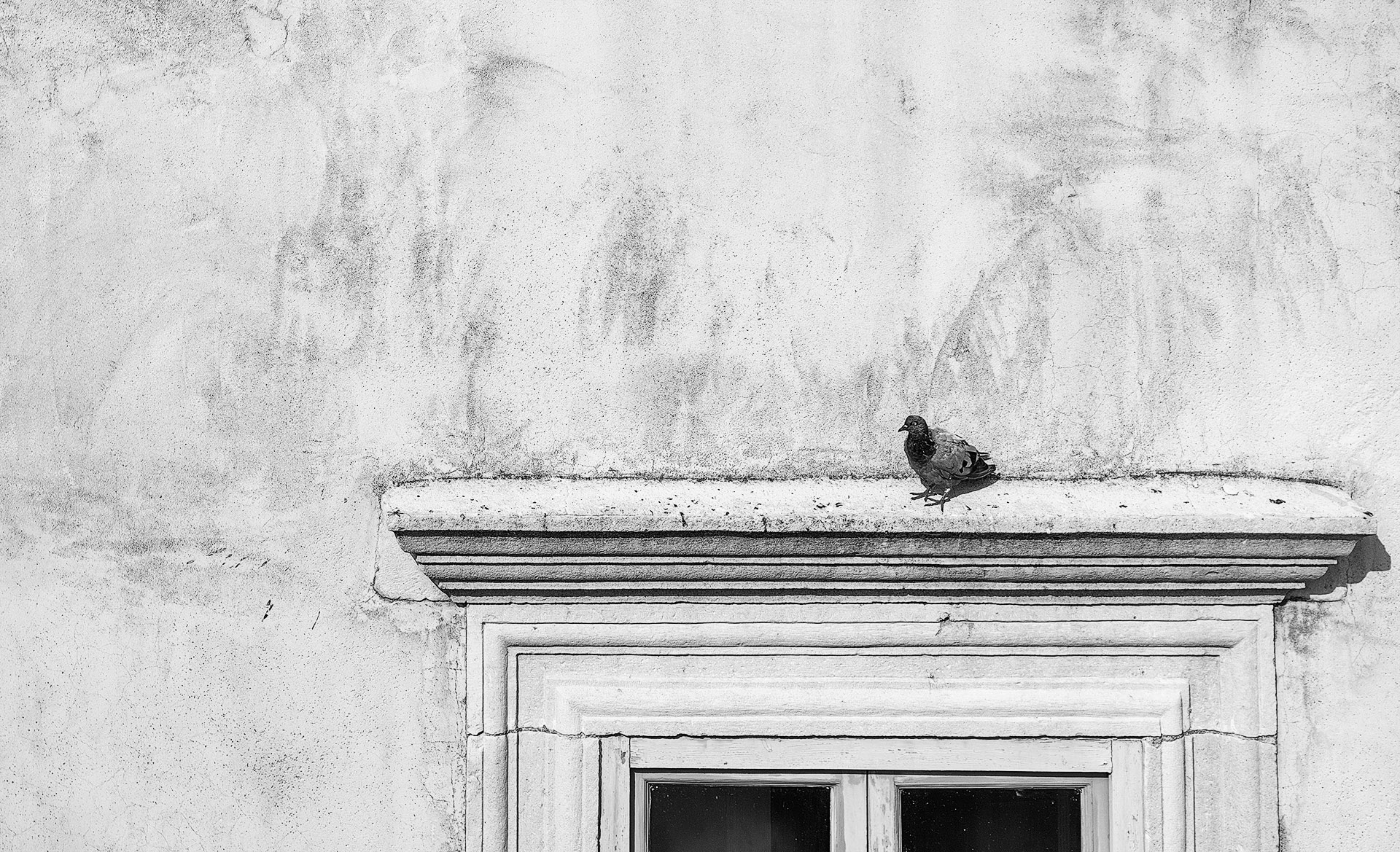
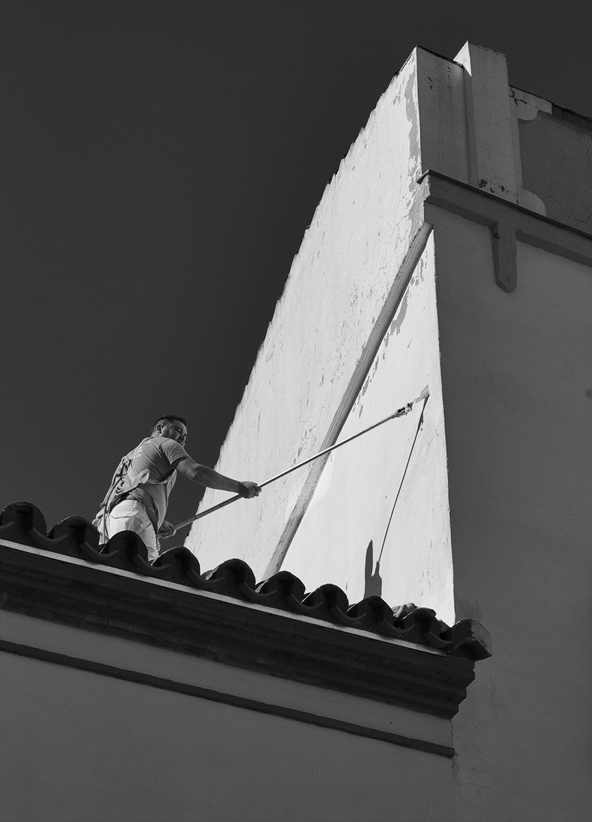
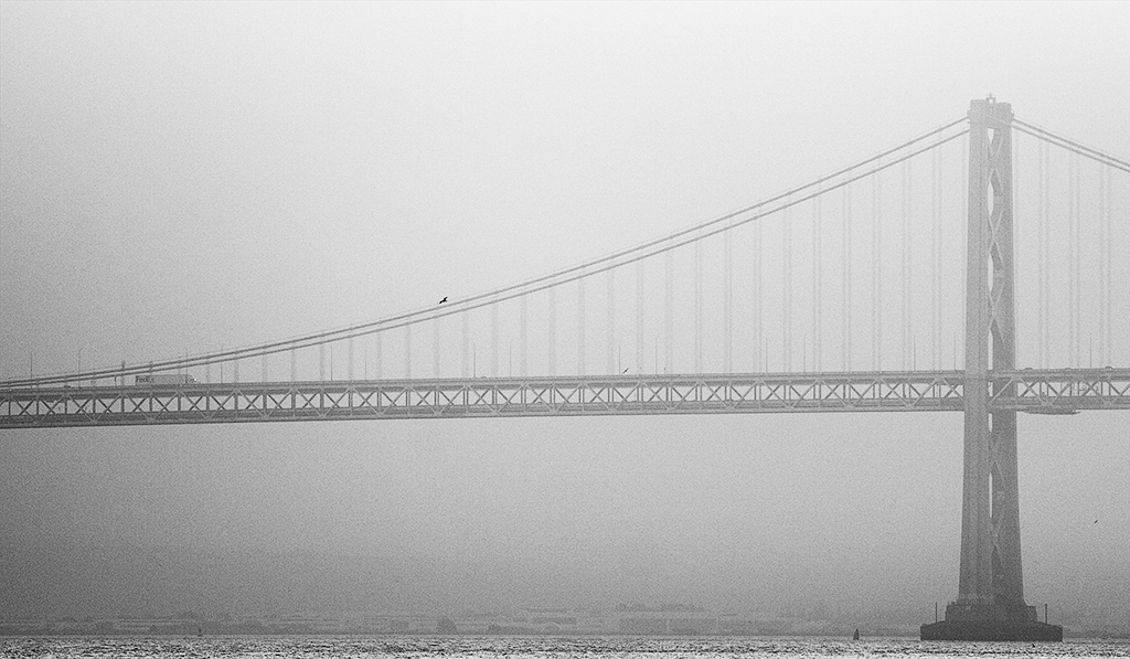
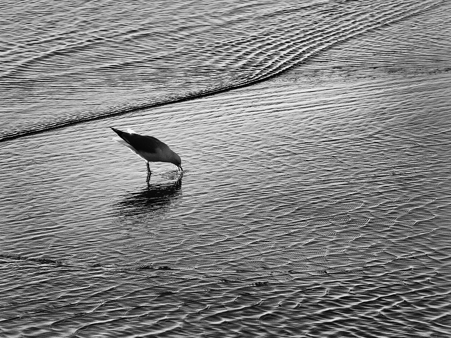
I considered removing the bird but liked that tiniest reference to nature in the man made environment. |
Jan 19th |
| 64 |
Jan 23 |
Reply |
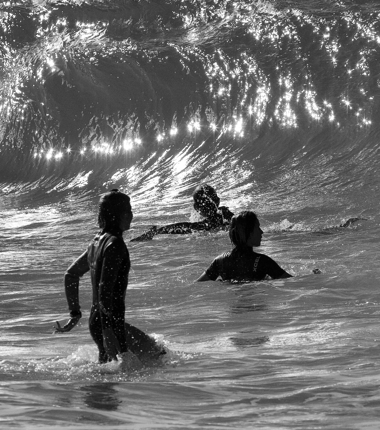
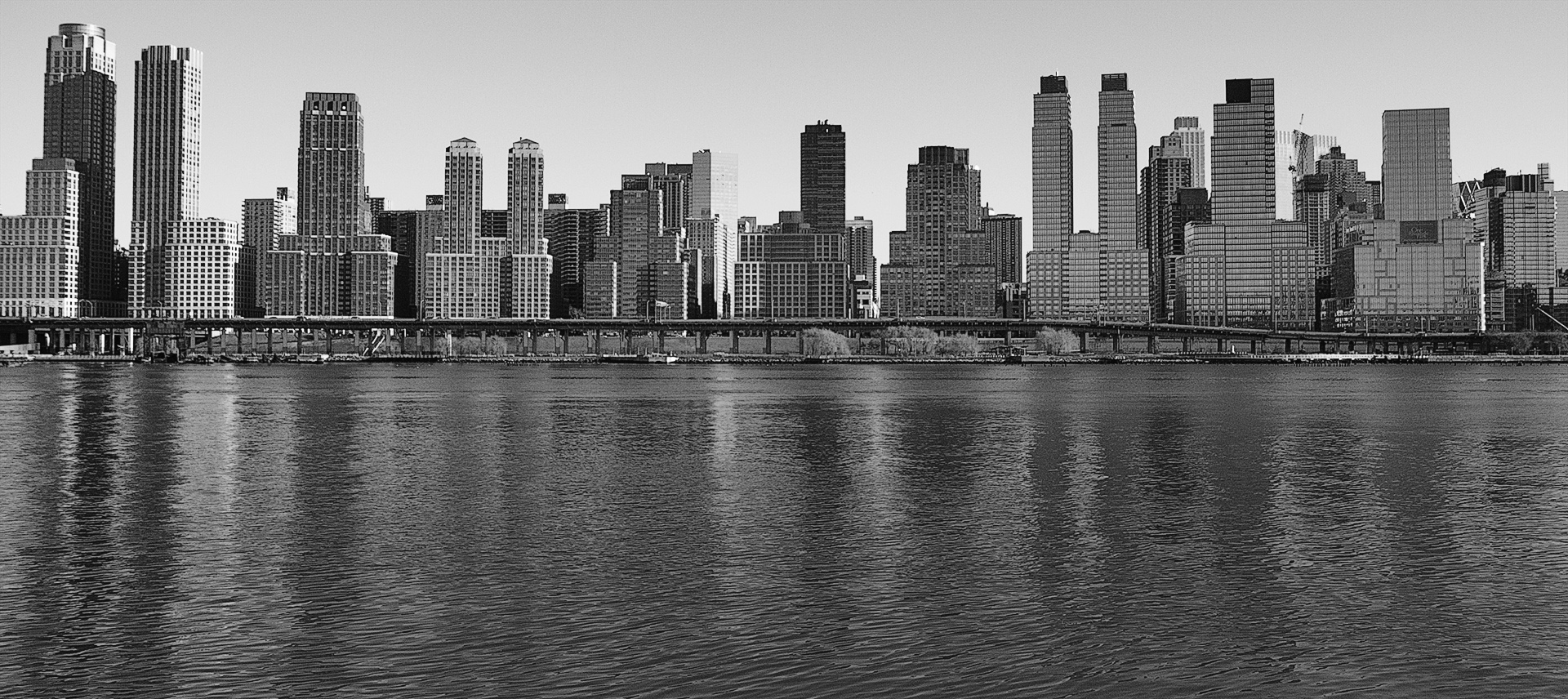
I'm not sold on it Stuart. Looks too mucky although the contrast is better so it is sort of solving one problem but creating another. |
Jan 19th |
| 64 |
Jan 23 |
Comment |
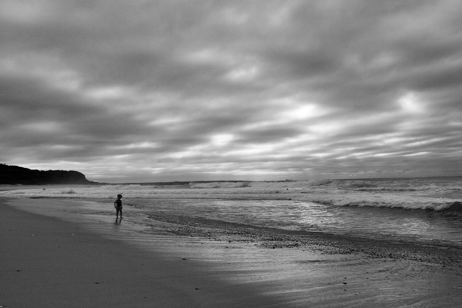
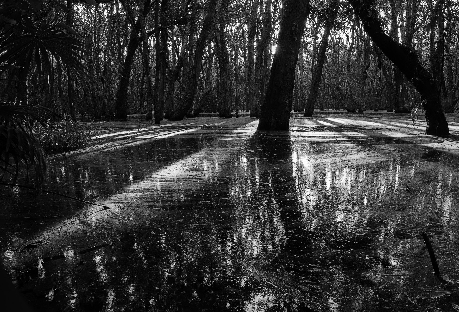
The footsteps are essential here to create the leading line through the image which otherwise could have been mundane. It has the viewer wondering. There is great contrast and the horizontal shadows of the stems are interesting. The tree trunk provides a convenient foil to hide where the footsteps start to disappear providing an air of mystery. I like the gradient of white to black as I travel through the image. Maybe a little less foreground? |
Jan 19th |
| 64 |
Jan 23 |
Comment |
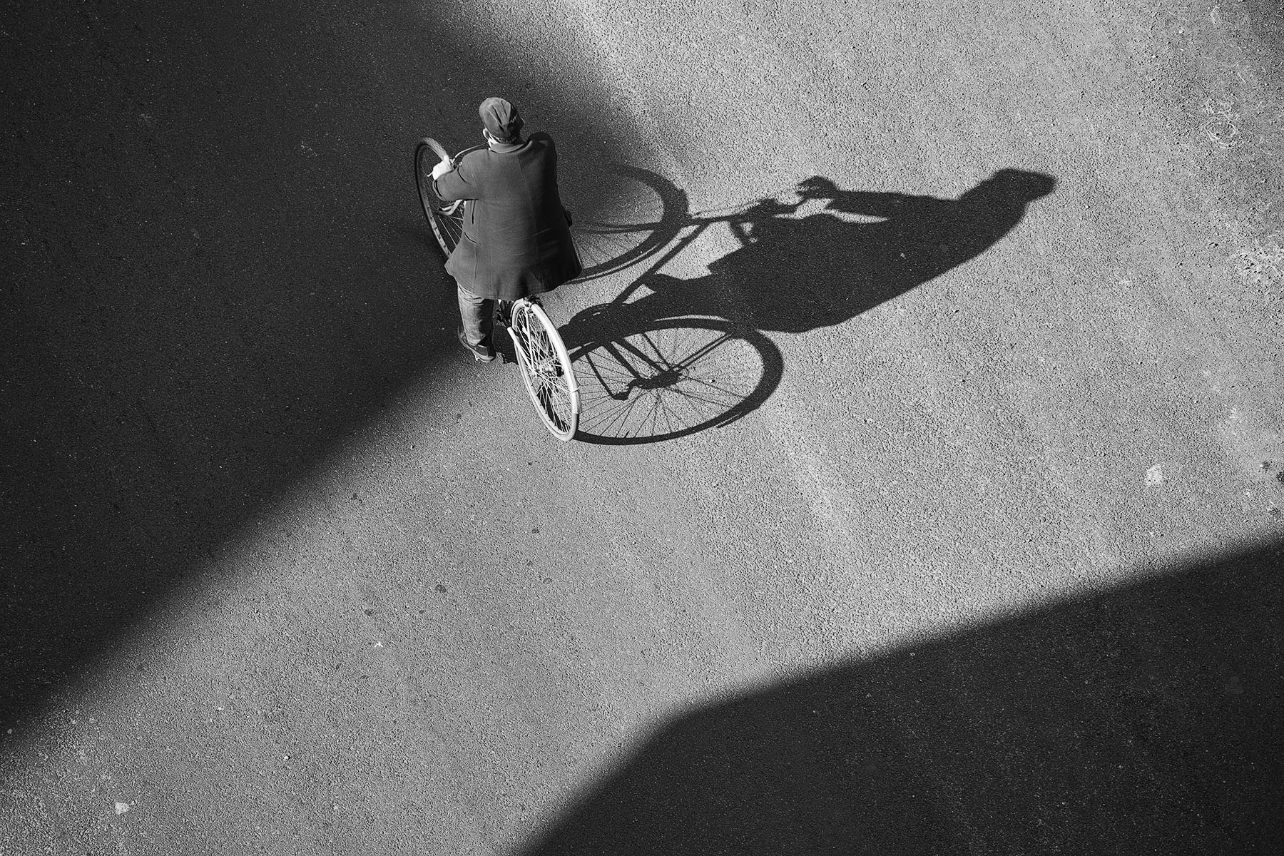
The black spot bottom left does it for me as it creates a focal point. The image is simple, has texture, good design elements and a vast tonal range and I like it in the vertical format. Definitely better than the colour version. My only suggestion is for the rest of the round white piece top left be fully included within the frame for a tidier composition. Nice one. |
Jan 19th |
6 comments - 2 replies for Group 64
|
6 comments - 2 replies Total
|