|
| Group |
Round |
C/R |
Comment |
Date |
Image |
| 64 |
Nov 22 |
Comment |
Beautiful reflections and the image has a mood of calmness and serenity. I would just like to see a person included to give it scale and provide a focal point (someone sitting on the bench would be super). I am happy with the density, tones and mono conversion. With scenes like this I often shoot as is and then throw a stone in the water to make ripples for some interesting effects. I prefer the mono as the colour version seems a little over saturated. |
Nov 30th |
| 64 |
Nov 22 |
Comment |
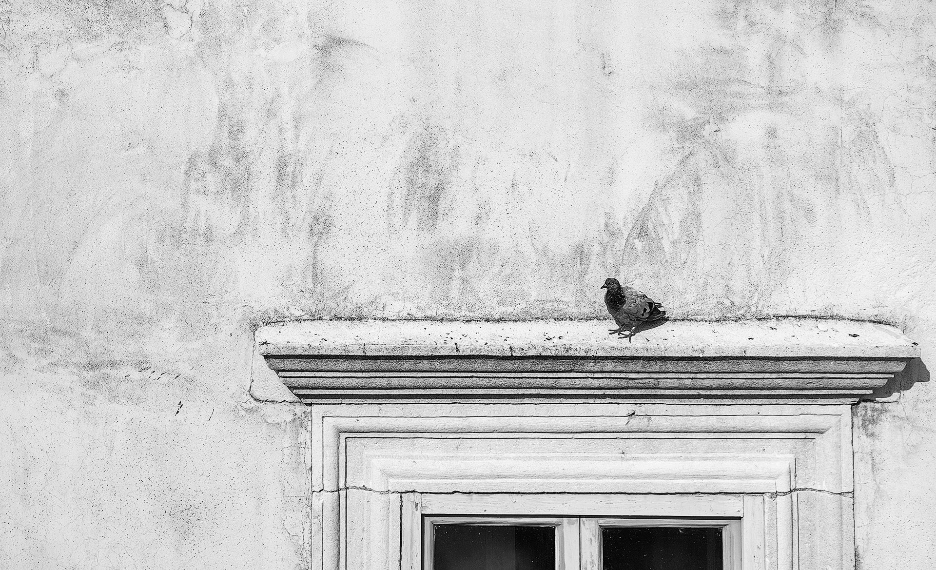
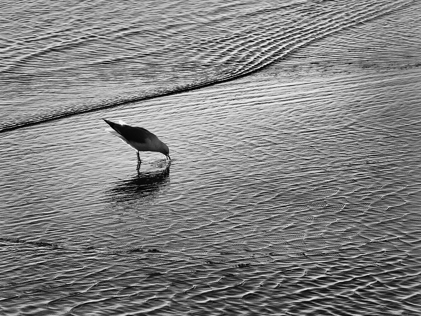
It is not easy to reveal a lot of detail in a black subject unless well lit so it must have been as there is plenty of feather detail. You were fortunate to be able to shoot at the same level as the subject as it reveals its form and shape well. The background density allows the bird to stand out well. Although not a dynamic image it is a good scientific record. |
Nov 30th |
| 64 |
Nov 22 |
Comment |
Firstly, I love the detail you have brought out in original 2 with the thick blanket of cloud shrouding the highest peak. It comes through well in the mono conversion. It is lacking in the original which presents as a washed out sky. I prefer original 2 as it is easier to discern the many intricate details which I find you have to go searching for in the mono. For example I viewed the mono first and did not realise there was a lake but it is clearly evident in original 2. The mono contains a long range of tones and I don't dislike it. |
Nov 30th |
| 64 |
Nov 22 |
Comment |
Has nice lyrical & luminous qualities. The composition keeps my interest on the pods and I like that little bit of detail in the background as opposed to darkening down to jet black. The plant the pods are clinging to provides a nice balance. A subject very well suited to Monochrome and you have done a good job with the conversion. |
Nov 30th |
| 64 |
Nov 22 |
Comment |
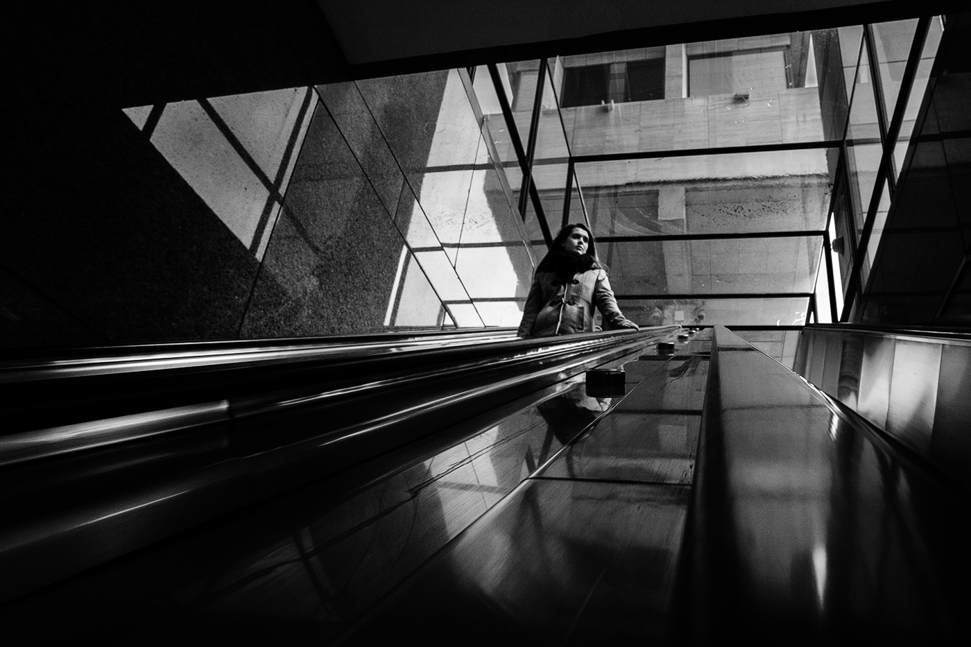
I like the lead in lines from the foreground pavement and the inclusion of the people down in that area. There is an abundance of textures and fine detail. My eyes keep travelling upward to the spire and across to the top of the building on the right and down to the sign so I am thinking a little crop on the right to eliminate the top of that building and the signage below would make a stronger composition. I find the sign to be a big spoiler to an otherwise fantastic image. The triangular building is the subject and the sign does not contribute but detracts from that magnificent building. Often less is more. |
Nov 28th |
| 64 |
Nov 22 |
Comment |
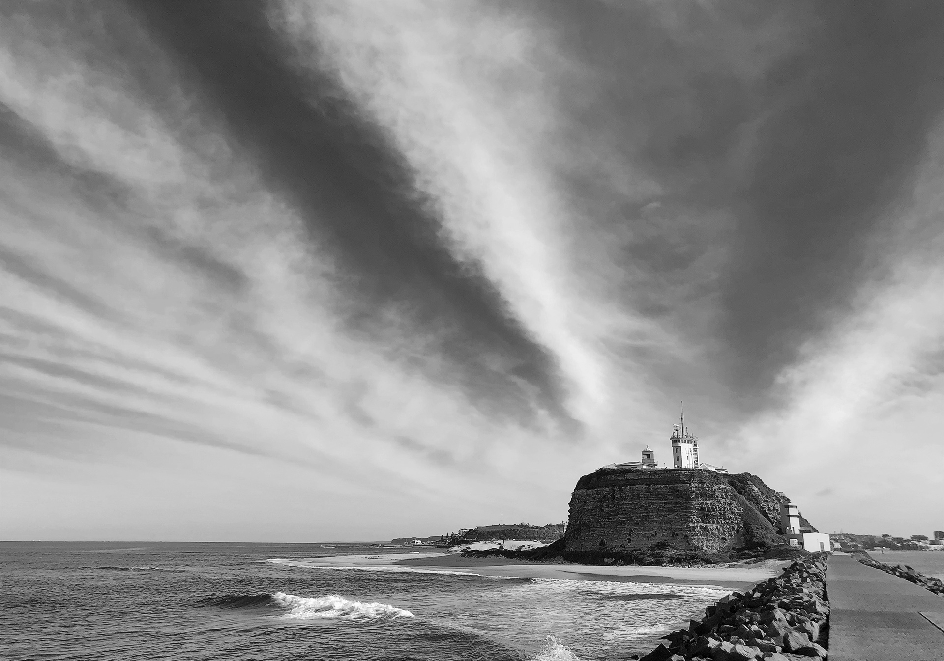
I like what you have done with this Helen cropping vertically and taking to mono. I like the colour version but the amended image gets rid of the distracting trees which tend to compete with the lighthouse but now they assist with the framing and make thinks a lot simpler and the lines, angles & textures are more prominent. |
Nov 28th |
6 comments - 0 replies for Group 64
|
6 comments - 0 replies Total
|