|
| Group |
Round |
C/R |
Comment |
Date |
Image |
| 64 |
Oct 22 |
Comment |
Plenty of interesting detail on display and a great range of tones. The first thing I notice is the rope and railings and I would prefer them eliminated so that the viewer is invited into the building. Perhaps a little bit more space above the framing arch would'nt hurt. Cropping out the 2 half arches adjacent the statues would make a stronger image with more impact. |
Oct 19th |
| 64 |
Oct 22 |
Comment |
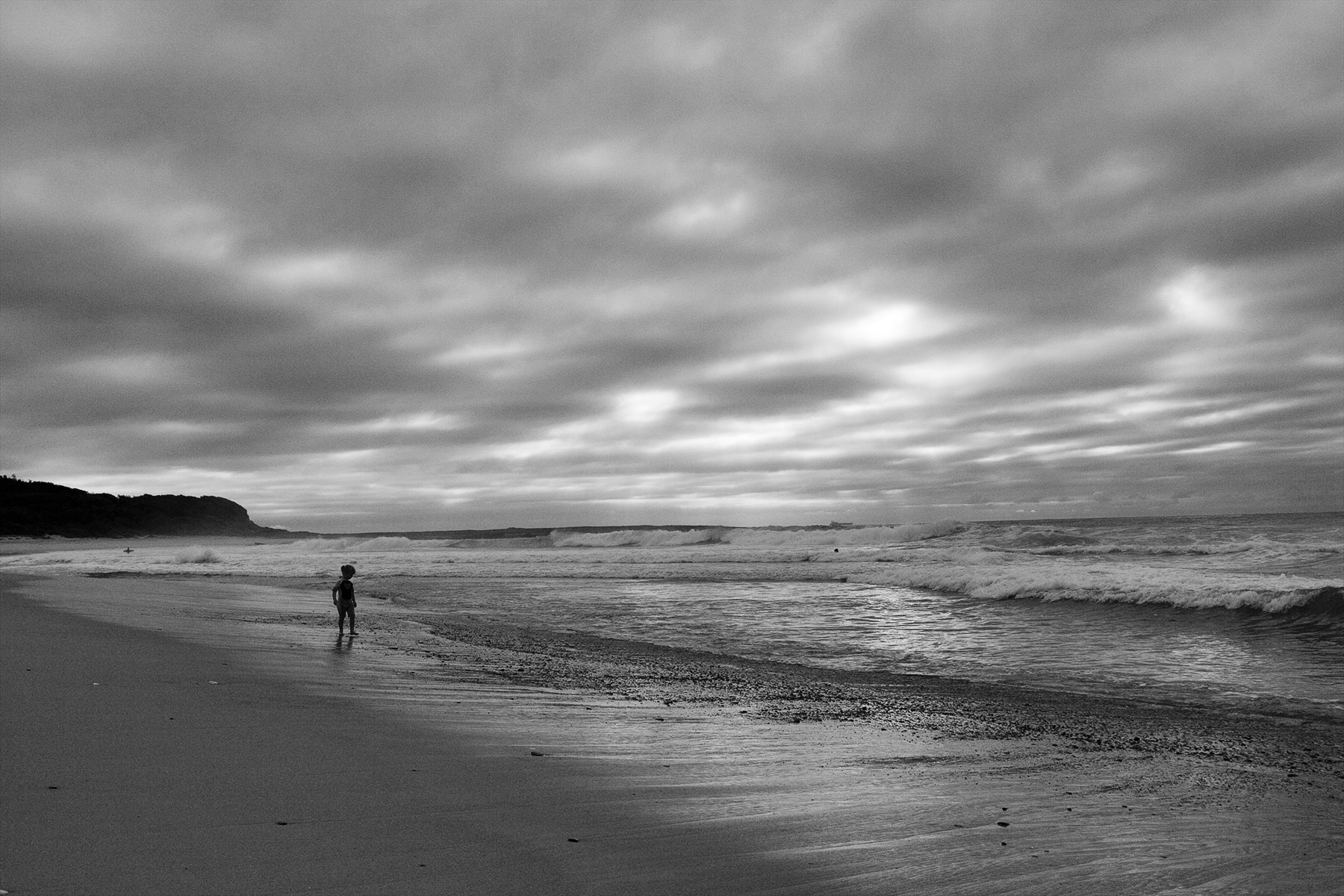
They both look chaotic. The foliage in the mono looks impenetrable whereas in the original it appears more open and easier to enter.The structure in the mono has more visual strength and appears to support the foliage whereas in the original the foliage appears to have no reliance on the structure so I guess the chaos has been tamed in the mono. Good exposure. |
Oct 10th |
| 64 |
Oct 22 |
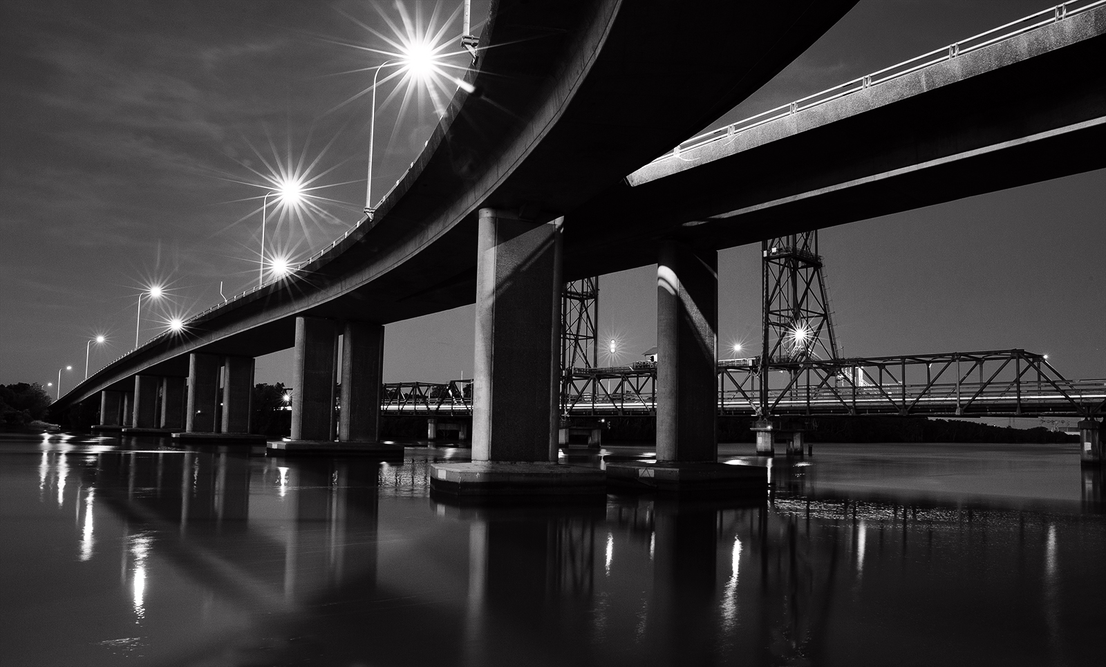
Comment |
Cool border. I like it and it is necessary to delineate the edge of the sky part of the image. That black sky really makes the buildings stand out against it and so they have a lot of impact and show off plenty of detail. Good choice of angle to separate the building from the fountain. Shame about the scaffold on the right of the building. A few steps to the right and you could have hidden it with the tree but then again it may have mucked up your composition. |
Oct 10th |
| 64 |
Oct 22 |
Comment |
Wonderful framing by use of the foliage. Composition works well and the reflections are enchanting. I would like to see the trees darkened down particularly in the area adjacent the left gable. It is a very suitable subject for infrared. |
Oct 9th |
| 64 |
Oct 22 |
Comment |
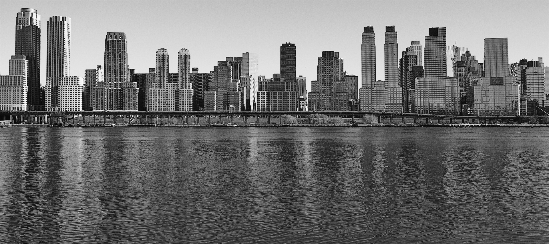
Great material for mono and nice composition which has much depth and strong tonal range. If you could have shot from a touch higher it would have placed the protruding roof beam and roof line against the lighter part of the foot hills where it would stand out more. It tends to get a bit lost in the base of the mountain as the tones there are similar. Love the sky. |
Oct 9th |
| 64 |
Oct 22 |
Comment |
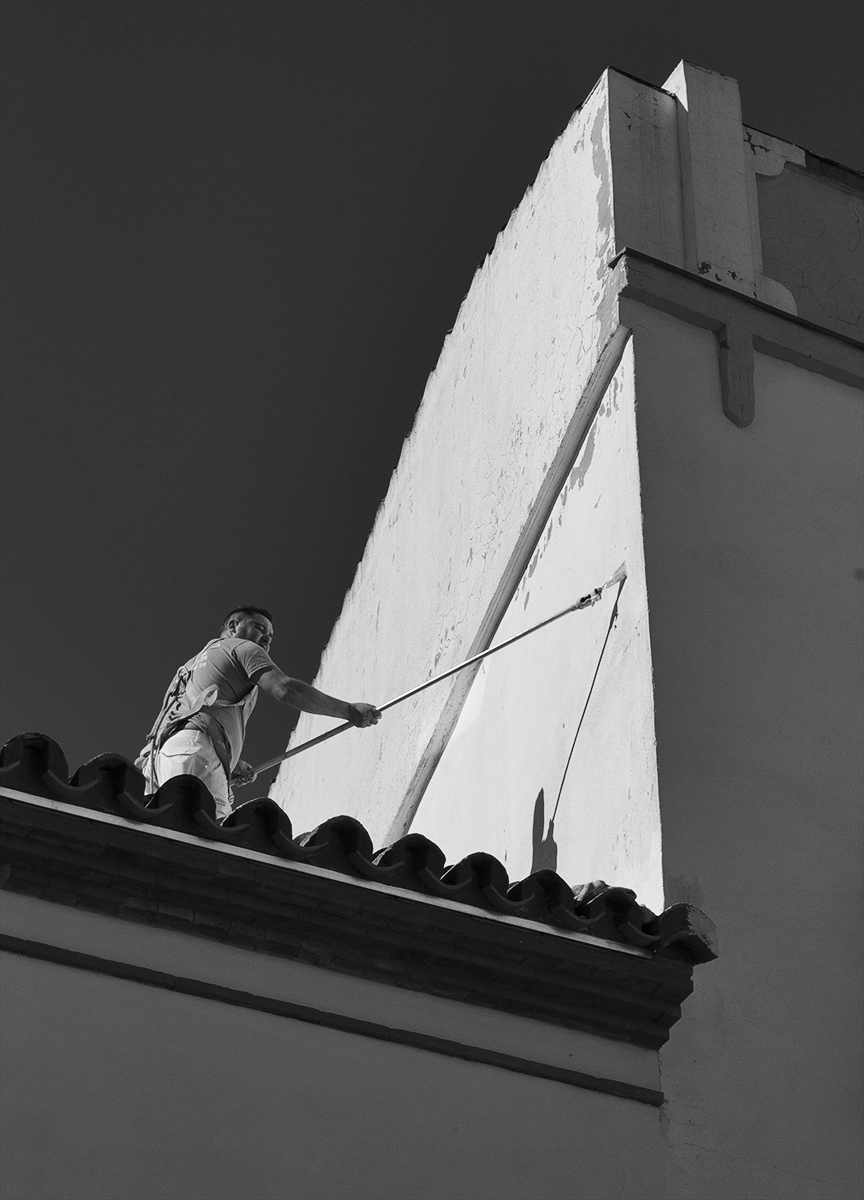
What a magnificent building. Your image provides a good look at the structural elements and emphasises the strength of the design and shows off plenty of detail. Good that the bottom background is light & soft to cut out any distractions. The burning down bottom left is rather heavy and is at odds with the density of the bottom right section, so it becomes obvious.
On another matter Stuart, I just saw the edited version of last months image where you did a first rate job of cloning out the marshall in front of the bike rider. It looks much better. |
Oct 9th |
6 comments - 0 replies for Group 64
|
6 comments - 0 replies Total
|