|
| Group |
Round |
C/R |
Comment |
Date |
Image |
| 64 |
Sep 22 |
Comment |
Firstly, I think it is a really engaging image and I think you have made it better with the radial filter effect as it places more emphasis on the face and takes care of some of the distracting highlights. The darkness all the way around frames the man and the clock so that they are the stars of the show. I love the relationship between the look of boredom and the clock and also the clutter and out of focus fish which just adds to the story. I think it would do well in competition.
PS: I've been in that fish market. |
Sep 17th |
| 64 |
Sep 22 |
Comment |
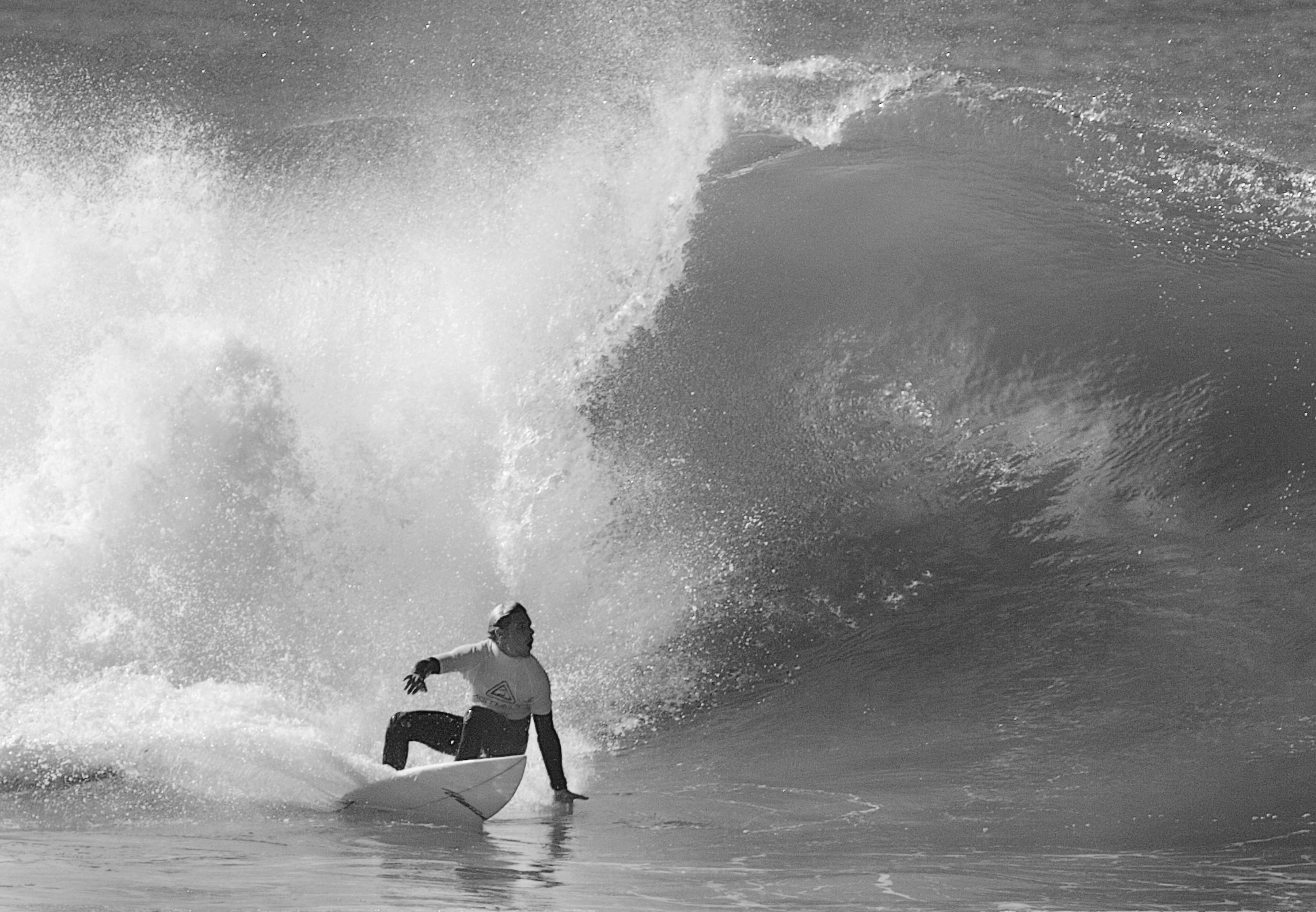
It is a very good photojournalistic image with no doubt as to the story line. The main subjects provide a really nice frame for the action beyond which although out of focus still has impact from the flying dust and body language of the riders. I am not in favour of the crop on the right but would prefer if the person in front of Jack 71 was omitted as I find that quite a distraction incongruent with the rest of the content. |
Sep 17th |
| 64 |
Sep 22 |
Comment |
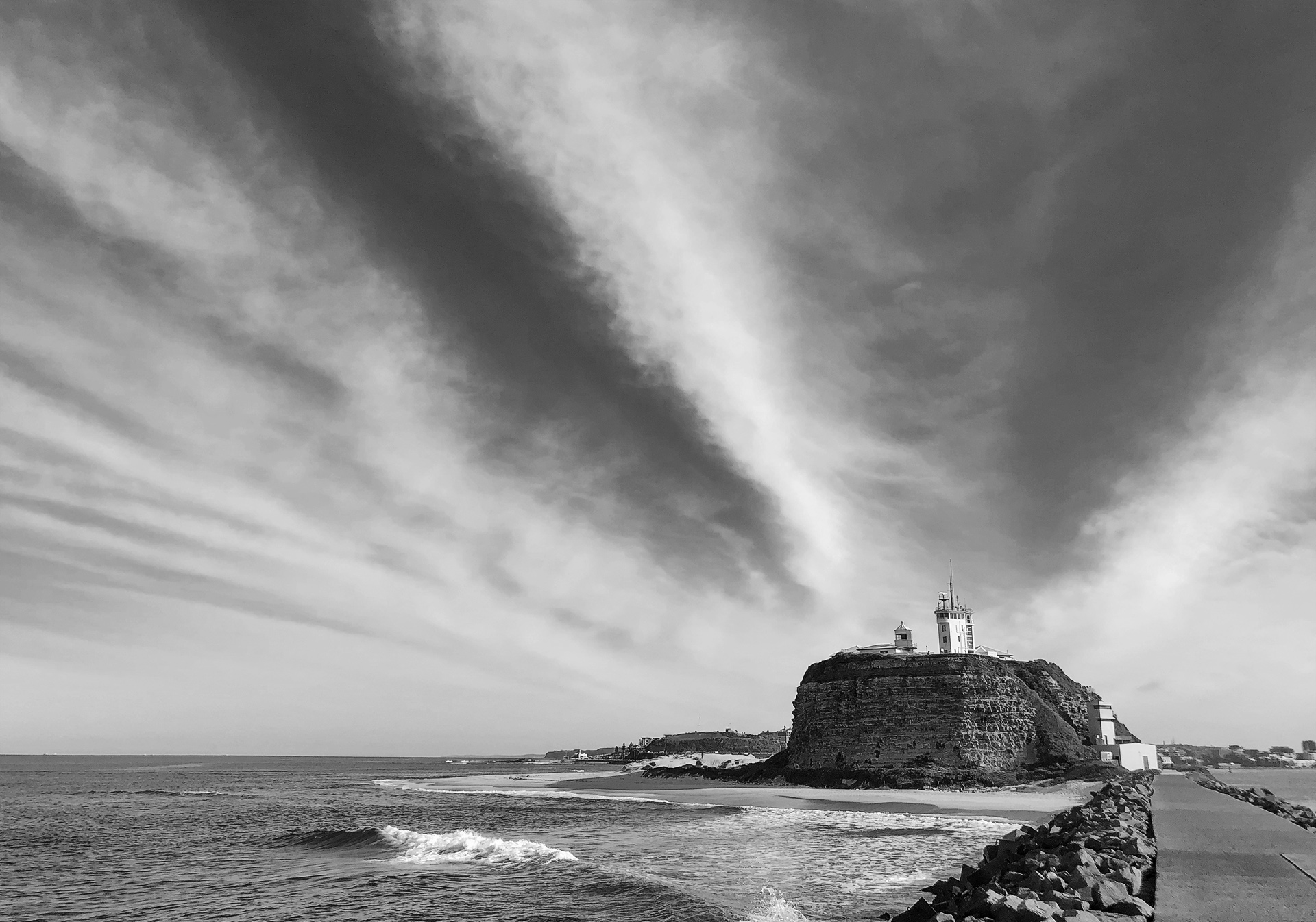
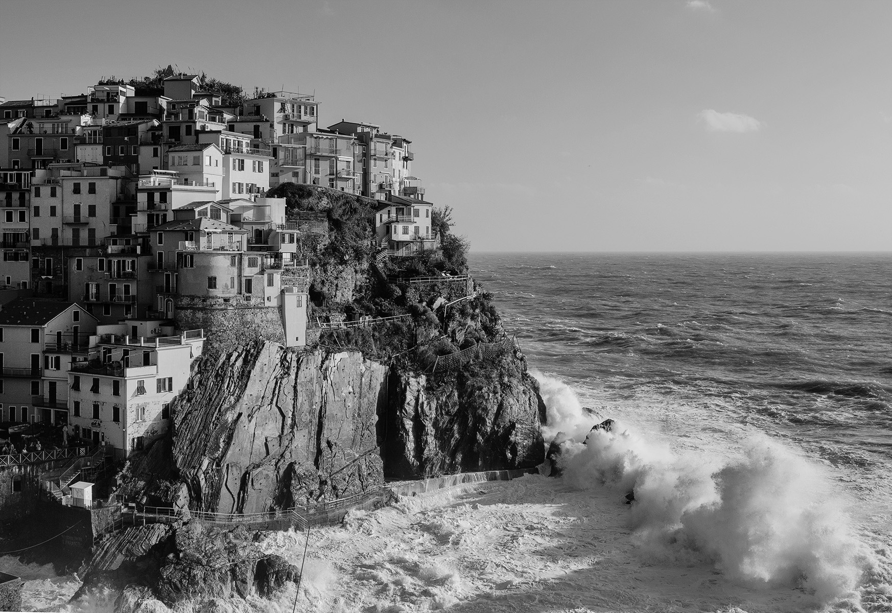
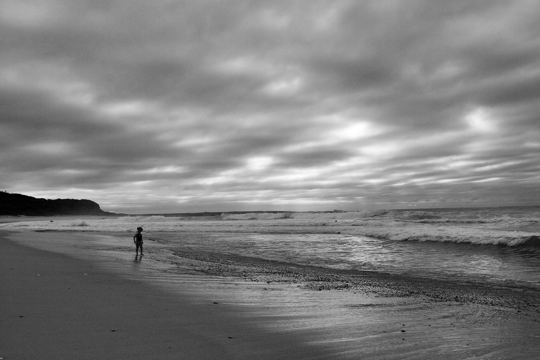
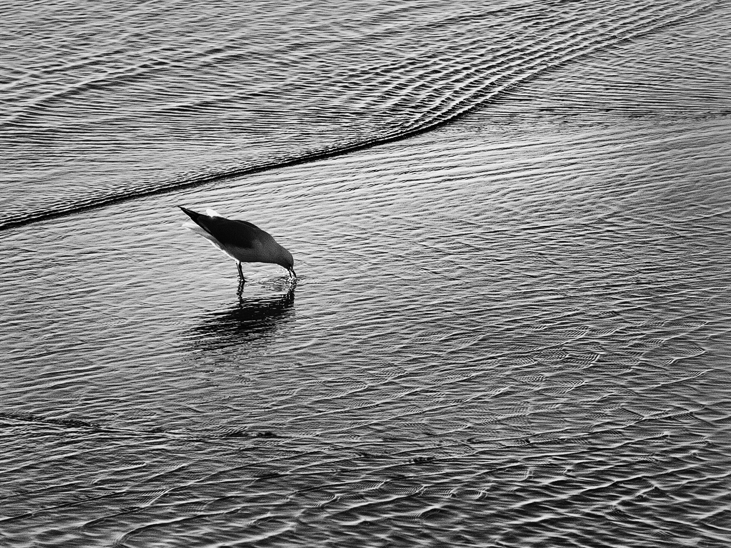
I think the mono treatment and square format work well and the triangular rock provides a nice balance and aids the diagonal composition. The unusual viewpoint creates interest. Good shadow detail. Maybe the top right sky could be darker to match that on the left. |
Sep 17th |
| 64 |
Sep 22 |
Comment |
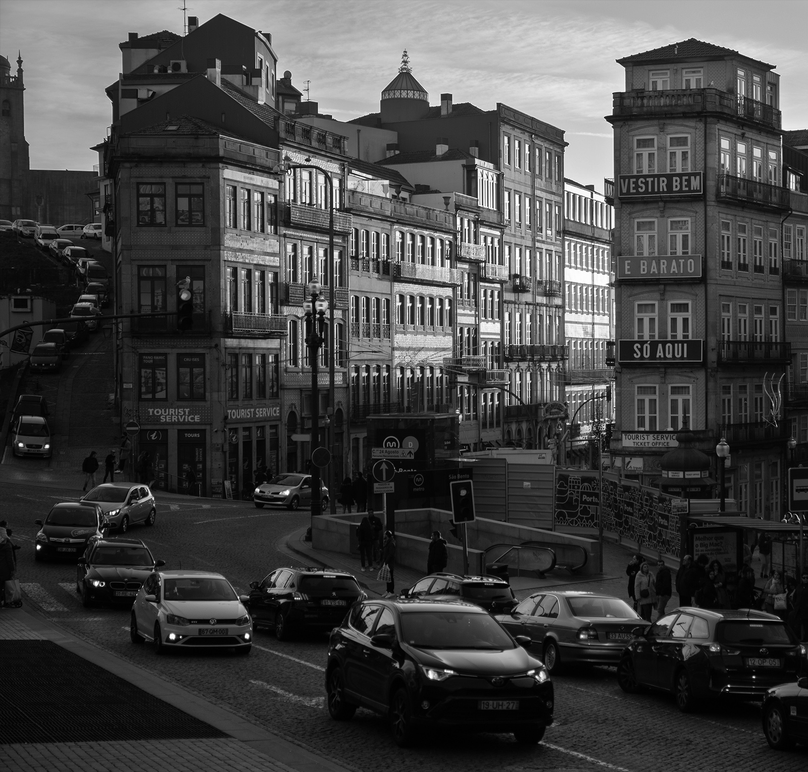
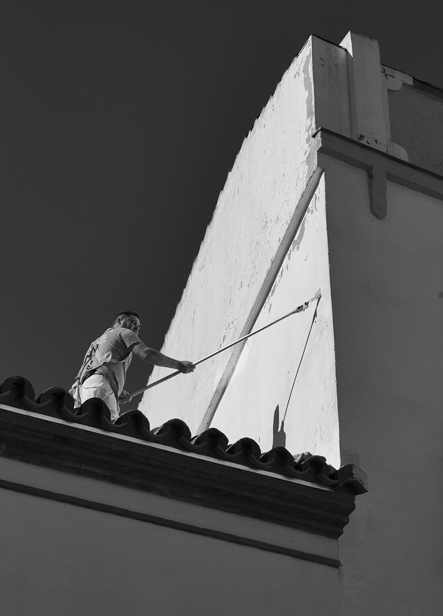
My first impression was it had been given an infra red treatment as there is plenty of contrast. I like the composition especially with the statued ladies hoisted up in to the vacant sky space between the buildings as they stand out so well against the dark area. Being a phone shot I wonder if it has automatically been oversharpened which could explain the texture which comes across as being like a filter effect. |
Sep 17th |
| 64 |
Sep 22 |
Comment |
The interest is in the lines around the leaves and the curves have appeal. I dont think the poor light has done you any favours. I am finding the shadow areas too dark and devoid of detail. I too think a white thin line frame would not go astray. |
Sep 17th |
| 64 |
Sep 22 |
Comment |
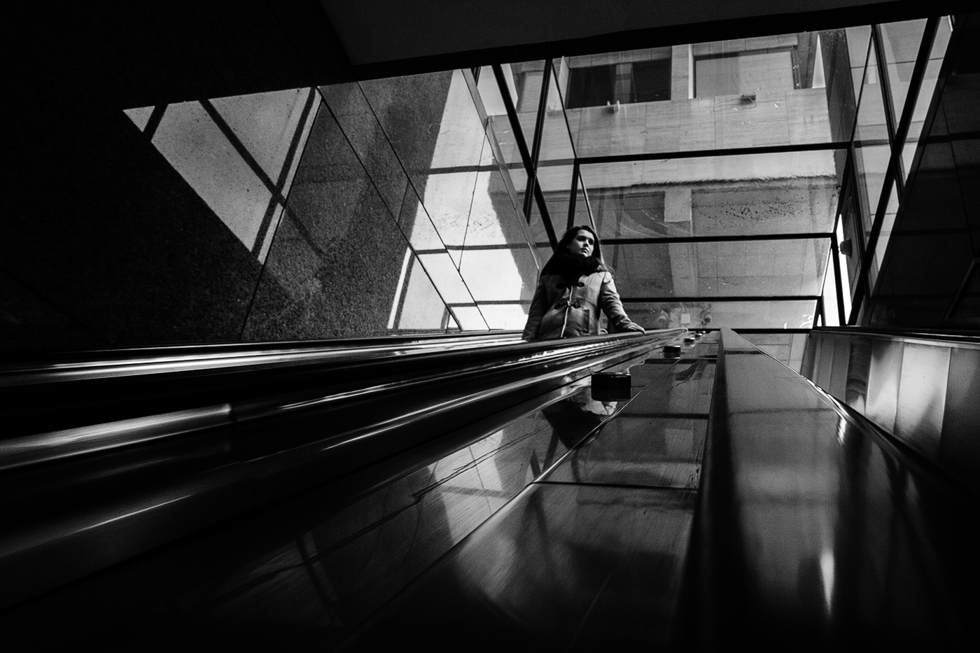
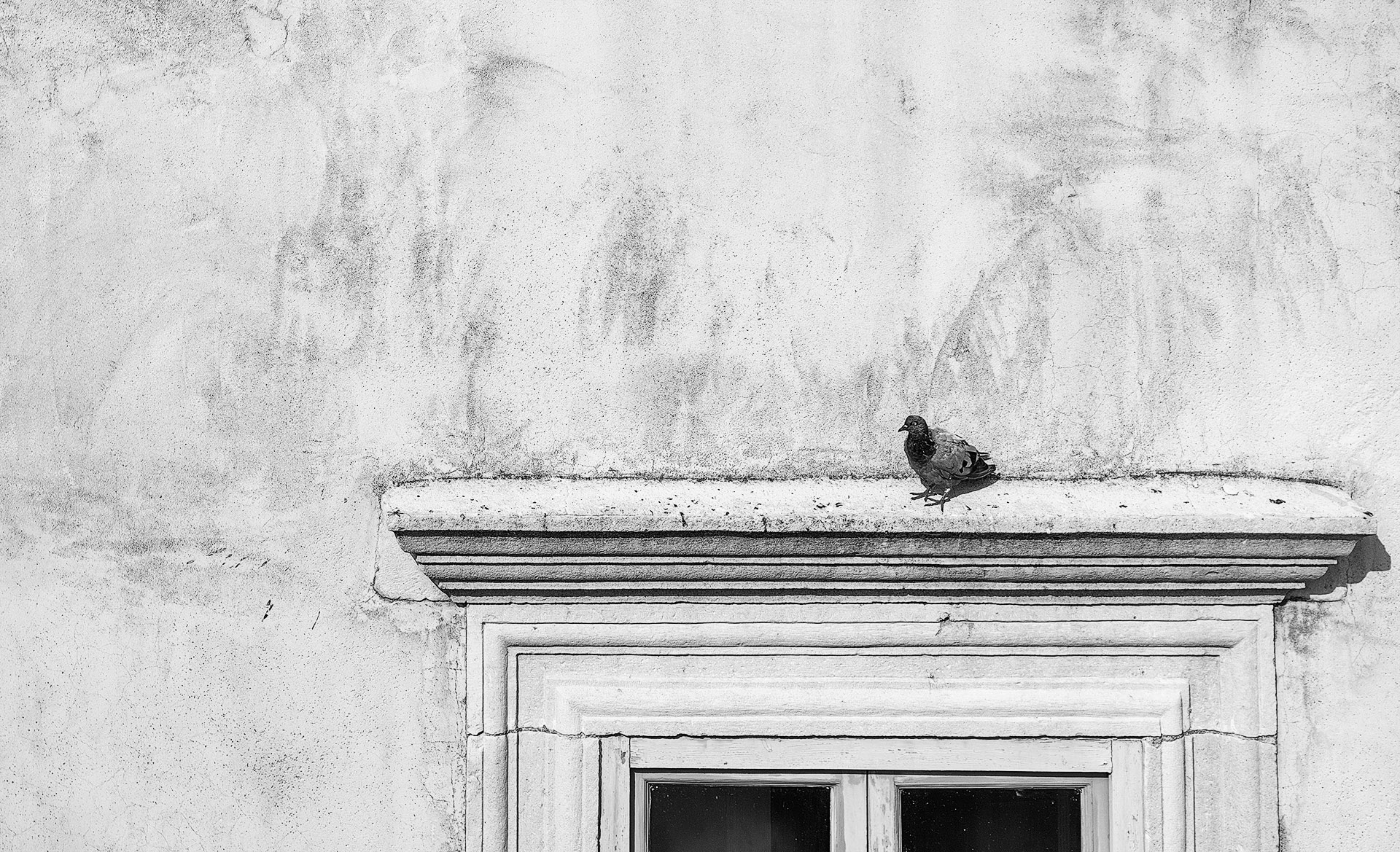
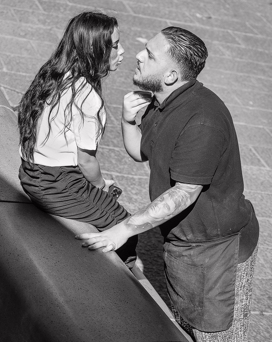
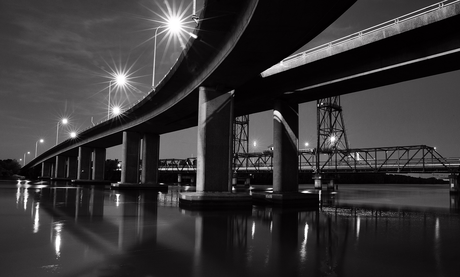
Extremely sharp and verticals are straight. Certainly is busy but it is a busy place. Mono simplifies and turns it in to an image that is all about the tones. I don't mind the colour version either. I would prefer the light building on left edge and the grey column right edge cropped out. I understand they are part of the framing but do you really need them? |
Sep 16th |
6 comments - 0 replies for Group 64
|
6 comments - 0 replies Total
|