|
| Group |
Round |
C/R |
Comment |
Date |
Image |
| 64 |
Aug 22 |
Comment |
Thanks for your thoughts. I totally agree with the lack of contrast and I might start it again from scratch to see if I can improve on it. |
Aug 24th |
| 64 |
Aug 22 |
Comment |
Certainly mono was the go. Nice even lighting shows up a lot of detail and the ornate crafting of the woodwork and I think it was a smart move to focus on the balustrade throwing the rest out of focus. Even though out of focus, the rest of the stair case is easily discernible and you can still appreciate the grain and texture there as well. Quite an amazing job at 1/10s. |
Aug 24th |
| 64 |
Aug 22 |
Comment |
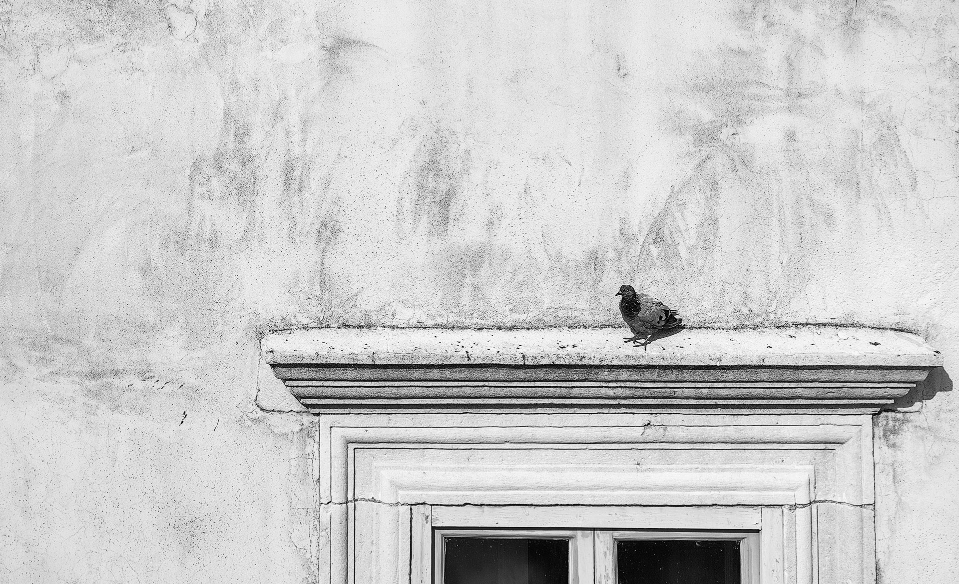
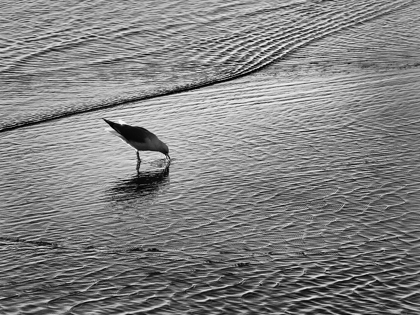
Plenty of tones, texture and detail and my first thoughts were it was a simple exercise in light and shadow. The thin branch makes a nice leading line diagonally through the image. The hole is only an incidental component of the whole image and so I cannot grasp it as the main subject. I think the dark leaves provide a foil to stop the viewer going beyond the trees and all the nice details, to the lighter patches in the background where it would be easy to lose interest. |
Aug 24th |
| 64 |
Aug 22 |
Comment |
In the colour version I am first drawn to the doors and in the mono, I am drawn straight to the artwork so I think the mono simplifies the image although I would like to see some more contrast in that artwork. Inclusion of the doors gives some scale to appreciate just how large a piece of artwork it is. |
Aug 24th |
| 64 |
Aug 22 |
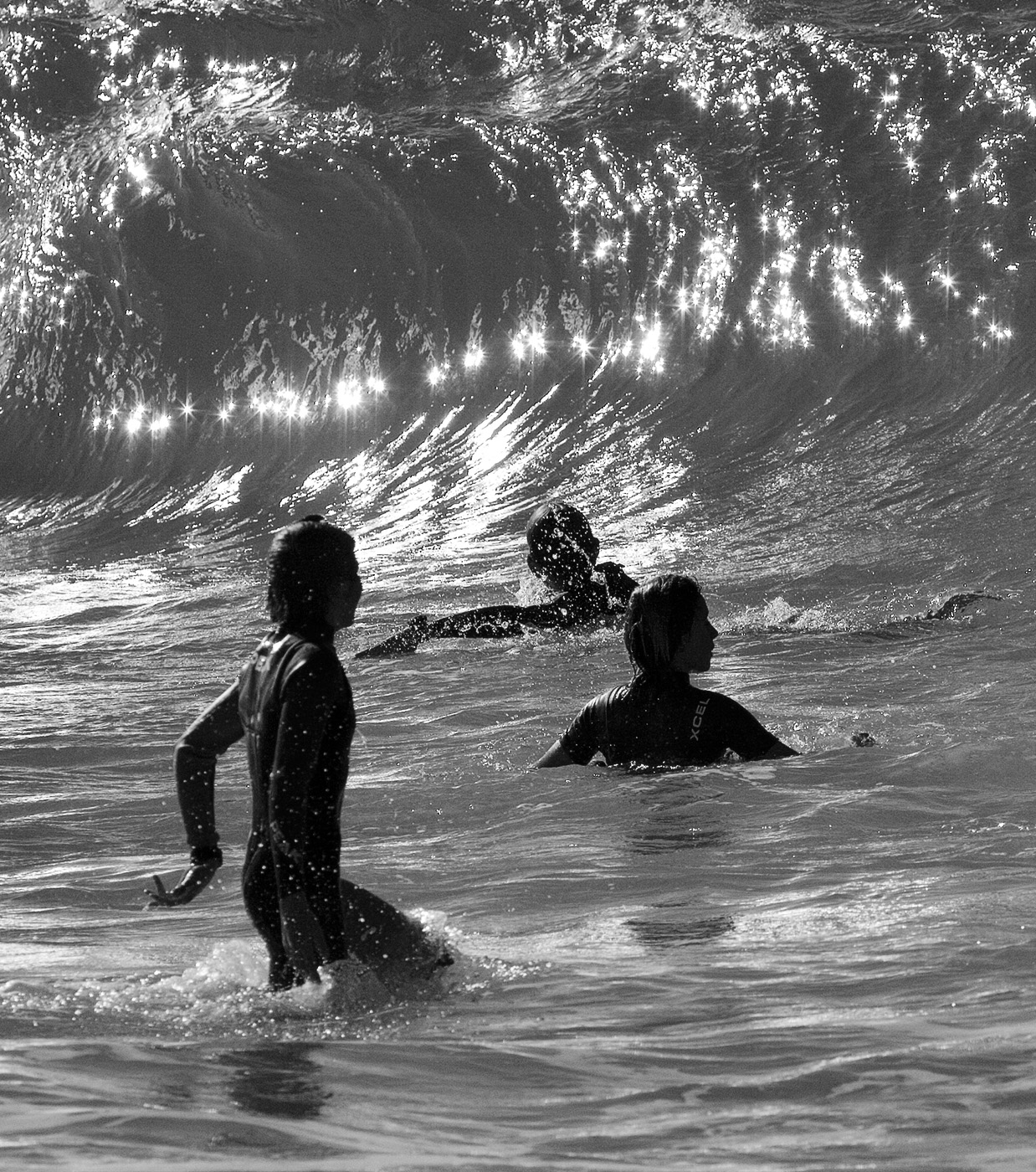
Comment |
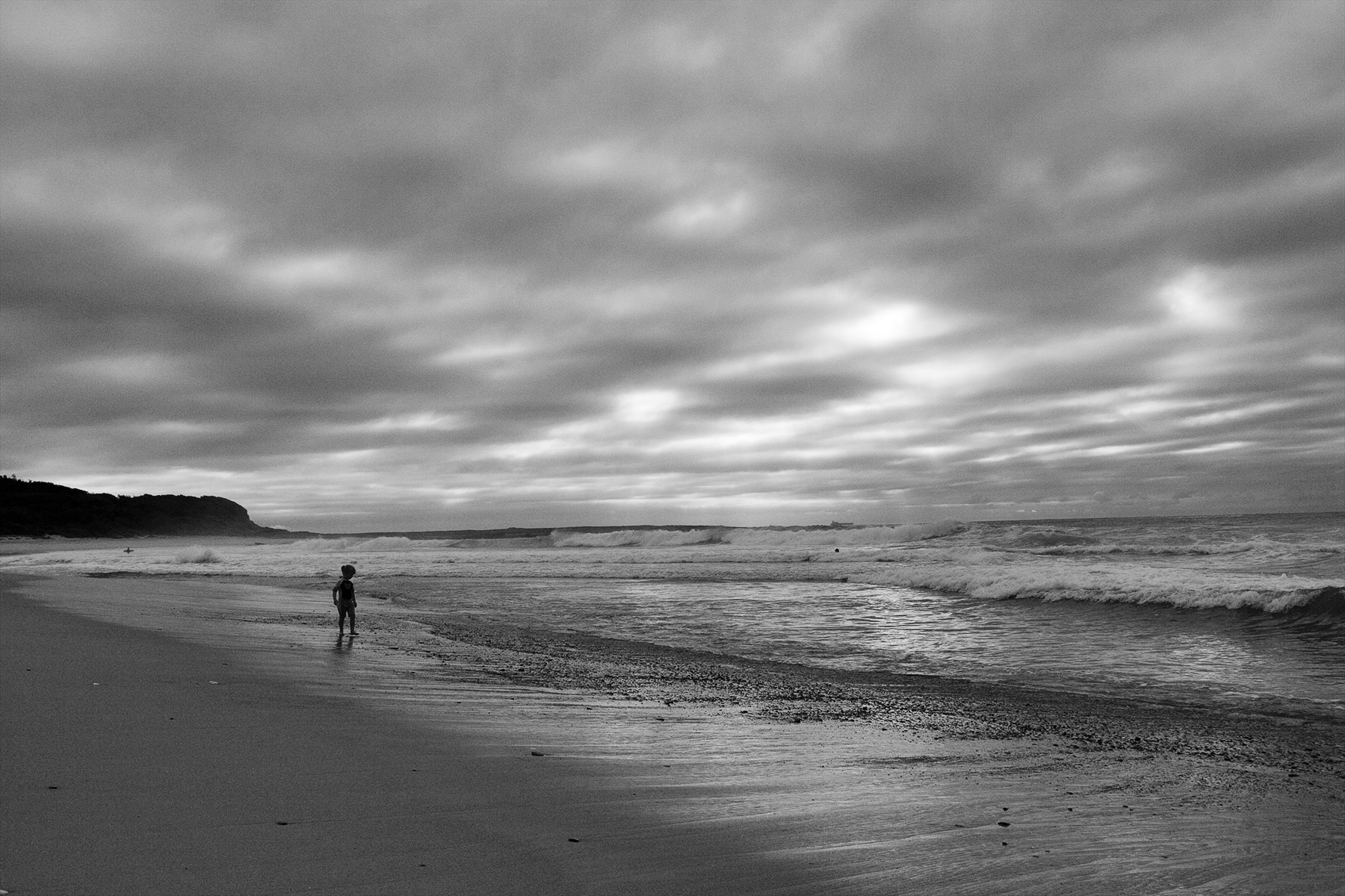
I am a big fan of "less is more" so what about cropping out the clear sky altogether? You do not really need it as the beach/ surf/ landscape is what the image is all about and you would be left with only dramatic sky at the top. I think the grassy foreground could be darkened down to assist with the framing. I do like the composition and the way the curves take me right out to the far point where the storm is. |
Aug 24th |
| 64 |
Aug 22 |
Comment |
A very suitable subject for mono and you have revealed a lot of detail with a great tonal range and probably just the right amount of contrast. I like the darkened down presentation as it suits the ramshackle, derelict mood and story of abandonment which is aided by the imposing tree which can be interpreted as ready to devour the building, and the drama in the sky (although that cloud top right is too much on the bright side). |
Aug 23rd |
| 64 |
Aug 22 |
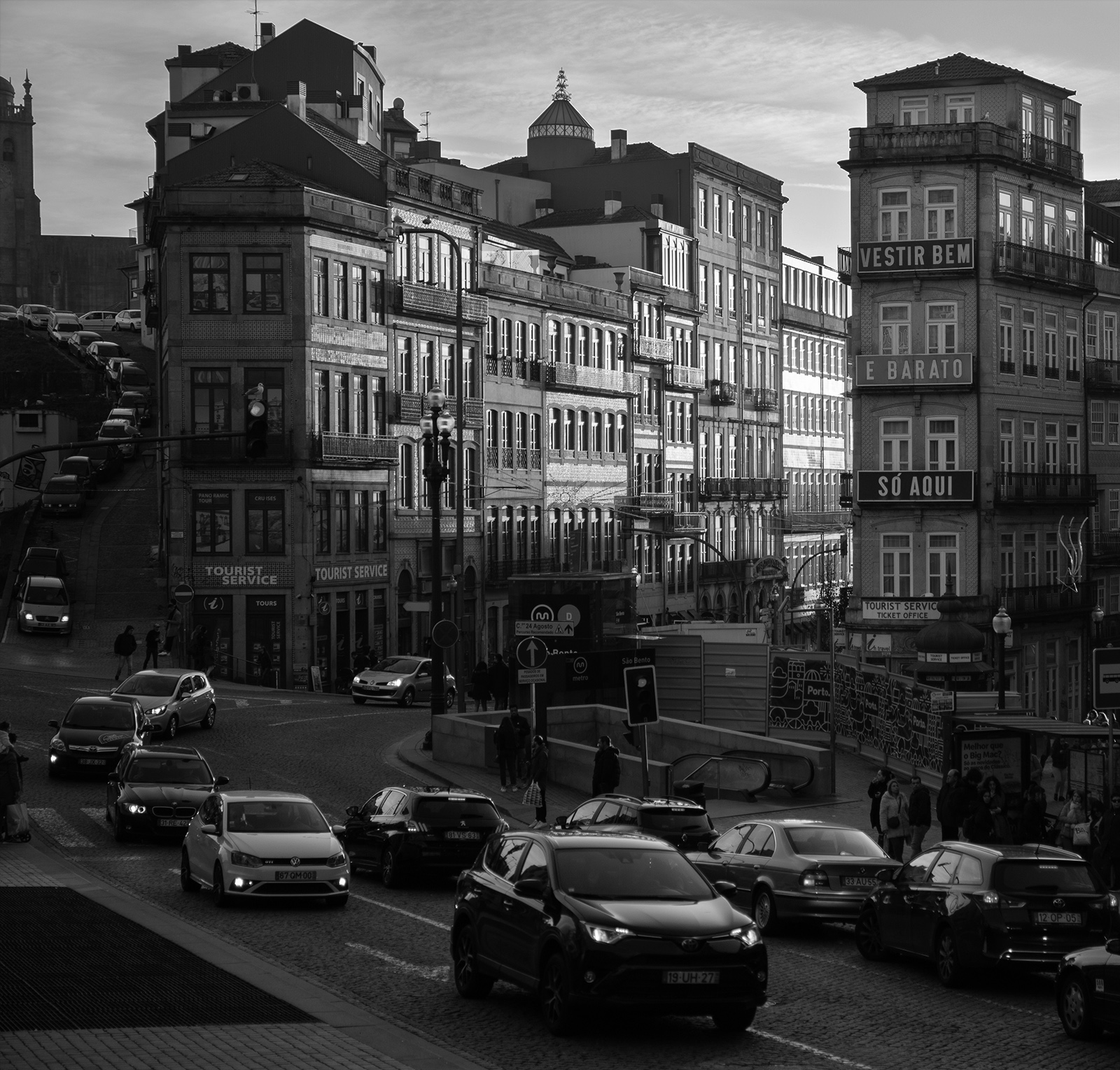
Comment |
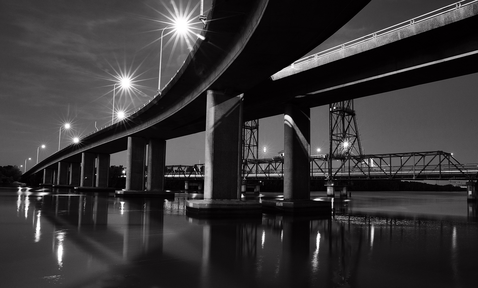
The contrast of curves and straight lines works well and the curves lead in from the top left and pull me through to the bottom in one continuous flow. The tonal range and contrast of black & white is a strong point. I am another not in favour with the leaves as I feel that are not discernible as leaves and so become a distraction. Something worth exploring.... if you cropped some top & left side to make the lighter space smaller than the darker space, it gets rid of the leaves and creates a new dynamic. |
Aug 23rd |
7 comments - 0 replies for Group 64
|
7 comments - 0 replies Total
|