|
| Group |
Round |
C/R |
Comment |
Date |
Image |
| 24 |
Jul 23 |
Comment |
Thank you all for your comments. |
Jul 27th |
| 24 |
Jul 23 |
Comment |
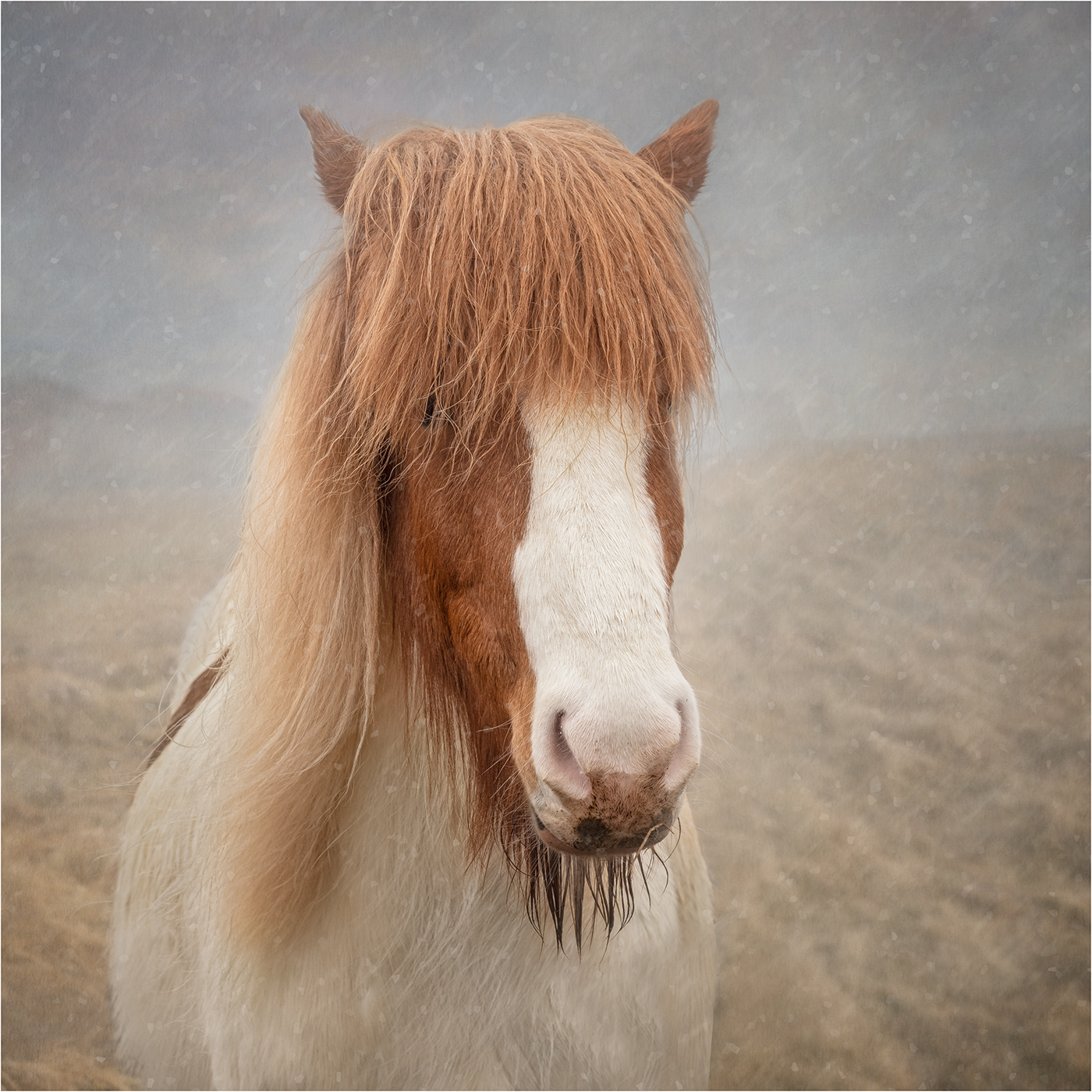
Lots of really interesting shapes and textures in the image, both in the tree and the sky. I really like your chosen viewpoint. Great image. |
Jul 27th |
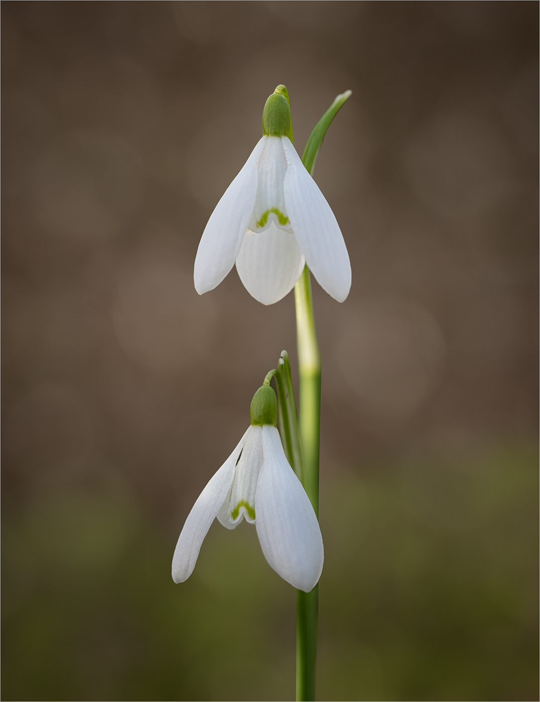
| 24 |
Jul 23 |
Comment |
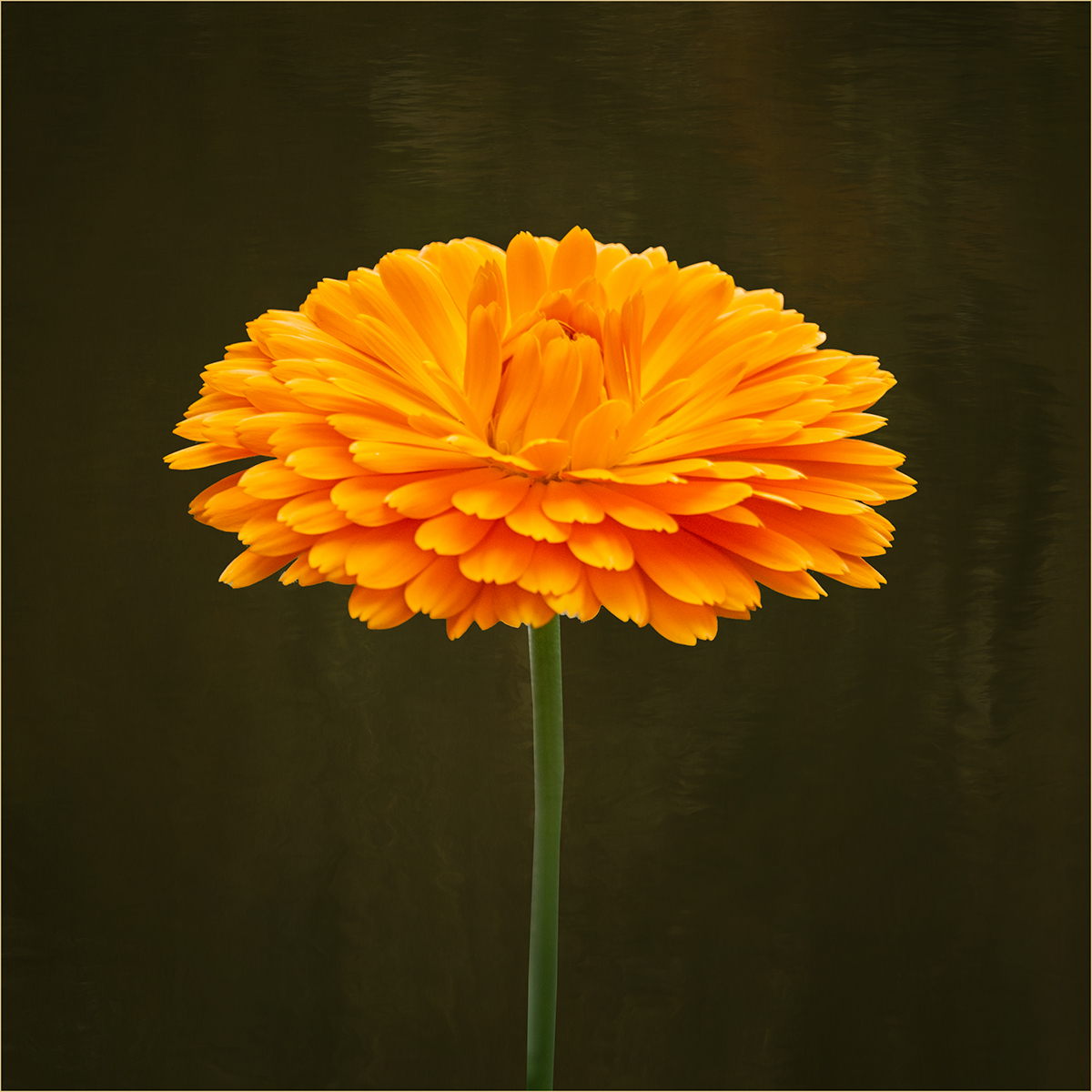
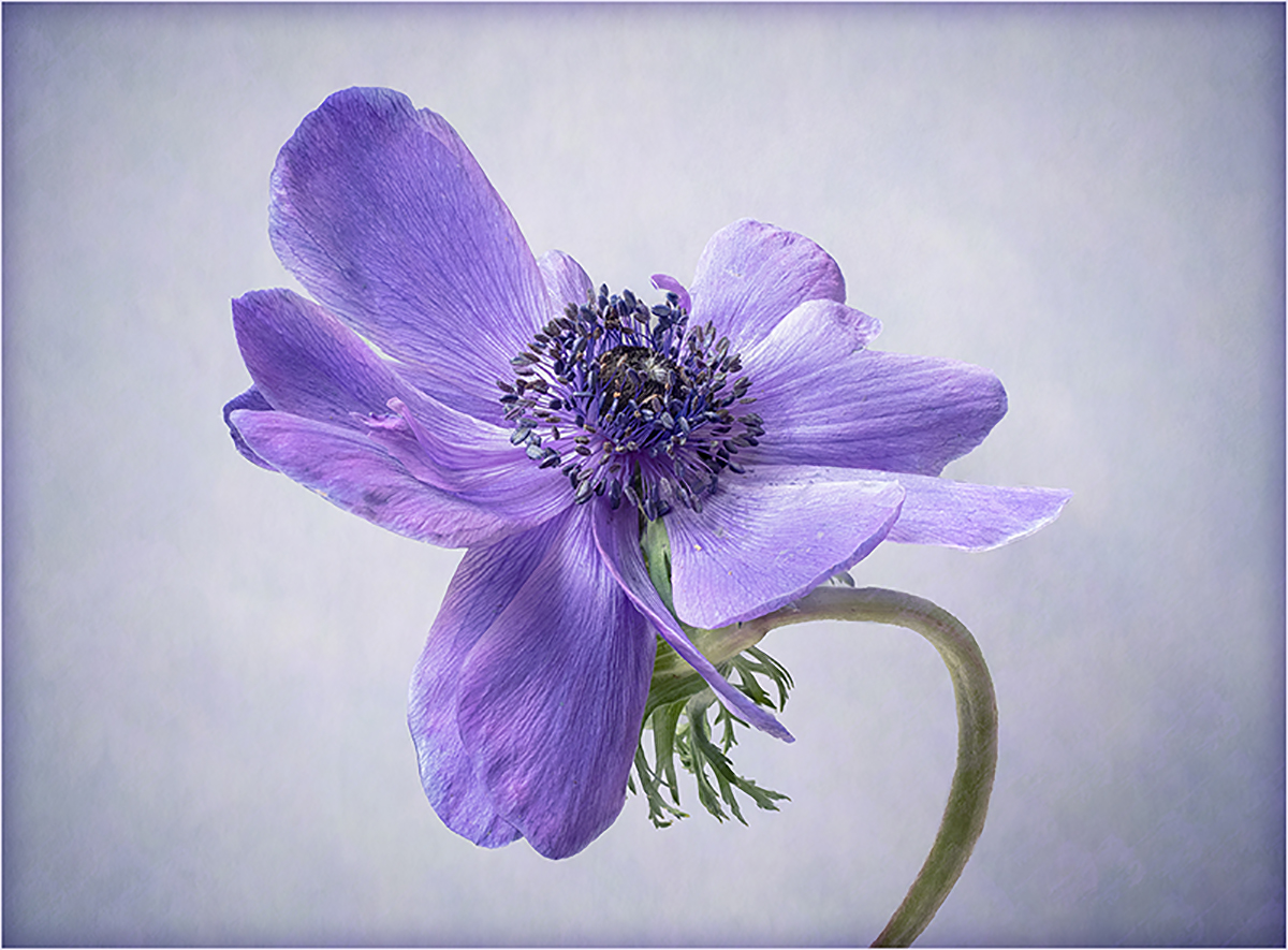
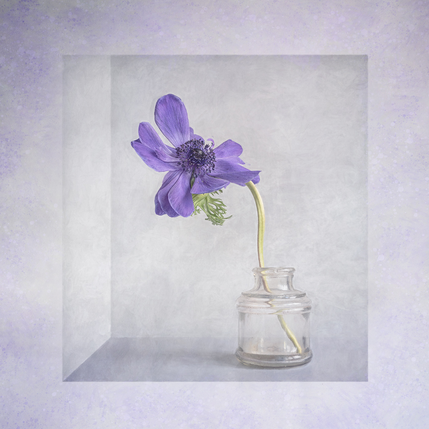
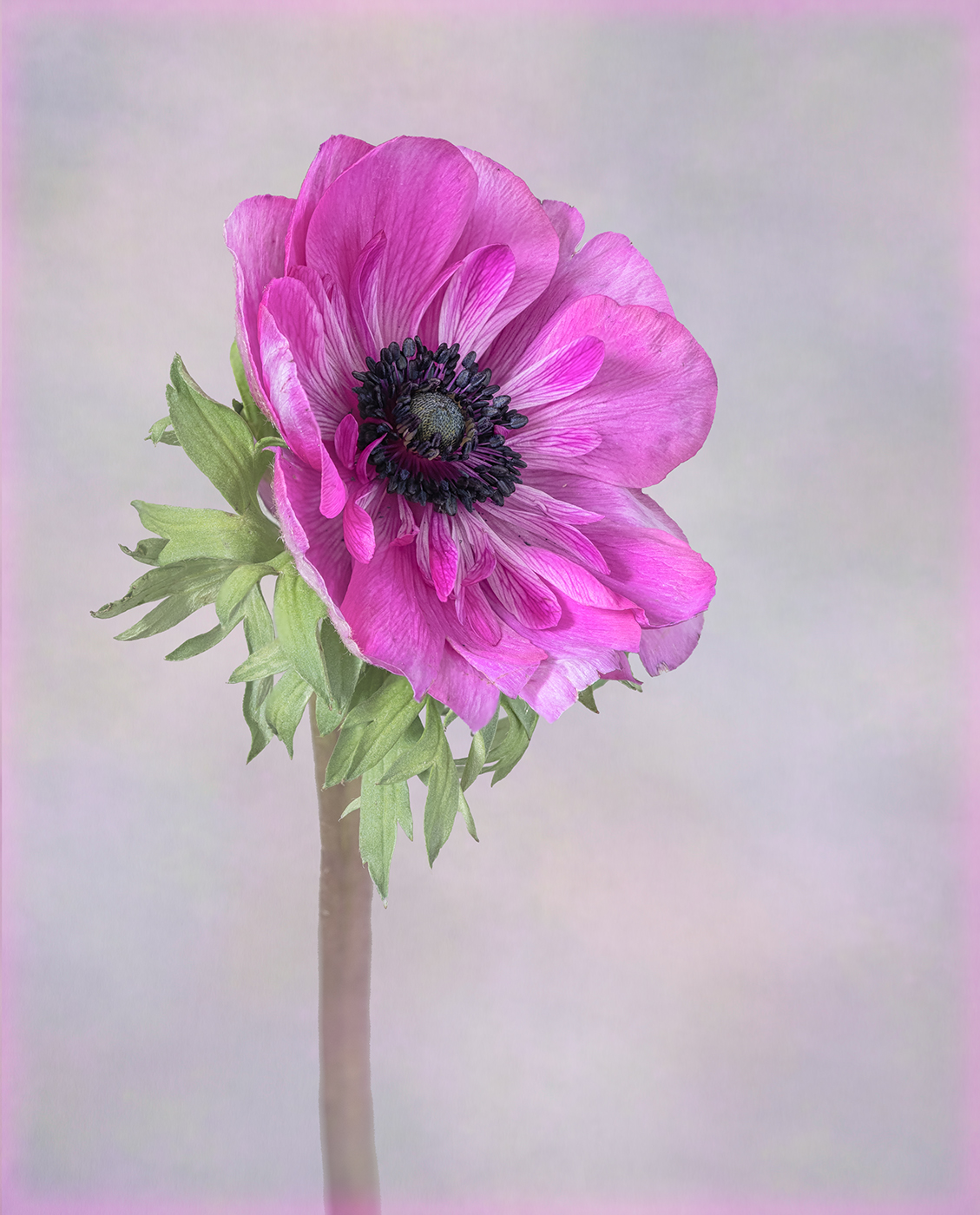
Lovely image. I too prefer the square crop, to keep the focus on the centre of the flower and remove the distracting green foliage. For my taste I don't think you need to increase the saturation. |
Jul 27th |
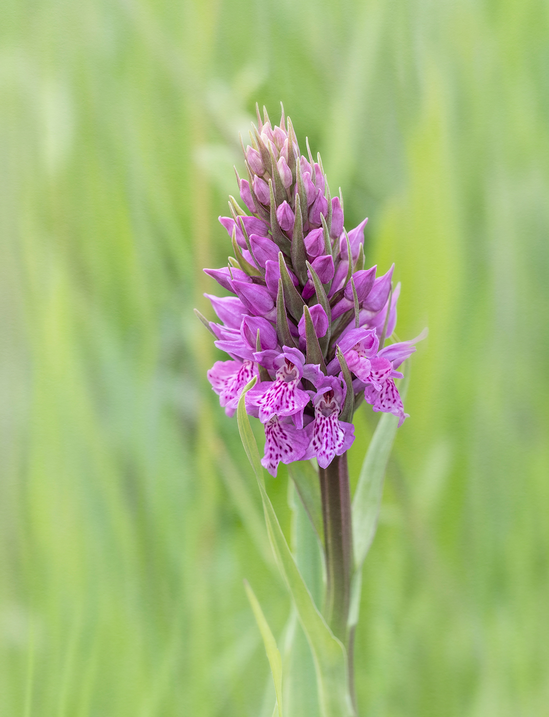
| 24 |
Jul 23 |
Comment |
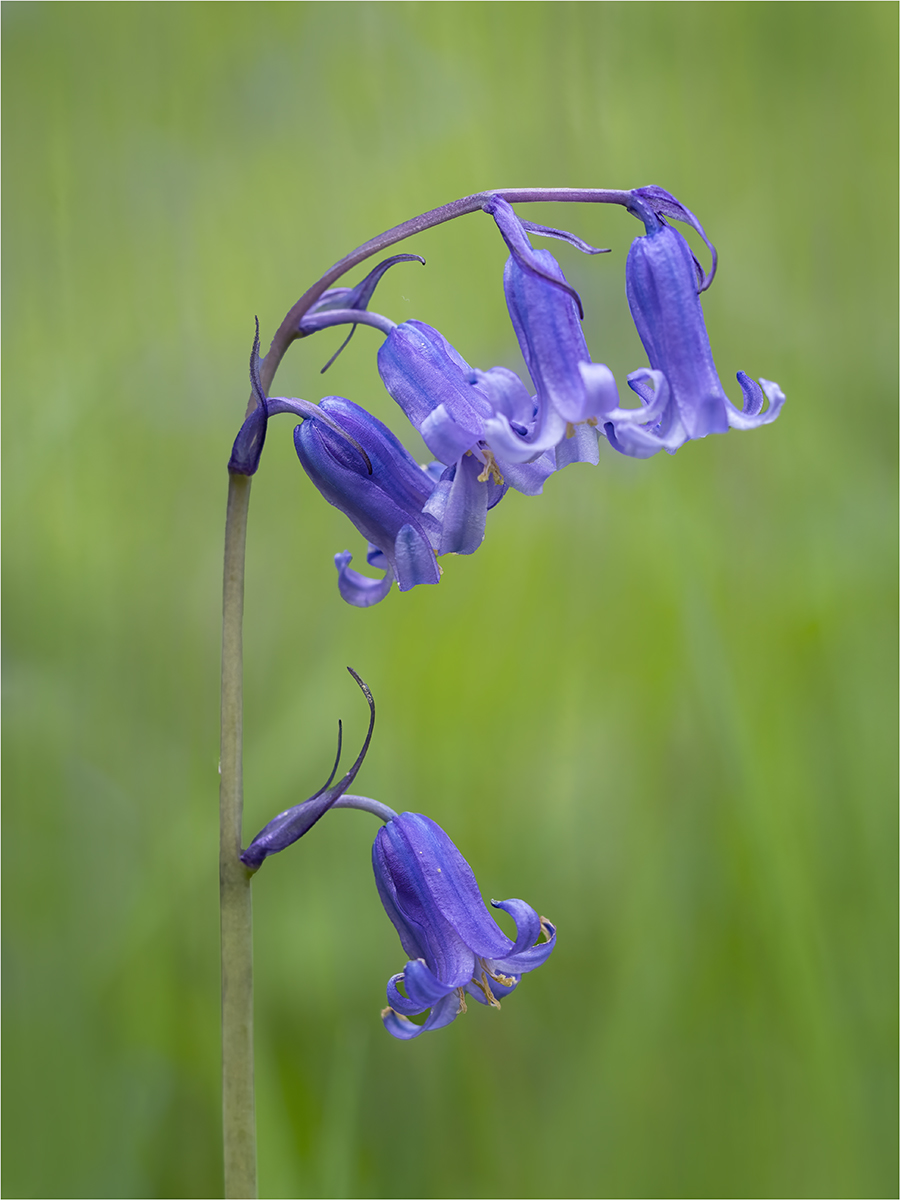
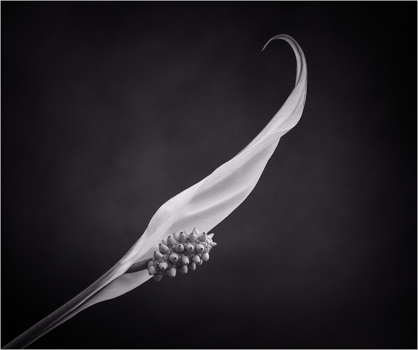
An interesting composition and close in crop. However the image does need to be sharp where you want the viewer to focus. |
Jul 27th |
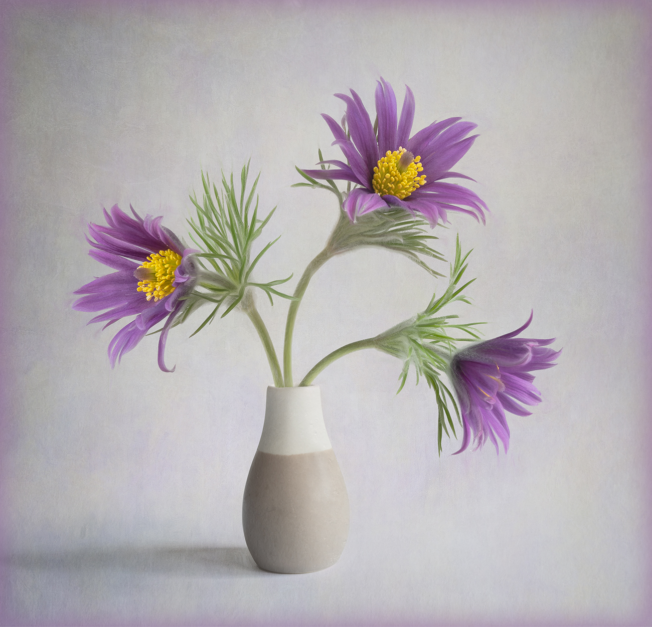
| 24 |
Jul 23 |
Comment |
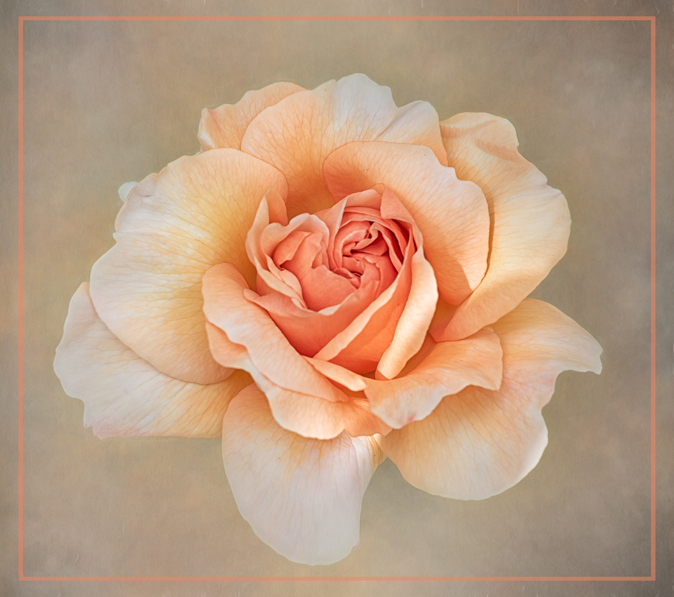
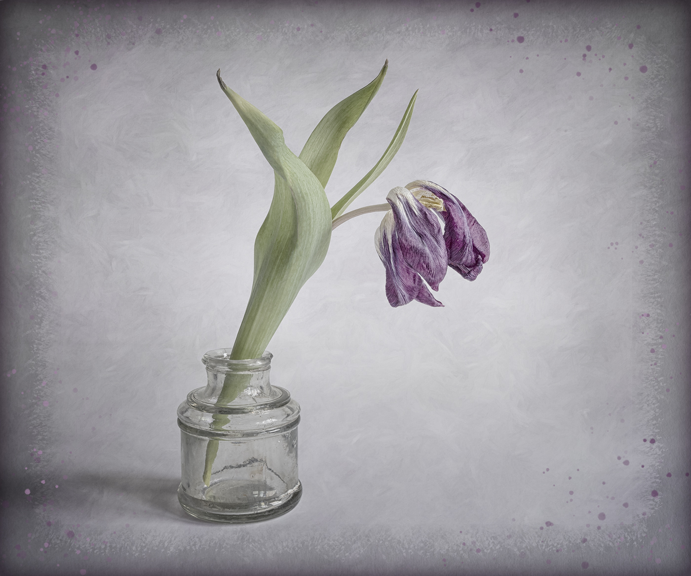
Hi Bev, I agree with the comments of the others. Your treatment has made the flower look unnatural and the background detracts from the flower. You have also missed masking off some of the black background behind the stamens which stands out against the green. |
Jul 27th |
5 comments - 0 replies for Group 24
|
| 77 |
Jul 23 |
Comment |
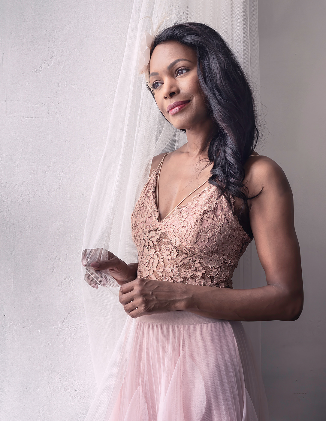
A lovely atmospheric image of your granddaughter. I really like the side lighting on her face and her far-away look. My only suggestion for improvement would be to brighten the eyes a little to make them stand out more. |
Jul 27th |
| 77 |
Jul 23 |
Comment |
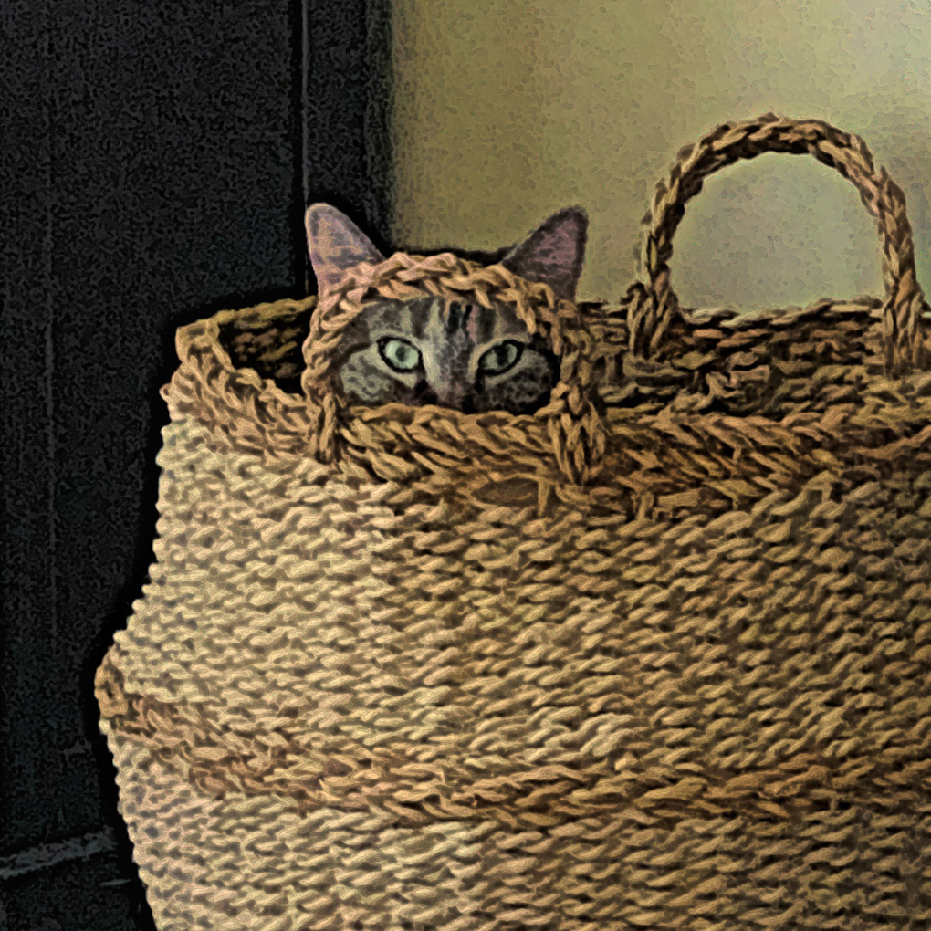
Hi Denise, well done on getting your image in the showcase. This is a great fun image. I agree that a slightly tighter crop works better. I think perhaps you could just lighten the cats face a touch and gives the eyes a bit more pop. In the attached I have used the underwater filter in PS. |
Jul 27th |
 |
| 77 |
Jul 23 |
Comment |
Hi Linda, a great idea to flip the image, it works much better that way. The colours really make the image pop. For my taste I would desaturate the sky just a touch. |
Jul 27th |
| 77 |
Jul 23 |
Comment |
Hi Jan, an interesting abstract image. For my taste I would prefer to see a bit more detail left in the flowers. For such a dark image it would benefit from a thin stroke line to separate the image from the black background. |
Jul 27th |
| 77 |
Jul 23 |
Comment |
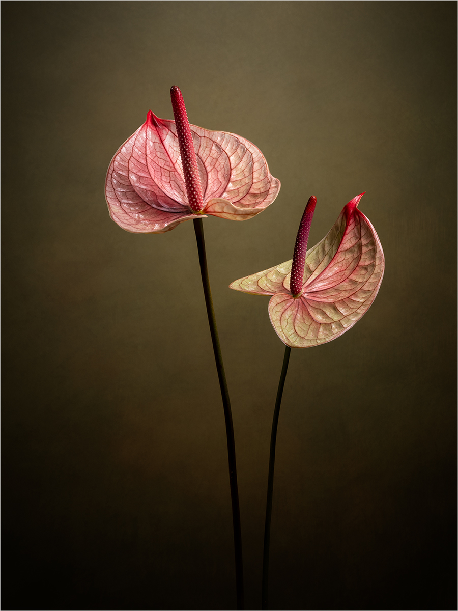
Hi Connie, an interesting image and you have good suggestions above to try. For me I don't really think that you need the second flower, so you might also try just using a single flower. |
Jul 27th |
| 77 |
Jul 23 |
Comment |
Hi Jodi, you have created a lovely floral image. I like the addition of the phlox texture as it makes your image original. I think I would place the flower slightly higher in the frame and rotate it more towards the centre but that's just a minor point. I would also desaturate the colours in the background a touch. |
Jul 27th |
| 77 |
Jul 23 |
Reply |
Hi Connie, many thanks for your comments. |
Jul 27th |
| 77 |
Jul 23 |
Reply |
Hi Jodi, many thanks for your comments. |
Jul 27th |
| 77 |
Jul 23 |
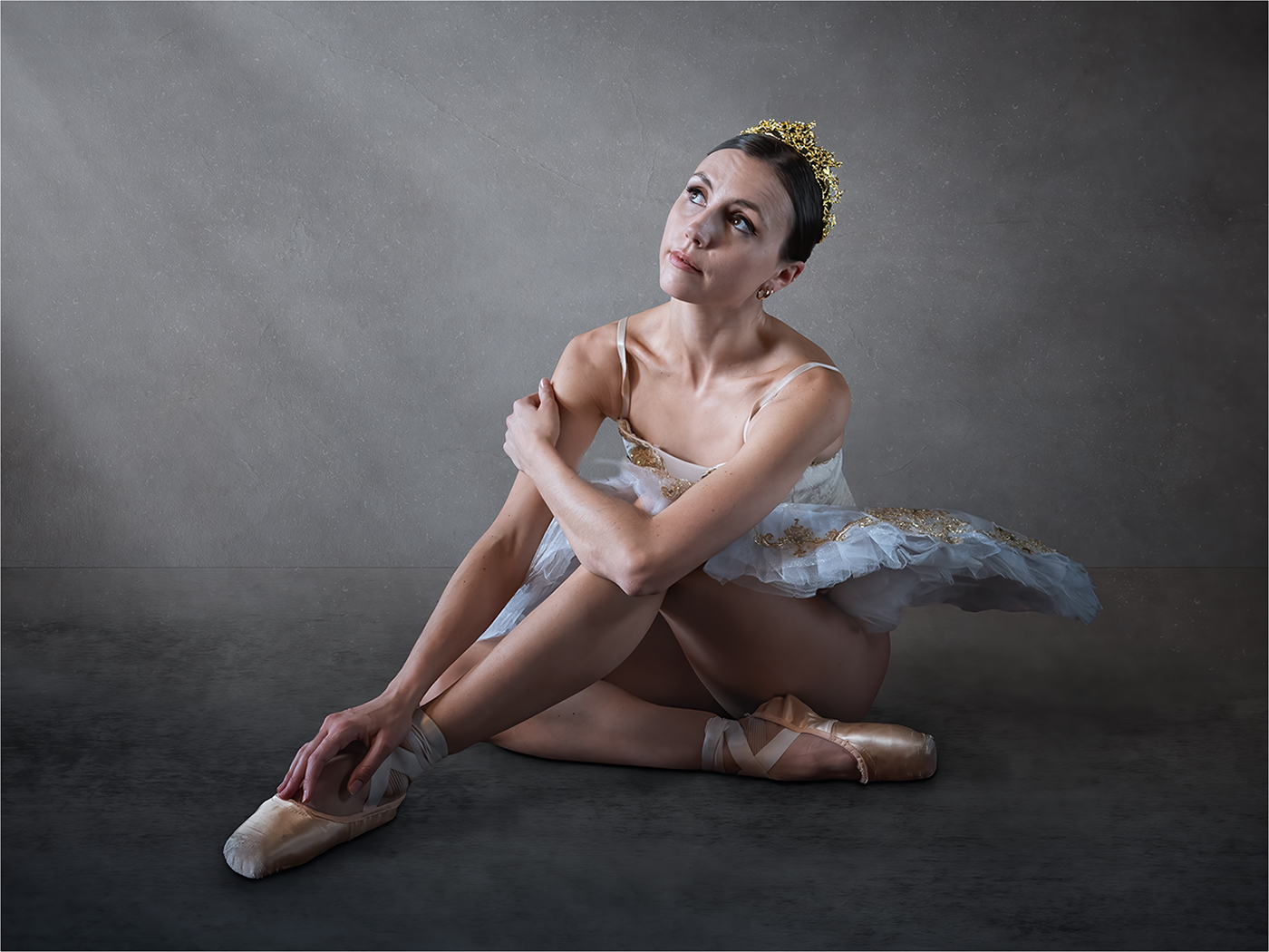
Reply |
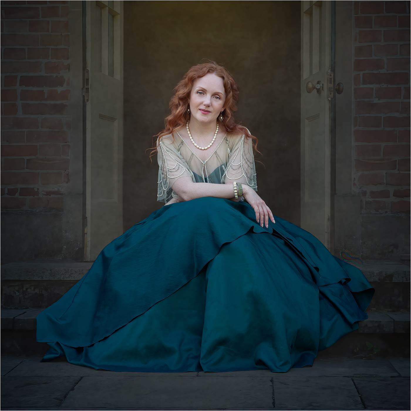
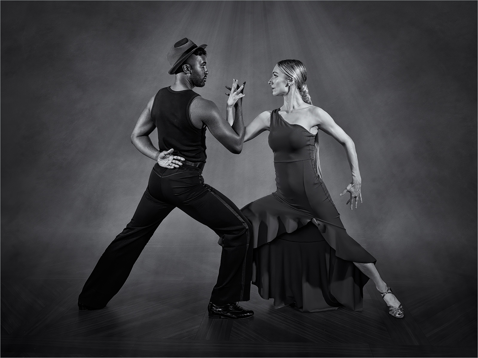
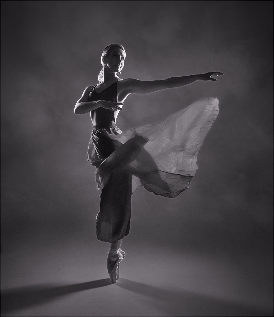
Hi Jan, thanks for your comments. I'm not sure I would want to darken it too much as I prefer to keep some detail in the dancer but that is just my preference. |
Jul 27th |
| 77 |
Jul 23 |
Reply |
Hi Denise, many thanks for your comments. |
Jul 27th |
| 77 |
Jul 23 |
Reply |
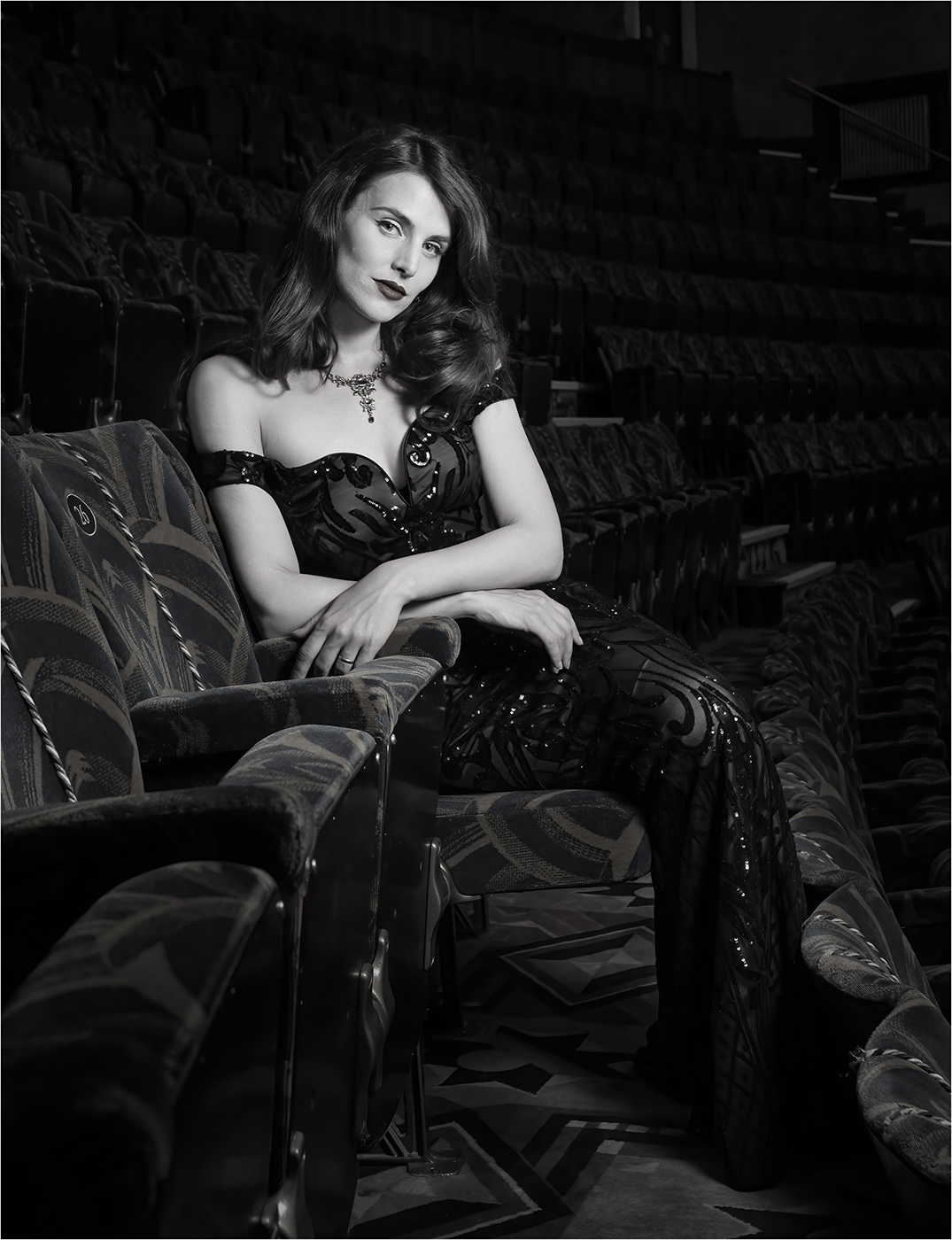
Hi Linda, thanks for your comments. I think it is her hair and earring that is under her chin, rather than a scarf, but I do agree that it needs cloning out. I prefer to keep the image on the darker side as I think it feels more atmospheric but that is just my preference. |
Jul 27th |
6 comments - 5 replies for Group 77
|
11 comments - 5 replies Total
|