|
| Group |
Round |
C/R |
Comment |
Date |
Image |
| 24 |
Jun 23 |
Comment |
Hi Pinaki, an interesting wild flower scene. I find Tom's version more restful, the inclusion of the cacti adds some tension to the scene, perhaps that is what you were after. |
Jun 26th |
| 24 |
Jun 23 |
Comment |
Hi Yvonne, a lovely vibrant image and good use of a shallow DoF. I like Tom's version, the simplified background makes the foreground flower stand out more. |
Jun 26th |
| 24 |
Jun 23 |
Comment |
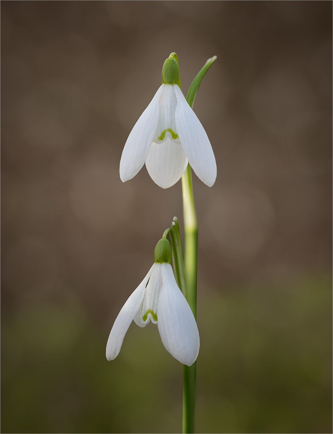
A lovely lily and I like your viewpoint. Agree with the others about the mulch! |
Jun 26th |
| 24 |
Jun 23 |
Reply |
Thanks for your comment Pinaki |
Jun 26th |
| 24 |
Jun 23 |
Reply |
Thanks Tom, the sharpening helps a bit but the flower is still soft where it comes forward. |
Jun 26th |
| 24 |
Jun 23 |
Reply |
Thanks Yvonne |
Jun 26th |
| 24 |
Jun 23 |
Reply |
Thanks Bev |
Jun 26th |
| 24 |
Jun 23 |
Reply |
Thanks Fred, yes I should have tried a bit of focus stacking! |
Jun 26th |
| 24 |
Jun 23 |
Comment |
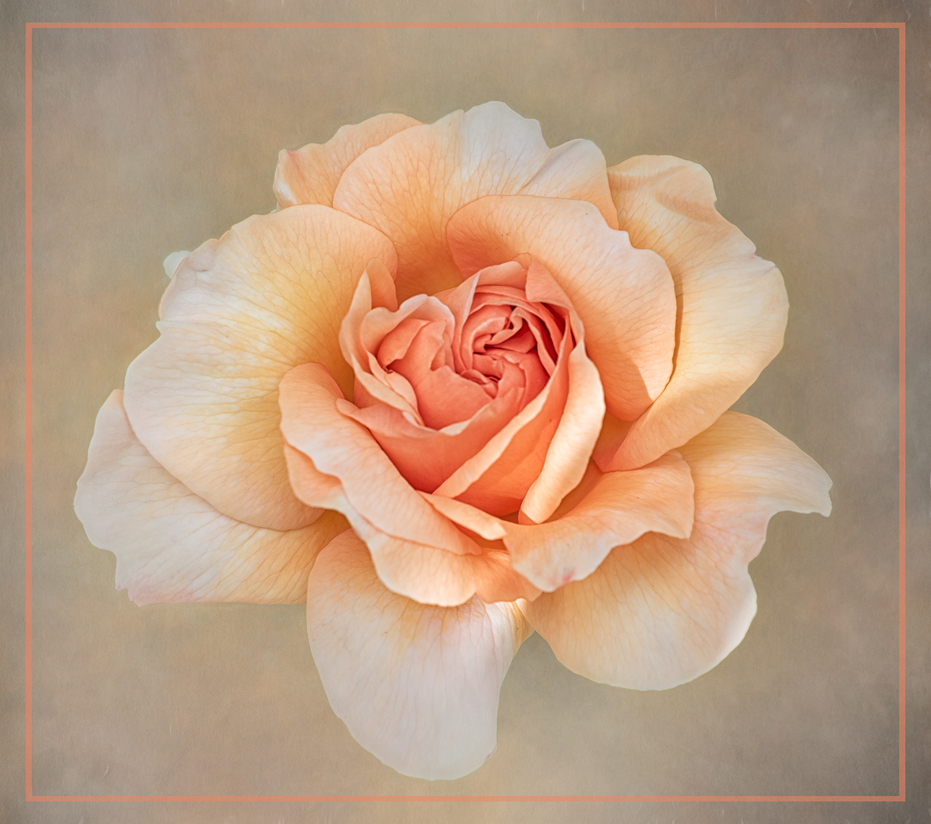
Hi Fred, a lovely piece of work. I think the flower is a bit close to left edge of the frame and perhaps I would trim a bit off the right (but not too much!)
|
Jun 26th |
| 24 |
Jun 23 |
Comment |
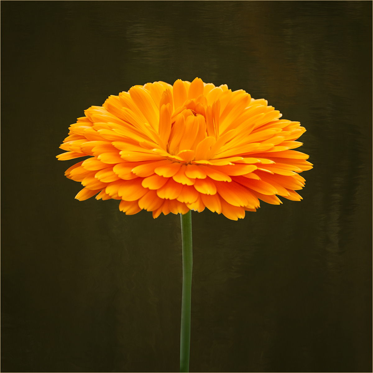
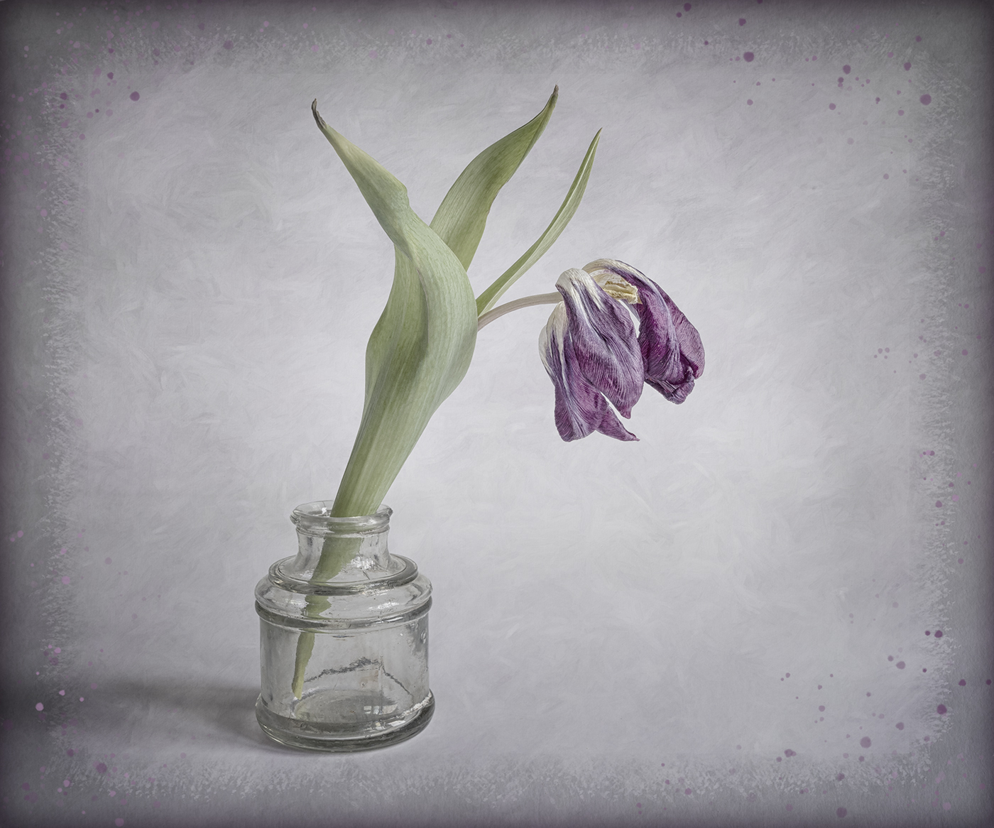
Hi Bev, an interesting flower. I too find your modification a bit over saturated and prefer the colours of the original but that's just my taste. |
Jun 26th |
5 comments - 5 replies for Group 24
|
| 77 |
Jun 23 |
Comment |
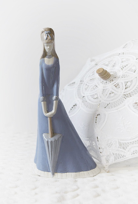
Hi Connie, a pleasant still life and I like the use of the umbrella in the background to give a link to the figure. There are some highlights on the figure which are a little distracting. I think the background could be lightened more so that the figure stands out and I would soften the transition on the vignette. I like Denise's idea to widen the figure to give more balance to the image. |
Jun 26th |
 |
| 77 |
Jun 23 |
Comment |
A very pleasing floral image and I like the soft painterly effect you have created. I think I would prefer the brightest area to be the part most sharply in focus as that is where the eye is drawn. |
Jun 26th |
| 77 |
Jun 23 |
Comment |
Hi Linda, I really like the composition of the image and I do think it works better flipped. Your post processing has certainly added more drama to the image. For me I think the area at the bottom of the steps looks too bright and some of the colours are beginning to look a bit artificial, particularly the water and the lights. |
Jun 26th |
| 77 |
Jun 23 |
Comment |
A beautiful image Michael, which is fine as is but I also like Linda's adjustments. |
Jun 24th |
| 77 |
Jun 23 |
Comment |
This is a very dramatic image and I like the vibrant colours. As the others have mentioned the halo is very distracting. Without a stroke line it is difficult to tell where the image ends and so for me the cape on the left looks too close to the edge of the frame (or it could just be disappearing into shadow). |
Jun 24th |
| 77 |
Jun 23 |
Comment |
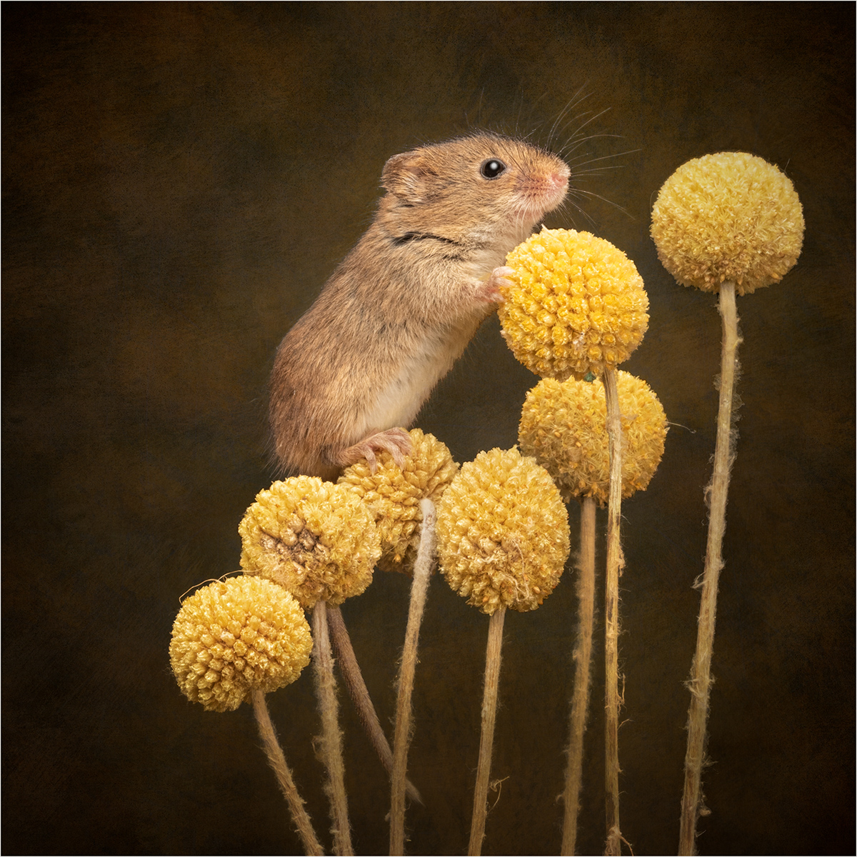
Hi Jodi, well done on getting an image in the showcase.
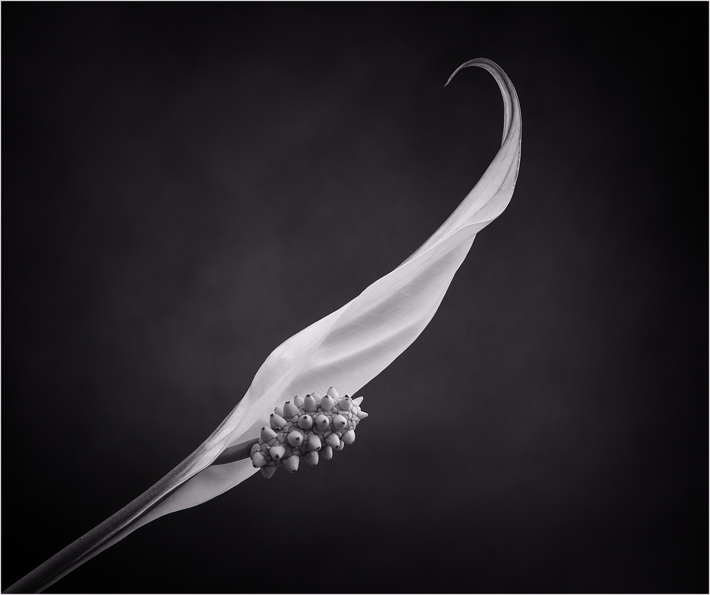
A lovely flower and I like your treatment of the background. I do not think you have blown the highlights, I think you can just pull back the highlights in Lightroom. I think the flower is a little low in the frame and it would be better to keep all the lower leaf in. You can do this with a slightly different crop. Unlike Michael I would prefer to keep the lower leaf as I think this provides a base for the flower. |
Jun 24th |
| 77 |
Jun 23 |
Reply |
Thanks Jodi. |
Jun 24th |
| 77 |
Jun 23 |
Reply |
Thanks Michael, yes one had to be quick to capture the mouse in a pose you liked as he didn't stay still for long! |
Jun 24th |
| 77 |
Jun 23 |
Reply |
Hi Linda, thanks for your feedback. My personal preference is to retain some of the texture in the background but I agree I could reduce the highlights a bit. |
Jun 24th |
6 comments - 3 replies for Group 77
|
11 comments - 8 replies Total
|