|
| Group |
Round |
C/R |
Comment |
Date |
Image |
| 24 |
May 23 |
Reply |
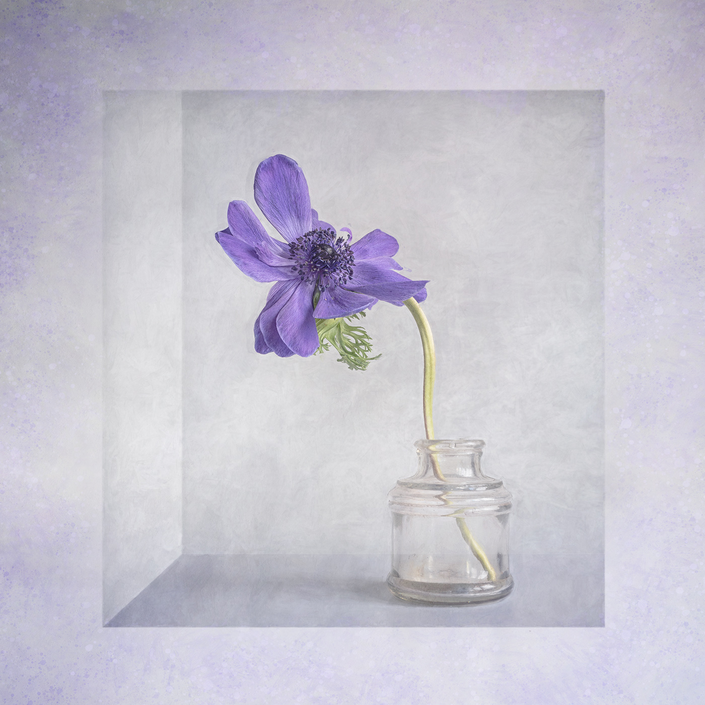
Hi Pinaki, the default setting for "Detail Extractor" when you open it is 25%. I never use more than 12% and for this kind of image I would reduce it down to 5-7%. |
May 12th |
| 24 |
May 23 |
Comment |
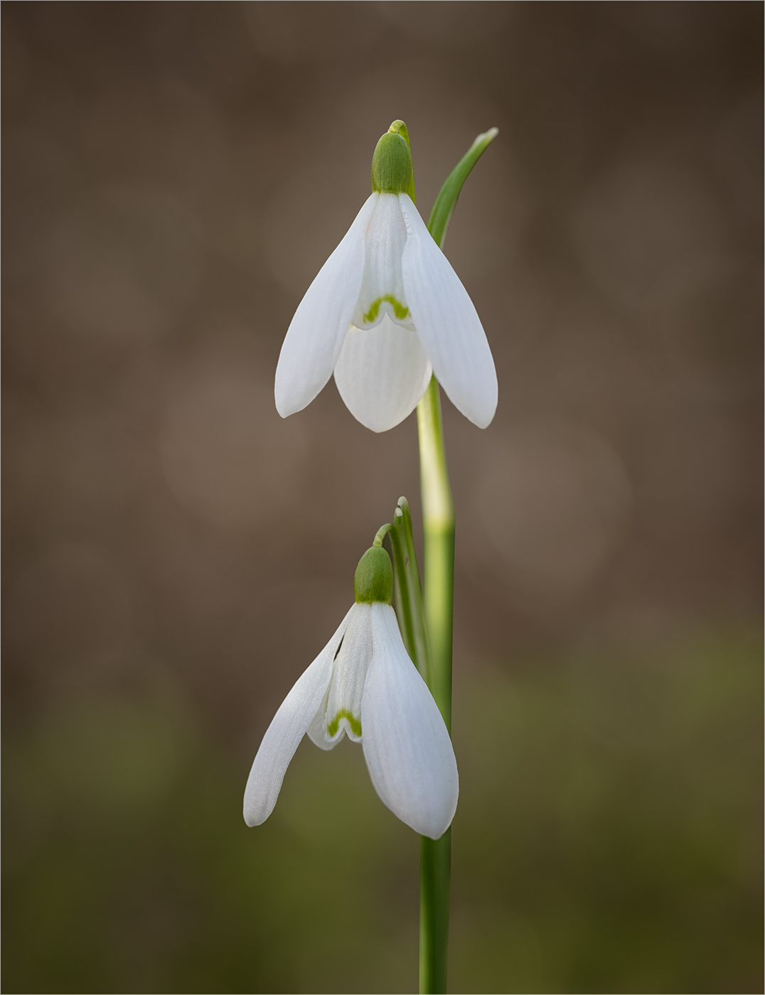
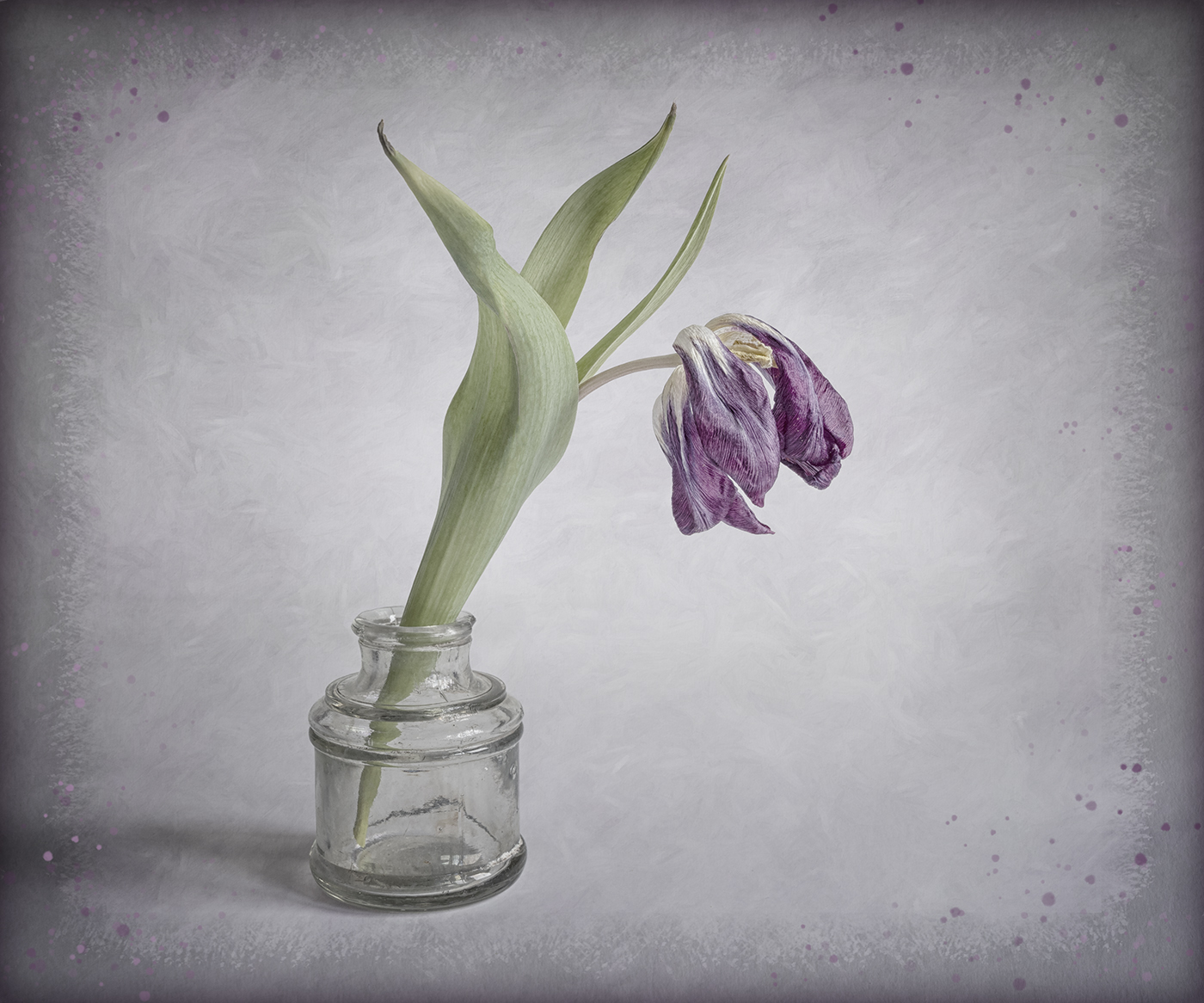
I like the composition of this, with the gentle curve up through the stem, flower and top leaf. I also really like the subdued tones which complement the slight softness of the image. |
May 12th |
| 24 |
May 23 |
Comment |
An interesting viewpoint to capture the cherry blossom. You do not mention what processing you used in Nik. It looks like you may have used "Detail Extractor" and I think this gives a harsh feel and needs to be reduced. |
May 12th |
| 24 |
May 23 |
Comment |
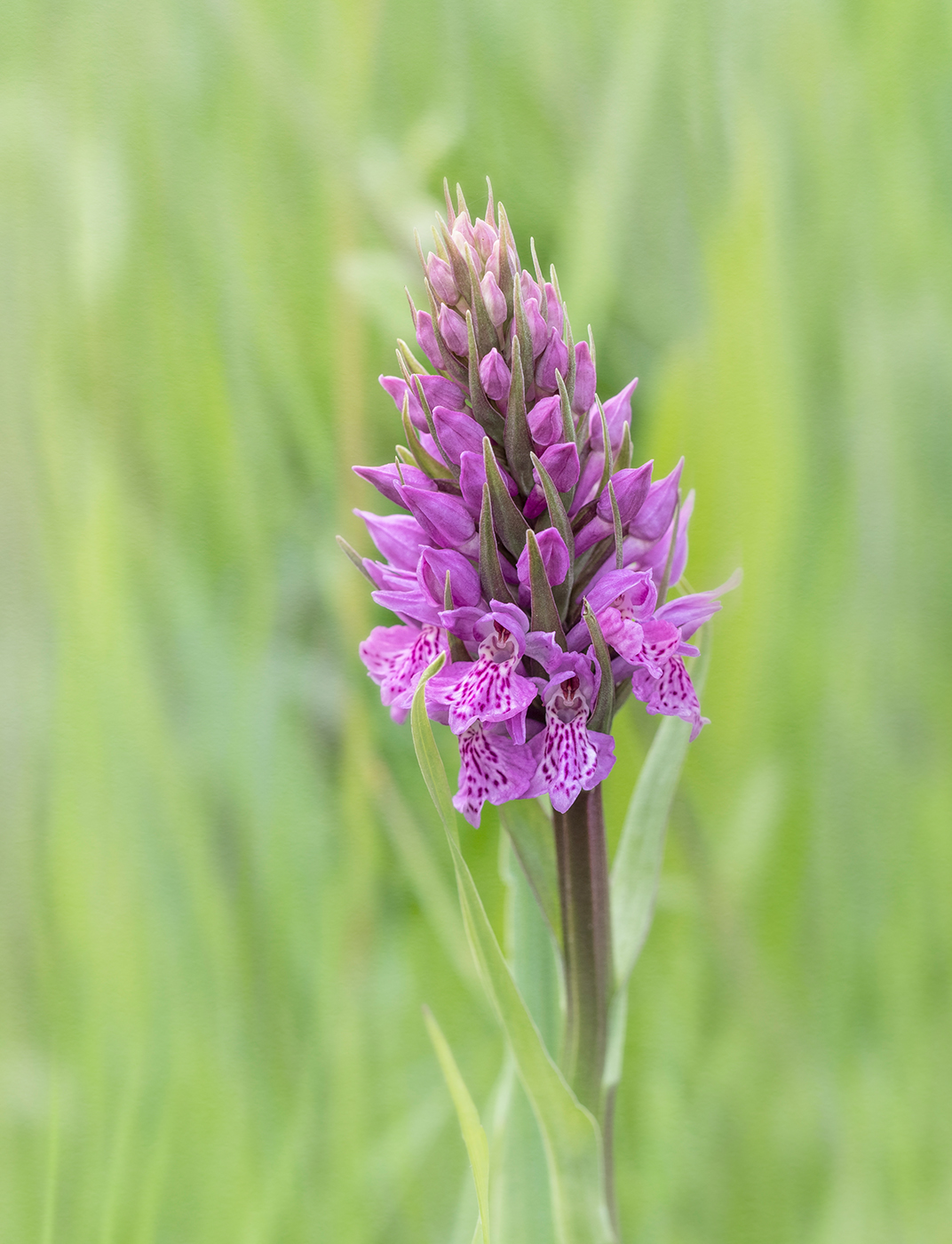
Nice detail on the stamens. I agree with Fred's comments. Also you may want to try a square crop to just concentrate on the flower. |
May 12th |
| 24 |
May 23 |
Comment |
A good idea to crop in and also remove the background distractions. Unfortunately the flowers are a little soft. Your point of focus appears to be the gap in the middle with the stems, which are further back than the flowers. |
May 12th |
| 24 |
May 23 |
Comment |
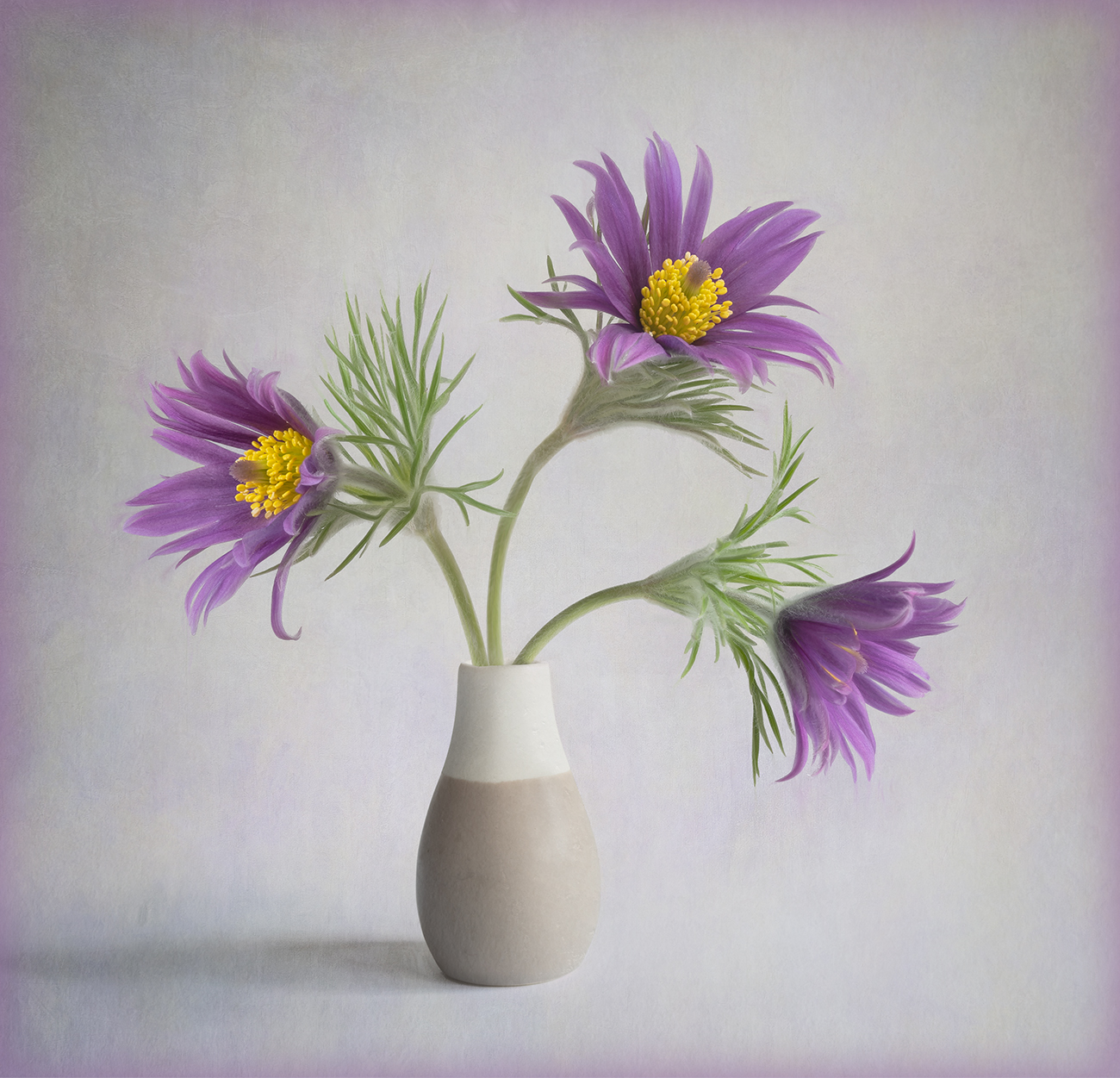
I like the nice diffuse background with the hint of another flower in the background. I am struggling to see any difference between the final image and the original. As Fred has mentioned there is something odd with the lower petals and leaves which is quite distracting. |
May 12th |
| 24 |
May 23 |
Comment |
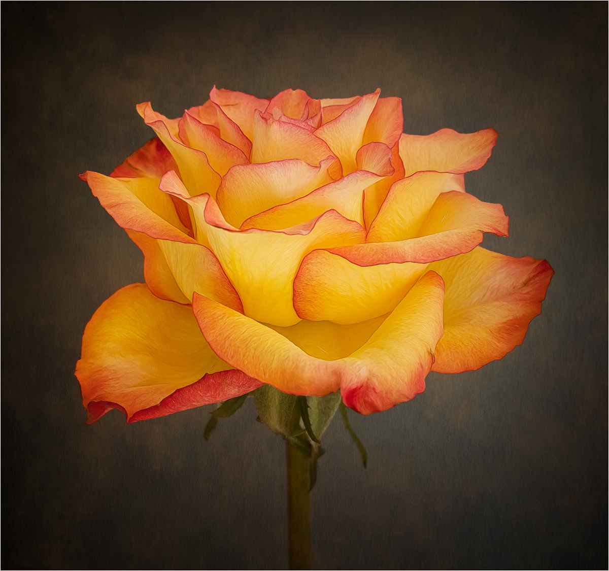
A lovely piece of work. I like how the colours in the texture complement those in the flower. For me I think I would have positioned the flower to the right (as in the original image) rather than the left. |
May 12th |
6 comments - 1 reply for Group 24
|
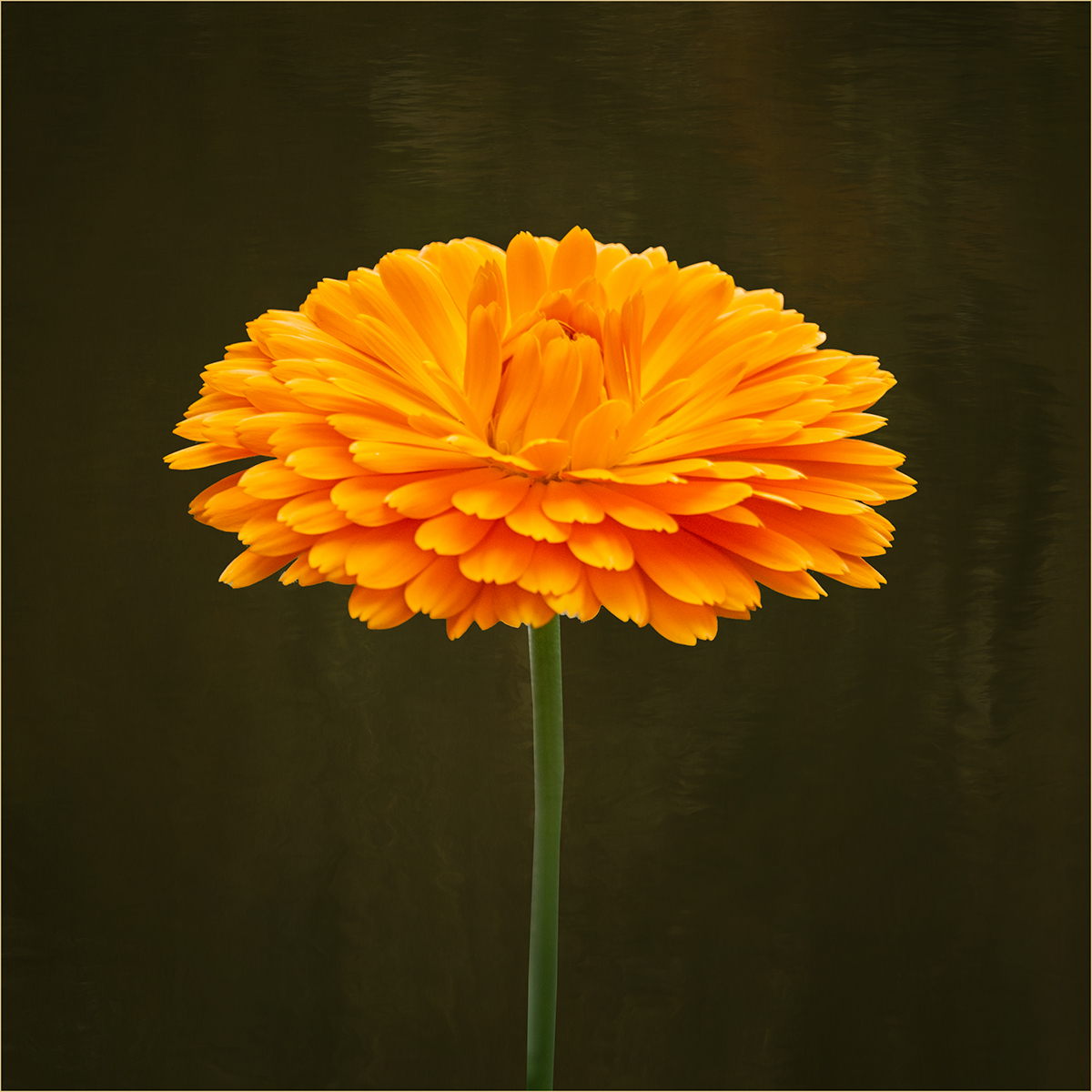
| 77 |
May 23 |
Comment |
A beautiful image of this lovely dahlia. My only suggestion for improvement would be to change the color of the frame to one that complements the flower. |
May 29th |
| 77 |
May 23 |
Comment |
Love the colours in the duck. Your treatment has produced an interesting abstract. I tried rotating your image 90 degrees clockwise and I prefer this, as I think it retains more of an essence of "duck"! |
May 29th |
| 77 |
May 23 |
Comment |
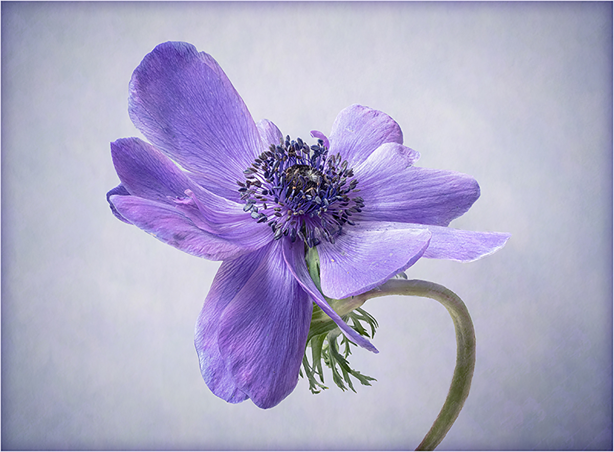
A great macro shot. I like the crop you have chosen and the placement of the stamens in the frame. I think I would be tempted to desaturate the pink in the background a little just to give more separation between the stamens and the background. |
May 29th |
| 77 |
May 23 |
Comment |
You have captured a great image which invokes the character of the man. I agree that he looks a bit washed out and more contrast is required to emphasise those wrinkles which are such a part of him. |
May 29th |
| 77 |
May 23 |
Comment |
A lovely image and well thought out. I really like the addition of the music. I think your reworked image with just the music on the keys is a little stronger. |
May 29th |
| 77 |
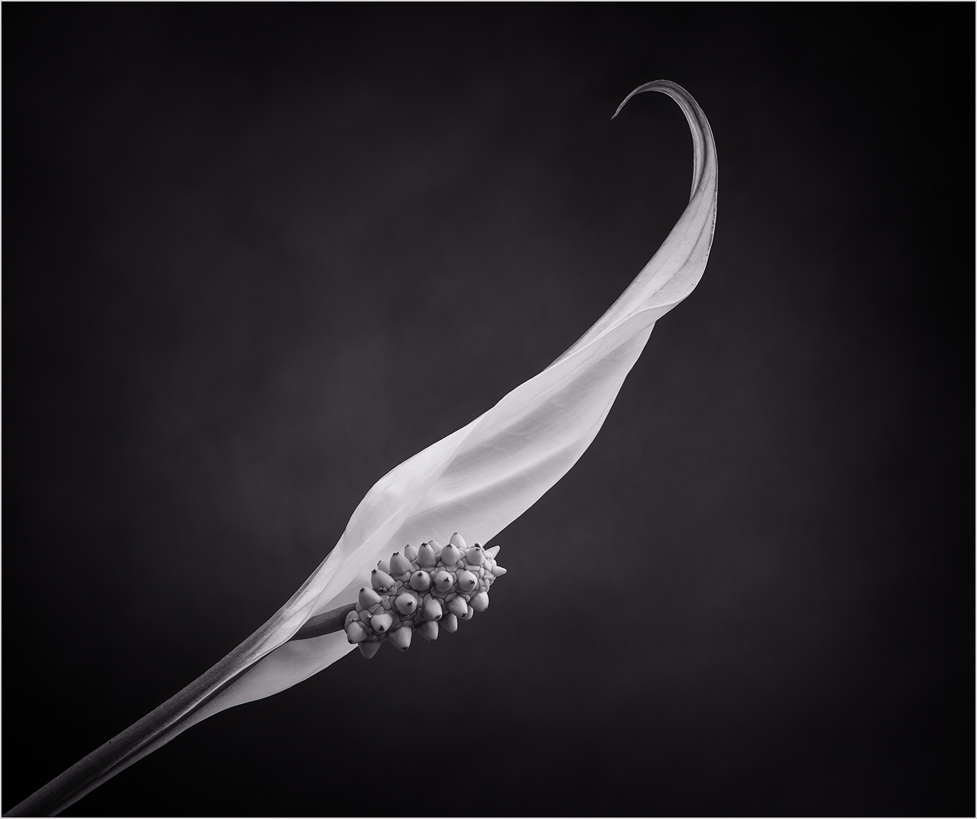
May 23 |
Comment |
I like the diagonal composition and the way the leaves frame the flower. It is quite an unusual flower and not one I have seen before. As Denise has mentioned the texture looks a little too heavy in places. I also find that the bright greens compete with the flower. Perhaps lighten and desaturate the surrounding leaves and background something like the attached. |
May 29th |
 |
| 77 |
May 23 |
Reply |
Thanks Michael I will give that a go. |
May 11th |
| 77 |
May 23 |
Reply |
I like what you have done here Denise, I think it does give the image a more harmonious feel. A colour to match the blues in the dress will work well and I'll certainly give that a try. |
May 10th |
6 comments - 2 replies for Group 77
|
12 comments - 3 replies Total
|