|
| Group |
Round |
C/R |
Comment |
Date |
Image |
| 24 |
Apr 23 |
Reply |
Yes, the red line complements the flower. |
Apr 25th |
| 24 |
Apr 23 |
Reply |
Thanks for your comment Bev. For me I don't think the flower needs more vibrance but that's just my taste. |
Apr 24th |
| 24 |
Apr 23 |
Comment |
An interesting crop and composition. Like Bev I find the background too distracting and feel it draws attention away from the flower and butterfly. |
Apr 24th |
| 24 |
Apr 23 |
Comment |
I really like the triangular composition of the image. As Bev has suggested I would remove some of the distractions on the water to keep the focus on the flowers. I would also try and lighten the underside of the lily pad in the bottom right, this should be possible on the RAW file. |
Apr 24th |
| 24 |
Apr 23 |
Comment |
Welcome to the group Yvonne. A very nice composition and as you say, very harsh light. I have no further suggestions for improvement above those already given. |
Apr 24th |
| 24 |
Apr 23 |
Comment |
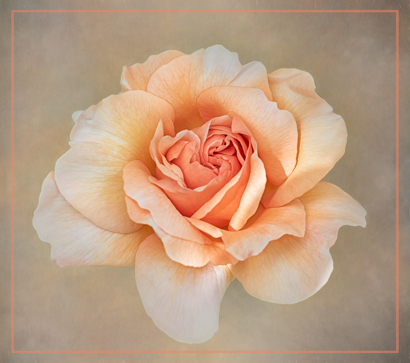
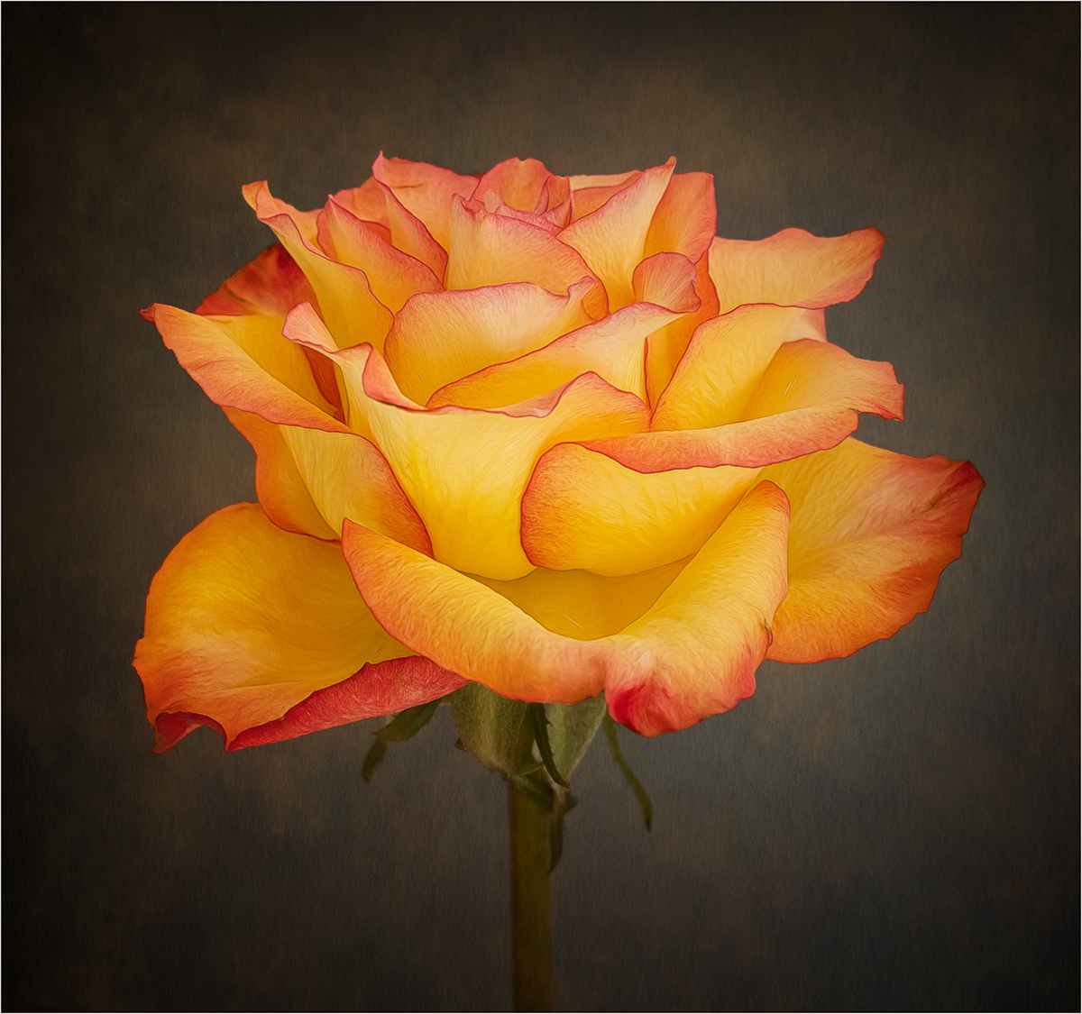
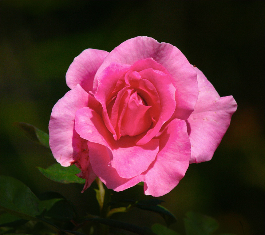
A lovely red rose well captured. My only suggestion would be to add a thin white stroke line to the image, just to delineate the image from a black background. |
Apr 24th |
| 24 |
Apr 23 |
Comment |
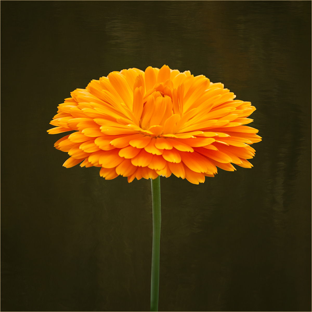
I like the shape of the petals and the colour of the flower. I find the bright anther in the background draws the eye away from the centre of the flower and would suggest darkening this down. |
Apr 24th |
| 24 |
Apr 23 |
Comment |
A very vibrant pink rose, for my taste I would tone it down a bit. To do this I have added a B&W layer, just on the flower, put it in lighten mode and at 50% opacity. I have then adjusted the shadows and highlights and darkened the background. Also I suggest removing the blemishes on the flower. Like the others I think the texture on the background is a bit heavy and detracts from the rose and the stem looks out of place. |
Apr 24th |
 |
6 comments - 2 replies for Group 24
|
| 77 |
Apr 23 |
Reply |
Hi Jodi, I would create a new blank layer in PS. Select a soft round brush set at about 15% opacity. Select the color adjacent to the highlight then just gradually paint over the highlight to tone it down. |
Apr 26th |
| 77 |
Apr 23 |
Reply |
Thank you Michael |
Apr 24th |
| 77 |
Apr 23 |
Reply |
Thanks Jodi, I agree that the people give a sense of scale. I might just add in a single figure. |
Apr 24th |
| 77 |
Apr 23 |
Comment |
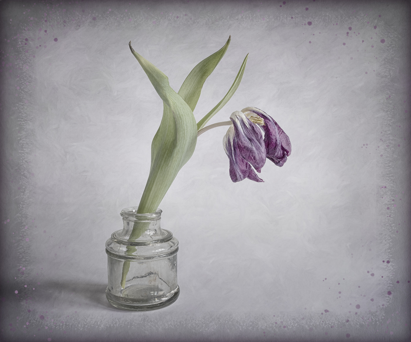
A beautiful image Denise. I agree with Linda about removing the white areas on the vase. To try and ground the vase a bit more you could just slightly darken across the bottom of the image. I would also be tempted to lighten the flower just a little more. |
Apr 24th |
| 77 |
Apr 23 |
Comment |
Hi Linda, I think your reworked image works really well. Removing the reed in front of the bird's face would have been my only suggestion for improvement and you've done it! |
Apr 24th |
| 77 |
Apr 23 |
Comment |
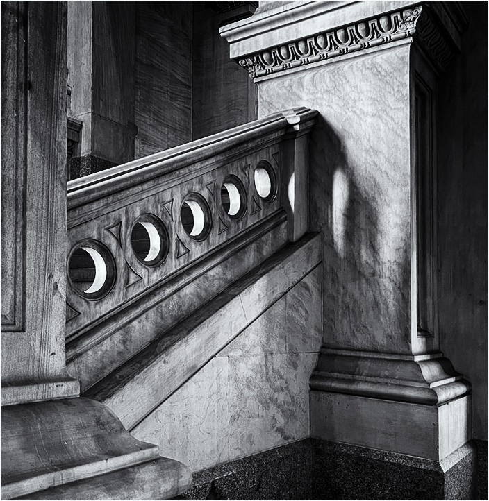
I love the shapes and textures in this image and it suits the conversion to mono. I would agree that some of the shadow areas need lifting a bit. I wondered about a slightly different crop to keep the shape of the pillar on the right, see image. I converted to B&W using Nik Silver Efex. |
Apr 24th |
 |
| 77 |
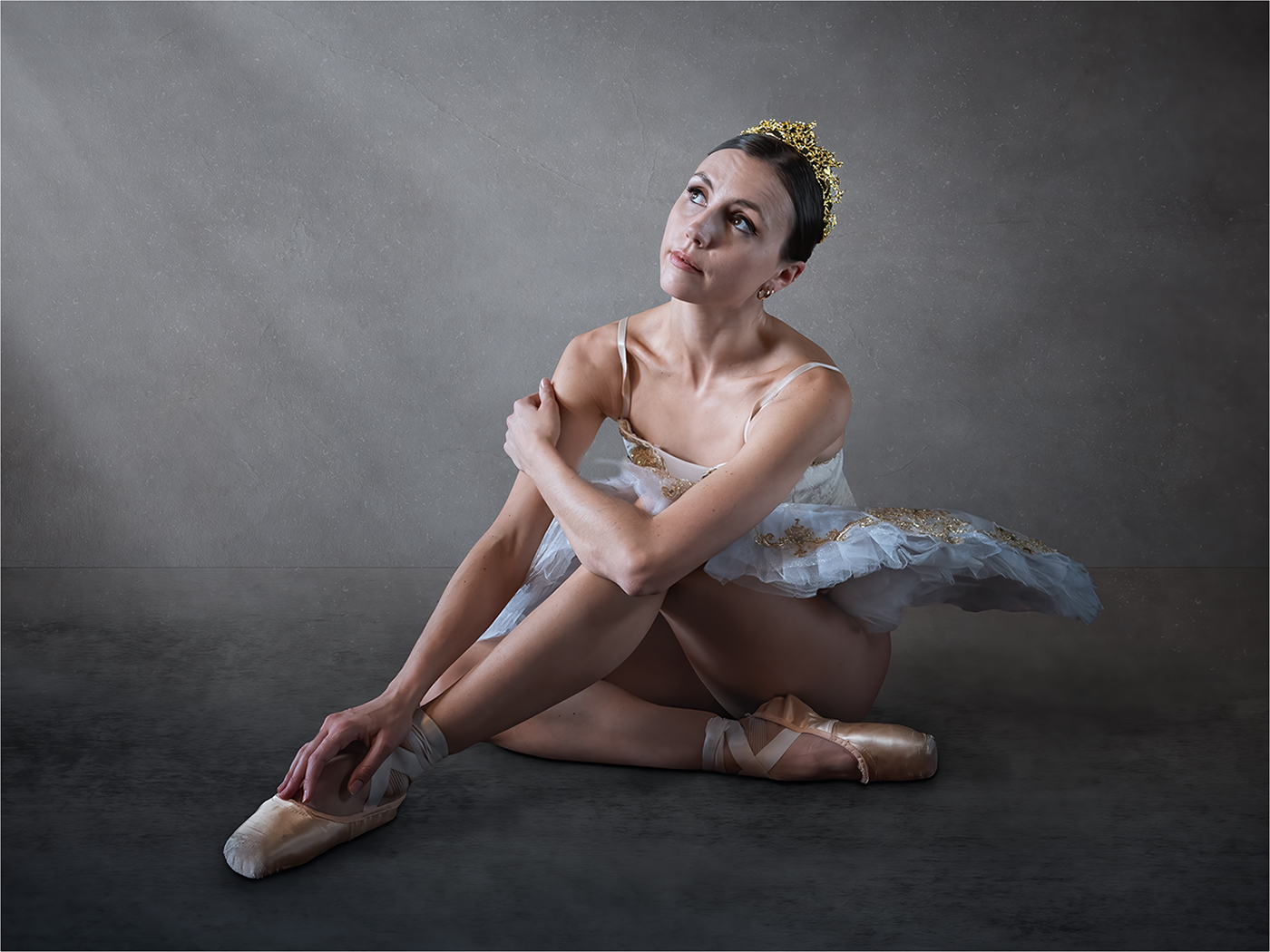
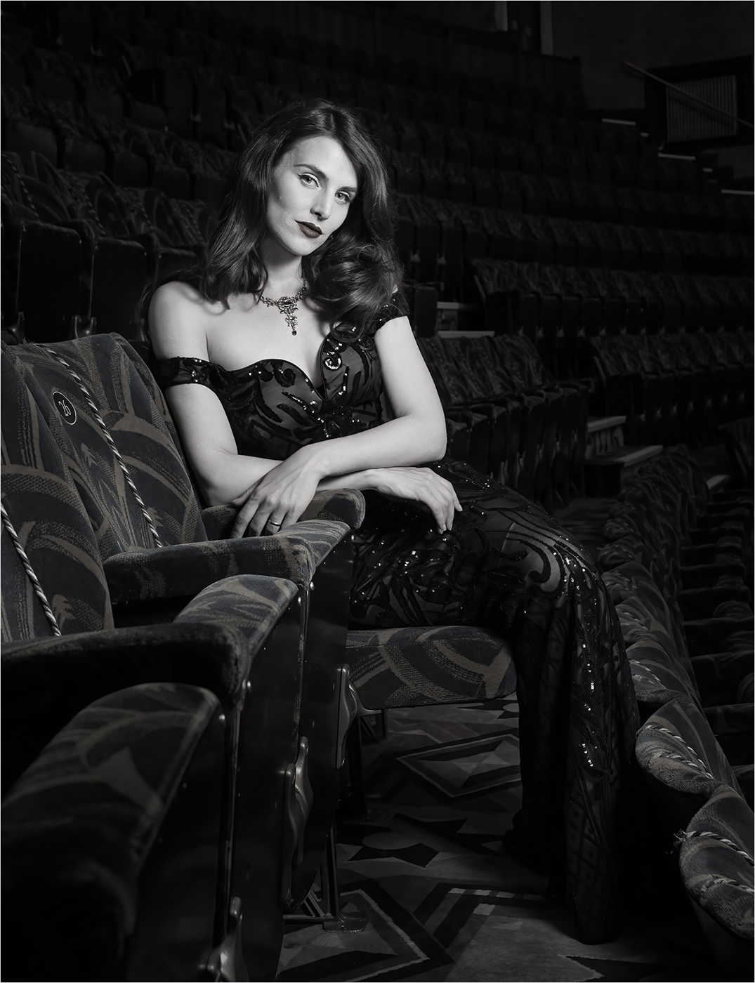
Apr 23 |
Comment |
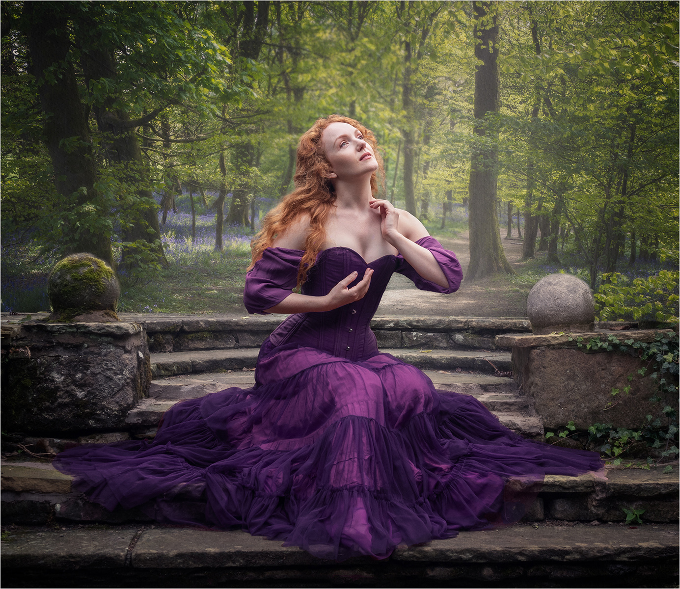
A very beautiful portrait. My only suggestion for improvement is to tone down the highlights on her face and chest. |
Apr 24th |
| 77 |
Apr 23 |
Comment |
A nice capture and your processing gives the image a lovely ethereal feel. I would tone down the highlights on the car, especially under the wing mirror on the left, as these draw the eye away from the boquet. |
Apr 24th |
5 comments - 3 replies for Group 77
|
11 comments - 5 replies Total
|