|
| Group |
Round |
C/R |
Comment |
Date |
Image |
| 24 |
Jan 23 |
Reply |
Thanks Lynne |
Jan 18th |
| 24 |
Jan 23 |
Reply |
Thanks Fred |
Jan 18th |
| 24 |
Jan 23 |
Reply |
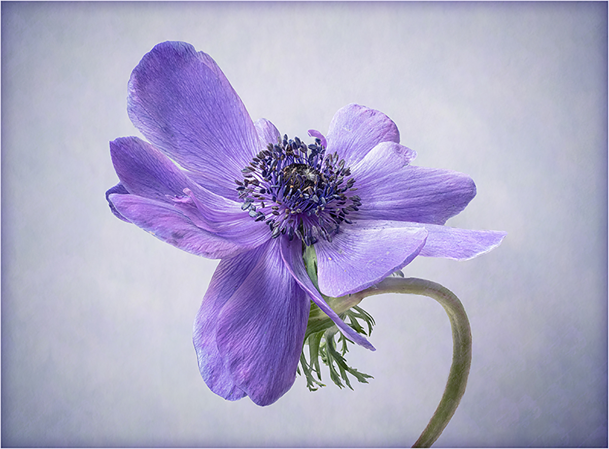
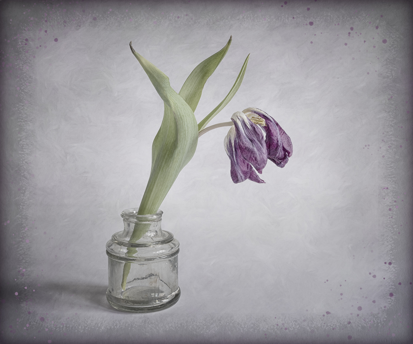
Thanks Bev. I agree the flower could stand a bit more "punch"! |
Jan 18th |
| 24 |
Jan 23 |
Comment |
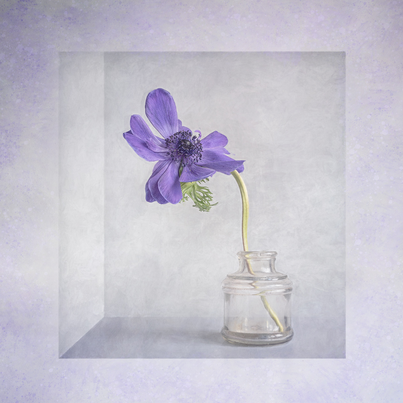
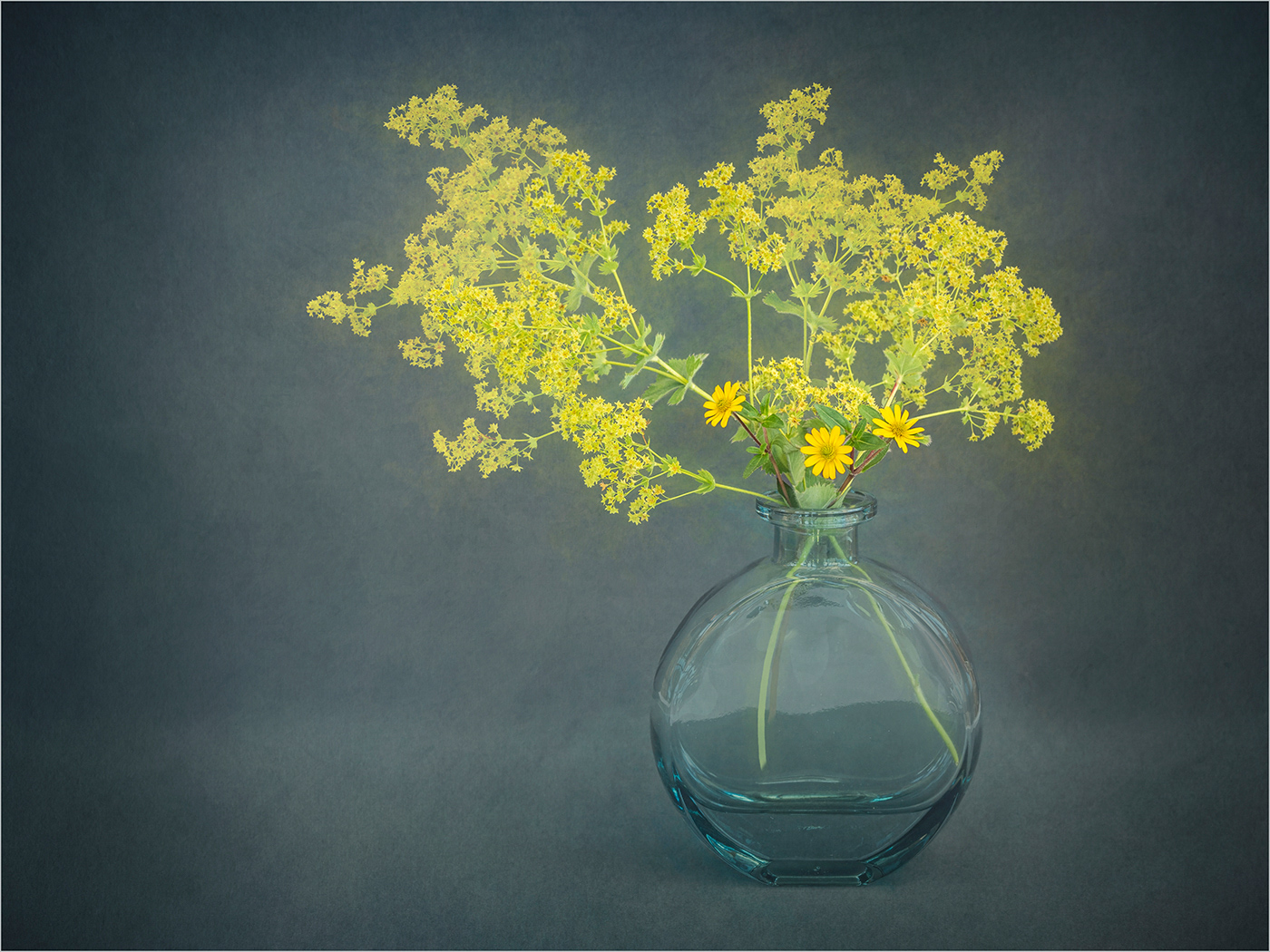
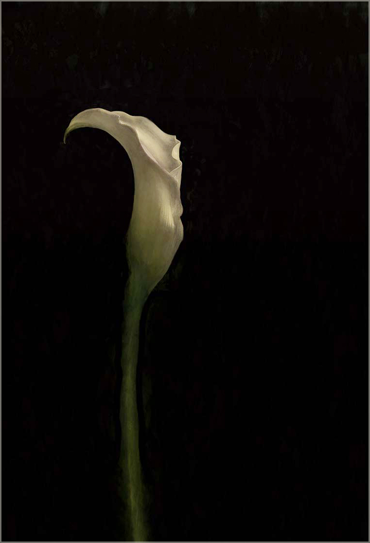
A great low key minimalist image. I did wonder if you could crop in little and also brighten the flower a touch, as shown. |
Jan 18th |
 |
| 24 |
Jan 23 |
Comment |
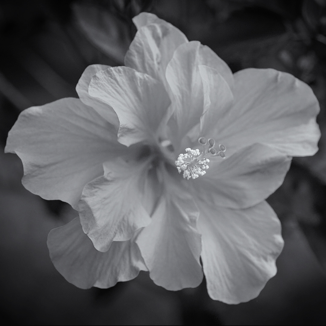
A beautiful flower well captured. The mono conversion really highlights the anthers. However I find that the tone of the flower is too similar to the background and I would prefer a bit more separation. I ran the original through Silver Efex and used a red filter for the background and darkenened this a little. I then used a yellow filter on the flower. No textures or blurring applied! |
Jan 18th |
 |
| 24 |
Jan 23 |
Comment |
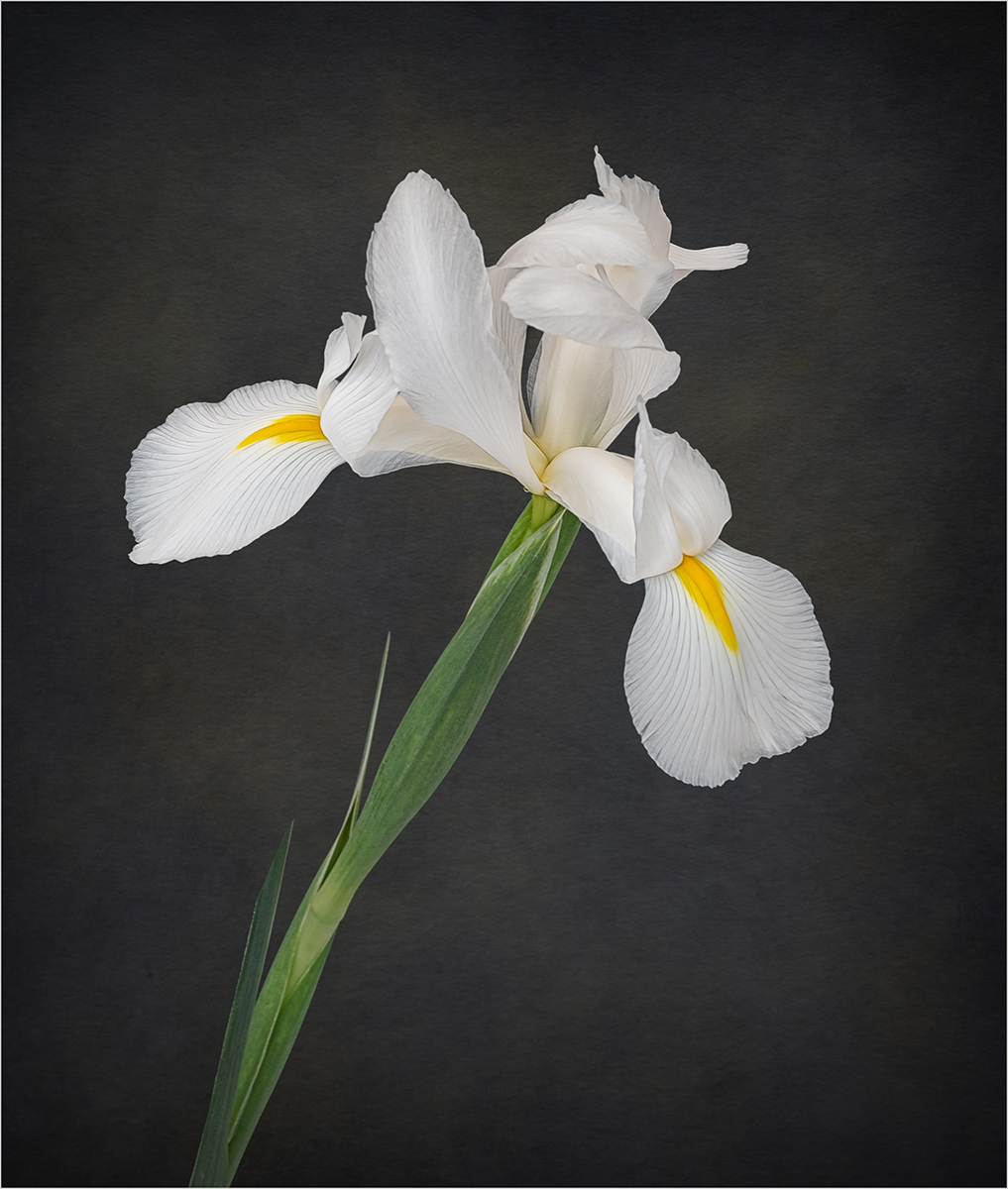
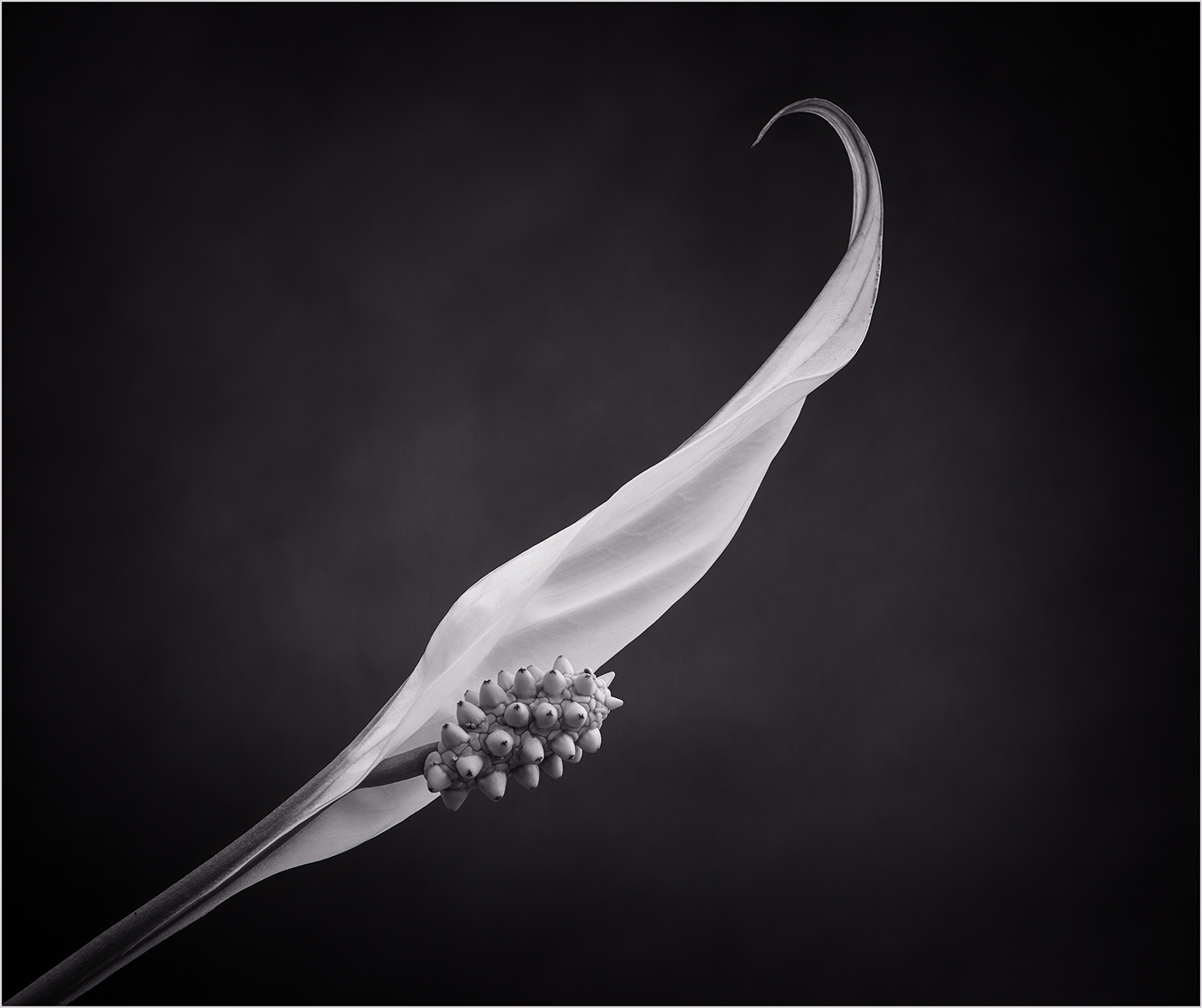
An interesting ICM image. I agree with Lance that a tighter crop works better. Same question as the others, where is the bird, I too struggle to see it. |
Jan 18th |
| 24 |
Jan 23 |
Comment |
Hi Tom, as Fred has commented the plant looks obviously cut out and the chosen background does not seem to fit with the flower. The colours in Bev's background are a better match. For me the highlights on the leaves are distracting and I would go for a squarer crop to remove the pot from the image. |
Jan 18th |
| 24 |
Jan 23 |
Comment |
A lovely macro shot of this flower. I think if you tone down the bright area in the background on the left the flower would stand out more. I do find the bottom blurry anther a little distracting. |
Jan 18th |
| 24 |
Jan 23 |
Comment |
A pleasant mono image with a full range of tones. I think the leaves at the bottom provide a good base for the flowers and also provide a balance to the image. Personally I am not a fan of plain black backgrounds and prefer a little bit of texture or something but that's just my taste. |
Jan 18th |
6 comments - 3 replies for Group 24
|
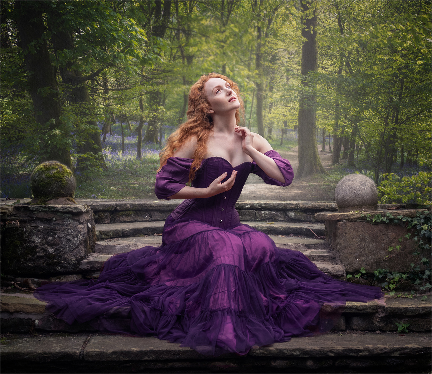
| 77 |
Jan 23 |
Reply |
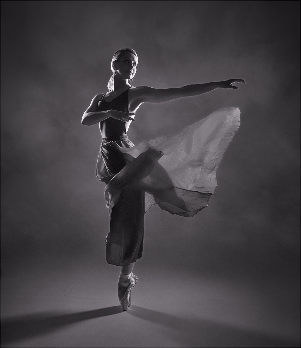
Thanks Witta. My preference is to keep the balls but I will darken the one on the right. I will lighten the bottom of the dress a touch. |
Jan 19th |
| 77 |
Jan 23 |
Reply |
Thanks Denise, I might look at a version without the balls but I think they help frame the model. |
Jan 19th |
| 77 |
Jan 23 |
Reply |
Thanks Linda. I agree that I need to reduce the highlights on the stone work, especially the ball on the right. |
Jan 19th |
| 77 |
Jan 23 |
Reply |
Thanks Michael. |
Jan 19th |
| 77 |
Jan 23 |
Reply |
Thanks Mary. I have not used the blend dialogue with LUTs, so will think about using that in future. |
Jan 19th |
| 77 |
Jan 23 |
Reply |
Thanks Connie. You can change just the colour of the dress by
use of the mask on the adjustment layer. |
Jan 19th |
| 77 |
Jan 23 |
Comment |
In addition to what has already been said about the birds I would suggest that you don't fill the width of the image but leave some room for them to fly into. |
Jan 19th |
| 77 |
Jan 23 |
Comment |
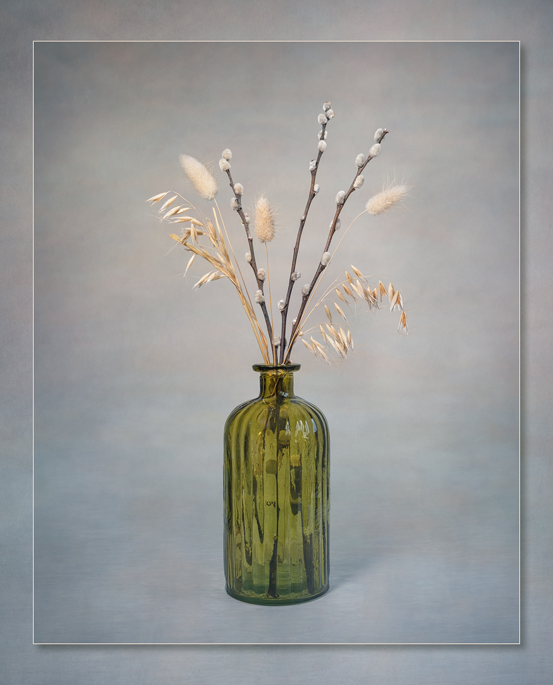
I really like the tones and textures of the image but do feel it is lacking something. Do you have any wider shots of the location of the wheel that you could add as an overlay to add to the story? |
Jan 19th |
| 77 |
Jan 23 |
Comment |
It is always going to be difficult to achieve a high key image when starting with a dark background. An alternative would be to keep a dark background but the end result is obviously very different. In the attached I copied the trees on the left and stretched them out to fill the background |
Jan 19th |
 |
| 77 |
Jan 23 |
Comment |
I think your treatment of the image has worked really well in giving the scene an aged feel. I agree with Michael and would suggest removing the bookcase in the background if you can. |
Jan 19th |
| 77 |
Jan 23 |
Comment |
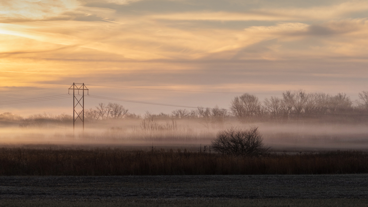
Hi Denise, I prefer the original colour version and like the soft pastel colours in the sky. In the mono version my eye is drawn to the bright area of sky on the left rather than the mist in the field. I think there is too much dark foreground as others have said, this could be removed with a more panoramic crop. I have made a few adjustments in the attached with curve layers, lightening the lower part of the iamge, darkening the bright area of sky and adjusting the contrast in the centre section to bring out the mist a bit more. |
Jan 19th |
 |
| 77 |
Jan 23 |
Comment |
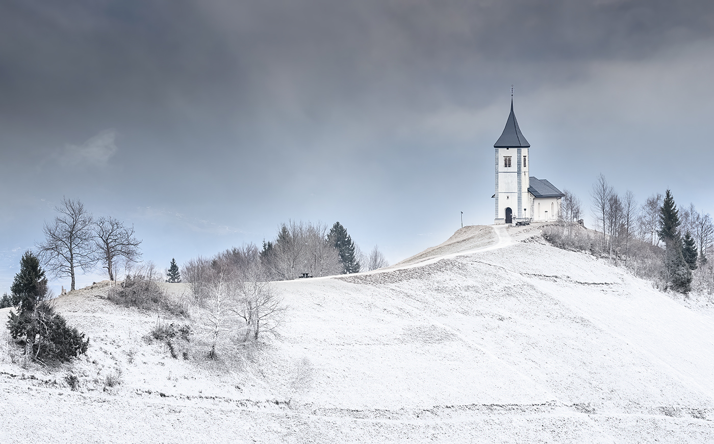
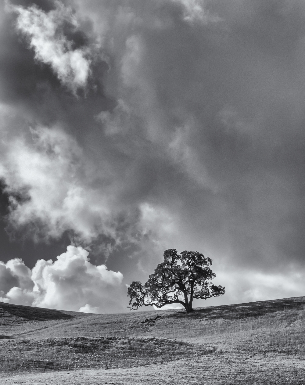
A great image which suits the mono conversion. I think the emphasis on the sky is the right way to go. Unlike the others I think you could perhaps just crop a bit off the top and bottom, as shown. |
Jan 19th |
 |
6 comments - 6 replies for Group 77
|
12 comments - 9 replies Total
|