|
| Group |
Round |
C/R |
Comment |
Date |
Image |
| 24 |
Nov 22 |
Comment |
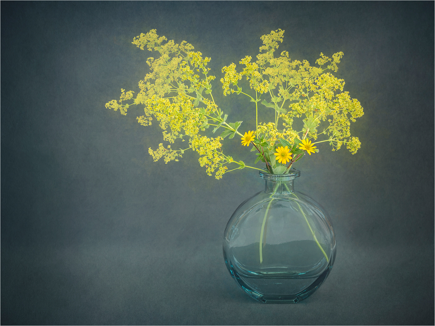
I agree with Lance on this, in that I do not think it is as effective as some of your previous images. I find the bright areas on the right of the image distracting, there are also distracting elements in the bottom left. I wonder if it might have worked better if you had just worked with the flowers in the centre. |
Nov 21st |
| 24 |
Nov 22 |
Comment |
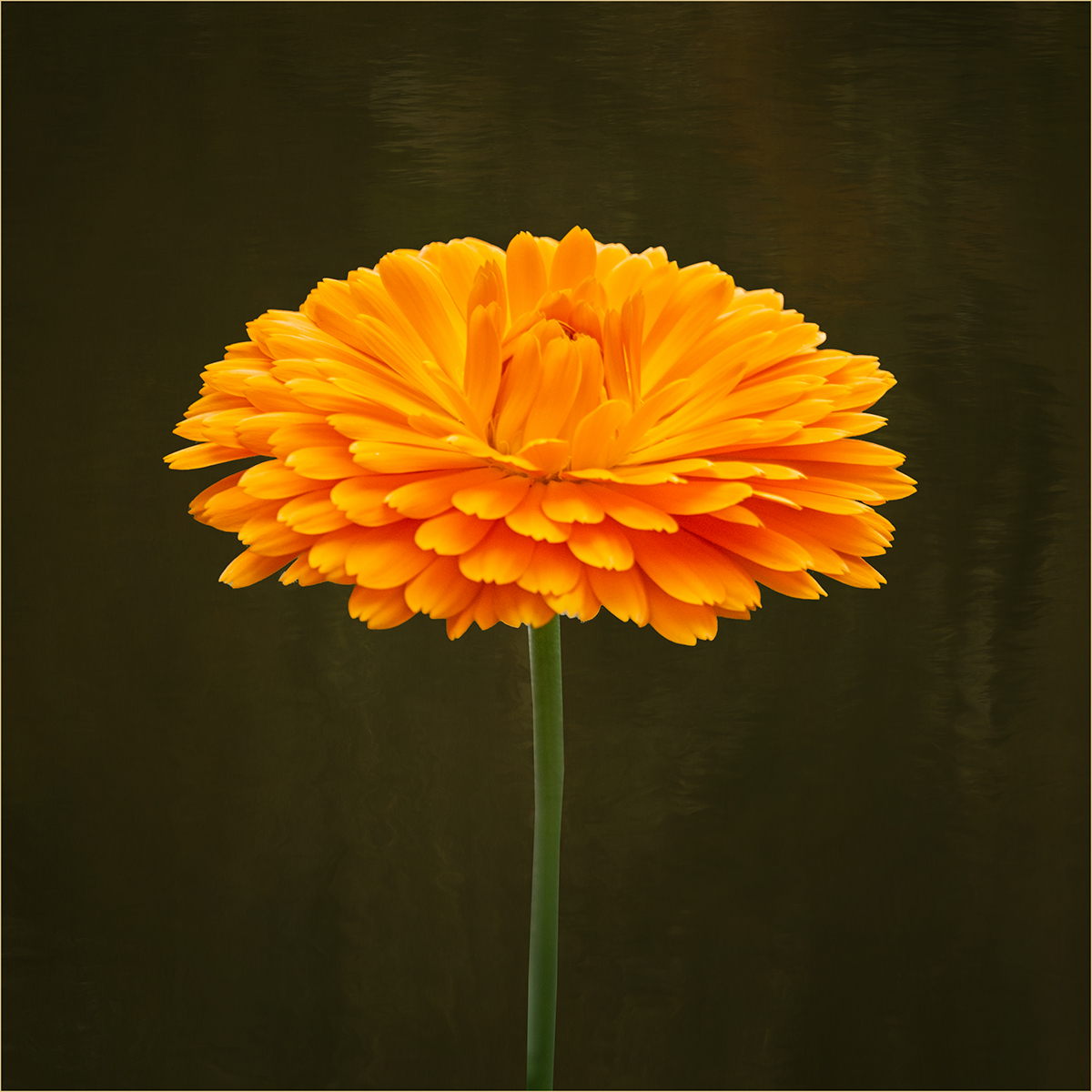
A very vibrant group of flowers. The yellow flowers really stand out from the rest and I think I would prefer all of these to be sharp. |
Nov 21st |
| 24 |
Nov 22 |
Comment |
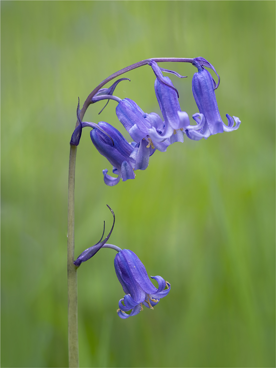
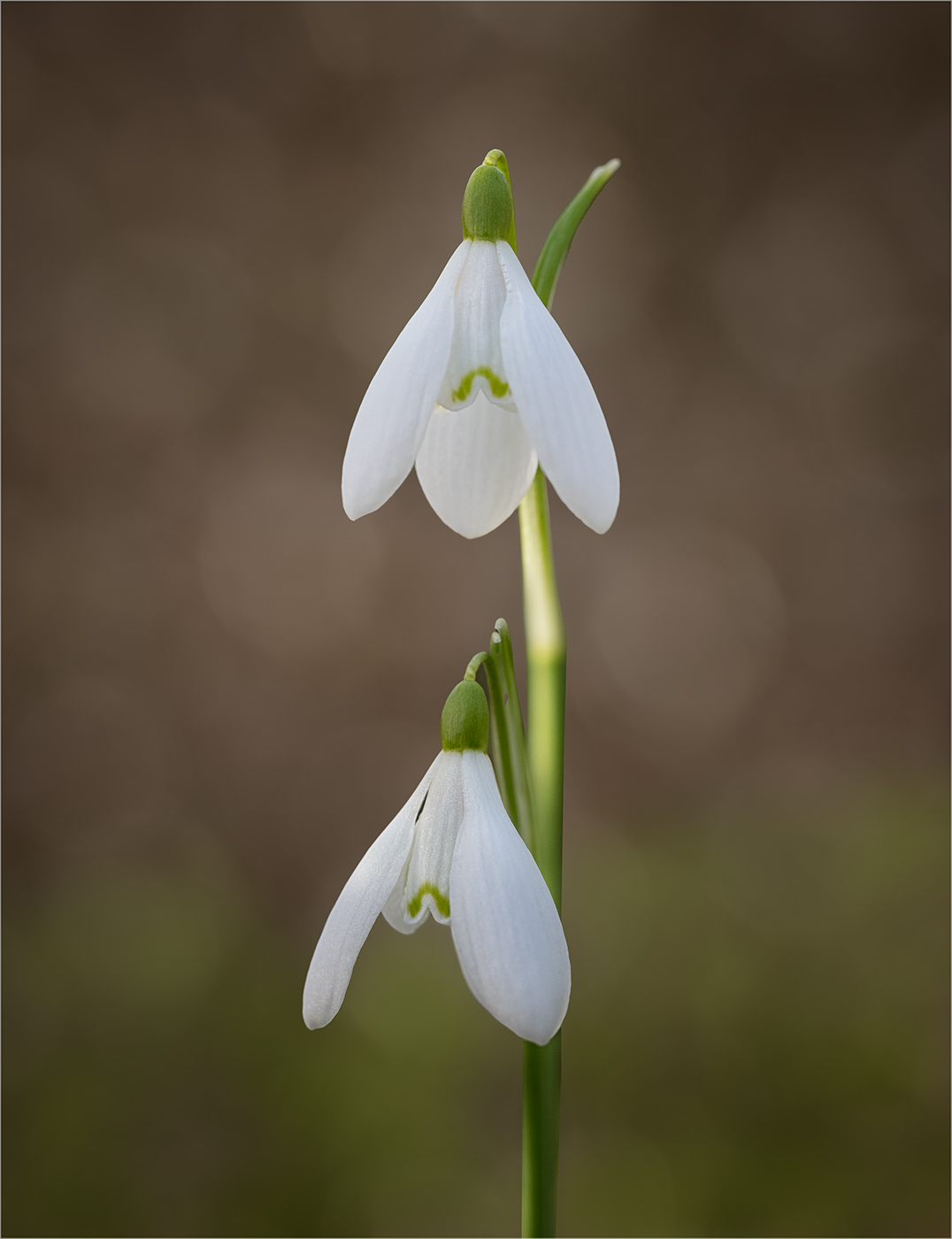
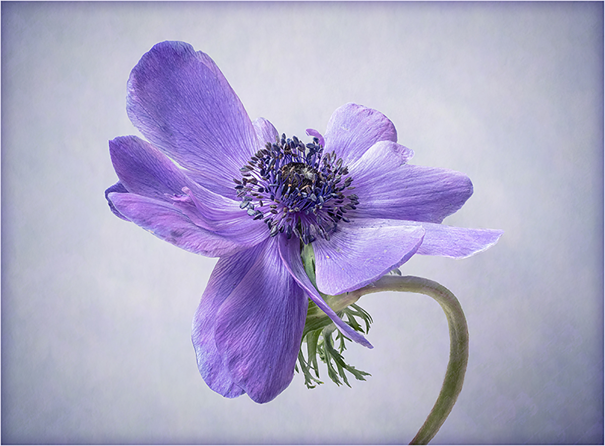
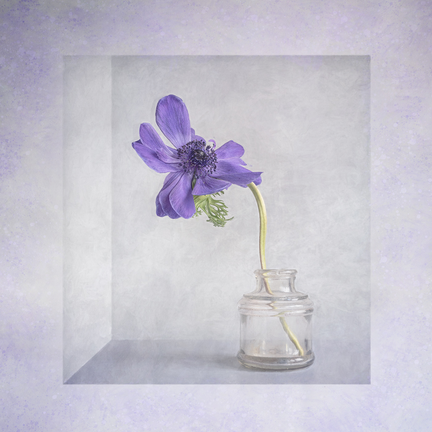
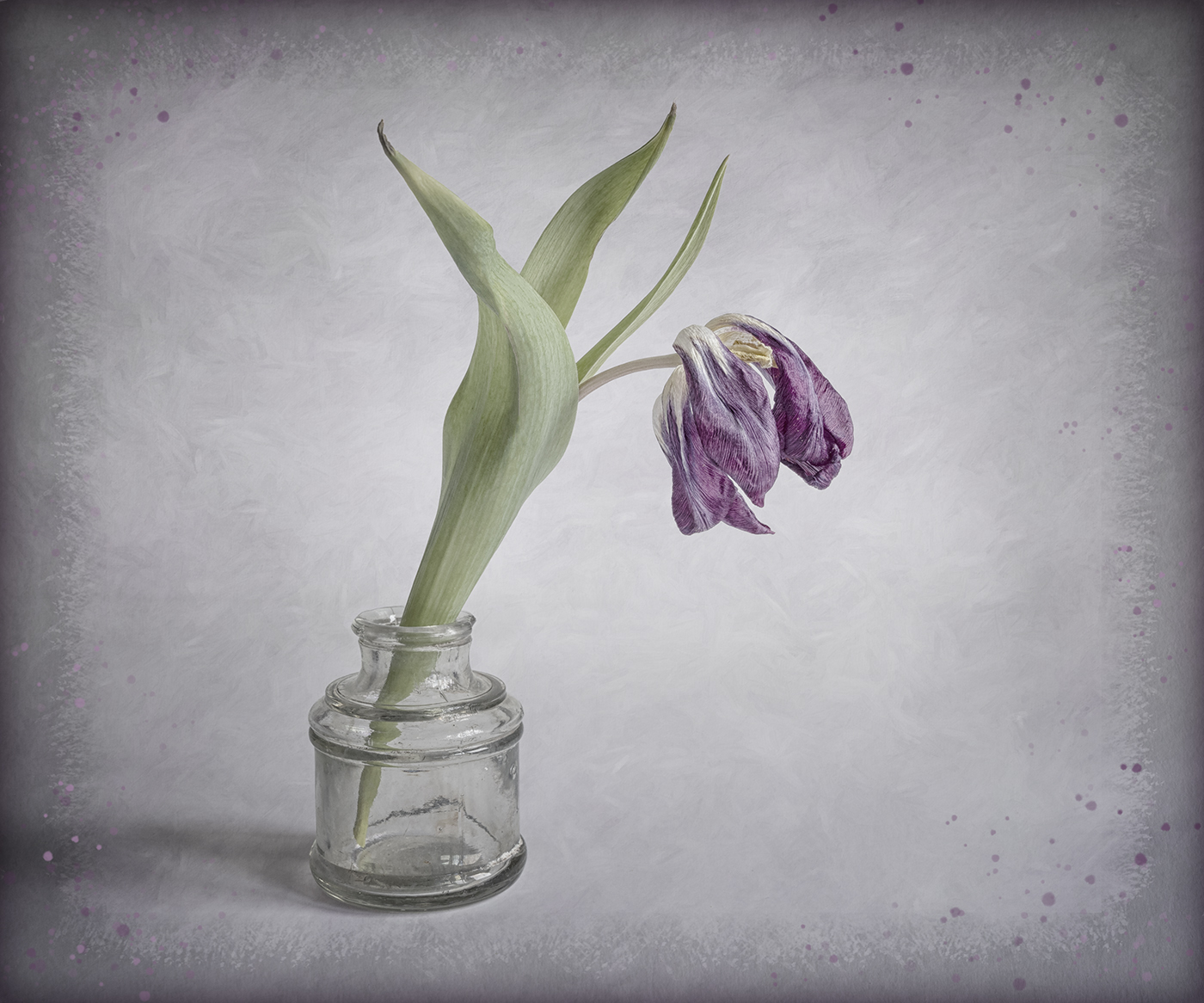
Hi Tom, A lovely flower well captured. Like the others I prefer a darker background to make the flower stand out more. I would remove the two leaves protruding from the bottom and would prefer to have the full leaves on either side. The top petal is close to the top of the frame, so you might want to add a bit of canvas just to give it a bit of space. An alternative presentation could be removing the leaves and going for a tighter crop. |
Nov 21st |
 |
| 24 |
Nov 22 |
Comment |
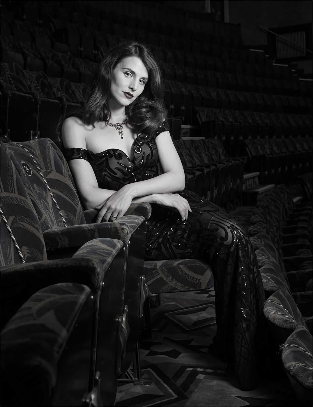
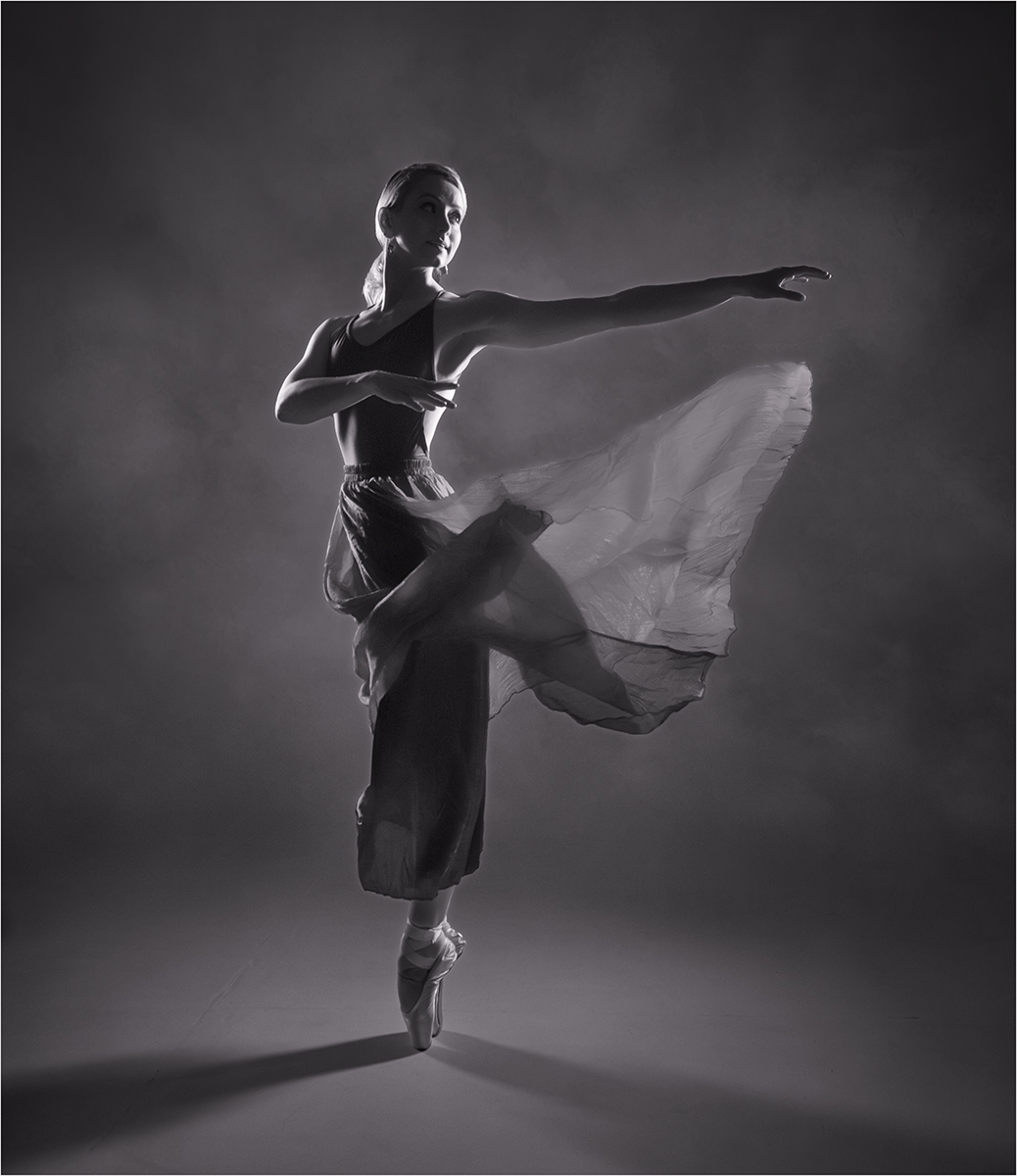
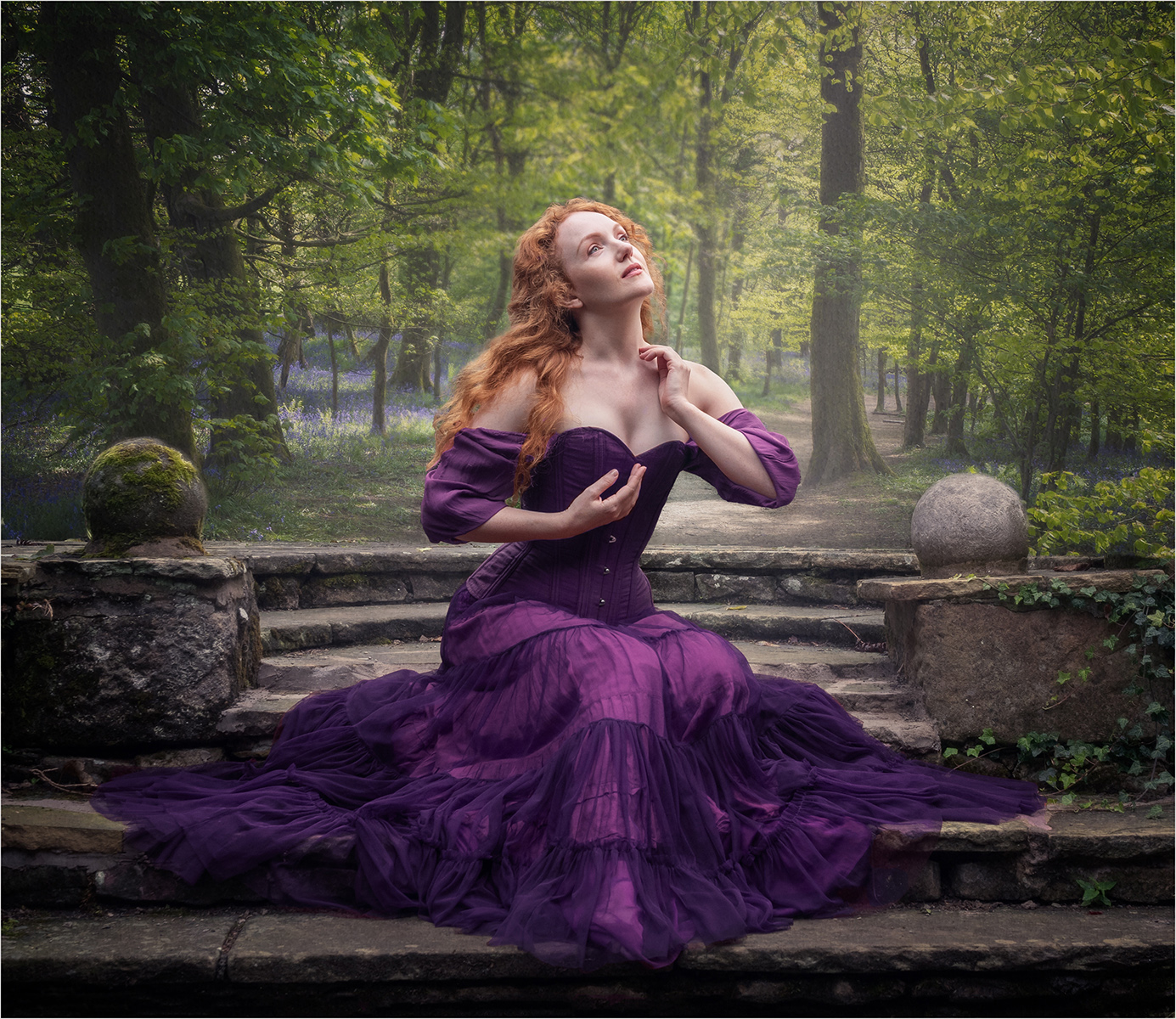
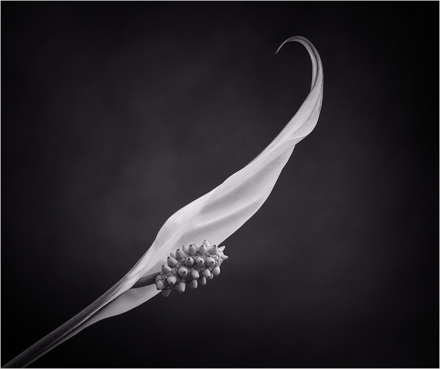
Hi Lance, A nice image with a dreamy ethereal feel. I do not mind that most of the flower is not sharply in focus but for me I would prefer the bottom flower to be the part in sharp focus. Just my personal preference. |
Nov 21st |
| 24 |
Nov 22 |
Comment |
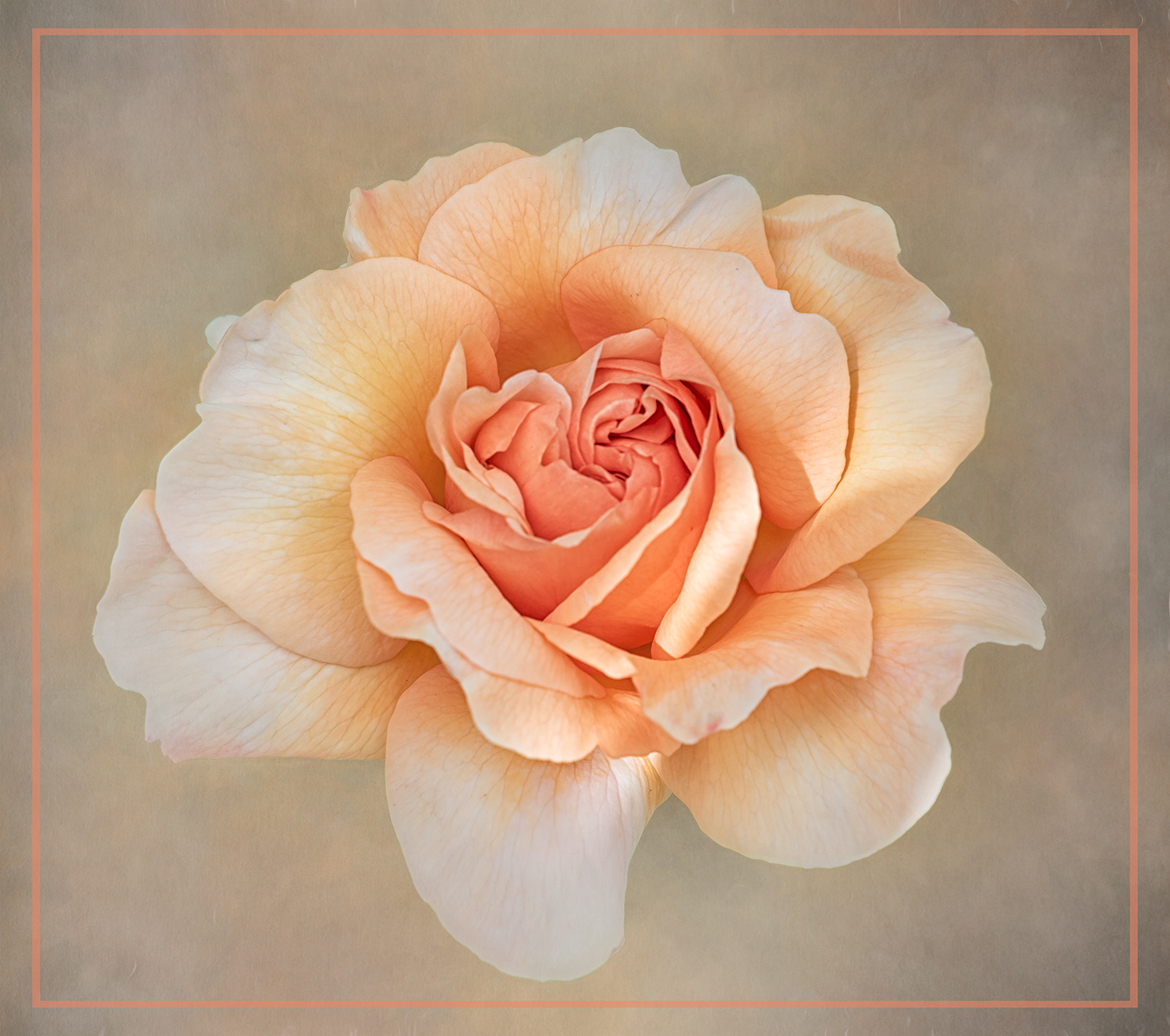
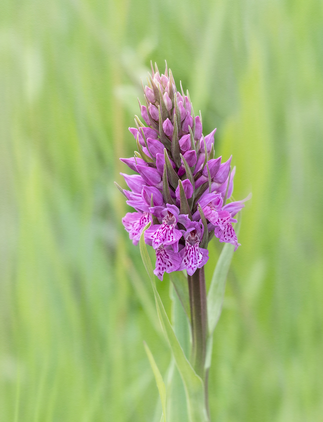
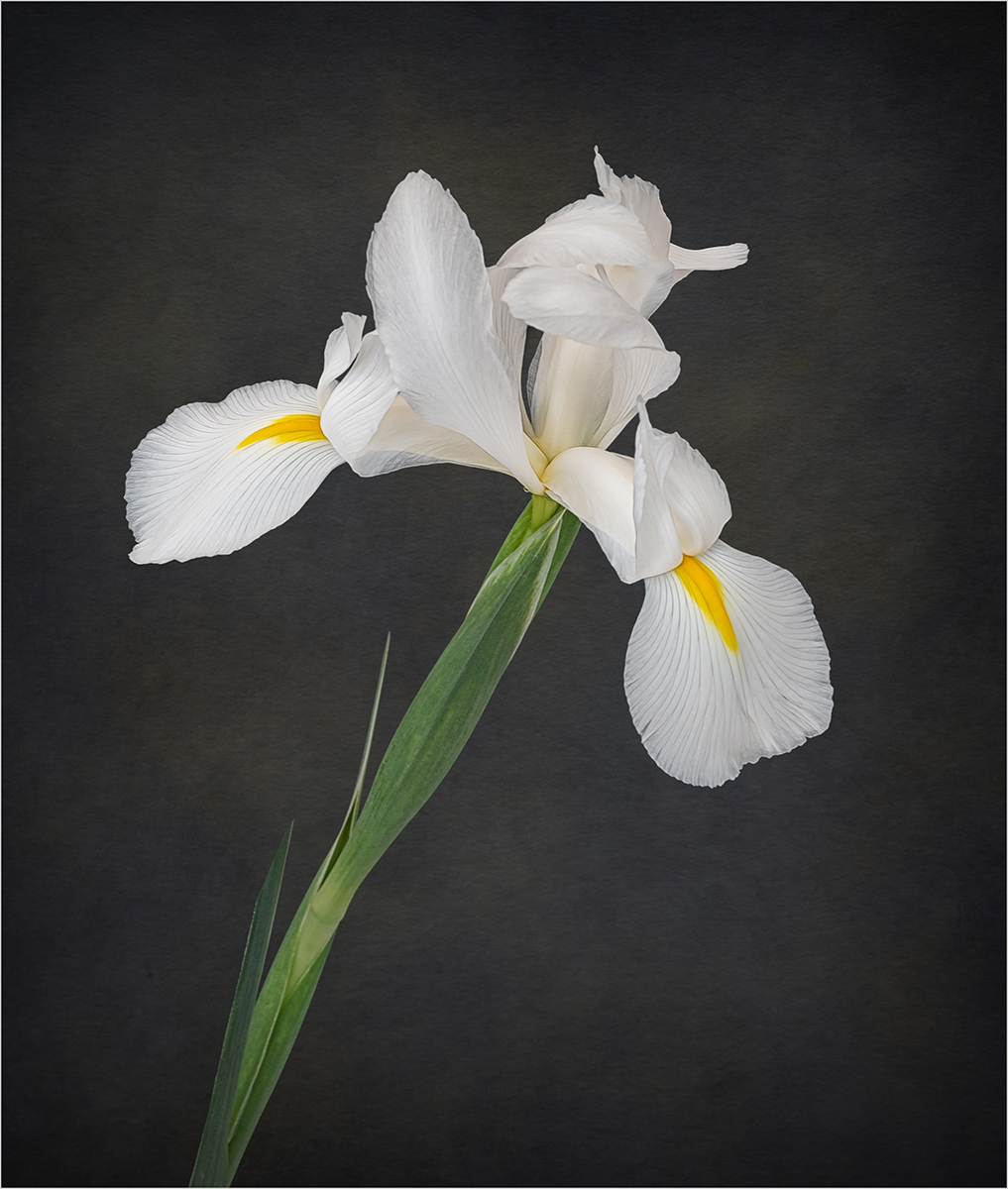
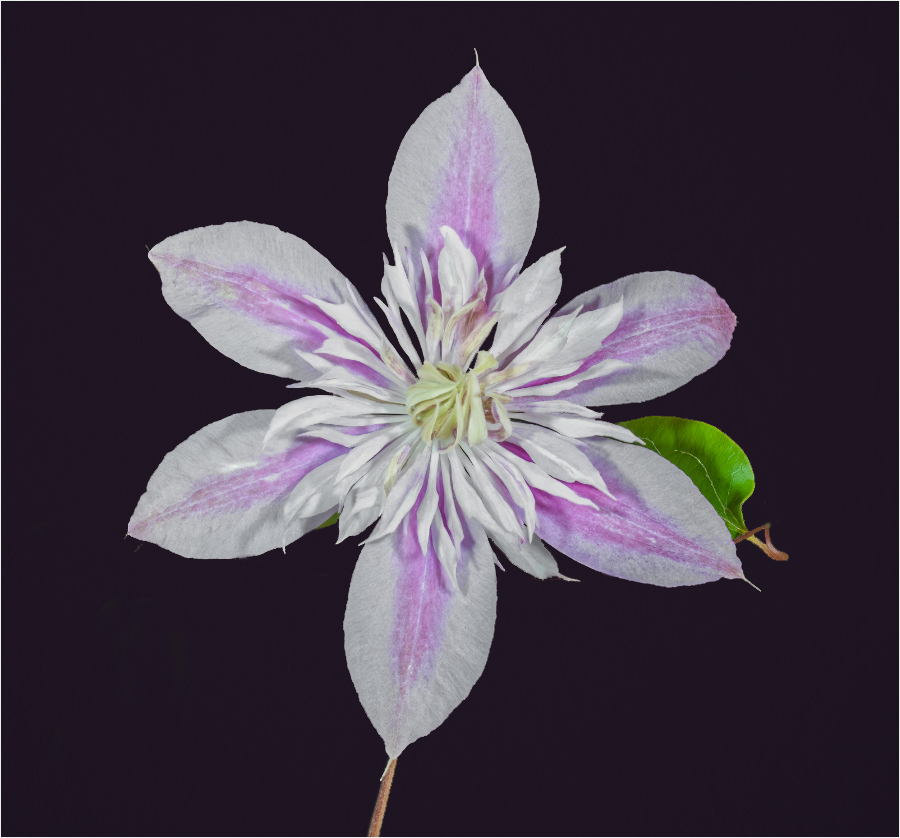
Hi Fred, I like the placement of the flower in the frame and the treatment you have applied to the background. The image would be stronger if you had included all the leaves on the right, rather than the tips being cut off. |
Nov 21st |
| 24 |
Nov 22 |
Comment |
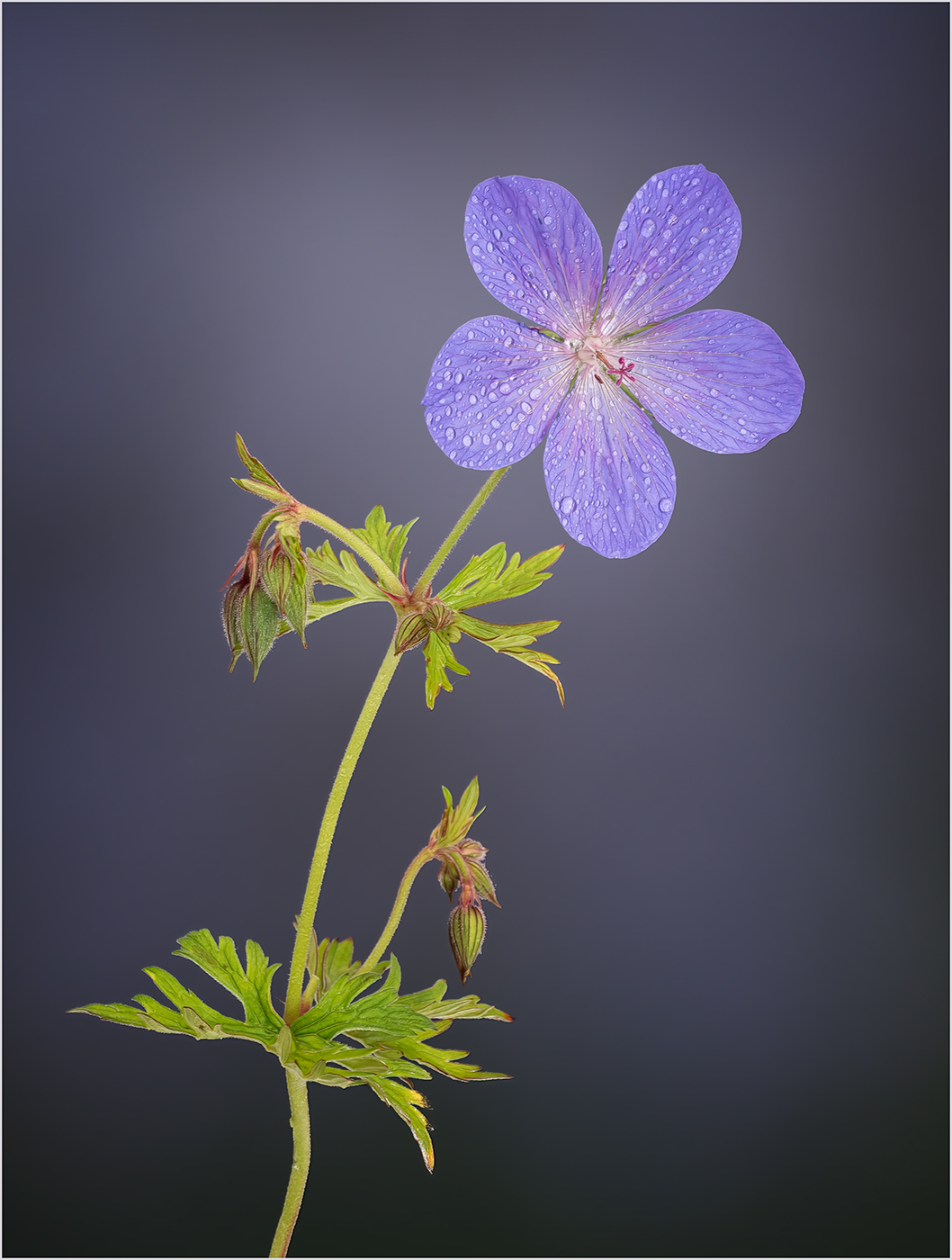
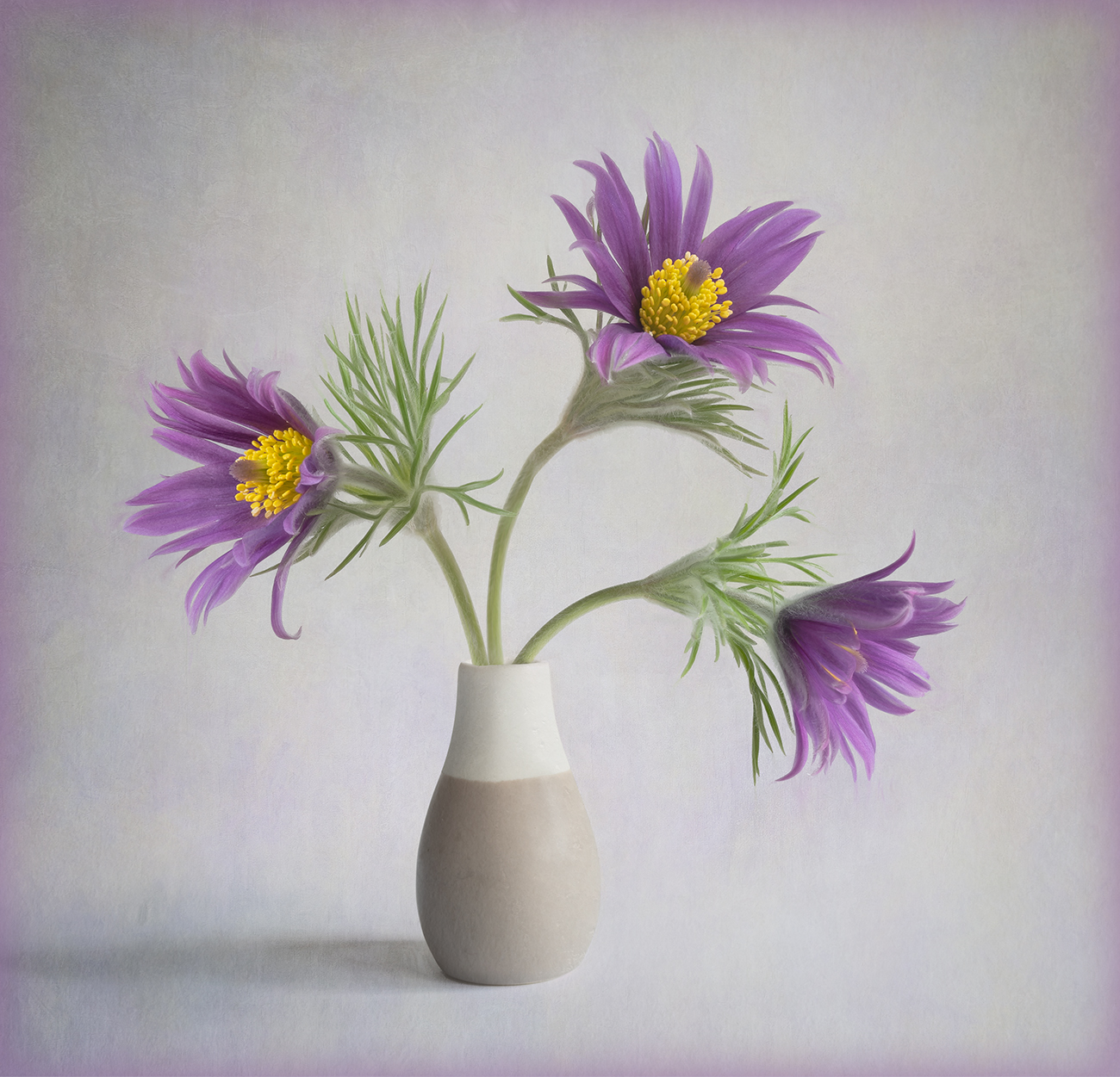
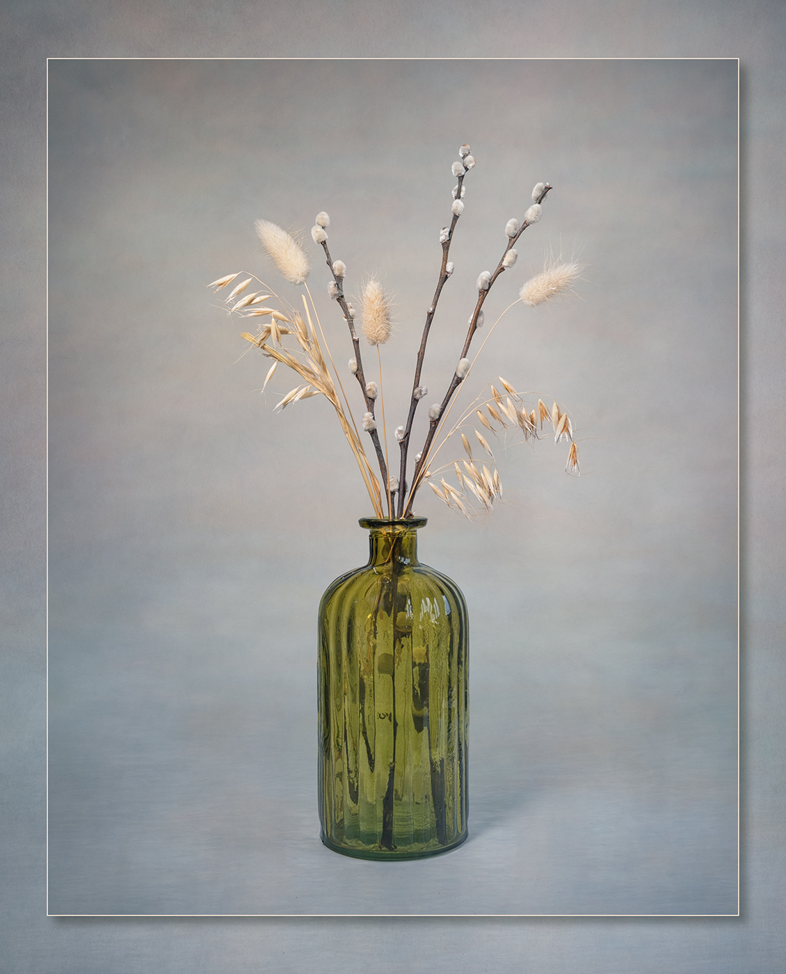
Hi Bev, I do not have a great deal to add other than the comments already made. The second background works much better. I agree with Fred that I would prefer the flowers to be anchored in some way rather than floating. |
Nov 21st |
| 24 |
Nov 22 |
Comment |
Thank you all for your comments they are very much appreciated. |
Nov 21st |
7 comments - 0 replies for Group 24
|
| 77 |
Nov 22 |
Comment |
I like the central composition of the image. For me the plates seem to be the dominant elements in the image, rather than the flower. Perhaps trying to harmonise the colours as Witta suggests may make them less dominant. |
Nov 21st |
| 77 |
Nov 22 |
Comment |
Well done on seeing the potential for combining these 2 images. I believe it is the choice of using a blend mode that has blown the sun out more and given the colour cast. Masking the birds and just using a normal blend mode does solve this. I agree with Michael that the top 2 birds could be removed. |
Nov 21st |
| 77 |
Nov 22 |
Comment |
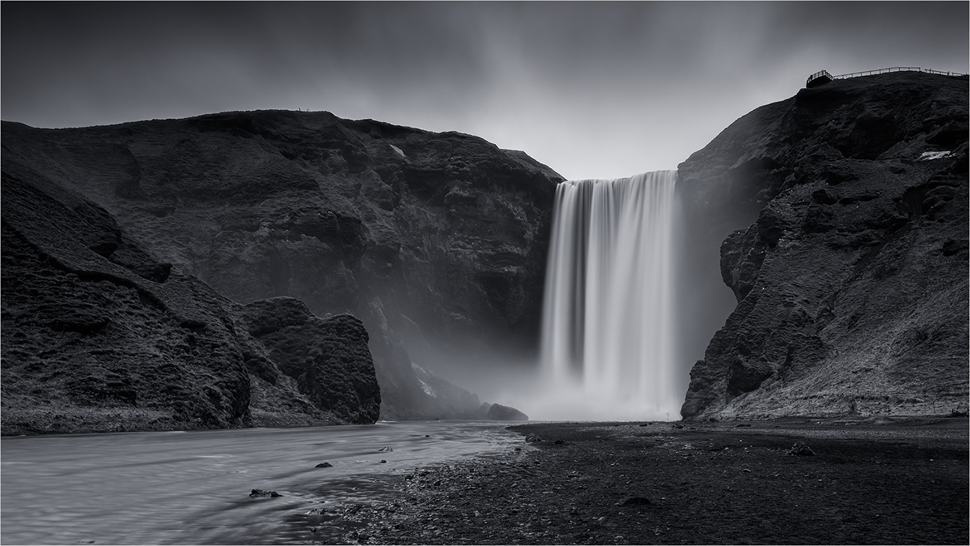
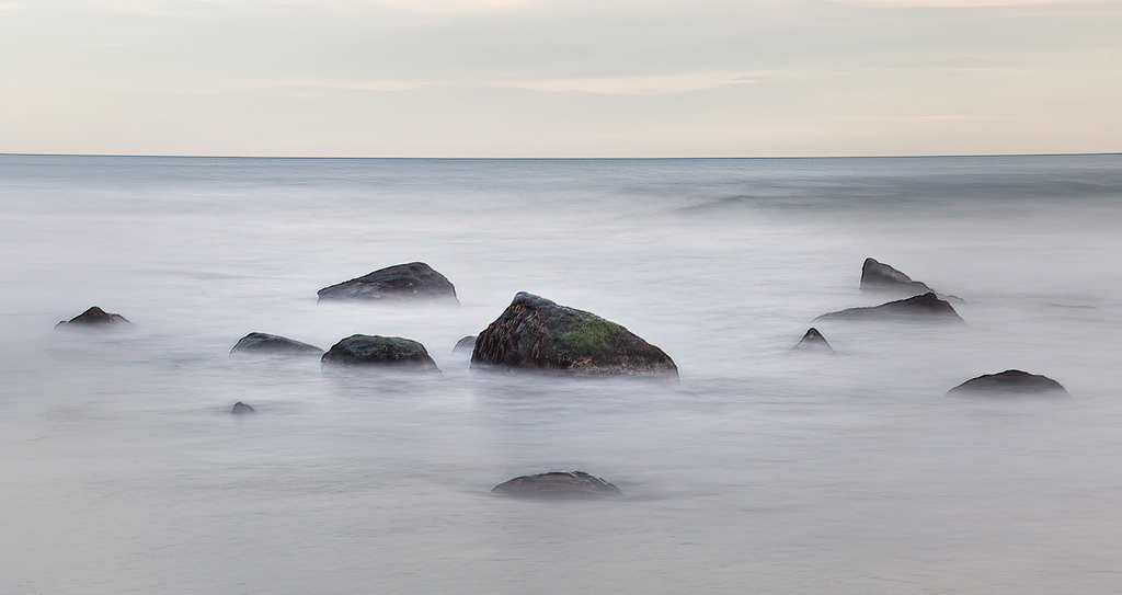
Hi Michael, You captured a wonderful long exposure shot here and have already had some great suggestions on adjustments you could make. There are so may different ways to edit this image and it really just depends on what kind of feel you are after.
I couldn't resist a little play, bringing out detail and brightening the central rocks. I stayed with colour but I do think it works really well in mono. |
Nov 21st |
 |
| 77 |
Nov 22 |
Comment |
Hi Mary, You have done very well to create something worth keeping from the original very busy image. |
Nov 21st |
4 comments - 0 replies for Group 77
|
11 comments - 0 replies Total
|