|
| Group |
Round |
C/R |
Comment |
Date |
Image |
| 24 |
Sep 22 |
Comment |
Many thanks for all the comments, it is much appreciated. |
Sep 18th |
| 24 |
Sep 22 |
Reply |
Hi Lance,
Many thanks for your comments. I do usually try and keep my flowers delicate but I was going for a more graphic feel on this one. |
Sep 18th |
| 24 |
Sep 22 |
Reply |
Hi Tom, I prefer the version with the green background. I think this gives a more natural feel and blends in better with the leaves. |
Sep 18th |
| 24 |
Sep 22 |
Reply |
Thank you Donna, glad that you like it. |
Sep 11th |
| 24 |
Sep 22 |
Comment |
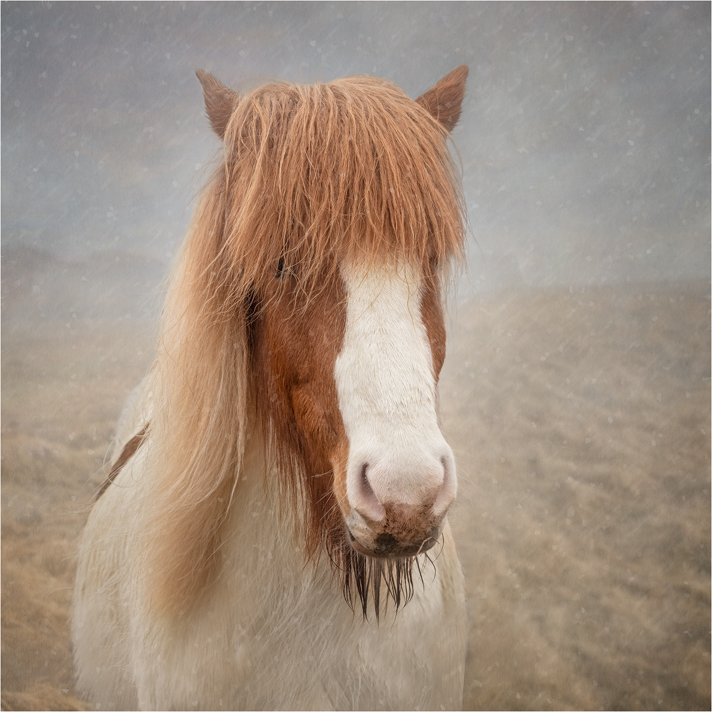
Hi Lance I assume that the image is the reflection of the plant in the pond, hence the speckles and soft focus. Unfortunately I find the image rather cluttered and am not sure what you want to draw my attention. |
Sep 10th |
| 24 |
Sep 22 |
Comment |
An interesting ICM image. I think the greens are a bit too vibrant and need toning a touch and perhaps also need darkening so that the flowers stand out more. |
Sep 10th |
| 24 |
Sep 22 |
Comment |
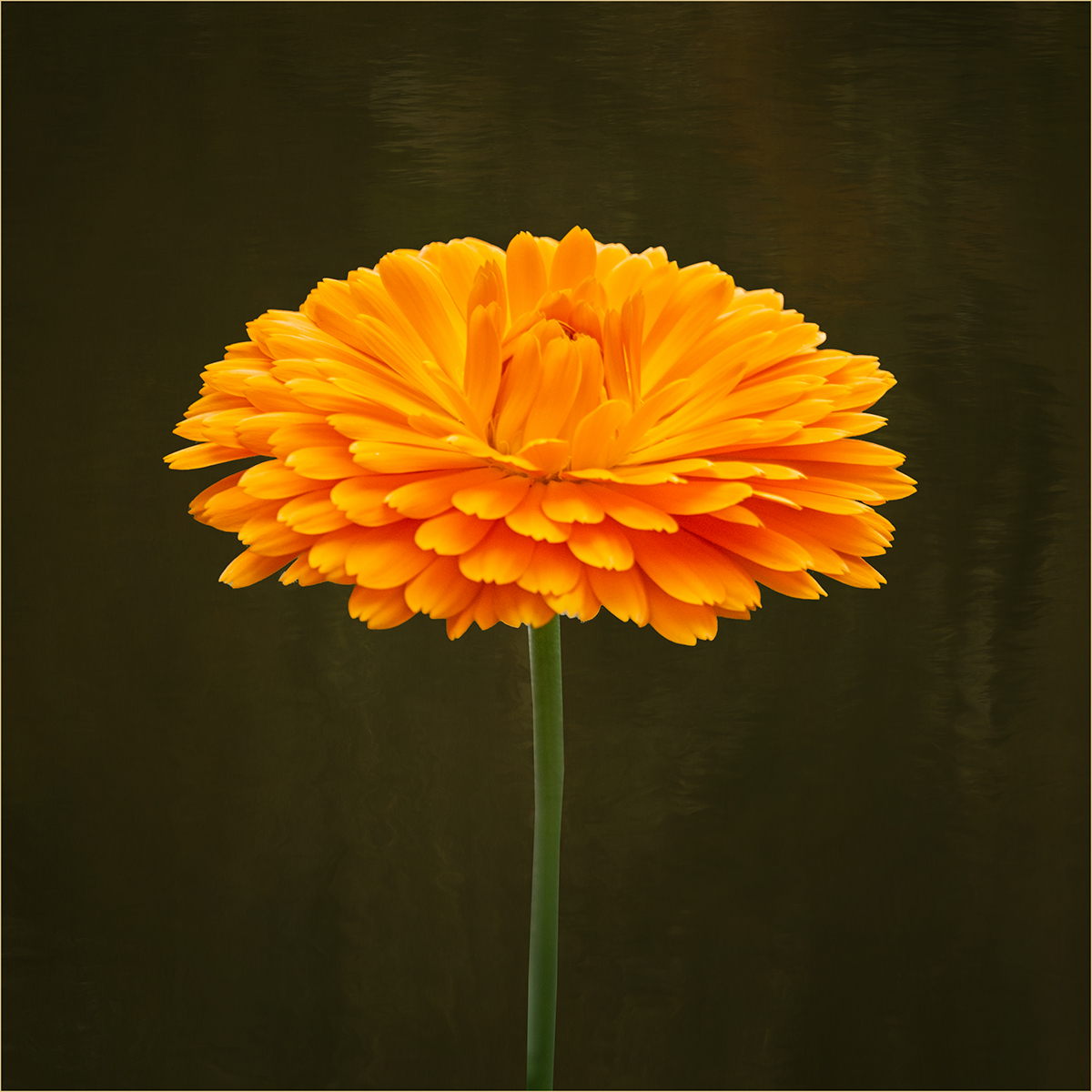
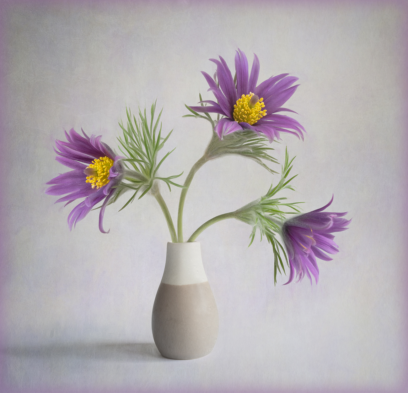
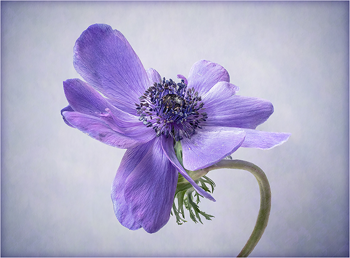
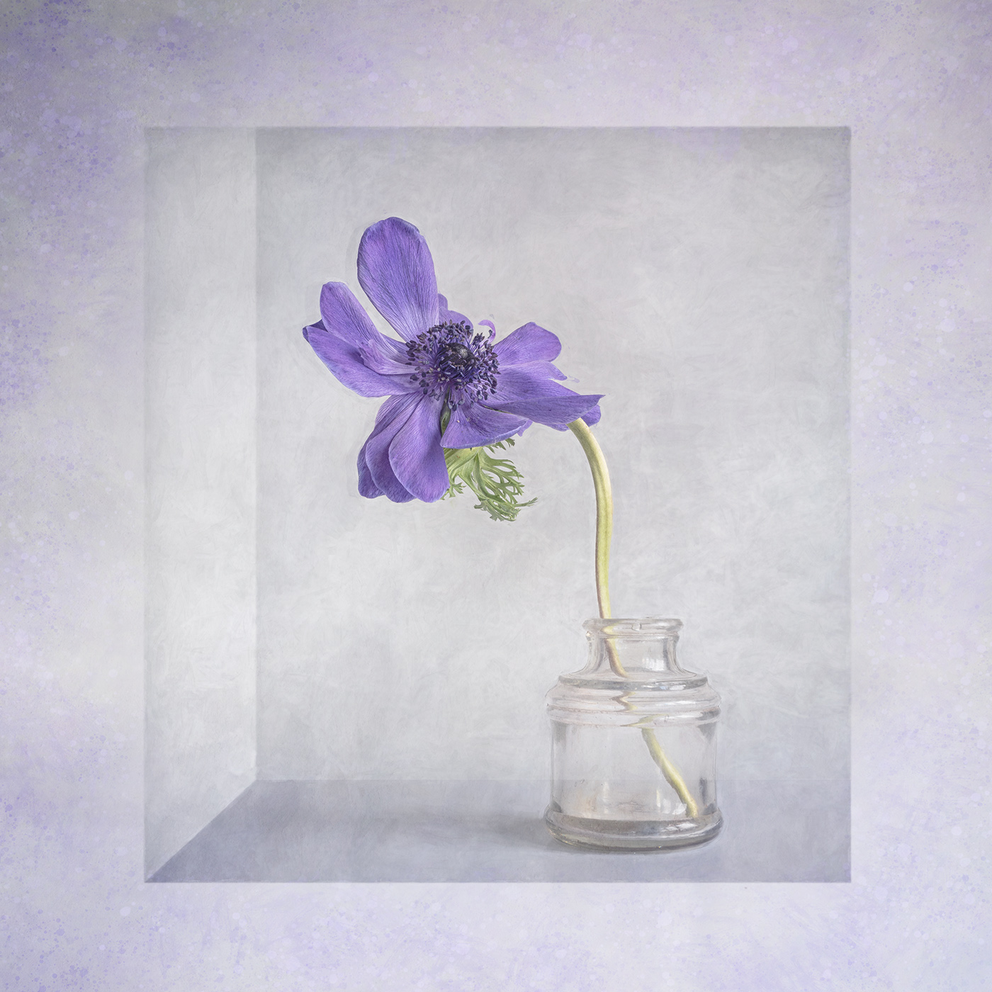
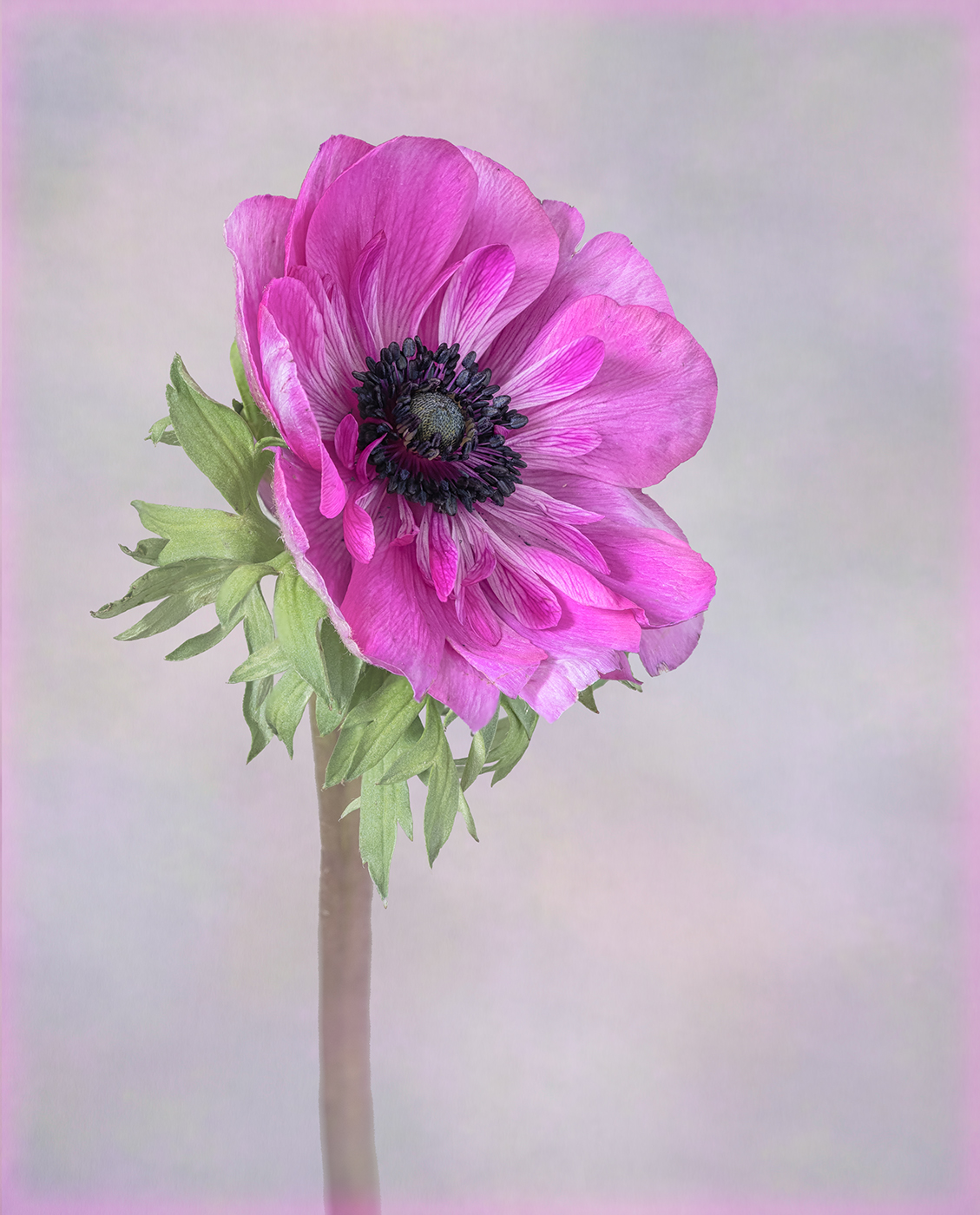
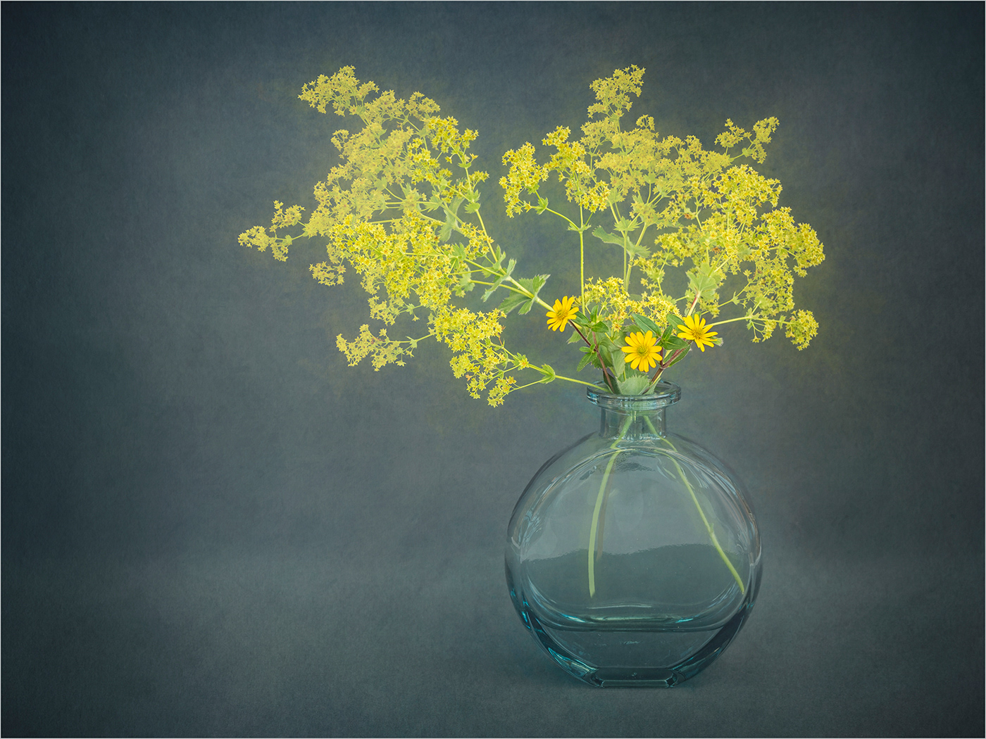
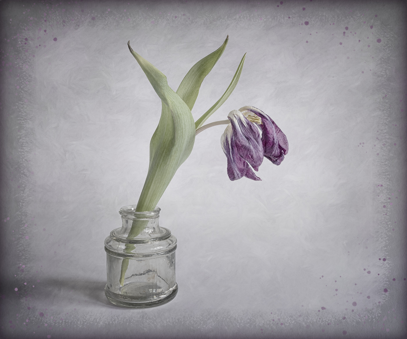
I like the lighting that you have used to photograph the flower. I would like to see a version with a pale background as I think this would give the flower a more delicate feel. |
Sep 10th |
| 24 |
Sep 22 |
Comment |
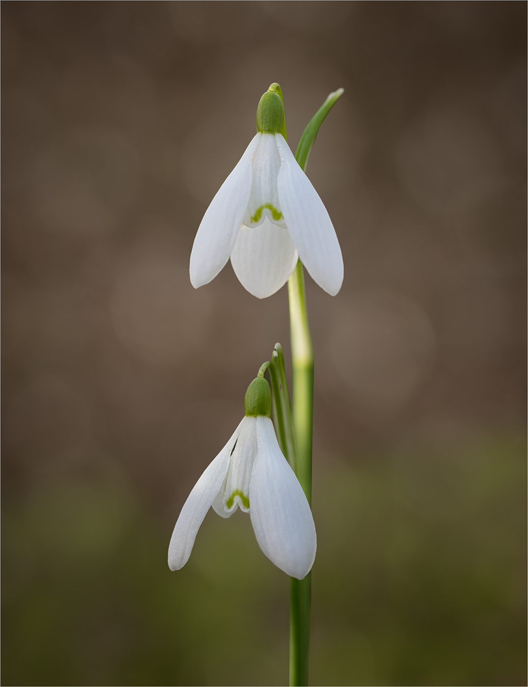
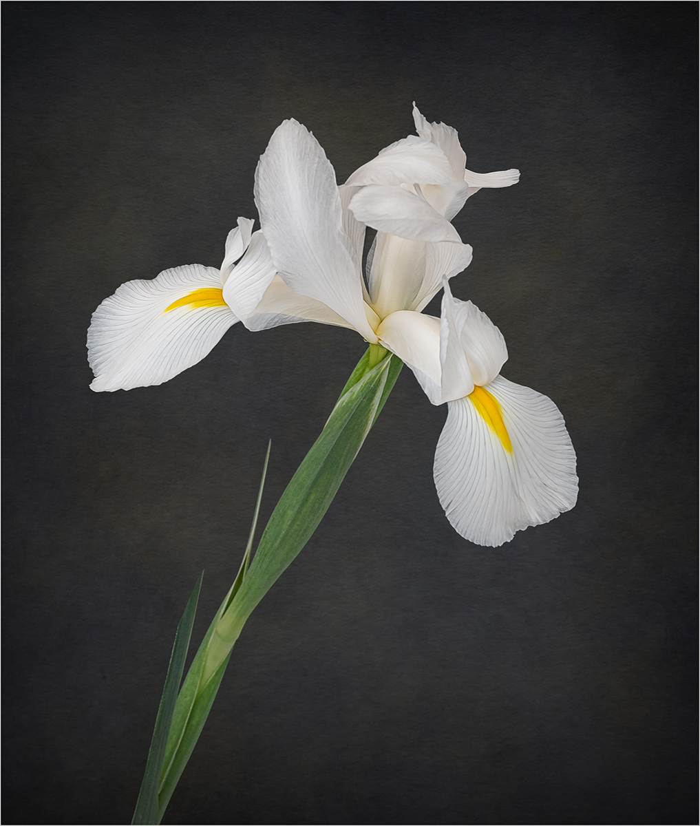
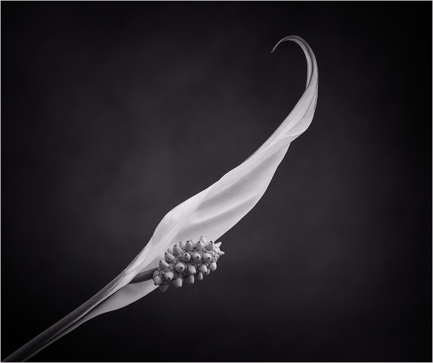
Nice detail captured in the flowers. I find the black background too stark and would prefer to have some sense of foliage or a complementary texture in the background. |
Sep 10th |
| 24 |
Sep 22 |
Comment |
A beautiful image and the post processing has brought a lovely ethereal feel. My only suggestion for improvement would be to remove some of the obvious blemishes on the petals of the bottom flower. |
Sep 10th |
| 24 |
Sep 22 |
Comment |
Well done on being able to mask out the butterfly and add it to the image along with its shadow. I think that the background is a bit busy and perhaps could be made more diffuse. |
Sep 10th |
| 24 |
Sep 22 |
Reply |
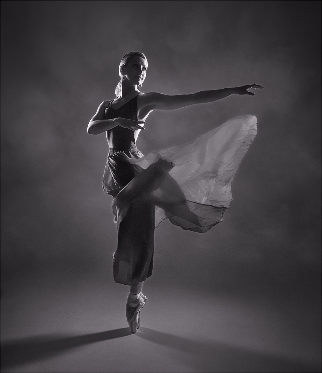
Thank you for your comment Pinaki. You are right the top of the flower is slightly soft and probably f8 or f9 would have been better. |
Sep 10th |
| 24 |
Sep 22 |
Reply |
Thank you Bev. I reversed the image as I know that some people prefer to "read" an image from left to right. I like the original position too. |
Sep 10th |
7 comments - 5 replies for Group 24
|
| 77 |
Sep 22 |
Comment |
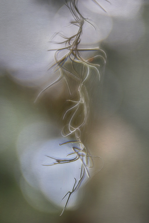
Hi Linda,
I like the shape of the moss and can see why you wanted to capture an image of it. The soft focus on the moss and the really bright highlights in the background make this a really difficult image to work on. In the version that you have created I feel that the moss is a little lost against the background. You might want to consider creating a lighter version of the image. |
Sep 18th |
 |
| 77 |
Sep 22 |
Comment |
Hi Denise,
I think the image suits the mono conversion and I like your added brickwork on the frame. I agree with Witta's suggestions, the asymmetry gives the image more interest. |
Sep 18th |
| 77 |
Sep 22 |
Comment |
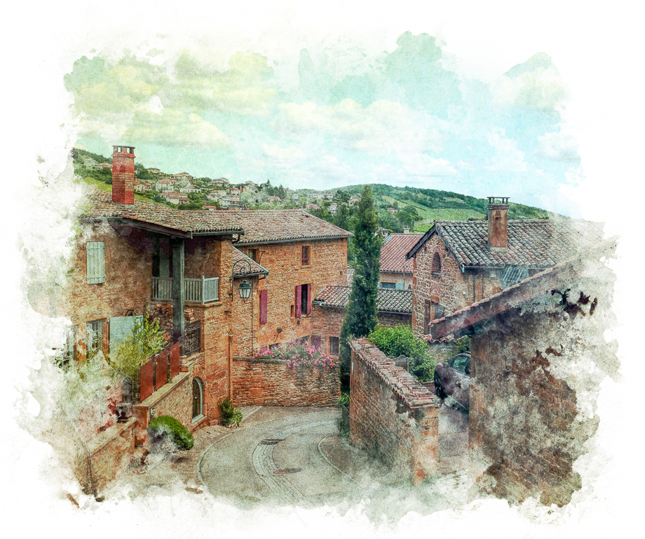
Hi Michael,
I really like the treatment you have applied to the image. You have transformed your holiday snap into something much more interesting. My only suggestion for improvement would be to lighten the image a touch. I have added a white canvas texture in soft blend mode at 50% opacity. |
Sep 18th |
 |
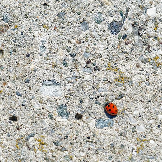
| 77 |
Sep 22 |
Comment |
Hi Mary,
You have captured some lovely texture in the concrete and brought out the colours well. Like Linda I feel that the ladybug is a bit small in the frame. I also think it is a bit too tight in the bottom corner. You have lots of space in the original to play around with different crops. As a suggestion this is a square crop with the bug on the bottom third and rotated to put the bug more on the diagonal. |
Sep 18th |
 |
| 77 |
Sep 22 |
Comment |
Thank you all for your comments it is very much appreciated. |
Sep 18th |
| 77 |
Sep 22 |
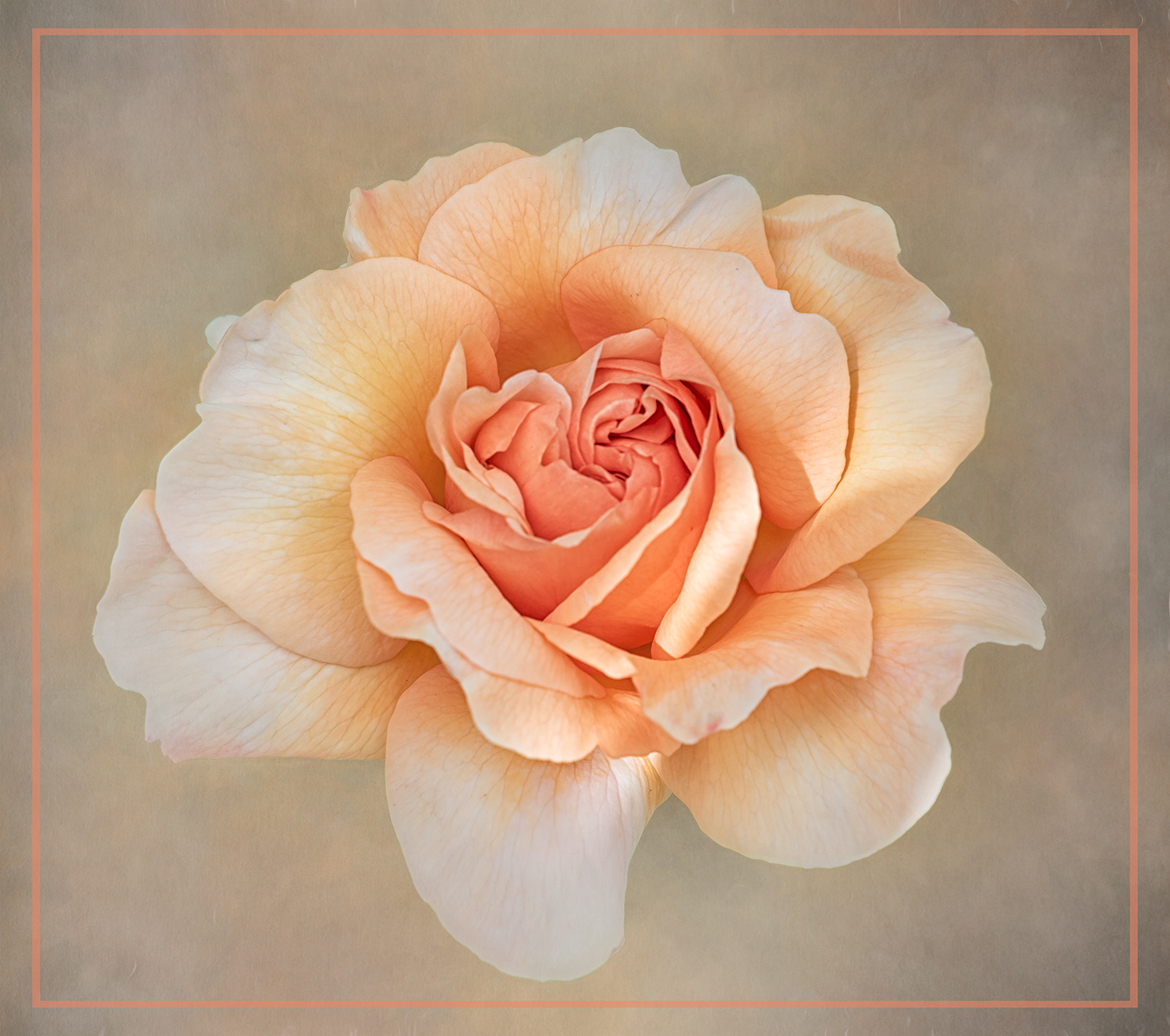
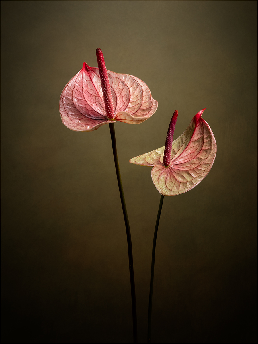
Comment |
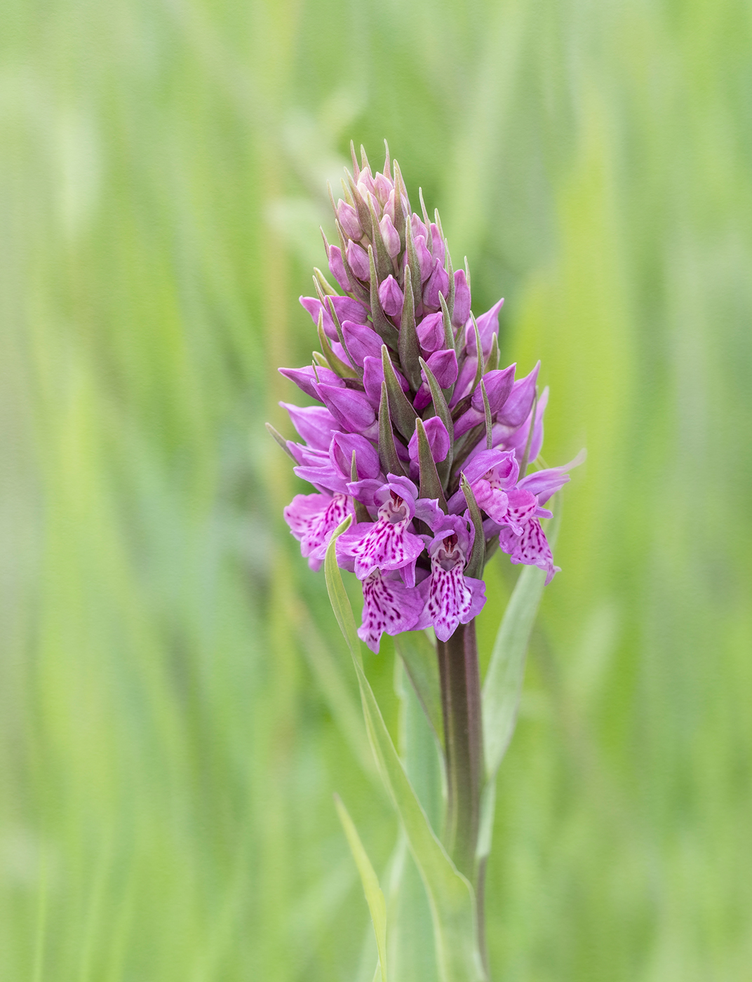
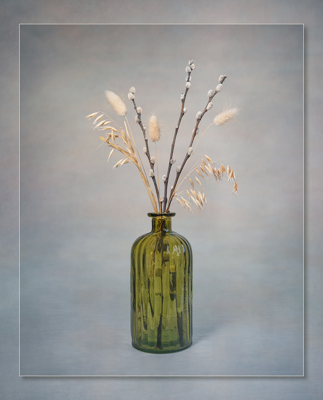
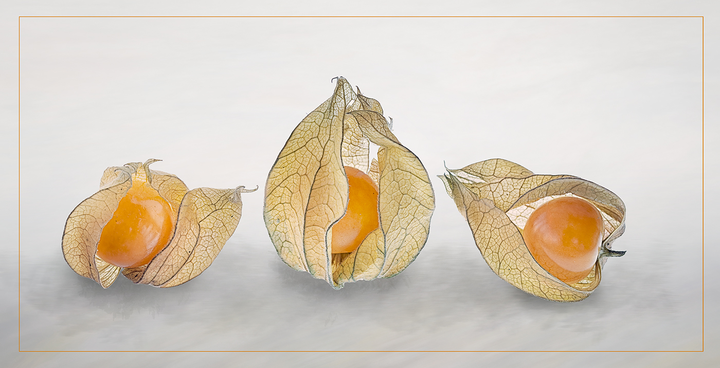
A lovely image with great detain in the flowers. I really like the border you have created, it sets the image off very well. My only suggestion for improvement would be to darken down the background to the flowers a little more. |
Sep 10th |
| 77 |
Sep 22 |
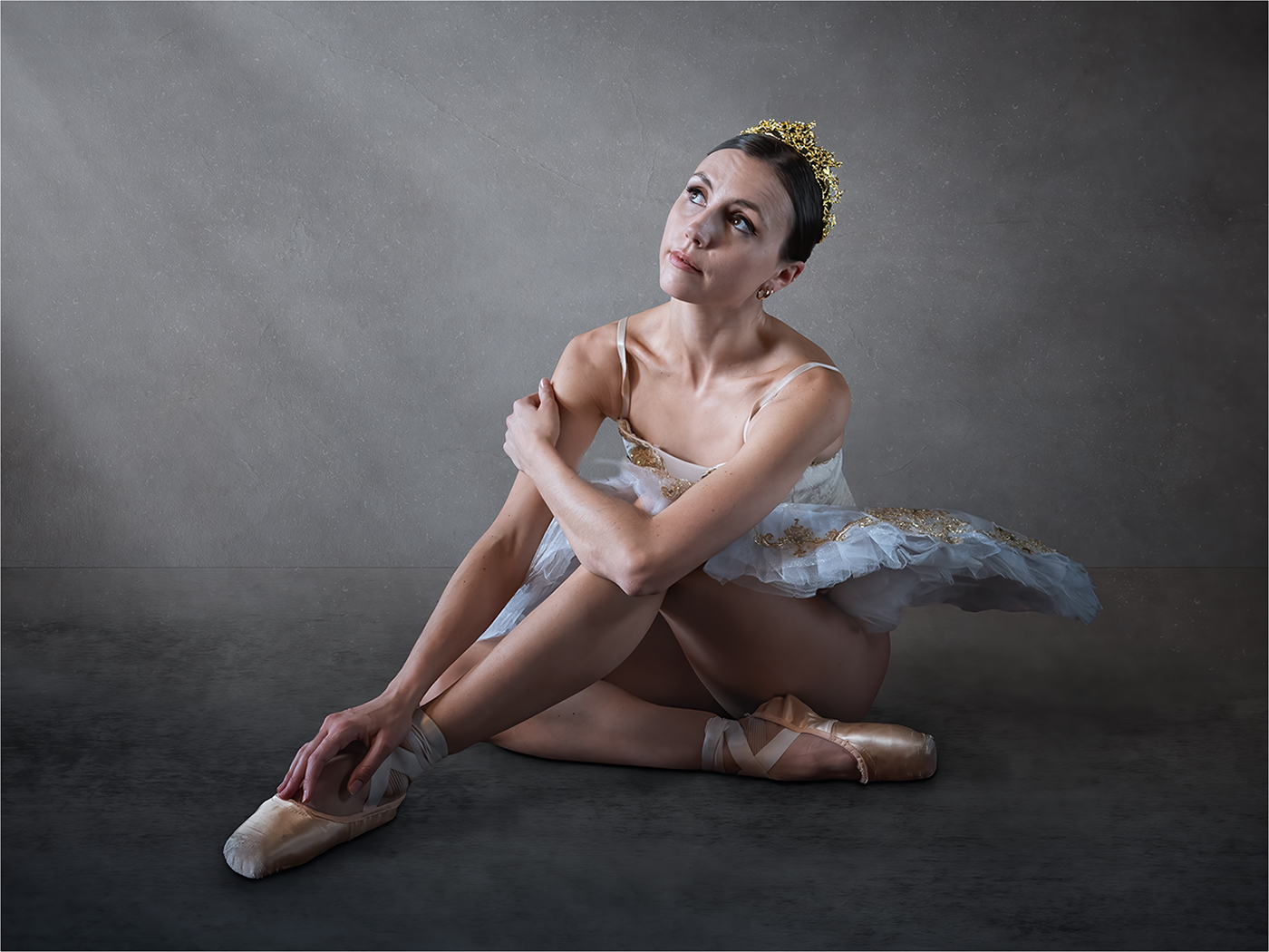
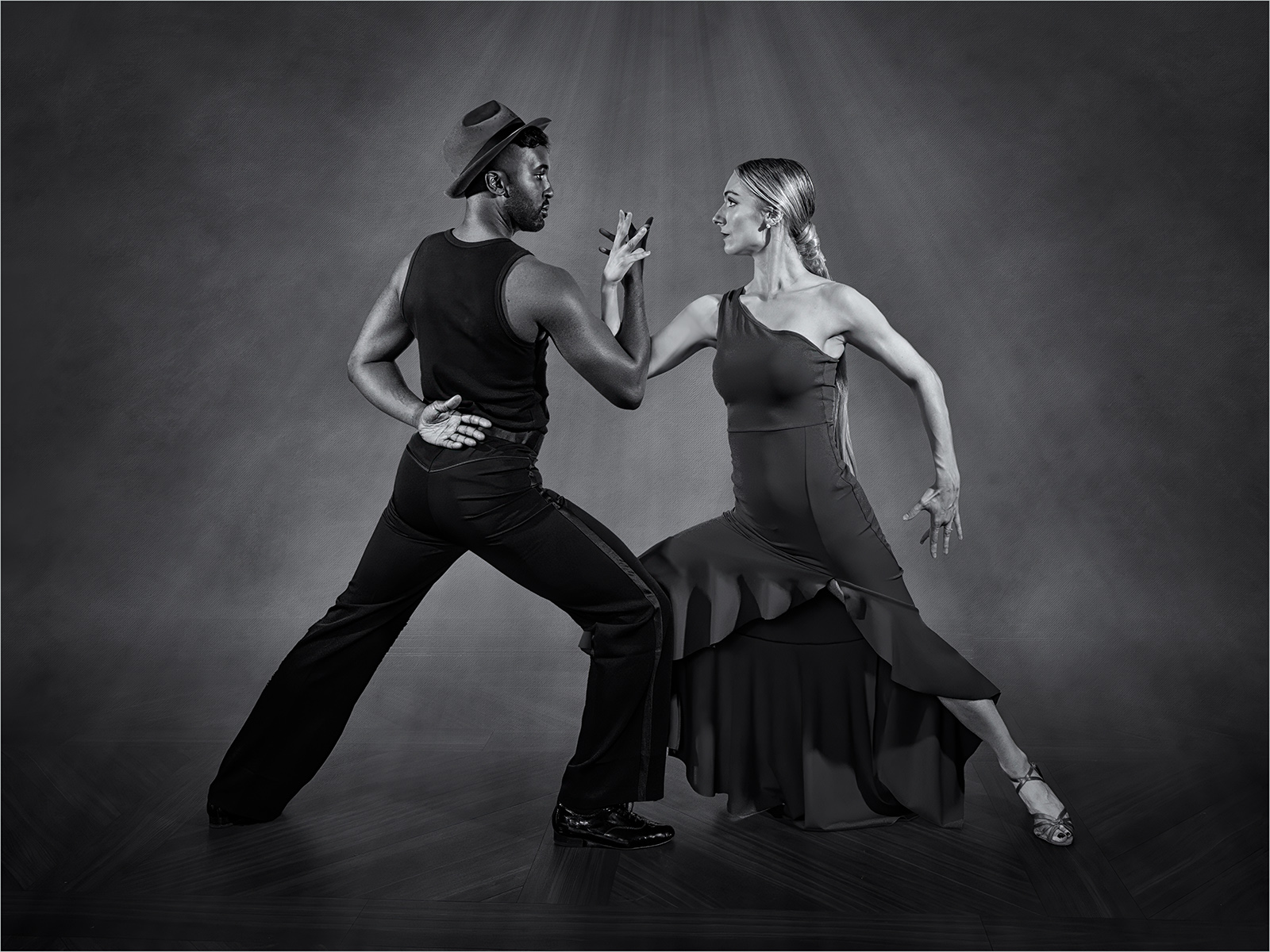
Comment |
The original image is beautiful and the treatment you have applied is unusual and certainly gives it a wow factor. However I think this kind of processing may well divide opinion. |
Sep 10th |
7 comments - 0 replies for Group 77
|
14 comments - 5 replies Total
|