|
| Group |
Round |
C/R |
Comment |
Date |
Image |
| 25 |
Nov 22 |
Reply |
Thanks, Brian & Ruth! |
Nov 28th |
| 25 |
Nov 22 |
Comment |
I would agree with Eric, as your cropped image seems to have more balance, particularly between the dark lines of the "Skin" sign and the doorway frame. The cropped image also draws more attention to the dark van with the person standing next to it. Great choice in doing this in B/W. |
Nov 18th |
| 25 |
Nov 22 |
Comment |
I can see that you are quite experienced in using lighting equipment and managing your exposure. The image is perfectly balanced with just the right amount of highlighting on her shoulder and cheek. I think if you had your reflector more to the right and below her, reflecting back the light from the beauty dish, it might have helped balance the shadows on the left side of her face. Her left eye seems a little dark to me, and you could also bring that back with a little dodging in post, making it look like a reflector was working for you. |
Nov 18th |
| 25 |
Nov 22 |
Comment |
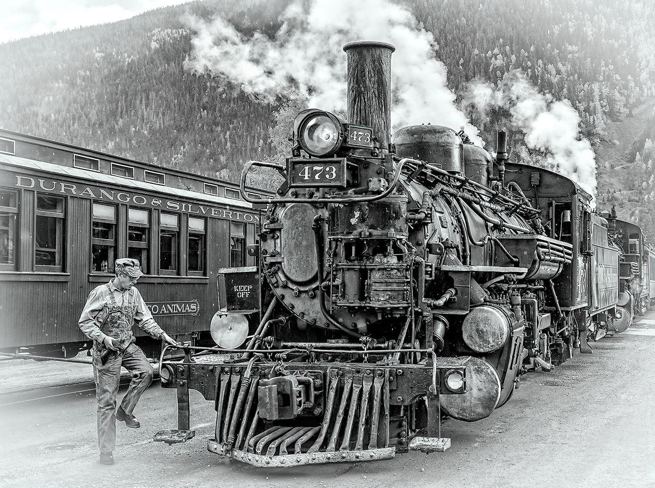
Thanks! As it turned out I entered the image again in print and the judge didn't like it as he didn't like how sharp the train was. His opinion was that by trying to represent an older photo, film would not be that sharp and it bothered him. As a side note, he still shoots on film. Well, we can't win them all! |
Nov 18th |
| 25 |
Nov 22 |
Comment |
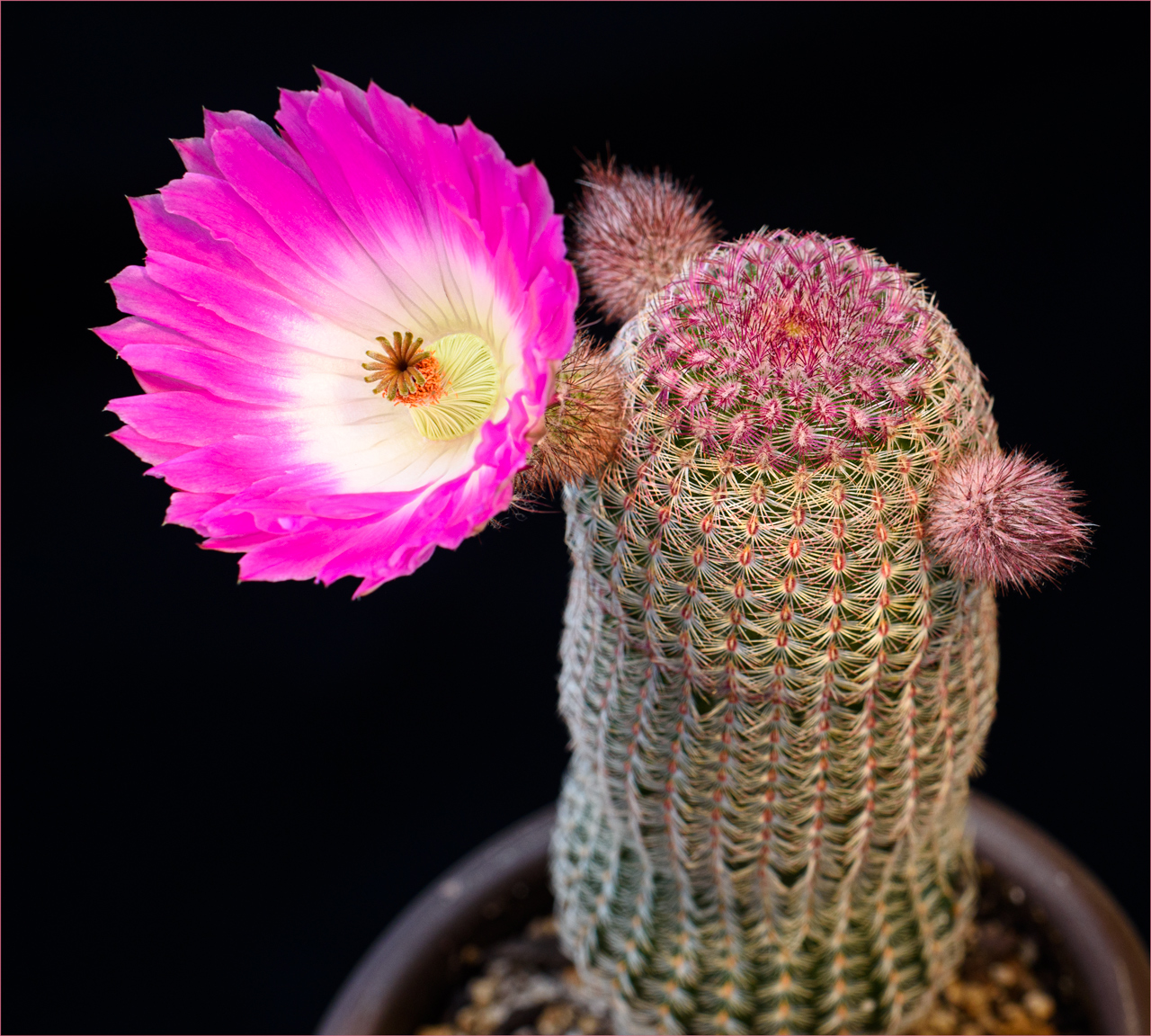
Nice composition and border selection. One of the challenges with smartphone images is that they sharpen the image during processing, and lack some of the clarity of larger sensors. When sharpening in post-processing, halos can occur around the edges of dark parts of the image, which you can see around the gold-colored stamens. I find that with cell phone images, particularly close-ups, that is is better to reduce sharpening and contrast, which make the image more dream-like and abstract. |
Nov 18th |
| 25 |
Nov 22 |
Comment |
HA! It looks like there is a need for more bandages! Great opportunity for light hearted imagery. |
Nov 10th |
6 comments - 1 reply for Group 25
|
6 comments - 1 reply Total
|