|
| Group |
Round |
C/R |
Comment |
Date |
Image |
| 14 |
Jan 20 |
Reply |
My apologies. Won't happen again. |
Jan 10th |
| 14 |
Jan 20 |
Reply |
Since my opinion is directed to the submitter of the image I am not sure why you are making comment. I was not aware that I had to get approval to give my critique of the submission. I have been doing this for many years and have never had another member of the group, other than the submitter, make a comment about how I felt about someone else's submission. Am I now suppose to route my opinion through you for approval? |
Jan 9th |
| 14 |
Jan 20 |
Comment |
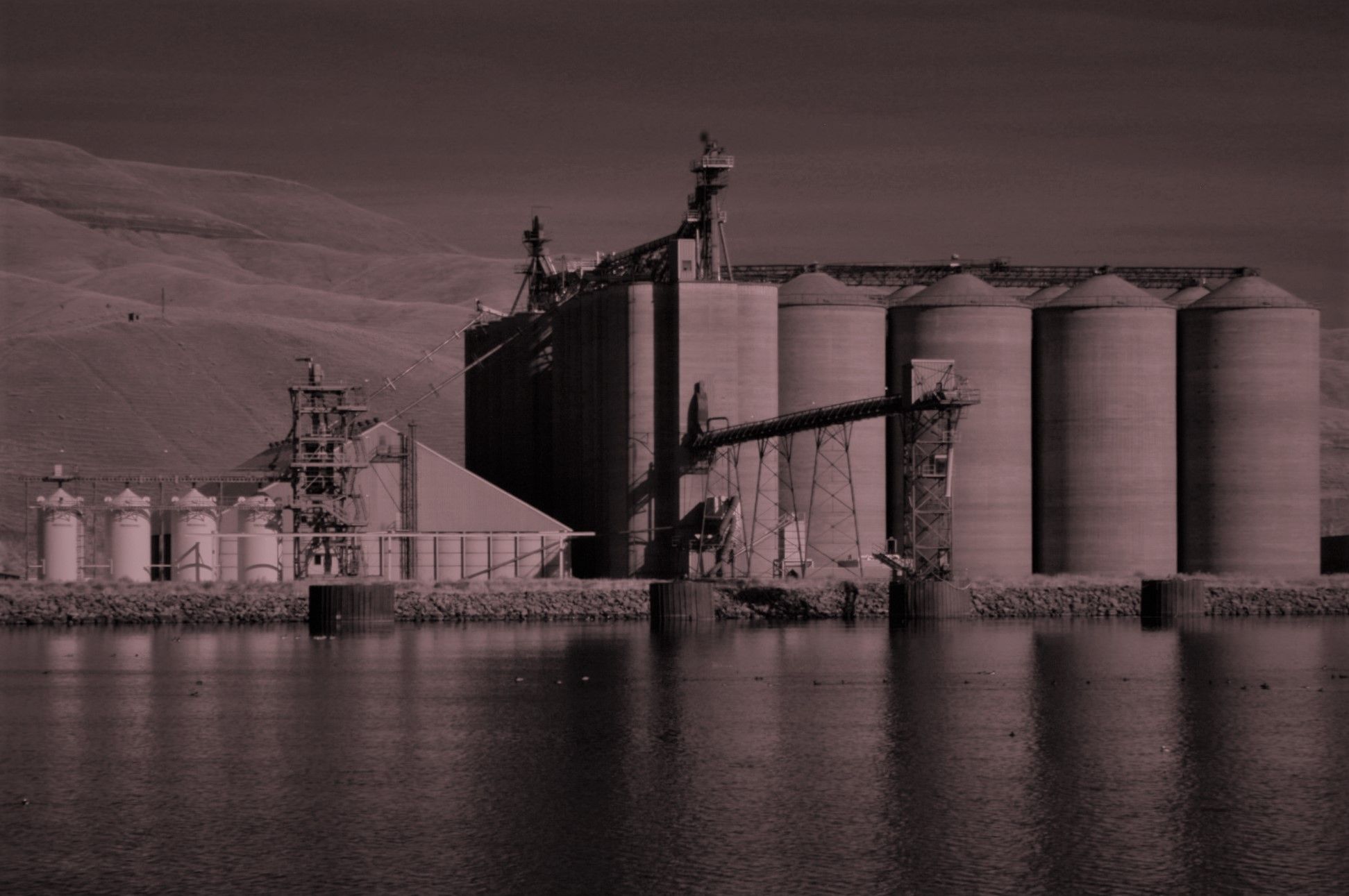
Nice scene of farm land. Seems a little over powering to have so much "dead space" above the farm fields. There is almost more area of the hill side than the farm area. The area of the farm land is warm with the sun light showing on it. With some cropping of that area might bring the farmed land into more detail. Keeping the eye on the lower part of the image the image has a nice feeling to it. |
Jan 8th |
| 14 |
Jan 20 |
Comment |
What a nice scene. For me this image in black and white is a winner. I like the feeling of having clear focus throughout the image. Several things bring the attention to your models. First is the dominate size and presents of the couple. The pollards of the wall and the horizontal top railing all lead my focus to them. Finally the steepled building showing through the railing pointing up to the couple. Finally the couple themselves displays a soft romance between them with the hands together and his hand resting on her arm with the heads together. Sorry this is so long, but this photo is so realistic with such feeling I had to say something. Great image! |
Jan 6th |
| 14 |
Jan 20 |
Comment |
This is a great shot. I really like the lighting on the buildings. The tall steeple is majestic and brings your eye into the image. Then there is the white border that over powers it all. I'm not a fan of borders and in this case it dominates the image in my opinion. If I were to put a border around this lovely image it would be very slender so as to not distract from the regal building. |
Jan 6th |
| 14 |
Jan 20 |
Comment |
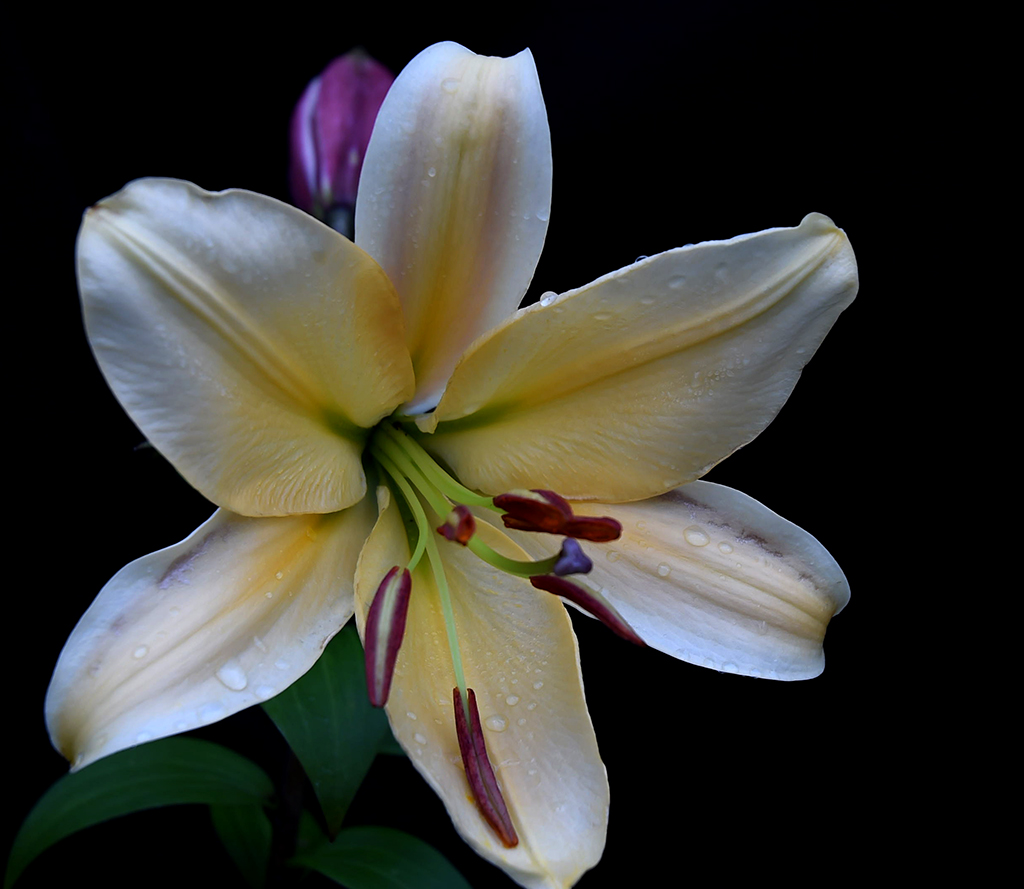
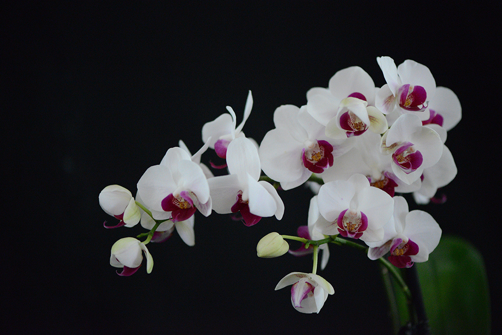
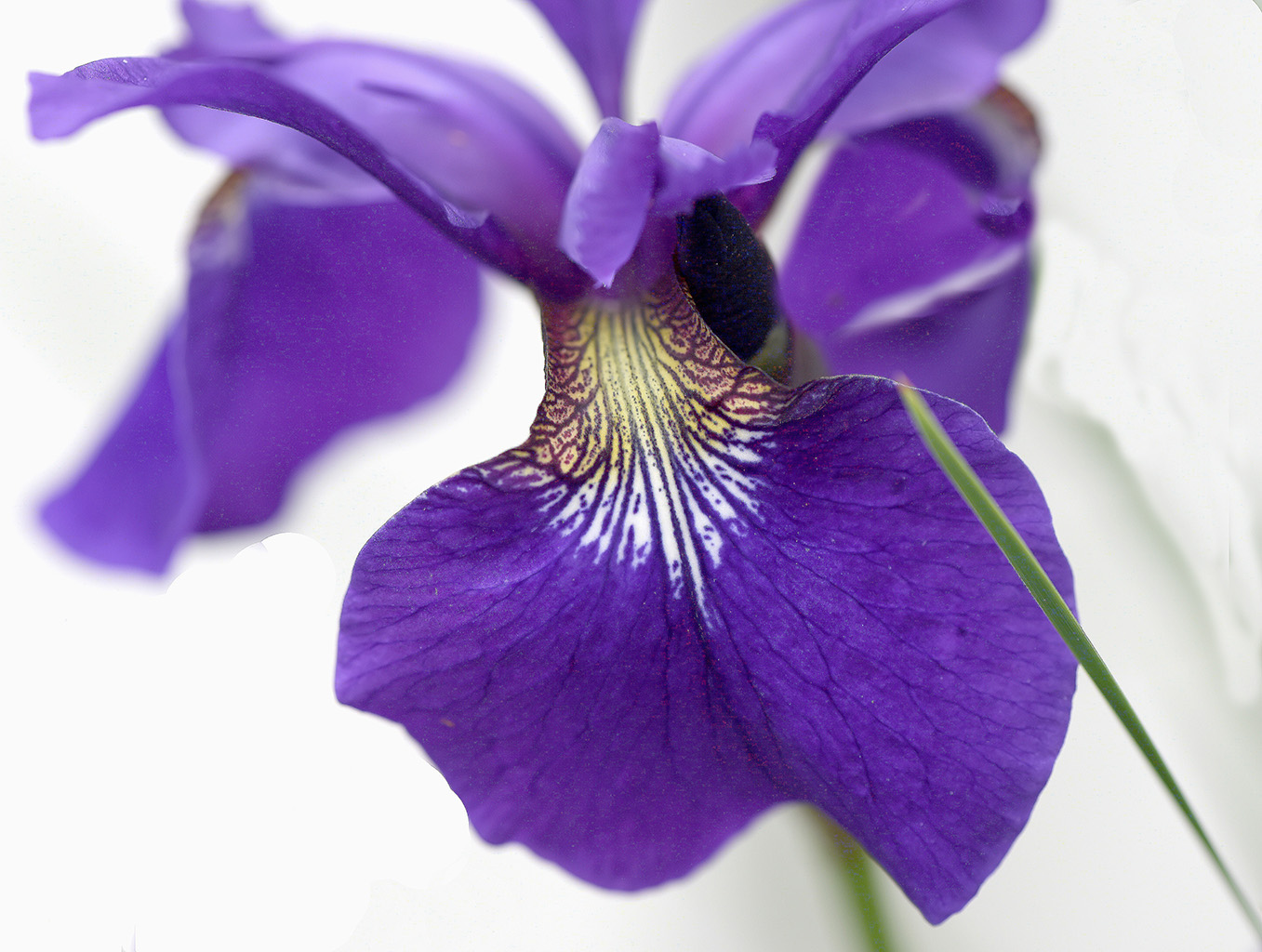
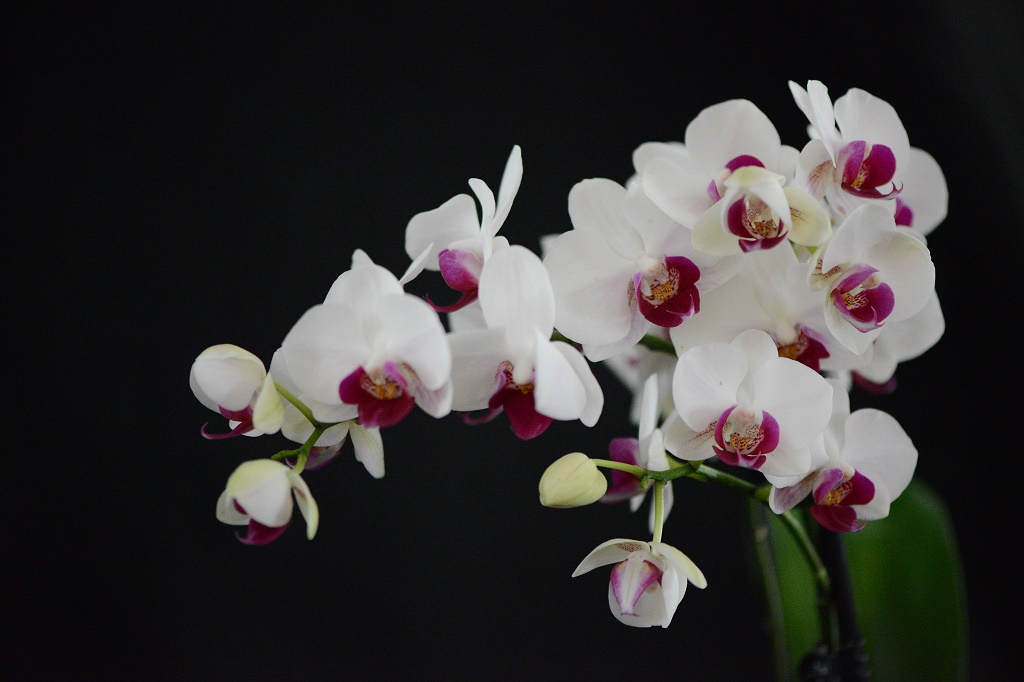
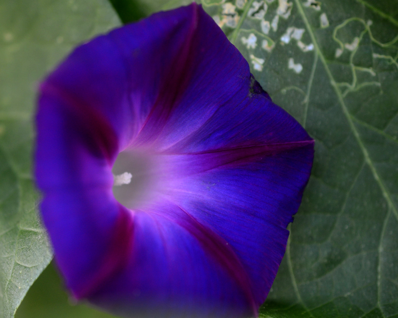
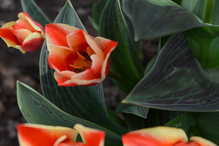
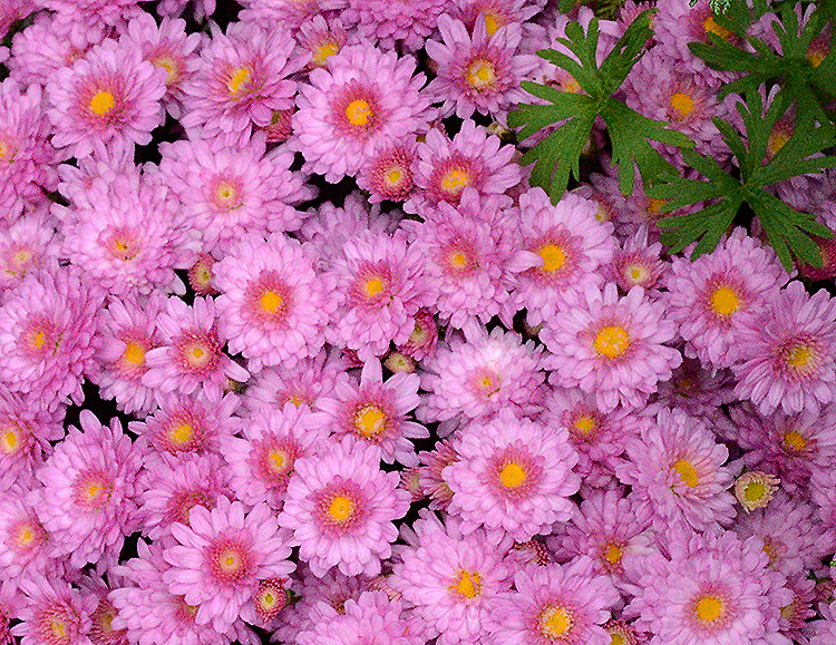
The colors complement each other. To me it appears that the center of focus is the flower on the front lower right as you look at the image. I'm not sure that I would have included so much of the greenery at the bottom of the image. It would be interesting to see what the image would have looked like with the focus was centered on the middle flower in front bringing the image down so the peddles were just above the bottom edge. The colors are great. |
Jan 6th |
| 14 |
Jan 20 |
Comment |
This is a very dramatic image. I agree with you that processing in black and white really adds to the impact of the image. Catching the clouds in the background for me really makes the image. I think this is a great presentation of historic structure. Well done. |
Jan 6th |
| 14 |
Jan 20 |
Comment |
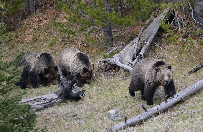
Thank you for your comment. Because of the sever cropping any additional cropping would cause the image to degrade so the animal would not be in focus at all. Thanks for the thought. |
Jan 6th |
6 comments - 2 replies for Group 14
|
6 comments - 2 replies Total
|