|
| Group |
Round |
C/R |
Comment |
Date |
Image |
| 20 |
Nov 24 |
Reply |
Thank you. I think I am going to submit to my Camera Club under Altered Reality |
Nov 17th |
| 20 |
Nov 24 |
Reply |
Thank you, Sylvia. I always try for Impact. Sometimes I succeed and sometimes not so much! |
Nov 17th |
| 20 |
Nov 24 |
Reply |
Thank you! |
Nov 17th |
| 20 |
Nov 24 |
Reply |
Thank you, Jennie. |
Nov 16th |
| 20 |
Nov 24 |
Comment |
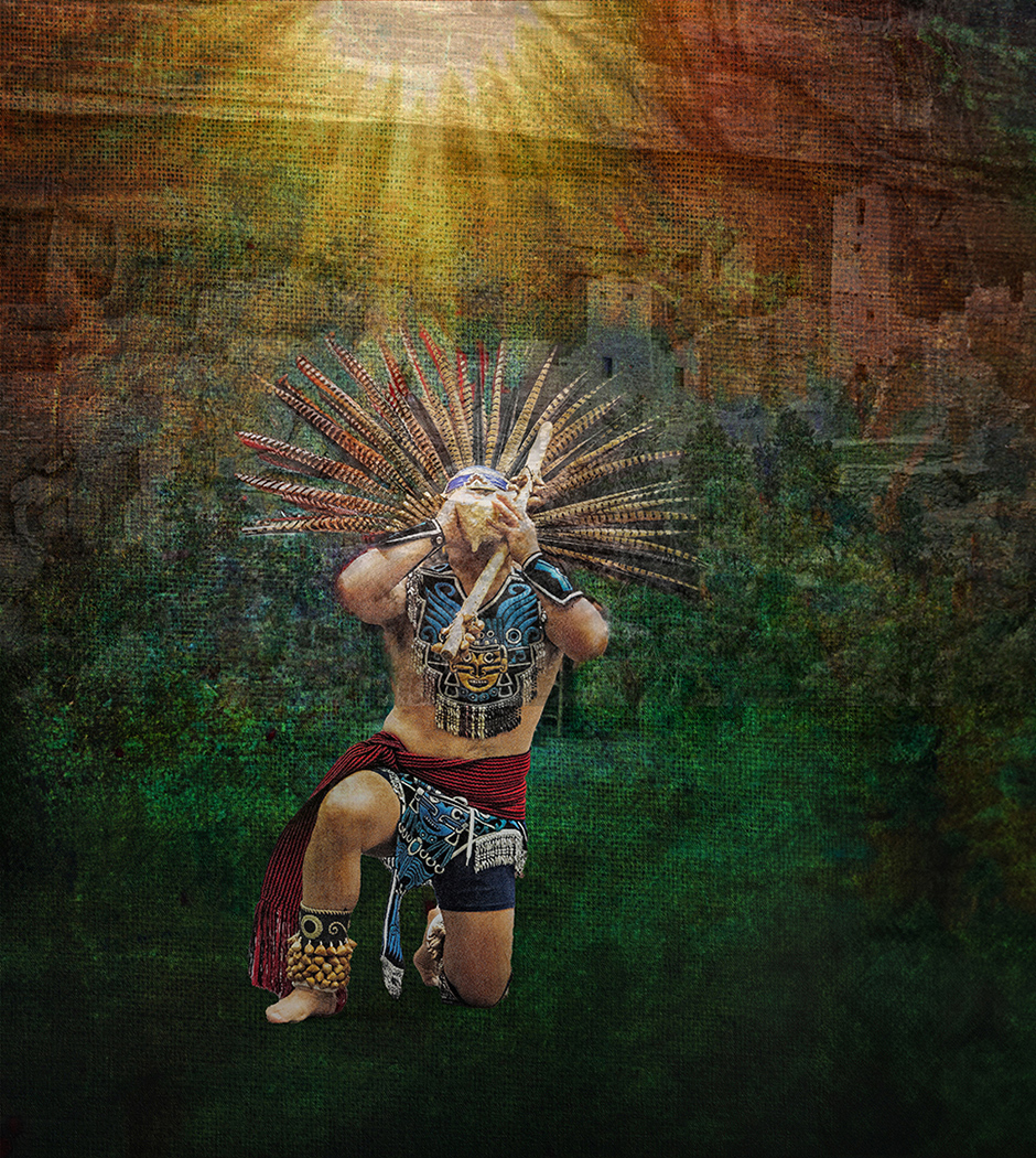
Thanks, Peter. Always fun to play with the story. |
Nov 16th |
| 20 |
Nov 24 |
Comment |
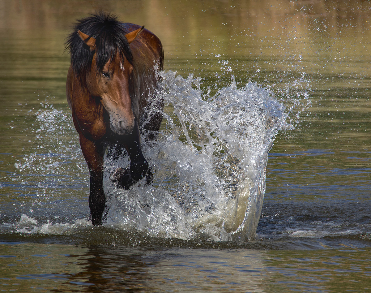
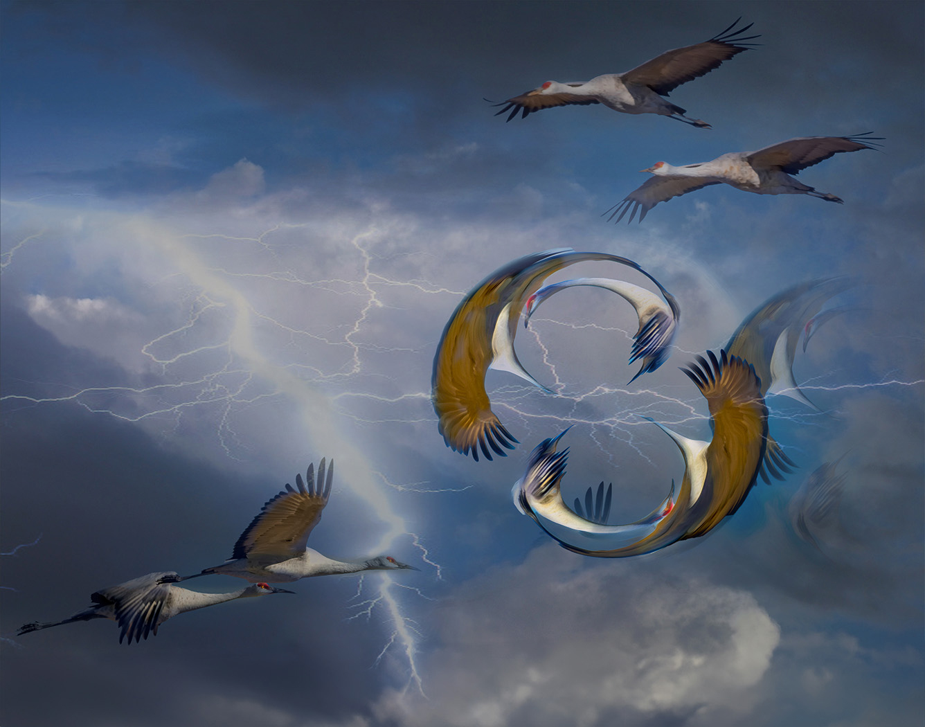
You are so Creative with your effects. Nicely done. I see a koi. More space around each side would allow for the movement I see in it. |
Nov 16th |
| 20 |
Nov 24 |
Comment |
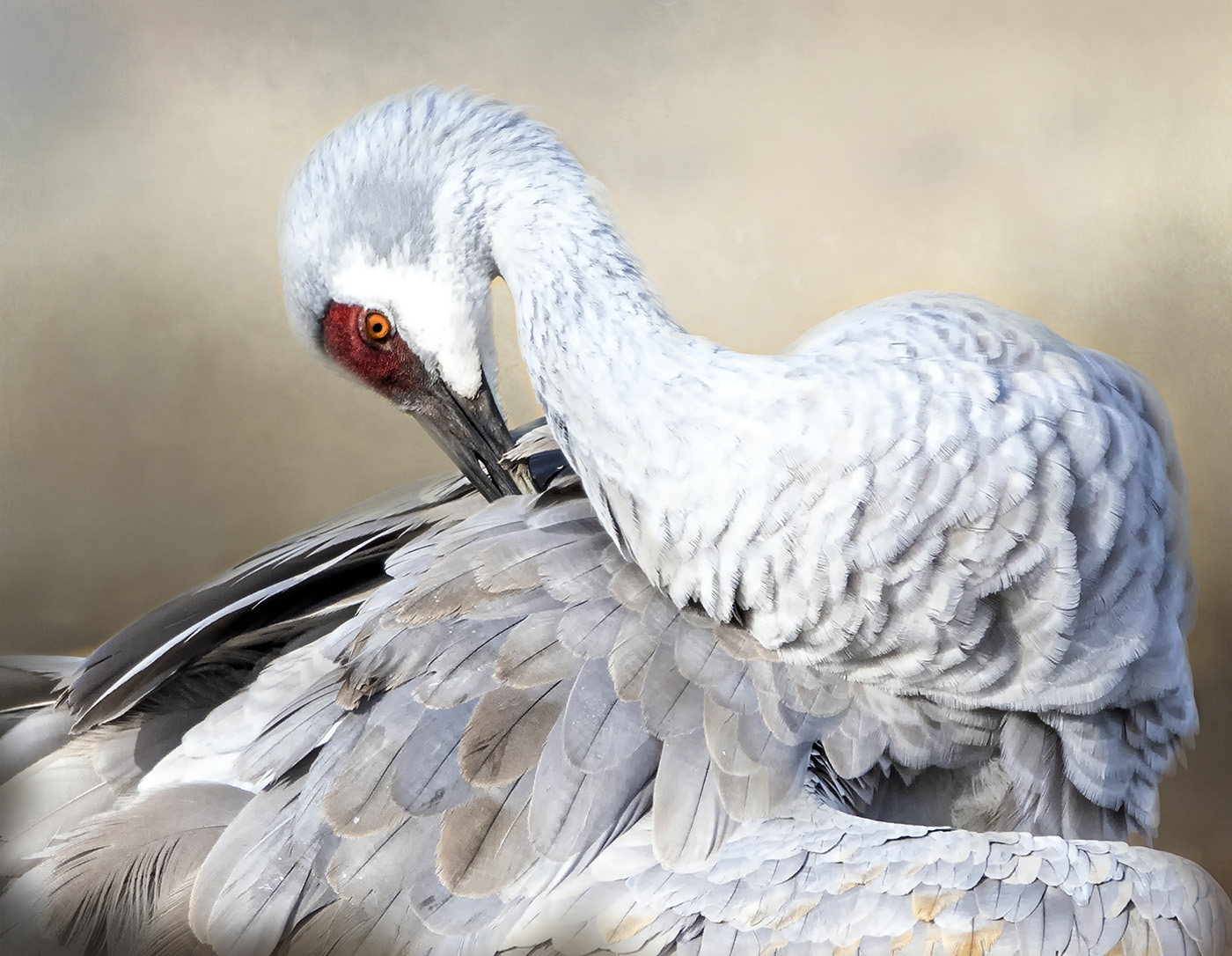
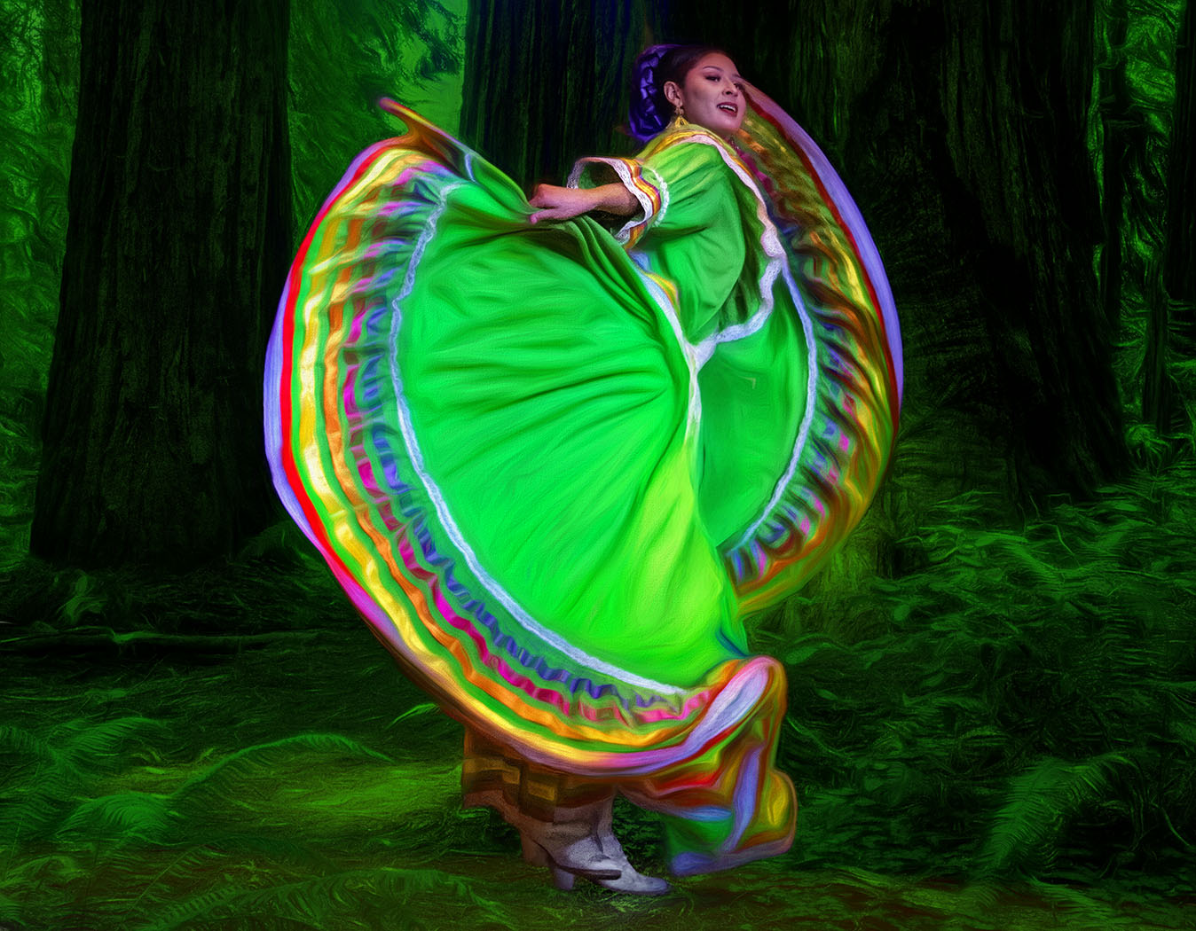
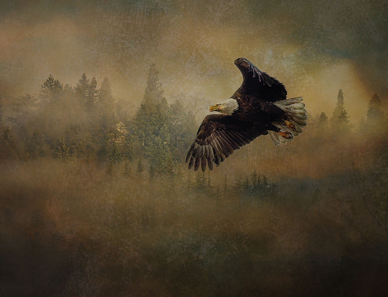
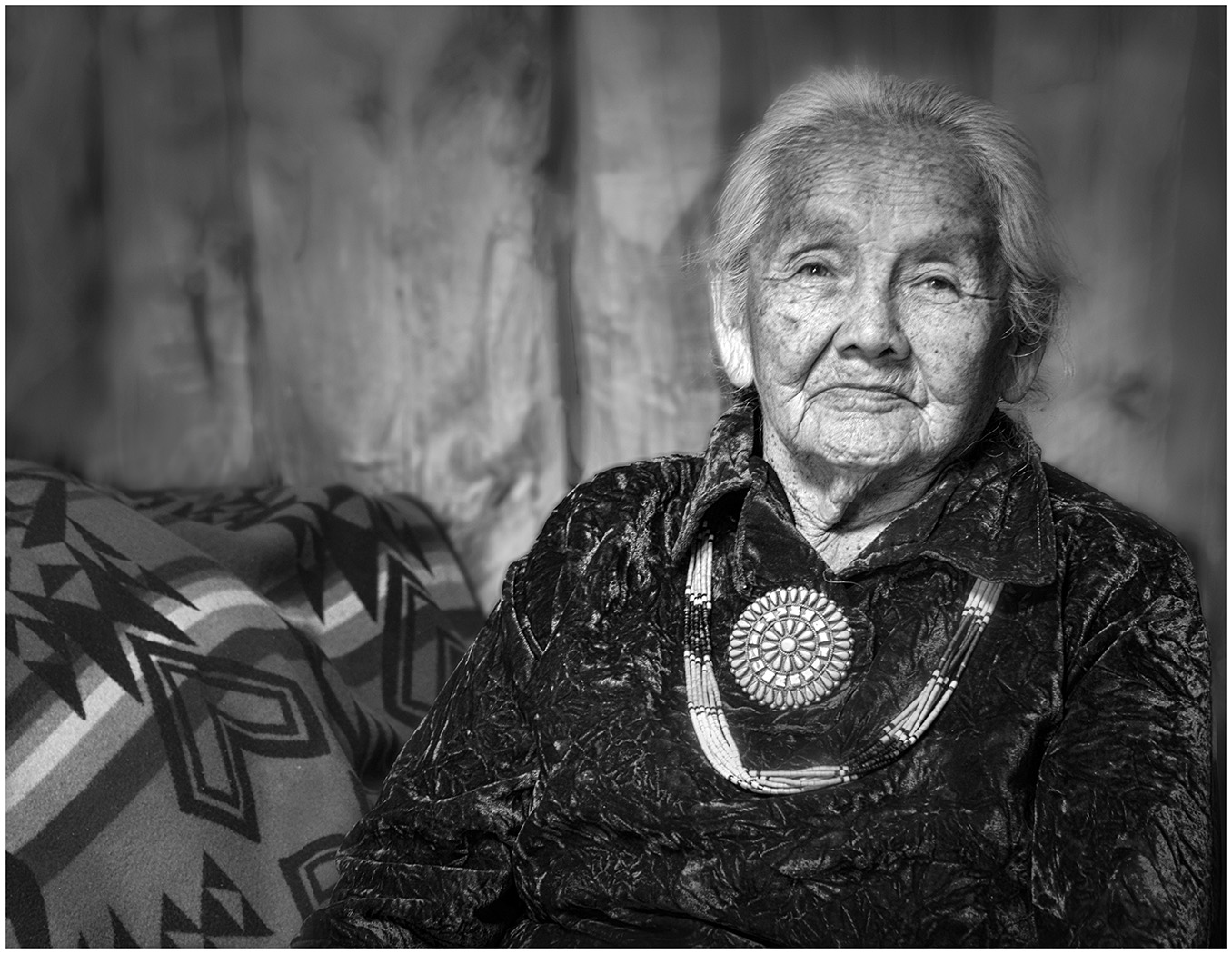
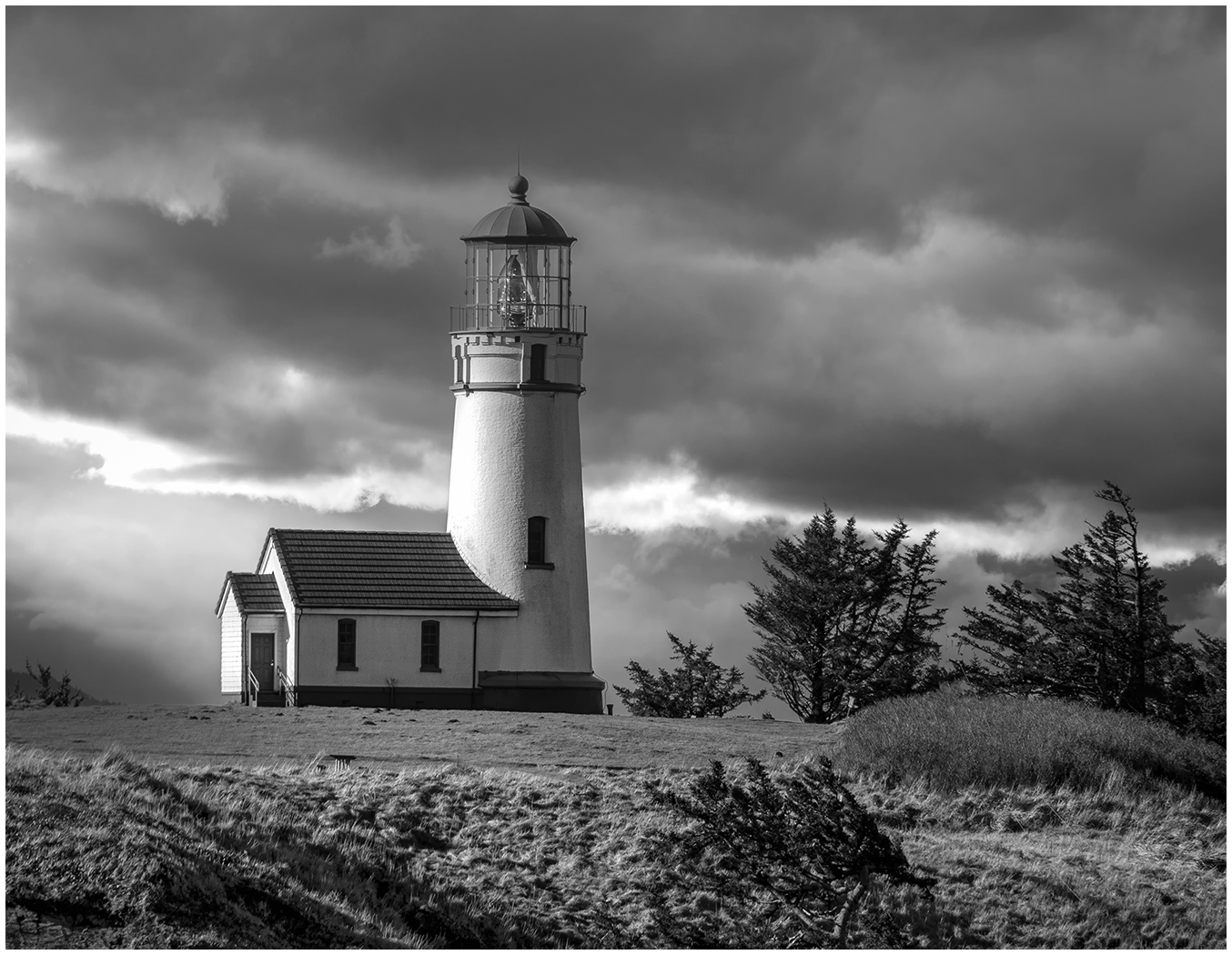
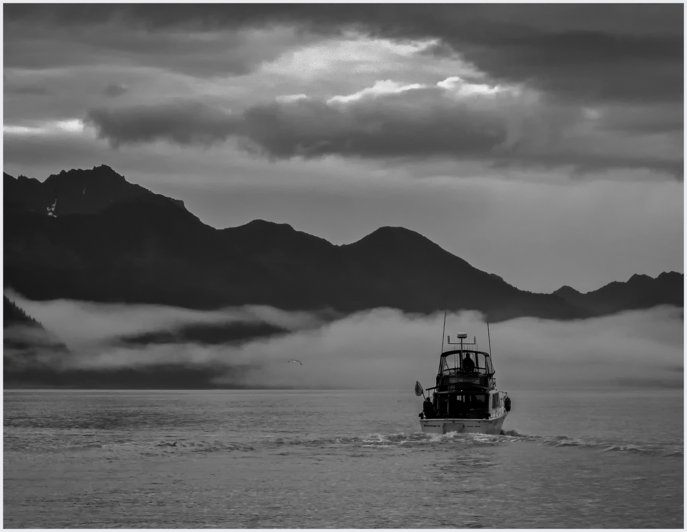
I love the High Key approach and how you isolated the subject. With the High Key I can feel the cold of being in Fairbanks. Wonderful! I might try a slight vignette to frame the picture and limit my eye from wondering out of the picture. |
Nov 16th |
| 20 |
Nov 24 |
Comment |
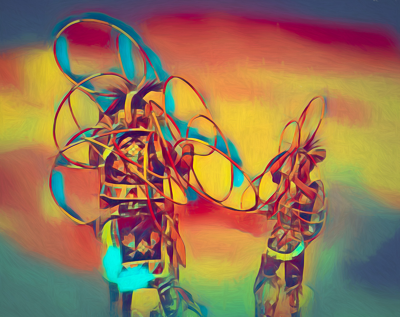
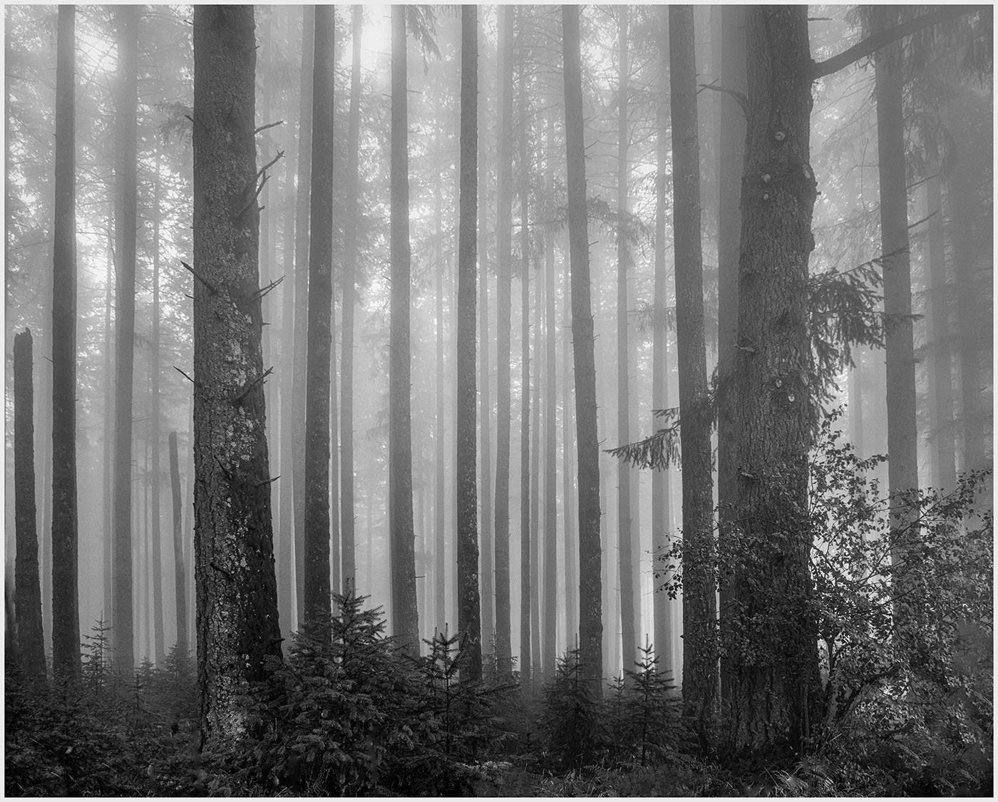
Very creative. I like the contrasting color and how the trees seem to be dancing. Was this a multiple exposure shot in camera? I am interested how you accomplished it. |
Nov 16th |
4 comments - 4 replies for Group 20
|
| 39 |
Nov 24 |
Reply |
That's a good question, Mary Ann. Is it all in the eye of the beholder? Comments, anyone? |
Nov 17th |
| 39 |
Nov 24 |
Comment |
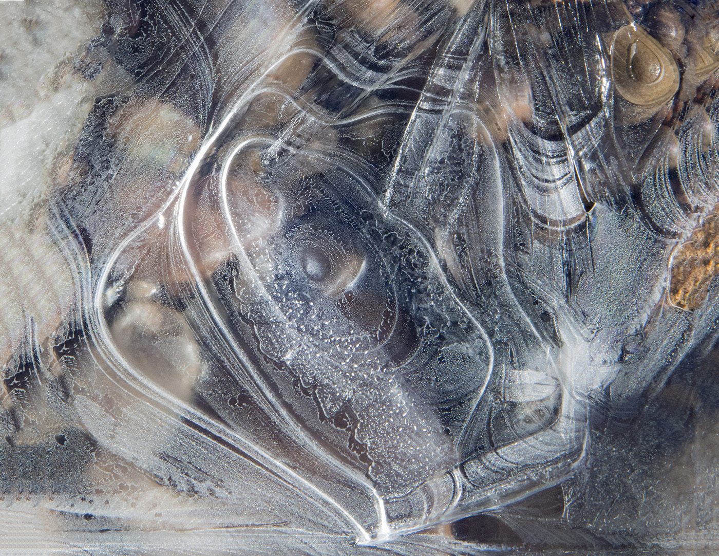
I love how it works in monochrome. In the color version, the front structure is distracting and takes over. In the monochrome it all works together...a study in lines and shapes. |
Nov 16th |
| 39 |
Nov 24 |
Comment |
This is a wonderful abstract. I, too, prefer the color. I think the patterns have a deeper contrast that way. There are 2 things I would try. I would try to straighten the horizon, so that the currents flow up more easily. I feel a bit off kilter. I also would see if you prefer it flipped horizontally. Personally, I prefer the flow. I have absolutely no experience with drone photography, ( still trying to master regular photography), so I am not sure why you have the smooth texture and lack of sharpness. My preference would be to see the patterns more in focus. I think you would still have the painterly feeling. |
Nov 16th |
| 39 |
Nov 24 |
Comment |
This design works well as both a vertical or a horizontal. As a vertical, the dark, larger supports serve as an anchor, but as a horizontal I would like to see them removed. That way my eye is just focused on the design. It appears as an architectural drawing. Very intriguing. |
Nov 16th |
| 39 |
Nov 24 |
Comment |
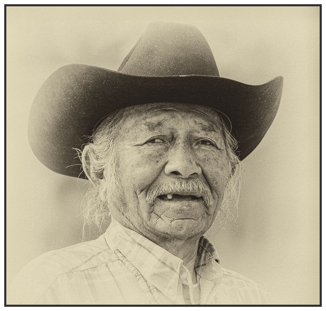
You are relatively new to the Group, Mary Ann. I value each member and their honest critiques. It is a true Study Group and I have learned a lot from each person. Just saying something is good doesn't move us forward. To me, your subject is the cow with the grass in her mouth. I would like to see her stand out more. You could take out the cows rumps behind her and head below. I also would focus on adding texture to the front cow. If you had focused on the cow's eye and eating the grass, the subject would have been more apparent. |
Nov 16th |
| 39 |
Nov 24 |
Comment |
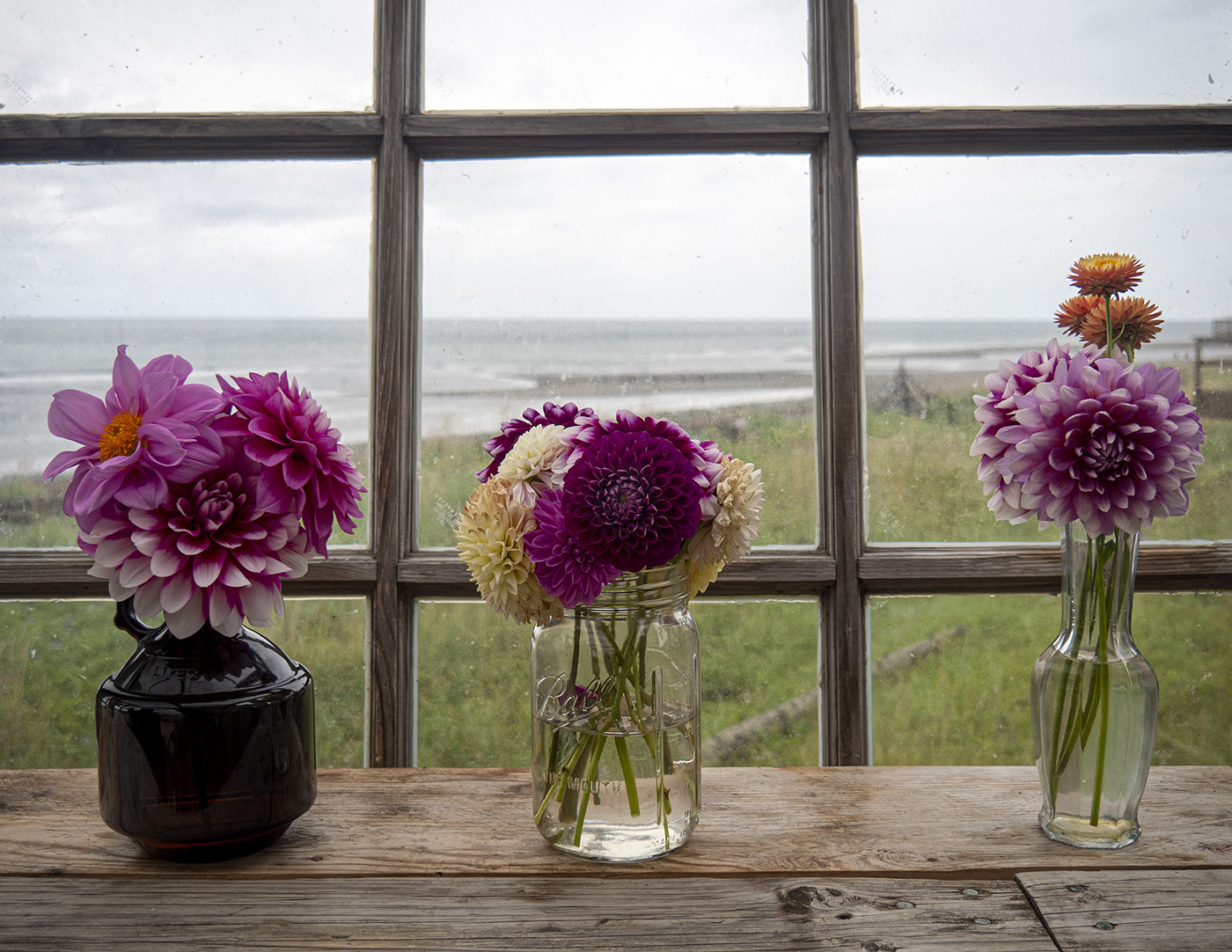
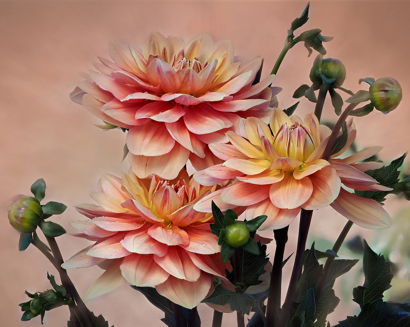
A wonderful chair and Reading Nook. I can visualize someone choosing a book and enjoying it for hours. The light is perfect for creating the tones and contrast. The chair does seem a bit cramped on the left. Using the new Generative Expand in PS, I would try to expand the frame a bit to the left for more balance. If you want to get rid of the stems and cut off flower, the remove tool would do a great job. |
Nov 16th |
| 39 |
Nov 24 |
Reply |
Thanks, Dave. I, too, think this is busy. I wanted focus on Sonny Boy. This is a different crop. Better? |
Nov 8th |
 |
5 comments - 2 replies for Group 39
|
9 comments - 6 replies Total
|