|
| Group |
Round |
C/R |
Comment |
Date |
Image |
| 20 |
Apr 24 |
Reply |
Thanks for your answer. I definitely photograph for my own expression and creativity. I often don't understand a judge's thinking, so I was curious how others thought it would do in a competition. I definitely will fix the halo and I like how you worked the clouds. |
Apr 14th |
| 20 |
Apr 24 |
Reply |
Thank you!
|
Apr 13th |
| 20 |
Apr 24 |
Reply |
Thank you, Fred. |
Apr 13th |
| 20 |
Apr 24 |
Reply |
Thank you, Peter. Do you think it is one for Competition...Altered Reality? |
Apr 13th |
| 20 |
Apr 24 |
Reply |
Good idea! I do like the effect. |
Apr 12th |
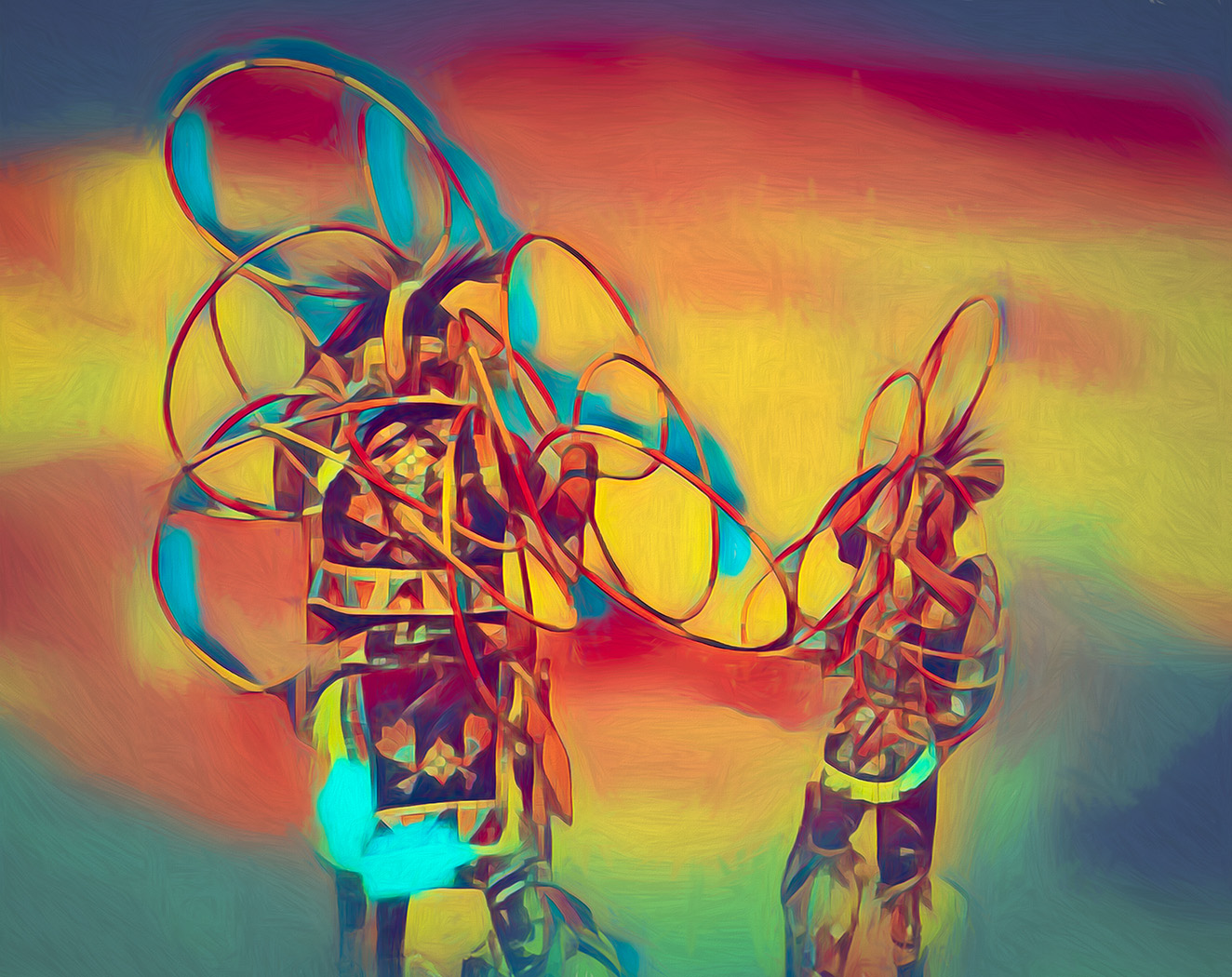
| 20 |
Apr 24 |
Comment |
So much to study. I like the concept and the feel. Can you bring out the Welcome sign a bit more, so that our eye focuses on it first, and the moves around the image? Right now my eye goes right to the piece center top. |
Apr 12th |
| 20 |
Apr 24 |
Comment |
Very creative. They look like a tryptic on a Gallery wall.
My imagination includes someone viewing them. |
Apr 12th |
| 20 |
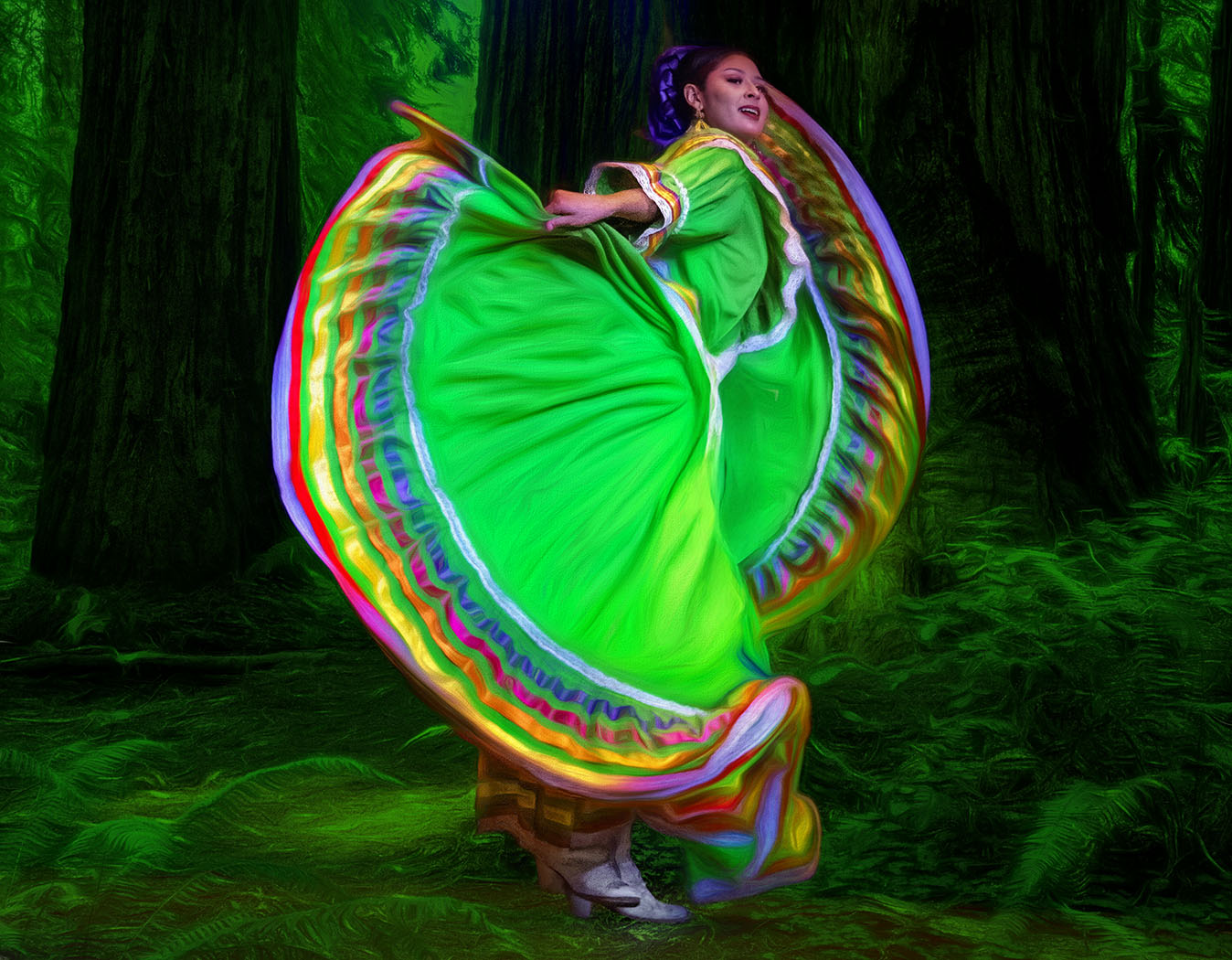
Apr 24 |
Comment |
Wonderful colors. The way the twirl is coming out of the windows makes it magical. How would the street lamps look if they were shorter and on top of the mountain? |
Apr 12th |
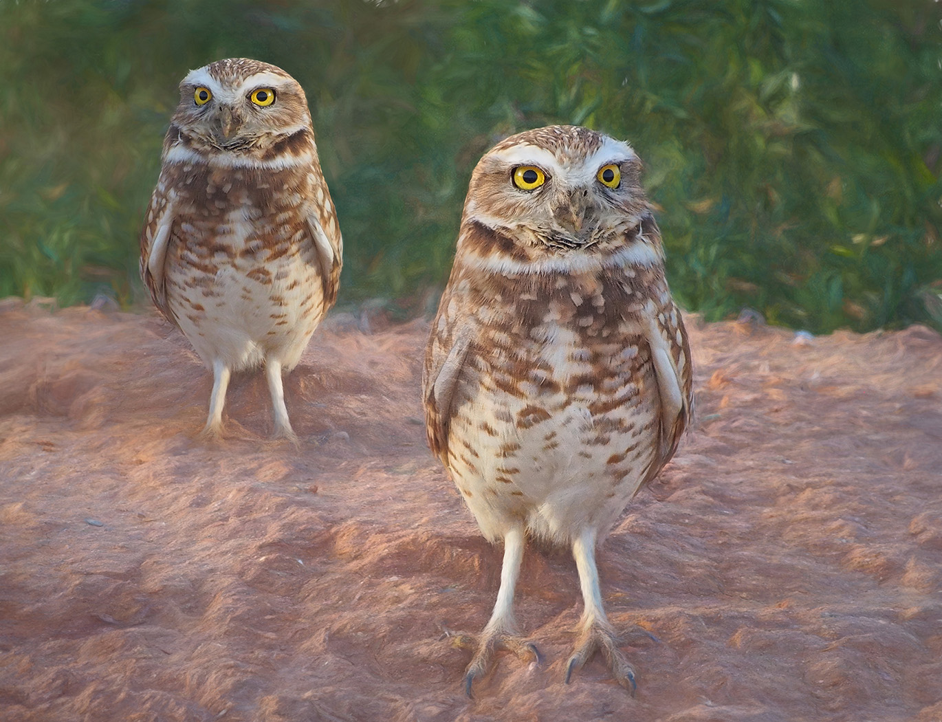
| 20 |
Apr 24 |
Comment |
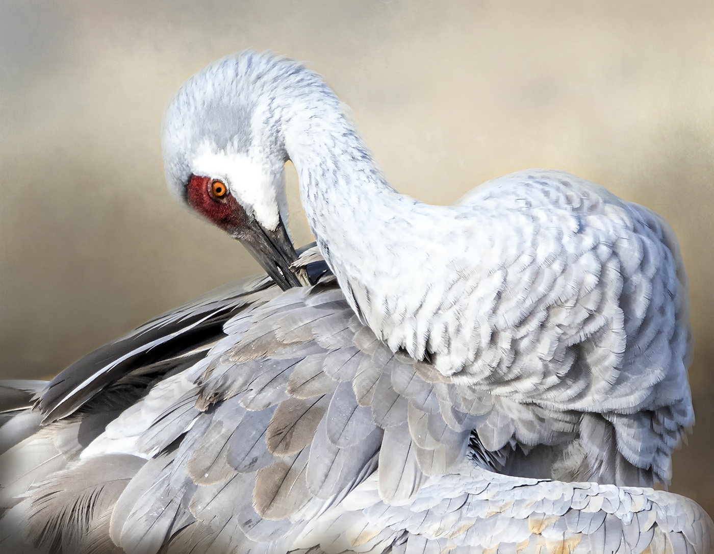
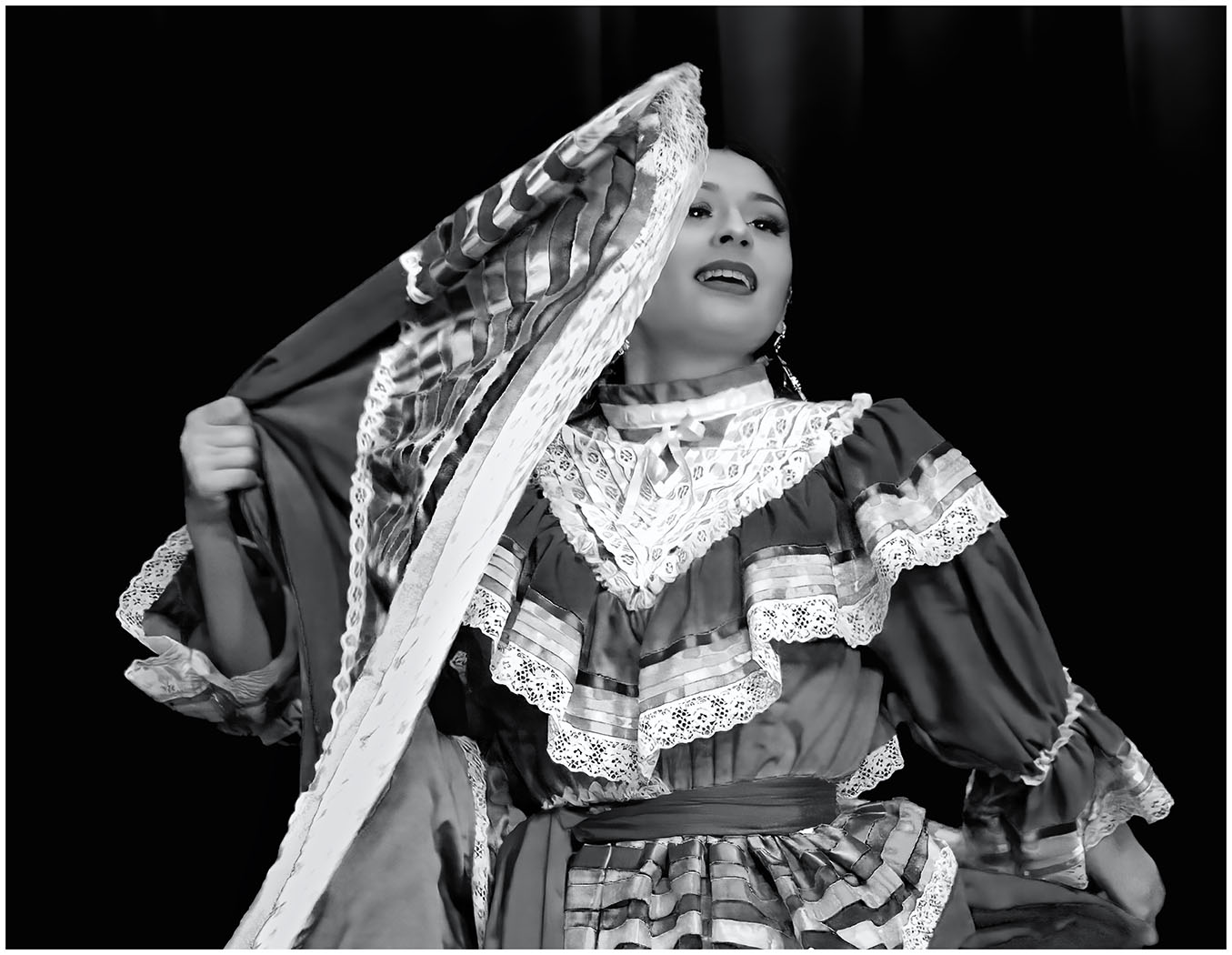
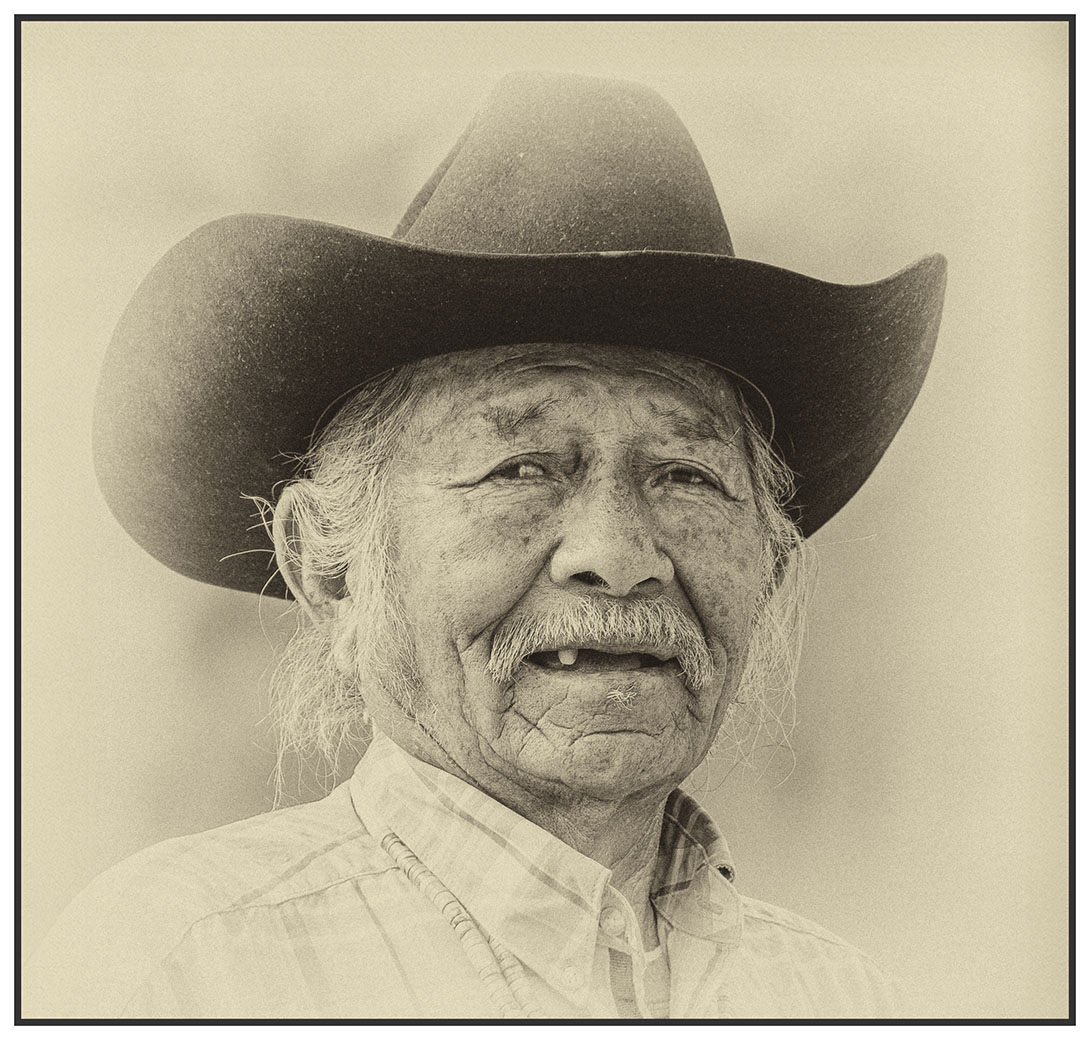
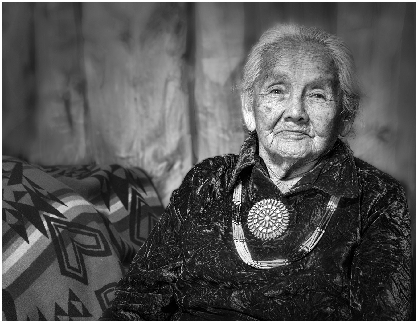
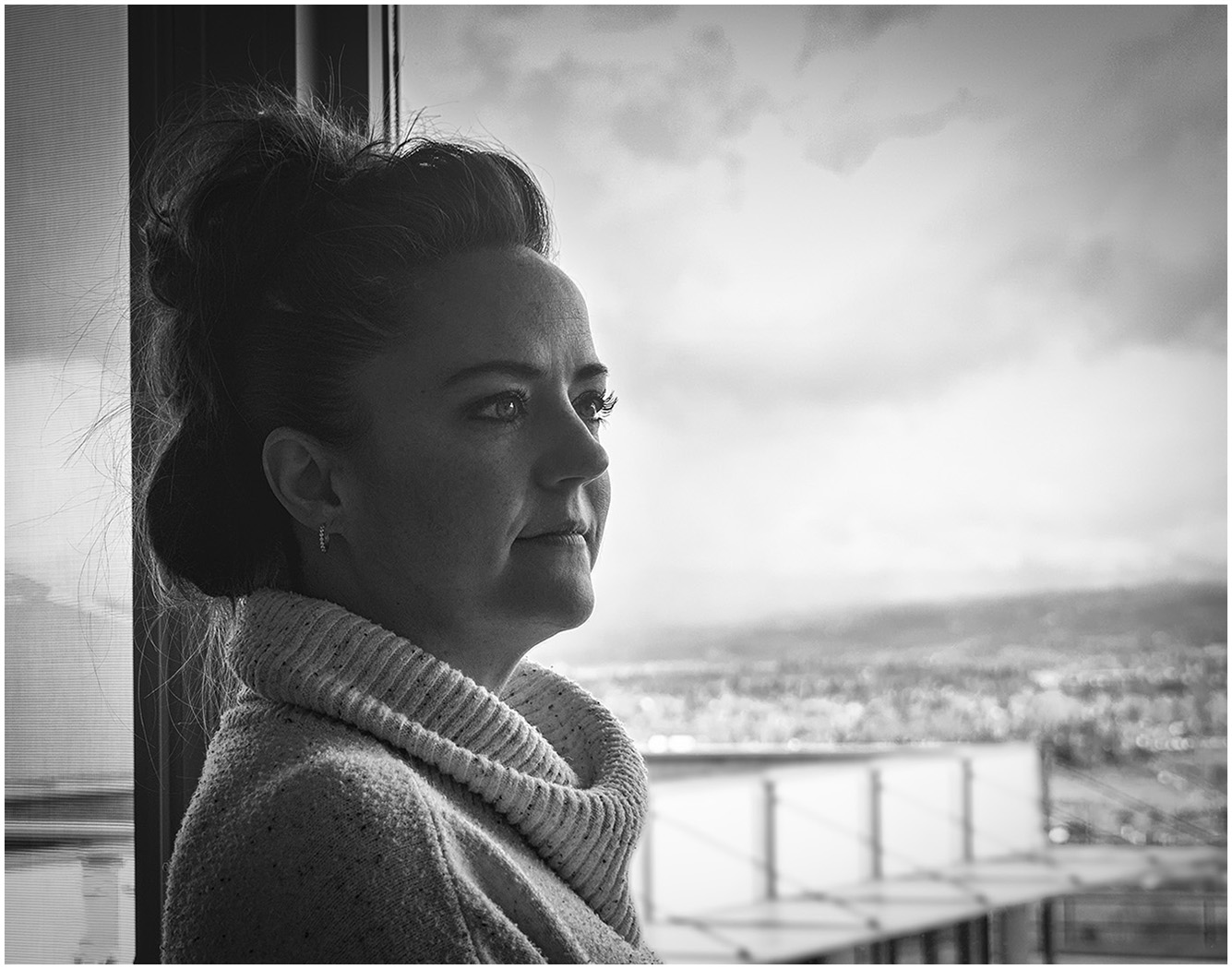
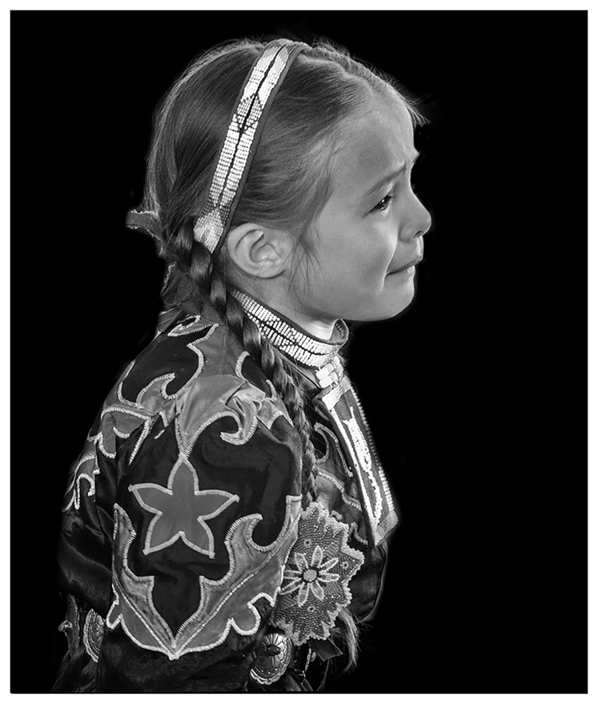
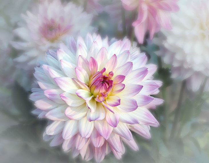
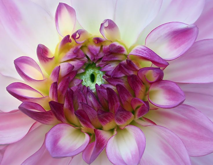
Two beautiful portraits. The close up image shows wonderful tone and details. I think I would also like to see the close up with the white background. It would be so dramatic. |
Apr 12th |
| 20 |
Apr 24 |
Comment |
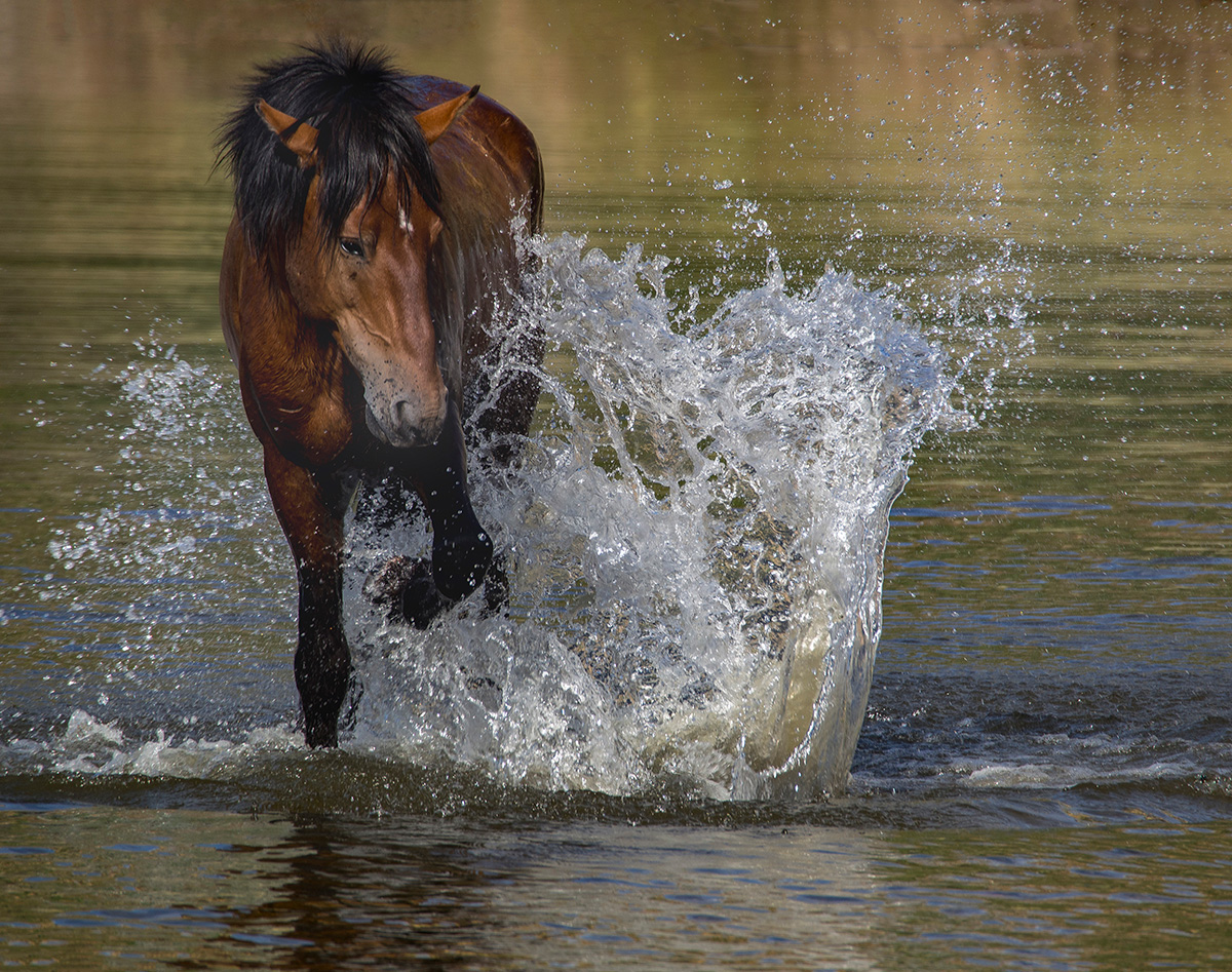
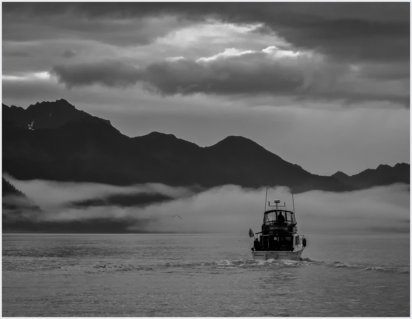
Good idea to "save" a photo. You still get the feel of action. Could you change the color of the jockey in red. He is so close in color that it is difficult to differentiate him from the horse. |
Apr 12th |
5 comments - 5 replies for Group 20
|
| 39 |
Apr 24 |
Reply |
Thanks, Paul. |
Apr 17th |
| 39 |
Apr 24 |
Reply |
Thank you, Vincent. |
Apr 17th |
| 39 |
Apr 24 |
Reply |
I understand. In PS you could use the Generative Expand a bit, if you wanted to, and only if you wanted, go more on the right. |
Apr 16th |
| 39 |
Apr 24 |
Reply |
Thanks! |
Apr 15th |
| 39 |
Apr 24 |
Reply |
And it is your photo and your artistic choice! I still hesitate to offer a change to someone else's photo. I now use the Generative Fill to remove things that I wish weren't there when taking the photo....especially
photo bombers. |
Apr 15th |
| 39 |
Apr 24 |
Comment |
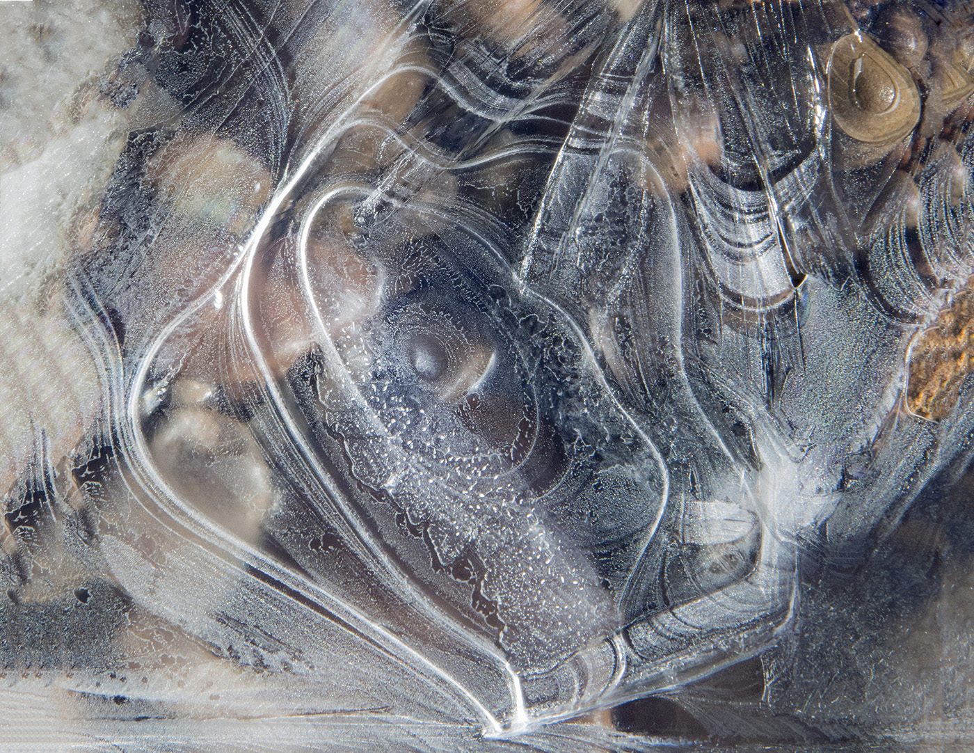
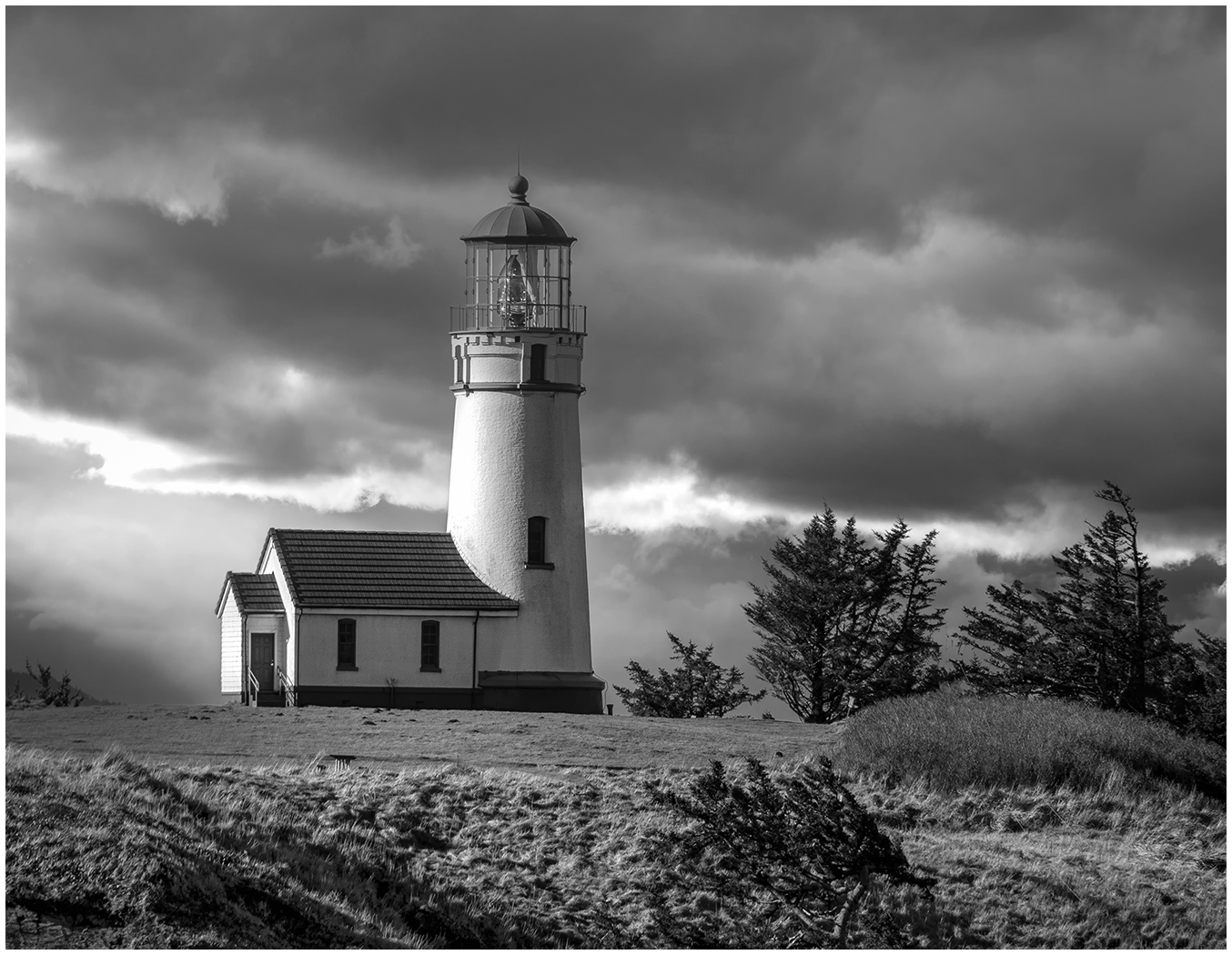
A creative way to show the ice on the window. I was not sure what I was looking at until I read your description. It is a beautiful abstract design. Is there a way you could add a window frame, so we know we are inside, looking out? If you prefer to keep it as a macro abstract, I might suggest a thin white border. |
Apr 14th |
| 39 |
Apr 24 |
Comment |
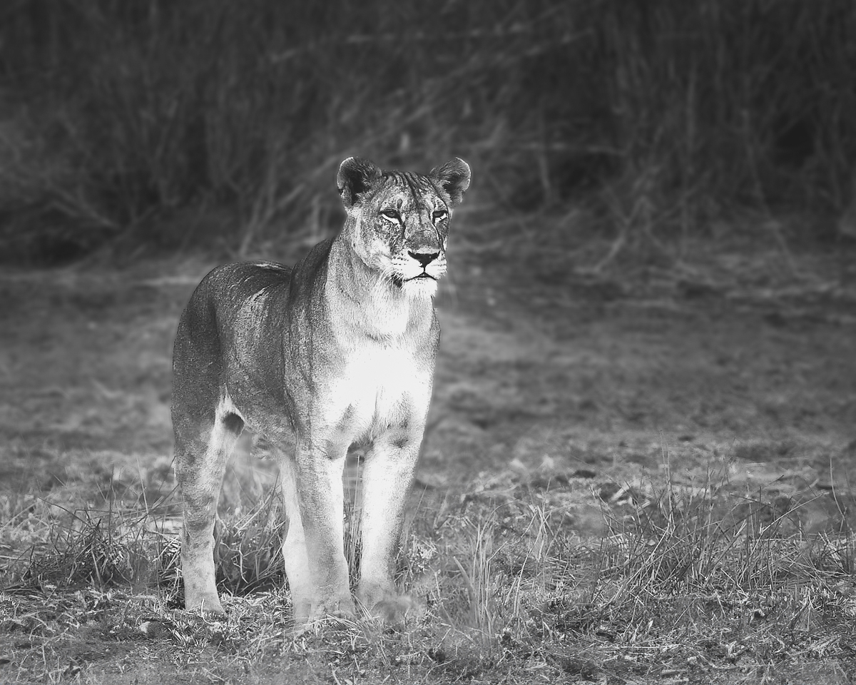
I love the color shot. The similar soft tones blend so well, yet she stands out. I see where the front grasses were blurred. You can fix that easily with Generative Fill. I also like it converted to Black and White. The contrast and the blurred background work well. I am not sure why you did the Motion Blur in the bottom half. Personally, it distracts me from the beautiful pose of the lioness. Your tones and textures on the lioness are much better than mine. Ignore what I did to her, but see what you think about the foreground and background. |
Apr 14th |
 |
| 39 |
Apr 24 |
Comment |
The lines and the different textures work so well. Did you try it in a gritty Black and White also? The Mining Cart is not in contrast enough with the wall. Perhaps darkening it would help. |
Apr 14th |
| 39 |
Apr 24 |
Comment |
Another great Street Scene. You have made Cheltenham High Street come to life for us. IF...I had to suggest anything it would be a touch more space on the right. I don't see her as sad and lonely, just taking a needed breather while out doing her errands. She's glad she found the empty bench! |
Apr 14th |
| 39 |
Apr 24 |
Comment |
I love the lighting and the tones. Perfect! I think you posted this last month. |
Apr 14th |
5 comments - 5 replies for Group 39
|
10 comments - 10 replies Total
|