|
| Group |
Round |
C/R |
Comment |
Date |
Image |
| 20 |
Mar 24 |
Comment |
I like the Composite...nicely done. Each swan could also be part of a tryptic. I like Angela's suggestion of including a bit more of the snow. I might also consider cropping up on the water a tad. |
Mar 11th |
| 20 |
Mar 24 |
Comment |
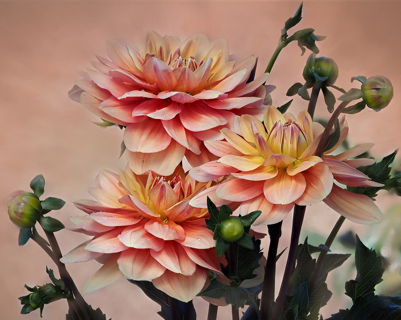
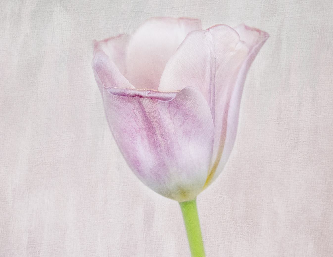
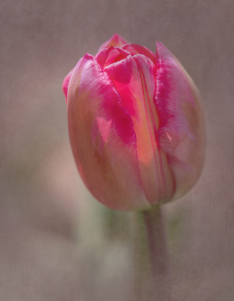
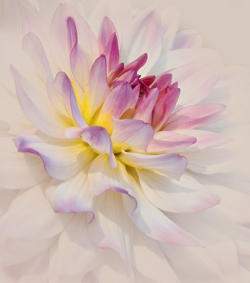
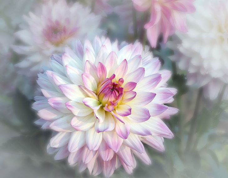
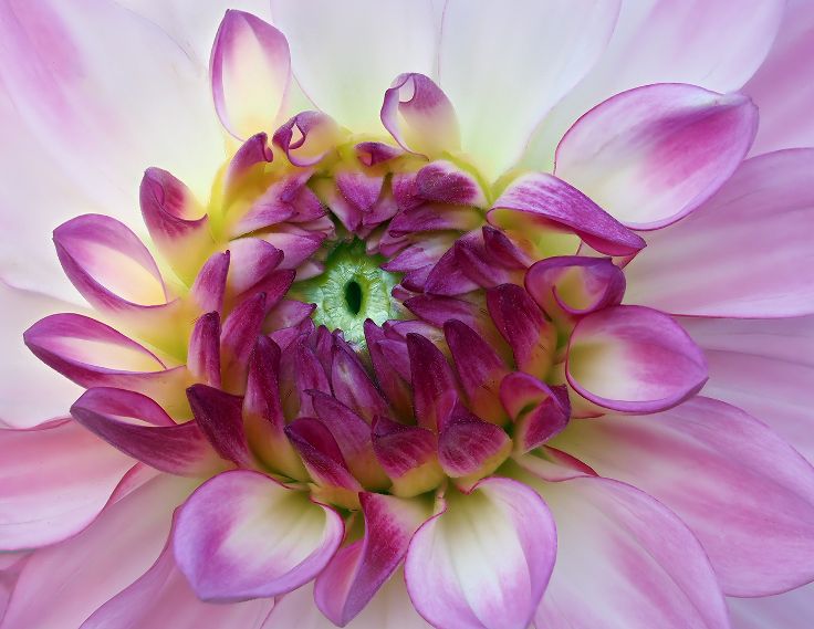
Lovely job. I like the addition of the bracelets. I love to stack flowers too. How does it look with the softer pink of the original? I have Topaz Studio 2, but am not familiar with the "Brilliant in Black" Look. What version do you have? Personally, I think the white lines of the texture distract from the beauty of the flowers. Would you consider leaving them on the bottom but removing some from the left side. |
Mar 11th |
| 20 |
Mar 24 |
Comment |
Beautifully done. I might suggest removing the figure on the right. To me, he is a distraction to the main composition. |
Mar 11th |
| 20 |
Mar 24 |
Comment |
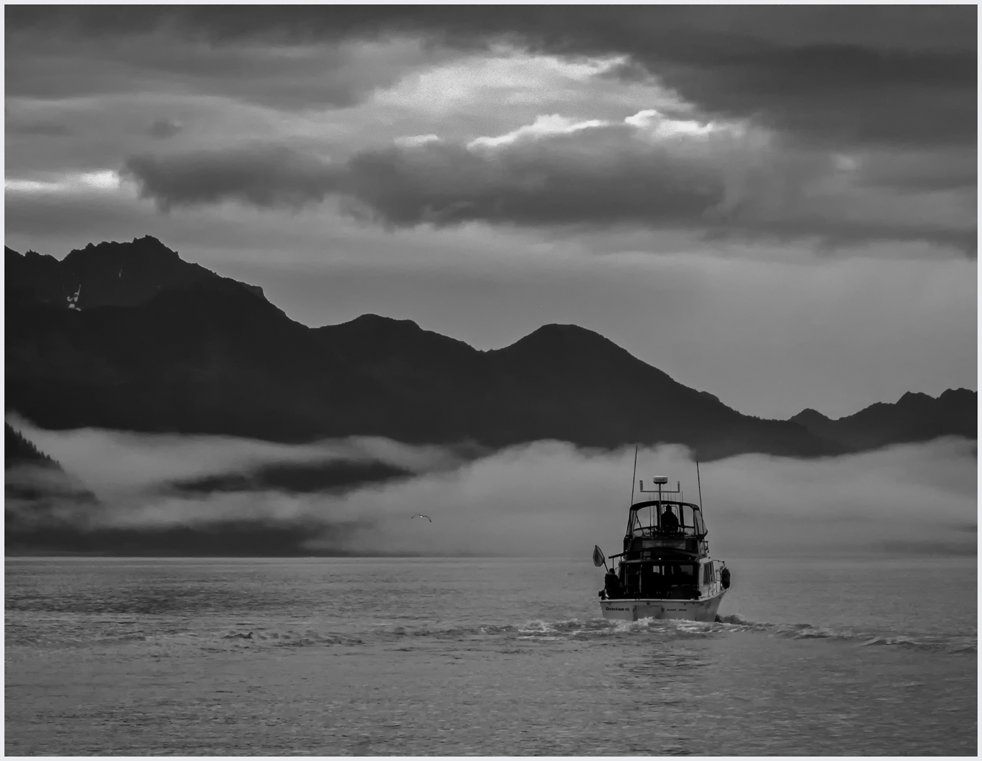
Beautiful light and tones to set the mood. I too, would suggest that you move the gull a bit down and to the right.
It takes away from the moon this way. It has been hammered into me to patrol my borders...the dock on the right is a bit distracting. I would suggest removing it. |
Mar 11th |
| 20 |
Mar 24 |
Reply |
Thanks, Deborah. I like that idea. Will try. |
Mar 11th |
| 20 |
Mar 24 |
Reply |
Thank you!
|
Mar 11th |
| 20 |
Mar 24 |
Reply |
Thank you, Fred. I don't know how to do a shadow. Can you point me in the right direction? |
Mar 11th |
4 comments - 3 replies for Group 20
|
| 39 |
Mar 24 |
Reply |
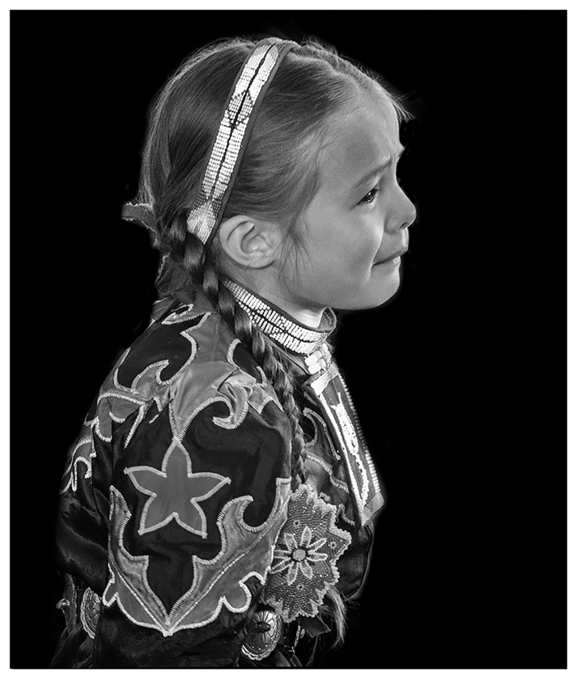
Thank you, Paul. Do you think the fingers are too soft for competition? |
Mar 18th |
| 39 |
Mar 24 |
Comment |
Thank you so much, Vincent. It was the emotion that drove me. |
Mar 14th |
| 39 |
Mar 24 |
Reply |
Thanks, Jerry. |
Mar 14th |
| 39 |
Mar 24 |
Reply |
Thanks, Kathryn. I see the softness of the fingers, but tried to sharpen them and didn't like the look. I did focus on the fence and the fingers poking through. |
Mar 14th |
| 39 |
Mar 24 |
Comment |
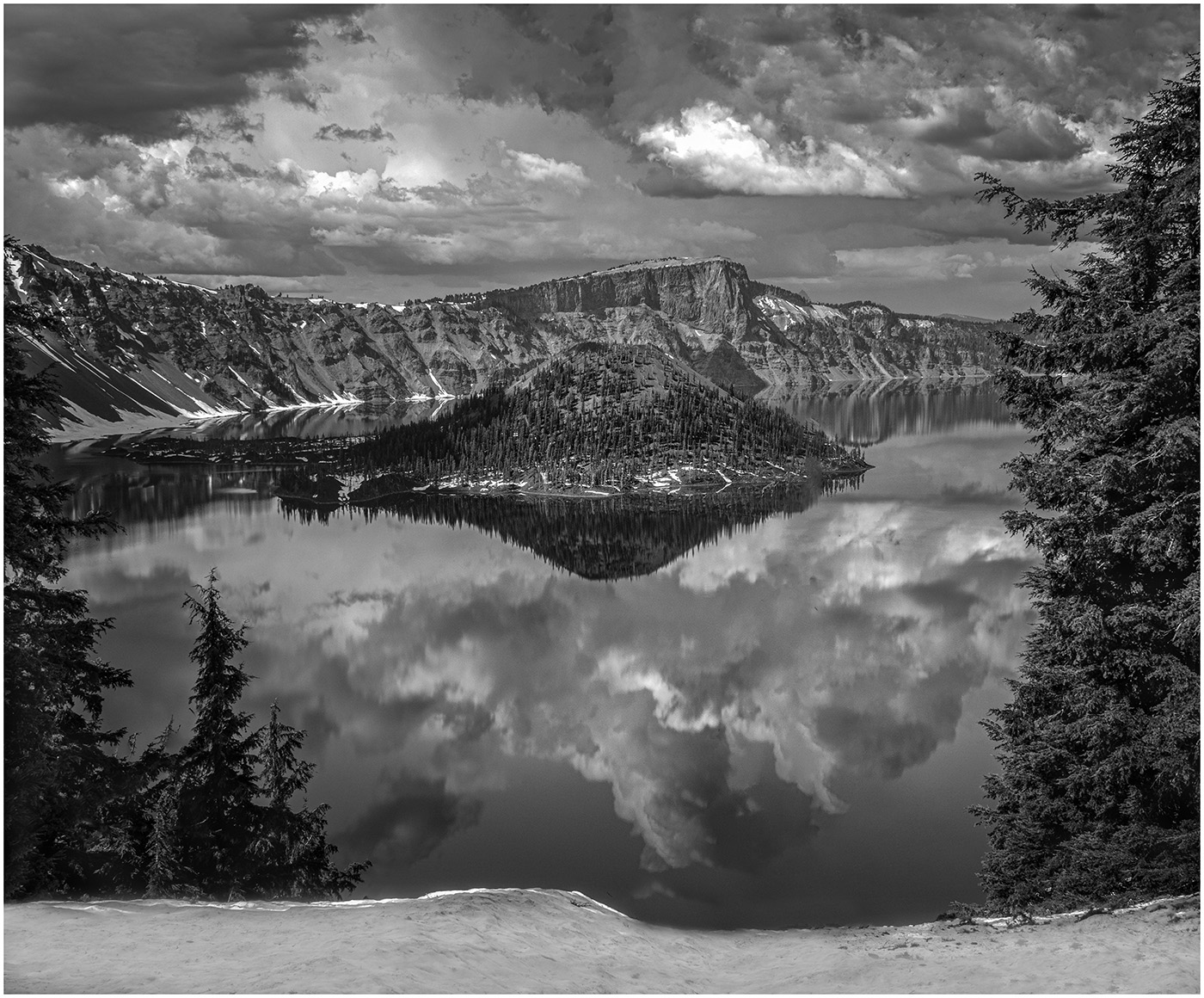
It is fun to play with AI, but I still consider it a slippery slope. I am confused as to what the original photo looked like. Your conversion to Black and White works well. All the tones are good. I would like to see the top cropped down so there is no sky on the left. Also I would remove the cactus on the far right as we cannot see enough of it. One last suggestion, I would use the door without the gate as in #2. The gate seems a barricade to entering the photo.
Have you been playing a lot with AI? It is a philosophical question to me, is this Photography or has all Photography become Digital Art? Would love to have that discussion over a drink. |
Mar 14th |
| 39 |
Mar 24 |
Comment |
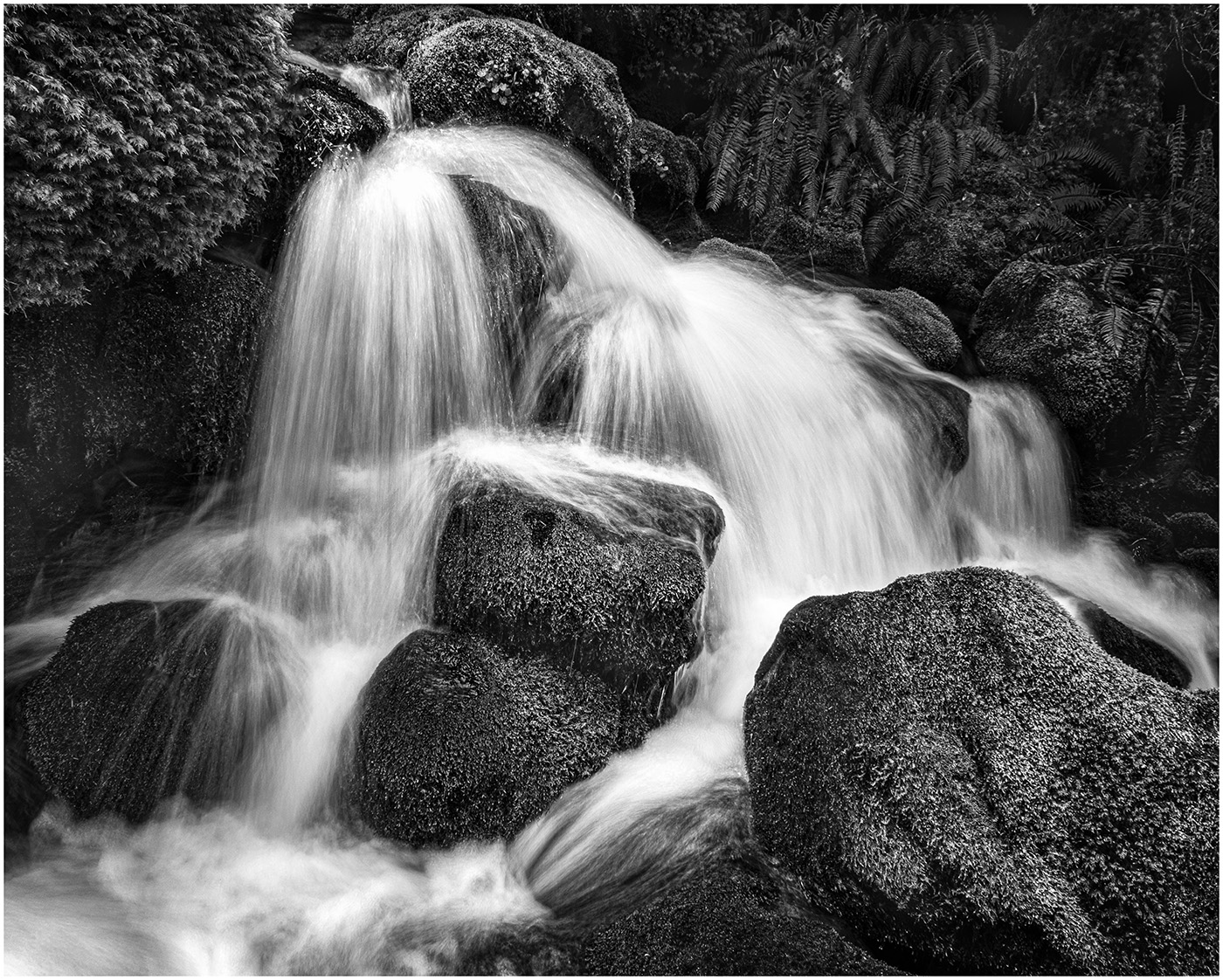
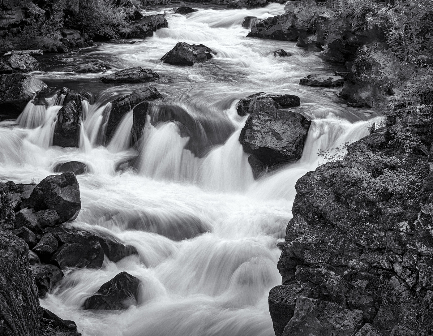
You have done an excellent job of capturing the water going over the rocks. Because to me, that is the photo, I would crop down on the sky to just below the bird. I want my eye on the Falls, with the sky complementing it, not competing with it. I, also, don't think the bird is necessary, but this is your vision, not mine. |
Mar 14th |
| 39 |
Mar 24 |
Comment |
Once again, the fruits of your wanders were rewarded. What a great capture. Something that gives you a lot to look at. My only suggestion would be to crop in on the right and up from the bottom to leave a narrow suggestion of the building. The light reflections do not distract me, but the 3 little white dots do. How about removing them? Love this photo!
|
Mar 14th |
| 39 |
Mar 24 |
Comment |
Great geometrics. When I look at it, I see triangles. Good eye. If you cropped in on the right and the left and up from the bottom a bit (as others have suggested), more emphasis would be on the black triangle. Also, the blown light in the front could just be removed. I think the eye would then go right through the columns and to the people. And to nit pick, I would remove the white sign on the black door on the left. Really minor suggestions for a great architectural photo. |
Mar 14th |
| 39 |
Mar 24 |
Comment |
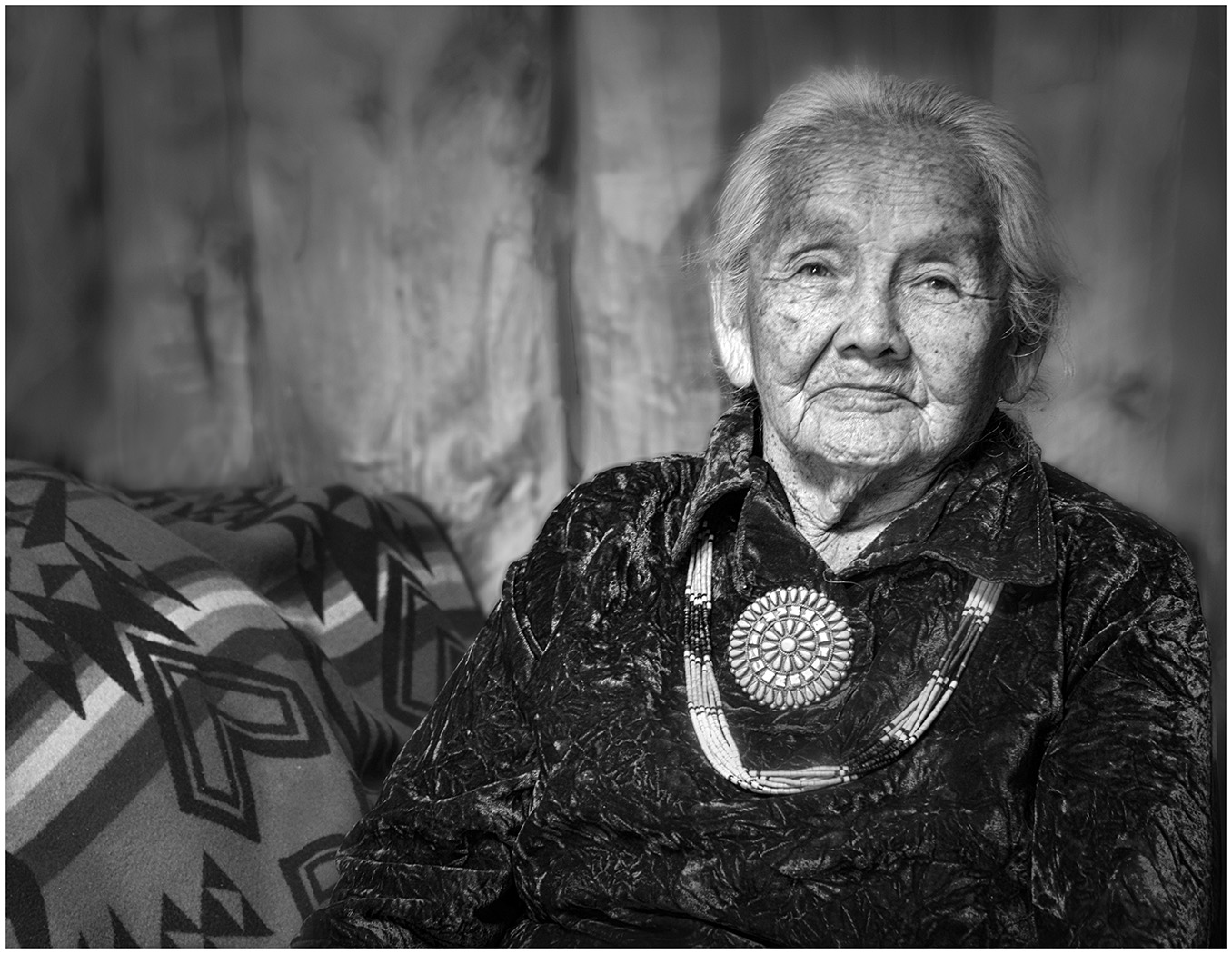
Wow! I think this is perfect. The texture of the rock contrasts with the Cat, but doesn't compete. The clear sky also sets him off. Good luck with your Camera Club. |
Mar 14th |
| 39 |
Mar 24 |
Comment |
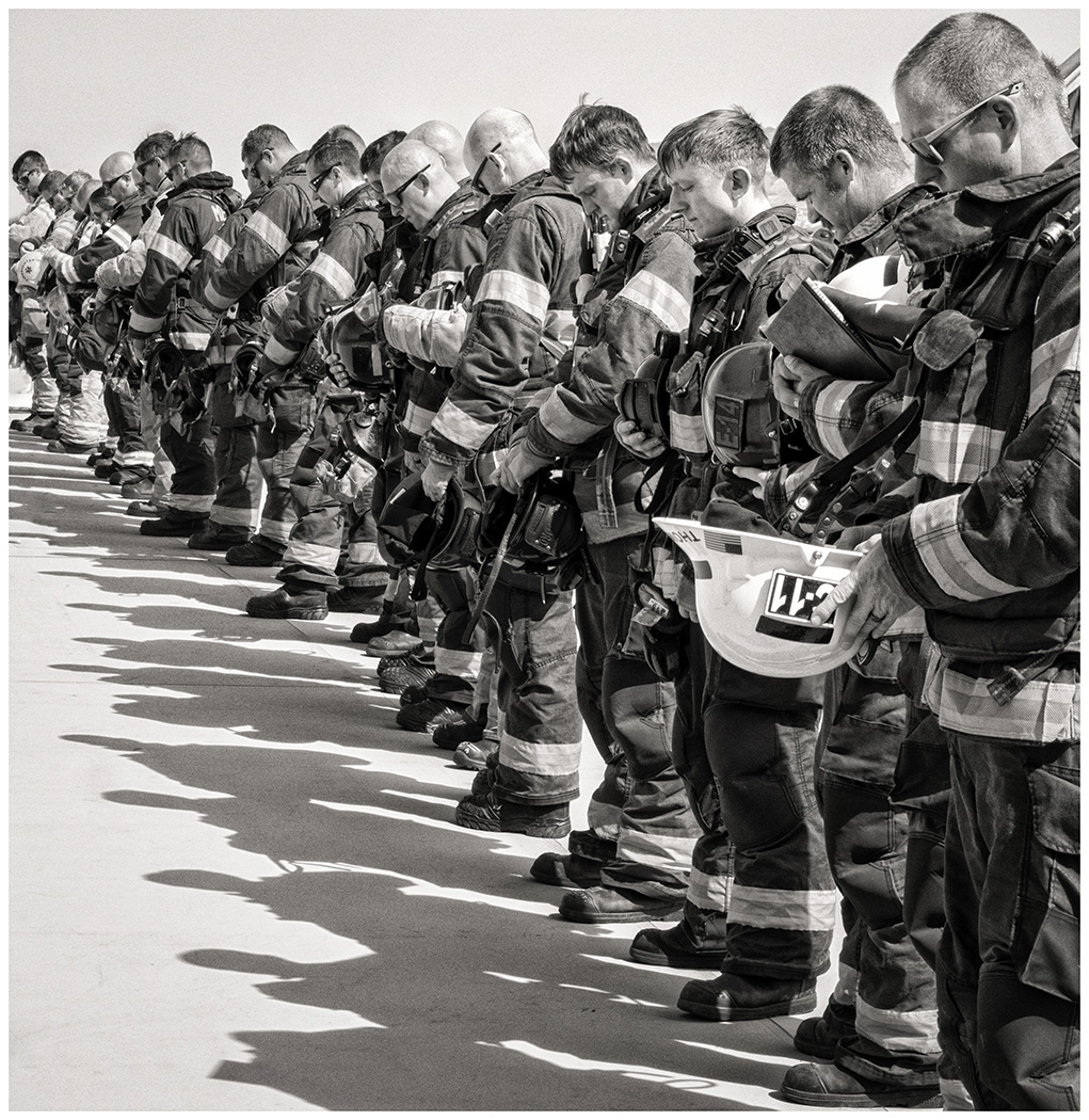
Wonderful lighting and tones. I like the low key look. |
Mar 14th |
| 39 |
Mar 24 |
Reply |
I see what you mean. |
Mar 6th |
| 39 |
Mar 24 |
Reply |
Thank you, Lance. I am well and hope you are too. I always enjoy when you "pop" in and I receive your input. |
Mar 6th |
| 39 |
Mar 24 |
Reply |
Thanks, Dave. I did want soft focus for everything but the "fingers" and chain-link. |
Mar 6th |
7 comments - 6 replies for Group 39
|
11 comments - 9 replies Total
|