|
| Group |
Round |
C/R |
Comment |
Date |
Image |
| 20 |
Jan 24 |
Reply |
Thanks, Fred. Looking forward to sharing and seeing everyone's creations. |
Jan 22nd |
| 20 |
Jan 24 |
Reply |
Thank you, Peter. Good suggestions I will check out. |
Jan 22nd |
| 20 |
Jan 24 |
Reply |
Thank you! |
Jan 22nd |
| 20 |
Jan 24 |
Reply |
Thank you, Angela. I look forward to learning from all of you!
|
Jan 22nd |
| 20 |
Jan 24 |
Comment |
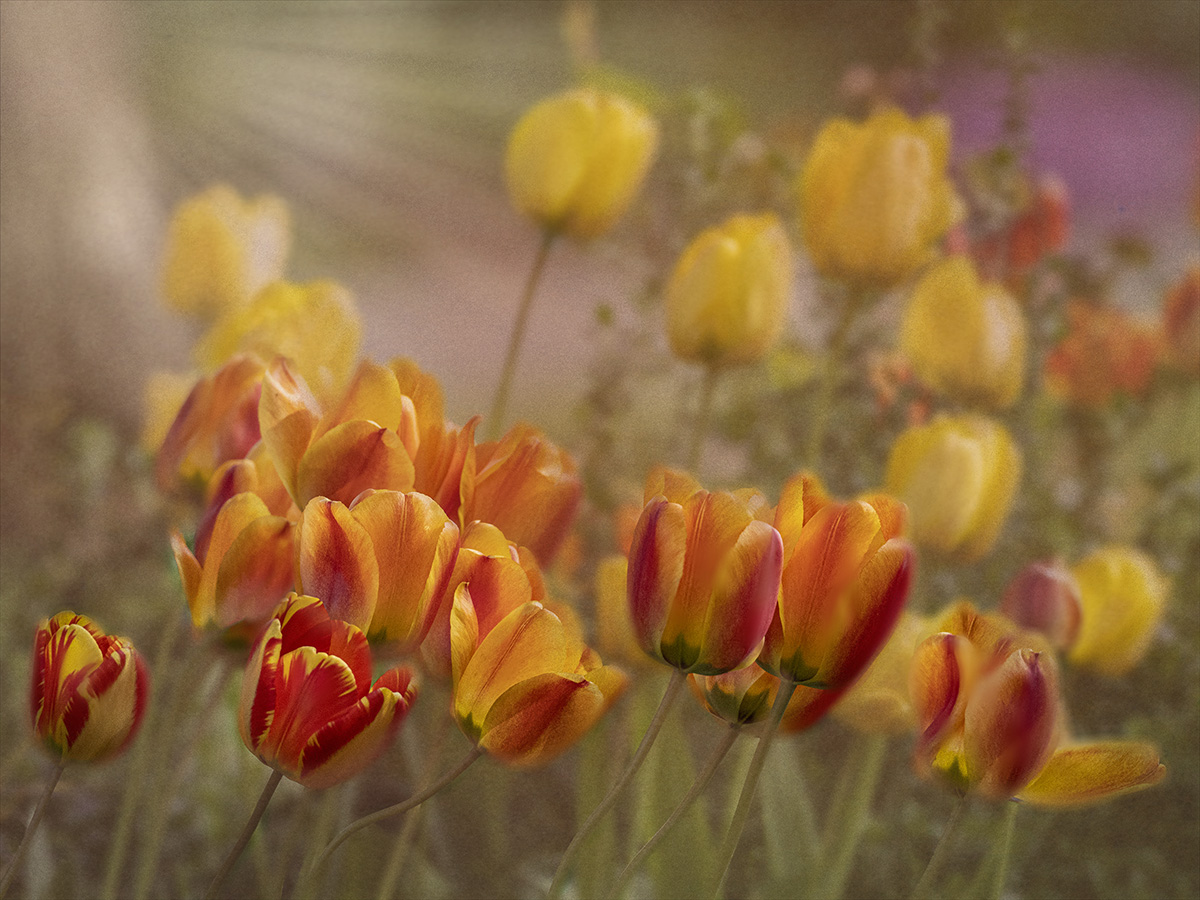
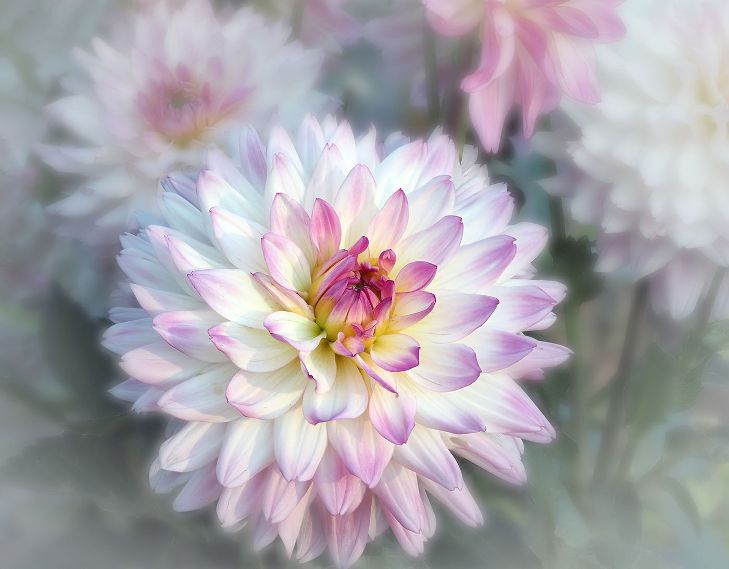
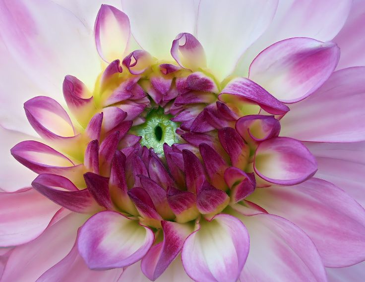
Thanks, Peter for explaining how you made the stained glass. I will try it. I was thinking of a real bold saturation. I'm not sure it is your vision, but I made a Duplicate Layer with the Blending Mode of Vivid Light. Then I decreased the Fill % until I liked it. And with a Layer Mask I took out all the vivid light except for the orange and yellow tulips. What do you think? Too saturated? |
Jan 21st |
 |
| 20 |
Jan 24 |
Reply |
I like the concept of stained glass. I think you did a great job of painting the lines. I think I would like to see the orange and yellow saturated more, so it is not fighting with the black for interest.
|
Jan 11th |
| 20 |
Jan 24 |
Comment |
First of all, I love this image. I like how you took a modern photo and converted it into "Back in Time" Monochrome was a perfect choice. Cropping is just right. I am interested in your comment about "Altered Reality" What is Altered Reality? A composite such as the one I submitted is not an Altered Reality, but it is many layers and filters. To be excepted into this Group, I had to submit photos to show that I did more than just add a filter. There is confusion in my Camera Club also. Would love to hear other people's thoughts. |
Jan 10th |
| 20 |
Jan 24 |
Comment |
I love the fact that you took a creative idea and took it a step further. I used to do globes, haven't for awhile. Thanks for reminding me about this. The sparklers contrast so well to the black globe. Since you weren't sure about the Background Color, how would it look if you converted the background to black? |
Jan 10th |
| 20 |
Jan 24 |
Comment |
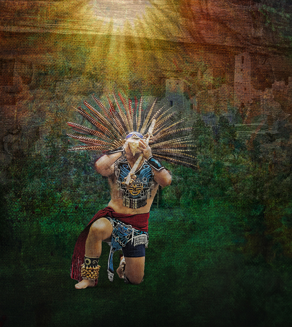
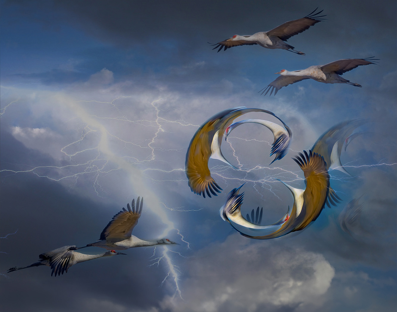
Truly a Creative Vision. I like how you isolated the bird and added the rays. The rays, the bird, and the branch form a nice triangle. I'm wondering how it would look if you moved the notes and the lyrics down a bit and over to the right. It would balance the frame more and make the lyrics more part of the story. |
Jan 10th |
| 20 |
Jan 24 |
Comment |
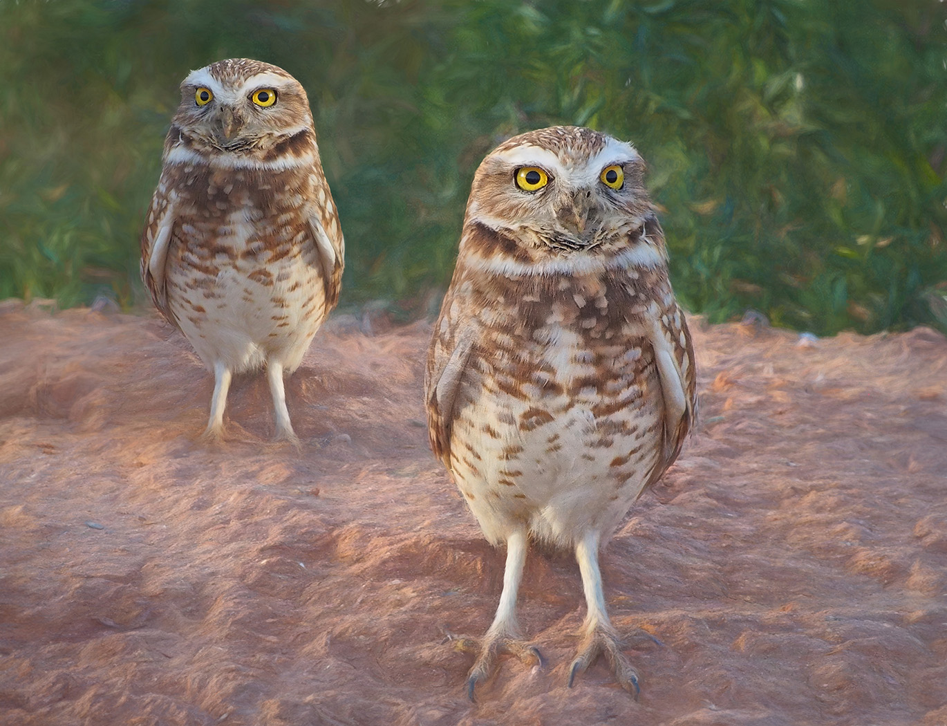
I am looking forward to learning from all of you. Never thought of using the spherize tool. Will have to try. I like how the orange flowers are almost mirrors of each other. The colors are wonderfully saturated and makes you think "wow". Nicely done! |
Jan 10th |
5 comments - 5 replies for Group 20
|
| 39 |
Jan 24 |
Reply |
Thank you, Lance. I appreciate your input, |
Jan 22nd |
| 39 |
Jan 24 |
Comment |
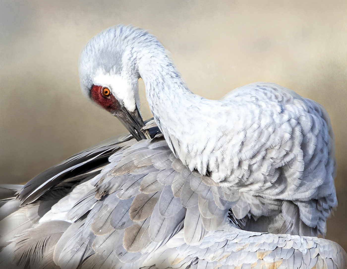
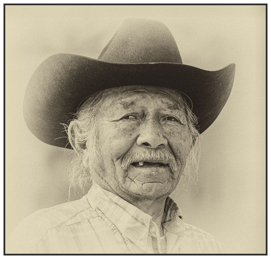
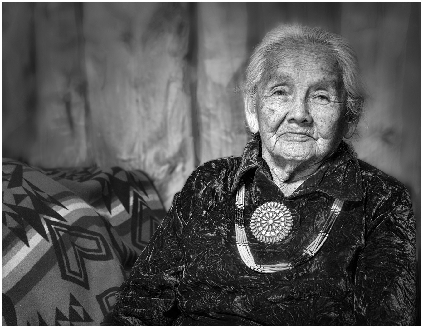
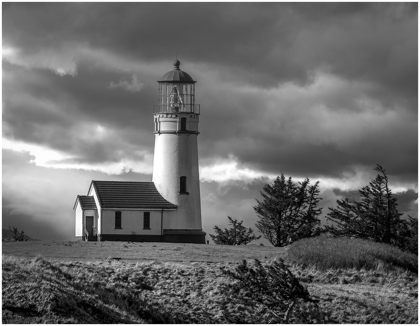
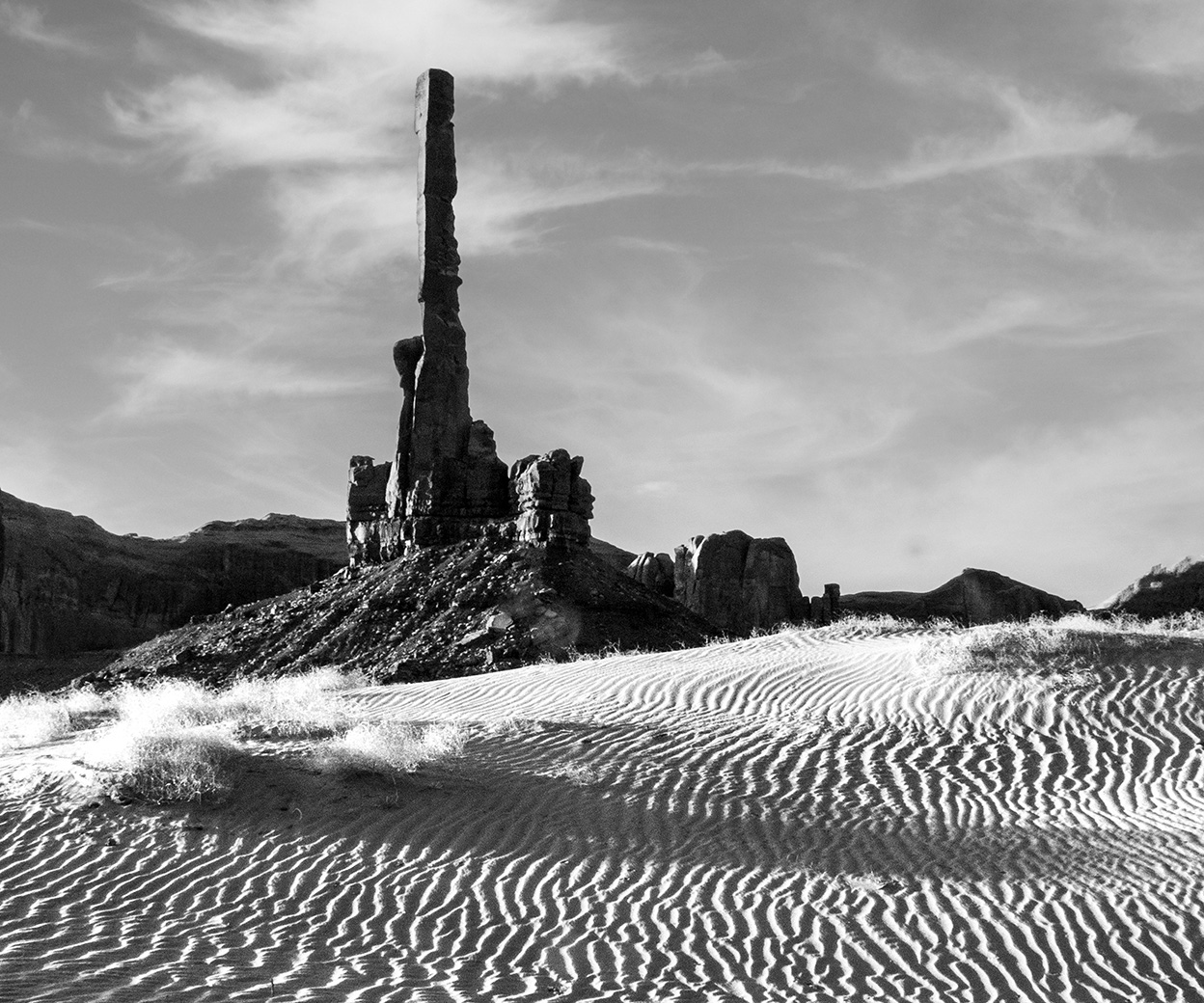
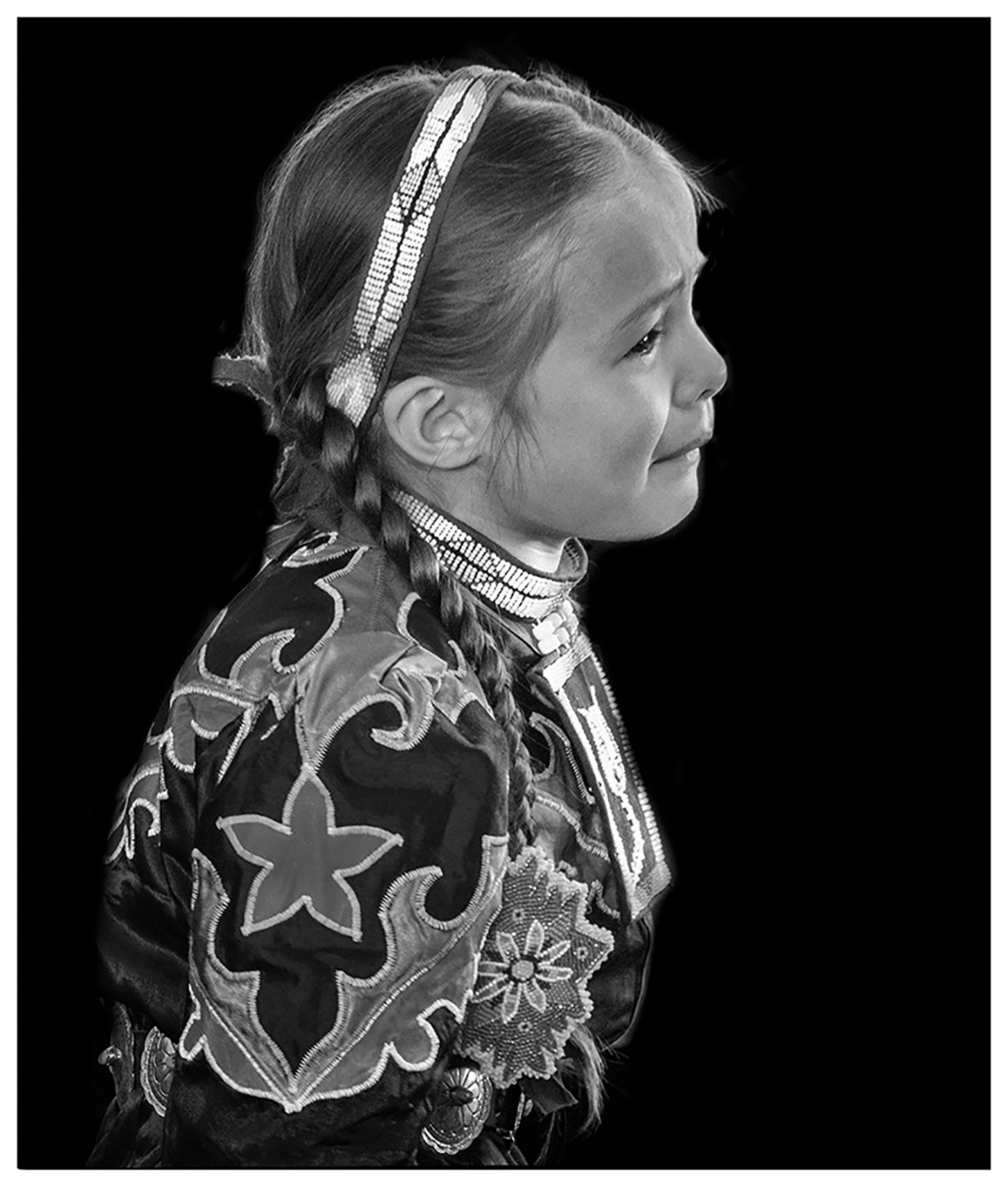
First of all, I was not aware of this PSA rule. Does this mean, we cannot submit studio portraits, or have our family and friends sit for us? Just asking for clarification? I have taken the same photo of the Totems, standing in the same place, but at sunrise. Oh, those Begays! Good choice when converting it to monochrome. It brings out the textures so well. |
Jan 10th |
| 39 |
Jan 24 |
Comment |
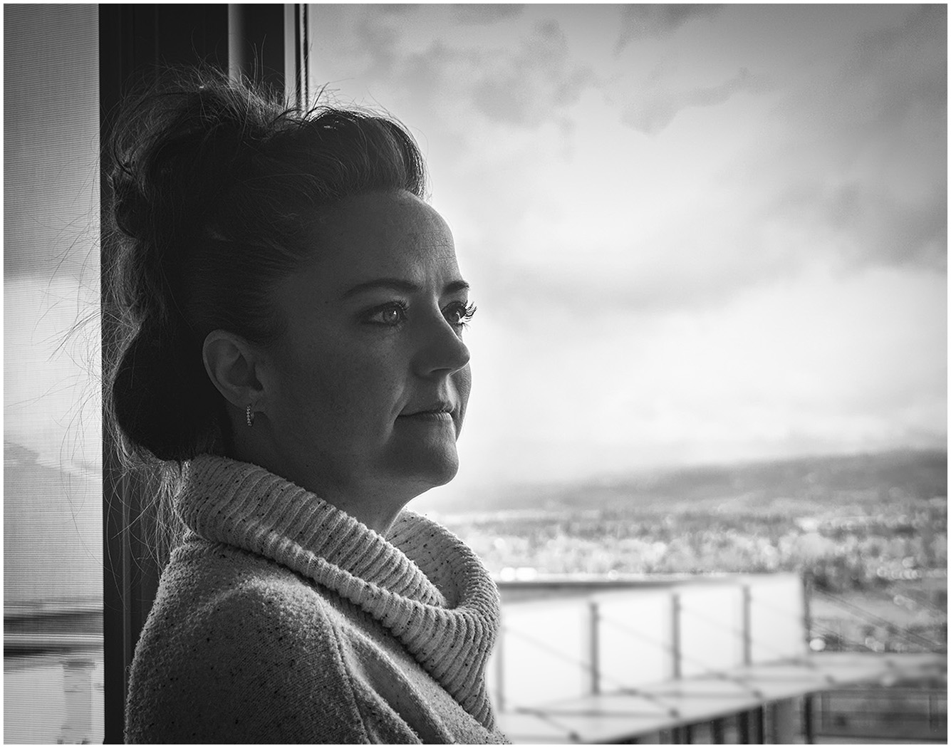
I have not heard of Bannick City. Will have to put it on my list. I like your use of tones and the simplicity of the scene. It alludes to a simpler time. Subtle rays coming in from the window add to the mood. |
Jan 10th |
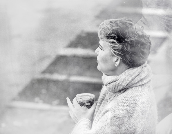
| 39 |
Jan 24 |
Comment |
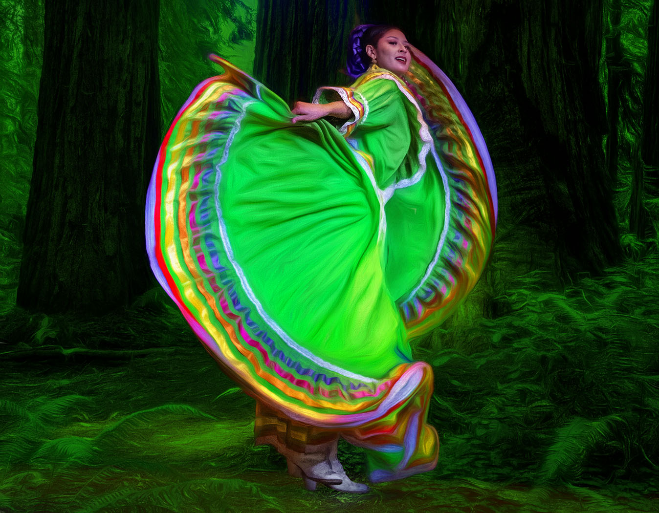
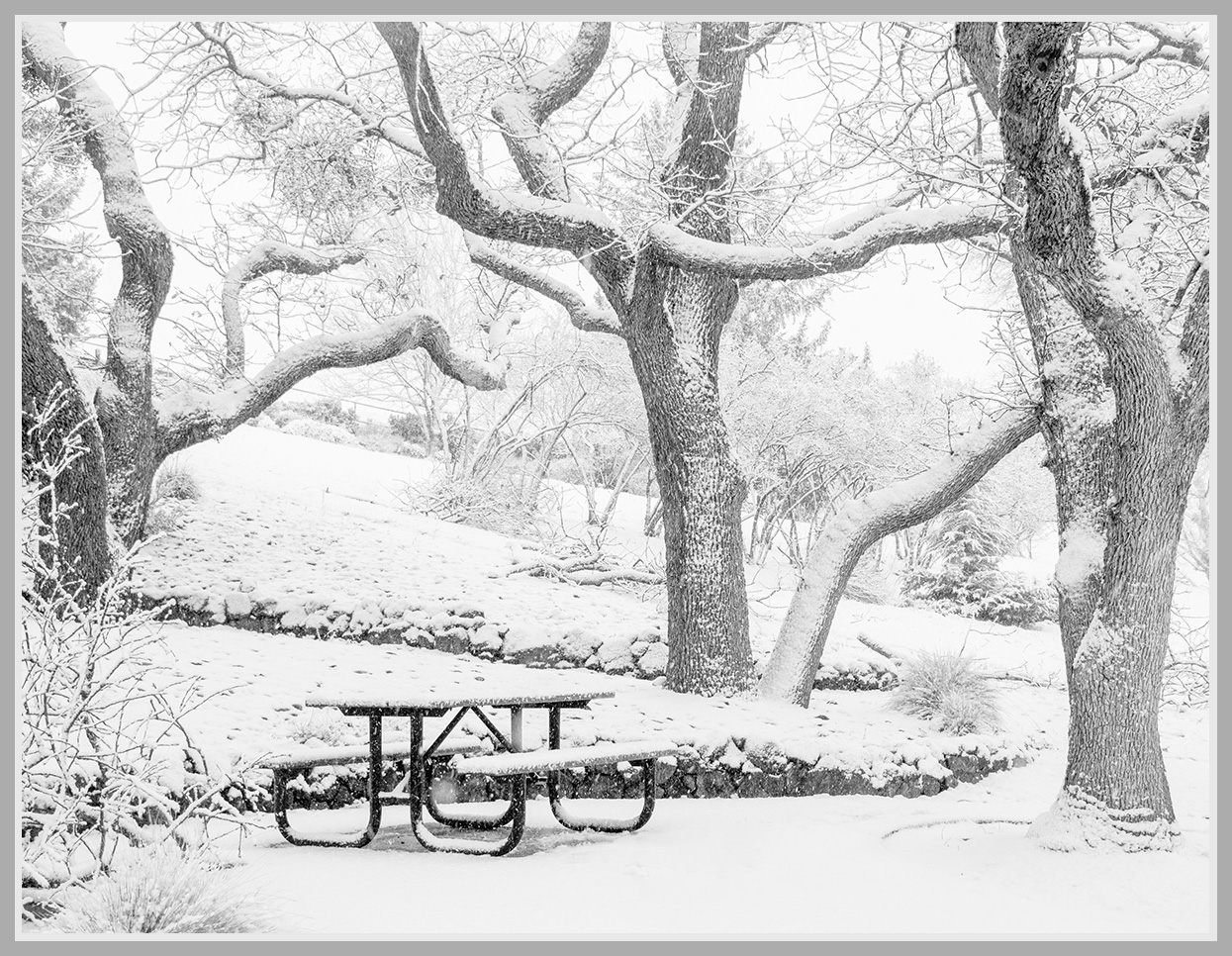
I love the concept of "dreaming" and the High Key look. To soften the "distractions" on the left and add to the dreaminess, I added a white vignette filter in Color Efex Pro. Personally, I love the photo the way it is without the Double Exposure, but it is your Creative vision with the Double Exposure, thus I think it would be less distracting if it wasn't over her hair, but had the look of being behind her. |
Jan 10th |
 |
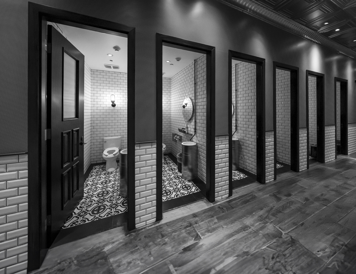
| 39 |
Jan 24 |
Comment |
This just goes to show that Beauty is everything. I love the lines, the details, the tones. It is perfect in Black and White. One small suggestions would be to extend the bottom of the canvas a bit, so that you can see the bottom of the 1st door. I used the new Generative Expand in PS. Does it work for you? |
Jan 10th |
 |
| 39 |
Jan 24 |
Comment |
Oh, how I would enjoy going on a morning walk with you. This is a strong shot. I have 2 small suggestions for you to consider. I would remove the metal seat bar to give him a less constrained look and blur the others just a smidge. |
Jan 10th |
| 39 |
Jan 24 |
Comment |
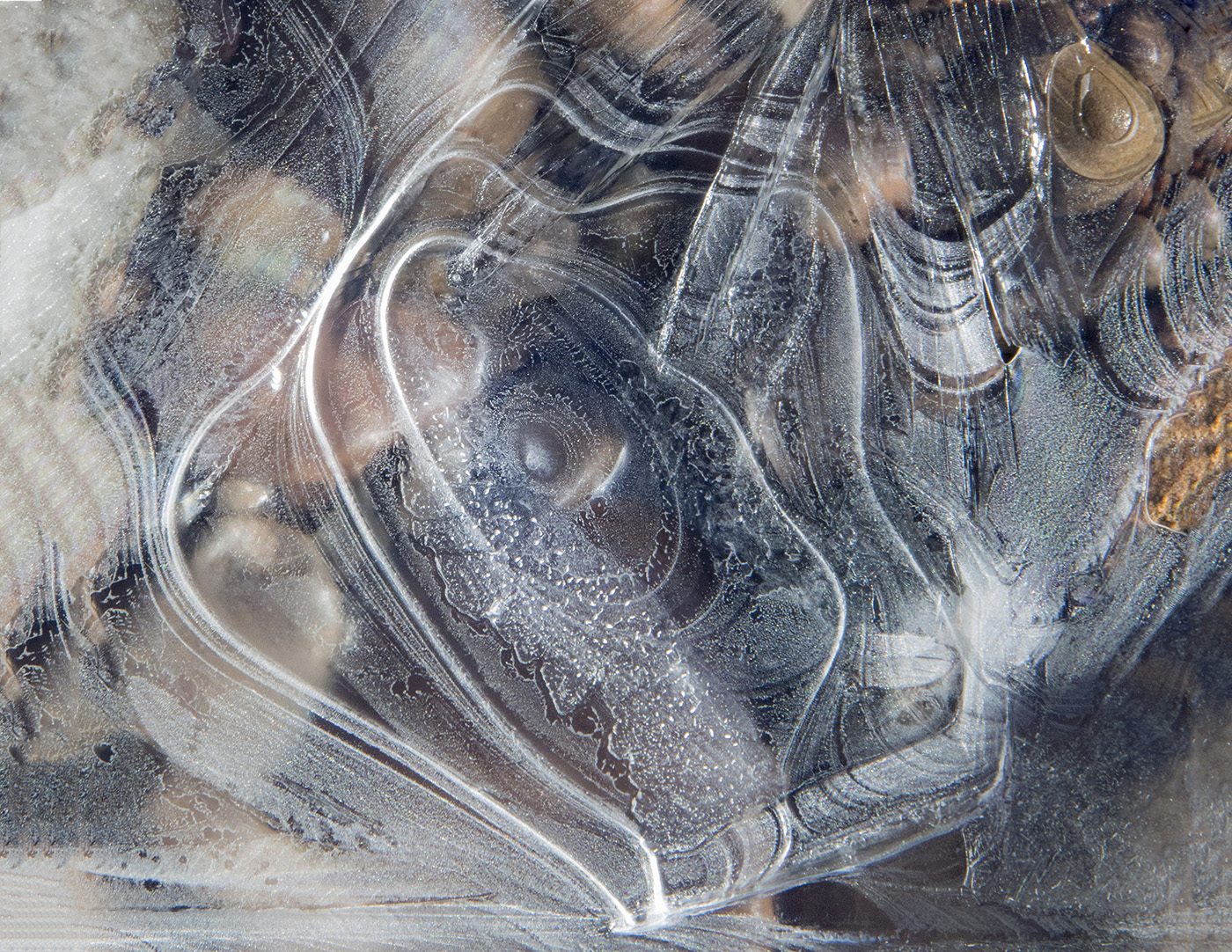
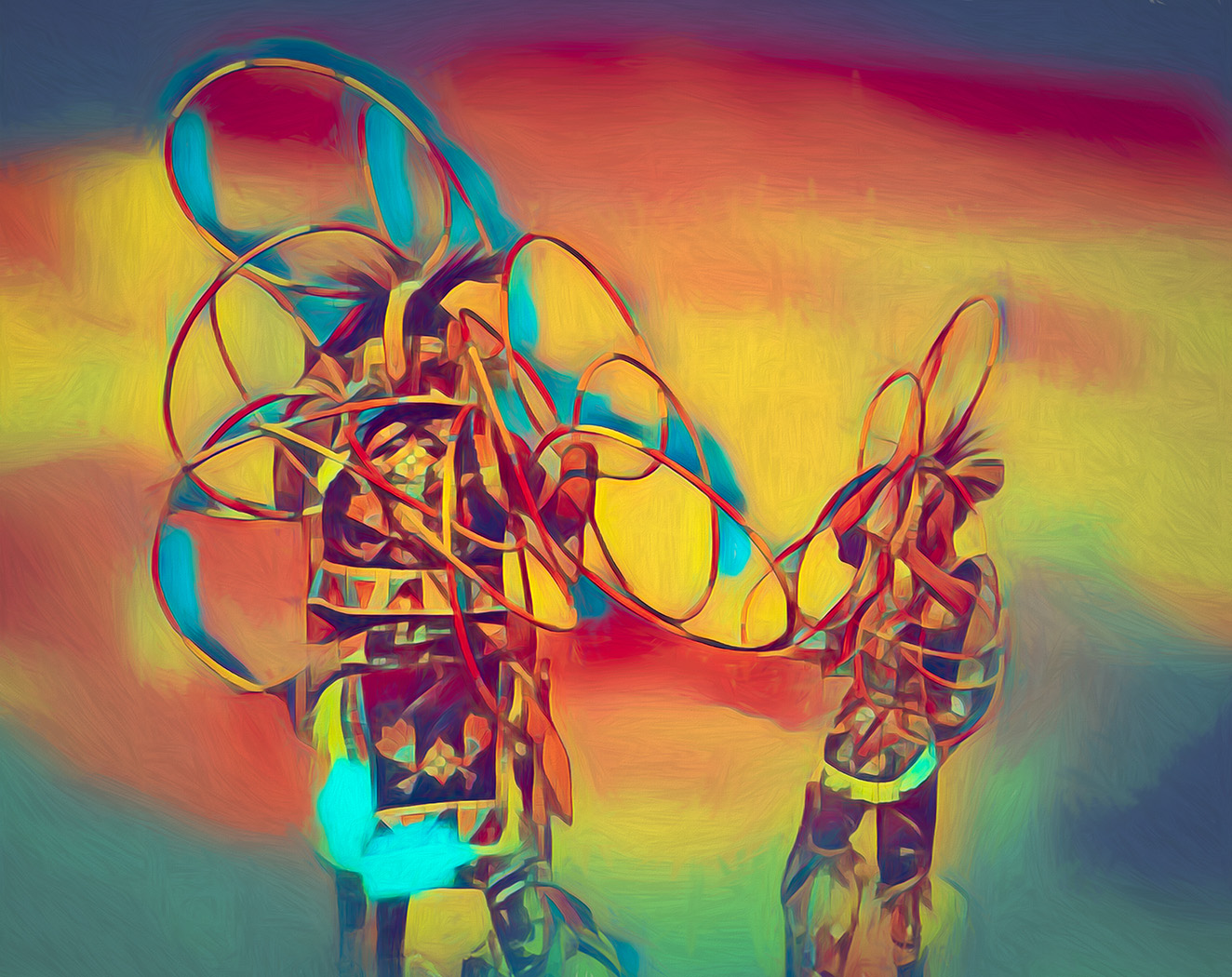
A wonderful abstract image. It could be so many things. I love the swirls of the wood. I would add a vignette, though, to bring my eye in. The light of the upper left is a bit too white. |
Jan 10th |
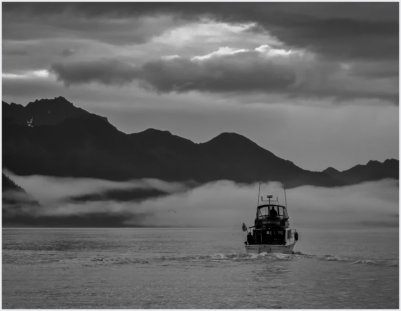
| 39 |
Jan 24 |
Comment |
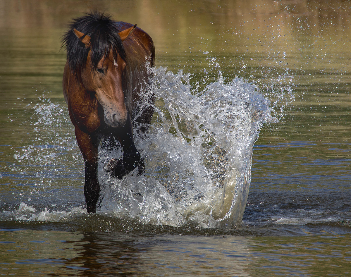
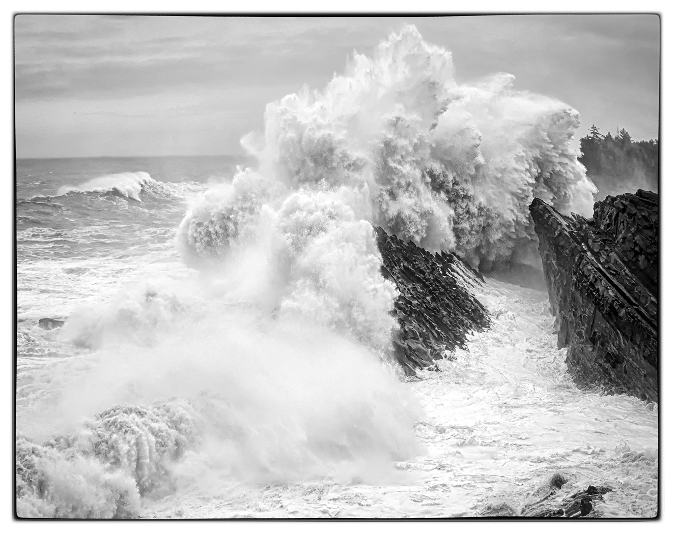
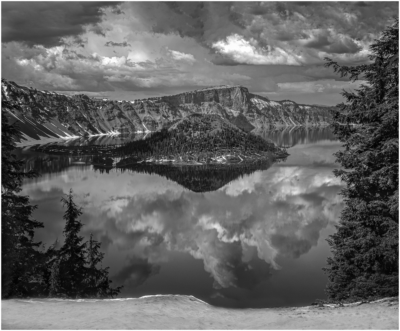
Thank you, Dave. I went back and darkened the sky. When I originally processed the photo I was trying to portray what I saw, I white, grey sky and white water all over. I believe I like the darker sky. |
Jan 10th |
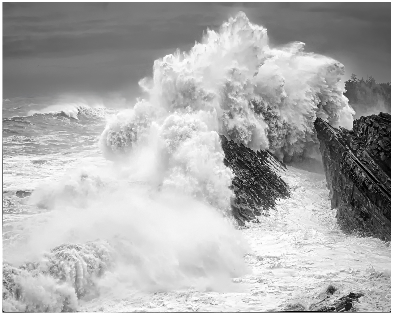 |
| 39 |
Jan 24 |
Reply |
Thank you, Kathryn. |
Jan 10th |
| 39 |
Jan 24 |
Reply |
Thank you, Ken. I was trying to capture the force of the waves.
|
Jan 10th |
| 39 |
Jan 24 |
Reply |
Thank you, Vincent. |
Jan 10th |
7 comments - 4 replies for Group 39
|
12 comments - 9 replies Total
|